Coder Social home page Coder Social logo

gaospecial / ggvenndiagram Goto Github PK

View Code? Open in Web Editor NEW
277.0 8.0 36.0 39.16 MB

A 'ggplot2' implement of Venn Diagram.

Home Page: https://gaospecial.github.io/ggVennDiagram/

License: GNU General Public License v3.0

R 99.23% CSS 0.77%
venn-plot venn-diagram set-operations upset upsetplot

ggvenndiagram's Introduction

ggVennDiagram

ggVennDiagram’ enables fancy Venn plot with 2-7 sets and generates publication quality figure. It also support upset plot with unlimited number of sets from version 1.4.4.

Installation

You can install the released version of ggVennDiagram from CRAN with:

install.packages("ggVennDiagram")

And the development version from GitHub with:

# install.packages("devtools")
devtools::install_github("gaospecial/ggVennDiagram")

Citation

If you find ggVennDiagram is useful and used it in academic papers, you may cite this package as:

  1. Gao, C.-H., Chen, C., Akyol, T., Dușa, A., Yu, G., Cao, B., and Cai, P. (2024). ggVennDiagram: intuitive Venn diagram software extended. iMeta 3, 69. doi: 10.1002/imt2.177.
  2. Gao, C.-H., Yu, G., and Cai, P. (2021). ggVennDiagram: An Intuitive, Easy-to-Use, and Highly Customizable R Package to Generate Venn Diagram. Frontiers in Genetics 12, 1598. doi: 10.3389/fgene.2021.706907.
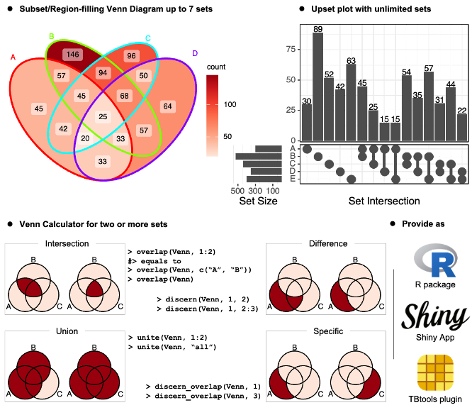
Features

Notes

The ggVennDiagram Shiny app can be accessed at Shinyapps.io (https://bio-spring.shinyapps.io/ggVennDiagram), or ggVennDiagram::launch_app() in local machine.

The TBtools plugin can be accessed through its plugin store.

Example

ggVennDiagram maps the fill color of each region to quantity, allowing us to visually observe the differences between different parts.

library(ggVennDiagram)
genes <- paste("gene",1:1000,sep="")
set.seed(20231214)
x <- list(A=sample(genes,300),
          B=sample(genes,525),
          C=sample(genes,440),
          D=sample(genes,350))

ggVennDiagram return a ggplot object, the fill/edge colors can be further modified with ggplot functions.

library(ggplot2)
ggVennDiagram(x) + scale_fill_gradient(low="grey90",high = "red")

ggVennDiagram(x, set_color = c("blue","red","green","purple"))

ggVennDiagram support 2-7 dimension Venn plot. The generated figure is generally ready for publish. The main function ggVennDiagram() will check how many items in the first parameter and call corresponding function automatically.

The parameter category.names is set names. And the parameter label can label how many items are included in each parts.

ggVennDiagram(x,category.names = c("Stage 1","Stage 2","Stage 3", "Stage4"))

ggVennDiagram(x,category.names = c("Stage 1","Stage 2","Stage 3", "Stage4"), label = "none")

Set label_alpha = 0 to remove label background.

ggVennDiagram(x, label_alpha=0)

Showing intersection values

Note: you need to install the GitHub version to enable these functions.

We implemented the process_region_data() to get intersection values.

y <- list(
  A = sample(letters, 8),
  B = sample(letters, 8),
  C = sample(letters, 8),
  D = sample(letters, 8)
)

process_region_data(Venn(y))
#> # A tibble: 15 × 4
#>    id      name    item      count
#>    <chr>   <chr>   <list>    <int>
#>  1 1       A       <chr [3]>     3
#>  2 2       B       <chr [1]>     1
#>  3 3       C       <chr [3]>     3
#>  4 4       D       <chr [0]>     0
#>  5 1/2     A/B     <chr [0]>     0
#>  6 1/3     A/C     <chr [1]>     1
#>  7 1/4     A/D     <chr [2]>     2
#>  8 2/3     B/C     <chr [1]>     1
#>  9 2/4     B/D     <chr [3]>     3
#> 10 3/4     C/D     <chr [1]>     1
#> 11 1/2/3   A/B/C   <chr [1]>     1
#> 12 1/2/4   A/B/D   <chr [1]>     1
#> 13 1/3/4   A/C/D   <chr [0]>     0
#> 14 2/3/4   B/C/D   <chr [1]>     1
#> 15 1/2/3/4 A/B/C/D <chr [0]>     0

If only several items were included, intersections may also be viewed interactively by plotly method (if you have two many items, this is useless).

ggVennDiagram(y, show_intersect = TRUE)

In web browser or RStudio, you will get:

Customizing your plot

There are three components in a Venn plot: 1) the set labels; 2) the edge of sets; and 3) the filling regions and labels (optional) of each parts. We separately stored these data in a structured VennPlotData object, in which labels, edges and regions are stored as data frames.

In general, ggVennDiagram() plot a Venn in three steps:

  • get the coordinates of a applicable shape from internal shapes datasets.
  • calculate sub regions of sets, including both the shape regions and sets members, and return a VennPlotData object that includes all necessary definitions. We implement a number of set operations functions to do this job.
  • plot using ggplot2 functions.

Please check vignette("fully-customed", package = "ggVennDiagram") for more information.

Venn Diagram for more than four sets

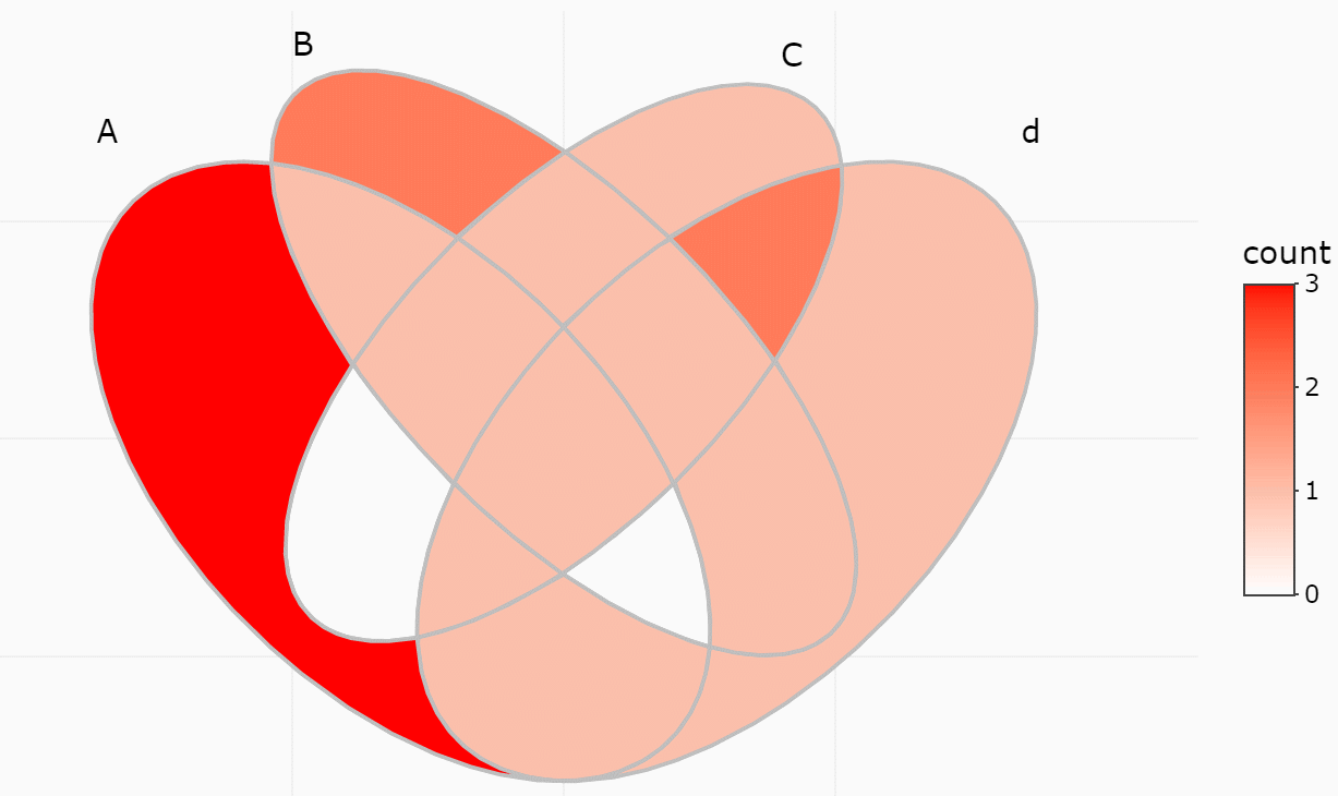
If you have reviewed my codes, you may find it is easy to support Venn Diagram for more than four sets, as soon as you find a ideal parameter to generate more circles or ellipses in the plot. The key point is to let the generated ellipses have exactly one intersection for each combination.

Venn Diagram of up to seven sets

From v1.0, ggVennDiagram can plot up to seven dimension Venn plot. Please note that the shapes for this five sets diagram, as well as those for six and seven sets, are imported from the original package venn authored by Adrian Dușa.

However, Venn Diagram for more than four sets may be meaningless in some conditions, as some parts may be omitted in such ellipses. Therefore, it is only useful in specific conditions. For example, if the set intersection of all group are extremely large, you may use several ellipses to draw a “flower” to show that.

x <- list(A=sample(genes,300),
          B=sample(genes,525),
          C=sample(genes,440),
          D=sample(genes,350),
          E=sample(genes,200),
          F=sample(genes,150),
          G=sample(genes,100))

# two dimension Venn plot
ggVennDiagram(x[1:2],label = "none")

# three dimension Venn plot
ggVennDiagram(x[1:3],label = "none")

# four dimension Venn plot
ggVennDiagram(x[1:4],label = "none")

# five dimension Venn plot
ggVennDiagram(x[1:5],label = "none")

# six dimension Venn plot
ggVennDiagram(x[1:6],label = "none")

# seven dimension Venn plot
ggVennDiagram(x,label = "none")

Native support of upset plot

From version 1.4.4, ggVennDiagram supports unlimited number of sets, as it can draw a plain upset plot automatically when number of sets is more than 7.

# add an extra member in list
x$H = sample(genes,500)
ggVennDiagram(x)
#> Warning in ggVennDiagram(x): Only support 2-7 dimension Venn diagram. Will give
#> a plain upset plot instead.
#> Warning: Removed 1 rows containing missing values (`position_stack()`).

Upset plot can also be used by setting force_upset = TRUE.

ggVennDiagram(x[1:4], force_upset = TRUE, order.set.by = "name", order.intersect.by = "none")

Since upset plot is consisted with upper panel and lower panel, and left panel and right panel, the appearance should be adjusted with different conditions. We provide two parameters, which are relative_height and relative_width to do this.

For example, if we want to give more space to lower panel, just change the relative_height from 3 (the default) to 2.

venn = Venn(x)
plot_upset(venn, nintersects = 30, relative_height = 2, relative_width = 0.3)

Reference

Adrian Dușa (2024) venn: Draw Venn Diagrams, R package version 1.12. https://CRAN.R-project.org/package=venn.

ggvenndiagram's People

Contributors

dusadrian avatar gaospecial avatar guangchuangyu avatar liuyigh avatar xiangpin avatar

Stargazers

 avatar  avatar  avatar  avatar  avatar  avatar  avatar  avatar  avatar  avatar  avatar  avatar  avatar  avatar  avatar  avatar  avatar  avatar  avatar  avatar  avatar  avatar  avatar  avatar  avatar  avatar  avatar  avatar  avatar  avatar  avatar  avatar  avatar  avatar  avatar  avatar  avatar  avatar  avatar  avatar  avatar  avatar  avatar  avatar  avatar  avatar  avatar  avatar  avatar  avatar  avatar  avatar  avatar  avatar  avatar  avatar  avatar  avatar  avatar  avatar  avatar  avatar  avatar  avatar  avatar  avatar  avatar  avatar  avatar  avatar  avatar  avatar  avatar  avatar  avatar  avatar  avatar  avatar  avatar  avatar  avatar  avatar  avatar  avatar  avatar  avatar  avatar  avatar  avatar  avatar  avatar  avatar  avatar  avatar  avatar  avatar  avatar  avatar  avatar  avatar

Watchers

 avatar  avatar  avatar  avatar  avatar  avatar  avatar  avatar

ggvenndiagram's Issues

Edit README to reflect updated geom_line aesthetics

Minor update to docs - the aesthetics arguments of ggplot::geom_line have changed

From the customization example in README.html:

Now we can customize this figure.

ggplot() +
  geom_sf(aes(fill=count), data = venn_region(data)) +
  geom_sf(size = 2, lty = "dashed", color = "grey", data = venn_setedge(data), show.legend = F) +

I believe the last line should read:

geom_sf(linewidth = 2, linetype = "dashed", ...) +

When used in ggplot2, geom_line(size=2) returns the following warning:

Warning message:
Using `size` aesthetic for lines was deprecated in ggplot2 3.4.0.
Please use `linewidth` instead.

When I use geom_sf(size=2), I don't get a warning, but there's no affect on the plot. However, geom_sf(linewidth=2) works as expected.

Note that geom_sf(lty='dashed') does works as expected, but lty isn't documented in ggplot2. It might improve clarity a bit to use linetype instead?

How to manage intersection fill region

I'm using region variable to fill the regions with a named vector and some alpha value. I get gray color on intersection areas. How to get an overlap alpha colors on intersection region? Thanks

Colors for plotly figure

How do I change the colors for the plotly figure? I tried the following but doesn't work.

ggVennDiagram(x, show_intersect=TRUE) + scale_fill_gradient(low="grey90",high = "red")

It gives an warning:
Ignoring unknown aesthetics: text

Get the error of "Error: Input must be a vector, not a `sfc_LINESTRING/sfc` object."

Hi,

I really like the Venn plot generated by the package, however, when I tried the example code:

> genes <- paste("gene",1:1000,sep="")
> set.seed(20210419)
> x <- list(A=sample(genes,300),
+           B=sample(genes,525),
+           C=sample(genes,440),
+           D=sample(genes,350))
> ggVennDiagram(x)

I got an error of "Error: Input must be a vector, not a sfc_LINESTRING/sfc object."

> class(x)
[1] "list"

Any clues why it doesn't accept my input?

Best,
Yixin

Below is my sessionInfo()

R version 3.6.1 (2019-07-05)
Platform: x86_64-conda_cos6-linux-gnu (64-bit)
Running under: Ubuntu 18.04.5 LTS

Matrix products: default
BLAS/LAPACK: /home/yixin/software/anaconda3/envs/Sun_et_al_2020/lib/libopenblasp-r0.3.10.so

locale:
[1] LC_CTYPE=en_US.UTF-8 LC_NUMERIC=C LC_TIME=en_US.UTF-8 LC_COLLATE=en_US.UTF-8
[5] LC_MONETARY=en_US.UTF-8 LC_MESSAGES=en_US.UTF-8 LC_PAPER=en_US.UTF-8 LC_NAME=C
[9] LC_ADDRESS=C LC_TELEPHONE=C LC_MEASUREMENT=en_US.UTF-8 LC_IDENTIFICATION=C

attached base packages:
[1] stats graphics grDevices utils datasets methods base

other attached packages:
[1] ggVennDiagram_1.1.1 ggtree_2.0.4 cowplot_1.1.0 forcats_0.5.0 stringr_1.4.0
[6] dplyr_1.0.2 purrr_0.3.4 readr_1.3.1 tidyr_1.1.2 tibble_3.0.3
[11] ggplot2_3.3.2 tidyverse_1.3.0 Seurat_3.2.2

loaded via a namespace (and not attached):
[1] readxl_1.3.1 backports_1.1.10 plyr_1.8.6 igraph_1.2.4.2 lazyeval_0.2.2
[6] splines_3.6.1 listenv_0.8.0 usethis_1.6.3 digest_0.6.25 htmltools_0.5.0
[11] fansi_0.4.1 magrittr_1.5 memoise_1.1.0 tensor_1.5 cluster_2.1.0
[16] ROCR_1.0-11 remotes_2.2.0 limma_3.42.0 globals_0.13.0 modelr_0.1.8
[21] matrixStats_0.57.0 prettyunits_1.1.1 RVenn_1.1.0 colorspace_1.4-1 blob_1.2.1
[26] rvest_0.3.6 rappdirs_0.3.1 ggrepel_0.8.2 haven_2.3.1 callr_3.4.4
[31] crayon_1.3.4 jsonlite_1.7.1 spatstat_1.64-1 spatstat.data_1.4-3 survival_3.2-7
[36] zoo_1.8-8 ape_5.4-1 glue_1.4.2 polyclip_1.10-0 gtable_0.3.0
[41] leiden_0.3.3 pkgbuild_1.1.0 future.apply_1.6.0 abind_1.4-5 scales_1.1.1
[46] DBI_1.1.0 miniUI_0.1.1.1 Rcpp_1.0.5 viridisLite_0.3.0 xtable_1.8-4
[51] units_0.7-1 tidytree_0.3.3 reticulate_1.16 proxy_0.4-25 rsvd_1.0.3
[56] htmlwidgets_1.5.1 httr_1.4.2 RColorBrewer_1.1-2 ellipsis_0.3.1 ica_1.0-2
[61] pkgconfig_2.0.3 farver_2.0.3 uwot_0.1.8 dbplyr_1.4.4 deldir_0.1-29
[66] utf8_1.1.4 tidyselect_1.1.0 labeling_0.3 rlang_0.4.7 reshape2_1.4.4
[71] later_1.1.0.1 munsell_0.5.0 cellranger_1.1.0 tools_3.6.1 cli_2.0.2
[76] generics_0.0.2 devtools_2.3.2 broom_0.7.0 ggridges_0.5.2 fastmap_1.0.1
[81] yaml_2.2.1 goftest_1.2-2 processx_3.4.4 fs_1.5.0 fitdistrplus_1.1-1
[86] RANN_2.6.1 pbapply_1.4-3 future_1.19.1 nlme_3.1-149 mime_0.9
[91] aplot_0.0.6 xml2_1.3.2 compiler_3.6.1 rstudioapi_0.11 curl_4.3
[96] plotly_4.9.2.1 png_0.1-7 e1071_1.7-6 testthat_2.3.2 spatstat.utils_1.17-0
[101] reprex_0.3.0 treeio_1.10.0 stringi_1.5.3 ps_1.3.4 desc_1.2.0
[106] lattice_0.20-41 Matrix_1.2-18 classInt_0.4-3 vctrs_0.3.4 pillar_1.4.6
[111] lifecycle_0.2.0 BiocManager_1.30.12 lmtest_0.9-38 RcppAnnoy_0.0.16 data.table_1.12.8
[116] irlba_2.3.3 httpuv_1.5.4 patchwork_1.1.1 R6_2.4.1 promises_1.1.1
[121] KernSmooth_2.23-17 gridExtra_2.3 sessioninfo_1.1.1 codetools_0.2-16 MASS_7.3-53
[126] assertthat_0.2.1 pkgload_1.1.0 rprojroot_1.3-2 withr_2.3.0 sctransform_0.3
[131] mgcv_1.8-33 parallel_3.6.1 hms_0.5.3 grid_3.6.1 rpart_4.1-15
[136] class_7.3-19 rvcheck_0.1.8 Rtsne_0.15 sf_0.7-6 shiny_1.5.0
[141] lubridate_1.7.9

rotate of venn / special shapes not working

I am trying to get the special shape 201f to work, which is a 90 degree rotated 2 circle plot, but it seems to not work (I think it is doing a 180 in stead of a 90). The other special shapes (like 401f) worked fine for me

x <- list(A = 1:5, B = 2:7)
data = process_data(Venn(x), shape_id == "201f")
ggplot() +
  geom_sf(aes(fill = count), data = venn_region(data)) +
  geom_sf(aes(color = id), data = venn_setedge(data), show.legend = FALSE) +
  geom_sf_text(aes(label = name), data = venn_setlabel(data)) +
  geom_sf_label(aes(label = count), data = venn_region(data)) +
  theme_void()

aww

Scale region labels size with count

Hey is it possible to scale the label size of each region with the count of it?
My current code is the following which produces:

library(rjson)
library(ggVennDiagram)
library(ggplot2)
library(dplyr)
# READ THE json files from ./resultCalc each subfolder is a project
# 1. read the json file
files <- list.files(path = "sbom2023_plot/resultCalc", full.names = TRUE)
for (project in files) {
  venn_data <- list() # Initialize an empty list to store Venn diagram data
  producers <- list.files(path = project, pattern = "*.json", full.names = TRUE)
  producer_genes <- list() # Initialize an empty list to store genes for each producer

  for (producer in producers) {
    content <- fromJSON(file = producer)
    # get the array with the key "truePositive"
    truePositives <- content$truePositive
    # convert each json object to a string $groupdID:$artifactId:$version
    list_of_strings <- list()
    for (truePositive in truePositives) {
      # get the groupID
      groupID <- truePositive$groupId
      # get the artifactID
      artifactID <- truePositive$artifactId
      # get the version
      version <- truePositive$version
      # concatenate the strings
      string <- paste(groupID, artifactID, version, sep = ":")
      # add the string to the list
      list_of_strings <- append(list_of_strings, string)
    }
    producer_genes[[tools::file_path_sans_ext(basename(producer))]] <- unlist(list_of_strings)
  }

  # Generate the Venn diagram
  venn <- Venn(producer_genes)
  plot <- ggVennDiagram(producer_genes, label = "count", edge_size = 2) +
    scale_color_brewer(palette = "Paired") +
    theme(
      plot.background = element_rect(fill = "white"),
    )
  data <- process_data(venn)
  # Save the Venn diagram with high dpi
  ggsave(
    filename = paste("./venns", paste(basename(project), "pdf", sep = "."), sep = "/"),
    plot = plot,
    width = 13, height = 13, units = "in",
    dpi = 1200
  )
}
image

I also took a look at #50, but haven't understood how to do this for my diagram. I am a complete R beginner and help is appreciated.

formatting decimal places

Hello,
is it possible to change the number of decimal places displayed in the plot? I can see from your source code that you specified that two decimal places are shown (label=percentage). Can I define the number of decimal places (one or zero) when I call the function on my data frame?
Thanks,

Marie

Can not change the color of edges

Hi,

I can not change the color of the edges in ggVennDiagram:

ggVennDiagram(x_bac, color = "black", category.names = c("AM", "FE"), label_alpha = 0) +
scale_fill_gradient(low = "pink1", high = "pink4")

This works otherwise fine, but none of the commands to modify the edges have any effect(color, lty, lwd), and I get red border for AM set and light blue for FE set, no matter the settings.

I also tried the other way and this produces red edges to both sets, no matter the options:

venn <- Venn(x_bac)
data <- process_data(venn)
ggplot() +
geom_sf(aes(fill = count), data = venn_region(data)) +
geom_sf(aes(color="black"), data = venn_setedge(data), show.legend = FALSE) +
geom_sf_text(aes(label = name), data = venn_setlabel(data)) +
geom_sf_label(aes(label = count), data = venn_region(data)) +
theme_void()

What am I doing wrong here?

Capture1
Capture2

Cannot change path edges

Hello,

Thank you for your package, it's very useful. I'm having trouble getting the edge color to change. It says online that color = "black" should do this, but no matter what, it still stays in the default ggplot2 colors for each edge color.

Below is my code and I have attached the output graph I keep getting:

`

make the data frame for graphing

paths <- list(WholeDataset = sign_cpglmALL$pathway,
F0 = sign_cpglm$pathway,
F1 = sign_cpglmF1$pathway,
F2 = sign_cpglmF2_2$pathway)

graph a venn diagram of the data

ggVennDiagram(paths, category.names = c("Whole Dataset",
"F0 Generation",
"F1 Generation",
"F2 Generation"),
color = "black") +
scale_fill_gradient(low = "white", high = "red")
`

Screen Shot 2023-02-13 at 3 18 56 PM

The object I'm using as an input is a list of four character vectors representing pathway names for four data sets. Github won't let me include a .RDS object but here is the structure:

`

str(paths)
List of 4
$ WholeDataset: chr [1:54] "ARG.POLYAMINE.SYN..superpathway.of.arginine.and.polyamine.biosynthesis" "ARGSYN.PWY..L.arginine.biosynthesis.I..via.L.ornithine." "ARGSYN.PWY..L.arginine.biosynthesis.I..via.L.ornithine." "ARGSYNBSUB.PWY..L.arginine.biosynthesis.II..acetyl.cycle." ...
$ F0 : chr [1:94] "ARGSYN.PWY..L.arginine.biosynthesis.I..via.L.ornithine." "ARGSYNBSUB.PWY..L.arginine.biosynthesis.II..acetyl.cycle." "BIOTIN.BIOSYNTHESIS.PWY..biotin.biosynthesis.I" "BIOTIN.BIOSYNTHESIS.PWY..biotin.biosynthesis.I" ...
$ F1 : chr [1:81] "ANAGLYCOLYSIS.PWY..glycolysis.III..from.glucose." "ARGININE.SYN4.PWY..L.ornithine.biosynthesis.II" "ARGSYN.PWY..L.arginine.biosynthesis.I..via.L.ornithine." "ARGSYNBSUB.PWY..L.arginine.biosynthesis.II..acetyl.cycle." ...
$ F2 : chr [1:139] "ANAEROFRUCAT.PWY..homolactic.fermentation" "ANAGLYCOLYSIS.PWY..glycolysis.III..from.glucose." "ARGSYN.PWY..L.arginine.biosynthesis.I..via.L.ornithine." "ARGSYN.PWY..L.arginine.biosynthesis.I..via.L.ornithine." ...
`

Rotate the whole venn diagram

Dear authors,

Is their any methods to rotate the whole venn diagram. For example, the default 3-sets venn is like below,
image

so how can we make it like this:
image

ggVennDiagram pkg installation issue

Really looking forward to try
the ggVennDiagram pkg.

But it will not install in my

  • latest Rstudio,
  • Ubuntu Linux 18.04 64bits
  • R 3.6.1
    from either CRAN nor from:
    devtools::install_github("gaospecial/ggVennDiagram")

Here's the Rstudio console output
with the installation error messages:


install.packages("ggVennDiagram")
Installing package into ‘/home/ray/R/x86_64-pc-linux-gnu-library/3.6’
(as ‘lib’ is unspecified)
also installing the dependencies ‘units’, ‘sf’

trying URL 'https://cloud.r-project.org/src/contrib/units_0.6-5.tar.gz'
Content type 'application/x-gzip' length 959970 bytes (937 KB)

downloaded 937 KB

trying URL 'https://cloud.r-project.org/src/contrib/sf_0.8-0.tar.gz'
Content type 'application/x-gzip' length 8607770 bytes (8.2 MB)

downloaded 8.2 MB

trying URL 'https://cloud.r-project.org/src/contrib/ggVennDiagram_0.3.tar.gz'
Content type 'application/x-gzip' length 163551 bytes (159 KB)

downloaded 159 KB

  • installing source package ‘units’ ...
    ** package ‘units’ successfully unpacked and MD5 sums checked
    ** using staged installation
    configure: units: 0.6-4
    checking whether the C++ compiler works... yes
    checking for C++ compiler default output file name... a.out
    checking for suffix of executables...
    checking whether we are cross compiling... no
    checking for suffix of object files... o
    checking whether we are using the GNU C++ compiler... yes
    checking whether g++ -std=gnu++11 accepts -g... yes
    checking how to run the C++ preprocessor... g++ -std=gnu++11 -E
    checking for grep that handles long lines and -e... /bin/grep
    checking for egrep... /bin/grep -E
    checking for ANSI C header files... yes
    checking for sys/types.h... yes
    checking for sys/stat.h... yes
    checking for stdlib.h... yes
    checking for string.h... yes
    checking for memory.h... yes
    checking for strings.h... yes
    checking for inttypes.h... yes
    checking for stdint.h... yes
    checking for unistd.h... yes
    checking for stdbool.h that conforms to C99... no
    checking for _Bool... no
    checking for error_at_line... yes
    checking for gcc... gcc -std=gnu99
    checking whether we are using the GNU C compiler... yes
    checking whether gcc -std=gnu99 accepts -g... yes
    checking for gcc -std=gnu99 option to accept ISO C89... none needed
    checking for XML_ParserCreate in -lexpat... no
    checking udunits2.h usability... no
    checking udunits2.h presence... no
    checking for udunits2.h... no
    checking udunits2/udunits2.h usability... no
    checking udunits2/udunits2.h presence... no
    checking for udunits2/udunits2.h... no
    checking for ut_read_xml in -ludunits2... no
    configure: error: in `/tmp/RtmpruJp2n/R.INSTALL1cb671dba372/units':
    configure: error:

Configuration failed because libudunits2.so was not found. Try installing:
* deb: libudunits2-dev (Debian, Ubuntu, ...)
* rpm: udunits2-devel (Fedora, EPEL, ...)
* brew: udunits (OSX)
If udunits2 is already installed in a non-standard location, use:
--configure-args='--with-udunits2-lib=/usr/local/lib'
if the library was not found, and/or:
--configure-args='--with-udunits2-include=/usr/include/udunits2'
if the header was not found, replacing paths with appropriate values.
You can alternatively set UDUNITS2_INCLUDE and UDUNITS2_LIBS manually.

See `config.log' for more details
ERROR: configuration failed for package ‘units’

  • removing ‘/home/ray/R/x86_64-pc-linux-gnu-library/3.6/units’
    Warning in install.packages :
    installation of package ‘units’ had non-zero exit status
    ERROR: dependency ‘units’ is not available for package ‘sf’
  • removing ‘/home/ray/R/x86_64-pc-linux-gnu-library/3.6/sf’
    Warning in install.packages :
    installation of package ‘sf’ had non-zero exit status
    ERROR: dependency ‘sf’ is not available for package ‘ggVennDiagram’
  • removing ‘/home/ray/R/x86_64-pc-linux-gnu-library/3.6/ggVennDiagram’
    Warning in install.packages :
    installation of package ‘ggVennDiagram’ had non-zero exit status

The downloaded source packages are in
‘/tmp/RtmpAMBDPc/downloaded_packages’

Help!
I really want to try this out...what am I missing?.

**SFD99
San Francisco

  • latest Rstudio
  • Ubuntu Linux 18.04 64bits
  • R 3.6.1**

remove the background of text

1051572249007_ pic

Thank you for building this package. The code is user friendly.
Would you add an option that user can choose whether add background for text or not? Thank you very much.

How can I get the full list of elements per overlap subset?

Hey, thanks for the great package.

I am curious to know if there is a simple method to get a list of elements in each subset of your venn diagrams?

Similar in gplots::venn:

xx.1 <- list(A = sort(sample(LETTERS, 15)),
             B = sort(sample(LETTERS, 15)),
             C = sort(sample(LETTERS, 15)),
             D = sort(sample(LETTERS, 15)))

ItemsList <- gplots::venn(xx.1, show.plot = FALSE)
lengths(attributes(ItemsList)$intersections)
attributes(ItemsList)$intersections

resulting in

> attributes(ItemsList)$intersections
$A
[1] "C"

$B
[1] "D" "Q"

$C
[1] "B"

$D
[1] "V"

$`A:B`
[1] "N"

$`A:C`
[1] "E" "W"

If so, u may want to share also at:

https://stackoverflow.com/questions/65898472/how-to-obtain-the-list-of-elements-from-a-venn-diagram
https://stackoverflow.com/questions/23559371/get-the-list-of-items-in-venn-diagram

Thanks for your time!

Can we change the way to calculate percentage in ggVennDiagram ?

Thanks for a wonderful tool!

I have a question about percentage calculation in ggVennDiagram. Your package calculates it based on (n/total * 100), right ?. According to my data, my total of each group is dramatically unequl (A = 10000, B=2000, C=500). I would like to reduce the imbalance of them by calculating the percentage following these,
A=((n of A /10000) * 100)
B=((n of B /2000) * 100)
C=((n of C /500) * 100)
A∩B=((n of A∩B /12000) * 100)
A∩C=((n of A∩C /10500) * 100)
B∩C=((n of B∩C /2500) * 100)
A∩B∩C=((n of A∩B∩C /12500) * 100)

Is it possible to do these ? or it is wrong to calculate it because of mathematical theory ?

A short question

Can't I use expression to change sets names ?

I need it but I tried my best it still doesn't work.

I want to change the sets labels, it works well. However, when I add expression in ggplot2 or VennDiagram,

error information always appeared.

Could you give me some advice ?

 geom_sf_text(aes(label = c("Set 1",
                             "Set 2")),fontface = "bold",data = venn_setlabel(data),size = 6) +

library("ggVennDiagram")
library(ggplot2)
venn <- Venn(x)
data <- process_data(venn)
personal_theme = theme(plot.title = element_text(hjust = 0.5))
?geom_sf
?geom_sf_label
?percent

ddd<-venn_setlabel(data)


p<-ggplot() +

  geom_sf(aes(fill = count,alpha=1), data = venn_region(data)) +

  #geom_sf(aes(color = "black",size=2), data = venn_setedge(data), show.legend = FALSE) +
  geom_sf(color="black", size = 20, data = venn_setedge(data), show.legend = FALSE) +

  geom_sf_text(aes(label = c("Set 1",
                             "Set 2")),fontface = "bold",data = venn_setlabel(data),size = 6) +


  geom_sf_text(aes(label = paste0(count, " \n(", scales::percent(count/sum(count), accuracy = 0.01), ")")), 
                data = venn_region(data),
                size = 6) +
  theme_void()+
  scale_fill_gradient(low = "#4981BF", high = "#21908dff") +
  theme(legend.position = "none")+
  theme(plot.title = element_text(size=22))

data format

I'm curious about what kinds of data formats should be used. It would be very helpful to a beginner like me if you could provide detailed instructions with example data files and commands.

ggVennDiagram memory vs ggvenn

Using ggVennDiagram_0.5.0:

My dataset:

Large list (3 elements, 23.5 MB)
List of 3
 $ Score : chr [1:129544] 
 $ Length: chr [1:5109]
 $ Charge: chr [1:88312]

I'm trying to use ggVennDiagram on the dataset listed above. However, it seems that it uses a lot of memory, and R crashes with 8GB of RAM. I was able to subsample and run with a smaller dataset (see below), so I know the program works.

Large list (3 elements, 3.5 MB)
List of 3
 $ Score : chr [1:19016] 
 $ Length: chr [1:793]
 $ Charge: chr [1:13012]

Rplot

I am able to run the same dataset using ggvenn (no memory issues, see figure below) but would prefer to use ggVennDiagram due to the counts legend.

Rplot01

Is there a way to reduce the memory usage of the program, or any other work around?

Colour by percentage

Hello,

I want to compare different Venn Diagrams and in each diagram, I show both count and percentage values, but I want to colour by percentage so that several Venn Diagrams can be compared. Is that possible?

Thank you so much!

Marie

toggle for geom_text instead of geom_label (for ggplotly support)

Hi there! I've been looking for a proper ggplot implementation of venn diagrams for a long time now, so thank you for this :)
I make an app that can toggle between ggplot and plotly - and ideally in a venn diagram in plotly I'd like to be able to click an overlapping part and get all members of that overlap. So what that means is basically that I have two requests:

  1. ggplotly doesn't support geom_label - would you consider switching to geom_text or adding an option to toggle to that?
  2. would you be willing to add a 'key' aes to the plot that contains something akin to "Category1, Category2, Category3" that I could reference in ggplotly?

I'll take a look if I can make a pull request for it if I can get it working :)

p = ggVennDiagram(x,label = "percent")
ggplotly(p)
Warning message:
In geom2trace.default(dots[[1L]][[1L]], dots[[2L]][[1L]], dots[[3L]][[1L]]) :
geom_GeomLabel() has yet to be implemented in plotly.
If you'd like to see this geom implemented,
Please open an issue with your example code at
https://github.com/ropensci/plotly/issues

Change color of edges

Hi,

Is it possible to change the edge color without having to generate a VennPlotData object and customizing it?

It seems that in older versions you could change it by specifying color, but it is no longer possible.

Example here does not produce a plot with black edges.

# install.packages("ggVennDiagram")
library(ggVennDiagram)
# install.packages("ggplot2")
library(ggplot2)

# List of items
x <- list(A = 1:5, B = 2:7, C = 5:10)

# Venn diagram with custom border
ggVennDiagram(x, color = "black", lwd = 0.8, lty = 1) + 
  scale_fill_gradient(low = "#F4FAFE", high = "#4981BF")

Could you please tag your project.

To promote reproducible science, could you please use git tags. Creating a tag also creates a release for your project. We require tagged releases when building scientific software. Pulling from the master is not reproducible.

I would also recommend using at least a 3 digit semantic versioning scheme; Magor.Minor.Patch. Please do not
follow the git examples by putting a "v" as the leading character. Github will create a "release" when the tag is pushed.

thanks for making your software available

git tag 1.0.0
git tag push origin 1.0.0

FYI - I have created an EasyConfig to build ggVennDiagram. I will get this pushed to the main EasyBuild repository.

https://github.com/FredHutch/easybuild-life-sciences/tree/master/fh_easyconfigs/g/ggVennDiagram

Increase margin between title and plots

First of all thank you so much for this insanely incredible package! I was wondering if there's a way to increase the margin between titles and plots? [Ideally I'd like to move the category_names up a bit.

image

Any help/tips appreciated!

How to change the font

Hi
when I use ggplot2 function
theme (text = element_text (family = "serif"))
there is no error and the font does not change,
and Can you tell me how to do it

R crash when using ggVennDiagram()

My platform is Ubuntu 18.04, R version is 4.1.0. When I used ggVennDiagram in rstudio-server, R will crash, reporting a R session Error: The previous R session was abnormally terminated due to an unexpected crash.
Is this package not support linux system?

Option for counts/labels in plotly

Hi there! Thanks for all you work on this package and addressing my earlier issue :) I noticed that you removed the numbers in the intersections in plotly plots for the new release. I was wondering if you'd consider adding those back in (perhaps optional?) as it would aid me in my analyses.

Thank you and kind regards,
Joanna

return a list of each region

Would you add a return list so that I can check which genes are there in each region.
For example, I want to know the overlap gene list, or genes specific in one group.

empty "" was generated during Venn()

Hi,
When we input data with csv file, an empty cell "" was found in the column with less items as below shown in $Mono.M7.prog and $Mono.F7.prog.

df<-read.csv("D:\covid19\sm6.sm7.sf7.intersecton.csv")
venn <- Venn(df[1:3])
venn
An object of class "Venn"
Slot "sets":
$Mono.M6.prog
[1] "S100A9" "S100A8" "ID1" "CLU" "HIST1H1E" "ID2" "FBP1" "TXNIP" "EGR1"
[10] "TSC22D1" "NRIP1" "BCL11A" "IRF7" "PPARG" "PELI1" "GTF2B" "NCOA7" "HSPA8"
[19] "MITF" "PIM1" "YBX3" "BHLHE40" "SP140" "DNAJB1" "DDIT3" "FOS" "AIM2"
[28] "HESX1" "BASP1" "TDP2" "ENG" "NR4A2" "HSPA1B" "ELL2" "SQSTM1" "NFKBIA"
[37] "FOSB" "CIR1" "VEGFA" "NR1H3" "KLF2" "TXN" "HSPA1A" "EGR2" "ATF3"
[46] "DAB2" "ATF5" "NLRP3" "LITAF" "CEBPB" "PLSCR1" "CREM" "HES4" "NFKBIZ"
[55] "RGCC" "IRF1" "STAT1" "MAFB" "JUN" "SGK1"

$Mono.M7.prog
[1] "NFKBIA" "MAFB" "JUND" "SGK1" "NFKBIZ" "NLRP3" "ATF3" "BHLHE40" "PELI1" "NCOA7"
[11] "YBX3" "BCL11A" "DDIT3" "HSPA1B" "CREG1" "JUN" "S100A9" "FOS" "S100A8" ""

$Mono.F7.prog
[1] "TXN" "CLU" "DAB2" "S100A8" "HSPA8" "PCBD1" "CITED2" "FBP1" "CREG1"
[10] "CALR" "CEBPB" "LITAF" "RGCC" "HIST1H1C" "GTF2B" "TCF4" "SGK1" "S100A9"
[19] "PLSCR1" "AIM2" "NRIP1" "BCL11A" "YBX3" "BHLHE40" "NR4A2" "PIM1" "ID2"
[28] "STAT1" "TCF7L2" "JUND" "JUN" "IRF7" "NLRP3" "PELI1" "KLF2" "IRF1"
[37] "FOSB" "TXNIP" "NFKBIZ" "NFKBIA" "FOS" ""

Therefore, a code should be added to remove the empty "".

Possibility of having set legends

geom_sf(aes_string(color = "id"), data = data@setEdge, show.legend = F,

This is more a suggestion rather than an issue. Sometimes it is very useful to have color legend in addition to the counts legend. This can be turned off/on by user if the parameter 'show.legend' can be set in the call.

edge_size is probably not working

Thank you for building this package. I was trying to change the edge size (line width, if that's the right place to go), and it was not working as I expected. I'm guessing if there is anything wrong with this setting.
I'm using v 1.2.2

ggVennDiagram(venn_x, label = "count", label_alpha=0, edge_size = 10000)+ scale_fill_gradient(low="white",high = "red")
image

Drawing VennDiagram with "percent"

Thanks for your innovative tool.

I have some additional requests on this.

Can I draw the venndiagram with "percent" and the percent legend?
And the color gradient indicates "percent", not the "count".

Thanks again

Update figures in README

Hello,

I originally skipped over this library because the figures in the README have some gnarly jagged lines. I think this might be an issue with image resizing or not using a high enough resolution. I think fixing this will help you get more users. Thanks for the  nice package!

The label length of the sets cannot be customized

sometimes label of each set is so long but important. the current version doesn't seem to be able to change the length of the label, tried 'scale_x_discrete' but it's not work.

for example, the raw label shown like this,

'phenotype_in_control_group_vs_phenotype_in_treated_group'

but i want it to look like this,

'phenotype_in_control_group_vs
_phenotype_in_treated_group'

How to show label = item (not count), and exclude `character(0)`, `0 (0%)`, and related strings?

ggVennDiagram is a great work. Thanks. I would appreciate any thoughts on solving the following issues (also posted here):

# # reproducible example

library(ggVennDiagram)

set.seed(0)
small_list <- lapply(sample(0:10, size = 4), function(x){
sample(letters,x)
})

names(small_list) <- c("Mercury", "Venus", "Earth", "Mars")

# via ggVennDiagram
# how to remove "0 (0%)" from intersections without an element?

ggVennDiagram(small_list, label_alpha = 0)

ggVennDiagram(small_list, 
                category.names = LETTERS[1:4], 
                show_intersect = TRUE)					

# via ggplot
# how to remove the "c(", ")", and quotation marks from each item label?
# how to remove "character(0)" from intersections without an element?

venn <- Venn(small_list)
data <- process_data(venn)
View(data)

ggplot() +
# 1. region count layer
geom_sf(aes(fill = count), data = venn_region(data)) +
# 2. set edge layer
geom_sf(aes(color = id), data = venn_setedge(data), show.legend = FALSE) +
# 3. set label layer
geom_sf_text(aes(label = name), data = venn_setlabel(data)) +
# 4. region label layer
# geom_sf_label(aes(label = count), data = venn_region(data)) +
geom_sf_label(aes(label = item), data=venn_region(data)) +
theme_void()

Create Clickable R shiny Venn Diagram

Hi Mr. Gao,

I am currently using your ggVennDiagram package. It's a great package for me to discover the relationship between my data. However, I wonder if there is any way that I can click on the Venn plot and return the exact gene list. E.g. I click on the intersection part and I will get a table of those genes.
image

Thank you for your help.

Sincerely,
Hao

`sf` dependency very heavy

Hello,

I am installing your package in a constrained environment and realizing that the sf package is very complex, as it supports large amount of geographical data types. I think you are using only a tiny fraction of the sf package functionality - like drawing ellipses/polygons... would it be possible to drop this dependency and only use the few tiny functions to reduce the "weight" of your package?

Recommend Projects

  • React photo React

    A declarative, efficient, and flexible JavaScript library for building user interfaces.

  • Vue.js photo Vue.js

    🖖 Vue.js is a progressive, incrementally-adoptable JavaScript framework for building UI on the web.

  • Typescript photo Typescript

    TypeScript is a superset of JavaScript that compiles to clean JavaScript output.

  • TensorFlow photo TensorFlow

    An Open Source Machine Learning Framework for Everyone

  • Django photo Django

    The Web framework for perfectionists with deadlines.

  • D3 photo D3

    Bring data to life with SVG, Canvas and HTML. 📊📈🎉

Recommend Topics

  • javascript

    JavaScript (JS) is a lightweight interpreted programming language with first-class functions.

  • web

    Some thing interesting about web. New door for the world.

  • server

    A server is a program made to process requests and deliver data to clients.

  • Machine learning

    Machine learning is a way of modeling and interpreting data that allows a piece of software to respond intelligently.

  • Game

    Some thing interesting about game, make everyone happy.

Recommend Org

  • Facebook photo Facebook

    We are working to build community through open source technology. NB: members must have two-factor auth.

  • Microsoft photo Microsoft

    Open source projects and samples from Microsoft.

  • Google photo Google

    Google ❤️ Open Source for everyone.

  • D3 photo D3

    Data-Driven Documents codes.