cri-iatlas / shiny-iatlas Goto Github PK
View Code? Open in Web Editor NEWAn interactive web portal for exploring immuno-oncology data. This repo now superseded by iatlas-app
Home Page: https://www.cri-iatlas.org
License: Apache License 2.0
An interactive web portal for exploring immuno-oncology data. This repo now superseded by iatlas-app
Home Page: https://www.cri-iatlas.org
License: Apache License 2.0


For an example of this , probably in shiny , see
http://www.10kimmunomes.org/
Downloads as PDf
See https://github.com/andrewsali/shinycssloaders.
For any components that require some amount of calculation that might cause a momentary delay in rendering, we should provide a clear indication that the app is "working...". These loader animations (spinners) seem like a nice, easy to implement solution.
It would be helpful to know all of the variables from the feature matrix that we’re actually using somewhere in the app. I’m wondering if it’d be possible to add something to load_data.R that could capture this information and store it in a log somewhere... Not exactly sure what this would look like.
Creating a separate issue for this rather than under #11, but that module would be a good place to test out ideas. I'm thinking as a simple first example*, we can try to take the boxplot for expression of a selected gene across immune subtypes; when a user "clicks" on the box for one of the subtypes, a new plot pops up (below or to the side) with a histogram/density plot showing the distribution of expression values for that gene in the specific subtype.
*A more realistic case might be to have a heatmap showing expression of all immunomodulator genes across subtypes, and when a user clicks on a row corresponding to a gene, the boxplot for that gene is what pops up... but the example above should be sufficient to help us learn the mechanics.
While we don't necessarily need to limit ourselves in any way while prototyping, we should try to keep track of what's possible with and without Shiny (as the former would be more generalizable to other applications).
Here are a number of references I've compiled that should help:
crosstalk?)htmlwidgets, plotly, crosstalk and shiny; seems useful for understanding what's possible with and without Shiny...crosstalk package on RStudio with documentation and exampleshighcharter package rather than plotly, but might still be a useful referenceSite should be fairly minimal, with a link to the Shiny app, some summary information about the project/study, and maybe a handful of other relevant links. We can host the code (R Markdown, etc.) in a GitHub repo (e.g., "iatlas-website") under our CRI-iAtlas org and connect to our www.cri-iatlas.org domain.
For immunomodulator dropdown selection, it would be best to display column A from https://docs.google.com/spreadsheets/d/1aqOXYsU1ubkbxIZI_5p8ZRootgOAT0KweMA3LvSZ7HY/edit?usp=sharing as the dropdown label
Modify tooltip info for scatterplot points, outlier points in violin plots, and any other plots that show per-individual values.
For some breakdowns (e.g., CIBERSORT cell fractions), displaying all ~20+ bars side-by-side is a bit overwhelming.
At some point before we launch, we should rename this repo to something like shiny-iatlas or iatlas-shiny (and rename the folder iatlas-demo as well) — remove words like "prototyping" and "demo" :) We should also make the repo public and link to the code before we go live.
-Needs to be accessible to our collaborators, non-computational people
-Needs to have password/credential access
The current variable selection gives a set of possible pre-selected variable choices.
For the continuous variables, it would be better to select from among all possible variables,
The immune features modules might serve as an example , with
  fluidRow(
    optionsBox(
      width = 6,
      selectInput(
        ns("violin_y"),
        "Select violin plot y variable",
        choices = get_friendly_numeric_columns(),
        selected = "leukocyte_fraction"
      )
    )
  ),
Allow more dynamic use of categorical variables: Gene Family, Super Category, Immune Checkpoint listed in immumodulator annotation spreadsheet. Possibilities
Stick with local files for various tables and matrices for now (need to sort out various Google connections later). Try to load minimum amount of data needed, and use faster formats/packages (e.g., feather, fread).
For the main explorer page, image links were not intended to all be the same boxplot — need to update with screenshots from each module (or some representative vector art, if available...).
READMEs for methods were put together quickly and will need a go-through,
The divider seems to catch people up. It's really calling the R function 'cut', so maybe that's what we should call it. Or something similar.
For features like dashboard box elements, title panels, etc. that are used in a common way across modules, should create shared functions to enable consistent formatting. For example,
titleBox - customized box used for page titlesinfoBox - customized box with descriptions/informationoptionBox - customized box for containing Shiny optionsplotBox - customized box to wrap interactive plot elementsThese can all go in format.R for now.
Should include a (dashed?) diagonal line with slope = 1, intercept = 0 — not exactly sure how to add manual traces with plotly. Can also include the option to manually specify axis limits, for cases where equal ranges are desired.
For an example of this , probably in shiny , see
http://www.10kimmunomes.org/
It would be good to reverse the current vertical order in mosaic plots. For example , if immune subtypes are displayed as vertical divisions C1 should be at top.
For example:
iatlas-demo/
├── helpers
    └── heatmap_widget.R
heatmap_widget.R would include the function heatmap_widget() that would take a set of inputs and options and return a heatmap object. All helper scripts would be sourced by global.R and functions would be available for any module UI or server functions.
Note: not exactly sure if this is best practice, but can't find good examples of how to handle this.
It would be good to reverse the current vertical order in the correlation plot. For example , if "Aggregate 1 " is selected , Lymphocytes should be at top.
There are some lingering issues with margins that can hopefully be addressed with the get_margins function; also need to address how axis labels are positioned.
Identify what would go into a dedicated B Cell Receptor Repertoire Module. Include Ben Vincent in discussion about this.
Would be best to find better labels for our four ways of displaying and working with CIBERSORT fractions.
The values are estimated by CIBERSORT (“Original” fraction), and various combinations of those estimates are provided, for example “Aggregate 1” corresponding to broader categories of cells, and “Aggregate 2” and “Aggregate 3” to finer categories.
Identify what would go into a dedicated T Cell Receptor Repertoire Module. Include Scott Brown and possibly others in the discussion.
We should include more of the results reported for the "Tumor-Immune Interface" section and figures from the IRWG manuscript, not just diversity.
Go through manuscript figures and select panels that will be feasible to reproduce quickly.
Currently just using plotly default tooltips; should be able to control what information is presented in labels (as well as label formatting) either in the corresponding build_<plot-type>_df function or in the create_<plot-type> function.
For the Clinical Outcomes module, there are a number of different ways we’ll want to present concordance index for survival, in addition to the KM plots (see Figure 3 and S3 here). Based on emails from Tai-Hsien, he has some code for calculating CI, but I’m guessing this might still be slow to compute on the fly.
It might be helpful to build a tidy dataframe with columns sample_selection_choice, sample_category, variable_class, variable, ci that stores CI values for the combinations that we would want to plot. The relevant variable classes i think would just be immune signatures and cell types… for now at least.
In the survival module.
We should make 2 the minimum value in:
      sliderInput(
        ns("divk"),
        "Divider",
        min = 0,
        max = 10,
        value = 2
      ),
This uses the R function 'cut' to create sample groups using continuous variables, which are then shown as individual lines in the plot. Certainly could use different methods too... like a 1-D kmeans clustering, or find an optimal cut point based on maximizing a T stat, or something.
See slides here:
https://github.com/daattali/shiny-training-rstudioconf-2018/blob/master/slides/08-dashboards.pdf
For individual modules, controlling layout and getting the UI into the state we want (i.e., similar to the analysis modules in ICGC and GDC portals) might be easier using pre-existing tools for building dashboards — as opposed to more standard fluidPage et al. layouts.
Can more or less mirror the information in the README for this repo (might even be able to load the md file directly...).
The Shiny app will initially be the initial version of the iAtlas portal on release (pre-April 5th, 2018). Need to settle on a more suitable overall layout for visualization panels and any other information we want to include.
Include links to relevant programs (CRI, NCI, TCGA), along with links to any data repositories that we can share (e.g., GDC, Synapse).
Should be able to use bits of code from Tai-Hsien's app and existing functions for heatmaps.
See slides here for more details:
https://github.com/daattali/shiny-training-rstudioconf-2018/blob/master/slides/05-modules.pdf
Basically, instead of
iatlas-demo/
├── global.R
├── panels
│   ├── panel-server-cellcontent.R
│   ├── panel-server-clonaldiversity.R
│   ├── panel-server-corrheatmap.R
│   ├── panel-server-survivalcurve.R
│   ├── panel-ui-cellcontent.R
│   ├── panel-ui-clonaldiversity.R
│   ├── panel-ui-corrheatmap.R
│   └── panel-ui-survivalcurve.R
├── server.R
└── ui.R
...we'd want something more like this:
iatlas-demo/
├── global.R
├── modules
│   ├── cellcontentmodule.R
│   ├── clonaldiversitymodule.R
│   ├── corrheatmapmodule.R
│   └── survivalcurvemodule.R
├── server.R
└── ui.R
Each module script would include a UI and server function — e.g., cellcontent_module_UI() and cellcontent_module() in cellcontentmodule.R. Module scripts would then be sourced in global.R and functions used in ui.R and server.R
Need to add a note about Tai-Hsien's concordanceIndex package (along with installation instructions). Might be a few other items to clean up as well.
This is specifically for the y-variable selection within the "Immune Feature Trends" module. Users would still select individual variables, but they'd be visually grouped (and labelled) by variable class in the dropdown. See this page for example code:
https://github.com/daattali/advanced-shiny/tree/master/dropdown-groups
Some data (e.g., immunomodulator gene annotations) won't be stored in the IRWG feature matrix. Need to enumerate these datasets and make sure they're available to the Shiny app.
Links in portal footer currently don't go anywhere. Need to update accordingly.
When drawing the correlation plot, the text for row labels is often obscured by the containing window. Most easily visible for longer labels, such as original , non-aggregated CIBERSORT values.
Function load_data() (exact name TBD) should be stored in helpers/load_data.R— see #2 — and include all necessary logic to load the IRWG feature matrix and return the expected data frame. Might also want to include a local vs. remote option for loading data directly from BigQuery.
Put together outline of recommended practices / steps for building new modules, extending or modifying shared/core functions, etc., managing branches and pull requests, etc.
This module would allow users to explore and visualize the distribution of subtype groups/labels across TCGA and within individual TCGA studies. This might also be a reasonable place to present violin/beeswarm plots summarizing the distribution of selected values (or related groups of values) across subtypes.
Should be more directly focused on current implementation of the iAtlas portal: what information is included, what types of exploration are possible, how the modules are organized. Should also include a blurb about the IRWG and the PanImmune study (along with a reference/link to the publication). Finally, should include at least some forward looking vision about the portal: what other types of information and features will be included over time, etc.
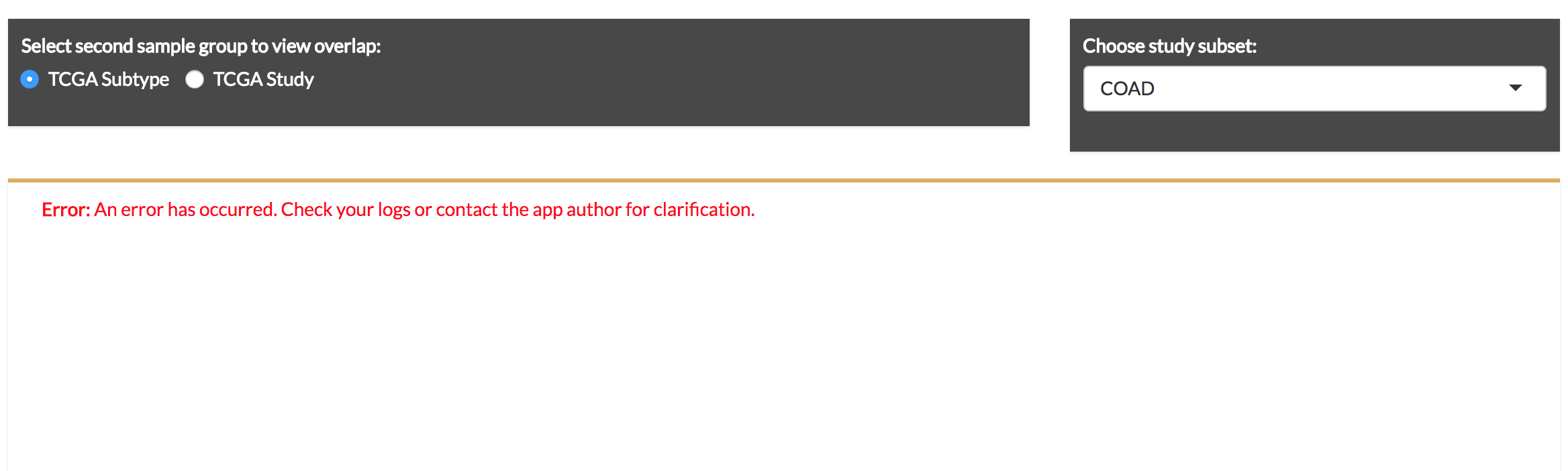
To deal with our over-abundant “TCGA Subtype” problem, we could try the following: under the Select Sample Groups dropdown in the side panel, we can add a “conditional” dropdown for “TCGA Study”. That is, if “TCGA Subtype” is selected, then a second dropdown appears to select “TCGA Study”. the axis values for plotting would then be subsetted to the subtypes of the selected study/cancer. Presumably this would be achieved by modifying or adding to the various functions in load_data.R and transform.R.
Identify what should go into correlation with somatic alteration module.
Ideally would include some summary visualizations of cross-subtype and cross-study patterns (e.g., heatmaps, etc.) as well as ability to "drill down" and view underlying data and distributions. This link could be handy:
https://github.com/bborgesr/rstudio-conf-2018
It'd also be nice to think about framing this as a "Gene Explorer" module to allow for the possibility of more general use. For example, if someone wants to include this module in their feature to explore a pre-defined list of genes (analogous to our list of immunomodulator genes), they'd be able to use our module rather than create a new one.
A declarative, efficient, and flexible JavaScript library for building user interfaces.
🖖 Vue.js is a progressive, incrementally-adoptable JavaScript framework for building UI on the web.
TypeScript is a superset of JavaScript that compiles to clean JavaScript output.
An Open Source Machine Learning Framework for Everyone
The Web framework for perfectionists with deadlines.
A PHP framework for web artisans
Bring data to life with SVG, Canvas and HTML. 📊📈🎉
JavaScript (JS) is a lightweight interpreted programming language with first-class functions.
Some thing interesting about web. New door for the world.
A server is a program made to process requests and deliver data to clients.
Machine learning is a way of modeling and interpreting data that allows a piece of software to respond intelligently.
Some thing interesting about visualization, use data art
Some thing interesting about game, make everyone happy.
We are working to build community through open source technology. NB: members must have two-factor auth.
Open source projects and samples from Microsoft.
Google ❤️ Open Source for everyone.
Alibaba Open Source for everyone
Data-Driven Documents codes.
China tencent open source team.