Coder Social home page Coder Social logo

nui's Introduction

NUI

Build Status Version License Platform

Style iOS apps with a stylesheet, similar to CSS

Description

NUI is a drop-in UI kit for iOS that lets you style UI elements using a stylesheet, similar to CSS. It lets you style an entire app in minutes.

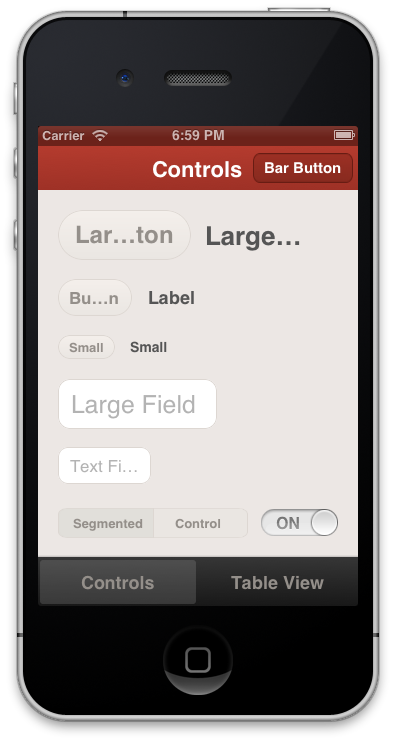
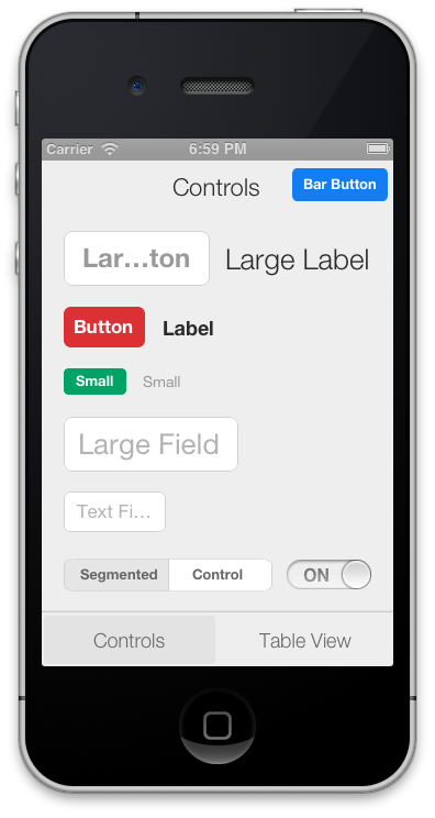
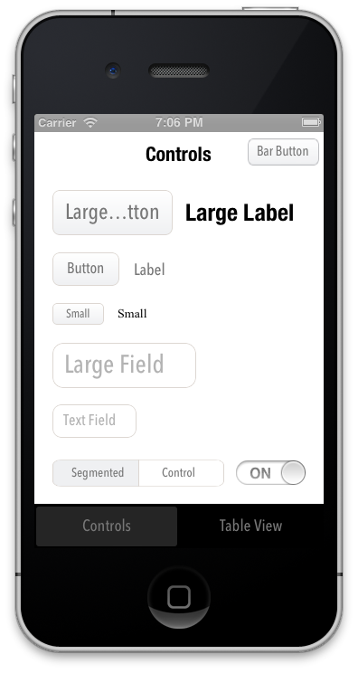
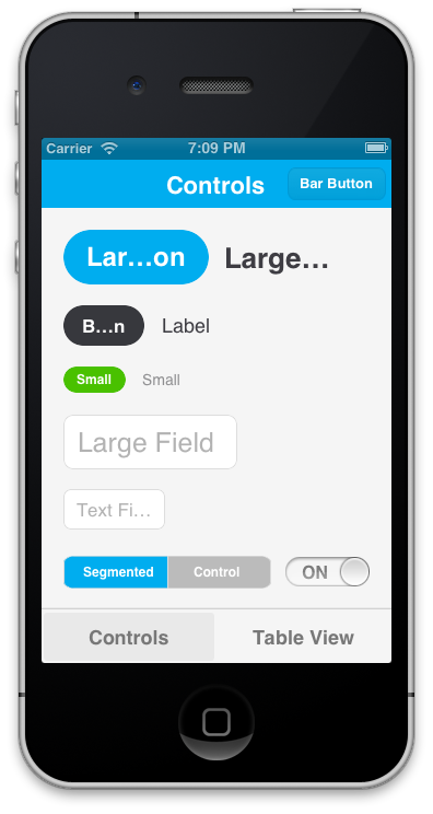
Out of the box, the styling looks like this:

It's easily modified, though. The styling above, for example, is declared like this. Here are examples of other themes that are defined here:

The styling is declared using a CSS-like syntax that supports variables:

@primaryFontName: HelveticaNeue;
@secondaryFontName: HelveticaNeue-Light;
@primaryFontColor: #333333;
@primaryBackgroundColor: #E6E6E6;

Button {
    background-color: @primaryBackgroundColor;
    border-color: #A2A2A2;
    border-width: @primaryBorderWidth;
    font-color: @primaryFontColor;
    font-color-highlighted: #999999;
    font-name: @primaryFontName;
    font-size: 18;
    corner-radius: 7;
}
NavigationBar {
    background-tint-color: @primaryBackgroundColor;
    font-name: @secondaryFontName;
    font-size: 20;
    font-color: @primaryFontColor;
    text-shadow-color: #666666;
    text-shadow-offset: 1,1;
}

NUI lets you:

  • Update the visual appearance of an entire application in minutes
  • Save themes for use in multiple applications
  • Set the styles of UI elements using simple rules, like setting Button { border-color: #CCCCCC; }
  • Define variables like @primaryFontName or @myBackgroundColor (a la Sass/LESS)
  • Avoid digging through documentation to find how to change specific UI elements' styling
  • Quickly create custom style classes
  • Modify an application's styling while it is running

Some exciting features are on the horizon, and contributions are very encouraged. Please see the FAQ.

Installation

CocoaPods

NUI is most easily installed using CocoaPods. Its pod name is "NUI". After installing it, add [NUISettings init]; to application:didFinishLaunchingWithOptions in AppDelegate.m (like this). When installed as a framework, NUI can be natively imported in Swift. Just add import NUI to the top of your file.

Without CocoaPods

If you choose not to use CocoaPods, you can install NUI with these steps:

  1. Copy the NUI directory into your application
  2. Add the CoreImage and QuartzCore frameworks to your application if you haven't already (like this)
  3. Add NUIParse as a subproject, set its iOSNUIParse target as a dependency of your target, and add libNUIParse.a to your linked libraries.
  4. Add [NUISettings init]; to application:didFinishLaunchingWithOptions in AppDelegate.m (like this)
  5. To use NUI in Swift add #import <NUI/NUISettings.h> to your bridging header.

The Demo uses CocoaPods, so you'll want to install CocoaPods, run pod install in the Demo directory, and then open the .xcworkspace to open the project.

Usage

Here's a walkthrough on how to get up and running with NUI.

After dropping in NUI, you can modify your app's styling by simply editing NUIStyle.nss. If you want to avoid modifying NUI's files, you can copy NUIStyle.nss into your app, rename it (e.g. MyTheme.nss), then replace [NUISettings init] with [NUISettings initWithStylesheet:@"MyTheme"]; (step 4 in Installation).

Due to the nature of UIKit's usage of simple UI components within more complex UI components, NUI doesn't style some UIKit components in some very rare cases. If you ever need to apply styling for these cases, you can simply use NUIRenderer:

[NUIRenderer renderButton:myButton];

This will use the 'Button' style. You can also specify a custom class:

[NUIRenderer renderButton:myButton withClass:@"LargeButton"]

N.B. NUI used to require that you make your elements inherit from a NUI class, but this is no longer the case. See "Migrating From Subclasses To Categories" below for details.

Editing The Style Rules

NUIStyle.nss contains all of the style rules. A rule like Button { font-name: Helvetica; } modifies the font name of every UIButton, for example.

The format should be self-explanatory, but here are some notes:

  • Styling variables are defined at the top, but they can be added/modified/removed as you see fit.
  • You can make an element inherit from multiple style classes (see Creating Custom Style Classes below).

To see all of the available properties and values, see the Style Classes and Style Value Types lists below.

Creating Custom Style Classes

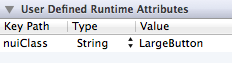
You can give elements custom style classes (e.g. LargeButton), and make those classes inherit from one or more other style classes by using the form Button:LargeButton. To bypass NUI's styling for a particular element, set the class to none. You can set an element's style class either in Interface Builder or programmatically:

Setting an Element's Style Class in Interface Builder

To do this, you'll set a runtime attribute for the element (in Identity Inspector > User Defined Runtime Attributes, click +). Set the Key Path to nuiClass, Type to String, and Value to LargeButton (or Button:MyButton:

Setting an Element's Style Class Programmatically

To do this, you'll want to import the NUI category for the element. If you're styling a UIButton, you'd import:

#import "UIButton+NUI.h"

You can then set nuiClass on your element:

myButton.nuiClass = @"LargeButton";

N.B. A style class can inherit from an indefinite number of style rules, so if you want to create groups of style rules, you can set nuiClass to something like @"MyStyleGroup1:MyStyleGroup2:MyButton".

Excluding Views from NUI's Styling

If you want to prevent specific view classes from being styled (e.g. third party UI elements that are already styled), you can specify these in NSS:

Button {
    exclude-views: UIAlertButton;
    exclude-subviews: UITableViewCell,TDBadgedCell,UITextField;
}
  • exclude-views will prevent NUI from applying the Button style to views of the specified classes
  • exclude-subviews will prevent NUI from applying the `Button style to subviews of views of the specified classes

If you want to globally prevent specific view classes from being styled (regardless of style class), you can do this using +[NUISettings setGlobalExclusions:]:

int main(int argc, char *argv[])
{
    @autoreleasepool {
        [NUISettings init];
        [NUISettings setGlobalExclusions:@[@"ABMemberCell", @"ABMultiCell"]];
        return UIApplicationMain(argc, argv, nil, NSStringFromClass([MyAppDelegate class]));
    }
}

Styles specific to a device or orientation

You can have styles or variable definitions only be applied for a particular device and/or orientation by using a @media query:

@media (device:ipad) {
    /* styles or definitions for iPad */
}

@media (device:iphone) {
    /* styles or definitions for iPhone */
}

@media (orientation:landscape) {
    /* styles or definitions for landscape orientation */
}

@media (orientation:portrait) {
    /* styles or definitions for portrait orientation  */
}

@media (orientation:portrait) and (device:ipad) {
    /* styles or definitions for portrait orientation on iPad */
}

Modifying Styling While The Application Is Running

To do this, add the following line after [NUISettings init]; in main.m, replacing @"/path/to/Style.nss" with the absolute file path of your .nss file (e.g. /Users/myusername/projects/ios/MyApp/Style.nss):

[NUISettings setAutoUpdatePath:@"/path/to/Style.nss"];

Now, whenever you modify and save your .nss file while the app is running, the new changes will be applied instantaneously, without any need to rebuild the app. This can drastically speed up the process of styling. You'll want to remove this line when you create a release build.

Creating Custom Themes

Because all of the style rules are contained in NUIStyle.nss, it's easy to create an NUI theme that can be reused in other projects. If you make one you like, let me know, and I'll likely be very happy to include it in this repo.

Migrating From Subclasses To Categories

Version 0.1 of NUI required that you manually make your app's UI components inherit from NUI classes (e.g. NUIButton). NUI no longer requires this, as it uses UIKit categories instead subclasses. If you were previously using NUI 0.1, and update to a newer version of NUI, you'll want to simply unset those custom classes, so that, for example, a UIButton is simply a UIButton, instead of being a NUIButton (this would be done either in Identity Inspector > Custom Class or in the application code).

Style Classes

Below are all of the currently available style classes, their corresponding UI component classes, and the properties they support. Value types (e.g. Color, Gradient) are described below in Style Value Types.

BarButton

UIBarButtonItem

  • background-color (Color)
  • background-color-top/background-color-bottom (Gradient)
  • background-color-highlighted (Color)
  • background-image (Image)
  • background-image-insets (Box)
  • background-tint-color (Color)
  • border-color (Color)
  • border-width (Number)
  • corner-radius (Number)
  • font-color (Color)
  • font-name (FontName)
  • font-size (Number)
  • text-shadow-color (Color)
  • text-shadow-offset (Offset)

BarButtonBack

UIBarButtonItem back button, inherits from BarButton

  • background-color (Color)
  • background-image (Image)
  • background-image-insets (Box)
  • background-tint-color (Color)
  • border-color (Color)
  • border-width (Number)
  • corner-radius (Number)
  • font-color (Color)
  • font-name (FontName)
  • font-size (Number)
  • text-shadow-color (Color)
  • text-shadow-offset (Offset)

Button

UIButton

  • background-color (Color)
  • background-color-normal (Color)
  • background-color-top/background-color-bottom (Gradient)
  • background-color-disabled (Color)
  • background-color-highlighted (Color)
  • background-color-selected (Color)
  • background-color-selected-highlighted (Color)
  • background-image (Image)
  • background-image-insets (Box)
  • background-image-disabled (Image)
  • background-image-disabled-insets (Box)
  • background-image-highlighted (Image)
  • background-image-highlighted-insets (Box)
  • background-image-selected (Image)
  • background-image-selected-insets (Box)
  • background-image-selected-disabled (Image)
  • background-image-selected-disabled-insets (Box)
  • background-image-selected-highlighted (Image)
  • background-image-selected-highlighted-insets (Box)
  • border-color (Color)
  • border-width (Number)
  • content-insets (Box)
  • corner-radius (Number)
  • font-color (Color)
  • font-color-disabled (Color)
  • font-color-highlighted (Color)
  • font-color-selected (Color)
  • font-color-selected-disabled (Color)
  • font-color-selected-highlighted (Color)
  • font-name (FontName)
  • font-size (Number)
  • height (Number)
  • image (Image)
  • image-insets (Box)
  • image-disabled (Image)
  • image-disabled-insets (Box)
  • image-highlighted (Image)
  • image-highlighted-insets (Box)
  • image-selected (Image)
  • image-selected-insets (Box)
  • image-selected-disabled (Image)
  • image-selected-disabled-insets (Box)
  • image-selected-highlighted (Image)
  • image-selected-highlighted-insets (Box)
  • padding (Box)
  • shadow-color (Color)
  • shadow-offset (Offset)
  • shadow-opacity (Number)
  • shadow-radius (Number)
  • text-align (TextAlign)
  • text-alpha (Number)
  • text-auto-fit (Boolean)
  • text-shadow-color (Color)
  • text-shadow-color-disabled (Color)
  • text-shadow-color-highlighted (Color)
  • text-shadow-color-selected (Color)
  • text-shadow-color-selected-disabled (Color)
  • text-shadow-color-selected-highlighted (Color)
  • text-shadow-offset (Offset)
  • text-transform (TextTransform)
  • title-insets (Box)
  • width (Number)

Control

UIControl

  • background-color (Color)
  • background-image (Image)
  • border-color (Color)
  • border-width (Number)
  • corner-radius (Number)
  • shadow-color (Color)
  • shadow-offset (Offset)
  • shadow-opacity (Number)
  • shadow-radius (Number)

Label

UILabel

  • background-color (Color)
  • border-color (Color)
  • border-width (Number)
  • corner-radius (Number)
  • font-color (Color)
  • font-color-highlighted (Color)
  • font-name (FontName)
  • font-size (Number)
  • height (Number)
  • shadow-color (Color)
  • shadow-offset (Offset)
  • shadow-opacity (Number)
  • shadow-radius (Number)
  • text-align (TextAlign)
  • text-alpha (Number)
  • text-auto-fit (Boolean)
  • text-line-clamp (Integer)
  • text-shadow-color (Color)
  • text-shadow-offset (Offset)
  • text-transform (TextTransform)
  • width (Number)

NavigationBar

UINavigationBar

  • bar-tint-color (Color)
  • background-color (Color)
  • background-color-top/background-color-bottom (Gradient)
  • background-image (Image)
  • background-image-insets (Box)
  • background-tint-color (Color)
  • font-color (Color)
  • font-name (FontName)
  • font-size (Number)
  • shadow-image (Image)
  • text-shadow-color (Color)
  • text-shadow-offset (Offset)
  • title-vertical-offset (Number)

PageControl

UIPageControl

  • color (Color) pageIndicatorTintColor
  • current-color (Color) currentPageIndicatorTintColor

Progress

UIProgressView

  • progress-image (Image)
  • progress-tint-color (Color)
  • track-image (Image)
  • track-tint-color (Color)
  • width (Number)

SearchBar

UISearchBar

  • background-color (Color)
  • background-color-top/background-color-bottom (Gradient)
  • background-image (Image)
  • background-tint-color (Color)
  • scope-background-color (Color)
  • scope-background-image (Image)

SearchBarButton

UISearchBar button, inherits from BarButton

See Button

SearchBarScopeBar

UISearchBar scope bar, inherits from SegmentedControl

See SegmentedControl

SegmentedControl

UISegmentedControl

  • background-color (Color)
  • background-color-selected (Color)
  • background-image (Image)
  • background-image-insets (Box)
  • background-image-selected (Image)
  • background-image-selected-insets (Box)
  • background-tint-color (Color)
  • border-color (Color)
  • border-width (Number)
  • corner-radius (Number)
  • divider-color (Color)
  • divider-image (Image)
  • font-color (Color)
  • font-color-selected (Color)
  • font-name (FontName)
  • font-size (Number)
  • text-shadow-color (Color)
  • text-shadow-color-selected (Color)
  • text-shadow-offset (Offset)
  • text-shadow-offset-selected (Offset)

Slider

UISlider

  • minimum-track-tint-color (Color)
  • maximum-track-tint-color (Color)
  • minimum-value-image (Image)
  • maximum-value-image (Image)
  • thumb-image (Image)
  • thumb-tint-color (Color)

Switch

UISwitch

  • background-color (Color)
  • off-image (Image)
  • off-image-insets (Box)
  • on-image (Image)
  • on-image-insets (Box)
  • on-tint-color (Color)
  • thumb-tint-color (Color)
  • tint-color (Color)

TabBar

UITabBar

  • bar-tint-color (Color)
  • background-color (Color)
  • background-color-top/background-color-bottom (Gradient)
  • background-image (Image)
  • background-image-insets (Box)
  • background-tint-color (Color)
  • selected-image (Image)
  • selected-image-tint-color (Color)

TabBarItem

UITabBarItem

  • background-image-selected (Image)
  • background-image-selected-insets (Box)
  • finished-image (Image)
  • finished-image-selected (Image)
  • font-color (Color)
  • font-color-selected (Color)
  • font-name (FontName)
  • font-size (Number)
  • text-offset (Offset)
  • text-shadow-color (Color)
  • text-shadow-offset (Offset)

Table

UITableView

  • background-color (Color)
  • background-color-top/background-color-bottom (Gradient)
  • row-height (Number)
  • separator-color (Color)
  • separator-style (SeparatorStyle)

TableCell

UITableViewCell

  • tint-color (Color)
  • background-color (Color)
  • background-color-top/background-color-bottom (Gradient)
  • background-color-selected (Color)
  • background-color-top-selected/background-color-bottom-selected (Gradient)
  • font-color (Color)
  • font-color-highlighted (Color)
  • font-name (FontName)
  • font-size (Number)
  • text-align (TextAlign)
  • text-alpha (Number)
  • text-auto-fit (Boolean)
  • text-shadow-color (Color)
  • text-shadow-offset (Offset)

TableCellContentView

The content view of a UITableViewCell

  • all attributes supported by UIView

TableCellDetail

The detail label of a UITableViewCell

  • font-color (Color)
  • font-color-highlighted (Color)
  • font-name (FontName)
  • font-size (Number)
  • text-align (TextAlign)
  • text-alpha (Number)
  • text-auto-fit (Boolean)
  • text-shadow-color (Color)
  • text-shadow-offset (Offset)

Toolbar

UIToolbar

  • background-color (Color)
  • background-image-top (Image)
  • background-image-bottom (Image)
  • background-image-top-landscape (Image)
  • background-image-bottom-landscape (Image)
  • background-tint-color (Color)
  • shadow-image (Image)
  • shadow-image-top (Image)
  • shadow-image-bottom (Image)

TextField

UITextField

  • background-color (Color)
  • background-image (Image)
  • background-image-insets (Box)
  • border-color (Color)
  • border-style (BorderStyle)
  • border-width (Number)
  • corner-radius (Number)
  • text-align (TextAlign)
  • text-alpha (Number)
  • text-auto-fit (Boolean)
  • font-color (Color)
  • font-name (FontName)
  • font-size (Number)
  • height (Number)
  • padding (Box)
  • shadow-color (Color)
  • shadow-offset (Offset)
  • shadow-opacity (Number)
  • shadow-radius (Number)
  • tint-color (Color)
  • vertical-align (VerticalAlign)
  • horizontal-align (HorizontalAlign)
  • width (Number)
  • keyboard-appearance (KeyboardAppearance)

TextView

UITextView

  • font-color (Color)
  • font-name (FontName)
  • font-size (Number)
  • padding (Box)
  • keyboard-appearance (KeyboardAppearance)
  • all other attributes supported by UIView

View

UIView

  • background-color (Color)
  • background-image (Image)
  • border-color (Color)
  • border-width (Number)
  • corner-radius (Number)
  • height (Number)
  • shadow-color (Color)
  • shadow-offset (Offset)
  • shadow-opacity (Number)
  • shadow-radius (Number)
  • width (Number)

Window

UIWindow

  • background-color (Color)

Style Value Types

  • Boolean - A boolean (true or false)
  • BorderStyle - A border style, as rendered by a UITextBorderStyle. Accepted values are none, line, bezel, and rounded.
  • Box - A series of 1 to 4 integers that specify the widths of a box's edges. Interpreted like CSS's padding and margin properties (top, right, bottom, left). Examples: 15 (a box with a width of 15 for each edge), 10 15 (a box with a width of 10 for the top and bottom edges and 15 for the right and left edges)
  • Color - A hex color (e.g. #FF0000); a rgb, rgba, hsl, or hsla expression (e.g. rgb(255,0,0) or hsla(0.5, 0, 1.0, 0.5)); or a color name that UIColor has a related method name for (e.g. red, yellow, clear). If [UIColor redColor] is supported, then red is supported.
  • FontName - A font name. See available values here. Can also be one of the following:
    • system
    • boldSystem
    • italicSystem
    • blackSystem
    • heavySystem
    • lightSystem
    • mediumSystem
    • semiboldSystem
    • thinSystem
    • ultraLightSystem
  • Gradient - Two Colors that will create a vertical gradient. background-color-top and background-color-bottom need to be defined in separate .nss properties.
  • Image - A name of an image, as used in [UIImage imageNamed:name] (e.g. MyImage.png).
  • Number - A number (e.g. -1, 4.5)
  • Offset - Two numbers comprising the horizontal and vertical values of an offset (e.g. -1,1)
  • SeparatorStyle - A separator style, as rendered by a UITableViewSeparatorStyle. Accepted values are none, single-line, and single-line-etched.
  • TextAlign - A text alignment (e.g. left, right, center)
  • TextTransform - A text transform (e.g. uppercase, lowercase, capitalize, none)
  • VerticalAlign - A vertical alignment (e.g. top, center, bottom, fill)
  • KeyboardAppearance - A keyboard appearance (e.g. default, dark, light, alert)

FAQ

How can I contribute?

Contributers are extremely appreciated! NUI covers a lot of ground, but there are still a number of elements and properties that are unsupported. Adding support for new properties is easy (take a look at NUIButtonRenderer for examples). There are also a number of exciting big features that on the Roadmap that are up for grabs. We're also always looking for new themes, so feel free to add those, too!

What advantages does this have over UIAppearance?

UIAppearance is alright, but it's unintuitive, time-consuming, and it doesn't support either the granularity or number of style modifications that NUI does. Styling should be abstracted in a simple stylesheet with simple property definitions; you shouldn't have to stare at long, nested method calls and have to dig through Apple's documentation every time you want to make a small styling modification.

I have an app that uses NUI; can I add a link to it here?

Sure! Feel free to add it to Apps Using NUI.

Do you know about Pixate?

Yep! It's unclear when it will be launched, it won't be free (in either meaning of the word, likely), and the jury is still out on how good of a product it'll be. I prefer free, lightweight solutions.

How is "NUI" pronounced?

"New-ee". (It rhymes with "GUI", of course.)

License

NUI is released under the MIT License. Please see the LICENSE file for details.

nui's People

Contributors

aaronyi avatar ajubbal avatar alejandro-isaza avatar antobito11 avatar benjie avatar benvium avatar brotchie avatar chocochipset avatar christophercotton avatar cristianbica avatar davidlawson avatar flambert avatar fleitz avatar gogopair avatar huguesbr avatar johntmcintosh avatar jphalip avatar markrickert avatar mcohen75 avatar merasmussen avatar phatmann avatar pinda avatar schmitzc avatar squarefrog avatar stunner avatar szyhf avatar theory avatar timbodeit avatar tombenner avatar xbeg9 avatar

Stargazers

 avatar  avatar  avatar  avatar  avatar  avatar  avatar  avatar  avatar  avatar  avatar  avatar  avatar  avatar  avatar  avatar  avatar  avatar  avatar  avatar  avatar  avatar  avatar  avatar  avatar  avatar  avatar  avatar  avatar  avatar  avatar  avatar  avatar  avatar  avatar  avatar  avatar  avatar  avatar  avatar  avatar  avatar  avatar  avatar  avatar  avatar  avatar  avatar  avatar  avatar  avatar  avatar  avatar  avatar  avatar  avatar  avatar  avatar  avatar  avatar  avatar  avatar  avatar  avatar  avatar  avatar  avatar  avatar  avatar  avatar  avatar  avatar  avatar  avatar  avatar  avatar  avatar  avatar  avatar  avatar  avatar  avatar  avatar  avatar  avatar  avatar  avatar  avatar  avatar  avatar  avatar  avatar  avatar  avatar  avatar  avatar  avatar  avatar  avatar  avatar

Watchers

 avatar  avatar  avatar  avatar  avatar  avatar  avatar  avatar  avatar  avatar  avatar  avatar  avatar  avatar  avatar  avatar  avatar  avatar  avatar  avatar  avatar  avatar  avatar  avatar  avatar  avatar  avatar  avatar  avatar  avatar  avatar  avatar  avatar  avatar  avatar  avatar  avatar  avatar  avatar  avatar  avatar  avatar  avatar  avatar  avatar  avatar  avatar  avatar  avatar  avatar  avatar  avatar  avatar  avatar  avatar  avatar  avatar  avatar  avatar  avatar  avatar  avatar  avatar  avatar  avatar  avatar  avatar  avatar  avatar  avatar  avatar  avatar  avatar  avatar  avatar  avatar  avatar  avatar  avatar  avatar  avatar  avatar  avatar  avatar  avatar  avatar  avatar  avatar  avatar  avatar  avatar  avatar  avatar  avatar  avatar  avatar  avatar  avatar  avatar  avatar

nui's Issues

UIButton with subviews

The condition at the top of NUIButtonRenderer:

if ([button.layer.sublayers count] == 3) {
    [button.layer.sublayers[0] setOpacity:0.0f];
    [button.layer.sublayers[1] setOpacity:0.0f];
}

breaks if a button has a subview added to it. This results in image/background/... randomly disappearing.

Custom Styles Section is Gone!!

The new version which uses Categories is bit confusing!! The section about creating custom styles is no where to be found in documentation. How do you create a LargeButton? Does it inherit from NUIButton class? The complete documentation is missing???

I can't override the default UIBarButtonItem style

If I have a default UIBarButtonItem style in my .nss file and when I call [NUIAppearance init] I can't override those values using another class defined as runtime attribute on the Storyboard.

I've noticed that both NUIBarButtonItemRenderer and NUIAppearance are using setTitleTextAttributes but I could not find the reason why the NUIBarButtonItemRenderer is not overring the default value.

Example:

UIBarButtonItem {
  background-tint-color: @primaryBackgroundTintColor;
  font-name: @secondaryFontNameBold;
  font-color: @primaryFontColor;
  text-shadow-color: clear;
  font-size: 13;
}

MyMenuButton {
  font-color: #ff0000;
  text-shadow-color: clear;    
  font-size: 18;    
  background-tint-color: none;    
}

Selected state of UIButton

Would be nice if you can have a selected state of a button.

for example: 'background-image-selected' and 'font-color-selected'.

Improve the NSS Parser

NUIStyleParser currently uses a number of regexes, and this isn't ideal going forward, as we want to be able to support more complex style rules. It looks like all of the major lexical analyzer generators that support C use licenses that don't play well with the App Store, but I may be overlooking something. @mattt had suggested CoreParse, which looks promising.

Support descendant selectors

Descendant selectors (e.g. TableCell Button to select buttons within table cells) would be very useful. The implementation should be such that it doesn't have to be completely refactored to accomodate #59.

It might not be terribly difficult; an element's ancestors can easily be found by recursively calling [element superview].

text-shadow-color on UIButton doesn't work

text-shadow-color doesn't work on UIButton. Because you must use setTitleShadowColor to set it, not set on titleLabel directly.

You could add:

// Set shadow color
if ([NUISettings hasProperty:@"text-shadow-color" withClass:className]) {
    [button setTitleShadowColor:[NUISettings getColor:@"text-shadow-color" withClass:className] forState:UIControlStateNormal];
}

to NUIButtonRenderer.m. Maybe should have text-shadow-color-highlighted, too.

Programatically instantiated views do not get styled on categories branch

I've just refactored my app to use the "categories" branch as the proliferation of NUIView subclasses was indeed getting out of control and I agree this is a much better approach.

Unfortunately, it now seems that views that get loaded programatically, i.e....

    -(void)viewDidLoad {
        [super viewDidLoad];

        [[NUISwizzler new] swizzleAwakeFromNib: [PSFooterBarView class]];

        PSFooterBarViewController *fbvc = [[PSFooterBarViewController alloc] initWithNibName:@"PSFooterBarViewController" bundle:nil];
        [self.view addSubview: fbvc.view];

Are not getting styled. It seems to me this is because NUI works by hot-patching over awakeFromNib:, which apparently does not get called on views that are instantiated using initWithNibName.

Custom Styles Not Working

I created a custom style called NUIGreenButton as shown below:

import "NUIButton.h"

@interface NUIGreenButton : NUIButton

@EnD

import "NUIGreenButton.h"

@implementation NUIGreenButton

  • (void)initNUI {
    [super initNUI];
    self.nuiClass = @"GreenButton";
    }

@EnD

I dragged a UIButton on the Interface Builder and set its class to NUIGreenButton. I edited the NUIStyle.nss file as shown below:

GreenButton
{
background-color: #3ADF00;
font-color:#190707;
font-name:Verdena;
font-size:50;
corner-radius:6;
height:50;

}

But the height never changes, Even the font never changes.

Support for UIWindow

This was initiated by @jphalip in #66, and the relevant commit is here.

@jphalip, you might've already caught this, but NUI's automatic rendering is usually done by overriding didMoveToWindow; if you happen to know of (or can find) a similar method that's called whenever a UIWindow is about to be shown we could just override that.

Otherwise, does anyone else know of a method that would be appropriate? I haven't worked with UIWindow directly, but could take a closer look at this if nothing comes to mind for anyone offhand.

Setting up a UIWindowDidBecomeVisibleNotification might be another option for this.

No styling on UIView except bg color?

I have this css:

OuterPictureFrame {
background-color: #FFFFFF;
border-color: #000000;
border-width: @primaryBorderWidth;
corner-radius: 2;
box-shadow: 0 1 1 rgba(0,0,0,0.2);
}
InnerPictureFrame {
box-shadow: inset 0 0 3 rgba(0,0,0,0.75);
}

None of this works, apart from the bg color - these are normal UIViews. Reading the code in NUIViewRenderer, it appears that it only processes background-color and background-image.

Adding borders would be trivial but I am not sure how to do box shadow. Let alone box shadow with an inset... (that's supposed to be an inner shadow and so far I haven't even figured out how to do that in the GLLayer... )

Demo app crashes on missing selector

Hi

I tried running the test app today but it crashes on missing category selector

2013-01-29 09:43:46.739 NUIDemo[6823:707] -[UIImage resizableImageWithCapInsets:resizingMode:]: unrecognized selector sent to instance 0x1aa690
2013-01-29 09:43:46.744 NUIDemo[6823:707] *** Terminating app due to uncaught exception 'NSInvalidArgumentException', reason: '-[UIImage resizableImageWithCapInsets:resizingMode:]: unrecognized selector sent to instance 0x1aa690'
*** First throw call stack:
(0x3568388f 0x37a2a259 0x35686a9b 0x35685915 0x355e0650 0x252a5 0x22ae3 0x228a1 0x21f09 0x330efcab 0x330e97dd 0x330b7ac3 0x330b7567 0x330b6f3b 0x3727622b 0x35657523 0x356574c5 0x35656313 0x355d94a5 0x355d936d 0x330e886b 0x330e5cd5 0x21e91 0x21e00)
terminate called throwing an exception

Allow to set SelectionIndicatorImage for TabBar

I'm not sure for naming and other details, but just adding code like that will add this option:

if ([NUISettings hasProperty:@"selection-indicator-image" withClass:class_name])
{
    [bar setSelectionIndicatorImage:[NUISettings getImage:@"selection-indicator-image" withClass:class_name]];
}

Support reloading images in re-render call when NSS file is auto-updated.

It'd be great if images referenced in NSS files could be reloaded when the NSS file is auto-updated. This'd really help speed up theme design as you can tweak an image and immediately see the result.

Presumably we'd need to somehow clean out the UIImage cache. Also, the new versions of images would exist only in the project and not in the bundle so I assume [UIImage imageNamed] isn't going to work.

So this sounds a bit tricky, but I think it's probably possible so long as we activate a debug mode or something where the images are loaded from the project rather than the bundle.

What do you all think?

Cant style toolbar

I dont seem to be unable to style a toolbar however. Everything else is done fine, the top bar, buttons and labels but not the toolbar.

I have tried manually styling it using [NUIRendered rendertoolbar:toolbar] but it makes no difference. The button on the toolbar seems to be styled though!

photo

Support 'darken' and 'lighten' functions, like in LESS

LESS simplifies making highlight and shadow colors based on a primary colour by having a function that can darken or lighten an existing color.
I think this'd be pretty cool as it'd save the designer having to darken a color in Photoshop and then type the new value in.

Here's an example of how this might look in the NSS file, based on the current demo.

@primaryBackgroundColor: #E6E6E6;
@primaryBackgroundTintColor: lighten(@primaryBackgroundColor, 30%);
@primaryBackgroundColorTop: lighten(@primaryBackgroundColor, 50%);
@primaryBackgroundColorTop: darken(@primaryBackgroundColor, 30%);

Note you should also be able to use these functions in any place where a color can be defined (background color, border color etc).

LESS also has saturate and desaturate functions that alert the colour saturation, which may also be useful. http://lesscss.org/#reference

This request is definitely a non-essential, nice-to-have feature!

Method swizzling and drawRect:

I see in the sources you may have considered swizzling the drawRect: to ensure styles are applied when views are loaded programmatically.

- (void)swizzleDrawRect:(Class)class
{
    [self swizzle:class from:@selector(drawRect:) to:@selector(override_drawRect:)];
}

Is there a way to avoid calling the [NUIRenderer render...] for views where awakeFromNib does not get called? (e.g. UITableViewCell) or NavigationBar not instantiated from a StoryBoard

editingRectForBounds: for UITextField returns invalid rect

When overriding editingRectForBounds: in UITextField, call proper implementation of editingRectForBounds: from superclass. This fixes incorrect layouts when using accessory views. The code that fixes this is simply:

- (CGRect)override_editingRectForBounds:(CGRect)bounds {
    if ([self nuiShouldBeApplied] &&
        [NUISettings hasProperty:@"padding" withClass:self.nuiClass]) {
        UIEdgeInsets insets = [NUISettings getEdgeInsets:@"padding" withClass:self.nuiClass];
        return CGRectMake(bounds.origin.x + insets.left,
                          bounds.origin.y + insets.top,
                          bounds.size.width - (insets.left + insets.right),
                          bounds.size.height - (insets.top + insets.bottom));
    } else {
        return [self override_editingRectForBounds:bounds];
    }
}

Support url-style image location references

Instead of simply passing image paths as arguments to [UIImage imageNamed:], as in response to

Button {
    background-image: image.png;
}

Allow more explicit references to images at standard iOS file system locations, for example

Button {
    background-image: url(bundle://image.png);
    background-image-highlighted: url(caches://highlighted.png);
}

Bundle paths can be mapped directly to files using [NSBundle pathForResource:ofType:inDirectory:] while system specified directories can map prefixes to NSSearchPathDirectory enum items then mapped to files using [NSFileManager URLsForDirectory:inDomains:].

All these changes could be isolated to the [NUIConverter toImageFromImageName:] method. Retain existing behaviour if path is not wrapped in url().

Crash when updating to categories

2012-12-23 13:31:44.583 LocoPix[3106:c07] +[NUIGraphics gradientLayerWithTop:bottom:frame:]: unrecognized selector sent to      class 0x74f1c
2012-12-23 13:31:44.583 LocoPix[3106:c07] *** Terminating app due to uncaught exception 'NSInvalidArgumentException', reason: '+  [NUIGraphics gradientLayerWithTop:bottom:frame:]: unrecognized selector sent to class 0x74f1c'
*** First throw call stack:
(0x22e9012 0x1c19e7e 0x23742ad 0x22d8bbc 0x22d894e 0x33d23 0x2e988 0x37518 0x37418 0x386de9 0x5b248a 0x5b2a83   0x5b2b54 0x21a899 0x21ab3d 0xc21e83 0x22a8376 0x22a7e06 0x228fa82 0x228ef44 0x228ee1b 0x22437e3 0x2243668 0x16b65c     0x259d 0x24c5 0x1)
libc++abi.dylib: terminate called throwing an exception
(lldb) 

Redundancy of category methods

The following methods are duplicated in each custom views category.

UIXXX+NUI.h
@Property (nonatomic, retain) NSString* nuiClass;
@Property (nonatomic, retain) NSNumber* nuiIsApplied;

  • (void)applyNUI;

UIXXX+NUI.m

  • (void)setNuiClass:(NSString*)value
  • (NSString*)nuiClass
  • (void)setNuiIsApplied:(NSNumber*)value
  • (NSNumber*)nuiIsApplied

But since all components (labels, switches, etc) are descendants of UIView, should there be only a single category on UIView and rather than redefining the methods we may only include the UIView+NUI.h file.

@media Queries to Target iPad / iPhone, Orientation, Auto-Layout Constraints

CSS defines a pretty robust syntax for building responsive layouts with @media queries.

It would be exceedingly cool to be able to use them in this context to target device families and orientations. Perhaps something could be implemented with Auto-Layout Constraints to this effect.

Anyway, just wanted to put this out there as a feature request. Really psyched about the direction and momentum of this project. Well done, @tombenner!

(By the way, this was totally @dominic's idea originally. That guy is way smart.)

NUI renderer inheritance

Tom, is there any reason why the NUI renderer class don't use inheritance? If they did then it would allow for reuse of style properties. For instance bulking up support in NUIViewRenderer could then add support for many UI components if they derived NUIViewRenderer. I mean, why not allow label backgrounds to have gradients, rounded corners, shadows, ...?

[NUIRenderer init] causes crash

The README says that you should put [NUIRenderer init]; in the application:didFinishLaunchingWithOptions method. If you do this on the HEAD then the app crashes with the error:

+[NUIRenderer<0x107e78> init]: cannot init a class object.

Presumably this call is no longer needed as if I remove it the app is themed anyway?

Programmatically rendered NUIButton doesn't seem to inherit classes

This code:

[NUIRenderer renderButton:doneButton withClass:@"SmallButton"];

doesn't inherit the properties of Button, which I thought was the desired behavior.

I've tried different methods of naming the class using CSS conventions (i.e. Button.SmallButton, Button SmallButton, etc), and also using the class name itself NUISmallButton, but to no avail.

Is there a way to do this, or does this method only work in Interface Builder?

Preview Tools

What is the preferred workflow for previewing NUI stylesheets? Are people just editing the style sheet and then Build-and-Run in Xcode?

UIButton border is gone

In the new version of NUI which uses Categories I have noticed that the border of the Button is now gone and this has to be created manually by the user. Is this intended or it this a bug?

Support Pseudo-classes (e.g. Button:highlighted)

This is currently handled with property suffixes (e.g. font-color-highlighted), but it should be done with pseudo-classes instead (e.g. Button:highlighted {font-color: black;}). We'll probably want to complete #33 before setting this up.

text-align on UIButton

This might not strictly speaking be a bug, I wanted to point out that text-align on UIButton does not work as expected. This is because it is not enough to set textAlignment on titleLabel, as the label itself is centered. contentHorizontalAlignment would have to be set to UIControlContentHorizontalAlignmentLeft/Right or UIControlContentHorizontalAlignmentFill to achieve the desired effect.

Thank you for this very useful library.

Margins

How can I set the margins of the text inside the Button? text-offset does nothing right now!

Inheritance by stylesheet rules

Hi

Just wanted to ask if there is some possibility that a style StyleA:StyleB:StyleC which I define in nss file will be respected on an element with nuiClass = StyleC? Right now i'm setting inheritance by applying nuiClass = StyleA:StyleB:StyleC but it would be great if i could just set niuClass = StyleC and the .nss defined style would inherit form StyleA:StyleB automatically (like it is in css).

Cheers

Support for < iOS 6.0

I have been trying to make this library work for an app running on iOS5.x and have been facing some weid object reference issues. Is this library backward compatible with the earlier versions of iOS down to 5.x? If it's not, do you have an idea of what needs to be done to enable this?

Categories instead of NUI subclasses

Wouldn't it be a better idea to use categories on standard UIKit components, instead of subclassing them?

That way you wouldn't have to change each element's class in Interface Builder or code;
You'd use them as they were standard UIKit components.

Style problem

I'm building a TableView app. I have copied the .nss file from the demo. However, while everything else is ok, the background for labels and for the nav. bar title are white while the background is E3E3E3 (roughly). I think there needs to be a background-color property associated with these elements.

Also note you are starred on Cocoa Controls today.

Congrats. It's a tremendous resource.

[NUISettings initwithStylesheet:@"mystyle"] requires NUIStyle.nss

It seems like the call to the getInstance factory method initializes a stylesheet recursively calling itself and requiring NUIStyle.nss to be in the resources even if it ends up not being used.

+ (void)initWithStylesheet:(NSString *)name
{
    instance = [self getInstance];
    NUIStyleParser *parser = [[NUIStyleParser alloc] init];
    instance.settings = [parser getStylesFromFile:name];
}

+ (NUISettings*)getInstance
{
    @synchronized(self) {    
        if(instance == nil) {
            [[NUISwizzler new] swizzleAll];
            instance = [NUISettings new];
            [self initWithStylesheet:@"NUIStyle"];
        }
    }

    return instance;
}

Support Modification of NSS at Runtime

This would let developers modify style rules and restyle the UI while the app is running, without needing to recompile to see the changes' effects.

One approach could be to register NUI-styled elements in an array as they are rendered, and then reload the .nss and re-render those elements when the developer sends a signal during runtime (e.g. something like a shake gesture (Ctrl-Cmd-Z in iOS Simulator), though that's a little hacky).

We would want to be able to disable this for production code, so it would probably also make sense to create two modes for NUI (debug/test, production), which could be useful in other contexts, too.

If anyone has thoughts about what event should cause the rules to be reapplied (e.g. iOS Simulator gaining focus, a shake gesture, watching for when the NSS file is saved, etc) and how to implement it, feel free to weigh in on that, too.

Fix non-retina appearance of border created in +[NUIGraphics backButtonWithClass:]

The border of the back button created by +[NUIGraphics backButtonWithClass:] looks fine in retina resolution:

retina

But in non-retina display it's blurry on the top, right, and bottom edges (they should have a width of 1px like the left edges have):

non-retina

I'm not sure where the blurriness is occurring; I've taken a few stabs in the dark by removing resizingMode:UIImageResizingModeStretch, setting shape.contentsScale and shape.rasterizationScale to [[UIScreen mainScreen] scale], and adjusting shape.shouldRasterize to no avail.

Any ideas of how to fix this?

Add Test Suite

Because NUI uses custom graphics (e.g. gradients) that cannot be tested by checking elements' properties programmatically, one approach for this might be to add elements to a view, render that view to an image, and then compare that image with an authoritative image of how the view should be rendered.

If each property of each element was tested incrementally, though, we'd need to work out how to organize those across authoritative images, as having a different authoritative image for every combination in that Cartesian product (element x property) might not be realistic.

Other thoughts on how to approach this?

NUI doesn't support resizing of UINavigationBar on rotation

Hi, I noticed that when using NUI, a styled UINavigationBar will not reduce it's size on rotation (usually it goes from 44 in portrait to 32 in landscape)

It comes from the fact that NUI inserts a subview in the UINavigationBar but doesn't remove it when rotating so the new bar is displayed but the previous one overlaps the difference beetween portrait and landscape

Resizeable Image Support

I'd love to have some resizable image support like apple supports it:
(UIImage *)resizableImageWithCapInsets:(UIEdgeInsets)capInsets
reference:
http://developer.apple.com/library/ios/#documentation/uikit/reference/UIImage_Class/Reference/Reference.html

I'm not an css expert so I don't know how such thing would be best handled with css syntax.

suggestion 1:
for every image property there is a inset property:
background-image
background-image-inset

suggestion 2:
background-image: image(NUIViewBackground.png, 0,0,0,0):

suggestion 3:
more nifty. support 9patch for ios ;)
(https://github.com/andylanddev/Tortuga22-NinePatch)

Support both element type selectors and class selectors

Currently, NUI has one type of selector that has traits of both class and element type selectors. We should support both element type selectors (e.g. button) and class selectors (e.g. .large-button). Perhaps the nuiClass property on UI elements could be replaced by a nuiElementType property and we could add a nuiClasses NSMutableArray that's empty by default (with convenience methods like addNUIClass:). Thoughts?

Create Dedicated Graphics Engine

This has already begun in a small sense with NUIGraphics. The next big step might be to support a box model that supports properties like margin, padding, border-*, box-shadow, and use this for all UI elements. Setting up support for custom graphics allows for many other applications, too, of course.

If anyone has thoughts on what the most valuable features would be for this, feel free to chime in.

UISwitch support

Hiya. I'm trying to add support for setting the onTintColor of a UISwitch to my new fork of this library with the property on-tint-color.

E.g.

Switch {
    on-tint-color: @primaryBackgroundTintColor;
}

I've been copying the way the other elements are styled (e.g. adding UISwitch+NUI and NUISwitchRenderer classes) and using similar implementations.

However, I'm running into an infinite loop issue with the code in UISwitch+NUI.m. This is identical to the implementations for UIView+NUI and UIButton+NUI etc, apart from the UISwitch class test.

- (void)override_didMoveToWindow
{
    if (!self.nuiIsApplied) {
        // Styling shouldn't be applied to inherited classes
        if ([self class] == [UISwitch class]) {
            [self initNUI];
            [self didMoveToWindowNUI];
        }
        self.nuiIsApplied = [NSNumber numberWithBool:YES];
    }
    [self override_didMoveToWindow];
}

What I find particularly odd is how this code doesn't cause infinite loops in your other classes? Surely if self.nuiIsApplied is true, the code will loop forever? I presume I'm missing something about the internals of Obj-C here.

I can commit + push to my branch so you can see the code if this is useful. NOTE: If I remove the [self override_didMoveToWindow] call, then actually it does work and the UISwitch is correctly themed.

Thanks!

Recommend Projects

  • React photo React

    A declarative, efficient, and flexible JavaScript library for building user interfaces.

  • Vue.js photo Vue.js

    ๐Ÿ–– Vue.js is a progressive, incrementally-adoptable JavaScript framework for building UI on the web.

  • Typescript photo Typescript

    TypeScript is a superset of JavaScript that compiles to clean JavaScript output.

  • TensorFlow photo TensorFlow

    An Open Source Machine Learning Framework for Everyone

  • Django photo Django

    The Web framework for perfectionists with deadlines.

  • D3 photo D3

    Bring data to life with SVG, Canvas and HTML. ๐Ÿ“Š๐Ÿ“ˆ๐ŸŽ‰

Recommend Topics

  • javascript

    JavaScript (JS) is a lightweight interpreted programming language with first-class functions.

  • web

    Some thing interesting about web. New door for the world.

  • server

    A server is a program made to process requests and deliver data to clients.

  • Machine learning

    Machine learning is a way of modeling and interpreting data that allows a piece of software to respond intelligently.

  • Game

    Some thing interesting about game, make everyone happy.

Recommend Org

  • Facebook photo Facebook

    We are working to build community through open source technology. NB: members must have two-factor auth.

  • Microsoft photo Microsoft

    Open source projects and samples from Microsoft.

  • Google photo Google

    Google โค๏ธ Open Source for everyone.

  • D3 photo D3

    Data-Driven Documents codes.