Coder Social home page Coder Social logo

ballr's Introduction

BallR: Interactive NBA Shot Charts with R and Shiny

BallR uses the NBA Stats API to visualize every shot taken by a player during an NBA season dating back to 1996.

See this post for more info

See also the college branch of this repo for men's college basketball shot charts.

Run your own local version

You can run BallR on your own machine by pasting the following code into the R console (you'll have to install R first):

packages = c("shiny", "tidyverse", "hexbin")
install.packages(packages, repos = "https://cran.rstudio.com/")
library(shiny)
runGitHub("ballr", "toddwschneider")

Screenshot

ballr

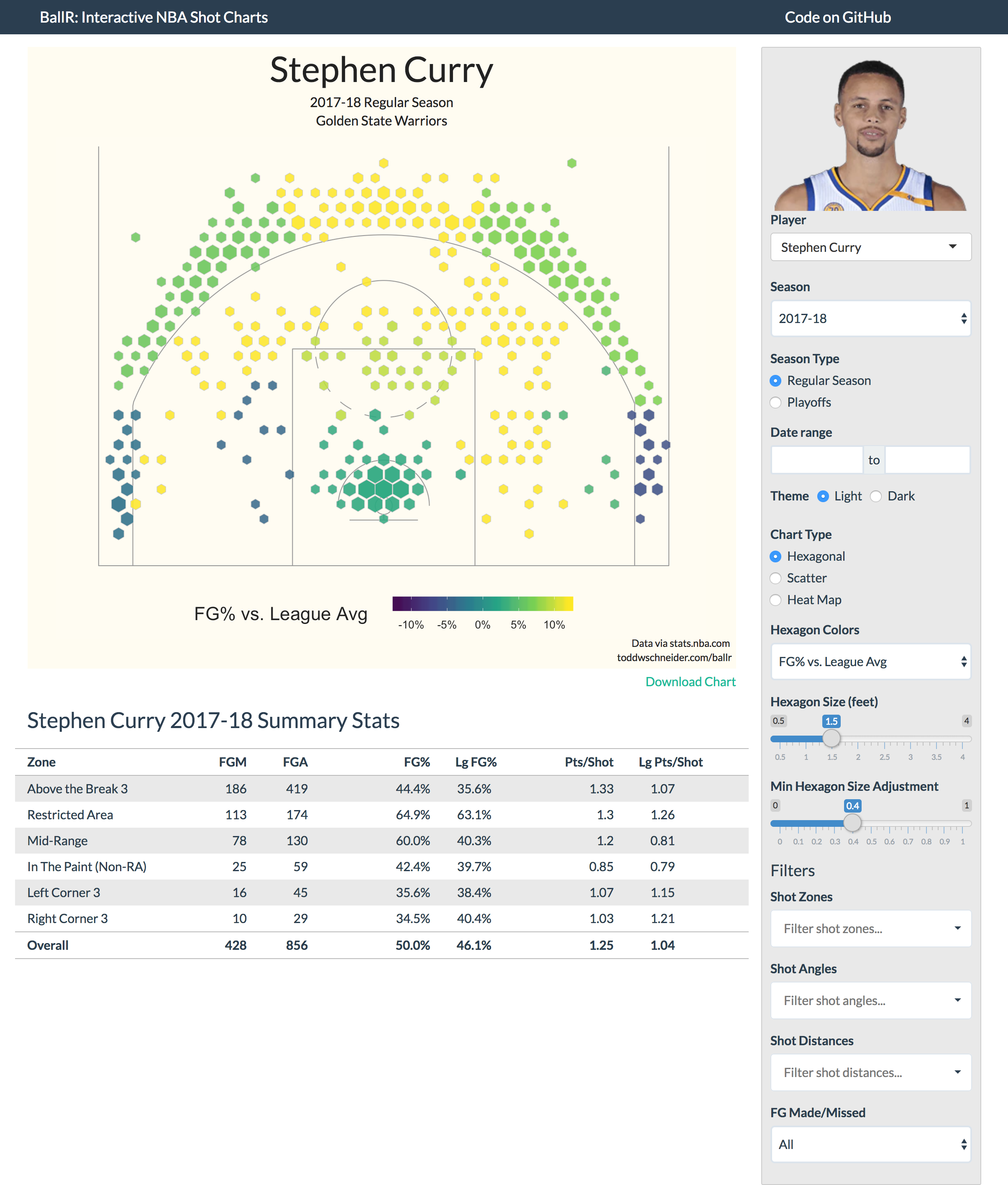
There are three chart types to choose from: hexagonal, scatter, and heat map

Hexagonal

Hexagonal charts, which are influenced by the work of Kirk Goldsberry at Grantland, use R's hexbin package to bin shots into hexagonal regions. The size and opacity of each hexagon are proportional to the number of shots taken within that region, and the color of each hexagon represents your choice of metric, which can be one of:

  • FG% vs. league average
  • FG%
  • Points per shot

There are two sliders to adjust the maximum hexagon sizes, and also the variability of sizes across hexagons, e.g. here's the same Stephen Curry chart but with larger hexagons, and plotting points per shot as the color metric.

Note that the color metrics are not plotted at the individual hexagon level, but at the court region level, e.g. all hexagons on the left side of the court that are 16-24 feet from the basket will have the same color. If BallR were extended to, say, chart all shots for an entire team, then it might make sense to assign colors at the hexagon-level, but for single players that tends to produce excessive noise.

Scatter

Scatter charts are the most straightforward option: they show the location of each individual shot, with color-coding for makes and misses

scatter

Heat map

Heat map charts use two-dimensional kernel density estimation to show the distribution of shot attempts across the court.

Anecdotally I've found that heat maps often show, unsurprisingly, that most shot attempts are taken in the restricted area near the basket. It might be more interesting to filter out restricted area shots when generating heat maps, for example here's the heat map of Stephen Curry's shot attempts excluding shots from within the restricted area:

heat map excluding restricted area

Filters

BallR lets you filter shots along a few dimensions (zone, angle, distance, made/missed) by adjusting the inputs in the sidebar. When you apply filters, the shot chart and summary stats update automatically to reflect whatever subset of shots you have chosen.

Color themes

BallR comes with light and dark color themes, and you can define your own theme in court_themes.R

Data

The data comes directly from the NBA Stats API via the shotchartdetail endpoint. See fetch_shots.R for the API call itself. The player select input lets you choose any player and season back to 1996, so you can compare, for example, Michael Jordan of 1996 to LeBron James of 2012.

See also: NBA Shots DB

NBA Shots DB is a Rails app that populates a PostgreSQL database with every NBA shot attempt since 1996 (4.5 million shots and growing).

https://github.com/toddwschneider/nba-shots-db

BallR does not interact with NBA Shots DB yet, but that might change in the future.

Acknowledgments

Posts by Savvas Tjortjoglou and Eduardo Maia about making NBA shot charts in Python and R, respectively, served as useful resources

Questions/issues/contact

[email protected], or open a GitHub issue

ballr's People

Contributors

toddwschneider avatar

Stargazers

 avatar  avatar  avatar  avatar  avatar  avatar  avatar  avatar  avatar  avatar  avatar  avatar  avatar  avatar  avatar  avatar  avatar  avatar  avatar  avatar  avatar  avatar  avatar  avatar  avatar  avatar  avatar  avatar  avatar  avatar  avatar  avatar  avatar  avatar  avatar  avatar  avatar  avatar  avatar  avatar  avatar  avatar  avatar  avatar  avatar  avatar  avatar  avatar  avatar  avatar  avatar  avatar  avatar  avatar  avatar  avatar  avatar  avatar  avatar  avatar  avatar  avatar  avatar  avatar  avatar  avatar  avatar  avatar  avatar  avatar  avatar  avatar  avatar  avatar  avatar  avatar  avatar  avatar  avatar  avatar  avatar  avatar  avatar  avatar  avatar  avatar  avatar  avatar  avatar  avatar  avatar  avatar  avatar  avatar  avatar  avatar  avatar  avatar  avatar  avatar

Watchers

 avatar  avatar  avatar  avatar  avatar  avatar  avatar  avatar  avatar  avatar  avatar  avatar  avatar  avatar  avatar  avatar  avatar  avatar  avatar  avatar  avatar  avatar  avatar  avatar  avatar  avatar  avatar  avatar  avatar  avatar  avatar  avatar  avatar  avatar  avatar  avatar  avatar  avatar  avatar  avatar  avatar  avatar  avatar  avatar  avatar  avatar  avatar

ballr's Issues

Shot charts flipped?

I think I may have found an issue with your charts. I was comparing the data to a few other shot chart sites, and it looks like your data is flipped. The links below illustrate the issue. A good example is Lamarcus Aldridge's 2018-2019 shot chart. He’s pretty known to setup on the left block (if you’re facing the basket) but on your charts, his main shots are on the right side of the court.

I tried to compare it to a few different web apps that did shot charts, not just Stat Muse, so I included Steph Curry’s 2015-2016 chart with links to other’s

Lamarcus Aldridge's 2018-2019 shot chart
https://www.statmuse.com/ask?q=lamarcus+aldridge+2018-2019+shot+chart&d=nba

Steph Curry 2015-2016 shot chart
https://www.statmuse.com/ask?q=stephen+curry+2015-2016+shot+chart&d=nba
http://buckets.peterbeshai.com/app/#/playerView/201939_2015?playerSelector=true&dataType=zones
http://www.austinclemens.com/shotcharts/#players

If you’ll look at Steph’s 3’s to the right side (not corners) you’ll see he’s a bit worse than other areas of the court. On your chart, it’s flipped to the other side.

I think that your tool is better than all of these, and I hope you can correct the issue. I could totally be wrong, but I’ve been looking at a bunch of different ones, and they all look flipped to me. Thanks for your consideration.

lamarcus-aldridge-2018-19-shot-chart-hexagonal
Screen Shot 2019-05-23 at 11 12 52 AM

Getting ERROR: 'data' must be of a vector type, was 'NULL' when trying to open package

When running the runGitHub command, I get the message in my window that say ERROR: 'data' must be of a vector type, was 'NULL'.

Attaching package: ‘dplyr’

The following objects are masked from ‘package:stats’:

filter, lag

The following objects are masked from ‘package:base’:

intersect, setdiff, setequal, union

Attaching package: ‘jsonlite’

The following object is masked from ‘package:shiny’:

validate

Warning: Error in matrix: 'data' must be of a vector type, was 'NULL'
57: matrix
53: fetch_shots_by_player_id_and_season [fetch_shots.R#70]

Above is what my code shows before the window pops open and shows the error statement.

Trouble with Shiny App

Hi, I attempted to run the code for creating shot charts but all I am getting is a blank window. There doesn't seem to be any error messages to help. When I hit "Stop" I get the following:

Warning: Error in curl::curl_fetch_memory: Operation was aborted by an application callback
59: curl::curl_fetch_memory
58: request_fetch.write_memory
56: request_perform
55: GET

Can you help? Thanks

error on live version

When running the live version of this application, it throws a "ERROR: 'data' must be of a vector type, was 'NULL'" error

Career-long Charts

Hi,

First of all, congratulation on this fantastic work. I honestly believe the pros at NBA are going to check these charts out quite a bit. You can get a lot of information out of them, and very intuitively so.

Have you considered allowing users to not filter by season, therefore getting stats for a player's entire career? I'm sure many would like to see that. I think you can take that a step further and do charts that compare a player's performance against his own, across his career, highlighting good and bad years. It should allow us to see when a player peaked and compare his performance across different teams.

Anyway, keep up the good work!

Recommend Projects

  • React photo React

    A declarative, efficient, and flexible JavaScript library for building user interfaces.

  • Vue.js photo Vue.js

    🖖 Vue.js is a progressive, incrementally-adoptable JavaScript framework for building UI on the web.

  • Typescript photo Typescript

    TypeScript is a superset of JavaScript that compiles to clean JavaScript output.

  • TensorFlow photo TensorFlow

    An Open Source Machine Learning Framework for Everyone

  • Django photo Django

    The Web framework for perfectionists with deadlines.

  • D3 photo D3

    Bring data to life with SVG, Canvas and HTML. 📊📈🎉

Recommend Topics

  • javascript

    JavaScript (JS) is a lightweight interpreted programming language with first-class functions.

  • web

    Some thing interesting about web. New door for the world.

  • server

    A server is a program made to process requests and deliver data to clients.

  • Machine learning

    Machine learning is a way of modeling and interpreting data that allows a piece of software to respond intelligently.

  • Game

    Some thing interesting about game, make everyone happy.

Recommend Org

  • Facebook photo Facebook

    We are working to build community through open source technology. NB: members must have two-factor auth.

  • Microsoft photo Microsoft

    Open source projects and samples from Microsoft.

  • Google photo Google

    Google ❤️ Open Source for everyone.

  • D3 photo D3

    Data-Driven Documents codes.