thx / cube Goto Github PK
View Code? Open in Web Editor NEW跨终端、响应式、低设计耦合的CSS解决方案
Home Page: http://thx.github.io/cube/
License: MIT License
跨终端、响应式、低设计耦合的CSS解决方案
Home Page: http://thx.github.io/cube/
License: MIT License


iOS input 默认顶部有内阴影
http://zomigi.com/blog/bug-fixes-for-removing-the-inner-shadow-on-ios-inputs/
input[type="text"] {
  -webkit-appearance: none;
}简单的链接列表就行
既然有以上问题,尤其是第一条,那么这个 我们是不是可以不必写到样式库里面去,而作为一个 群博 或者 doc 记录即可。
.clip-hide {
    position: absolute !important; /*clip: rect(1px 1px 1px 1px); /* IE6, IE7 */
    clip: rect(1px, 1px, 1px, 1px); /* 1 */
    padding: 0 !important;
    border: 0 none!important;
    height: 1px !important; /* 2 */
    width: 1px !important;
    overflow: hidden;
}兼容所有浏览器的做法是在所有需要锚点的位置生成一个空标签
<h2><a class="achor" name="">标题……</h2>高级浏览器提供CSS方法修复锚点定位,并提供提醒动画。
考虑去除默认的 padding
input[type="button"], input[type="submit"], input[type="reset"], input[type="file"]::-webkit-file-upload-button, button {
  padding: 1px 6px;
}按钮如果是 a 标签时,hover 样式有一个下划线
About small triangle
Maybe, you can do more
结构类似如下
<div class="toc">
  <h2>目录</h2>
  <ol>
  ...
  </ol>
</div>不是很清楚这个的应用场景,不过我 在 demo 里,依然可以在 input 中输入中文:
<input class="ime-disabled" type="text" placeholder="禁用中文输入">q:lang(zh){
quotes: "\300C" "\300D" "\300E" "\300F";
/* quotes: "「" "」" "『" "』"; */
}
cite:lang(zh){
quotes: "《" "》" "〈" "〉";
font-style: normal;
}
cite:before {
content: open-quote;
}
cite:after {
content: close-quote;
}解决方法:子元素使用 line-height:initial; 不继承父元素的line-height,需要测试兼容性。
提供 iconfont SCSS 版本,只有调用的时候才输出对应的 content
att
一直以来,我是一个 CSS「原教徒」,信奉简单直接的 CSS。但是在实际开发中,CSS 的确是缺少很多「可编程」的功能。所以在 Cube 1.0 技术选型上,我选择了以原生 CSS 为主,预处理器为辅的思路。基本架构是原生 CSS,但 iconfont 这个强烈需要可编程的模块选择了 SCSS。
随着 CSS 社区的发展,CSS 预处理从无到有。现如今已是百花齐放,这是一件令人欣慰的事情。简单看一下 CSS 预处理器的发展历程:
Sass 一开始是基于 Ruby 来实现的,其思路是增强 CSS 可编程功能,简化 CSS 书写方式,抛弃 CSS 中的大括号。显然实践证明,更多开发者还是更喜欢原生 CSS 的语法。所以有了后来的 SCSS
三者之中,最吸引我的是 Stylus,当我第一次看到 transparent mixin 的时候,心中抑制不住的欣喜٩(๑ᵒ̴̶̷͈᷄ᗨᵒ̴̶̷͈᷅)و
这才是我想要的好嘛。。。
Input:
border-radius(n)
  -webkit-border-radius n
  -moz-border-radius n
  border-radius n

//used
.foo
  border-radius 5px;
Output:
.foo {
  -webkit-border-radius: 5px;
  -moz-border-radius: 5px;
  border-radius: 5px;
}
就是这么简单,你只需在调用的时候直接写 border-radius 5px
但是似乎还欠缺点什么?
纵观 CSS 预处理器中的 mixin,其实大多数时候是拿来生成前缀和兼容性代码片段的。那么我们有两个选择:
前者几乎基于预处理器的 CSS 库都会有,但实际开发中典型的 PC 页面和移动页面我们所需要兼容的浏览器是不一样的,我们并不需要把 -webkit,-moz,-ms,-o 都生成在最终的 CSS 文件中,也就是说,没有一种方便且安全的按兼容浏览器输出对应前缀。
如果自己写,会更容易犯一些错误:
//Less
.transition(value) {
  -webkit-transition: value;
     -moz-transition: value;
      -ms-transition: value;
       -o-transition: value;
          transition: value;
}
IE 一开始就是支持不带前缀的 transition 属性。
此时,Autoprefixer 应运而生,完美解决以上场景,Compass、Sass、Less 中现在都以引用。
在 Autoprefixer 中你只需要写标准的 CSS 属性,这简直是「原教徒」的福音!
.foo {
  transition: width .3s;
}
输出:
.foo {
  -webkit-transition: width .3s;
     -moz-transition: width .3s;
       -o-transition: width .3s;
          transition: width .3s;
}
如果你配置了浏览器参数:
autoprefixer({ browsers: ['> 1%', 'Firefox 16', 'Opera 12'] })由于 Firefox 16 已经无需前缀,就会自动生成:
.foo {
   -webkit-transition: width .3s;
        -o-transition: width .3s;
           transition: width .3s;
}
CSS 后处理器中我选择了 PostCSS,理由嘛,作者非常亲和,也很重视其他语言的社区,插件数量已经远超 Rework。
PostCSS 中有我们需要的变量,嵌套,mixin,更有一系列的实现 CSS 前瞻语法或特性的插件:
https://github.com/cssnext/cssnext#features
在创意中心里,我们有一套自动生成 IE Hack 的方案,这是开发 CSS Grace 的初衷。
例如,*年们会经常用下面这段 CSS 用来解决闭合浮动的问题:
.clearfix {
  *zoom: 1;
}
.clearfix:after {
  clear: both;
}
.clearfix:before,
.clearfix:after {
  content: '';
  display: table;
}
这个语法糖虽然好用,兼容性良好,但在 HTML 中会出现非常多的 class="clearfix"。甚至有些地方已经闭合了浮动,有些人为了保险起见,还是随手加上了class="clearfix"。o(╯□╰)o
如此一来代码显得尤为冗余,而且加了很多无语意的 class。更进一步,我们知道如果触发了 BFC 的元素是自带闭合浮动特性的,clearfix 君略感违和。
Q: 那么,CSS Grace 如何解决呢?
A: 直接使用
clear: fix即可。
input:
.foo {
  clear: fix;
}
output:
.foo {
  *zoom: 1;
}
.foo:after {
  clear: both;
}
.foo:before,
.foo:after {
  content: '';
  display: table;
}
Q: 那么,如何解决冗余问题呢?
A: 还是直接使用
clear: fix即可,(^o^)/~
智能识别,如果存在触发 BFC 的属性,不生成语法糖。
input:
.foo {
  clear: fix;
  overflow: hidden; /* 已经可以闭合浮动了 */
}
output:
.foo {
  overflow: hidden; /* 已经可以闭合浮动了 */
}
这就是 Smart mixin!
当然这只是 CSS Grace 其中之一特性,更多参见文档。
1 拥抱后处理器
整体开发引入 CSSNext,拥抱 CSS 标准语法,减少未来学习成本。
/* custom properties */
:root {
  --fontSize: 1rem;
  --mainColor: #12345678;
  --highlightColor: hwb(190, 35%, 20%);
}

/* custom media queries */
@custom-media --viewport-medium (width <= 50rem);

/* some var() & calc() */
body {
  color: var(--mainColor);
  font-size: var(--fontSize);
  line-height: calc(var(--fontSize) * 1.5);
  padding: calc((var(--fontSize) / 2) + 1px);
}
2 引入 CSS Grace 并完善其功能
功能列表:https://github.com/cssdream/cssgrace/issues
CSS Grace 目前还缺少浏览器版本配置的功能,理想状态下,他应该是和 Autoprefixer 一样按需生成
兼容性代码。
考虑增加 @browser,具体还需和社区讨论。
@browser ie>=8, firefox >= 16, ios-safari > 6.0;input:
@browser ie>=8;

.foo {
  display: inline-block;
}
output:
.foo {
  display: inline-block;
}
当需要兼容旧的浏览器时,才会输出兼容性语法糖:
input:
@browser ie>=6;

.foo {
  display: inline-block;
}
output:
.foo {
  display: inline-block;
  *display: inline;
  *zoom: 1;
}
3 自动修复前缀兼容性
现阶段,Autoprefixer 已经能很好的完成根据标准属性自动增加前缀了, 这也是现在极力推荐的开发方式。但是很多开发者依然停留在 WebKit Only 上,只写 -webkit- 属性。这样的窘境也导致了,IE 在新版本中无奈支持-webkit- 前缀。我们需要一个工具快速安全的把某个特定的前缀生成我们所需要的全部前缀。当然,实际开发中还是绝对推荐只写标准属性。这个工具更多时候应该用在对旧网站(比如 m.hao123.com)的 CSS 升级上,以较小的成本快速兼容更多的浏览器。
示例:
.foo {
  display: -webkit-box;
}
输出:
.foo {
  display: -webkit-box;
  display: -webkit-flex;
  display: -moz-box;
  display: -ms-flexbox;
  display: flex;
}
还可以修正声明书写顺序问题
input:
 /* 标准属性应该写在非标准的后面 */
.foo {
  box-sizing: border-box;
  -moz-box-sizing: border-box;
}
output:
/* 标准属性应该写在非标准的后面 */
.foo {
  -moz-box-sizing: border-box;
  box-sizing: border-box;
}
除此之外,这个工具还有一个小场景可以使用,比如要测试一个新的带前缀的属性(backdrop-filter),然而 Autoprefixer 还没有支持它,而且目前只有带前缀版本的实现。
.foo {
  -webkit-backdrop-filter: blur(5px);
}
自动生成标准的属性:
.foo {
  -webkit-backdrop-filter: blur(5px);
  backdrop-filter: blur(5px);
}
当然现在 Blink/Firefox 已经不再添加新的前缀属性,而是通过 Flag 来控制新特性。这无疑对开发者来说是件好事,前缀这件事情终究如同 IE6 一样没入历史的长河。
4 完善 CSS 书写规范,特别是预处理器方面。
5 需要 HTML 书写规范,特别是 meat,viewport 标签。
6 删除 iconfont 模块,随着 iconfont.cn 的完善,cube 中的 iconfont 模块可以归隐田园了。
7 拆出 type.css 单独发展。
8 重构 neat.css 模块。
至此,整个 CSS 工作流基本完善。
开发环境 → 书写规范 → 模块化开发 → CSS Grace 检验修正书写规范 → Autoprefixer 自动前缀
→ 自动修复前缀兼容性 → Gulp/Grunt 打包发布
同时,随着设计团队设计规范的落地,在 Cube 2.0 中,可以舍弃一些 Brix Style 的包袱,带来一个
全新版本。
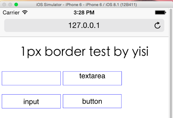
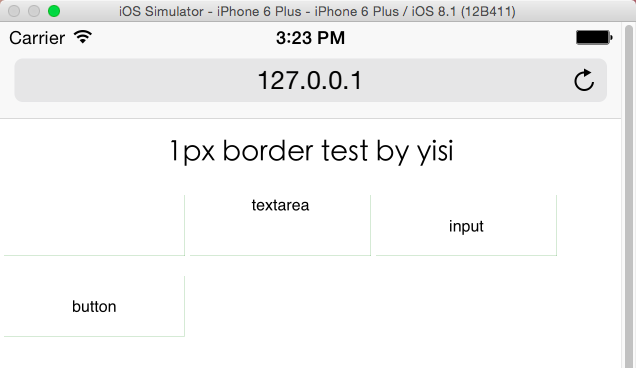
移动浏览器的 CSS 兼容情况不容乐观,毫不夸张的说,这是「移动 IE6 时代」。比如常见的如何在高分辨率屏幕上实现 1px border,m.taobao.com 目前使用的是用 JS 来判断设备像素比(Window.devicePixelRatio),然后动态计算 viewport 的值。
例如 iPhone 6(2x) 中,计算出的 viewport 是:
<meta name="viewport" content="initial-scale=0.5, maximum-scale=0.5, minimum-scale=0.5, user-scalable=no">iPhone 6 Plus(3x)中,计算出的 viewport 是:
<meta name="viewport" content="initial-scale=0.3333333333333333, maximum-scale=0.3333333333333333, minimum-scale=0.3333333333333333, user-scalable=no">这样实际显示出来的线条宽度就始终是 1px 啦。
然而,现实很残酷,在 iPhone 6 Plus 中,边框会显示不完整。
这需要我们在 CSS Grace 中另辟蹊径,迎难而上。
在与木头,行列聊过之后,大家一拍即合,决定开发我们自己的移动框架,欢迎大家提出宝贵意见和建议。
通常文章底部会有引用的外部链接,增加相关的样式:
1.3.2 版本的 NPM 包不知道为啥没有 readme.md。
.clearcell:after {
    clear: both;
    display: block;
    visibility: visible;
    overflow: hidden;
    height: 0 !important;
    line-height: 0;
    font-size: xx-large;
    content: " x x x x x x x x x x x x x x x x x x x x x x x x x x x x x x x x x x x x x x x x x x x x x x x x x x x x x x x x x x x x x x x x x x x x x x x x x x x x x x x x x x x x x x x x x x x x x x x x x x x x x x x x x x x x x x x x x x x x x x x x x x x x x x x x x x x x x x x x x x x x x x x x x x x x x x x x x x x x ";
}
如题,这里这么多 x 是有专门的用途么?
另外 x-large 这个字体是做什么用的,必须是 x-large 么,有点迷惑性
att
在外部样式表中最多有一个@charset规则可以出现——它不可以出现在嵌套的样式表中,也必须出现在文档的最开始,且前面没有任何字符。在"@charset"之后,用户指定字符编码的名称。
为了避免HTML和CSS文件编码不同时造成的中文解析乱码,请在CSS文件头部加上指定的@charset,例如:
@charset "utf-8";IE8 以上浏览器,支持 :before 伪元素,因此可以用来提供语义化的 iconfont 写法:
<style>
.iconfont-cube:before {
    content: '\01bc';
}
</style>
<i class="iconfont iconfont-cube"></i>
这样,维护好样式即可,在 HTML 中就可以用得舒服点了。
另外,http://ux.etao.com/fonts 是有元数据的,如果在元数据中假如英文名称,以上样式支持,可以自动生成,下周研究下。
图片垂直居中的结构是不是不可以随意调整,如下是:
<div class="center-box" style="height: 500px;background: #f8f8f8;">
  <div class="center-hack"></div>
  <div class="center-img">
    <img width="100%" src="http://cyj.me/assets/img/2013-new-york/IMG_0770.jpg" alt="自由女神像,来自 cyj.me">
  </div>
  <div class="center-body">
    <p>这里若不加 center-body, 会被重置为 font-size: 0 导致字不显示。</p>
  </div>
</div>
<p>(栅格、常用布局解决方案、如何 Mobile First 等)</p>
会导致 外面的文字被遮挡。但愿是我的用法有问题
 React
React
A declarative, efficient, and flexible JavaScript library for building user interfaces.
🖖 Vue.js is a progressive, incrementally-adoptable JavaScript framework for building UI on the web.
 Typescript
TypeScript is a superset of JavaScript that compiles to clean JavaScript output.
An Open Source Machine Learning Framework for Everyone
 Django
The Web framework for perfectionists with deadlines.
 Laravel
A PHP framework for web artisans
Bring data to life with SVG, Canvas and HTML. 📊📈🎉
JavaScript (JS) is a lightweight interpreted programming language with first-class functions.
Some thing interesting about web. New door for the world.
A server is a program made to process requests and deliver data to clients.
Machine learning is a way of modeling and interpreting data that allows a piece of software to respond intelligently.
Some thing interesting about visualization, use data art
Some thing interesting about game, make everyone happy.
 Facebook
We are working to build community through open source technology. NB: members must have two-factor auth.
 Microsoft
Open source projects and samples from Microsoft.
 Google
Google ❤️ Open Source for everyone.
 Alibaba
Alibaba Open Source for everyone
 D3
D3
Data-Driven Documents codes.
 Tencent
China tencent open source team.