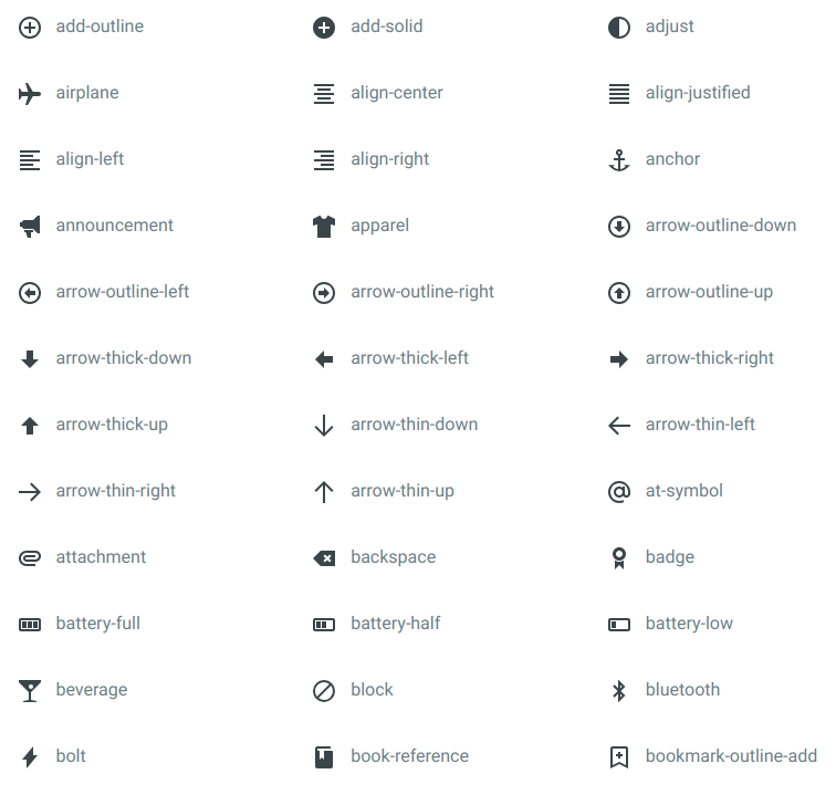
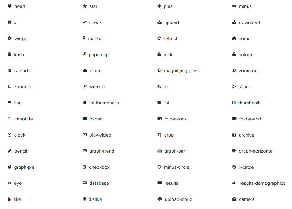
styled-icons provides over 20,000 icons from the following icon packs as Styled Components, with full support for TypeScript types and tree-shaking / ES modules.
- Bootstrap
- Boxicons
- Crypto Icons
- Entypo
- Eva Icons
- Evil Icons
- Feather
- FluentUI System
- Font Awesome
- Foundation
- Heroicons
- Icomoon
- Ionicons
- Material Design
- Octicons
- Open Iconic
- Remix
- Simple Icons
- Typicons
- Zondicons
Do you use Emotion?
Check out 👩🎤 Emotion Icons
Would you prefer plain SVGs?
Check out 🎛️ SVG Icons
You can install all the icon packs simultaneously:
yarn add styled-icons
or
npm install styled-icons --save
Alternatively you can install only the icon packs you need:
yarn add @styled-icons/bootstrap
yarn add @styled-icons/boxicons-logos
yarn add @styled-icons/boxicons-regular
yarn add @styled-icons/boxicons-solid
yarn add @styled-icons/crypto
yarn add @styled-icons/entypo
yarn add @styled-icons/entypo-social
yarn add @styled-icons/evaicons-outline
yarn add @styled-icons/evaicons-solid
yarn add @styled-icons/evil
yarn add @styled-icons/fa-brands
yarn add @styled-icons/fa-regular
yarn add @styled-icons/fa-solid
yarn add @styled-icons/feather
yarn add @styled-icons/fluentui-system-filled
yarn add @styled-icons/fluentui-system-regular
yarn add @styled-icons/foundation
yarn add @styled-icons/heroicons-outline
yarn add @styled-icons/heroicons-solid
yarn add @styled-icons/icomoon
yarn add @styled-icons/ionicons-sharp
yarn add @styled-icons/ionicons-solid
yarn add @styled-icons/ionicons-outline
yarn add @styled-icons/material
yarn add @styled-icons/material-outlined
yarn add @styled-icons/material-rounded
yarn add @styled-icons/material-twotone
yarn add @styled-icons/material-sharp
yarn add @styled-icons/octicons
yarn add @styled-icons/open-iconic
yarn add @styled-icons/remix-fill
yarn add @styled-icons/remix-editor
yarn add @styled-icons/remix-line
yarn add @styled-icons/simple-icons
yarn add @styled-icons/typicons
yarn add @styled-icons/zondicons
Finally, you will need to have installed a version of styled-components at least version 4.1.0 or newer, as styled-icons depends on styled-components as a peer dependency.
All icons are available for preview at the Icon Explorer.
The entire icon packs are available via the main import and sub-imports:
import {material, octicons} from 'styled-icons'

import * as bootstrap from '@styled-icons/bootstrap'
import * as boxiconsLogos from '@styled-icons/boxicons-logos'
import * as boxiconsRegular from '@styled-icons/boxicons-regular'
import * as boxiconsSolid from '@styled-icons/boxicons-solid'
import * as crypto from '@styled-icons/crypto'
import * as entypo from '@styled-icons/entypo'
import * as entypoSocial from '@styled-icons/entypo-social'
import * as evaiconsOutline from '@styled-icons/evaicons-outline'
import * as evaiconsSolid from '@styled-icons/evaicons-solid'
import * as evil from '@styled-icons/evil'
import * as faBrands from '@styled-icons/fa-brands'
import * as faRegular from '@styled-icons/fa-regular'
import * as faSolid from '@styled-icons/fa-solid'
import * as feather from '@styled-icons/feather'
import * as fluentUISystemFilled from '@styled-icons/fluentui-system-filled'
import * as fluentUISystemRegular from '@styled-icons/fluentui-system-regular'
import * as foundation from '@styled-icons/foundation'
import * as heroiconsOutline from '@styled-icons/heroicons-outline'
import * as heroiconsSolid from '@styled-icons/heroicons-solid'
import * as icomoon from '@styled-icons/icomoon'
import * as ioniconsSharp from '@styled-icons/ionicons-sharp'
import * as ioniconsSolid from '@styled-icons/ionicons-solid'
import * as ioniconsOutline from '@styled-icons/ionicons-outline'
import * as material from '@styled-icons/material'
import * as materialOutlined from '@styled-icons/material-outlined'
import * as materialRounded from '@styled-icons/material-rounded'
import * as materialSharp from '@styled-icons/material-sharp'
import * as materialTwoTone from '@styled-icons/material-twotone'
import * as octicons from '@styled-icons/octicons'
import * as openIconic from '@styled-icons/open-iconic'
import * as remixFill from '@styled-icons/remix-fill'
import * as remixEditor from '@styled-icons/remix-editor'
import * as remixLine from '@styled-icons/remix-line'
import * as simpleIcons from '@styled-icons/simple-icons'
import * as typicons from '@styled-icons/typicons'
import * as zondicons from '@styled-icons/zondicons'
You can also import just the icons you need:
import React, {Fragment} from 'react'
import {AccountCircle, Lock} from '@styled-icons/material'

const App = () => (
  <Fragment>
    <AccountCircle />
    <Lock />
  </Fragment>
)
For the individual icon pack packages (@styled-icons/PACK), the icons are also importable individually - this is not possible with the uber-styled-icons package containing all the packs:
import React from 'react'
import {Lock} from '@styled-icons/material/Lock'

const App = () => <Lock />Styled Icons accept all the valid props of an <svg /> element, in addition to the following custom props:
| Prop | Required | Type | Description |
|---|---|---|---|
size |
optional | string, number | This is a convenience for setting both width and height to the same value |
title |
optional | string | This sets the icon title and enables the standalone icon accessibility mode. See accessibility below for additional details |
Example
import React from 'react'
import {Lock} from '@styled-icons/material'

const App = () => <Lock size="48" title="Unlock account" />Some icons natively have non-square dimensions - original dimensions are exported from the individual icon exports:
import {LogoGithub, LogoGithubDimensions} from '@styled-icons/octicons/LogoGithub'

const App = () => <LogoGithub />

console.log(LogoGithubDimension) // {height: 16, width: 45}
Dimension exports are not available on the icon pack or index exports:
import * as octicons from '@styled-icons/octicons'
import {octicons} from 'styled-icons'

// octicons contains only icon exportsAll icons are exported as Styled Components, which means it is possible to utilize the Styled Components API:
import styled from 'styled-components'
import {Lock} from '@styled-icons/material'

export const RedLock = styled(Lock)`
  color: red;

  font-weight: ${(props) => (props.important ? 'bold' : 'normal')};
`If you wish to style all icons at once, you can create a wrapper styled component that imparts a particular style to all icons contained within the wrapper by targeting the StyledIconBase component:
import styled from 'styled-components'
import {StyledIconBase} from '@styled-icons/styled-icon'
export const IconStyleWrapper = styled.div`
${StyledIconBase} {
color: red;
/* icon styles go here */
}
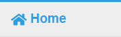
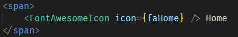
`Styled Icons have two different built-in "modes" for accessibility purposes. By default, icons are considered decorative, meaning the icon is just visual sugar and the surrounding content is sufficient for conveying meaning. This will set the aria-hidden attribute on the resulting HTML to hide the icon from screen readers.
// this icon
<Lock />
// will result in
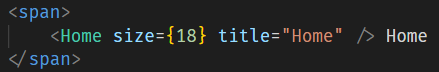
<svg aria-hidden="true">...</svg>Alternatively the icon could be used in standalone mode, meaning the icon itself should convey meaning. This mode is enabled by setting a title prop - this is the text that will be read by a screen reader. This results in role being set to img and the addition of a <title> element.
// this icon
<Lock title="Lock account" />

// will result in
<svg role="img"><title>Lock account</title> ...</svg>
Since Style Icons accept all <svg> element attributes as props, you are free to override these aria-* attributes if you have a more complex use-case.
As this library provides direct access to the <svg> element, you may wish to further wrap the icon for additional semantic meaning. For example, for a loading spinner:
import styled from 'styled-components'
import {Spinner} from '@styled-icons/fa-solid/Spinner'

const VisuallyHidden = styled.span`
  border: 0 !important;
  clip: rect(1px, 1px, 1px, 1px) !important;
  height: 1px !important;
  overflow: hidden !important;
  padding-top: 0 !important;
  padding-right: 0 !important;
  padding-bottom: 0 !important;
  padding-left: 0 !important;
  position: absolute !important;
  white-space: nowrap !important;
  width: 1px !important;
`

<span title="Loading posts..." role="alert" aria-live="assertive">
  <Spinner />
  <VisuallyHidden>Loading posts...</VisuallyHidden>
</span>Styled Icons supports automatic tree-shaking via the package.json module property from any of the import paths (icon pack, individual icon, etc.). Tree shaking has been tested with Create React App v2, Next.js, Rollup, and Webpack v4.
The icons of styled-icons are built using TypeScript and export type definitions. If you need a type to reference any styled icon, there is a StyledIcon type exported from the @styled-icons/styled-icon package (recommended) or the styled-icons/types import:
import styled from 'styled-components'

// Recommended:
import {StyledIcon} from '@styled-icons/styled-icon'
// Alternatively:
import {StyledIcon} from 'styled-icons/types'

interface Props {
  icon: StyledIcon
}
NOTE: you should ensure that the version of @types/react in your project is at least 16.8.14 or greater. That version of the React types package added support for ARIA attributes on SVG elements, which Styled Icons uses.
If you have any ideas for improvements to the TypeScript typing, please open an issue or PR!
Contributions are welcome! Feel free to open an issue or a pull request and participate at whatever level you would like.
The MIT License - see LICENSE.
The Bootstrap icons are licensed under the MIT License.
The Boxicons are licensed under the CC BY 4.0 License.
The Cryptocurrency icons are licensed under the CC0 1.0 Universal License.
The Entypo icons are licensed under the CC BY-SA 4.0 License.
The Eva Icons are licensed under the MIT License.
The Evil Icons are licensed under the MIT License.
The Font Awesome icons are licensed under the CC BY 4.0 License.
The Feather icons are licensed under the MIT License.
The FluentUI System icons are licensed under the MIT License.
The Foundation icons are licensed under the MIT License.
The Heroicons are licensed under the MIT License.
The Icomoon icons are dual licensed under GPL / CC BY 4.0 License.
The Ionicons are licensed under the MIT License.
The Material Design icons are licensed under the Apache License Version 2.0.
The Octicons are licensed under the MIT License.
The Open Iconic icons are licensed under the MIT License.
The Remix icons are licensed under the Apache License 2.0.
The Simple Icons are licensed under the CC0 1.0 Universal License.
The Typicons are licensed under the CC BY SA 3.0 License.
The Zondicons are licensed under the MIT License.
Thank you to all our backers! 🙏 [Become a backer]
Support this project by becoming a sponsor. Your logo will show up here with a link to your website. [Become a sponsor]


![dependabot-preview[bot] avatar](https://avatars.githubusercontent.com/in/2141?v=4 "dependabot-preview[bot]")

![dependabot[bot] avatar](https://avatars.githubusercontent.com/in/29110?v=4 "dependabot[bot]")


![github-actions[bot] avatar](https://avatars.githubusercontent.com/in/15368?v=4 "github-actions[bot]")


![kodiakhq[bot] avatar](https://avatars.githubusercontent.com/in/29196?v=4 "kodiakhq[bot]")
![mergify[bot] avatar](https://avatars.githubusercontent.com/in/10562?v=4 "mergify[bot]")


 React
React
 Typescript
 Django
 Laravel
 Facebook
 Microsoft
 Google
 Alibaba
 D3
D3
 Tencent