 ____             __                               __
/\  _`\          /\ \__                 __        /\ \
\ \ \/\ \     __ \ \ ,_\    __   _____ /\_\    ___\ \ \/'\      __   _ __
 \ \ \ \ \  /'__`\\ \ \/  /'__`\/\ '__`\/\ \  /'___\ \ , <    /'__`\/\`'__\
  \ \ \_\ \/\ \L\.\\ \ \_/\  __/\ \ \L\ \ \ \/\ \__/\ \ \\`\ /\  __/\ \ \/
   \ \____/\ \__/.\_\ \__\ \____\\ \ ,__/\ \_\ \____\\ \_\ \_\ \____\\ \_\
    \/___/  \/__/\/_/\/__/\/____/ \ \ \/  \/_/\/____/ \/_/\/_/\/____/ \/_/
                                   \ \_\
                                    \/_/ By: The Qodesmith
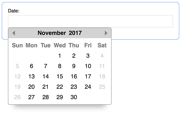
Get a date with JavaScript! Or a daterange, but that's not a good pun. Datepicker has no dependencies and weighs in at 5.9kb gzipped! Datepicker is simple to use and looks sexy on the screen. A calendar pops up and you pick a date. #Boom.
- Installation
- Basic Usage
- Custom Elements / Shadow DOM Usage
- Manual Year & Month Navigation
- Using As A Daterange Picker
- Calendar Examples
- Sizing The Calendar
- Properties & Values
- formatter
- position
- startDay
- customDays
- customMonths
- customOverlayMonths
- defaultView
- overlayButton
- overlayPlaceholder
- events
See the examples below.
Simply include datepicker.min.css in the <head>...
<head>
  ...
  <link rel="stylesheet" href="datepicker.min.css">
  <!-- Or remotely via Unpkg CDN -->
  <!-- <link rel="stylesheet" href="https://unpkg.com/js-datepicker/dist/datepicker.min.css"> -->
</head>
and include datepicker.min.js just above your closing </body> tag...
<body>
  ...
  <script src="datepicker.min.js"></script>
  <!-- Or remotely via Unpkg CDN -->
  <!-- <script src="https://unpkg.com/js-datepicker"></script> -->
</body>
If you downloaded the package via zip file from Github, these files are located in the dist folder. Otherwise, you can use the Unpkg CDN as shown in the examples above.
npm install js-datepicker
Files & locations:
| File | Folder | Description |
|---|---|---|
| datepicker.min.js | node_modules/js-datepicker/dist | production build - (ES5, 5.9kb gzipped) |
| datepicker.min.css | node_modules/js-datepicker/dist | production stylesheet |
| datepicker.scss | node_modules/js-datepicker/src | Scss file. Use it in your own builds. |
Importing the library if you're using it in Node:
import datepicker from 'js-datepicker'
// or
const datepicker = require('js-datepicker')
Using it in your code:
const picker = datepicker(selector, options)Importing the styles into your project using Node:
// From within a scss file,
// import datepickers scss file...
@import '~js-datepicker/src/datepicker';

// or import datepickers css file.
@import '~js-datepicker/dist/datepicker.min.css';
Datepicker takes 2 arguments:
selector- two possibilities:string- a CSS selector, such as'.my-class','#my-id', or'div'.DOM node- provide a DOM node, such asdocument.querySelector('#my-id').
- (optional) An object full of options.
The return value of the datepicker function is the datepicker instance. See the methods and properties below.
You can use Datepicker with any type of element you want. If used with an <input> element (the common use case), then the <input>'s value will automatically be set when selecting a date.
NOTE: Datepicker will not change the value of input fields with a type of date - <input type="date">. This is because those input's already have a built in calendar and can cause problems. Use <input type="text"> instead.
By clicking on the year or month an overlay will show revealing an input field and a list of months. You can either enter a year in the input, click a month, or both:
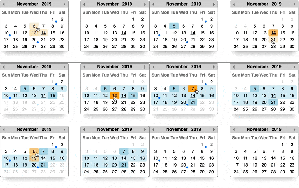
Want 2 calendars linked together to form Voltron a daterange picker? It's as simple as giving them both the same id! By using the id option, Datepicker handles all the logic to keep both calendars in sync.
The 1st calendar will serve as the minimum date and the 2nd calendar as the maximum. Dates will be enabled / disabled on each calendar automatically when the user selects a date on either. The getRange method will conveniently give you an object with the start and end date selections. It's as simple as creating 2 instances with the same id to form a daterange picker:
const start = datepicker('.start', { id: 1 })
const end = datepicker('.end', { id: 1 })
And when you want to get your start and end values, simply call getRange on either instance:
start.getRange() // { start: <JS date object>, end: <JS date object> }
end.getRange() // Gives you the same as above!You can use Datepicker within a Shadow DOM and custom elements. In order to do so, must pass a node as the 1st argument:
class MyElement extends HTMLElement {
  constructor() {
    super()
    const shadowRoot = this.attachShadow({ mode: 'open' })
    shadowRoot.innerHTML = `
      <div>
        <style>${textOfDatepickersCSS}</style>
        <input />
      </div>
    `

    // Create the node we'll pass to datepicker.
    this.input = shadowRoot.querySelector('input')
  }

  connectedCallback() {
    // Pass datepicker a node within the shadow DOM.
    datepicker(this.input)
  }
}

customElements.define('my-element', MyElement)
All other options work as expected, including dateranges. You can even have a date range pair with one calendar in the shadow DOM and another outside it!
Use these options if you want to fire off your own functions after something happens with the calendar.
Callback function after a date has been selected. The 2nd argument is the selected date when a date is being selected and undefined when a date is being unselected. You unselect a date by clicking it again.
const picker = datepicker('.some-input', {
  onSelect: (instance, date) => {
    // Do stuff when a date is selected (or unselected) on the calendar.
    // You have access to the datepicker instance for convenience.
  }
})- Arguments:
instance- the current datepicker instance.date:- JavaScript date object when a date is being selected.
undefinedwhen a date is being unselected.
NOTE: This will not fire when using the instance methods to manually change the calendar.
Callback function when the calendar is shown.
const picker = datepicker('.some-input', {
  onShow: instance => {
    // Do stuff when the calendar is shown.
    // You have access to the datepicker instance for convenience.
  }
})- Arguments:
instance- the current datepicker instance.
NOTE: This will fire when using the show instance method.
Callback function when the calendar is hidden.
const picker = datepicker('.some-input', {
  onHide: instance => {
    // Do stuff once the calendar goes away.
    // You have access to the datepicker instance for convenience.
  }
})- Arguments:
instance- the current datepicker instance.
NOTE: This will fire when using the hide instance method.
Callback function when the month has changed.
const picker = datepicker('.some-input', {
  onMonthChange: instance => {
    // Do stuff when the month changes.
    // You have access to the datepicker instance for convenience.
  }
})- Arguments:
instance- the current datepicker instance.
These options help you customize the calendar to your suit your needs. Some of these are especially helpful if you're using a language other than English.
Using an input field with your datepicker? Want to customize its value anytime a date is selected? Provide a function that manually sets the provided input's value with your own formatting.
const picker = datepicker('.some-input', {
  formatter: (input, date, instance) => {
    const value = date.toLocaleDateString()
    input.value = value // => '1/1/2099'
  }
})- Default - default format is
date.toDateString() - Arguments:
input- the input field that the datepicker is associated with.date- a JavaScript date object of the currently selected date.instance- the current datepicker instance.
Note: The formatter function will only run if the datepicker instance is associated with an <input> field.
This option positions the calendar relative to the <input> field it's associated with. This can be 1 of 5 values: 'tr', 'tl', 'br', 'bl', 'c' representing top-right, top-left, bottom-right, bottom-left, and centered respectively. Datepicker will position itself accordingly relative to the element you reference in the 1st argument. For a value of 'c', Datepicker will position itself fixed, smack in the middle of the screen. This can be desirable for mobile devices.
// The calendar will be positioned to the top-left of the input field.
const picker = datepicker('.some-input', { position: 'tl' })- Type - string
- Default -
'bl'
Specify the day of the week your calendar starts on. 0 = Sunday, 1 = Monday, etc. Plays nice with the customDays option.
// The first day of the week on this calendar is Monday.
const picker = datepicker('.some-input', { startDay: 1 })- Type - number (
0-6) - Default -
0(Sunday starts the week)
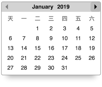
You can customize the display of days on the calendar by providing an array of 7 values. This can be used with the startDay option if your week starts on a day other than Sunday.
const picker = datepicker('.some-input', {
  customDays: ['天', '一', '二', '三', '四', '五', '六']
})- Type - array
- Default -
['Sun', 'Mon', 'Tue', 'Wed', 'Thu', 'Fri', 'Sat']
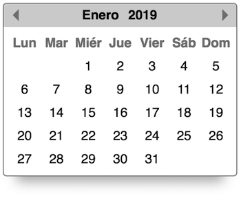
You can customize the display of the month name at the top of the calendar by providing an array of 12 strings.
const picker = datepicker('.some-input', {
  customMonths: ['Enero', 'Febrero', 'Marzo', 'Abril', 'Mayo', 'Junio', 'Julio', 'Agosto', 'Septiembre', 'Octubre', 'Noviembre', 'Diciembre']
})- Type - array
- Default -
['January', 'February', 'March', 'April', 'May', 'June', 'July', 'August', 'September', 'October', 'November', 'December']
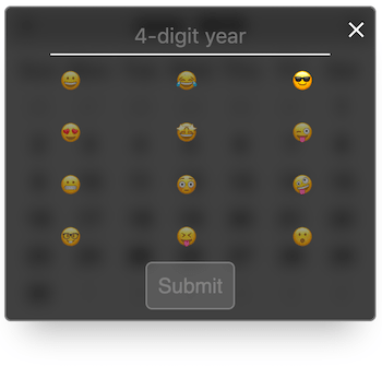
You can customize the display of the month names in the overlay view by providing an array of 12 strings. Keep in mind that if the values are too long, it could produce undesired results in the UI.
Here's what the default looks like:
Here's an example with an array of custom values:
const picker = datepicker('.some-input', {
  customOverlayMonths: ['😀', '😂', '😎', '😍', '🤩', '😜', '😬', '😳', '🤪', '🤓 ', '😝', '😮']
})- Type - array
- Default - The first 3 characters of each item in
customMonths.
Want the overlay to be the default view when opening the calendar? This property is for you. Simply set this property to 'overlay' and you're done. This is helpful if you want a month picker to be front and center.
const picker = datepicker('.some-input', {defaultView: 'overlay'})- Type - string (
'calendar'or'overlay') - Default -
'calendar'
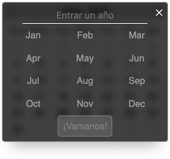
Custom text for the year overlay submit button.
const picker = datepicker('.some-input', {
  overlayButton: "¡Vamanos!"
})- Type - string
- Default -
'Submit'
Custom placeholder text for the year overlay.
const picker = datepicker('.some-input', {
  overlayPlaceholder: 'Entrar un año'
})- Type - string
- Default -
'4-digit year'
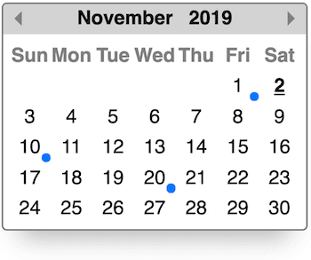
An array of dates which indicate something is happening - a meeting, birthday, etc. I.e. an event.
const picker = datepicker('.some-input', {
  events: [
    new Date(2019, 10, 1),
    new Date(2019, 10, 10),
    new Date(2019, 10, 20),
  ]
})- Type - array of JS date objects
Use these options to set the calendar the way you want.
By default, the datepicker will hide & show itself automatically depending on where you click or focus on the page. If you want the calendar to always be on the screen, use this option.
const picker = datepicker('.some-input', { alwaysShow: true })- Type - boolean
- Default -
false
This will start the calendar with a date already selected. If Datepicker is used with an <input> element, that field will be populated with this date as well.
const picker = datepicker('.some-input', { dateSelected: new Date(2099, 0, 5) })- Type - JS date object
This will be the maximum threshold of selectable dates. Anything after it will be unselectable.
const picker = datepicker('.some-input', { maxDate: new Date(2099, 0, 1) })- Type - JavaScript date object.
NOTE: When using a daterange pair, if you set maxDate on the first instance options it will be ignored on the 2nd instance options.
This will be the minumum threshold of selectable dates. Anything prior will be unselectable.
const picker = datepicker('.some-input', { minDate: new Date(2018, 0, 1) })- Type - JavaScript date object.
NOTE: When using a daterange pair, if you set minDate on the first instance options it will be ignored on the 2nd instance options.
The date you provide will determine the month that the calendar starts off at.
const picker = datepicker('.some-input', { startDate: new Date(2099, 0, 1) })- Type - JavaScript date object.
- Default - today's month
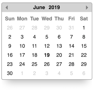
By default, the datepicker will not put date numbers on calendar days that fall outside the current month. They will be empty squares. Sometimes you want to see those preceding and trailing days. This is the option for you.
const picker = datepicker('.some-input', { showAllDates: true })- Type - boolean
- Default -
false
<input />'s can have a disabled or readonly attribute applied to them. In those cases, you might want to prevent Datepicker from selecting a date and changing the input's value. Set this option to true if that's the case. The calendar will still be functional in that you can change months and enter a year, but dates will not be selectable (or deselectable).
const picker = datepicker('.some-input', { respectDisabledReadOnly: true })- Type - boolean
- Default -
false
These options are associated with disabled various things.
Provide true to disable selecting weekends. Weekends are Saturday & Sunday. If your weekends are a set of different days or you need more control over disabled dates, check out the disabler option.
const picker = datepicker('.some-input', { noWeekends: true })- Type - boolean
- Default -
false
Sometimes you need more control over which dates to disable. The disabledDates option is limited to an explicit array of dates and the noWeekends option is limited to Saturdays & Sundays. Provide a function that takes a JavaScript date as it's only argument and returns true if the date should be disabled. When the calendar builds, each date will be run through this function to determine whether or not it should be disabled.
const picker1 = datepicker('.some-input1', {
  // Disable every Tuesday on the calendar (for any given month).
  disabler: date => date.getDay() === 2
})

const picker2 = datepicker('.some-input2', {
  // Disable every day in the month of October (for any given year).
  disabler: date => date.getMonth() === 9
})- Arguments:
date- JavaScript date object representing a given day on a calendar.
Provide an array of JS date objects that will be disabled on the calendar. This array cannot include the same date as dateSelected. If you need more control over which dates are disabled, see the disabler option.
const picker = datepicker('.some-input', {
  disabledDates: [
    new Date(2099, 0, 5),
    new Date(2099, 0, 6),
    new Date(2099, 0, 7),
  ]
})- Type - array of JS date objects
Optionally disable Datepicker on mobile devices. This is handy if you'd like to trigger the mobile device's native date picker instead. If that's the case, make sure to use an input with a type of "date" - <input type="date" />
const picker = datepicker('.some-input', { disableMobile: true })- Type - boolean
- Default -
false
Clicking the year or month name on the calendar triggers an overlay to show, allowing you to enter a year manually. If you want to disable this feature, set this option to true.
const picker = datepicker('.some-input', { disableYearOverlay: true })- Type - boolean
- Default -
false
Want to completely disable the calendar? Simply set the disabled property on the datepicker instance to true to render it impotent. Maybe you don't want the calendar to show in a given situation. Maybe the calendar is showing but you don't want it to do anything until some other field is filled out in a form. Either way, have fun.
Example:
const picker = datepicker('.some-input')

function disablePicker() {
  picker.disabled = true
}

function enablePicker() {
  picker.disabled = false
}

function togglePicker() {
  picker.disabled = !picker.disabled
}Now we're getting fancy! If you want to link two instances together to help form a daterange picker, this is your option. Only two picker instances can share an id. The datepicker instance declared first will be considered the "start" picker in the range. There's a fancy getRange method for you to use as well.
const start = datepicker('.start', { id: 1 })
const end = datepicker('.end', { id: 1 })- Type - anything but
nullorundefined
Each instance of Datepicker has methods to allow you to programmatically manipulate the calendar.
Performs cleanup. This will remove the current instance from the DOM, leaving all others in tact. If this is the only instance left, it will also remove the event listeners that Datepicker previously set up.
const picker = datepicker('.some-input')

/* ...so many things... */

picker.remove() // So fresh & so clean clean.Programmatically navigates the calendar to the date you provide. This doesn't select a date, it's literally just for navigation. You can optionally trigger the onMonthChange callback with the 2nd argument.
const picker = datepicker('.some-input')
const date = new Date(2020, 3, 1)

/* ...so many things... */

// Navigate to a new month.
picker.navigate(date)

// Navigate to a new month AND trigger the `onMonthChange` callback.
picker.navigate(date, true)- Arguments:
date- JavaScript date object.trigger onMonthChange- boolean (default isfalse)
Allows you to programmatically select or unselect a date on the calendar. To select a date on the calendar, pass in a JS date object for the 1st argument. If you set a date on a month other than what's currently displaying and you want the calendar to automatically change to it, pass in true as the 2nd argument.
Want to unselect a date? Simply run the function with no arguments.
// Select a date on the calendar.
const picker = datepicker('.some-input')

// Selects January 1st 2099 on the calendar
// *and* changes the calendar to that date.
picker.setDate(new Date(2099, 0, 1), true)

// Selects November 1st 2099 but does *not* change the calendar.
picker.setDate(new Date(2099, 10, 1))

// Remove the selection simply by omitting any arguments.
picker.setDate()- Arguments:
date- JavaScript date object.changeCalendar- boolean (default isfalse)
Note: This will not trigger the onSelect callback.
Allows you to programmatically set the minimum selectable date or unset it. If this instance is part of a daterange instance (see the id option) then the other instance will be changed as well. To unset a minimum date, simply run the function with no arguments.
// Set a minimum selectable date.
const picker = datepicker('.some-input')
picker.setMin(new Date(2018, 0, 1))

// Remove the minimum selectable date.
picker.setMin()- Arguments:
date- JavaScript date object.
Allows you to programmatically set the maximum selectable date or unset it. If this instance is part of a daterange instance (see the id option) then the other instance will be changed as well. To unset a maximum date, simply run the function with no arguments.
// Set a maximum selectable date.
const picker = datepicker('.some-input')
picker.setMax(new Date(2099, 0, 1))

// Remove the maximum selectable date.
picker.setMax()- Arguments:
date- JavaScript date object.
Allows you to programmatically show the calendar. Using this method will trigger the onShow callback if your instance has one.
const picker = datepicker('.some-input')
picker.show()
Note: see the "gotcha" below for implementing this method in an event handler.
Allows you to programmatically hide the calendar. If the alwaysShow property was set on the instance then this method will have no effect. Using this method will trigger the onHide callback if your instance has one.
const picker1 = datepicker('.some-input')
const picker2 = datepicker('.some-other-input', { alwaysShow: true })

picker1.hide() // This works.
picker2.hide() // This does not work because of `alwaysShow`.
Note: see the "gotcha" below for implementing this method in an event handler.
Want to show / hide the calendar programmatically with a button or by clicking some element? Make sure to use stopPropagation in your event callback! If you don't, any click event in the DOM will bubble up to Datepicker's internal oneHandler event listener, triggering logic to close the calendar since it "sees" the click event outside the calendar. Here's an example on how to use the show and hide methods in a click event handler:
// Attach the picker to an input element.
const picker = datepicker(inputElement, options)

// Toggle the calendar when a button is clicked.
button.addEventListener('click', e => {
  // THIS!!! Prevent Datepicker's event handler from hiding the calendar.
  e.stopPropagation()

  // Toggle the calendar.
  const isHidden = picker.calendarContainer.classList.contains('qs-hidden')
  picker[isHidden ? 'show' : 'hide']()
})Call this method on the picker to programmatically toggle the overlay. This will only work if the calendar is showing!
const picker = datepicker('.some-input')

// Click the input to show the calendar...

picker.toggleOverlay()This method is only available on daterange pickers. It will return an object with start and end properties whose values are JavaScript date objects representing what the user selected on both calendars.
const start = datepicker('.start', { id: 1 })
const end = datepicker('.end', { id: 1 })

// ...

start.getRange() // { start: <JS date object>, end: <JS date object> }
end.getRange() // Gives you the same as above!If you take a look at the datepicker instance, you'll notice plenty of values that you can grab and use however you'd like. Below details some helpful properties and values that are available on the picker instance.
| Property | Value |
|---|---|
calendar |
The calendar element. |
calendarContainer |
The container element that houses the calendar. Use it to size the calendar or programmatically check if the calendar is showing. |
currentMonth |
A 0-index number representing the current month. For example, 0 represents January. |
currentMonthName |
Calendar month in plain english. E.x. January |
currentYear |
The current year. E.x. 2099 |
dateSelected |
The value of the selected date. This will be undefined if no date has been selected yet. |
el |
The element datepicker is relatively positioned against (unless centered). |
minDate |
The minimum selectable date. |
maxDate |
The maximum selectable date. |
sibling |
If two datepickers have the same id option then this property will be available and refer to the other instance. |
You can control the size of the calendar dynamically with the font-size property!
Every element you see on the calendar is relatively sized in em's. The calendar has a container <div> with a class name of qs-datepicker-container and a font-size: 1rem style on it in the CSS. Simply override that property with inline styles set via JavaScript and watch the calendar resize! For ease, you can access the containing div via the calendarContainer property on each instance. For example:
// Instantiate a datepicker instance.
const picker = datepicker('.some-class')

// Use JavaScript to change the calendar size.
picker.calendarContainer.style.setProperty('font-size', '1.5rem')Simplest usage:
const picker = datepicker('#some-id')Setting up a daterange picker:
const start = datepicker('.start', { id: 1 })
const end = datepicker('.end', { id: 1 })

// NOTE: Any of the other options, as shown below, are valid for range pickers as well.
With all other options declared:
const picker = datepicker('#some-id', {
  // Event callbacks.
  onSelect: instance => {
    // Show which date was selected.
    console.log(instance.dateSelected)
  },
  onShow: instance => {
    console.log('Calendar showing.')
  },
  onHide: instance => {
    console.log('Calendar hidden.')
  },
  onMonthChange: instance => {
    // Show the month of the selected date.
    console.log(instance.currentMonthName)
  },

  // Customizations.
  formatter: (input, date, instance) => {
    // This will display the date as `1/1/2019`.
    input.value = date.toDateString()
  },
  position: 'tr', // Top right.
  startDay: 1, // Calendar week starts on a Monday.
  customDays: ['S', 'M', 'T', 'W', 'Th', 'F', 'S'],
  customMonths: ['Jan', 'Feb', 'Mar', 'Apr', 'May', 'Jun', 'Jul', 'Aug', 'Sep', 'Oct', 'Nov', 'Dec'],
  customOverlayMonths: ['😀', '😂', '😎', '😍', '🤩', '😜', '😬', '😳', '🤪', '🤓 ', '😝', '😮'],
  overlayButton: 'Go!',
  overlayPlaceholder: 'Enter a 4-digit year',

  // Settings.
  alwaysShow: true, // Never hide the calendar.
  dateSelected: new Date(), // Today is selected.
  maxDate: new Date(2099, 0, 1), // Jan 1st, 2099.
  minDate: new Date(2016, 5, 1), // June 1st, 2016.
  startDate: new Date(), // This month.
  showAllDates: true, // Numbers for leading & trailing days outside the current month will show.

  // Disabling things.
  noWeekends: true, // Saturday's and Sunday's will be unselectable.
  disabler: date => (date.getDay() === 2 && date.getMonth() === 9), // Disabled every Tuesday in October
  disabledDates: [new Date(2050, 0, 1), new Date(2050, 0, 3)], // Specific disabled dates.
  disableMobile: true, // Conditionally disabled on mobile devices.
  disableYearOverlay: true, // Clicking the year or month will *not* bring up the year overlay.

  // ID - be sure to provide a 2nd picker with the same id to create a daterange pair.
  id: 1
})Copyright 2017 - present, Aaron Cordova
Permission is hereby granted, free of charge, to any person obtaining a copy of this software and associated documentation files (the "Software"), to deal in the Software without restriction, including without limitation the rights to use, copy, modify, merge, publish, distribute, sublicense, and/or sell copies of the Software, and to permit persons to whom the Software is furnished to do so, subject to the following conditions:
The above copyright notice and this permission notice shall be included in all copies or substantial portions of the Software.
THE SOFTWARE IS PROVIDED "AS IS", WITHOUT WARRANTY OF ANY KIND, EXPRESS OR IMPLIED, INCLUDING BUT NOT LIMITED TO THE WARRANTIES OF MERCHANTABILITY, FITNESS FOR A PARTICULAR PURPOSE AND NONINFRINGEMENT. IN NO EVENT SHALL THE AUTHORS OR COPYRIGHT HOLDERS BE LIABLE FOR ANY CLAIM, DAMAGES OR OTHER LIABILITY, WHETHER IN AN ACTION OF CONTRACT, TORT OR OTHERWISE, ARISING FROM, OUT OF OR IN CONNECTION WITH THE SOFTWARE OR THE USE OR OTHER DEALINGS IN THE SOFTWARE.

