Coder Social home page Coder Social logo

mapbox / mr-ui Goto Github PK

View Code? Open in Web Editor NEW
85.0 94.0 7.0 16.21 MB

UI components for Mapbox projects

Home Page: https://mapbox.github.io/mr-ui/

License: BSD 2-Clause "Simplified" License

JavaScript 2.90% HTML 0.13% CSS 0.56% TypeScript 96.41%
frontend-tooling frontend-shared

mr-ui's Introduction

@mapbox/mr-ui

mr-ui logo

Build Status

Pronounced 'mis-tər yü-'ī. Mapbox React UI components.

UI components for Mapbox projects. See docs at https://mapbox.github.io/mr-ui/.

This project is for internal Mapbox usage. The code is open source and we appreciate bug reports; but we will only consider feature requests and pull requests from Mapbox developers.

Installation

npm install @mapbox/mr-ui

On Mapbox projects, pair these components with version 1.1.0+ of Mapbox's custom Assembly build. (This is not in peerDependencies because you might use <link> and <script> tags instead of the npm package.)

The public Assembly build should work fine, with maybe one or two hiccups.

Usage

Import individual components! All components are exposed at @mapbox/mr-ui/{component-name}. For example:

import Modal from '@mapbox/mr-ui/modal';
import Tooltip from '@mapbox/mr-ui/tooltip';

Only the component itself and whatever it depends on will be drawn into your bundle.

Utility functions

There are a few utility functions you can import from @mapbox/mr-ui/utils/{name}.

See the utils documentation.

Development

Here are some commands you'll probably want to use:

# Start the documentation site.
npm start

# Start Jest's CLI in watch mode.
npx jest --watchAll

# Lint and test everything.
npm test

Publishing

The build command creates a pkg/ directory that contains the code we want to publish, organized the way we want it. So pkg/ is the directory that we publish. pkg/package.json is a clone of package.json but with private: true removed.

  • Increment version numbers in package.json and package.lock.json, and ensure the changelog has an entry for the latest version. Then, create a new Git tag.
  • Build the pkg/ directory: npm run build.
  • cd into the pkg/ directory and mbx npm publish from there.
  • cd back to root and run npm run deploy-docs to update the docs at https://mapbox.github.io/mr-ui/

mr-ui's People

Contributors

adrianababakanian avatar badiuoanaalexandra avatar chriswhong avatar danswick avatar davidtheclark avatar dependabot[bot] avatar elifitch avatar katydecorah avatar kelsey-taylor avatar kepta avatar lawsberrypi avatar lshig avatar mbullington avatar miafan23 avatar mzdraper avatar olemstrom avatar samanpwbb avatar tristen avatar vluisa avatar

Stargazers

 avatar  avatar  avatar  avatar  avatar  avatar  avatar  avatar  avatar  avatar  avatar  avatar  avatar  avatar  avatar  avatar  avatar  avatar  avatar  avatar  avatar  avatar  avatar  avatar  avatar  avatar  avatar  avatar  avatar  avatar  avatar  avatar  avatar  avatar  avatar  avatar  avatar  avatar  avatar  avatar  avatar  avatar  avatar  avatar  avatar  avatar  avatar  avatar  avatar  avatar  avatar  avatar  avatar  avatar  avatar  avatar  avatar  avatar  avatar  avatar  avatar  avatar  avatar  avatar  avatar  avatar  avatar  avatar  avatar  avatar  avatar  avatar  avatar  avatar  avatar  avatar  avatar  avatar  avatar  avatar  avatar  avatar  avatar  avatar  avatar

Watchers

 avatar  avatar  avatar  avatar  avatar  avatar  avatar  avatar  avatar  avatar  avatar  avatar  avatar  avatar  avatar  avatar  avatar  avatar  avatar  avatar  avatar  avatar  avatar  avatar  avatar  avatar  avatar  avatar  avatar  avatar  avatar  avatar  avatar  avatar  avatar  avatar  avatar  avatar  avatar  avatar  avatar  avatar  avatar  avatar  avatar  avatar  avatar  avatar  avatar  avatar  avatar  avatar  avatar  avatar  avatar  avatar  avatar  avatar  avatar  avatar  avatar  avatar  avatar  avatar  avatar  avatar  avatar  avatar  avatar  avatar  avatar  avatar  avatar  avatar  avatar  avatar  avatar  avatar  avatar  avatar  avatar  avatar  avatar  avatar  avatar  avatar  avatar  avatar  avatar  avatar  avatar  avatar  avatar  avatar

mr-ui's Issues

MbxAvatar component?

I'm often creating a circular avatar that usually looks like this:

<div
className='w60 h60 round-full inline-block'
style={{
  backgroundImage: 'url(' + user.photo + ')',
  backgroundSize: '100%',
  backgroundRepeat: 'no-repeat'
}}
/>

Result:
image

Anyone see a need for this type of component? Of the top of my head, I can imagine the ability to pass different sizes through. Perhaps border options, too.

Can't input or close top Modal

Recent changes to Modal, possibly [fix] Update react-aria-modal to get some bug fixes and focus-management improvements., breaks Modal in the Account Dashboard. It works fine when there's only 1 Modal being rendered, however we have a user experience where there is a Modal being rendered on top of another Modal. It'd be ideal if we could get this specific scenario to work again in mr-ui since I imagine it'll be a long time from now till we have bandwidth to change the design and user experience.

Example below with creating a token and 2FA:
screen shot 2018-10-17 at 10 17 30 am

I'm unable to click into the inputs, type any characters, or close the modal by clicking the x. Only way out is by clicking off the top Modal and in the overlay.

Upgrade deprecated react lifecycle methods

React is planning to remove several component lifecycle methods in v17 (forthcoming), but in the meantime they've begun to deprecate them.

The tl;dr (full version here: https://reactjs.org/blog/2018/03/27/update-on-async-rendering.html#gradual-migration-path) is that in 16.3 new lifecycle names are introduced (UNSAFE__componentWillMount for instance), in 16.9 using the old methods throws a console warning, and in 17.0 the old methods will no longer work.

I'm not sure the targeted version of React we're planning on supporting, but with things like Suspense coming (and probably not until 17.0), we should develop a plan for migrating / refactoring components to not use the old methods.

MbxAlertModal component

We could consolidate some minor variation between apps to create a single component for alert modals.

Alert modals prompt the user for confirmation and sometimes allow for cancellation. Typically we include an illustration, text, and buttons, all center-aligned.

In both Studio and Account Dashboard, the cancel button is on the left, confirm button on the right. In both places, the confirm button is red if the action is destructive (deleting something). But the two apps use different illustrations, and slightly different buttons:

screen shot 2018-07-27 at 10 51 31 am

screen shot 2018-07-27 at 11 02 14 am

In some cases you're just acknowledging that something went wrong, so there's no close button in the upper right and your only option is to say "Okay" with resignation. (Illustration is missing below because I blocked network traffic to get the error.)

screen shot 2018-07-27 at 11 12 14 am

We do have this one weird case where there are 3 actions:

screen shot 2018-07-27 at 10 50 41 am

Here's how I'd propose we make a generic component:

  • Use the knob-monster illustration until somebody tells us not to.
  • Use the button styles proposed in #11
  • Allow for primary, secondary, and tertiary actions. If there's a tertiary action, follow @emilymdubois's suggestion of adjusting alignment like this:
    screen shot 2018-07-27 at 12 40 51 pm
  • Allow for a title — like "Delete account," above — beneath the illustration.
  • Ensure that the Enter key performs the primary action and Escape closes the modal.
  • Try our best to follow these accessibility authoring practices for alert modals: https://www.w3.org/TR/2018/WD-wai-aria-practices-1.2-20180719/examples/dialog-modal/alertdialog.html

See also @emilymdubois's tickets https://github.com/mapbox/studio/issues/9468 and https://github.com/mapbox/studio/issues/9462

Buttons!

It's time to create some opinionated button components.

Here's what I'm thinking we'll want ...

For all buttons, there will be props that make it easy to

  • add a vertically centered icon before the text
  • control colors
  • stretch the button to the full width of its container
  • make it a larger size — e.g. on marketing pages we provide some extra horizontal padding
  • disable the button (in which it'll use Assembly's disabled style)
  • make the button an icon-only button with a tooltip text explanation (replacing the need for our current IconButton component)

MbxButton looks like this:

screen shot 2018-07-27 at 11 13 28 am

That's what we have throughout Studio and marketing pages. Account Dashboard is the outlier with larger text. There seems to be to be enough enthusiasm for the smaller-text norm that we should stick with that.

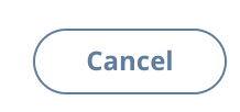
MbxSecondaryButton is the outlined version of the primary button:

screen shot 2018-07-27 at 12 09 16 pm

MbxDiscouragingButton is gray, but not too gray, and outlined:

screen shot 2018-07-27 at 12 07 05 pm

MbxTextButton looks like a bold link. Usually it includes an icon, and it can take on whatever text size its container is using.

screen shot 2018-07-27 at 12 12 11 pm

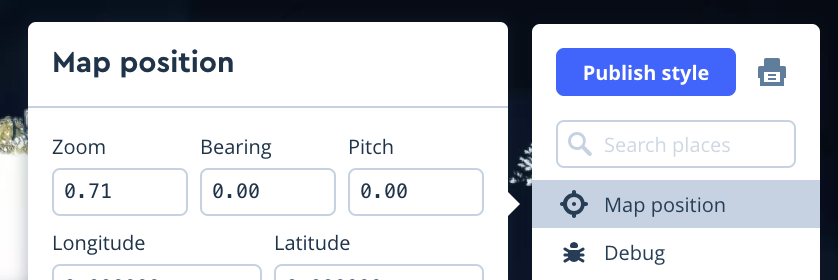
MbxAppButton is for denser apps like Studio's style editor. Borders are not fully rounded, text is usually smaller — though we could have two sizes, txt-xs and txt-s. The default color is gray instead of blue, so it's not hogging too much attention in a dense UI. (You'll be able to make it blue with an option).

screen shot 2018-07-27 at 11 16 53 am

screen shot 2018-07-27 at 11 16 56 am

MbxAppSecondaryButton is the same as MbxAppButton but outlined instead of filled.

More information for props with type enum, union, etc.

We can get more information out of these types (from react-docgen). We just need to put a little work into extracting it and rendering it legibly. That would save us from the need to type out details about, say, which strings are allowed for an enum type.

Error: `initialFocus` refers to no known node

Sentry Issue: DOCS-SUBDOMAIN-2DC

Error: `initialFocus` refers to no known node
  at getNodeForOption (./node_modules/focus-trap-react/node_modules/focus-trap/index.js:175:15)
  at getInitialFocusNode (./node_modules/focus-trap-react/node_modules/focus-trap/index.js:189:9)
  at apply (./node_modules/focus-trap-react/node_modules/focus-trap/index.js:143:16)
  at r (./node_modules/@sentry/browser/esm/helpers.js:74:23)

Change label proptypes to support elements

One common use case I've found is having a label that includes an icon or some semantic markup, like either of these:

<ControlText
  id='name'
  label={<span>Who are you? <em>(this will be displayed publicly)</em></span>}
  onChange={this.handleFormChange}
  value={this.state.name}
/>
<ControlText
  id='github'
  label={<span><FaGithubIcon />Github username</span>}
  onChange={this.handleFormChange}
  value={this.state.github}
/>

Under the hood, all the various Control elements use ControlLabel, which sets the label text here: https://github.com/mapbox/mr-ui/blob/master/src/components/control-label/control-label.js#L29

This code is still perfectly valid with the prop examples above, but because of the PropType that's set, it throws a warning in the console.

I'd propose we change it from text: PropTypes.string.isRequired to

text: React.PropTypes.oneOfType([
  React.PropTypes.string,
  React.PropTypes.element
]).isRequired

Optionally then it might make sense to rename text to something that more accurately describes the valid possibilities, though I'm unsure what specifically. Maybe just label?

Improve Prism integration with CodeSnippet

<CodeSnippet> is set up to use highlight.js for pretty syntax highlighting. HL.js is a pretty big library, even if you only import what you need, it can still be dozens of KB for a single language. In fact, in Studio, we're just using the parser for HTML, and it still added 100kb to our bundle.

I think we could get it looking just as good by using prism.js instead, which is a much smaller alternative.

GoForward and GoBack components

We have some unnecessary variation in links/buttons where the intention is to make you feel like you're going forward or back. This would be a super simple component, but probably worth standardizing.

In most places we use a right chevron after the text to indicate "Take me to the next thing". In some places we use a right arrow. I don't know of very many places where we have the "Take me back" action, but I think when we do we use an arrow. Sometimes the text is bold, sometimes it's not.

Here's what I propose:

  • We use a chevron for both forward and back, since that's the most widespread usage right now, suggesting that it's favored by the most people.
  • By default we bold the text so it looks & feels like a text button. I guess we could make it unboldable, too, with a prop.
  • Small and large sizes.

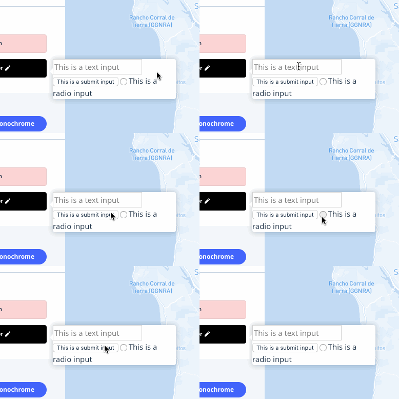
Popover within a modal disables input focus

In Studio, when a user chooses to customize a monochrome color style, we render the color picker in a popover that is the child of a modal. When this happens, the inputs (that are not buttons or type="submit" in the popover are not focusable.

Popover within a modal

modal-popover

Popover not within a modal

non-modal-popover

Ref https://github.com/mapbox/studio/issues/11636

Looking into this a bit, I'm guessing that focus-trap is what's preventing this construction from working as expected. Would love some input (pun intended) on whether this is likely the case, and if there are any strategies for disabling or white-listing a particular focus-trapped instance.

React 16: Popover Positioner does not attach to document root

With React 15, as one would expect, Popover Positioner attaches to the document. With React 16 (I tested React 16.4 and React 16.13), Popover positioner attaches to the element that spawned the popover.

React 15 (expected):
image

React 16 (uh oh):
image

Add style options to code snippet's `highlightElements`

The code snippet component's current default style works well for self-contained pages like the mapbox.com install pages:

image

However, the hightlight style is perhaps too subtle for some other use cases. For example, tutorials that need to demonstrate which lines have changes from step to step as the reader scrolls through a single, long page. For these types of use cases, it would be useful to expose an option for a "high contrast" mode or a prop for specifying CSS classes to be passed to [highlightElements](https://github.com/mapbox/mr-ui/blob/master/src/components/code-snippet/code-snippet.js#L284).

Replace componentWillReceiveProps in CopyButton

Similar to #91

Warning: componentWillReceiveProps has been renamed, and is not recommended for use. See https://fb.me/react-unsafe-component-lifecycles for details.

  • Move data fetching code or side effects to componentDidUpdate.
  • If you're updating state whenever props change, refactor your code to use memoization techniques or move it to static getDerivedStateFromProps. Learn more at: https://fb.me/react-derived-state
  • Rename componentWillReceiveProps to UNSAFE_componentWillReceiveProps to suppress this warning in non-strict mode. In React 17.x, only the UNSAFE_ name will work. To rename all deprecated lifecycles to their new names, you can run npx react-codemod rename-unsafe-lifecycles in your project source folder.

Please update the following components: CopyButton

NewTabLink component

This is a VERY minor wrapper component we use in Account Dashboard and other Accounts related web apps. It's helpful in remembering to add some extra attributes for creating a new tab link. This may find itself useful as it relates to #13 (comment).

<a target="_blank" rel="noopener" {...this.props}>
  {this.props.children}
</a>

Extend `theme*` props to accept functions that receive the default class list

Having experimented with a few different options, here's the outline of a styling pattern that I think could fit our purposes:

  • Opinionated defaults.
  • Standard variants are easy to implement, with either boolean or keyword props. The current MbxButton component illustrates this approach with the variant, size, and width props.
  • Non-standard variants are possible to implement, with theme* props. This is the pattern established by the bulk of existing components and has proven useful. The main problem with it is that it requires a lot of the user — so it makes sense for advanced users, but not for the average user. We should continue to use these but indicate in the docs that they are advanced props and most people should not need to use them.

One major annoyance with the theme* props is that you need to replace every class that you don't want to override. A common use case is to just append a class to the end of the list, but to do this you actually need to copy-paste the default class list and add your own to the end — and that's not very robust or cheery. So I'm thinking that instead of theme* props accepting only strings, they'll also accept functions that receive the default class list and return a modified one. Appending would be very easy, then.

cc @danswick

MbxTooltip component

I'm thinking the MbxTooltip can be pretty much the same as the regular tooltip but also incorporate some patterns that are used widely in Studio:

  • A dark variant. (Does anybody think this should be the default tooltip?)
    screen shot 2018-07-27 at 12 59 16 pm
  • A yellow variant ... It would be good to encourage people to use a tooltip to explain why things are disabled if they're disabled, and that's what this yellow variant is doing in Studio.
    screen shot 2018-07-27 at 12 59 58 pm
  • The only other difference I see between Studio's styling and the current defaults is that the Studio tooltip has wmax240. I'd be in favor of including that by default, with the option to disable it.

Greeting component

In the Account Dashboard we have a simple Greeting component that's used on the landing page. This component takes in a username prop. Right now it's not too special besides saying Welcome, {username}!, but we're hopeful that one day this greeting could be smarter by language, the time of day, season, special event, etc. Right now we only plan to use it as a heading on pages, but it could be one day placed in body text or styled to different heading sizes for pages, cards, or modals.

screen shot 2018-11-06 at 11 09 06 am

cc: @angel

Mapbox React Components migration gotchas doc

Studio has encountered some gotchas in migrating from Mapbox React Components to Mr-UI. It might be a nice thing to have a migration guide from MRC to Mr-UI. I'm not sure of how many teams are using MRC though, so if this guide would only really help the studio team, and we'd be writing it as we move through the migration, it might not really be worth the effort. What do y'all think?

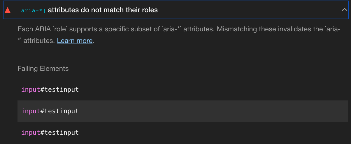
Replace `aria-required` with `required` in ControlRange

In another repository, the Lighthouse accessibility audit is failing on ControlRange due to:

[aria-*] attributes do not match their roles

I ran Lighthouse accessibility audit on the test cases /ControlRange and saw the same result:

image
image

Solution

Replace aria-required with required in the ControlRange.

From what I've learned, we can safely move to using required:

Note: HTML also specifies the required attribute which is supported well in user agents. Use aria-required for backwards compatibility only.
https://developer.mozilla.org/en-US/docs/Web/Accessibility/ARIA/ARIA_Techniques/Using_the_aria-required_attribute

Tagging @mapbox/studio as other known users of ControlRange, please let me know if you disagree with this suggested change.

shallowEqualObjects error in Icon component

It looks like when you pass a nested object to <Icon> as a prop, shallowEqualObjects throws an error if it is passed an object with wonky keys and the allowedObjectKeys flag is not set. This caused some issues when Studio was migrating to Mr UI, as there were a handful of instances where we were passing a nested object to MRC's Icon component, and we didn't catch all of them when migrating.

<Icon> worked great for us once we removed these instances, but maybe we should add a prop to components that use shallowEqualObject to allow users to configure it? Maybe documenting this change to aid folks in migrating to Mr-UI?

MbxUnderlineTabs component

The details of this component are surprisingly difficult to get completely right, so I was thinking it could be a good first candidate for the Mbx* line of more opinionated components.

I'm of aware of 3 current variants that were deliberately styled:

screen shot 2018-07-27 at 10 26 18 am

screen shot 2018-07-27 at 10 26 21 am

screen shot 2018-07-27 at 10 26 25 am

Some variations in those patterns:

  • Text size: txt-xs, txt-s, and regular.
  • Whether inactive items are dimmed or not.
  • Whether active items are bold or not.
  • Color of the active-item underline.
  • Distance between items (corresponds to text size).
  • Height (corresponds to text size).
  • Underline length — whether it exceeds the text by a couple of pixels or not.
  • Horizontal overflow: the page-shell subnav tabs scroll horizontally when they run out of space; the larger docs tabs grow a "More" button with a dropdown.
  • Hover state: only the small version in Studio has a hover state, darkening the dimmed text.

I'm leaning towards make the following choices (knowing that the Studio team is going to be best suited to maintaining their own variant):

  • Don't dim the inactive tabs, so there's no danger of it looking disabled.
  • Two sizes: small (current subnav) and large.
  • Bold active items.
  • Trim underline length to the text, so the component can be flush with the edge of its container.
  • Active underline matches text color.
  • Inactive items get blue text on hover (?).
  • Build in the ability to transform some or all of the items into a dropdown.

@maikyon @angel I know you both worked on design for the two variants outside of Studio. Any opinions on the above?

Popover improvement ideas

  • Add an option to render the tooltip in the same context as its trigger, instead of putting it into a React Portal (or React <16 equivalent). One place where this could prove handy is with popovers inside modals. It might avoid some of the weirder bugs that we try to avoid via design instead of technical changes (like when you have to add z-index to a modal to get it on top of other things but then its close-button tooltip shows up under the underlay).
  • In PopoverTrigger, if the tooltip is set to show on focus and not click it should not show up because you clicked, even though that puts focus on the trigger — and then should not stay visible until you click or Tab to move focus. I think we could figure out some elaborate state-tracking machinery to prevent this.
  • Default title styling, as in Studio:
    screen shot 2018-07-27 at 11 29 52 am
    Except with one change: sounds like @dasulit wants to add some padding on the side of the title's underline, so it doesn't extend all the way to the edge of the popover.

Review of recent changes

I'd love it if @samanpwbb and @mapbox/frontend-platform (and anybody else in @mapbox/frontend who is interested) could take a look at the HEAD section in the changelog and share any feedback you have about the new patterns. It would probably be helpful to look at the changelog then run the docs locally and check things out.

There's a little bit of general clean up, but most of the changes relate to more opinionated styling and more controlled style-modifying props. Most components that are not form components have been updated according to this plan. (Form components can come later.)

Here's a run-down of the patterns:

  • A variant prop can be used for keyword-based presets. In Button, the chosen variant ends up setting props that you can then override if you want to set those props directly.
  • color props expect an Assembly color name.
  • There a bunch of keyword styling props (e.g. "small" | "medium" | "large").
  • There are a few boolean styling props (e.g. block, overlapBorder).
  • passthroughProps is a convention for passing props directly to a DOM element.
  • CopyButton is the only component that includes a className prop for fully overriding the element's classes. If necessary, we could add a similar nuclear-option override to other components; but CopyButton seems like an exception because we have almost no consistency across our usage of it.
See the specific props related to the above patterns

Button:

  • variant
  • size
  • width
  • outline
  • color
  • corners
  • block
  • passthroughProps

Copiable:

  • truncated

CopyButton:

  • block
  • passthroughProps
  • className (full flexibility)

Heading:

  • variant

IconText:

  • spacing

Modal:

  • size
  • padding

Popover

  • coloring
  • padding
  • passthroughProps

PopoverTrigger

  • block
  • passthroughTriggerProps

Tooltip

  • coloring
  • textSize
  • maxWidth
  • padding
  • block

UnderlineTabs

  • size
  • overlapBorder
  • inactiveColor
  • activeColor
  • hoverColor
  • bold

Once we have consensus about these changes, we'll need to do some cross-browser testing, then we can release. There is no huge hurry on this; but it'd be a good idea to finish up these changes within the next few weeks so the repo doesn't stagnate and we're unable to release bug fixes.

Form component should have a disabled prop, which disables submission even with the Enter key

We recently had a bug where we disabled the FormSubmit component (using its disabled prop), but the Form could still be submitted with the Enter key. To avoid this situation, there should be a disabled prop on the Form component, which we could have set to true.

(In the meantime, the workaround is to do nothing in the handleFormData callback when the form should be disabled.)

SearchInput component

An input with the following details:

  • Full width by default.
  • Two sizes: small and large.
  • Text-colored search icon on the left.
  • Placeholder is required.
  • Optionally add a button to the right (flushed against the input) that says "Search".
  • Accepts both onChange and onSubmit props. onSubmit will be triggered if you hit the Enter key or click the "Search" button if you have it.

I know this will be a popular component for internal apps.

Badge component

The Account Dashboard has a very simple Badge component to label features as Beta or Coming soon. I propose we move this component here and be design opinionated on padding, coloring, and font size. It will take in a text prop and margins will be left up to a wrapper or sibling elements around it.

screen shot 2019-02-14 at 11 43 43 am

screen shot 2019-02-14 at 11 44 06 am

screen shot 2019-02-14 at 11 45 06 am

Would love feedback on use cases and color themes! cc: @angel @mapbox/docs @mapbox/studio

Dark theme for Modal

The color of the close icon is always blue, but sometimes I wish it could be white. Example:

image

A couple ideas come to mind:

  • Add a dark theme (example: theme='dark' which would set the close icon to color-white and the background of the modal to bg-dark-gray. But you could still customize by turning off the padding like in the example above.
  • Add option to change color of close icon - solve the root problem.

Opinions?

Alert component

For the Account Dashboard and other Accounts team related web apps, we have a localized Alert component that appears when there's a confirmation, warning, or error on modals and cards.

screen shot 2018-11-05 at 3 38 16 pm

screen shot 2018-11-05 at 3 42 55 pm

It can also be globalized with a wrapper that allows the user to close it early.

screen shot 2018-11-05 at 3 42 18 pm

Open to any discussion about this component!

cc: @angel

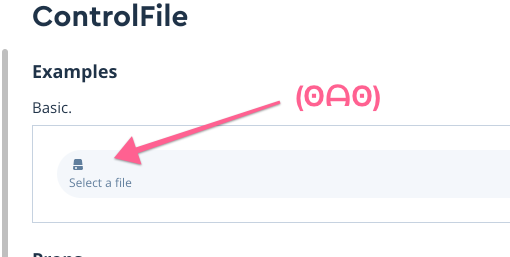
ControlFile icon takes up its own line

2018-09-07 at 11 55 am

It should look like this older example:

screen shot 2018-09-07 at 11 57 22 am

We'll also want to check the layout of the trash icon to delete a file you've already selected.

@otherwiseman is this something you'd be interested in fixing? I'll be out on vacation next week but would be happy to review a PR fixing it when I'm back, or @kepta or @danswick could.

MbxHeading component

MbxHeading will just style some text. The class list they apply will be short but valuable — with txt-fancy and some media-query-based sizing.

How about a variant property with primary, secondary, tertiary, and minor styles that correspond to these established patterns:

screen shot 2018-08-02 at 12 47 55 pm

Button component cannot match height of form controls

When you put a select next to a button, all the Button sizes add either too much padding or not enough so that the two elements do not line up:

Size Button
small image
medium image
large/default image
What I want
(just right 🐻)
image

To achieve the desired look we can use <button class="btn"/>.

Have we considered making the default <Button> component (without options) look like <button class="btn" />?

Card component

The Account Dashboard and Atlas Account Dashboard use a card to display an overview/preview of information that can lead to dedicated pages with more detailed information. This Card component should be a wrapper component with children props, can be with or without a header, and can be with or without an actionable icon button in the top right corner. In the past, we've used the actionable icon button to close/remove the card or to collapse the card in view.

screen shot 2018-11-05 at 3 59 59 pm

We're open to discussion about this component!

cc: @angel

Strategy for Form and its controls

To match our current patterns, we should have two standard sizes for all form elements: small (as in the dense style editor) and large (as everywhere else).

My impression is that Forms current validation system is working fine, so we should carry the same patterns into Mbx* components. Studio's style editor remains the only place where we want to use a different validation pattern.

However, I'd be fine with changing the default styling of validation to match @angel's suggestion a little while ago: turn the input's borders red, when possible, and just provide red text for the error message (without a red background & outline).

Scroll to first live chunk in code-snippets

Depending on the size of the code snippet, the first live (copyable) chunk may be out of view. It would be helpful to scroll to the first live chunk so the reader doesn't have to hunt for it.

Better styling for ControlToggleGroup component

Here are a few variations on the toggle group:

screen shot 2018-07-27 at 1 26 07 pm

screen shot 2018-07-27 at 1 26 25 pm

screen shot 2018-07-27 at 1 26 35 pm

screen shot 2018-07-27 at 1 26 44 pm

We've got to figure out a default. I don't have ideas right now. Will circle back to this; or if anybody wants to make some choices, go for it.

Recommend Projects

  • React photo React

    A declarative, efficient, and flexible JavaScript library for building user interfaces.

  • Vue.js photo Vue.js

    🖖 Vue.js is a progressive, incrementally-adoptable JavaScript framework for building UI on the web.

  • Typescript photo Typescript

    TypeScript is a superset of JavaScript that compiles to clean JavaScript output.

  • TensorFlow photo TensorFlow

    An Open Source Machine Learning Framework for Everyone

  • Django photo Django

    The Web framework for perfectionists with deadlines.

  • D3 photo D3

    Bring data to life with SVG, Canvas and HTML. 📊📈🎉

Recommend Topics

  • javascript

    JavaScript (JS) is a lightweight interpreted programming language with first-class functions.

  • web

    Some thing interesting about web. New door for the world.

  • server

    A server is a program made to process requests and deliver data to clients.

  • Machine learning

    Machine learning is a way of modeling and interpreting data that allows a piece of software to respond intelligently.

  • Game

    Some thing interesting about game, make everyone happy.

Recommend Org

  • Facebook photo Facebook

    We are working to build community through open source technology. NB: members must have two-factor auth.

  • Microsoft photo Microsoft

    Open source projects and samples from Microsoft.

  • Google photo Google

    Google ❤️ Open Source for everyone.

  • D3 photo D3

    Data-Driven Documents codes.