Coder Social home page Coder Social logo

casesandberg / react-color Goto Github PK

View Code? Open in Web Editor NEW
11.9K 82.0 900.0 5.81 MB

:art: Color Pickers from Sketch, Photoshop, Chrome, Github, Twitter & more

Home Page: http://casesandberg.github.io/react-color/

License: MIT License

JavaScript 100.00%
react react-component color-picker sketch photoshop chrome inline-styles

react-color's Introduction

Npm Version Build Status License Downloads

  • 13 Different Pickers - Sketch, Photoshop, Chrome and many more

  • Make Your Own - Use the building block components to make your own

Demo

Demo

Live Demo

Installation & Usage

npm install react-color --save

Include the Component

import React from 'react'
import { SketchPicker } from 'react-color'

class Component extends React.Component {

  render() {
    return <SketchPicker />
  }
}

You can import AlphaPicker BlockPicker ChromePicker CirclePicker CompactPicker GithubPicker HuePicker MaterialPicker PhotoshopPicker SketchPicker SliderPicker SwatchesPicker TwitterPicker respectively.

100% inline styles via ReactCSS

react-color's People

Contributors

acurry avatar akx avatar alampros avatar alexander-daniel avatar andarist avatar atfzls avatar casesandberg avatar elob avatar elvisvoer avatar envex avatar greenkeeperio-bot avatar islemaster avatar jaeh avatar jakobsandberg avatar jariztia avatar ldanet avatar leonfedotov avatar marcusmolchany avatar markogresak avatar mattbierner avatar mattliving avatar mfix22 avatar miikka avatar morozserge1st avatar pconerly avatar pradel avatar rahavlussato avatar ralf-strehle avatar scttcper avatar transcranial avatar

Stargazers

 avatar  avatar  avatar  avatar  avatar  avatar  avatar  avatar  avatar  avatar  avatar  avatar  avatar  avatar  avatar  avatar  avatar  avatar  avatar  avatar  avatar  avatar  avatar  avatar  avatar  avatar  avatar  avatar  avatar  avatar  avatar  avatar  avatar  avatar  avatar  avatar  avatar  avatar  avatar  avatar  avatar  avatar  avatar  avatar  avatar  avatar  avatar  avatar  avatar  avatar  avatar  avatar  avatar  avatar  avatar  avatar  avatar  avatar  avatar  avatar  avatar  avatar  avatar  avatar  avatar  avatar  avatar  avatar  avatar  avatar  avatar  avatar  avatar  avatar  avatar  avatar  avatar  avatar  avatar  avatar  avatar  avatar  avatar  avatar  avatar  avatar  avatar  avatar  avatar  avatar  avatar  avatar  avatar  avatar  avatar  avatar  avatar  avatar  avatar  avatar

Watchers

 avatar  avatar  avatar  avatar  avatar  avatar  avatar  avatar  avatar  avatar  avatar  avatar  avatar  avatar  avatar  avatar  avatar  avatar  avatar  avatar  avatar  avatar  avatar  avatar  avatar  avatar  avatar  avatar  avatar  avatar  avatar  avatar  avatar  avatar  avatar  avatar  avatar  avatar  avatar  avatar  avatar  avatar  avatar  avatar  avatar  avatar  avatar  avatar  avatar  avatar  avatar  avatar  avatar  avatar  avatar  avatar  avatar  avatar  avatar  avatar  avatar  avatar  avatar  avatar  avatar  avatar  avatar  avatar  avatar  avatar  avatar  avatar  avatar  avatar  avatar  avatar  avatar  avatar  avatar  avatar  avatar  avatar

react-color's Issues

EditableInput: Increment on Drag

The text input fields could be draggable, as with applications like After Effects.

  • On :hover, a east-west cursor is shown (north-south if more appropriate for the given layout).
  • On drag originating from the field, the value is modified by +/-1 at an interval that scales with the vector's magnitude. On account of typical input precision, the rate should be slow (1 per 500ms?) for a generous margin near the field (estimated: first 8-10px).
  • On mouseup, the timeout is cancelled so as to not increment after gesture ends.
  • It may be necessary to lock out text-selection until mouseup (or focus) inside the field. Many apps that support this have an edit state to resolve these conflicting interactions.

when color prop set cursor does not work

this code does not work

import React 'react';
import ReactColor from 'react-color';


class ColorPicker extends React.Component {

  constructor() {
    super();
    this.state = {
      value: '#fff'
    };

    this.handleChangeComplete = this.handleChangeComplete.bind(this);
  }

  handleChangeComplete(color) {
    this.setState({value: color.hex});
  }

  render() {
    return <ReactColor color={ this.state.value }
                       type="sketch"
                       onChangeComplete={ this.handleChangeComplete } />;
  }
}

export default ColorPicker;

SliderPicker Dynamic Brightness

When passing a hex value through the color prop on the 'slider' ColorPicker, the color value is set properly (from what I can tell) on the hue slider, but the 5 swatches themselves are all different.

My expectation would be that the center swatch is auto-selected with the exact color value passed to it, as those are generally used as the visual cue for 'This is the color that is selected'.

Not a bug so much as just unexpected output? :)

Tags/Versions

Hello,

Would you please be so kind to create tags or versions?
Ideally would be for react < 14 and react >= 14.

I have a large code base which I need to rewrite to be compatible with react >= 14 and would be great to hook up to a tag/version for react-color.

Thanks a lot

Updating to 1.2.0 throws error

Uncaught Error: Invariant Violation: ColorPicker.render(): A valid ReactComponent must be returned. You may have returned undefined, an array or some other invalid object.

incorrect red value shown in chrome picker when adjusting alpha

on the chrome picker (demo on http://casesandberg.github.io/react-color/#examples ), choose a colour by clicking on the gradient area. Ensure the hex value is shown, not RGBA or HSLA. Click into the hex display area so that the textbox has focus. Now drag the alpha slider - the view switches to RGBA but the R component shows the hex value and keeps the focus highlight border.

Tested on chrome canary (46.0.2485.0 canary (64-bit)) and webkit nightly (Version 8.0.8 (10600.8.9, r188509))

screenshot 2015-08-17 17 45 02

Color values do not populate

screenshot 2015-08-18 11 20 12

On my example, RGB and Hex codes do not populate by default, or when picking in the color picker.
Clicking on the value and then typing something will display the code.

I've tried this using chrome, sketch and compact examples.

Cannot resolve module 'react-material-design'

First, thanks for the module! When I require react-color into one of my components and run webpack I get the following error:

ERROR in ./~/react-color/src/components/swatches/Swatches.jsx
Module not found: Error: Cannot resolve module 'react-material-design' in /Users/asaldivar/fuisz/studio/node_modules/react-color/src/components/swatches
 @ ./~/react-color/src/components/swatches/Swatches.jsx 16:15-47

ERROR in ./~/react-color/src/components/material/Material.jsx
Module not found: Error: Cannot resolve module 'react-material-design' in /Users/asaldivar/fuisz/studio/node_modules/react-color/src/components/material
 @ ./~/react-color/src/components/material/Material.jsx 15:15-47

ERROR in ./~/react-color/src/components/compact/Compact.jsx
Module not found: Error: Cannot resolve module 'react-material-design' in /Users/asaldivar/fuisz/studio/node_modules/react-color/src/components/compact
 @ ./~/react-color/src/components/compact/Compact.jsx 17:15-47

I could not find a react-material-design module. Would you please point me in the right direction?

Build fails on case sensitive file systems

The current npm version 1.0.6 fails on case sensitive file systems because Color.jsxrequires var Sketch = require('./sketch/Sketch'); but the path is actually ./Sketch/Sketch.

It is fixed in master so this is actually just a reminder to put it out there :)

Otherwise awesome component!

cannot bundle with webpack since 1.3.1

Hi I can't use your module since the 1.3.1 version. I get this error with the latest version which is 1.3.3.

It appear to be since the migration to Babel 6.0 here 0d1c7d2.

ERROR in ./~/react-color/modules/react-material-design/lib/components/Tabs.js
Module not found: Error: Cannot resolve module 'lodash/lang/isString' in /home/kontest/workspace/game-livebuilder/node_modules/react-color/modules/react-material-design/lib/components
 @ ./~/react-color/modules/react-material-design/lib/components/Tabs.js 11:16-47

ERROR in ./~/react-color/modules/react-material-design/lib/components/Link.js
Module not found: Error: Cannot resolve module 'lodash/lang/isString' in /home/kontest/workspace/game-livebuilder/node_modules/react-color/modules/react-material-design/lib/components
 @ ./~/react-color/modules/react-material-design/lib/components/Link.js 9:16-47

Maybe you should also tag on github that's way it will be easier to track versions :)

bundle.js includes react

The bundle includes React. You should add React and ReactDOM to webpack externals so that they are not included

npm in dependencies?

First of all: Thank you for this project, keep up the good work!

In the package.json there is npm2 listed as a dependency.

Is this required?
Does react-color work with npm3?

I use npm3 for most of my projects and then with react-color I get errors because of this dependency.

Unexpected Reserved word

ERROR in .//react-color/src/components/Color.jsx
Module parse failed: S:\GitHub\MyFlock\node_modules\react-color\src\components\Color.jsx Line 35: >Unexpected reserved word
You may need an appropriate loader to handle this file type.
| };
|
| class ColorPicker extends ReactCSS.Component {
|
| constructor(props) {
@ ./
/react-color/src/index.js 2:17-50

All I did was install and place the component as
<ColorPicker type="slider" />

On react 0.13.3

More props for "swatches" picker

Hi, it would be great to have more opportunities to customize "swatches" (box size, now its set to 320x240, or override all styles like positionCss)

For other types It could be useful to hide some elements of a component (keep hex block in "Material" and hide rgb block)

ColorPicker Not displaying even though this.state.displayColorPicker = true after onClick={handleClick}

As per title. I'm probably missing something, but definitely in need of a second opinion! Cheers!

var React = require('react');
var classNames = require('classnames');
var ColorPicker = require('react-color');

// http://casesandberg.github.io/react-color/
module.exports = ColourPickerComponent = React.createClass({

    getInitialState: function(){
        return {
            displayColorPicker: false
        }
    },

    handleClick: function( event ) {
        console.log('clicked');
        this.setState({ displayColorPicker: !this.state.displayColorPicker });
    },

    render: function (){

        var btnClass = classNames({
            'inline': true,
            'colour-picker': true
        });

        return <div>
                <button className="mdl-button mdl-js-button mdl-js-ripple-effect edit-button" onClick={this.handleClick}>
                    <div className={btnClass}>
                        <i className="material-icons">colorize</i>
                    </div>
                </button>
                <ColorPicker type="chrome" display={ this.state.displayColorPicker }/>
        </div>
    }

});

Have also tried the example, which gives me the same results:

'use strict';

var React = require('react');
var classNames = require('classnames');
var ColorPicker = require('react-color');  // http://casesandberg.github.io/react-color/

class ColourPickerComponent extends React.Component {

    constructor() {
        super();
        this.state = {
            displayColorPicker: true
        };
        this.handleClick = this.handleClick.bind(this);
    }

    handleClick() {
        console.log('clicked');
        this.setState({ displayColorPicker: !this.state.displayColorPicker });
    }

    render() {

        var btnClass = classNames({
            'inline': true,
            'colour-picker': true
        });

        return (
            <div>
                <button className="mdl-button mdl-js-button mdl-js-ripple-effect edit-button" onClick={this.handleClick}>
                    <div className={btnClass}>
                        <i className="material-icons">colorize</i>
                    </div>
                </button>
                <ColorPicker type="chrome" display={ this.state.displayColorPicker }/>
            </div>
        );
    }
}

module.exports = ColourPickerComponent;

Using RGB values w/ no hue breaks saturation picker.

Passing in a value like {r: 100, g:100, b:100} Will not allow you to use the saturation input to select colors. Because oldHue starts as undefined, and the if statement in helpers/color.js sets the hue to that undefined value:

  toState: function toState(data, oldHue) {
    var color = tinycolor(data);
    var hsl = color.toHsl();
    var hsv = color.toHsv();

    if (hsl.s === 0) {
      hsl.h = oldHue;
      hsv.h = oldHue;
  }

    return {
      hsl: hsl,
      hex: color.toHex(),
      rgb: color.toRgb(),
      hsv: hsv,
      oldHue: data.h || oldHue || hsl.h
    };
  }

Letters in Number Fields

Changing an integer value to "g" in the R field of "Sketch" breaks ALL widgets with the only apparent way of fixing is clicking a swatch or entering a valid hex where available. Clicking Up or Down arrows in 'Chrome' does not fix. Clicking in color areas of 'Chrome', 'Sketch', or 'Photoshop' does not fix. Inputting Valid RGB values into any field does not fix but reverts to NAN.

https://news.ycombinator.com/reply?id=10074509&goto=item%3Fid%3D10072834

Implementing custom pickers

Hey, first of all this is a superb react component.

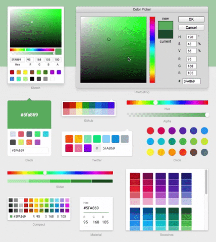
While trying to implement a custom picker, I noticed it only seemed to display the 'sketch' picker, so I had a look in the source in the render function I found this:

 var Picker: any;
    if (this.props.type === 'sketch') {
      Picker = Sketch;
    } else if (this.props.type === 'photoshop') {
      Picker = Photoshop;
    } else if (this.props.type === 'chrome') {
      Picker = Chrome;
    } else if (this.props.type === 'swatches') {
      Picker = Swatches;
    } else if (this.props.type === 'slider') {
      Picker = Slider;
    } else if (this.props.type === 'material') {
      Picker = Material;
    } else if (this.props.type === 'compact') {
      Picker = Compact;
    }

With nothing to deal with a custom Picker as suggested in the docs
But by adding this, for example, it works just fine:

    var Picker: any;
    if(this.props.custom) {
      Picker = this.props.custom
    } else if (this.props.type === 'sketch') {
    ...

Am I missing something here?
Would really love to get this working without having to touch the node module.

For reference here's my custom picker:

import React from 'react'
import ReactCSS, { Component } from 'react-color/node_modules/reactcss'
import { Alpha, Checkboard, EditableInput, Hue, Saturation } from 'react-color/lib/components/common'
import color from 'react-color/lib/helpers/color'

export default class ReactColorPreset extends Component {

    classes() {
        return {
            'default': {
                picker: {
                    width: '200px',
                    padding: '10px 10px 0',
                    boxSizing: 'initial',
                    background: '#fff',
                    borderRadius: '4px',
                    boxShadow: '0 0 0 1px rgba(0,0,0,.15), 0 8px 16px rgba(0,0,0,.15)',
                },
                saturation: {
                    width: '100%',
                    paddingBottom: '75%',
                    position: 'relative',
                    overflow: 'hidden',
                },
                Saturation: {
                    radius: '3px',
                    shadow: 'inset 0 0 0 1px rgba(0,0,0,.15), inset 0 0 4px rgba(0,0,0,.25)',
                },
                controls: {
                    display: 'flex',
                },
                sliders: {
                    padding: '4px 0',
                    flex: '1',
                },
                color: {
                    width: '24px',
                    height: '24px',
                    position: 'relative',
                    marginTop: '4px',
                    marginLeft: '4px',
                    borderRadius: '3px',
                },
                activeColor: {
                    Absolute: '0 0 0 0',
                    borderRadius: '2px',
                    background: 'rgba(' + this.props.rgb.r + ', ' + this.props.rgb.g + ', ' + this.props.rgb.b + ', ' + this.props.rgb.a + ')',
                    boxShadow: 'inset 0 0 0 1px rgba(0,0,0,.15), inset 0 0 4px rgba(0,0,0,.25)',
                    zIndex: '2',
                },
                hue: {
                    position: 'relative',
                    height: '10px',
                    overflow: 'hidden',
                },
                Hue: {
                    radius: '2px',
                    shadow: 'inset 0 0 0 1px rgba(0,0,0,.15), inset 0 0 4px rgba(0,0,0,.25)',
                },
                alpha: {
                    position: 'relative',
                    height: '10px',
                    marginTop: '4px',
                    overflow: 'hidden',
                },
                Alpha: {
                    radius: '2px',
                    shadow: 'inset 0 0 0 1px rgba(0,0,0,.15), inset 0 0 4px rgba(0,0,0,.25)',
                },

                fields: {
                    display: 'flex',
                    paddingTop: '4px',
                },
                single: {
                    flex: '1',
                    paddingLeft: '6px',
                },
                double: {
                    flex: '2',
                },
                Input: {
                    style: {
                        input: {
                            width: '80%',
                            padding: '4px 10% 3px',
                            border: 'none',
                            boxShadow: 'inset 0 0 0 1px #ccc',
                            fontSize: '11px',
                        },
                        label: {
                            display: 'block',
                            textAlign: 'center',
                            fontSize: '11px',
                            color: '#222',
                            paddingTop: '3px',
                            paddingBottom: '4px',
                            textTransform: 'capitalize',
                        },
                    },
                },
            },
        };
    }

    handleChange(data) {
        this.props.onChange(data);
    }

    handleInputChange(data) {
        if (data.hex) {
            color.isValidHex(data.hex) && this.props.onChange(data.hex);
        } else if (data.r || data.g || data.b) {
            this.props.onChange({
                r: data.r || this.props.rgb.r,
                g: data.g || this.props.rgb.g,
                b: data.b || this.props.rgb.b,
                a: this.props.rgb.a,
            });
        } else if (data.a) {
            if (data.a < 0) {
                data.a = 0;
            } else if (data.a > 100) {
                data.a = 100;
            }

            data.a = data.a / 100;
            this.props.onChange({
                h: this.props.hsl.h,
                s: this.props.hsl.s,
                l: this.props.hsl.l,
                a: data.a,
            });
        }
    }

    render() {
        return (
            <div is="picker">
                <div is="saturation">
                    <Saturation is="Saturation" {...this.props} onChange={ ::this.handleChange }/>
                </div>
                <div is="controls" className="flexbox-fix">
                    <div is="sliders">
                        <div is="hue">
                            <Hue is="Hue" {...this.props} onChange={ ::this.handleChange } />
                        </div>
                    </div>
                    <div is="color">
                        <div is="activeColor"/>
                        <Checkboard />
                    </div>
                </div>
                <div is="fields">
                    <div is="fields" className="flexbox-fix">
                        <div is="double">
                            <EditableInput is="Input" label="hex" value={ this.props.hex.replace('#', '') } onChange={ ::this.handleInputChange }/>
                        </div>
                        <div is="single">
                            <EditableInput is="Input" label="r" value={ this.props.rgb.r } onChange={ ::this.handleInputChange } dragLabel="true" dragMax="255"/>
                        </div>
                        <div is="single">
                            <EditableInput is="Input" label="g" value={ this.props.rgb.g } onChange={ ::this.handleInputChange } dragLabel="true" dragMax="255"/>
                        </div>
                        <div is="single">
                            <EditableInput is="Input" label="b" value={ this.props.rgb.b } onChange={ ::this.handleInputChange } dragLabel="true" dragMax="255"/>
                        </div>
                    </div>
                </div>
            </div>
        );
    }
}

Suggestions on improving rendering perf

Hi! As I pointed out on Twitter: “moving picker point doesn't feel smooth”, I would like to share with you some findings (sorry, I have no time to prepare a PR).

  1. A huge perf loss is here. That code means that on every mouse move it does query the DOM for some layout info, which is expensive operation. It's possible to reduce the frequency of that operations by caching those values within componentDidMount call and assigning the function which will update those props on container element resize (if it's resizeable of course) and window scroll, since these are cases when that props can change.
  2. Moving the picker can be done with CSS Transforms, rather than top/left props. In addition to this will-change: transform; CSS rule can be added to let browser know and thus optimize frequently changing transform prop on that element.
  3. Not actually related, but I didn't notice a single shouldComponentUpdate check :)

Here's a short clip with the resulting perf I got after applying all of the suggestions from above: see. I know the picker is out of position :)

Bower support

Do you plan to have bower package?
Some client side developers (me included) doesn't use NPM but bower. Hope this good library is also in Bower package 😄

ColorWrap: ARGB Support

Hi there,
Thank you for a great component!

I was wondering if you're planning to add ARGB support.

webpack build failed

ERROR in ./src/components/sketch/Sketch.jsx
Module not found: Error: Cannot resolve 'file' or 'directory' ./SketchFields in /home/na/Desktop/react-color/src/components/sketch
 @ ./src/components/sketch/Sketch.jsx 23:19-44

ERROR in ./src/components/sketch/Sketch.jsx
Module not found: Error: Cannot resolve 'file' or 'directory' ./SketchPresetColors in /home/na/Desktop/react-color/src/components/sketch
 @ ./src/components/sketch/Sketch.jsx 24:25-56

ColorPicker Slider issue

Hi,

first of all, nice plugin :)

I have an issue with the Slider ColorPicker though, :

import React, {Component, PropTypes} from 'react'
import ColorPicker from 'react-color'

export default class MyClass extends React.Component
{
    render() {
        return (
                <ColorPicker type="slider" />
        )
    }
}

React.render(
  <MyClass/>,
  document.getElementById('react-root')
);

And i get the following error on the drag and drop:
"Uncaught TypeError: container.getBoundingClientRect is not a function" on the handleChange function.

Do you have any fix for this, or did i do something wrong ?

Thanks !

1.3.3 breaks everything browserify-related

You used to be able to do:

var ColorPicker = require('react-color');

as in the Readme

Now you have to do:

var ColorPicker = require('react-color').ColorPicker;

Since exports.default is not supported.

Could you perhaps bump to version 2.0 since it has significant changes to usage for browserify at least?

Allow passing in width for "Sketch"

First off, great component!

It seems the "Sketch" will support widths other than 200px so it would be great if there was a prop to pass that down. That, or some docs on how to pass down that with ReactCSS (not sure that is possible as I'm not familiar with that project).

Thanks!

Click outside the component

Hi,

does clicking outsite (parent div) of the color picker change the display property? I'm experiencing this behaviour and I don't know why.

Importing only one type of picker at once

Feature request: it would make this amazing library even more amazing if the components were provided individually. As it is, I have to bundle ~200KB of libraries even though I only end up using a fraction of them. (Or if this is already possible and I'm just not smart enough to find out how to do that, please help!)

In any case, thanks a million for a wonderfully useful tool!

Wrong case of Sketch directory causes building error

Hi,

First, thanks for you work on this component.

Running locally on my mac the build of the module is ok but on a linux environnement, npm can't find the Sketch file in the "sketch" directory because of case sensitivity.

The directory /lib/components/Sketch should be renamed to /lib/components/sketch

Thanks!

NaN on selecting color can't select color

constructor() {
  super(
    this.state = {
    color: '#333'
  }
  this.onChange = color => {
    console.log(color)
    this.setState({ color: '#' + color.hex })
  }
}

render() {
  return (
    <div className="demo">
      <ColorPicker color={this.state.color} type="chrome" onChangeComplete={this.onChange}/>
    </div>
  )
}

When I click on the color picker I get the following value logged from onChange:

{
  "hsl": {
    "h": null,
    "s": null,
    "l": null,
    "a": 1
  },
  "hex": "00NaNNaN",
  "rgb": {
    "r": 0,
    "g": null,
    "b": null,
    "a": 1
  },
  "hsv": {
    "h": null,
    "s": null,
    "v": null,
    "a": 1
  },
  "oldHue": null
}

React 0.14

Is anybody already using react-color together with react 0.14.0-beta1?

From my experience porting other projects mostly removing getDOMNode() and findDOMNode() is enough to make it work.

-    var container = React.findDOMNode(this.refs.container);
+    var container = this.refs.container;

1.3.4 is borked with Browserify

I've made sure I got the 1.3.4 version with the reverted export fix.

Just doing a simple
const ColorPicker = require('react-color');

and my usual

<ColorPicker type="compact"/>

Which has been working for months.

Chrome is now spitting out:

Warning: React.createElement: type should not be null, undefined, boolean, or number. It should be a string (for DOM elements) or a ReactClass (for composite components).

Uncaught Invariant Violation: Element type is invalid: expected a string (for built-in components) or a class/function (for composite components) but got: object.

Picker does not close

I am not able to close the pickers I open by clicking outside the picker element.

This is because I have put the picker in a component which has transform applied to an ancestor. Therefore, the cover element in Picker, which has a position: fixed actually starts behaving like a position: absolute element (transforms change the container element of fixed-pos elements)

screenshot 43

Cannot find module './sketch/Sketch'

When building my component using browserify it fails to resolve the sketch/Sketch module.

The problem seems to be this lowercase path:

var Sketch = require('./sketch/Sketch');

https://github.com/casesandberg/react-color/blob/master/src/components/Color.jsx#L10

in src/components there are two sketch folders. One lowercase and the other one is uppercase. In lib/components there is only the uppercase folder.

Changing the require statement from above to uppercase...

var Sketch = require('./Sketch/Sketch');

... fixes the problem.

PresetColors in Component API

Hi,

There's a situation in my project, I need to use my own preset colors in the sketch color picker.

Do you have any plan to add the resetColors to the Component API ?

Some of the swatch columns have varying hue

In most of the swatch columns, all of the colors have the same exact hue. But in a few (for example the top left one), some of the colors (e.g. the middle one) have a different hue and look noticeably off. Was this intentional? Just wanted to check

Error Parsing file when trying to use react-color

When including react-color in my project and trying to compile, I get the following:

Error: Parsing file /Users/mattvv/Documents/projects/xxx/node_modules/react-color/src/components/Color.jsx: Unexpected token (177:6)

I'm using react 0.13.3 and react-color 1.0.0 is there any other dependencies I may be missing?

display prop causes: left 100%

I'm rendering a sample component in the react-color repo and after toggling the display on, i do not see the color picker as left:100% is there. This puts the picker off screen. Am I not using this correctly?

'use strict';

const { React, Base } = require('./base');
const ColorPicker = require('react-color');

module.exports = class Button extends Base {

  constructor() {
    super();
    this.state = {
      displayColorPicker: false,
    };
    this.handleClick = this.handleClick.bind(this);
    this.handleClose = this.handleClose.bind(this);
  }

  handleClick() {
    this.setState({ displayColorPicker: !this.state.displayColorPicker });
  }

  handleClose() {
    this.setState({ displayColorPicker: false });
  }

  render() {

    var style = {
      height: '100%'
    };

    return (
      <div style={style}>
        <button onClick={ this.handleClick }>Pick Color</button>
        <ColorPicker display={ this.state.displayColorPicker } onClose={ this.handleClose } type="sketch" />
      </div>
    );
  }
};


Recommend Projects

  • React photo React

    A declarative, efficient, and flexible JavaScript library for building user interfaces.

  • Vue.js photo Vue.js

    🖖 Vue.js is a progressive, incrementally-adoptable JavaScript framework for building UI on the web.

  • Typescript photo Typescript

    TypeScript is a superset of JavaScript that compiles to clean JavaScript output.

  • TensorFlow photo TensorFlow

    An Open Source Machine Learning Framework for Everyone

  • Django photo Django

    The Web framework for perfectionists with deadlines.

  • D3 photo D3

    Bring data to life with SVG, Canvas and HTML. 📊📈🎉

Recommend Topics

  • javascript

    JavaScript (JS) is a lightweight interpreted programming language with first-class functions.

  • web

    Some thing interesting about web. New door for the world.

  • server

    A server is a program made to process requests and deliver data to clients.

  • Machine learning

    Machine learning is a way of modeling and interpreting data that allows a piece of software to respond intelligently.

  • Game

    Some thing interesting about game, make everyone happy.

Recommend Org

  • Facebook photo Facebook

    We are working to build community through open source technology. NB: members must have two-factor auth.

  • Microsoft photo Microsoft

    Open source projects and samples from Microsoft.

  • Google photo Google

    Google ❤️ Open Source for everyone.

  • D3 photo D3

    Data-Driven Documents codes.