如果觉得对你帮助,记得打赏哦。

你想知道的 CSS 奇技淫巧,在这里,都有。
本系列围绕 CSS 展开,谈一些有趣的话题,内容天马行空,想到什么说什么,不仅是为了拓宽解决问题的思路,更涉及一些容易忽视或是十分有趣的 CSS 细节。
所有文章都在 Issues 中,同步更新到我的个人博客,也可以点击下面链接进行跳转。
本 CSS 系列同步更新在我的博客:
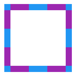
如何实现下列这种多列均匀布局:

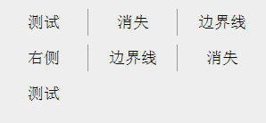
看看下图,常见于一些导航栏中,要求每行中最后一列的右边框消失,如何在所有浏览器中最便捷最优雅的实现?
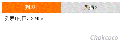
不用 Javascript,使用纯 CSS 方案,实现类似下图的导航栏 Tab 切换:
规定下面的布局,实现多列等高布局,要求两列背景色等高。
<div class="container">
    <div class="left">多列等高布局左</div>
    <div class="right">多列等高布局右</div>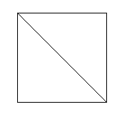
</div>10、巧妙的实现 CSS 斜线
使用单个标签,如何实现下图所示的斜线效果:
12、结构性伪类选择器
如何实现下述的背景色渐变动画?


 React
React
 Typescript
 Django
 Laravel
 Facebook
 Microsoft
 Google
 Alibaba
 D3
D3
 Tencent