Review/Cold calling:
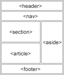
- HTML5 elements (header, nav, section, article, aside, footer, etc.) and attributes (src, alt, width, id, class, etc.)
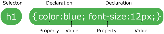
- Anatomy of a css rule
- Specificity

- Box model
- Box-sizing: border-box

- Pseudo class (:hover, ;focus, :active, :first-child, :nth-child(), etc) "...specifies a special state of the element to be selected"
- Pseudo elements (::after, ::before, ::first-letter, ::fitrst-line, etc) "...allow you to style certain parts of a document"
- Floats and clear, are they good to use for layouts?
- Other ways to position? Run through the ten steps of absolute and relative positioning
- Visibility:hidden vs display:none
- Flex box playground
Discuss normalize vs reset and an example
Discuss what they are, some of the common ones, how to use, etc. Example:
@media (max-width: 600px) {
  .facet_sidebar {
    display: none;
  }
}
11am - 12:30pm Exercise: Medium clone
####You need to create a layout for a blog site that your company uses. There are essentially three content areas: the header (with logo), the post content (left column), the “Also read” posts (right column), and the footer. ###Expected Outcomes
- A github repo for each student called medium
- An external CSS page (no inline styles!)
- Use assets/content from the page (if you copy code, you aren’t learning)
- Page should look almost exactly like current medium page (https://medium.com/react-tutorials/react-components-828c397e3dc8)
- A basic media query should be used to make the columns collapse when the viewport width is less than 600px


 React
React
 Typescript
 Django
 Laravel
 Facebook
 Microsoft
 Google
 Alibaba
 D3
D3
 Tencent