Coder Social home page Coder Social logo

ui-schema / ui-schema Goto Github PK

View Code? Open in Web Editor NEW
278.0 5.0 28.0 18.24 MB

Use JSON-Schema with React, generate Forms + UIs with any design system, easy creation of complex custom widgets.

Home Page: https://ui-schema.bemit.codes

License: MIT License

JavaScript 40.86% HTML 0.67% Shell 0.08% CSS 0.27% TypeScript 58.12%
ui-schema json-schema form-generator ui-generator react widget form-builder material-ui material mui

ui-schema's Introduction

UI Schema Logo

UI Schema for React

JSON Schema form + UI generator for any design system, first-class support for Material UI React, easily create own widgets and plugins.

Develop your next React app faster, with less code duplications - and without wasting time to implement validations.

Github actions Build react compatibility MIT license PRs Welcome Coverage Status Typed

  • @ui-schema/ui-schema npm (scoped)

  • @ui-schema/ds-material npm (scoped)

  • @ui-schema/ds-bootstrap npm (scoped)

  • @ui-schema/pro npm (scoped)

  • @ui-schema/dictionary npm (scoped)

  • Additional Material-UI Widgets:

    • Date-Time Picker: @ui-schema/material-pickers npm (scoped) Component Documentation
    • Codemirror as Material Input: @ui-schema/material-code npm (scoped) Component Documentation repo
    • react-color picker: @ui-schema/material-color npm (scoped) Component Documentation repo
    • react-colorful picker: @ui-schema/material-colorful npm (scoped) Component Documentation repo
    • ๐Ÿšง Drag 'n Drop with react-dnd: @ui-schema/material-dnd npm (scoped) Component Documentation
    • ๐Ÿšง EditorJS as Material TextField: @ui-schema/material-editorjs npm (scoped) Component Documentation
    • ๐Ÿšง SlateJS as Material TextField: @ui-schema/material-slate npm (scoped) Component Documentation
  • Additional Packages, not only for UI Schema:

    • ๐Ÿšง CodeMirror v6 kit: @ui-schema/kit-codemirror npm (scoped) Component Documentation repo
    • ๐Ÿšง Drag 'n Drop kit: @ui-schema/kit-dnd npm (scoped) Component Documentation

Documentation

Quick-Start

Schema Examples + Live Editor

Get Help on Slack

๐Ÿš€ Demo: UI Schema + Material Design + Create React App: Demo Source

Run on CodeSandbox

Run on StackBlitz

Fullscreen Demo


Schema

Use JSON Schema to validate data and automatically create UIs with it - UI-Schema makes it easy to write widgets based on schema structures, use custom UI keywords to make it look great!

Schema Documentation

Features

  • add any design-system or custom widget
    • easily create isolated and atomic widgets, with autowired data and validations
    • customize design system behaviour with e.g. widget compositions
    • easy binding of own design systems and custom widgets
    • easily add advanced features like read-or-write mode
  • auto-rendering by data & schema or full-custom forms with autowired widgets
  • flexible translation of widgets
  • modular, extensible and slim core
    • add own plugins
    • add own validators
    • add own base renderers
    • add own widget matchers & render strategies
    • use what you need
  • performance optimized, only updates HTML which must re-render, perfect for big schemas
  • code-splitting, with custom widget mappings / lazy-loading widgets
  • includes helper functions for store and immutable handling
  • easy nesting for custom object/array widgets with PluginStack
  • validate hidden/auto-generated values, virtualize schema levels (hidden keyword)
  • handle store update from anywhere and however you want
  • extensive documentations of core, widgets
  • typed components and definitions for JSON Schema and UI Schema
  • complex conditionals schemas
  • loading / referencing schemas by URL, connect any API or e.g. babel dynamic loading instead
  • definitions and JSON-Pointer references in schemas
  • JSON Schema extension: UI Schema, change design and even behaviour of widgets
  • JSON Schema versions supported: Draft 2019-09 / Draft-08, Draft-07, Draft-06, Draft-04

๐Ÿ”ฅ Professional service & support available, reach out now!

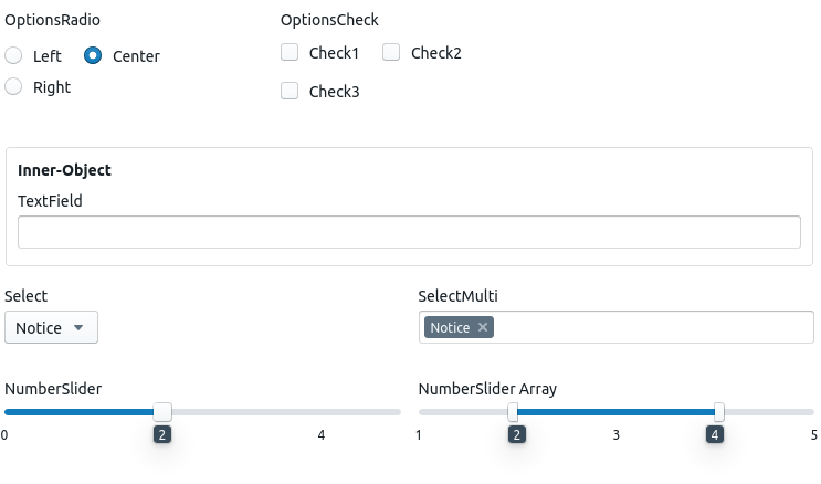
Design-System and Widgets Overview

Versions

This project adheres to semver, until 1.0.0 and beginning with 0.1.0: all 0.x.0 releases are like MAJOR releases and all 0.0.x like MINOR or PATCH, modules below 0.1.0 should be considered experimental.

Get the latest version - or help build it:

Example UI Schema

First time? Take the quick-start or take a look into the MUI demo repos: create-react-app & JS (simple) or create-react-app & Typescript (advanced).

Example setup of a renderer, followed by a simple text widget.

Instead of using UIRootRenderer it's also possible to use full custom rendering with e.g. ObjectGroup.

import React from 'react';

// Import Schema UI Provider and Render engine
import {isInvalid} from '@ui-schema/ui-schema/ValidityReporter';
import {createOrderedMap} from '@ui-schema/ui-schema/Utils/createMap';
import {UIStoreProvider, createStore} from '@ui-schema/ui-schema/UIStore';
import {storeUpdater} from '@ui-schema/ui-schema/storeUpdater';
import {UIMetaProvider, useUIMeta} from '@ui-schema/ui-schema/UIMeta';
// new in `0.4.0-alpha.1`:
// import {injectPluginStack} from '@ui-schema/ui-schema/applyPluginStack';
// deprecated since `0.4.0-alpha.1`:
import {UIRootRenderer} from '@ui-schema/ui-schema/UIRootRenderer';
// basic in-schema translator / `t` keyword support
import {relTranslator} from '@ui-schema/ui-schema/Translate/relT';
// Get the widgets binding for your design-system
import {widgets} from '@ui-schema/ds-material/widgetsBinding';
// new in `0.4.0-alpha.1`:
// import {GridContainer} from '@ui-schema/ds-material/GridContainer';

// could be fetched from some API or bundled with the app
const schemaBase = {
    type: 'object',
    properties: {
        country: {
            type: 'string',
            widget: 'Select',
            enum: [
                'usa',
                'canada',
                'eu'
            ],
            default: 'eu',
            tt: 'upper'
        },
        name: {
            type: 'string',
            maxLength: 20,
        }
    },
    required: [
        'country',
        'name',
    ],
};

// or fetch from API
const data = {};

// for `>=0.4.0-alpha.1`:
// const GridStack = injectPluginStack(GridContainer)

export const DemoForm = () => {
    // optional state for display errors/validity
    const [showValidity, setShowValidity] = React.useState(false);

    // needed variables and setters for the render engine, create wherever you like
    const [store, setStore] = React.useState(() => createStore(createOrderedMap(data)));
    const [schema/*, setSchema*/] = React.useState(() => createOrderedMap(schemaBase));

    // `useUIMeta` can be used safely, without performance impact (`useUI` has a performance impact)
    const {widgets, t} = useUIMeta()

    const onChange = React.useCallback((actions) => {
        setStore(storeUpdater(actions))
    }, [setStore])

    return <>
        <UIStoreProvider
            store={store}
            onChange={onChange}
            showValidity={showValidity}
        >
            {/*
              * for `>=0.4.0-alpha.1`:
              */}
            {/*<GridStack isRoot schema={schema}/>*}

            {/*
              * deprecated since `0.4.0-alpha.1`:
              */}
            <UIRootRenderer schema={schema}/>
        </UIStoreProvider>

        <button
            /* show the validity only at submit (or pass `true` to `showValidity`) */
            onClick={() =>
                isInvalid(store.getValidity()) ?
                    setShowValidity(true) :
                    console.log('doingSomeAction:', store.valuesToJS())
            }
        >send!
        </button>
    </>
};

export default function App() {
    return <UIMetaProvider
        widgets={widgets}
        t={relTranslator}
        // never pass down functions like this - always use e.g. `React.useCallback`, check performance docs for more
        //t={(text, context, schema) => {/* add translations */}}
    >
        {/*
          * somewhere in `YourRouterAndStuff` are your custom forms,
          * it's possible to nest `UIMetaProvider` if you need to have different widgets,
          * e.g. depending on some lazy loaded component tree
          */}
        <YourRouterAndStuff/>
    </UIMetaProvider>
}

Example Simple Text Widget

Easily create new widgets, this is all for a simple text (type=string) widget:

import React from 'react';
import { TransTitle, WidgetProps, WithScalarValue } from '@ui-schema/ui-schema';

const Widget = (
    {
        value, storeKeys, onChange,
        required, schema,
        errors, valid,
        ...props
    }: WidgetProps & WithScalarValue,
) => {
    return <>
        <label><TransTitle schema={schema} storeKeys={storeKeys}/></label>

        <input
            type={'text'}
            required={required}
            value={value || ''}
            onChange={(e) => {
                onChange({
                    storeKeys,
                    scopes: ['value'],
                    // or use another StoreAction like `update`
                    type: 'set',
                    data: {
                        value: e.target.value,
                        //internalValue: undefined
                        //valid: undefined
                    },
                    schema,
                    required,
                })
            }}
        />
    </>
}

Contributing

See CONTRIBUTING.md.

License

This project is free software distributed under the MIT License.

See: LICENSE.

ยฉ 2022 bemit UG (haftungsbeschrรคnkt)

License Icons

The icons in the badges of the readme's are either from simpleicons or are licensed otherwise:


Created by Michael Becker

ui-schema's People

Contributors

averybross avatar carolinholat avatar domhaas avatar elbakerino avatar

Stargazers

 avatar  avatar  avatar  avatar  avatar  avatar  avatar  avatar  avatar  avatar  avatar  avatar  avatar  avatar  avatar  avatar  avatar  avatar  avatar  avatar  avatar  avatar  avatar  avatar  avatar  avatar  avatar  avatar  avatar  avatar  avatar  avatar  avatar  avatar  avatar  avatar  avatar  avatar  avatar  avatar  avatar  avatar  avatar  avatar  avatar  avatar  avatar  avatar  avatar  avatar  avatar  avatar  avatar  avatar  avatar  avatar  avatar  avatar  avatar  avatar  avatar  avatar  avatar  avatar  avatar  avatar  avatar  avatar  avatar  avatar  avatar  avatar  avatar  avatar  avatar  avatar  avatar  avatar  avatar  avatar  avatar  avatar  avatar  avatar  avatar  avatar  avatar  avatar  avatar  avatar  avatar  avatar  avatar  avatar  avatar  avatar  avatar  avatar  avatar  avatar

Watchers

 avatar  avatar  avatar  avatar  avatar

ui-schema's Issues

BTS Select

Summary

Custom support Select in bootstrap.

Must result in a new definition:

import {Select} from '@ui-schema/ds-bootstrap'
const widgets = {
   custom: {
      Select
   }
}

Docs: remove /en path

No, multilingual docs won't happen.

  • the /en path in the docs should be removed, also the different "react based redirects"
  • Changing the readmes links
  • Changing other existing links (e.g. issues)

Implement schema version changing

To support multiple versions of JSON-Schema, the configuration of validateSchema/ValidatorStack should be adjusted.

Currently it doesn't allow usage of the different validators within other validators, which may lead to different validations used, if e.g. the TypeValidator is changed in the ValidatorStack, the validation of e.g. array items is still be made with the old TypeValidator - not the custom of the active ValidatorStack.

  • adjust ValidatorStack wiring up, needs to be adjustable per single Editor instance and possible to use through the hook and widgets.validators with validateSchema
  • must support providing validateSchema the internal validateType etc.

Should be done after #47 error type adjustments.

Custom ClassNames

  • UI-Schema (Core, JSON-Schema)
  • DS-Material
  • DS-Bootstrap

Summary

Adding a possibility to add custom classNames by schema, automatic by position in the schema or another way.

Adding unnecessary classes to each widget seems to much, error prone depending on the schema (e.g. numeric indices on nested array schemas).

Adding classNames by schema may lead to problems when combining widgets, e.g. the StringRenderer in MUI is used through other widgets to build others on composition. Also NestedSchemaEditor would need to know "was there some className added in the widget above me? should i add that also or only mine?", which applies to e.g. SimpleList and GenericList.

BTS number input

Summary

Type support number in bootstrap.

Must result in a new definition:

import {NumberRenderer} from '@ui-schema/ds-bootstrap'
const widgets = {
   type: {
      number: NumberRenderer
   }
}

Support `readOnly` and `writeOnly` attribute of json-schema

Scope of required: per design system/widget

  • DS-Material
  • DS-Bootstrap
  • DS-Blueprint

Summary

We should support the "readOnly" Attribute of the json schema to allow disabling of controls:
https://github.com/json-schema-org/json-schema-spec/blob/master/meta/meta-data.json#L24-L27

Examples

My current implementation in ds-blueprint:

Screenshot_2020-05-07  domhaas ds-blueprint 0 0 15 Demo

As readOnly means you cannot modify an input, I make use of the "disabled" attribute on the blueprintjs-components:

const readOnly = schema.get('readOnly') === true
(...)
<RendererComponent
  (...)
  disabled={readOnly}
/>

Example-Implementation

Motivation

Typings: Core Validators

Adding type definitions for the @ui-schema/ui-schema/Validators.

  • Base validator typing
  • Individual validator typings
  • Splitting of validator files

Widget: ApiSelect

Summary

A select (DropDown, Scroll, SingleSelect / MultiSelect) should get the enum from an API, e.g. getting a list of all countries for a Select a country field.

Data Handling through #45 ApiInterface

Options:

  • idIdent for setting which property in it contains the id which will be selected/saved
  • saveObj so it saves the whole selected object in the store, instead of only the id, needs the same schema there then and not integer
  • labelIdent for getting one label out of the component, maybe: if undefined use value as-is (scalar value)
  • labels for using multiple values of the obj as label
  • labelsTransform for actions, like concat to concatenate the labels
  • endpoint passed down to ApiInterface

Each ApiSelect should be able to use other data from the store to e.g. "only load states for the selected country"

...

Clearer and more even core naming

Shortly before releasing 0.1.0 the core should be renamed to a better, clearer and more even structure.

E.g. SchemaEditor resembles the initial use case for a schema driven editor, but actually it renders any UI (which still mostly will be some editor at the end). UIGenerator better resembles the more general usage, leading to a better general naming based on the UI* naming pattern.

  • SchemaEditor to UIGenerator
  • SchemaEditorProvider to UIProvider
  • NestedSchemaEditor to UIGeneratorNested
  • SchemaRootRenderer to UIRootRenderer
  • EditorStore to UIStore
    • EditorStoreProvider to UIStoreProvider, with "store, onChange, schema"
    • useSchemaStore to useUI() returns store....
    • EditorProvider to UIMetaProvider, with "widgets, t, showValidity"
    • useEditor to useUIMeta returns widgets...
    • withEditor to withUIMeta
  • EditorPluginStack to PluginStack
  • mv ValidatorErrors and ValidatorPlugin to ValidatorStack
  • swapping those two and small renaming:
    • WidgetRenderer to PluginStack
    • FinalWidgetRenderer (from PluginStack.js) to WidgetRenderer
  • and corresponding types....

Typings: Core EditorPlugin

Supply a base typing which can be used for all plugins.

Should update @ui-schema/ui-schema/EditorPlugin.d.ts

Typings: DS Bootstrap

Adding type definitions for the design-system bootstrap.

  • Widgets Bindings
  • Widgets

BTS Boolean Switch

Summary

Type support boolean in bootstrap.

Must result in a new definition:

import {BoolRenderer} from '@ui-schema/ds-bootstrap'
const widgets = {
   type: {
      boolean: BoolRenderer
   }
}

Multiple type support

Multiple types type: ["boolean", "null"] could be possible when widget is set for those.

Currently nothing will work with multiple types, but the actual implementation - if the ui is not selected by type - should be rather simple. The refactoring of existing usages may be the more problematic part.

The "used-for-validation" type can be get with the first plugin / after combination & referencing is executed. If not undefined and one of the specified types is valid, this type is used, otherwise "type-error" is set - but e.g. all further validators must do nothing then as no type can be used for "should the validator do something".

Select widget incorrectly applies beauty function.

Example schemas:

1) String type:

{
    "type": "object",
    "properties": {
        "variantSpecId": {
            "type": "string",
            "title": "Variant Spec",
            "widget": "Select",
            "enum": ["-1", "-2", "0", "1", "2", "_abc", "__H", "h"],
        },
    },
}

generates ["1","2","0","1","2","Abc","H","H"] MenuItems. Expected MenuItems to be ["-1","-2","0","1","2","_abc","__H","h"]

ui-schema select widget string type ItemMenue

2) Number or Integer type:

{
    "type": "object",
    "properties": {
        "variantSpecId": {
            "type": "number",
            "title": "Variant Spec",
            "widget": "Select",
            "enum": [-1, -2, 0, 1, 2],
        },
    },
}

generates [-1 , -2, widget.variantSpecId.enum.0, 1, 2] MenuItems. Selecting either -1 or -2 from MenuItem results in displaying 1 or 2 as field value (value is stored correctly in the internal data store as -1 or -2 but when display "-" is replaced with space. Expected MenuItems to be [-1,-2,0,1,2] and field display matches with what the user selected from the MenuItem.

ui-schema select widget number type ItemMenue

Based on version ddc28e6 of ui-schema/packages/ds-material/src/Widgets/Select/Select.js, the widget appears to apply text transformation via (starting at line 63) or calling t function (line 38 part of the logic used to set MenuItem's renderValue property) in the MenuItem component leading to the invocation of beauty() function causing the discrepancy between "selected" value and "displayed" value. Is there a way to disable text translation in select widgets?

Alternatively, I would suggest allowing users to specify enum.label property separate from enum.value property as opposed to deriving enum.label from enum.value via text transformation. In other words, allow users to specify:

"enum":[{"value":-1, "label":"Unassigned"}, {"value":0, "label":"Control"}, {"value":1, "label":"Test"}]

For backward compatibility, if user specified enum as an array of numbers or string, it implies that label === value.

Fieldsets for sub-objects

  • I have searched the issues of this repository and believe that this is not a duplicate.

Please select the scope if you know:

  • DS-Material
  • DS-Bootstrap
  • DS-Blueprint

Summary

Subobjects of schema should be rendered inside something like a fieldset and also displays a title, when there is a title-property present.

Examples

My current implementation in DS-Blueprint is to show a Card-Component when the object-level is > 0.

Screenshot-20200511162535-743x438

{
    type: 'object',
    properties: {
        Object: {
            type: 'object',
            title: 'Inner-Object',
            properties: {
                TextField: {
                    type: 'string',
                    view: {
                        sizeXs: columns,
                    }
                }
            }
        }
    }
}
const GroupRenderer = ({ schema, children, level }) =>
    <Grid container spacing={schema.getIn(['view', 'spacing']) || 2} wrap={'wrap'}>
    {
        level > 0?
            <Card style={{ width: '100%', margin: '10px', padding: '10px 10px 0 10px'}}>
                {schema.get('title')? <label style={{ display: 'block', margin: '0 0 10px 0', fontWeight: 'bold' }}>{schema.get('title')}</label>:null}
                {children}
            </Card>
        : children
    }
    </Grid>;

https://github.com/domhaas/ds-blueprint/blob/master/src/Grid.js#L29-L39

Motivation

Makes a form much better readable, especially when there are duplicate titles like "name", where one of name belongs to the root-object and the other to for example the sub-object "user".

Correct `mergeSchema` / ConditionalHandler with the spec.

The mergeSchema function used by e.g. the CombiningHandler should behave like using e.g. allOf on https://jsonschema.dev/

Update: The current intend and usage of mergeSchema must be thought about again completely.

It is currently used to handle applying sub-schemas from if, then, else. Resulting in a new single schema where the sub-schema is merged into the current schema - this is not like the JSON Schema spec. expect it.

In the spec.:

"if", "then", and "else" MUST NOT interact with each other across subschema boundaries.
spec

This is a valid conditional schema, where city is only required when street=demo, street is still also required, this is also like mergeSchema would resolve it

{
  "type": "object",
  "properties": {
    "name": {
      "type":"string" 
    },
    "city": {
      "type":"string" 
    },
    "street": {
      "type":"string" 
    }
  },
  "required": ["street"],
  "if": {
    "properties": {
      "name": {
        "const": "demo"
      }
    }
  },
  "then": {
    "required": ["city"]
  },
  "else": {
    "properties": {
      "street": {
        "minLength": 2
      }
    }
  }
}

validator

In this schema street is changed to type number when name=demo (nonsense, just exemplary) thus resulting in a never-correct schema as it was already defined as string, leading to street should be string or street should be number.
Currently mergeSchema would change the type=string to type=number, which must not be.
Same should happen e.g. for a defined pattern in the original schema and a pattern in the sub-schema: both must be valid, not only the one in the sub-schema.

{
  "type": "object",
  "properties": {
    "name": {
      "type":"string" 
    },
    "city": {
      "type":"string" 
    },
    "street": {
      "type":"string" 
    }
  },
  "required": ["street"],
  "if": {
    "properties": {
      "name": {
        "const": "demo"
      }
    }
  },
  "then": {
    "properties": {
      "street": {
        "type": "number" 
      }
    },
    "required": ["city"]
  },
  "else": {
    "properties": {
      "street": {
        "minLength": 2
      }
    }
  }
}

validator

Add Plugin EnumSearch

Summary

A schema driven plugin which enables e.g. live search for select/chip-select etc. through a generic fulltext search.

Fix DefaultHandler with required deleteOnEmpty behaviour

It was not possible to e.g. unselect all items in an array which has a default and is required. Unselecting the last resulted in setting the default again.
With 0.1.0 the default is only set again when the storeKeys are changing;

Select widget with dynamic content

Summary

Sometimes the content of the Select widget needs to reflect user entered content from previous sections; as such, static enum cannot be specified in advance.

Examples

An online experimentation app may have the following simplified Test Specification JSON-Schema:

{
  "type": "object",
  "title": "Test Spec",
  "properties": {
    "testSpecId": {
      "type": "string",
      "title": "Test Spec ID",
      "view": {
        "sizeXs": 12,
        "sizeMd": 6
      }
    },
    "name": {
      "type": "string",
      "title": "Name",
      "view": {
        "sizeXs": 12,
        "sizeMd": 6
      }
    },
    "variantSpecs": {
      "type": "array",
      "title": "Variant Specs",
      "widget": "GenericList",
      "items": {
        "type": "object",
        "title": "Variant Spec",
        "properties": {
          "variantSpecId": {
            "type": "integer",
            "title": "ID",
            "view": {
              "sizeXs": 12,
              "sizeMd": 1
            }
          },
          "name": {
            "type": "string",
            "title": "Name",
            "view": {
              "sizeXs": 12,
              "sizeMd": 4
            }
          },
          "description": {
            "type": "string",
            "title": "Description",
            "view": {
              "sizeXs": 12,
              "sizeMd": 7
            }
          }
        }
      }
    },
    "allocationSpecs": {
      "type": "array",
      "title": "Allocation Specs",
      "widget": "GenericList",
      "items": {
        "type": "object",
        "title": "Allocation Spec",
        "required": [
          "ranges"
        ],
        "properties": {
          "allocationRule": {
            "type": "string",
            "title": "Allocation Rule",
            "view": {
              "sizeXs": 12,
              "sizeMd": 12
            }
          },
          "ranges": {
            "type": "array",
            "widget": "GenericList",
            "title": "Ranges",
            "items": {
              "type": "object",
              "properties": {
                "variantSpecId": {
                  "type": "string",
                  "title": "Variant Spec (ID)",
                  "widget": "CustomSelect",
                  "view": {
                    "sizeXs": 12,
                    "sizeMd": 2
                  },
                  "t": {
                    "enum": {
                      "0": "Control",
                      "-1": "Unassigned"
                    }
                  },
                  "enum": [
                    "-1",
                    "0"
                  ]
                },
                "length": {
                  "type": "number",
                  "title": "Size",
                  "view": {
                    "sizeXs": 12,
                    "sizeMd": 4
                  }
                }
              }
            }
          }
        }
      }
    }
  }
}

Essentially a Test Spec defines multiple variants (variantSpecs) and how test subjects are allocated to each variant via ranges under allocationSpecs. Suppose a simple test spec consists of 3 variants - control group (Variant ID 0), unallocated (Variant ID -1), and test group (Variant ID 1), the range object's variantSpecId selection needs to reflect these 3 variants as entered by users under variantSpecs section.

Motivation

My current workaround is to dynamically update the schema's ranges.items.properties.variantSpecId.enum based on variantSpecs array triggered through onChange function. However, this approach is not reusable/generalizable and very limiting; the example above allows users to specify multiple Test Specs each with different sets of variantSpecs to be reflected in the associated allocationSpecs forcing another workaround to collect each Test Spec data separately and assemble them afterwards. It is fairly common for different parts of a data-entry form to have dependencies on one another, it would be very useful to provide a way to specify/enforce these intra-dependencies.

Correct `required` Support

Short Idea:

For correctly supporting required maybe there should a nativeValueRequiredTrueness function which tells if a value is currently valid for native browser input required="required" - false is only possible if schema.get('required') is true. If it is false, the index of that value is also deleted, which way the requiredValidator can support correct json-schema required validity checks.

BTS String Input

Summary

Type support string in bootstrap.

Must result in a new definition:

import {StringRenderer} from '@ui-schema/ds-bootstrap'
const widgets = {
   type: {
      string: StringRenderer
   }
}

Add `deleteOnEmpty` / `deleteOn` ui-schema keyword / property

A deleteOnEmpty property is useful for changing the updateValue/updateValues behaviour for e.g. dependencies, where mostly "empty values" like a "" string would apply the dependency/schema but e.g. TextField always sets an empty string, no possible way for the enduser to change back to undefined.

This keyword would trigger the full deletion on empty values for one schema level like it does for required.

This property would trigger the full deletion on empty values for the whole Editor like it does for required.

Should allow definitions like "delete when matching against schema" (to be ultra generic).

  • e.g. for supporting dependencies again correctly, it should be possible to remove false type boolean instead of setting false
  • e.g. for resetting optional numbers, an empty string must trigger deletion of index and not setting of string

deleteOn allows to specify a schema, when the schema is valid, the key is removed.

New Widget: Table

A schema driven table which works with type=array and uses array tuples or objects as row.

Component should have props to enable adding further columns at the end through widget composition. But should not contain any logic/output for it.

  • supporting array with array tuples [ [ "string", 12, false ] ] - in progress
  • supporting array with objects [ { id: "string", revenue: 12, done: false } ]
  • pagination with virtual rendering/validation of not shown values
  • specify table cell width / table-layout: fixed, responsive with view.sizeXs etc.
  • supporting intercepting onAddRow and onRemoveRow from wrapper
  • type: string table cell widget
  • type: string multiline table cell widget
  • type: number/type: integer table cell widget, with support for rightAlign cell content
  • type: string multiline table cell widget
  • type: boolean table cell widget #110
  • type: number/type: integer quick-calc table cell widget #103
  • keyword hidden (e.g. hiding headers for those columns)
  • additional "pre-pagination" footer row
  • additional "after-pagination" footer row
  • additional header rows
  • supports custom header component
  • supports custom footer component
  • supports custom table row component
  • a11y labelledBy for included cell widgets and table rows
  • sr-only translation inside of cell widgets in objects, recommended: add full label by e.g. keyword label
  • support row action: delete
  • support row action gear with up, down, delete and custom components
  • compatible @ui-schema/material-dnd row renderer for drag 'n drop

Core Schema Pre-Parser

The core needs to parse and change the schema, e.g. to resolve referenced schemas in conditionals.

Which leads to either

  • handling $ref everywhere from e.g. within functions/components using a schema/subSchema
  • in each widget row/only rendered is not possible as it would not resolve conditionals/nested (will be no problem after #72 is implemented)
  • for big schemas any change triggers a new reparsing

Thus a caching layer should be introduced for better handling big schemas:

  • using React.useRef and recalculating the schema from within the SchemaEditorProvider
    • what would make some "only show schema editor" toggles/dropDowns slow
  • adding parseSchema, asyncParseSchema and pass down the original and parsed schema from the using component, changing all schema={schema} props to schema + schemaParsed

The new caching layer would be perfect when supporting e.g. parsing only when really used, to e.g. not load too many schemas in e.g. conditionals/combinations.

Also related to #45 and #59 - network loading - the spec says:

The use of URIs to identify remote schemas does not necessarily mean anything is downloaded, but instead JSON Schema implementations SHOULD understand ahead of time which schemas they will be using, and the URIs that identify them.
https://json-schema.org/draft/2019-09/json-schema-core.html#rfc.section.8.2.4.5

Change `onChange`/`updateValues` to be more modular

Currently the onChange handler receives a function like: (oldStore) => return newStore, in widgets onChange is used together with updateValue/updateValues, those accept storeKeys, value and maybe internalValue and are returning a function which is passed to onChange. Thus any logic about updateValue must be changed from within each widget or globally in UIStore.

In the future updating values must use another approach to be easier adjustable, e.g. adding the required/deleteOnEmpty logic #44 #53 like middleware handlers from UIGenerator.

The new onChange only accepts storeKeys and needed value or a Function. But the actual handling (e.g. current updateValue) must be done from the position where the state is hoisted, e.g. UIGenerator.

Typings: DS Material

Adding type definitions for the design-system material.

  • Widgets Bindings
  • Components

New jsonschema-errors datatype in core

New JsonSchema errors structure in widgets, the current mixing of List, false and strings is problematic to test and maintain.

let tmp_err = validateSchema(schema.get('propertyNames').set('type', 'string'), key);
if(typeof tmp_err === 'string' || (List.isList(tmp_err) && tmp_err.size)) {
    if(List.isList(tmp_err)) {
        err = err.concat(tmp_err);
    } else {
        err = err.push(tmp_err);
    }
}

Typings JSON Schema / UI Schema

Finalize the typings for:

  • different JSON Schema Versions
  • UI Schema import {UISchema} from '@ui-schema/ui-schema'
  • UI Schema Widgets / DS import {widgets, widgetsBase} from '@ui-schema/ds-material, import {widgets, widgetsBase} from '@ui-schema/ds-bootstrap, import {widgetsBase} from '@ui-schema/ui-schema

New Widget: SelectOptional

A widget which supports single/multi selection by specified options and free-text entry.

Versions:

  • SelectOptional for single select dropdowns
  • SelectOptionalMulti for multi select dropdowns
  • SelectOptionalChips for multi select with chips instead of dropdown

Further Test Logic

If possible and useful, logic should be extracted from react components into pure JS functions.

This includes the following critical logic

  • @ui-schema/ui-schema/Plugins/*

Small components:

Typings refinement

Some typings need global refinement or checks that they are used everywhere they should be:

  • EditorStore / EditorStoreType
  • onChange
  • StoreSchemaType
  • errors property
  • StoreKeys / ownKey
  • Translation context, dictionary
  • everywhere used: WidgetProps
  • everywhere used: EditorPluginProps, EditorPluginType

New Extension: Kit-DnD + Material-DnD

New material-ui extension with multiple widgets and components to build a drag and drop UI Schema editor optimized for block based content input with clean data output. For usages this extension would replace the whole UISchema at the consumer component.

  • own extension package
  • using react-dnd react-beautiful-dnd (as, yeah, good UX and beautiful)
    • problem: does not support grid/different sizes, workaround: multi dropzones in grid layout (to be tested)
    • new solution: using react-dnd and providing an custom "non-UI logic package, containing the needed DnD detection and store updating"
  • copy-from-selection logic (not transfer list)
  • selection uses $defs with e.g. grouping/filtering keywords to know which schemas can be added to the dropzones
  • root dropzones are build by the object properties
  • supported are
    • "multiple droppable zones": root object with arrays as properties, where the array items are an object
    • "single droppable zone": root array , where the array items are an object
  • nested grids
  • include multiple layouts, like: roots as list, roots as tabs, roots as pages
  • include multiple widgets like: AccordionList, SimpleList etc.
  • support for $ref to external URLs inside $defs, with additionally $blockScope keyword and e.g. t, title, description for labeling
  • support generating new schema as array tuples when using $ref in definitions, this way conditional validations inside the root would work to restrict e.g droppable blocks, backend validation by user added/moved blocks
  • it should be possible to combine hard-schemas with dynamic parts, e.g. having three roots main, sidebar and event, where event is a hard schema that must be filled out for the page e.g. Event Page / Event, and main and sidebar are droptargets for adding blocks dynamically
  • it should be possible to tell that a root must only have 2 blocks, no subblocks etc.

// todo: add more requirements

MUI/BTS OptionsBoolean show error

For which Design-System: material-ui, bootstrap

Summary

  • New Feature for existing Widget: OptionsBoolean

Should show validation errors.

Add Date+Time Picker support `X`/`x`

Luxon adapter from @date-io/luxon supports formatting date time as unix seconds or milliseconds (i.e. 'X' or 'x'). When this format is used in formatData, as shown in the following example, it generates an invalid date time format error:

{
  "expirationDateTime": {
    "type": "string",
    "title": "Expiration Date Time",
    "format": "date+time",
    "widget": "DateTime",
    "date": {
      "variant": "inline",
      "clearable": true,
      "toolbar": true,
      "format": "yyyy-MM-ddTZZ",
      "formatData": "X"
    }
  }
}

The reason is while 'X' and 'x' are valid "formatting tokens", they are not recognized as "parsing tokens"; as such, parse() will throw an error. Could you please modify the DateTimePicker to check for these 2 data format strings ('X' or 'x') and call the proper methods fromSeconds/fromMillis instead of the generic parse method?

Build System Packages no-webpack

Currently the packages are build with webpack, but for the packages which are not apps, babel would be enough.

For this the build process needs to be changed:

  • No Webpack build for Packages
  • Same babel config for webpack and other processes (babel build, jest..)
  • ESLint & TSLint in babel process (eslint linting everything, with jest also .d.ts and test files)
  • Typings copying in babel process (typings are copied by babel and maybe generated with tsc)
  • Clean dist folder from babel process (cleaned at prebuild)
  • Supports TS (ts/tsx) along JS (js/jsx) with d.ts or not
  • Webpack build for apps still includes building packages for develop but relies on builded packages for production

BTS SimpleList

Summary

Widget support SimpleList in bootstrap.

Must result in a new definition:

import {SimpleList} from '.Widgets/SimpleList'
const widgets = {
   custom: {
      SimpleList
   }
}

BTS Checkbox

Summary

Custom support OptionsCheck in bootstrap.

Must result in a new definition:

import {OptionsCheck} from '@ui-schema/ds-bootstrap'
const widgets = {
   custom: {
      OptionsCheck
   }
}

BTS OptionsRadio

Summary

Custom support OptionsRadio in bootstrap.

Must result in a new definition:

import {OptionsRadio} from '@ui-schema/ds-bootstrap'
const widgets = {
   custom: {
      OptionsRadio
   }
}

Typings: Core Widget

Supply a base typing which can be used for all widgets.

Should be in @ui-schema/ui-schema/Widget.d.ts

Some initial questions

Hi there,
first of all, I'm very impressed of this library. I'm currently evaluating it together with json-schemas generated by symfony (forms).

I got a few questions:

1.) grid-system
Is it possible/any plans to define grid-settings for example for the options (enums) of the OptionsCheck-Widget to put 3 checkboxes in a row?

2.) enum-values
The values and the titles for example inside a select-list should be separated. I remember there is currently no such feature inside the json-schema, like:

enum: [
  'val1',
  'val2'
]

enumTitles: [
  'title1',
  'title2'
]

Any plans/suggestions? I think one way would be to achieve that over translations, right?

3.) live-submitting
I couldn't find any way to submit the form without an explicit action like a button click-event. Is there a common way to achieve this?

Thank you in advance.

Btw, I'm currently thinking to create a plugin to support blueprintjs.
Created one for another react-json-form-lib but stopped here because I'm not very happy with the development.

ChakraUI

Really like this lib - thanks for creating.

We are switching from MUI to ChakraUI - would love to see some integration. https://chakra-ui.com/

Support type `null`

Support for the json-schema type keyword null must be added to all validators, the widget matching for null relies on a special logic to match null with 'null'.

Read-only mode

Is there a way to put UIGenerator in read-only mode and lock/disable all inputs?

Summary

After user has completed data entry on the form, application may allow user to lock down the content so that no further editing is permitted.

Examples

Same rendering/presentation except removing all control functions (e.g. add, delete, select, etc) and disable input.

Motivation

Allows data to be rendered in the same appearance as specified by the schema without the ability to change the data. This is a common feature in an application where users' ability to edit the data is controlled by ACL/RBAC or business process/rule, the ability to lock down and disable input for certain sections of the form or the entire form will allow applications to implement this in production.

UIApi / Loading Schemas

Summary

Provide a Api Provider for interfacing different types of connections, so that components and schema plugins can load and update (etc.) data directly.

Scenarios:

  • schema loading, as e.g. the $id keyword supports loading from an endpoint ReferencingNetworkHandler
  • select widgets which get the enum from an api
  • table/list widgets which support crud apis and thus live editing

Should support:

  • different implementation styles
  • different way creating endpoints
  • dynamic endpoint-url with obj-param change, e.g. user/{id} should be for user { "id": 12}: user/12
  • endpoint which returns scalar values or object/nested values (with replacing/deleting etc.)

May be based on JSON-Schema Hyperschema, see specification examples

May be based on OpenAPI as Hyperschema will be deprecated in the near future.

Needed Main Features:

  1. Support schema loading
    • is implemented with the ReferencingNetworkHandler
  2. HyperSchema / OpenAPI / JSONAPI spec - still open
    • Support data loading according to schema

Tasks:

  • new UIApiProvider to add the actual API implementation, see docs
  • new hook useUIApi to add API to a component
  • ? Plugin ApiErrorPlugin to be able to push any custom errors in UIMetaProvider and map them to the actual widget
    • maybe wouldn't be needed, as the user can intercept the errors in his api implementation
  • new functions to work with $id, $ref to build URLs: getCleanRefUrl, getFragmentFromUrl, makeUrlFromRef in ReferencingProvider
  • support JSON LDO (Link Description Object) & RFC8288
  • pagination support by schema or header data extraction

Support LDO Keywords

No longer implementing JSON LDO, as JSON Hyper Schema is discontinued.

Add `tt` option `beauty-text`/`beauty-igno-lead`

As described in #65 using tt for e.g. numeric enum will produce wrong output, -1 is converted to 1.

To be able to display numeric negative values - and more - two new beautify keyword should be introduced.

  • beauty-text which will ignore any numeric value, but still beautifies text
  • beauty-igno-lead will not beautify anything at the start until first non-special character is used

Maybe even a more generic way should be used, to tell also ol-for-numeric-and-beautify-for-text.

New keyword `hidden` / basic-virtualization

When creating e.g. dynamic lists of objects, those may have internal values like an id which must not be shown in the UI, but is part of the JSON Schema. Therefor a hidden / hide keyword should be introduced, which will render an "empty" widget, with this I mean a PluginStack down to also the last plugin or schema-level level in deep nested objects/arrays, but without rendering any HTML.

With this logic in place, it should be possible to add also a hidden / hide property in e.g. Accordions, which will e.g. unmount the HTML when the accordion is closed - but because the plugin stack is still rendered, all validations and even conditionals are evaluated. The first step towards full virtualization of e.g. tables, lists etc.

Recommend Projects

  • React photo React

    A declarative, efficient, and flexible JavaScript library for building user interfaces.

  • Vue.js photo Vue.js

    ๐Ÿ–– Vue.js is a progressive, incrementally-adoptable JavaScript framework for building UI on the web.

  • Typescript photo Typescript

    TypeScript is a superset of JavaScript that compiles to clean JavaScript output.

  • TensorFlow photo TensorFlow

    An Open Source Machine Learning Framework for Everyone

  • Django photo Django

    The Web framework for perfectionists with deadlines.

  • D3 photo D3

    Bring data to life with SVG, Canvas and HTML. ๐Ÿ“Š๐Ÿ“ˆ๐ŸŽ‰

Recommend Topics

  • javascript

    JavaScript (JS) is a lightweight interpreted programming language with first-class functions.

  • web

    Some thing interesting about web. New door for the world.

  • server

    A server is a program made to process requests and deliver data to clients.

  • Machine learning

    Machine learning is a way of modeling and interpreting data that allows a piece of software to respond intelligently.

  • Game

    Some thing interesting about game, make everyone happy.

Recommend Org

  • Facebook photo Facebook

    We are working to build community through open source technology. NB: members must have two-factor auth.

  • Microsoft photo Microsoft

    Open source projects and samples from Microsoft.

  • Google photo Google

    Google โค๏ธ Open Source for everyone.

  • D3 photo D3

    Data-Driven Documents codes.