This workshop is important because:
Bootstrap is a library of CSS classes that helps make any old site look nice with very little effort. It comes with a grid system that makes layout out content on a variety of screen sizes much easier to deal with.
After this workshop, developers will be able to:
- Implement class-based CSS
- Require Bootstrap into your project
- Use and build a grid system
- Design HTML pages with the aid of Bootstrap & mockups
Before this workshop, developers should already be able to:
- Write custom HTML & CSS
- Include external stylesheets
- Bootstrap is a front-end framework created by a small team of developers at Twitter and maintained by a much larger community of contributors.
- The framework consists of one main CSS file, an optional theme CSS file, and a main JS file.
- Parts of Bootstrap require jQuery to work.
- And it has excellent documentation!
Bootstrap is extremely popular and knowledge of at least one CSS framework is a very valuable skill to have.
Bootstrap comes with a ton of features, including:
- Responsive Grid System
- CSS library for quick and easy styling
- UI components - HTML + CSS
- buttons
- forms
- etc.
Optional
- Javascript widgets to make your page interactive (e.g. a nav bar)
- Icons
- & more!
When we create modular classes in CSS, we make style rules that encapsulate a certain behavior and name them semantically - that is, very clearly and simply. This way, they can be reused multiple times on different elements.
For instance:
.shout— will uppercase the text inside the element.shadow— will add a text-shadow to text inside the element.invert— will flip an element upside-down
The CSS for these classes look like this:
.shout {
	text-transform: uppercase;
}

.shadow {
	text-shadow: 1px 1px 2px black;
}

.invert {
	transform: rotate(180deg);
}- To use Bootstrap, we need to include Bootstrap's CSS and Javascript libraries.
- We also need to include jQuery, as Bootstrap's JS plug-ins depend on it.
There are a few different ways to accomplish this:
- CDN (Content Delivery Network - someone else hosts the library/framework and you access it via a URL): http://getbootstrap.com/getting-started/#download-cdn. Where do we include these in our HTML file?
- Download the actual CSS and JS files and link to them on your local computer - better for offline/local development.
In this class, we'll keep it simple and stick with the CDN.
Sample code
<!DOCTYPE html>
<html>
<head>
  <title>Will Bootstrap 4 $</title>
  <meta charset="utf-8" />
  <meta http-equiv="Content-type" content="text/html; charset=utf-8" />
  <meta name="viewport" content="width=device-width, initial-scale=1" />
  <!-- Bootstrap CDN -->
  <link rel="stylesheet" href="https://maxcdn.bootstrapcdn.com/bootstrap/3.3.6/css/bootstrap.min.css">
</head>
<body>
	<!--html here-->
</body>
</html>Responsive web diesgn (RWD) is both a philosophy and a practice:
-
RWD is the philosophy that websites should adapt to whatever size screen their on - from mobile all the way up to large desktop screens - and display optimally on them, without having to pinch/zoom/scroll unnecessarily.
-
RWD is the practice of building web sites that scale to their environment, using Media Queries, CSS Frameworks like Boostrap, and other techniques.
There's one important first step to a responsive website - and that's the Responsive Meta Tag. Be sure to place this in the head of your HTML document:
<meta name="viewport" content="width=device-width, initial-scale=1">
Many browsers still assume websites are not designed to be responsive, and will try to "guess" what you want the page to look like - this will involve lots of incorrect zooming and text-sizing. This meta tag tells your browser to cut it out and trust you.

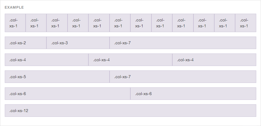
Arguably, Bootstrap's greatest contribtion to RWD is it's Responsive Grid System. It allows your entire page (or any HTML element, for that matter) to operate as a 12-column grid. This is also a common design standard, making your work with designers all the easier.
The grid system is simple in concept, but has a lot of depth to it - luckily Boostrap has great documentation on it, if you feel the need to investigate: http://getbootstrap.com/css/#grid
For a page-level grid - the most common implementation - you'll need 3 HTML elements, with 3 corresponding Bootstrap classes:
-
.containeror.container-fluidis the outer container of your page or section..container-fluidwill allow your grid to extend the full width of the screen or parent container, whereas.containerwill contrain it to a centered "strip" based on the screen size. -
.rowrepresents a row of grid columns - this is similar to a<tr>in a table, or a row in a spreadsheet. -
.col-x-ywill be placed on each grid element, with 'x' being filled on the screen size you're targeting, and 'y' being filled in by the number of columns (out of a total of 12) you want the element to occupy. For example -col-sm-6declares that on small screens, the element will take up 6 of 12 columns or half of the grid.
You'll always want to follow this format - Bootstrap does a lot of fancy math to the margins based on the parent container, so skipping one of the above 3 elements will result in columns that overlap or spill out of their containers.
Fork this repo and look at the sample-project directory - inside is a sample HTML page with a proper grid system set up. Squish the screen and see how the grid breaks to work on smaller screens! Let's take some time to play with the values. We'll be adjusting the two values in the columns - the grid column size, and grid screen size.
12 is a magic number - it's divisible by 2, 3, 4, and 6 (meaning we can have columns that are: half-width, third-width, quarter-width, and sixth-width - aka 50%, ~33.3%, 25%, and ~16.7%):
6 + 6                                           = 12
4 + 4 + 4                                       = 12
3 + 3 + 3 + 3                                   = 12
2 + 2 + 2 + 2 + 2 + 2                           = 12
1 + 1 + 1 + 1 + 1 + 1 + 1 + 1 + 1 + 1 + 1 + 1   = 12
So for a typical two column layout (main content area + sidebar):
 <div class="row">
   <div class="col-md-8">
     I'm a big column
    </div>
   <div class="col-md-4">
     I'm just a sidebar
   </div>
 </div>
Because:
8 + 4 = 12
Next, we'll select what screen size we'll want it to display on:
col-xs< 768px (e.g. smartphones)col-sm≥ 768px (e.g. tablets)col-md≥ 992px (e.g. laptops, desktops)col-lg≥ 1200px (e.g. large desktops)
For a no-fuss implementation, you can set your entire grid up with col-md and Bootstrap will be able to guess the rest - for both larger and smaller screens. However, you might want to make more specific declarations based on screensize - for this, you can use as many screen size declarations as you like:
<div class="col-xs-12 col-sm-12 col-md-6 col-lg-4">Totally fine!</div>The above example will occupy a different number of columns depending on the screensize:
- < 768px = 12 columns
- ≥ 768px = 12 columns
- ≥ 992px = 6 columns
- ≥ 1200px = 4 columns
That being said - what will this code do?
 <div class="row">
   <div class="col-sm-12 col-md-6">
     <p>Column 1</p>
    </div>
   <div class="col-sm-12 col-md-6">
     <p>Column 2</p>
   </div>
</div>Using the bootstrap grid, make a grid that is 4 Columns on Tablet (sm), Laptop (md), and Desktop (lg), 12 Column on Mobile(xs).
Sample code
<div class="row">
  <h3 class='text-center'>3 Columns on Tablet, Laptop, and Desktop, 1 Column on Mobile</h3>
  <div class="col-sm-4 col-xs-12">Yao</div>
  <div class="col-sm-4 col-xs-12">Hey</div>
  <div class="col-sm-4 col-xs-12">Ola</div>
</div>You can also offset and nest your columns. When you offset a column, you add a column of whitespace and push the column to the right. Example:
 <div class="row">
   <div class="col-md-3 col-md-offset-3">
     This column occupies 1/4 of the page width and is moved to the right
     by 1/4 of the page width
   </div>
 </div>
Here is an example of nesting columns (putting one row inside another)
 <div class="row">
   <div class="col-md-6">
     Level 1: Column takes 1/2 the width of the page
     <div class="row">
       <div class="col-md-4">
         Level 2: This column takes 1/3 the width of its parent column
       </div>
       <div class="col-md-8">
         Level 2: This column takes 2/3 the width of its parent column
       </div>
     </div>
   </div>
</div>The grid system is just the tip of the iceberg! Bootstrap also offers a wide variety of Utility Classes that can be applied to elements. Once again, I recommend going through the documentation to discover the full range of tools available: http://getbootstrap.com/css/
For a complete list: Bootstrap Typography classes
To align text, use these classes.
 <p class="text-left">Left aligned text.</p>
 <p class="text-center">Center aligned text.</p>
 <p class="text-right">Right aligned text.</p>
 <p class="text-justify">Justified text.</p>
 <p class="text-nowrap">No wrap text.</p>
More useful typography classes...
 <p class="lead">This text will stand out in a paragraph</p>
 <small>This line of text is meant to be treated as fine print.</small>
 <p class="text-lowercase">Lowercased text.</p>
 <p class="text-uppercase">Uppercased text.</p>
<p class="text-capitalize">Capitalized text.</p>Bootstrap comes with a set of icons that can be included in your page using the <i></i> tag. Check out these icons here. Just assign a class the your <i></i> tag with the name of the icon you want.
Bootstrap provides a wide selection of button sizes and colors. Button classes can be applied not just to <button> elements, but also <a> and <input> elements
Sometimes you need to provide multiple classes to an element in order for Bootstrap to style it. The button classes are an example of this:
 <!-- Standard button -->
 <button type="button" class="btn btn-default">Default</button>

 <!-- Provides extra visual weight and identifies the primary action in a set of buttons -->
 <button type="button" class="btn btn-primary">Primary</button>

 <!-- Contextual button for informational alert messages -->
 <button type="button" class="btn btn-info">Info</button>

 <!-- Indicates caution should be taken with this action -->
 <button type="button" class="btn btn-warning">Warning</button>
... and so on. See the docs for a comprehensive list of options. Note you can add a third class denoting size to any of the above: .btn-lg, .btn-sm, .btn-xs
Bootstrap helps you format images using class="img-rounded" (rounds the corners), class="img-circle" (makes the image a circle) and class="img-thumbnail" (adds a border). You can also add a class="img-responsive" to your image to make it scale well when the screen size changes (this sets its max-width to 100% of its parent element and the height to auto for maintaining aspect)
Bootstrap is also very helpful when you need to style your forms. All textual <input>, <textarea>, and <select> elements with class="form-control" are set to width: 100% by default. Wrap labels and their associated controls (inputs) in class="form-group" for optimum spacing.
Bootstrap allows you to incorporate interactive behavior into your page with Javascript plug-ins. While you would ultimately have to write some JS in order for these components to provide actual functionality within the application, you don't have to write JS if you're simply mocking up a UI.
Some examples:
Pick some aspect of Bootstrap that interests you. Spend 5-10 minutes learning how it works and be prepared to share it with the rest of the class.
Bootstrap demonstrates good practices in terms of exemplifying class-based CSS and introducing the concept of a grid-system. It is useful for most projects where style is somewhat important but not the central to the product.
- Foundation - another CSS-library, similar to Bootstrap
- Skeleton - a lovely, minimal, unopinionated CSS library
- Materialize - front-end framework based on "material design"
- Hipster Ipsum - Dummy placeholder "hipster" text
All content is licensed under a CCBYNCSA 4.0 license. All software code is licensed under GNU GPLv3. For commercial use or alternative licensing, please contact [email protected].
 React
React
 Typescript
 Django
 Laravel
 Facebook
 Microsoft
 Google
 Alibaba
 D3
D3
 Tencent