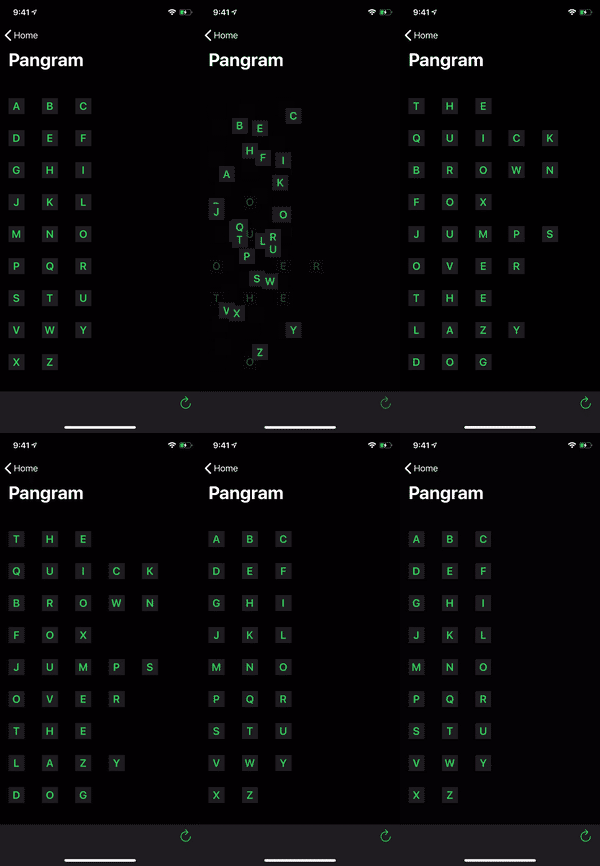
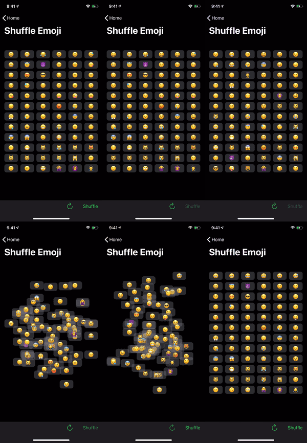
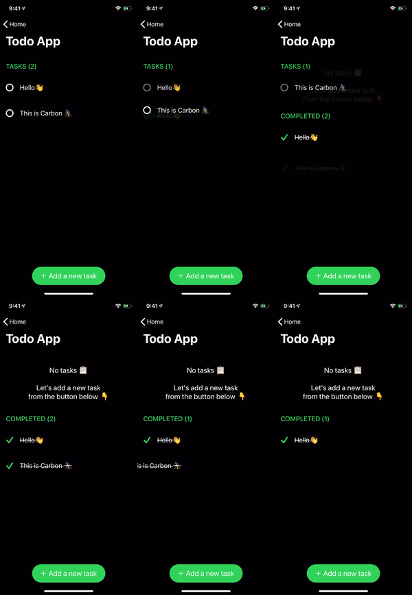
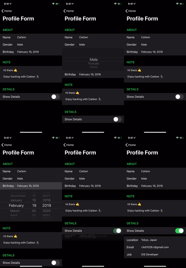
A declarative library for building component-based user interfaces
in UITableView and UICollectionView.
| Declarative | Component-Based | Non-Destructive |
|---|---|---|
| Provides a declarative design with power of diffing algorithm for building list UIs. | Declare component once, it can be reused regardless kind of the list element. | Solves the various problems by architecture and algorithm without destructing UIKit. |
Made with ❤️ by Ryo Aoyama
Carbon is a library for building component-based user interfaces in UITableView and UICollectionView inspired by React.
This make it painless to build and maintain the complex UIs.
Uses DifferenceKit which is highly optimized based on Paul Heckel's paper for diffing.
Declarative design and diffing algorithm make your code more predictable, debugging easier and providing beautiful animations to users.
Our goal is similar to IGListKit and Epoxy, we respect those library as pioneers.
renderer.render(
    Section(
        id: ID.greet,
        header: ViewNode(Header(title: "GREET")),
        cells: [
            CellNode(HelloMessage(name: "Vincent")),
            CellNode(HelloMessage(name: "Jules")),
            CellNode(HelloMessage(name: "Butch"))
        ],
        footer: ViewNode(Footer(text: "💡 Tap anywhere"))
    )
) |
 |
 |
 |
 |
|---|
$ git clone https://github.com/ra1028/Carbon.git
$ cd Carbon/
$ make setup
$ open Carbon.xcworkspaceDescribed here are the fundamentals for building list UIs with Carbon.
The API document will help you understand the details of each type.
For more advanced usage, see the Advanced Guide.
And the more practical examples are here.
Component is the base unit of the UI in Carbon.
All elements are made up of components, and it can be animated by diffing update.
UIView, UIViewController, and its subclasses are laid out with edge constraints by default. Other classes can also be rendered as Content by implementing layout function to component.
The value returned by referenceSize is used as the size of component on the list UI. Note that UITableView ignores width.
If returning nil, it falls back to default such as UITableView.rowHeight or UICollectionViewFlowLayout.itemSize.
Therefore, automatic sizing can also be used.
Definition below is the simplest implementation. It's not mandatory to conform to Equatable.
If the component have values that can't equality comparison such as closure, it can explicitly shift off the comparisons by implementing shouldContentUpdate.
struct HelloMessage: Component, Equatable {
    var name: String

    func renderContent() -> UILabel {
        return UILabel()
    }

    func render(in content: UILabel) {
        content.text = "Hello \(name)"
    }

    func referenceSize(in bounds: CGRect) -> CGSize? {
        return CGSize(width: bounds.width, height: 44)
    }
}This is a node representing header or footer.
The node is wrap an instance of type conforming to Component protocol and works as an intermediary with DifferenceKit for diffing.
ViewNode(HelloMessage(name: "Vincent"))CellNode is a node representing cell.
Unlike in the ViewNode, this needs an id which Hashable type to identify from among a lot of cells.
The id is used to find the same component in the list data before and after changed, then calculate the following kind of diff.
- deletes
- inserts
- moves
- updates
CellNode(id: 0, HelloMessage(name: "Jules"))The id can be predefined if conforming to IdentifiableComponent.
CellNode(HelloMessage(name: "Jules"))Section has a header, a footer and a group of cells.
A group of cells can be contains nil, then skipped rendering of it cell.
This also needs to specify id for identify from among multiple sections, then can be calculate the several kind of diff.
- section deletes
- section inserts
- section moves
- section updates
let emptySection = Section(id: 0)let hidesHelloMia: Bool = ...
let section = Section(
id: "hello",
header: ViewNode(HelloMessage(name: "Vincent")),
cells: [
CellNode(HelloMessage(name: "Jules")),
CellNode(HelloMessage(name: "Butch")),
hidesHelloMia ? nil : CellNode(HelloMessage(name: "Mia"))
],
footer: ViewNode(HelloMessage(name: "Marsellus"))
)The components are displayed on top of list UI by render via Renderer.
Boilerplates such as registering element types to a table view are no longer needed in Carbon.
The adapter acts as delegate and dataSource, the updater handles updates.
You can also change the behaviors by inheriting the class and customizing it.
There are also UITableViewReloadDataUpdater and UICollectionViewReloadDataUpdater which update by reloadData without diffing update.
Note that it doesn't retain target inside Renderer because it avoids circular references.
When render called again, the updater calculates the diff from currently rendering components and update them with system animation.
Since there are several style syntaxes for passing group of sections, please check the API docs.
@IBOutlet var tableView: UITableView!

lazy var renderer = Renderer(
    target: tableView,
    adapter: UITableViewAdapter(),
    updater: UITableViewUpdater()
)@IBOutlet var collectionView: UICollectionView!
lazy var renderer = Renderer(
target: collectionView,
adapter: UICollectionViewFlowLayoutAdapter(),
updater: UICollectionViewUpdater()
)let hidesBottomSection: Bool = ...
renderer.render(
Section(
id: "top section",
cells: [
CellNode(HelloMessage(name: "Vincent")),
CellNode(HelloMessage(name: "Jules")),
CellNode(HelloMessage(name: "Butch"))
]
),
hidesBottomSection ? nil : Section(
id: "bottom section",
header: ViewNode(HelloMessage(name: "Pumpkin")),
cells: [
CellNode(HelloMessage(name: "Marsellus")),
CellNode(HelloMessage(name: "Mia"))
],
footer: ViewNode(HelloMessage(name: "Honey Bunny"))
)
)Of course, the content of component can use custom class. You can also instantiate it from Xib.
It can be inherited whichever class, but the common means is inherit UIView or UIViewController.
class HelloMessageContent: UIView {
    @IBOutlet var label: UILabel!
}
struct HelloMessage: Component, Equatable {
var name: String
func renderContent() -> HelloMessageContent {
return HelloMessageContent.loadFromNib() // Extension for instantiate from Xib. Not in Carbon.
}
func render(in content: HelloMessageContent) {
content.label.text = "Hello \(name)"
}
...
IdentifiableComponent is a component that simply can predefine an identifier.
It can be omitted the definition of id if the component conforms to Hashable.
struct HelloMessage: IdentifiableComponent, Equatable {
    var name: String

    var id: String {
        return name
    }

    ...
Cell selection can be handled by setting didSelect to the instance of UITableViewAdapter or UICollectionViewAdapter.
adapter.didSelect { context in
    print(context.tableView)
    print(context.node)
    print(context.indexPath)
}
However, we recommend to make the Content of the component to the class inherited from UIControl.
It's more maintainable and extensible.
class MenuItemContent: UIControl {
    @IBOutlet var label: UILabel!

    var onSelect: (() -> Void)?

    @objc func handleSelect() {
        onSelect?()
    }

    override func awakeFromNib() {
        super.awakeFromNib()

        addTarget(self, action: #selector(handleSelect), for: .touchUpInside)
    }
}

struct MenuItem: Component {
    var text: String
    var onSelect: () -> Void

    func renderContent() -> MenuItemContent {
        return MenuItemContent.loadFromNib()
    }

    func render(in content: MenuItemContent) {
        content.label.text = text
        content.onSelect = onSelect
    }

    func shouldContentUpdate(with next: MenuItem) -> Bool {
        return text != next.text
    }

    func referenceSize(in bounds: CGRect) -> CGSize? {
        return CGSize(width: bounds.width, height: 44)
    }
}
In this way, in order to cancel the selection by scrolling, you need to implement the following extension.
extension UITableView {
    open override func touchesShouldCancel(in view: UIView) -> Bool {
        return true
    }
}

extension UICollectionView {
    open override func touchesShouldCancel(in view: UIView) -> Bool {
        return true
    }
}Components can define more detailed behaviors.
Following are part of it.
-
shouldContentUpdate
If the result istrue, the component displayed as a cell is reloaded individually, header or footer is reloaded with entire section.
It can be omitted by conforming toEquitable. -
shouldRender
By returningfalse, you can skip component re-rendering when reloading or dequeuing element.
You can re-render only when component is changed, if implement to callshouldContentUpdatewithin here.
This is recommended to use only for performance tuning. -
contentWillDisplay
Invoked every time of before a component got into visible area. -
contentDidEndDisplay
Invoked every time of after a component went out from visible area.
You can add methods of Delegate, DataSource by inheriting each adapter.
Furthermore, it can be customized the class of the elements(cell/header/footer) which becomes the container of component by setting it to config.
- config
The configuration which having the classes of elements. It can be specified only when adapter is initialized.
It can be modify the updating behavior of the list UI by inheriting Updater.
This is important thing to make Carbon well adapted to your project.
Below are some of the default provided settings of updater.
-
isAnimationEnabled
Indicating whether enables animation for diffing updates, settingfalsewill perform it usingUIView.performWithoutAnimation.
Default istrue. -
animatableChangeCount
The max number of changes to perform diffing updates. It falls back toreloadDataif it exceeded.
Default is300. -
skipReloadComponents
Indicates whether to explicitly avoidUITableView.reloadRows,UICollectionView.reloadItems.
Try it when an animation glitch occurs.
Default isfalse. -
alwaysRenderVisibleComponents
Indicates whether to always callrenderof the component in the visible area after updating.
Should use this in case of using the above mentionedskipReloadComponents.
Default isfalse.
The content of component can be received some emement-specific events such as when highlighted, selected, or immediately after rendered, by conforming to protocols below.
We recommend to do implementation that doesn't count on this protocols.
- UITableViewCellContent
- UITableViewHeaderFooterViewContent
- UICollectionViewCellContent
- UICollectionReusableViewContent
- Swift 4.2+
- iOS 10.0+
Add the following to your Podfile:
use_frameworks!

target 'TargetName' do
  pod 'Carbon'
endAdd the following to your Cartfile:
github "ra1028/Carbon"
Pull requests, bug reports and feature requests are welcome 🚀
Please see the CONTRIBUTING file for learn how to contribute to Carbon.
Carbon is released under the Apache 2.0 License.


