tkent-google / std-switch Goto Github PK
View Code? Open in Web Editor NEWExplainer and demo for <std-switch>
Explainer and demo for <std-switch>


Anyone checked how terrible this demo is on mobile?
A switch should react to touch.
You don't "click" with your finger, you slide it.
(From the example you have in the README, and the other threads here, it looks like you're already considering this, but I had some suggeestions, which I hope may be of help.)
This may relate to #7 but I thought it best to open a separate discussion. Another very common accessibility barrier with switches relates to contrast. There are two problems that often crop up:
The contrast of the switch, in either "off" or "on" position, against its background is insufficient for some users to be able to see/identify it.
The contrast between the "on" and "off" positions is insufficient for people to be able to tell which is the current state.
The Web Content Accessibility Guidelines state that non-text contrast should be at least 3:1. It's also a very good idea to use means other than colour changes, such as shape and/or text, to convey information—but that's been discussed in #7; this issue is concentrating on the contrast side of things.
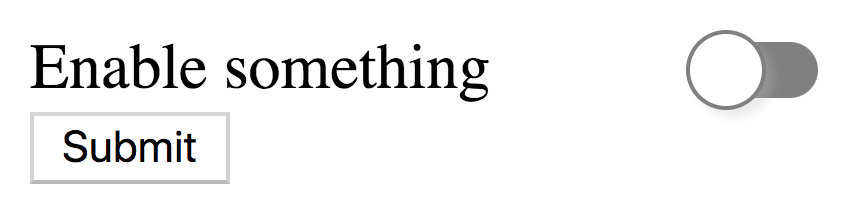
Many switch controls have a light grey border on a white background, which in the case of the switch in the figure below, is only 1.3:1—in fact that's the darkest border in the image; the one that partially surrounds the switch handle has lower contrast.

Further, the contrast of the green "on" colour on the white page background is only 1.9:1. Both of those are not sufficient for some users to be able to see them. People who are using a device in a bright setting, or outside, or people who have vision impairments could really struggle to perceive and thus understand the switches.
(Whilst the slider/handle does move, which provides an indication other than colour that something has changed, because of the low contrast in the "off" position, the fact it's moved could easily be missed.)
Positive examples: @scottaohara has created some great examples of accessible switches.
Suggestions:
Your "off" switch example has good contrast on a page with a light background, so this is a good start. Perhaps you could provide two sets of default colour values, for "light mode" and "dark mode", as examples?
Please consider helping people to design accessible switches by mentioning the minimum contrast accessibility requirements in the documentation.
If you'd like any suggestions for colour schemes and/or documentation, I'd be happy to provide some.
Related to #2. I see a few options:
:checked and :not(:checked):state(on), and then either :state(off) or :not(:state(on))[checked] and :not([checked]) or [on] and :not([on]).Suggest role/states/properties of the control need to mapped.
https://www.w3.org/TR/wai-aria-1.1/#switch
https://www.w3.org/TR/core-aam-1.1/#role-map-switch
This is interesting work; switches are quite prevalent these days, and having a standard implementation would be helpful. Switches can present some significant accessibility barriers, though. One affects people who zoom in.
It's a popular visual design technique to position labels on one side of the screen and switches on the other. This can result in the switch being quite far away from the label. If the user has a vision impairment and zooms in to see the screen, they can very easily find that the label is not on-screen when they are looking at the switches. As a result, they can't determine which switch does what.
Someone who's zoomed in could see something like this:

Contrast this to checkboxes, where the standard is for the checkbox and label to be in close proximity. It is very clear which checkbox is which.
I noticed that the Microsoft examples linked from the README all have the switches positioned right next to their labels. This is very good practice and it would be great if you could emphasise this in your documentation (if you'd like me to submit a patch, please let me know).
The demo page illustrates a number of different themes for <std-switch> and has a particular rendering (including animations). Will the available theme names be standardized? Will exact details of the rendering and animation be standardized?
If theme names aren't standardized, and browsers support different sets, there is poor interop. If theme names are standardized but their renderings aren't, they are not useful to authors who want an exact appearance. If names and renderings are standardized, this is without precedent for form controls in the platform, and potentially problematic. Platform renderings change over time. Switches haven't always looked the same in iOS for instance. The standardized versions might not even match any platform, for example the cocoa theme in the demo does not accurately replicate the rendering or appearance of switches in any iOS version. Fully accurate replication in a polyfill may not even be possible without violating intellectual property of platform vendors.
A possible alternate approach: there is a default appearance (possibly platform-specific), and it can be fully overridden to be exactly what the developer wants using normal CSS. <input type=button> and <input type=text> de facto have this behavior (if not per any spec) and it lets browsers have a platform-matching default styling if desired, while also meeting requirements to have controls styled a specific way on all platforms in some site. <input type=checkbox> lacks this, which is why sites use either uncustomized checkboxes or div soup. Sites would likely not be satisfied with a canned set of predefined themes.
In native UI playing with a switch does not require confirmation. Settings are changed live. Is there precedent for that not happening?
I'm a bit worried we might end up encouraging some kind of UX pattern on the web that's not found in native by making this submittable.
CSS Shadow Parts or CSS custom properties?
https://github.com/tkent-google/lapi-switch#form-submission discusses two models for how form data gets computed:
<input type=checkbox>Personally I think B) is quite nice. It feels like checkboxes having a value is mostly just because they got squashed into the <input> control; if they were a separate control, they wouldn't have one. I also remember when writing my server-side code getting confused as to why some fields "disappeared" (because they were unchecked checkboxes).
But, I could be quite wrong. Web developer input would be great here.
The explainer argues that a switch is a semantically different control from a checkbox, citing style guides that suggest different usage. The style guides roughly suggest that switches should be used for actions with immediate effect, while checkboxes are used where an extra step like a Submit button is required.
At least on macOS and iOS (the operating systems that most brought these respective controls to respective prominence), this is not true.
macOS does not have a standard switch control and it is not seen in the default system UI or built-in apps (at least as far as I've seen; there may be exceptions). Checkboxes are often used for actions with immediate effect. In fact, this is the most common use. Preference dialogs on macOS are modeless and their controls are expected to have instant effect, without requiring an extra apply step. These dialogs often contain checkboxes.
iOS, on the other hand, does not have checkboxes as a standard control. (Exception: WebKit renders <input type=checkbox> as a checkbox on iOS largely for web compatibility reasons and legacy, e.g. switches are generally labeled on the opposite side from checkboxes but a checkbox element does not contain its label.) Switches are used for the same purpose as checkboxes on macOS. In fact, directly corresponding settings have a checkbox on iOS but a switch on macOS.
At least for these two platforms, checkbox and switch are stylistic variants of the same basic semantic. The idea that both always exist and mean different things is biased towards specific and fairly new platforms.
References: the macOS Human Interface Guidelines and iOS Human Interface Guidelines (not cited in the explainer, but probably should be). Note that the macOS version does not describe switches, and the iOS version does not describe checkboxes, because each has only one of these.
Because of this, I think the decision to make this a new element may be based on a faulty premise.
The current API proposes "checked" as the name of the concept for the on switch. This gives drop-in compatibility with checkboxes. But semantically it is a little strange.
An alternative would be having an on="" attribute.
https://github.com/tkent-google/std-switch/tree/3418f78239e5a99ca6c37099ecb3edfc45e21b29#content-attributes discusses two models for attribute mappings. Here I will list some pros/cons.
A) Compatible with <input type=checkbox>
checked="" <-> defaultChecked and nothing <-> checked behavior has been quite confusing for developers. Some frameworks have worked to hide it. Maybe we should not propagate it.B) Simple mappings
#my-switch[checked], instead of pseudo-classes. See #3. (I think this is a pro because it removes the footgun of trying to use attribute selectors and it only working for default checkedness.)defaultchecked="" can be a bit confusing. Especially because you could write <std-switch defaultchecked> (with no checked="" attribute) where it is not checked "by default". Maybe we could fix this by renaming it to checkedafterreset=""?I think this issue would benefit a lot from web developer feedback.
The explainer lists the following goal:
Identical appearance on all platforms and all supported browsers by default
but provides no justification for it. Existing form controls have either a platform-specific or a browser-specific look by default. Some also de facto have the ability to remove that look via custom styling (e.g. <input type=text> or <input type=button>), while others can't be freely custom styled in a cross-browser way (e.g. <input type=checkbox>). The ones that do allow free styling tend to still be used in contexts that demand full custom looks, while the latter are replaced with div soup.
I think a default platform/browser/etc specific look that is unspecified, plus full styling with CSS that can entirely replace the look, is the best target. That's the most successful kind of form control so far, and it looks good both in mildly styled websites that don't care to override all form controls, and in heavily styled sites that want a total custom look.
It's not clear why a default cross-browser cross-platform look (but which might still not be fully specified per issue #20 ) would be better. Even if it looks good on lots of platforms and websites today, it will eventually look dated if frozen. And if not frozen, it can't achieve the goal of looking exactly the same on all browsers and platforms. On the other hand, a platform/browser specific default look can be updated over time.
For someone with dexterity issues (or maybe just a dirty keyboard), the space bar toggle interaction can cause issues. If held, the space bar will repeat, triggering another state change.
I suggest an alternate method for changing switch state IN ADDITION to <space>.
The word "THUMB" was chosen as it seems to have been used for naming the indicator of a ranged input control.
<left-arrow> = move THUMB to "left" position of SWITCH
<right-arrow> = move THUMB to "right" position of SWITCH
<up-arrow> = move THUMB to "right" position of SWITCH
<down-arrow> = move THUMB to "left" position of SWITCH
Arrows repeating will not cause another state change. Range sliders already use this interaction.
<std-switch> will have a platform-independent appearance by default. We should provide an easy way to enable platform-dependent appearance.
 React
React
A declarative, efficient, and flexible JavaScript library for building user interfaces.
🖖 Vue.js is a progressive, incrementally-adoptable JavaScript framework for building UI on the web.
 Typescript
TypeScript is a superset of JavaScript that compiles to clean JavaScript output.
An Open Source Machine Learning Framework for Everyone
 Django
The Web framework for perfectionists with deadlines.
 Laravel
A PHP framework for web artisans
Bring data to life with SVG, Canvas and HTML. 📊📈🎉
JavaScript (JS) is a lightweight interpreted programming language with first-class functions.
Some thing interesting about web. New door for the world.
A server is a program made to process requests and deliver data to clients.
Machine learning is a way of modeling and interpreting data that allows a piece of software to respond intelligently.
Some thing interesting about visualization, use data art
Some thing interesting about game, make everyone happy.
 Facebook
We are working to build community through open source technology. NB: members must have two-factor auth.
 Microsoft
Open source projects and samples from Microsoft.
 Google
Google ❤️ Open Source for everyone.
 Alibaba
Alibaba Open Source for everyone
 D3
D3
Data-Driven Documents codes.
 Tencent
China tencent open source team.