Survey Flow is a Flutter package that provides a framework for creating surveys or quizzes within your app. It allows you to easily define a survey's structure and customize its appearance, and it includes a range of pre-built widgets to help you display questions and collect user responses.
Inspired by survey_kit.


To use Survey Flow in your Flutter app, add it to your pubspec.yaml file:
dependencies:
  survey_flow: ^latest_version
Then, run flutter pub get to download the package.
To use Survey Flow, import the package in your Dart code:
import 'package:survey_flow/survey_flow.dart';To create a survey, use the one of the SurveyStep classes or create your own:
final List<SurveyStep> steps = [
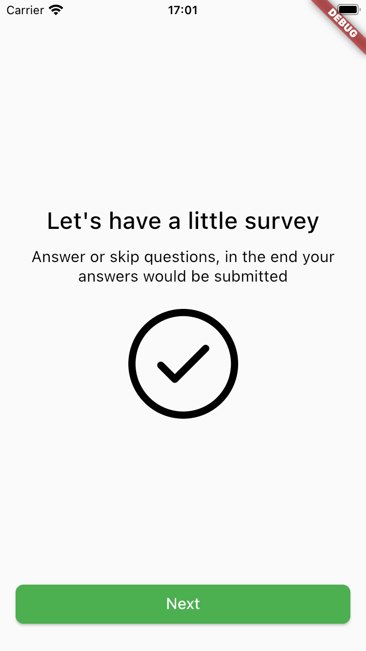
InformationStep(
title: 'Information title',
description: 'Bla bla bla description for this step',
image: StepImage.svg(
'https://www.svgrepo.com/show/24762/round-done-button.svg',
source: StepImageSource.network,
width: 0.3,
),
primaryButton: StepButton(
action: 'action:notificationsPermission',
text: 'Next',
),
),
];Predefined step types and components documentation you can find below. More examples you can find in this Example repository.
To display a survey, use the SurveyFlow widget:
class MySurveyScreen extends StatefulWidget {
   @override
   _MySurveyScreenState createState() => _MySurveyScreenState();
}

class _MySurveyScreenState extends State<MySurveyScreen> {
   final List<SurveyStep> survey = // create your survey here

   @override
   Widget build(BuildContext context) {
      return Scaffold(
         appBar: AppBar(title: Text('My Survey')),
         body: SurveyFlow(
            initialSteps: survey,
            onSubmit: (results) {
               // handle the survey results here
            },
            onFinish: () {
               // handle the survey finished here
            },
         ),
      );
   }
}
In this example, we've created a screen that displays a SurveyFlow widget with our SurveySteps, an onSubmit callback that will be called when user submits the last step or some step has a submit action (you can find how actions works in the documentation below) and onFinish callback that will be called when the user completes the survey.
To display a modal survey, use the showModalSurveyFlow function:
final List<SurveyStep> survey = // create your survey here

showModalSurveyFlow(
   context: context,
   initialSteps: survey,
   onSubmit: (results) {
      // handle the survey results here
   },
   onFinish: () {
      // handle the survey finished here
   },
);
InformationStep(
   title: 'Information title',
   description: 'Bla bla bla description for this step',
   image: StepImage.svg(
      'https://www.svgrepo.com/show/24762/round-done-button.svg',
      source: StepImageSource.network,
      width: 0.3,
   ),
   primaryButton: StepButton.next(),
);| Parameter | Default | Description |
|---|---|---|
| id String? | Null | Step id. Can be used for custom steps navigation. |
| title String | required | Title that will be displayed on the step. |
| description String? | Null | Description that will be displayed on the step. |
| image StepImage? | Null | Image that will be displayed on the step. Read more about StepImage below. |
| backgroundImage StepImage? | Null | Image that will be displayed on the background. Read more about StepImage below. |
| primaryButton StepButton | StepButton.next() | Primary button with step action. Read more about StepButton below. |
| secondaryButton StepButton? | Null | Secondary button with step action. Read more about StepButton below. |
| buttonsAlignment ButtonsAlignment | ButtonsAlignment.vertical | Defines how buttons should be aligned - vertically or horizontally. |
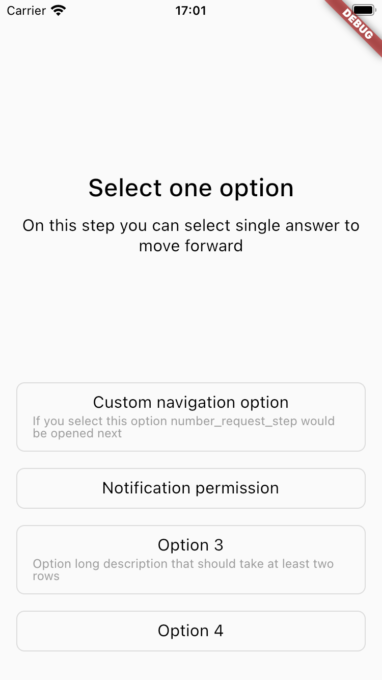
SingleSelectStep(
  title: 'Select one option to move forward',
  description: 'Bla bla bla description for this step',
  options: [
     SelectOption(
        text: 'Custom navigation option',
        description:
        'If you select this option number_request_step would be opened next',
        value: 'option_1',
        navigationConditions: [
           ButtonNavigationCondition(
            nextStepId: 'number_request_step',
           ),
        ],
    ),
     SelectOption(
        text: 'Notification permission',
        value: 'option_2',
        action: 'action:notificationsPermission',
     ),
     SelectOption(
        text: 'Option 3',
        description:
        'Option long description that should take at least two rows',
        value: 'option_3',
     ),
     SelectOption(
        text: 'Option 4',
        value: 'option_4',
     ),
  ],
);
| Parameter | Default | Description |
|---|---|---|
| id String? | Null | Step id. Can be used for custom steps navigation. |
| title String | required | Title that will be displayed on the step. |
| options List | required | Options list. Read more about SelectOption below. |
| description String? | Null | Description that will be displayed on the step. |
| backgroundImage StepImage? | Null | Image that will be displayed on the background. Read more about StepImage below. |
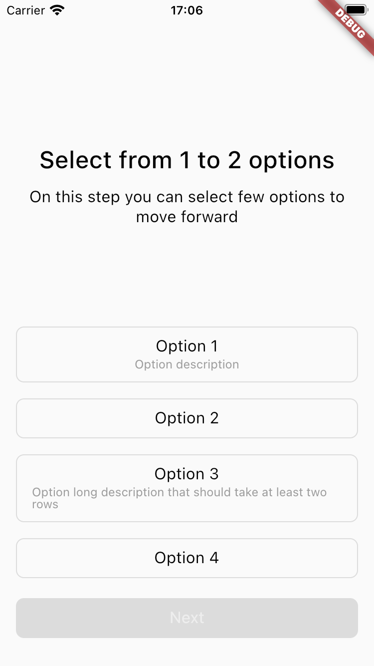
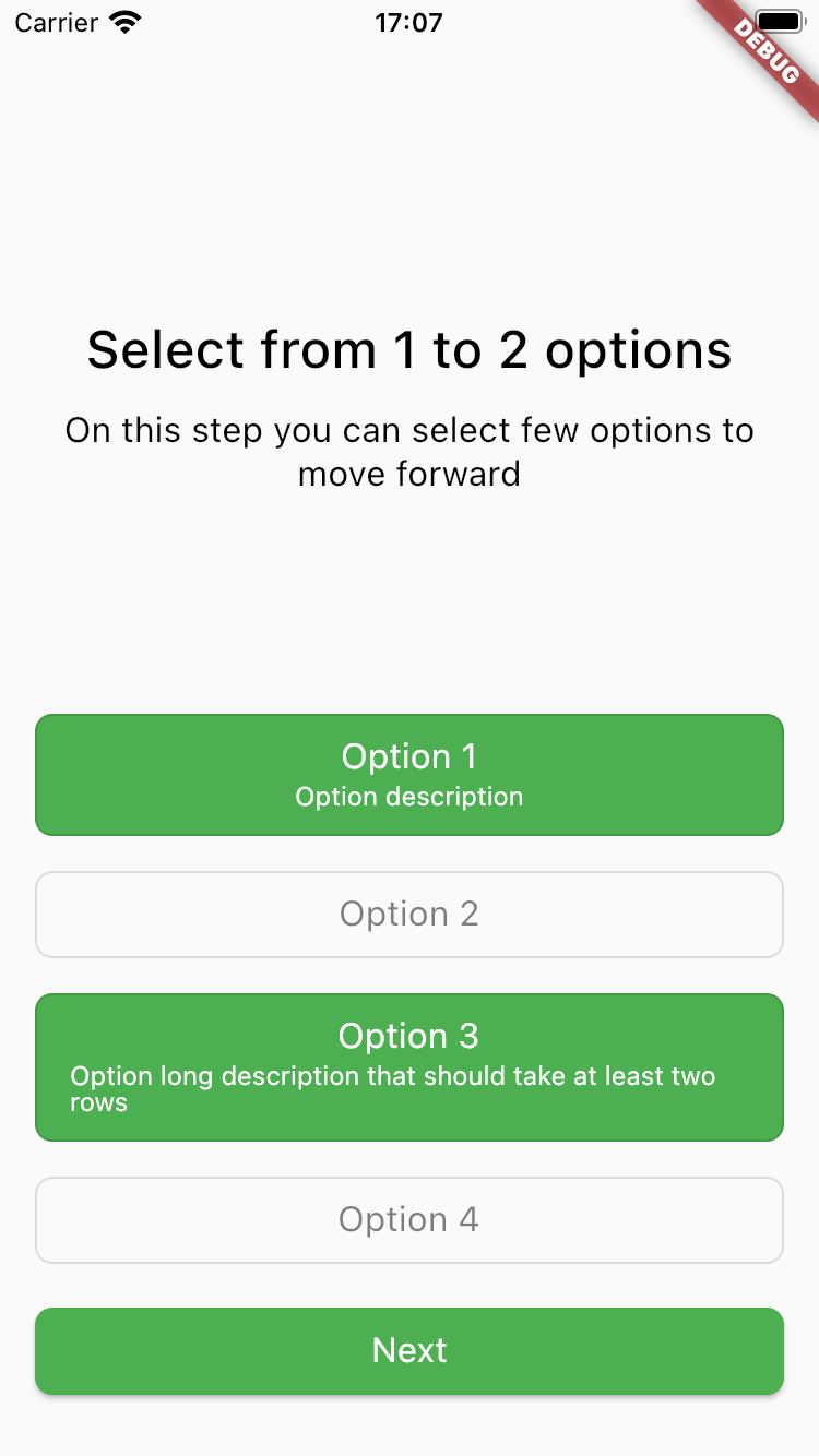
MultiSelectStep(
   title: 'Select from 1 to 2 options to move forward',
   description: 'Bla bla bla description for this step',
   minimumAmountOfOptionsSelected: 1,
   maximumAmountOfOptionsSelected: 2,
   options: [
      SelectOption(
         text: 'Option 1',
         description: 'Option description',
         value: 'option_1',
      ),
      SelectOption(
         text: 'Option 2',
         value: 'option_2',
      ),
      SelectOption(
         text: 'Option 3',
         description:
         'Option long description that should take at least two rows',
         value: 'option_3',
      ),
      SelectOption(
         text: 'Option 4',
         value: 'option_4',
      ),
   ],
);
| Parameter | Default | Description |
|---|---|---|
| id String? | Null | Step id. Can be used for custom steps navigation. |
| title String | required | Title that will be displayed on the step. |
| options List | required | Options list. Read more about SelectOption below. |
| description String? | Null | Description that will be displayed on the step. |
| backgroundImage StepImage? | Null | Image that will be displayed on the background. Read more about StepImage below. |
| primaryButton StepButton | StepButton.next() | Primary button with step action. Read more about StepButton below. |
| minimumAmountOfOptionsSelected int? | Null | Number of minimum options selected to enable the button. |
| maximumAmountOfOptionsSelected int? | Null | Number of maximum options selected. |
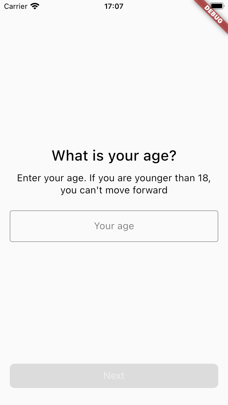
NumberRequestStep(
   id: 'number_request_step',
   title: 'Number request title',
   description: 'Bla bla bla description for this step',
   hint: 'Your age',
   primaryButton: StepButton.next(
      predicate: ButtonPredicate.moreThan(18),
   ),
   secondaryButton: StepButton.skip(),
);| Parameter | Default | Description |
|---|---|---|
| id String? | Null | Step id. Can be used for custom steps navigation. |
| title String | required | Title that will be displayed on the step. |
| description String? | Null | Description that will be displayed on the step. |
| primaryButton StepButton | StepButton.next() | Primary button with step action. Read more about StepButton below. |
| secondaryButton StepButton? | Null | Secondary button with step action. Read more about StepButton below. |
| buttonsAlignment ButtonsAlignment | ButtonsAlignment.vertical | Defines how buttons should be aligned - vertically or horizontally. |
| backgroundImage StepImage? | Null | Image that will be displayed on the background. Read more about StepImage below. |
| hint String? | Null | Text field hint. |
| type RequestType | RequestType.numberInt | Requested data type. Read more RequestType values below. |
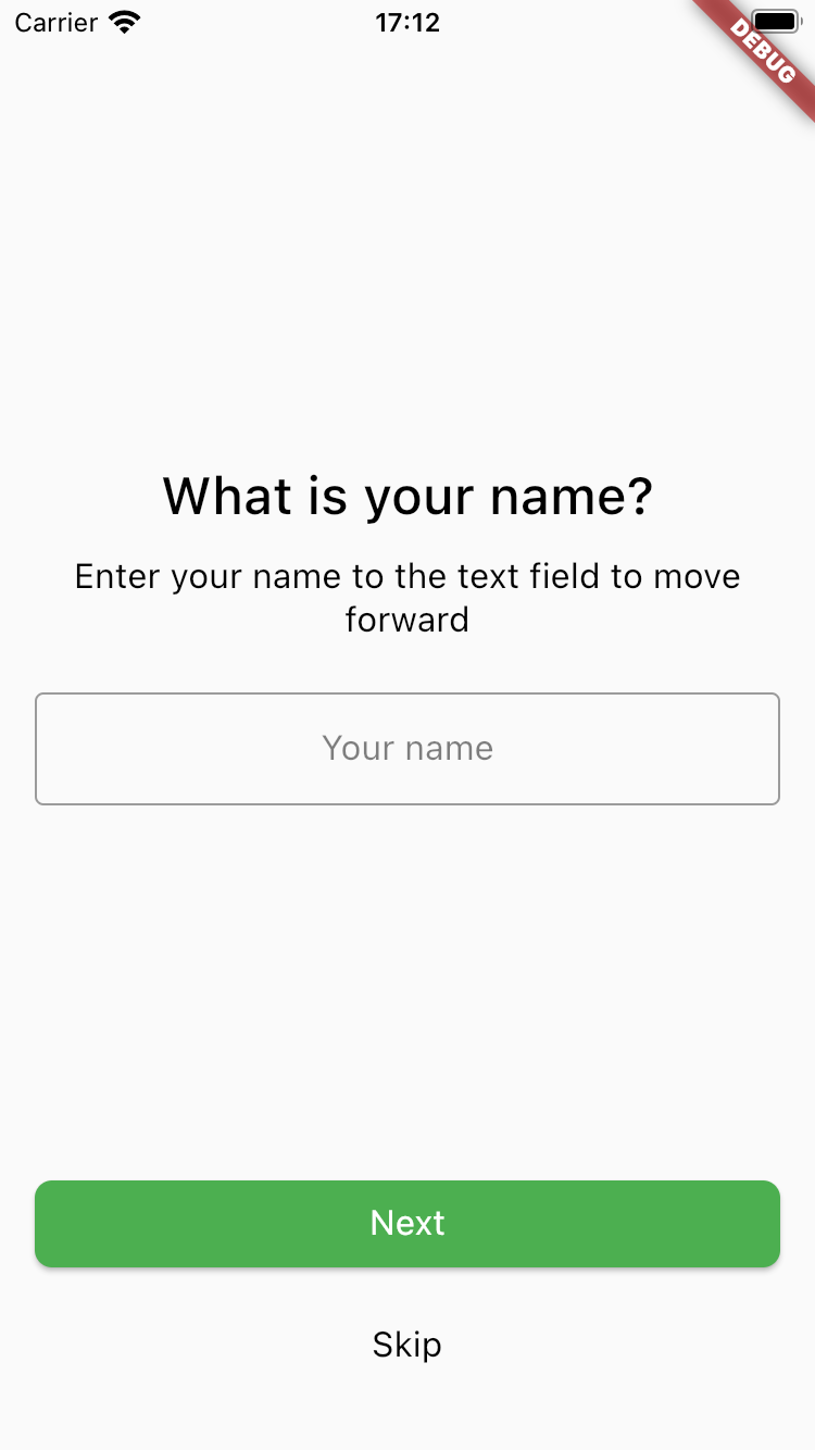
TextRequestStep(
   title: 'Text request title',
   description: 'Bla bla bla description for this step',
   hint: 'Your name',
   primaryButton: StepButton.next(),
   secondaryButton: StepButton.skip(),
);| Parameter | Default | Description |
|---|---|---|
| id String? | Null | Step id. Can be used for custom steps navigation. |
| title String | required | Title that will be displayed on the step. |
| description String? | Null | Description that will be displayed on the step. |
| primaryButton StepButton | StepButton.next() | Primary button with step action. Read more about StepButton below. |
| secondaryButton StepButton? | Null | Secondary button with step action. Read more about StepButton below. |
| buttonsAlignment ButtonsAlignment | ButtonsAlignment.vertical | Defines how buttons should be aligned - vertically or horizontally. |
| backgroundImage StepImage? | Null | Image that will be displayed on the background. Read more about StepImage below. |
| hint String? | Null | Text field hint. |
| type RequestType | RequestType.text | Requested data type. Read more RequestType values below. |
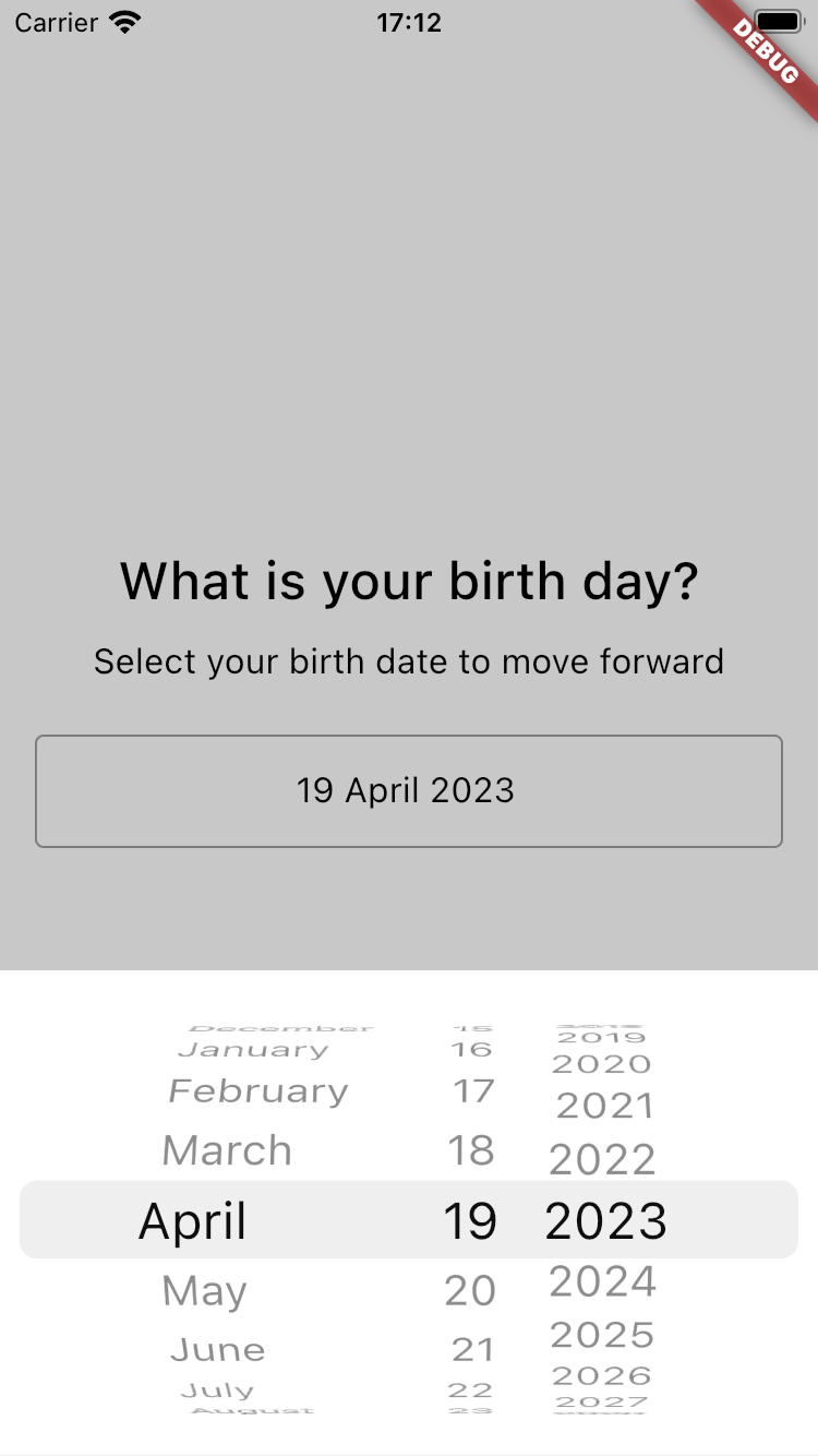
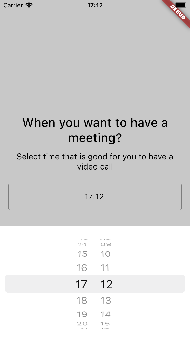
DateRequestStep(
   title: 'Date request title',
   description: 'Bla bla bla description for this step',
   hint: 'Your date of birth',
   primaryButton: StepButton.next(),
);| Parameter | Default | Description |
|---|---|---|
| id String? | Null | Step id. Can be used for custom steps navigation. |
| title String | required | Title that will be displayed on the step. |
| description String? | Null | Description that will be displayed on the step. |
| primaryButton StepButton | StepButton.next() | Primary button with step action. Read more about StepButton below. |
| secondaryButton StepButton? | Null | Secondary button with step action. Read more about StepButton below. |
| buttonsAlignment ButtonsAlignment | ButtonsAlignment.vertical | Defines how buttons should be aligned - vertically or horizontally. |
| backgroundImage StepImage? | Null | Image that will be displayed on the background. Read more about StepImage below. |
| hint String? | Null | Text field hint. |
| dateFormat String? | Null | Default 'd MMMM yyyy' for date, 'hh:mm' for time and 'd MMM yyyy hh:mm' for datetime. |
| type RequestType | RequestType.date | Requested data type. Read more RequestType values below. |
class CustomSurveyStep implements SurveyStep {
   const CustomSurveyStep({
      required this.id,
      required this.title,
      required this.description,
      required this.primaryButton,
      required this.image,
      this.backgroundImage,
   });

   @override
   final String id;

   @override
   final String title;

   @override
   final String description;

   @override
   final StepImage? backgroundImage;

   final StepImage image;
   final StepButton primaryButton;
}
You can create your own step by inheriting from SurveyStep and add you custom widget handler for it. Only imagination is your limit
enum RequestType {
  text,
  textMultiline,
  name,
  email,
  numberInt,
  numberDouble,
  date,
  time,
  dateAndTime,
}| Parameter | Default | Description |
|---|---|---|
| id String? | Null | Button id. |
| text String | required | Button title. |
| action String | required | Button action. What should be done when user clicks on the button. You can find few default actions in StepActions. |
| style StepButtonStyle | StepButtonStyle.elevated | Button style elevated, outlined or text. Widget styles could be defined using SurveyFlowThemeData in SurveyFlow. |
| type StepButtonType | StepButtonType.primary | Button type primary or secondary. Widget styles could be defined using SurveyFlowThemeData in SurveyFlow. |
| navigationConditions List? | Null | Navigation conditions that would define where should we navigate on button click. Read more about ButtonNavigationCondition below. |
| predicate ButtonPredicate? | Null | Predicate that will define when button should be enabled or disabled. Read more about ButtonPredicate below. |
enum StepButtonType { primary, secondary }enum StepButtonStyle { elevated, outlined, text }Is used to define when button should be enabled or disabled. Works by default on Request steps.
For example, if you want button to be enabled on the NumberRequestScreen only if provided number is more than 18, you should use predicate like:
ButtonPredicate.moreThan(18);| Parameter | Default | Description |
|---|---|---|
| type ButtonPredicateType | required | Predicate type. You can find enum values below. |
| value dynamic | Null | Value which be used to compare depending on the type. |
enum ButtonPredicateType {
   notEmpty,
   lengthMoreThan,
   matches,
   equals,
   lessThan,
   moreThan,
}Is used to define where used should be navigated on button click. Can have many conditions with different step ids.
For example, if you want to navigate to step with id 'my_step_id' only if provided number is more than 18, you should use navigation condition like:
ButtonNavigationCondition.moreThan('my_step_id', 18);| Parameter | Default | Description |
|---|---|---|
| type ButtonNavigationConditionType | ButtonNavigationConditionType.nextStep | Navigation condition type. You can find enum values below. |
| nextStepId String | required | Id of the step that should be opened. |
| value dynamic | Null | Value which be used to compare depending on the type. |
enum ButtonNavigationConditionType {
   nextStep,
   notEmpty,
   lengthMoreThan,
   matches,
   equals,
   lessThan,
   moreThan,
}Select option is child of StepButton, so action and navigationConditions works just the same way.
| Parameter | Default | Description |
|---|---|---|
| id String? | Null | Button id. |
| text String | required | Button title. |
| value dynamic | required | Value of the option that will be stored as step result. |
| description String? | Null | Description that will be displayed on the step. |
| action String | StepActions.next | Button action. What should be done when user clicks on the button. You can find few default actions in StepActions. |
| navigationConditions List? | Null | Navigation conditions that would define where should we navigate on button click. Read more about ButtonNavigationCondition below. |
Image that can be displayed on the step or step background. Supports different sources (local or network) and image types (default images as png, jpeg etc., svg and lottie animations).
StepImage.svg(
   'assets/badge.svg',
   source: StepImageSource.local,
   position: ImagePosition(right: 0.0, top: 0.0),
)| Parameter | Default | Description |
|---|---|---|
| path String | required | Image path like url or local path. |
| source StepImageSource | required | Image source local or network. |
| type StepImageType | required | Image type image, svg or lottie. |
| width double? | Null | Image width. If less than 1 will use that value as fraction of screen width. |
| height double? | Null | Image height. |
| position ImagePosition? | Null | Position of image on the screen. Usually used to position background image. |
| opacity double | 1.0 | Image opacity. |
enum StepImageSource {
  local,
  network,
}
enum StepImageType {
image,
svg,
lottie,
}You set your own style for the survey using SurveyFlowThemeData for SurveyFlow widget.
You can use json to provide steps for your survey. Every model supports json serialization.
That means that you can use Firebase Remote Config, local jsons, your own backend or any other service to dynamically change your survey without updating the application.
// if you have your own step, add converter to stepsConverters
stepsConverters.addAll({
  'customStep': (v) => CustomSurveyStep.fromJson(v),
});

final String initialStepsData = await rootBundle.loadString("assets/initial_steps.json");
final List<dynamic> initialStepsDecoded = jsonDecode(initialStepsData);

// use SurveyStepConverter to convert models from json
// You can use this converter directly inside model with annotation.
final List<SurveyStep> initialSteps = initialStepsDecoded
        .map((e) =>
            const SurveyStepConverter().fromJson(e as Map<String, dynamic>?))
        .toList();
[
{
"id": "information_svg_step",
"stepType": "information",
"title": "Information title",
"description": "Bla bla bla description for this step",
"image": {
"path": "https://www.svgrepo.com/show/24762/round-done-button.svg",
"source": "network",
"type": "svg",
"width": 0.3
},
"primaryButton": {
"action": "action:showBottomSheetSurvey",
"text": "Next"
}
}
]- Submit steps result
- Update steps list
- Loading state
- Widgets
- Information
- Single select
- Multi select
- Number request
- Date request
- Text request
- Custom actions
- Custom steps
- Custom styling (use inherited widget theme)
- JsonSerializable
- Extend styling for components, check default style
- Primary button disabled predicate for RequestScreens
- Custom next step navigation
- Button navigation conditions
- Buttons alignment (horizontal / vertical)
- BottomSheet view
Feel free to contact me ([email protected]) or create Pull Requests/Issues for this repository :)
Survey Flow is licensed under the MIT License.


 React
React
 Typescript
 Django
 Laravel
 Facebook
 Microsoft
 Google
 Alibaba
 D3
D3
 Tencent