


- Gradle Dependency
- Changes in Version 2
- Basics
- Action Buttons
- Adding an Icon
- Callbacks
- Dismissing
- Lists
- Checkbox Prompts
- Custom Views
- Miscellaneous
- Theming
The core module contains everything you need to get started with the library. It contains all
core and normal-use functionality.
dependencies {
  ...
  implementation 'com.afollestad.material-dialogs:core:2.0.0-rc9'
}The whole library has been rebuilt, layouts and everything. The library is 100% Kotlin. APIs have changed and a lot of things will be broken if you upgrade from the older version. Other things to note:
- This library will be more opinionated. Not every feature request will be implemented.
- Minimum API level is 16 (Android Jellybean).
- There is no longer a separate
Builderclass, it's all-in-one. - The whole library was completely re-written in Kotlin. All the layouts and views were remade as well. This library is now designed specifically to work with Kotlin - it technically will work with Java, but not pleasantly.
- All main classes exist in the
coremodule, the extension modules take advantage of Kotlin extensions to append functionality to it (such as input dialogs, color dialogs, etc.). This way, you can include only what your app needs. - The use of the neutral button is deprecated to discourage use, see the newer Material guidelines.
- There is no longer a progress dialog included in library, since they are discouraged by Google, and discouraged by me. You should prefer a non-blocking inline progress indicator.
- No dynamic color support, your dialogs will match your app theme. I will be making sure Aesthetic works correctly with this library if you really need dynamic theming.
- Other things will probably be added here.
Here's a very basic example of creating and showing a dialog:

MaterialDialog(this).show {
  title(R.string.your_title)
  message(R.string.your_message)
}
this should be a Context which is attached to a window, like an Activity.
If you wanted to pass in literal strings instead of string resources:
MaterialDialog(this).show {
  title(text = "Your Title")
  message(text = "Your Message")
}
Note that you can setup a dialog without immediately showing it, as well:
val dialog = MaterialDialog(this)
  .title(R.string.your_title)
  .message(R.string.your_message)

dialog.show()There are simple methods for adding action buttons:
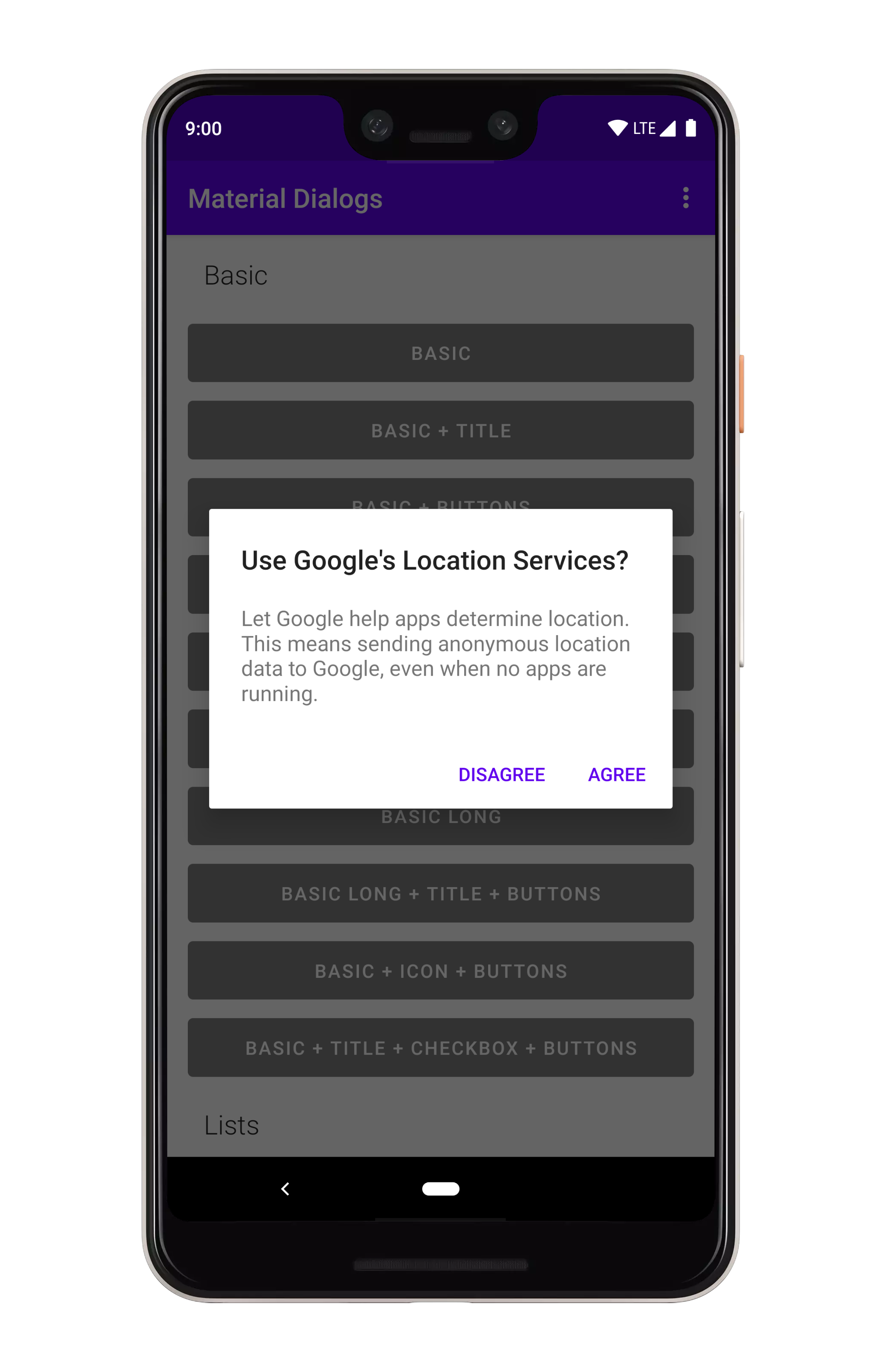
MaterialDialog(this).show {
  positiveButton(R.string.agree)
  negativeButton(R.string.disagree)
}
You can use literal strings here as well:
MaterialDialog(this).show {
  positiveButton(text = "Agree")
  negativeButton(text = "Disagree")
}
Listening for clicks on the buttons is as simple as adding a lambda to the end:
MaterialDialog(this).show {
  positiveButton(R.string.agree) { dialog ->
    // Do something
  }
  negativeButton(R.string.disagree) { dialog ->
    // Do something
  }
}
If action buttons together are too long to fit in the dialog's width, they will be automatically stacked:

You can display an icon to the left of the title:
MaterialDialog(this).show {
  icon(R.drawable.your_icon)
}
You can pass a Drawable instance as well:
val myDrawable: Drawable = // ...
MaterialDialog(this).show {
  icon(drawable = myDrawable)
}There are a few lifecycle callbacks you can hook into:
MaterialDialog(this).show {
  onPreShow { dialog -> }
  onShow { dialog -> }
  onDismiss { dialog -> }
  onCancel { dialog -> }
}
Dismissing a dialog closes it, it's just a simple method inherited from the parent Dialog class:
val dialog: MaterialDialog = // ...
dialog.dismiss()
You can prevent a dialog from being canceled, meaning it has to be explictly dismissed with an action button or a call to the method above.
MaterialDialog(this).show {
  cancelable(false)  // calls setCancelable on the underlying dialog
  cancelOnTouchOutside(false)  // calls setCanceledOnTouchOutside on the underlying dialog
}You can show lists using the listItems extension on MaterialDialog:
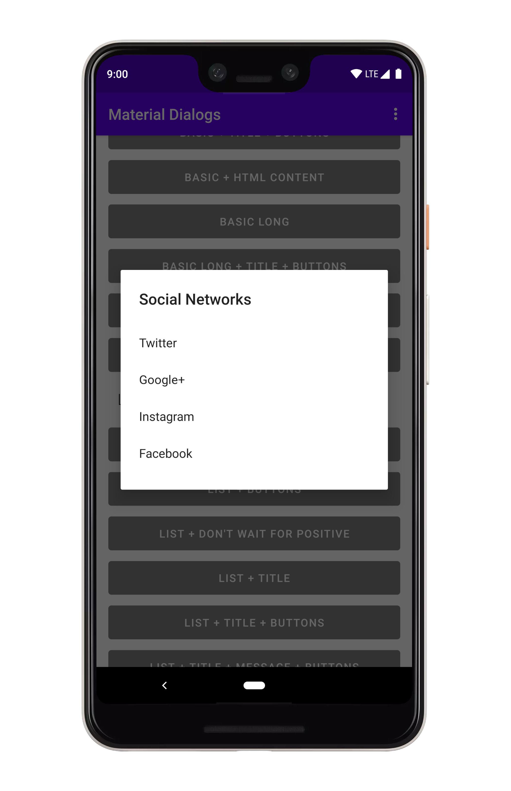
MaterialDialog(this).show {
  listItems(R.array.socialNetworks)
}
You can pass a literal string array too:
val myItems = listOf("Hello", "World")

MaterialDialog(this).show {
  listItems(items = myItems)
}
To get item selection events, just append a lambda:
MaterialDialog(this).show {
  listItems(R.array.socialNetworks) { dialog, index, text ->
    // Invoked when the user taps an item
  }
}You can show single choice (radio button) lists using the listItemsSingleChoice extension
on MaterialDialog:
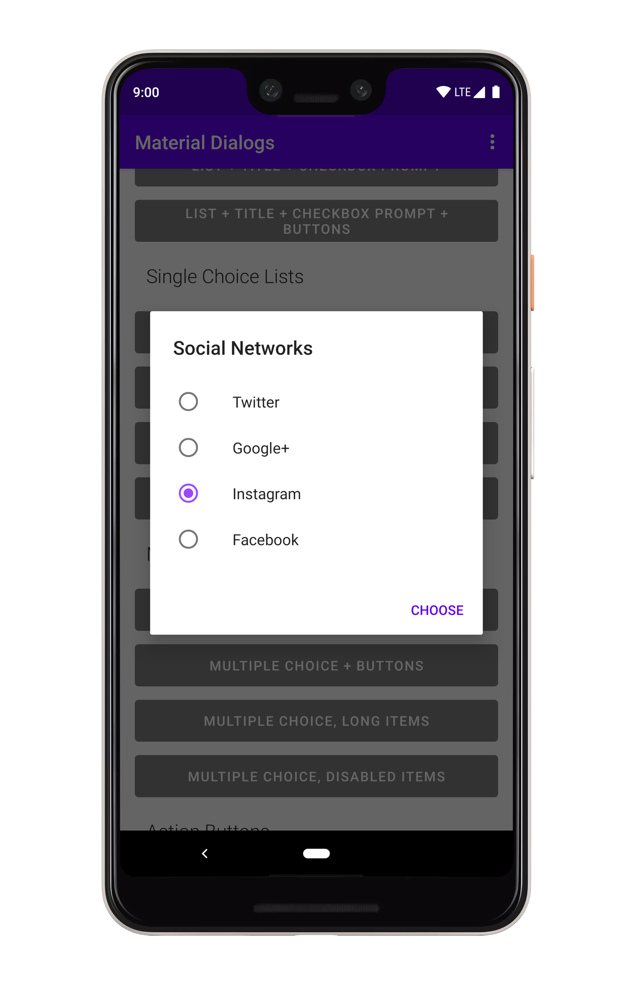
MaterialDialog(this).show {
  listItemsSingleChoice(R.array.my_items)
}
You can pass a literal string array too:
val myItems = listOf("Hello", "World")

MaterialDialog(this).show {
  listItemsSingleChoice(items = myItems)
}
If you want an option to be selected when the dialog opens, you can pass an initialSelection index):
MaterialDialog(this).show {
  listItemsSingleChoice(R.array.my_items, initialSelection = 1)
}
To get item selection events, just append a lambda:
MaterialDialog(this).show {
  listItemsSingleChoice(R.array.my_items) { dialog, index, text ->
    // Invoked when the user selects an item
  }
}
Without action buttons, the selection callback is invoked immediately when the user taps an item. If you add a positive action button...
MaterialDialog(this).show {
  listItemsSingleChoice(R.array.my_items) { dialog, index, text ->
    // Invoked when the user selects an item
  }
  positiveButton(R.string.select)
}
...then the callback isn't invoked until the user selects an item and taps the positive action
button. You can override that behavior using the waitForPositiveButton argument.
An added bonus, you can disable items from being selected/unselected:
val indices = intArrayOf(0, 2)

MaterialDialog(this).show {
  listItemsSingleChoice(R.array.my_items, disabledIndices = indices)
}
There are methods you can use in a built dialog to modify checked states:
val dialog: MaterialDialog = // ...

dialog.checkItem(index)

dialog.uncheckItem(index)

dialog.toggleItemChecked(index)

val checked: Boolean = dialog.isItemChecked(index)You can show multiple choice (checkbox) lists using the listItemsMultiChoice extension on MaterialDialog:
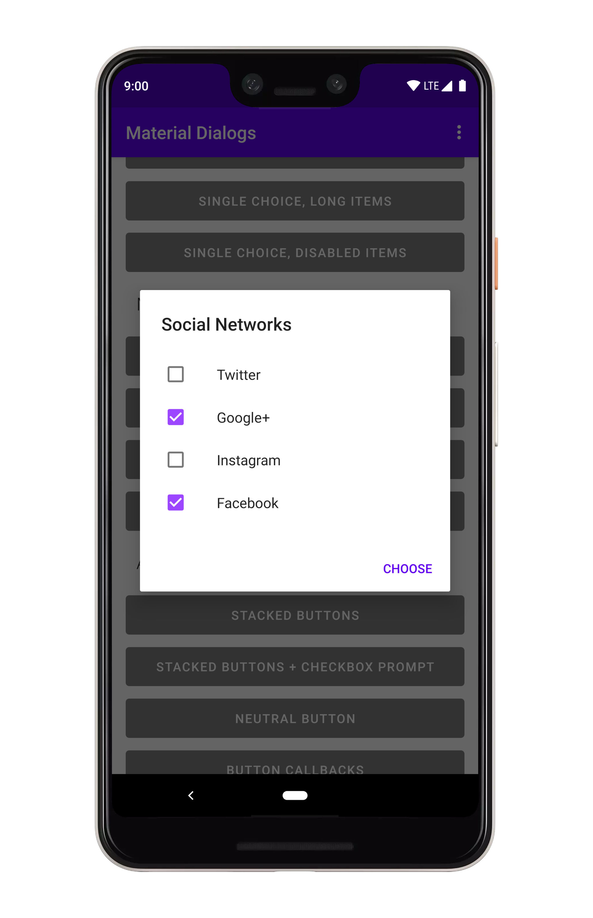
MaterialDialog(this).show {
  listItemsMultiChoice(R.array.my_items) { _, index, text ->
     // Invoked when the user selects item(s)
  }
}
You can pass a literal string array too:
val myItems = listOf("Hello", "World")

MaterialDialog(this).show {
  listItemsMultiChoice(items = myItems)
}
If you want option(s) to be selected when the dialog opens, you can pass an initialSelection index):
val indices = intArrayOf(1, 3)

MaterialDialog(this).show {
  listItemsMultiChoice(R.array.my_items, initialSelection = indices)
}
To get item selection events, just append a lambda:
MaterialDialog(this).show {
  listItemsMultiChoice(R.array.my_items) { dialog, indices, items ->
    // Invoked when the user selects an item
  }
}
Without action buttons, the selection callback is invoked immediately when the user taps an item. If you add a positive action button...
MaterialDialog(this).show {
  listItemsMultiChoice(R.array.my_items) { dialog, indices, items ->
    // Invoked when the user selects an item
  }
  positiveButton(R.string.select)
}
...then the callback isn't invoked until the user select one or more items and taps the positive
action button. You can override that behavior using the waitForPositiveButton argument.
An added bonus, you can disable items from being selected/unselected:
val indices = intArrayOf(0, 2)

MaterialDialog(this).show {
  listItemsMultiChoice(R.array.my_items, disabledIndices = indices)
}
There are methods you can use in a built dialog to modify checked states:
val dialog: MaterialDialog = // ...
val indices: IntArray = // ...

dialog.checkItems(indices)

dialog.uncheckItems(indices)

dialog.toggleItemsChecked(indices)

dialog.checkAllItems()

dialog.uncheckAllItems()

dialog.toggleAllItemsChecked()

val checked: Boolean = dialog.isItemChecked(index)If you want to customize lists to use your own views, you need to use a custom adapter.
val adapter: RecyclerView.Adapter<*> = // some sort of adapter implementation...

MaterialDialog(this).show {
  customListAdapter(adapter)
}
You can retrieve your adapter again later from the dialog instance:
val dialog: MaterialDialog = // ...

val adapter: RecyclerView.Adapter<*> = dialog.getListAdapter()
You can also retrieve the RecyclerView that the adapter is hosted in:
val dialog: MaterialDialog = // ...

val recyclerView: RecyclerView = dialog.getRecyclerView()
Checkbox prompts can be used together with any other dialog type, it gets shown in the same view which shows the action buttons.
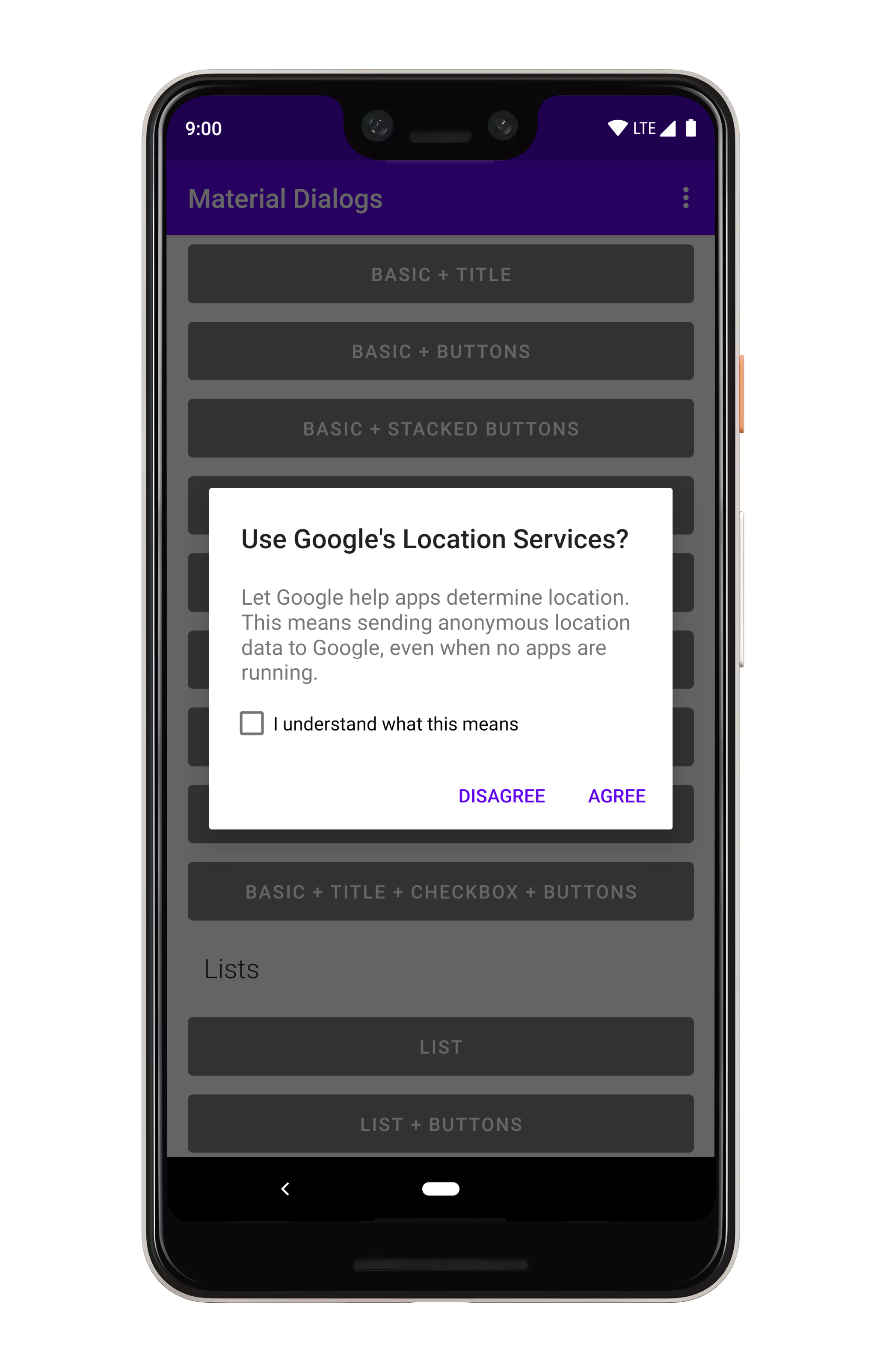
MaterialDialog(this).show {
  checkBoxPrompt(R.string.your_label) { checked ->
      // Check box was checked or unchecked
  }
}
You can pass a literal string for the label too:
MaterialDialog(this).show {
  checkBoxPrompt(text = "Hello, World")
}
You can also append a lambda which gets invoked when the checkbox is checked or unchecked:
MaterialDialog(this).show {
  checkBoxPrompt(text = "Hello, World") { checked -> }
}
If you only care about the checkbox state when the positive action button is pressed:
MaterialDialog(this).show {
  checkBoxPrompt(R.string.your_label)
  positiveButton(R.string.button_text) { dialog ->
      val isChecked = dialog.isCheckPromptChecked()
      // do something
  }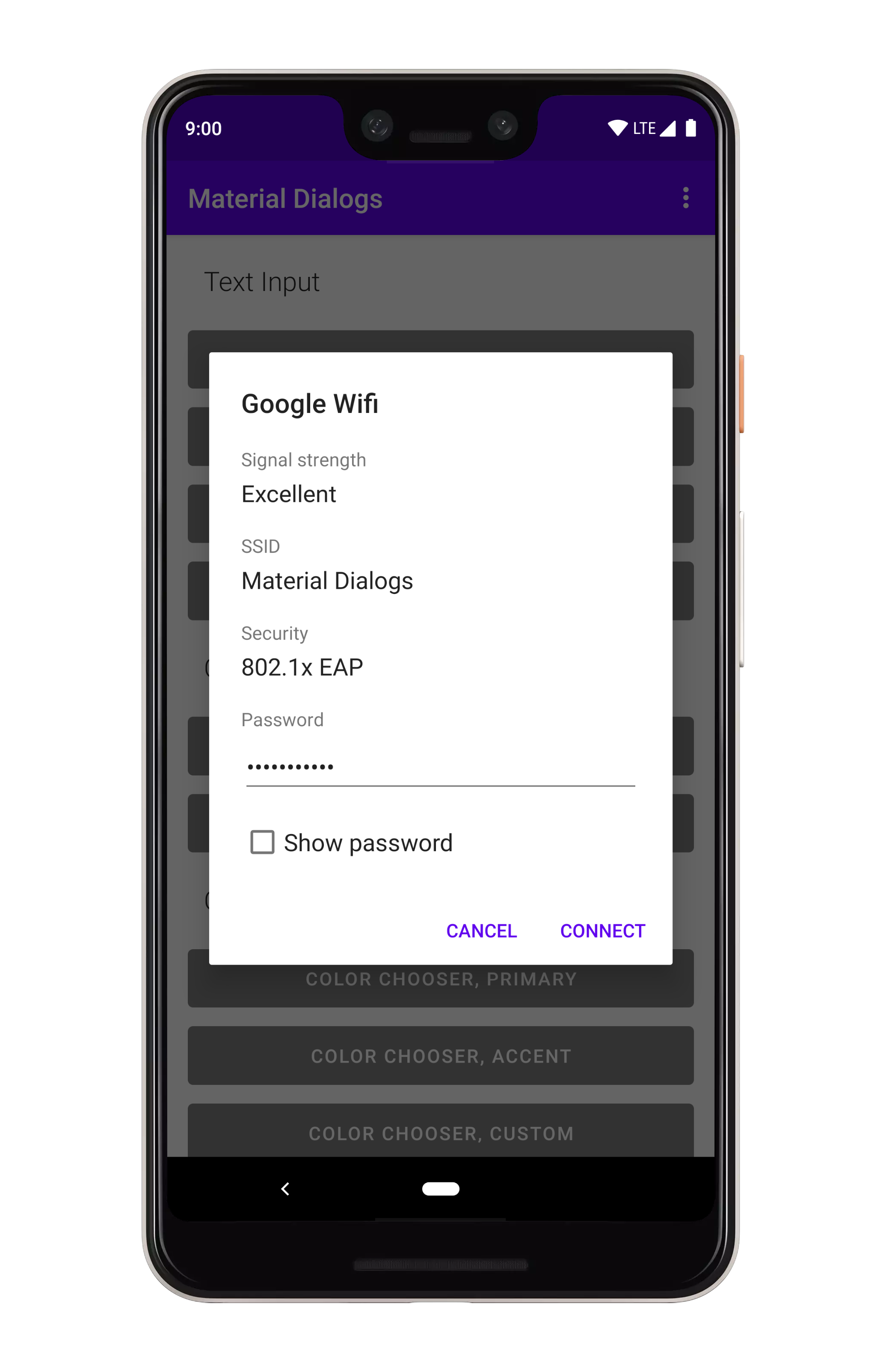
}A lot of the included extensions use custom views, such as the color chooser dialog. There's also a simple example in the sample project.
MaterialDialog(this).show {
  customView(R.layout.my_custom_view)
}
You can also pass a literal view:
val myView: View = // ...

MaterialDialog(this).show {
  customView(view = myView)
}
If your custom view may be taller than the dialog, you'll want to make it scrollable:
MaterialDialog(this).show {
  customView(R.layout.my_custom_view, scrollable = true)
}
For later access, you can use dialog.getCustomView():
val dialog = MaterialDialog(this)
  .customView(R.layout.my_custom_view, scrollable = true)

val customView = dialog.getCustomView()
// Use the view instance, e.g. to set values or setup listeners

dialog.show()There are little details which are easy to miss. For an example, auto dismiss controls whether pressing the action buttons or tapping a list item will automatically dismiss the dialog or not. By default, it's turned on. You can disable it:
MaterialDialog(this).show {
  noAutoDismiss()
}Google's newer mindset with Material Theming (vs the 2014 mindset) is flexible. If you take their "Crane example", you see that they change fonts, corner rounding, etc.
Light and dark theming is automatic based on your app's theme (basically whether android:textColorPrimary
is more light or more dark):

Material Dialogs uses the value of the colorBackgroundFloating attribute in your Activity theme
for the background color of dialogs. You can also use the md_background_color attribute in your
theme, which will take precedence.
Material Dialogs uses the value of the ?android:colorControlHighlight attribute in your Activity
theme for the ripple color of list items, buttons, etc. by default. You can override this with the
md_ripple_color theme attribute as well.
Corner radius is the rounding of dialog corners:

it can be changed with an attribute in your app theme. It defaults to 2dp:
<style name="AppTheme.Custom" parent="Theme.AppCompat">

  <item name="md_corner_radius">16dp</item>

</style>By default, android:textColorPrimary and android:textColorSecondary attributes from your Activity
theme are used for the title and content colors of dialogs. If you wish to override that, there
are two attributes provided:
<style name="AppTheme.Custom" parent="Theme.AppCompat">

  <item name="md_color_title">@color/your_color</item>
  <item name="md_color_content">@color/your_color</item>

</style>This library supports using custom fonts, powered by the Support libraries ResourcesCompat class.
With raw font files or XML font files in your /res/font folder, you can use them in Material Dialogs
using attributes in your app's theme.
<style name="AppTheme.Custom" parent="Theme.AppCompat">

  <item name="md_font_title">@font/your_font</item>
  <item name="md_font_body">@font/your_font</item>
  <item name="md_font_button">@font/your_font</item>

</style>
See the "Custom Theme" example in the sample project (open the overflow menu for the theme switcher).

The input module contains extensions to the core module, such as a text input dialog.
dependencies {
  ...
  implementation 'com.afollestad.material-dialogs:input:2.0.0-rc9'
}You can setup an input dialog using the input extension on MaterialDialog:
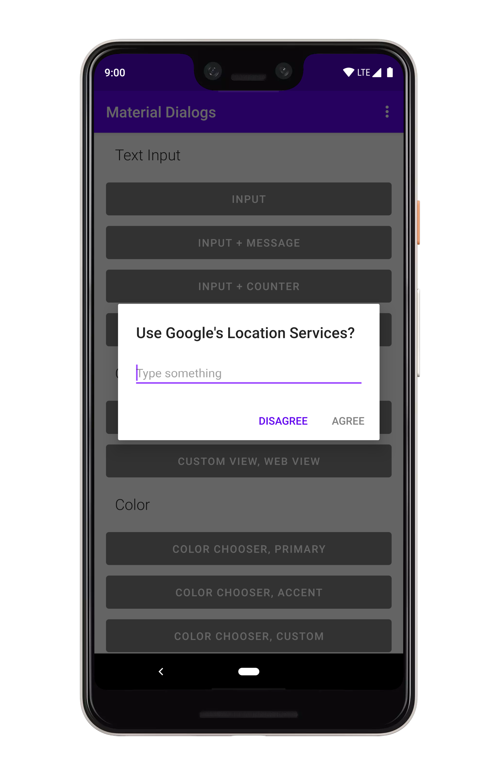
MaterialDialog(this).show {
  input()
  positiveButton(R.string.submit)
}
With a setup input dialog, you can retrieve the input field:
val dialog: MaterialDialog = // ...
val inputField: EditText = dialog.getInputField()
You can append a lambda to receive a callback when the positive action button is pressed with text entered:
MaterialDialog(this).show {
  input { dialpog, text ->
      // Text submitted with the action button
  }
  positiveButton(R.string.submit)
}
If you set waitForPositiveButton to false, the callback is invoked every time the text field is
modified:
MaterialDialog(this).show {
  input(waitForPositiveButton = false) { dialog, text ->
      // Text changed
  }
  positiveButton(R.string.done)
}
To allow the positive action button to be pressed even when the input is empty:
MaterialDialog(this).show {
  input(allowEmpty = true) { dialog, text ->
      // Text submitted with the action button, might be an empty string`
  }
  positiveButton(R.string.done)
}You can set a hint to the input field, which is the gray faded text shown when the field is empty:
MaterialDialog(this).show {
  input(hintRes = R.string.hint_text)
}
A literal string can be used as well:
MaterialDialog(this).show {
  input(hint = "Your Hint Text")
}
You can also prefill the input field:
MaterialDialog(this).show {
  input(prefillRes = R.string.prefill_text)
}
A literal string can be used as well:
MaterialDialog(this).show {
  input(prefill = "Prefilled text")
}You can apply input types to the input field, which modifies the keyboard type when the field is
focused on. This is just taken right from the Android framework, the input type gets applied
directly to the underlying EditText:
val type = InputType.TYPE_CLASS_TEXT or
  InputType.TYPE_TEXT_VARIATION_EMAIL_ADDRESS

MaterialDialog(this).show {
  input(inputType = type)
}You can set a max length which makes a character counter visible, and disables the positive action button if the input length goes over that:

MaterialDialog(this).show {
  input(maxLength = 8)
  positiveButton(R.string.submit)
}You can do custom validation using the input listener. This example enforces that the input starts with the letter 'a':
MaterialDialog(this).show {
  input(waitForPositiveButton = false) { dialog, text ->
    val inputField = dialog.getInputField()
    val isValid = text.startsWith("a", true)

    inputField?.error = if (isValid) null else "Must start with an 'a'!"
    dialog.setActionButtonEnabled(POSITIVE, isValid)
  }
  positiveButton(R.string.submit)
}
The files module contains extensions to the core module, such as a file and folder chooser.
dependencies {
  ...
  implementation 'com.afollestad.material-dialogs:files:2.0.0-rc9'
}Note: File choosers require your app to have permission to READ_EXTERNAL_STORAGE, otherwise
directory listings will come back empty.
You create file choosers using the fileChooser extension on MaterialDialog:
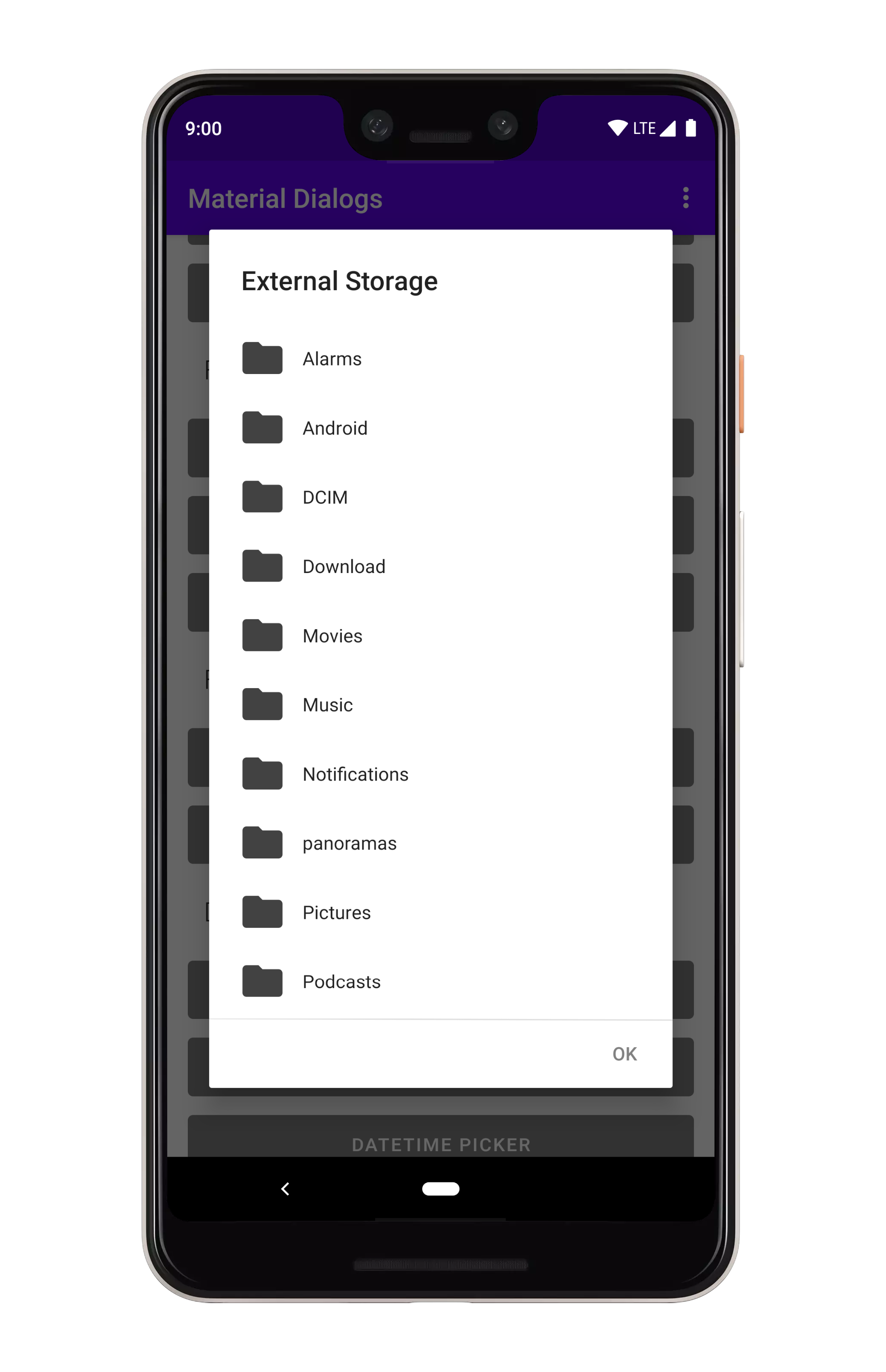
MaterialDialog(this).show {
  fileChooser { dialog, file ->
      // File selected
  }
}
It shows all files and folders, starting in the external storage directory. Tapping a file invokes the callback and dismisses the dialog.
You can change the directory which is listed initially:
val initialFolder = File(getExternalStorageDirectory(), "Download")

MaterialDialog(this).show {
  fileChooser(initialDirectory = initialFolder) { dialog, file ->
      // File selected
  }
}
If a positive action button exists, tapping a file will select it, but the callback isn't invoked until the positive action button is pressed.
A filter can be applied to only show the files and directories you wish to show:
// show ALL folders, and files that start with the letter 'a'
val myFilter: FileFilter = { it.isDirectory || it.nameWithoutExtension.startsWith("a", true) }

MaterialDialog(this).show {
  fileChooser(filter = myFilter) { dialog, file ->
      // File selected
  }
}
Empty text is shown when a folder has no contents. You can configure the empty text label:
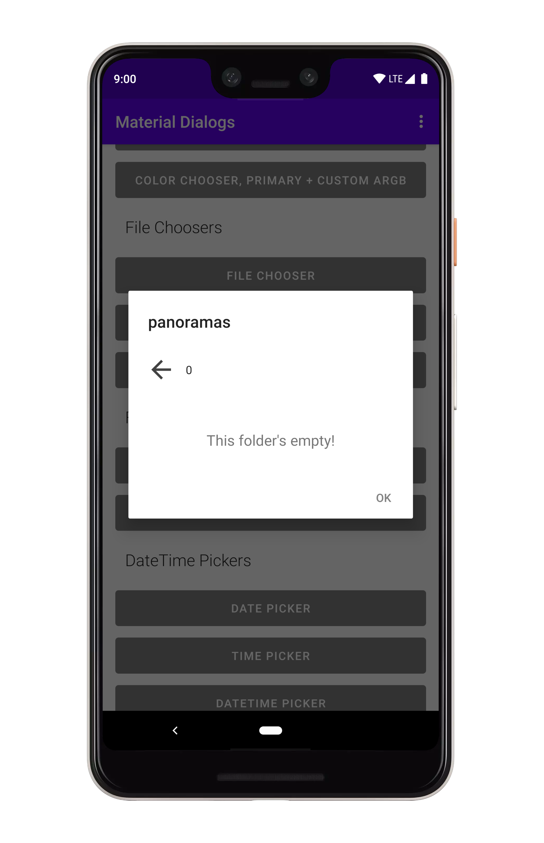
MaterialDialog(this).show {
  fileChooser(emptyTextRes = R.string.custom_label) { dialog, file ->
      // File selected
  }
}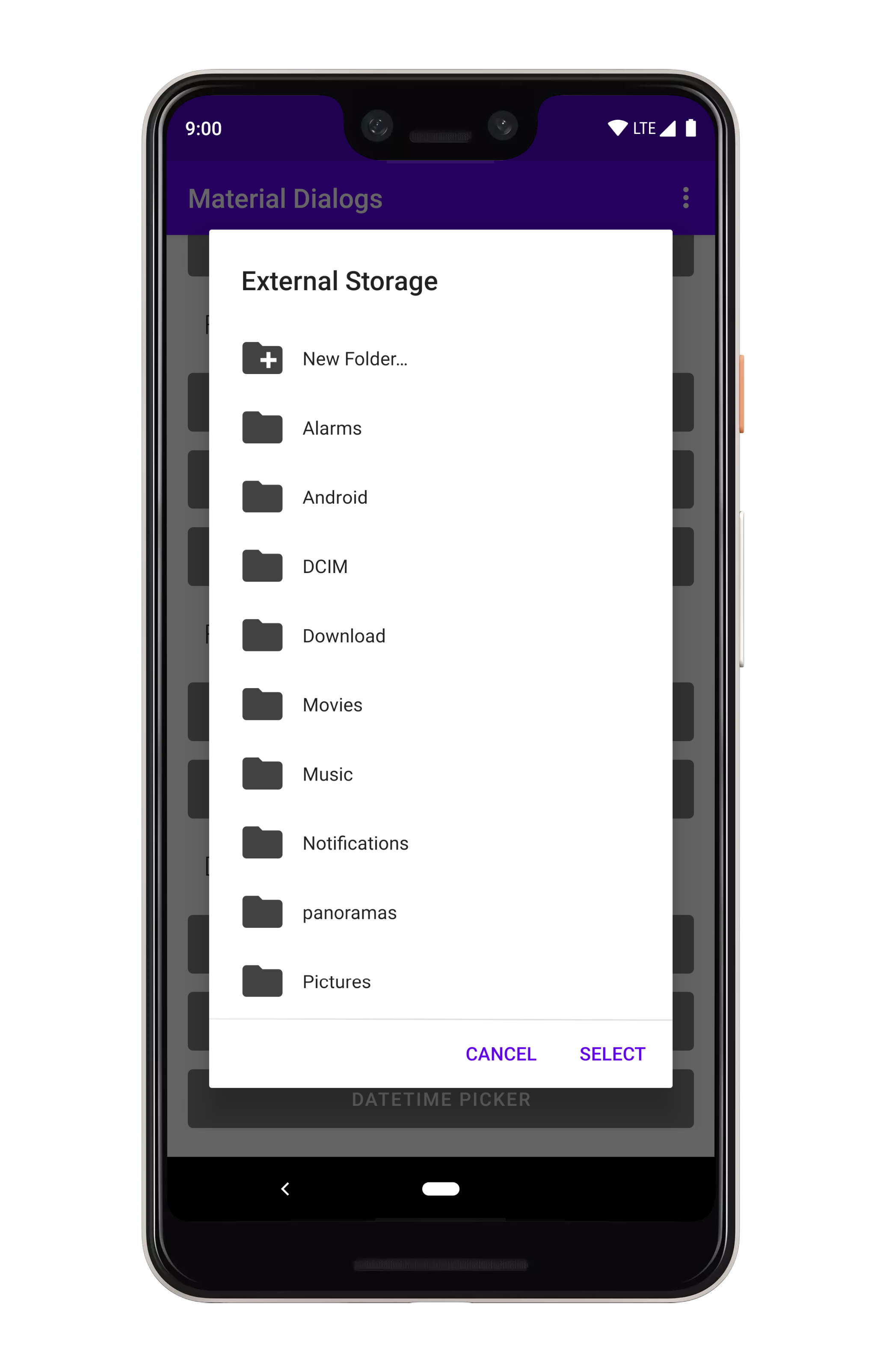
You can allow your users to create folders.
MaterialDialog(this).show {
  fileChooser(
      allowFolderCreation = true,
      folderCreationLabel = R.string.new_folder // optional as well
  ) { dialog, file ->
      // File selected
  }
}
This "New Folder" option is only show in directories which are writable.
Note: Folder choosers require your app to have permission to READ_EXTERNAL_STORAGE, otherwise
directory listings will come back empty.
Folder choosers are basically the same as file choosers, with a few minor differences: 1) only folders are shown, even when a custom filter is applied. 2) the selection callback is never invoked on a item click, it only gets invoked with the currently viewed folder when the positive action button is pressed.
MaterialDialog(this).show {
  folderChooser { dialog, folder ->
      // Folder selected
  }
}You can apply a filter like you can with the file chooser.
// show only folders that start with the letter 'a'
val myFilter: FileFilter = { it.name.startsWith("a", true) }

MaterialDialog(this).show {
  folderChooser(filter = myFilter) { dialog, file ->
      // Folder selected
  }
}
Empty text is shown when a folder has no contents. You can configure the empty text label:
MaterialDialog(this).show {
  folderChooser(emptyTextRes = R.string.custom_label) { dialog, file ->
      // File selected
  }
}
You can allow your users to create folders.
MaterialDialog(this).show {
  folderChooser(
      allowFolderCreation = true,
      folderCreationLabel = R.string.new_folder // optional as well
  ) { dialog, file ->
      // File selected
  }
}
This "New Folder" option is only show in directories which are writable.
The color module contains extensions to the core module, such as a color chooser.
dependencies {
  ...
  implementation 'com.afollestad.material-dialogs:color:2.0.0-rc9'
}
Color choosers show a simple grid of colors.

val colors = intArrayOf(RED, GREEN, BLUE)

MaterialDialog(this).show {
  title(R.string.colors)
  colorChooser(colors) { dialog, color ->
      // Use color integer
  }
  positiveButton(R.string.select)
}
You can specify an initial selection, which is just a color integer:
val colors = intArrayOf(RED, GREEN, BLUE)

MaterialDialog(this).show {
  title(R.string.colors)
  colorChooser(colors, initialSelection = BLUE) { dialog, color ->
      // Use color integer
  }
  positiveButton(R.string.select)
}You can specify sub-colors, which are a level down from each top level color. The size of the top level array must match the size of the sub-colors array.
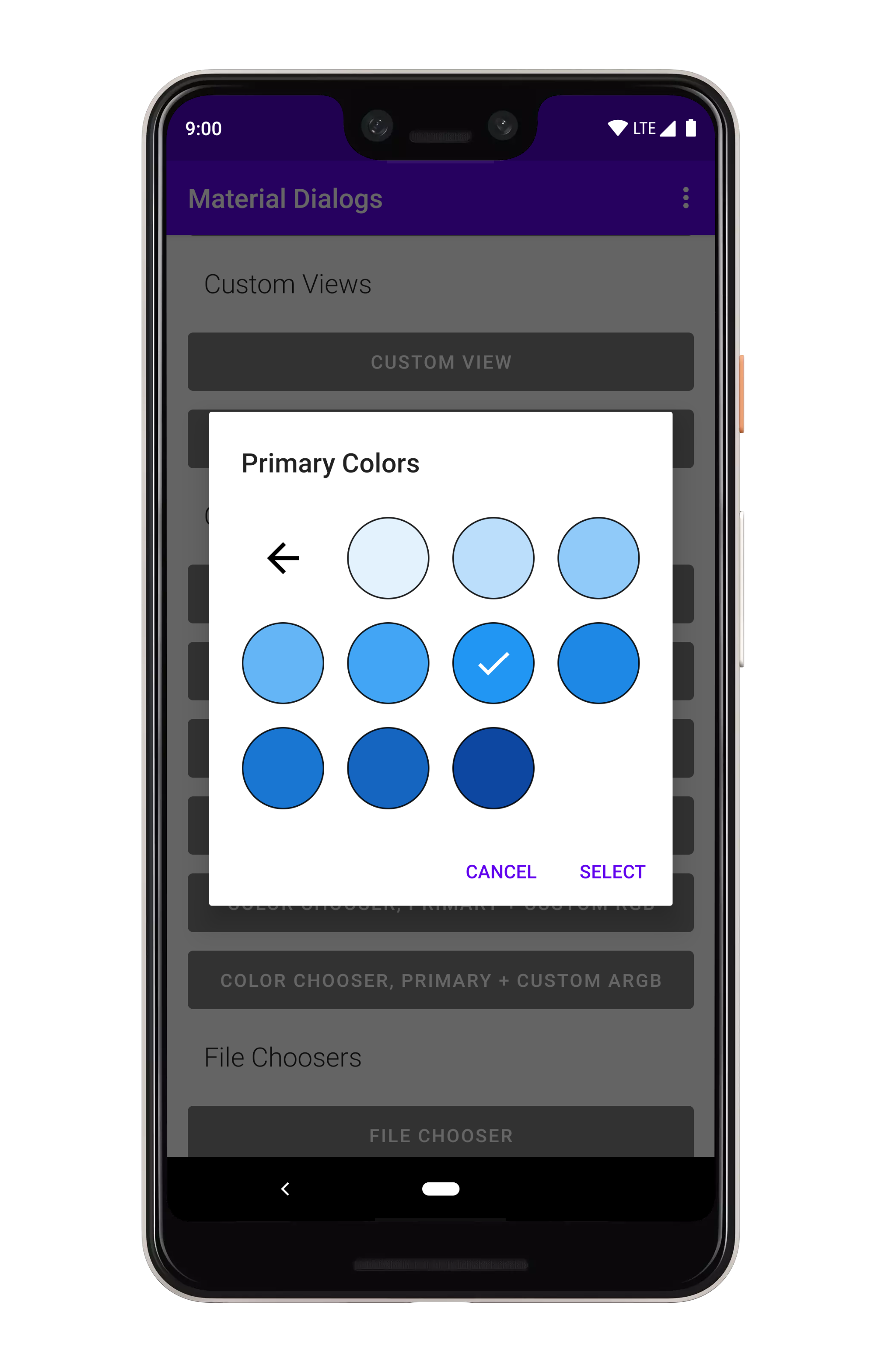
val colors = intArrayOf(RED, GREEN, BLUE) // size = 3

val subColors = listOf( // size = 3
  intArrayOf(LIGHT_RED, RED, DARK_RED, WHITE),
  intArrayOf(LIGHT_GREEN, GREEN, DARK_GREEN, GRAY),
  intArrayOf(LIGHT_BLUE, BLUE, DARK_BLUE, BLACK)
)

MaterialDialog(this).show {
  title(R.string.colors)
  colorChooser(colors, subColors = subColors) { dialog, color ->
      // Use color integer
  }
  positiveButton(R.string.select)
}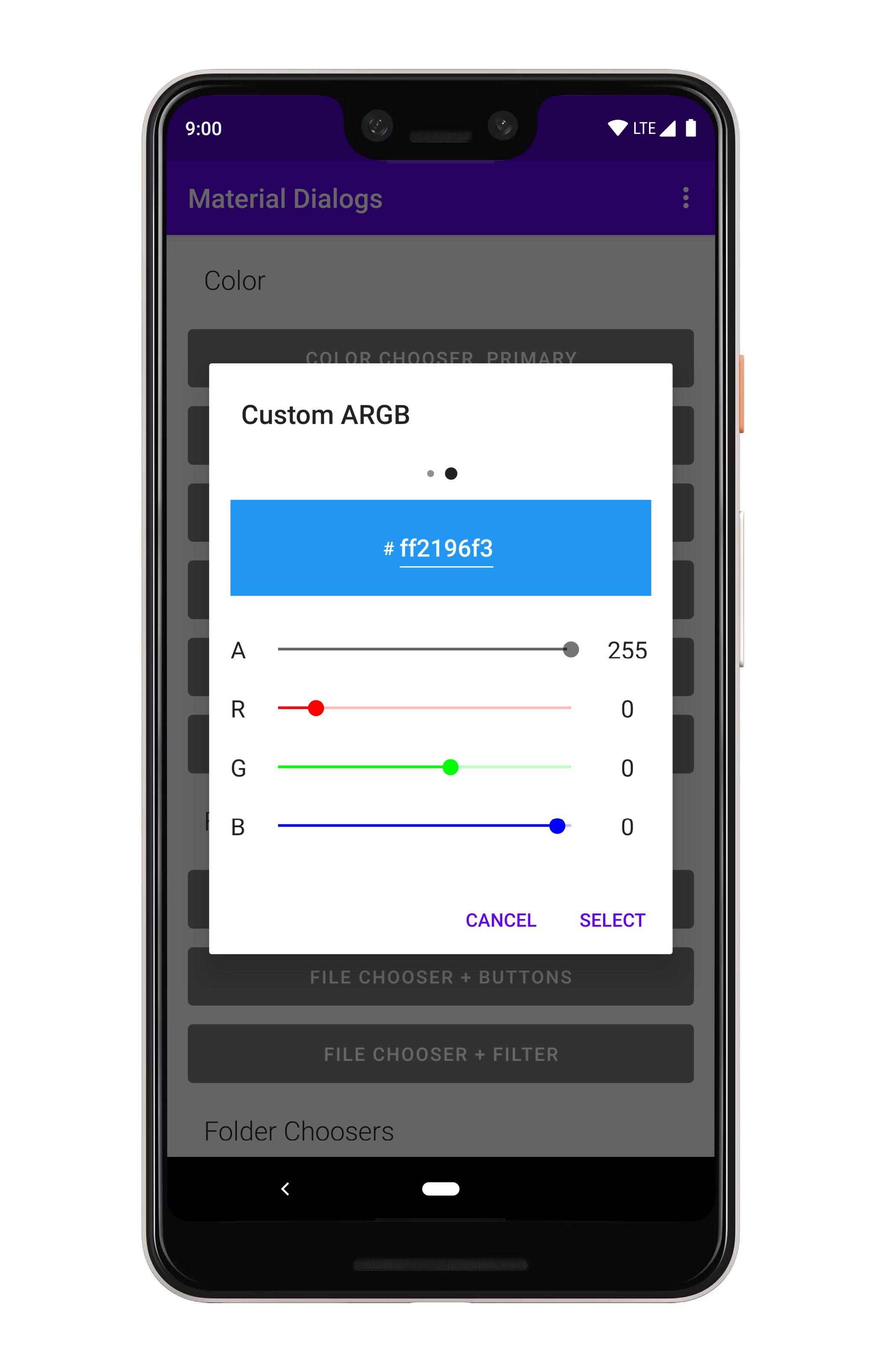
MaterialDialog(this).show {
  title(R.string.colors)
  colorChooser(
      colors = colors,
      subColors = subColors,
      allowCustomArgb = true,
      showAlphaSelector = true
  ) { dialog, color ->
      // Use color integer
  }
  positiveButton(R.string.select)
}
Omitting showAlphaSelector will hide the alpha (transparency) selector.
 React
React
 Typescript
 Django
 Laravel
 Facebook
 Microsoft
 Google
 Alibaba
 D3
D3
 Tencent