Vaadin in addition its own components has Java API for standard html elements. This makes possible to use standard html markup based toolkits such as Bootstrap or UIkit. This demo app is a proof of concept how to use UIkit with Vaadin.
The whole concept of this demo application is about creating Java API abstraction to the library.
Originally UIkit has been designed for creation of functional web-sites. So it has required some thinking how to create Java API's for the components, so that they facilitate connection to typical Java logic and backend data in a meaningful way. Here I have exploited greatly similar patterns than has been used in regular Vaadin components.
Add style imports on MainLayout
@StyleSheet("context://uikit.min.css")
Or
@StyleSheet("context://custom.css")
And the needed JavaScript imports to MainLayout
@JavaScript("context://uikit.min.js")
@JavaScript("context://uikit-icons.min.js")
The simplest starting point is to extend UkAppLayout class that builds a simple application frame with a menu.
@StyleSheet("context://uikit.min.css")
@JavaScript("context://uikit.min.js")
@JavaScript("context://uikit-icons.min.js")
@NoTheme
public class MainLayout extends UkAppLayout implements RouterLayout {

    public MainLayout() {
       setMenu();
       setLogo("Demo application");
    }
}
The @NoTheme disables Vaadin's own Lumo theme. Use this if you use only the UIkit and do not need Lumo for Vaadin's own components.
This demonstrator shows the flexibility of the Vaadin's core framework, which is called Flow. Vaadin has modular architecture, which means that design system, including its components is a separate module. In this demo application we actually use only the core framework, but not the components.
-
org.vaadin.uikit - Some demo views
-
org.vaadin.uikit.components - Different kind of components, mostly about viewing data or wrapping content
-
org.vaadin.uikit.components.layouts - Components purposed to be used as layouts
-
org.vaadin.uikit.components.input - Set of field type components that can be used with Flow's Binder
-
org.vaadin.uikit.components.interfaces - Generic API not specific to a single component has been defined in interfaces, which are implemented by many components.
-
org.vaadin.uikit.components.navigation - Vertical and horizontal menu / navigation components
There is about 50 components in the collection now. Component's class names are prefixed with "Uk" to avoid conflicts with Vaadin's own components.
Java API for UIkit's accordion component. A layout component with usual "accordion" approach. Accordion is vertical list of tabs, where one tab can be open at the time. Has event for opening and closing of a accordion tab.
UkAccordion accordion = new UkAccordion();
accordion.setOverflow(OverflowMode.AUTO);
accordion.addItem("Grid", createGrid());
accordion.addItem("Table", createTable());
add(accordion);

A component with SUCCESS,PRIMARY, WARNING and DANGER styles, which typically has a text and disappears automatically after set timeout or clicking integrated close button. Has event listener for closing event.
UkAlert alert = new UkAlert("Demo app loaded", AlertVariant.SUCCESS);
alert.addAlertHiddenListener(event -> {
    UkNotification.show("Ack!");
});
add(alert);
UIkit does not have app layout component. This is a macro component done by composing several components. This app layout component has option for auto generated menu, which is populated by scanning available @Route's and @PageTitle's. The menu can be either UkNavBar, UkNav or populated in UkOffcanvas.
public class MainLayout extends UkAppLayout implements RouterLayout, BeforeEnterObserver {

    public MainLayout() {
        setMenu();
        setLogo("Demo application");
        setLogout();
        getLogout().addClickListener(event -> {
            VaadinSession.getCurrent().getSession().invalidate();
            UI.getCurrent().navigate("login");
        });
    }
}

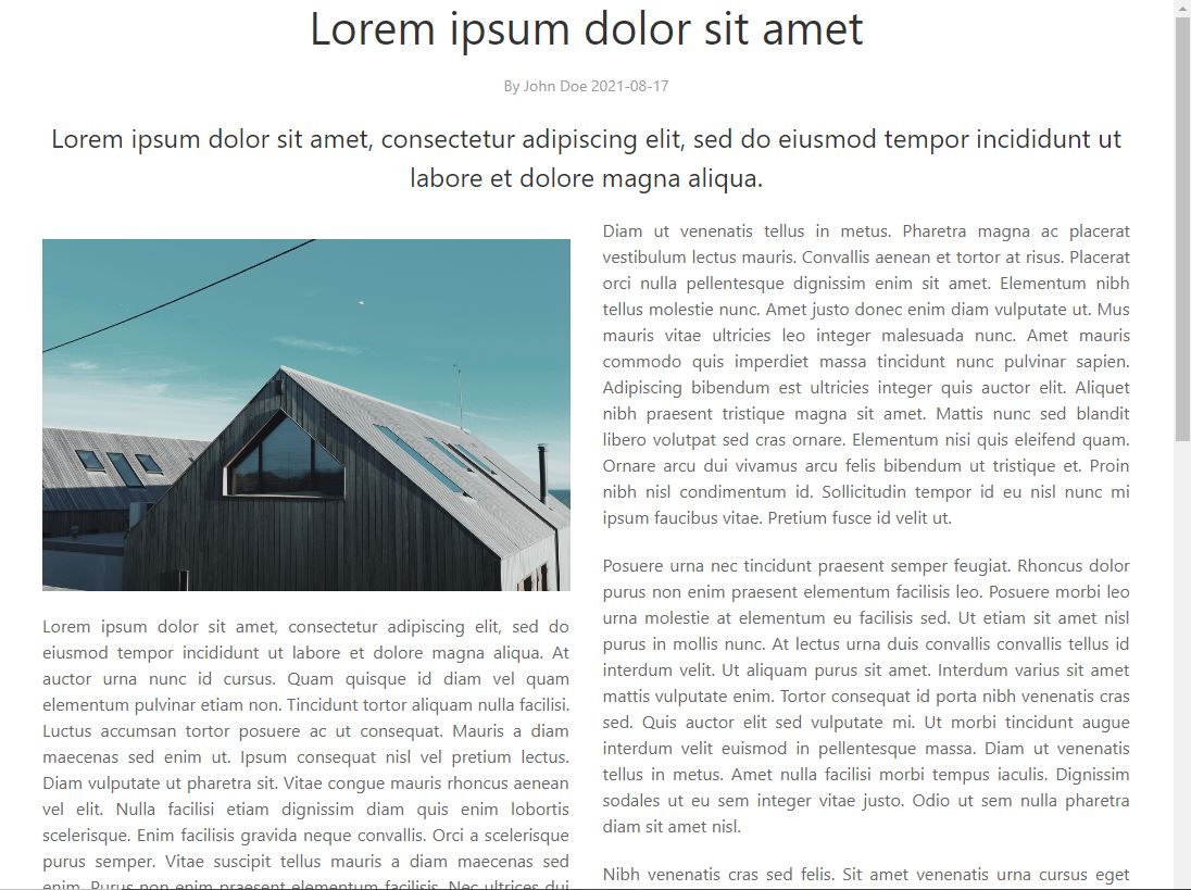
A component to show an article or document. The content is wrapped in article html tag. There is fluent API to construct the API from heading, lead, paragraphs and citations etc. The paragraphs can be read from a File or String. There some styling options, like enable responsive columns between 1-5.
UkArticle article = new UkArticle();
article
   .withHeading("Lorem ipsum dolor sit amet")
   .withLead(loremIpsum)
   .withParagraph(new UkImage("photo.jpg","Photo"))
   .withFile(file) // Read content from file, translate each line to a paragraph
   .withTextAlignment(TextAlignment.JUSTIFY)
   .withMeta("By John Doe "+ LocalDate.now().toString())
   .withColumns(3)
   .withHeaderSpan(ArticleHeaderSpan.WITH_LEAD,TextAlignment.CENTER)
   .build();
A span with a Badge style.
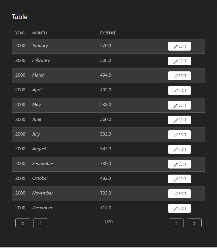
A variant of html table based component, which is populated by beans from DataProvider. The component supports paging and if you use DataProvider from callbacks, the pages are lazy loaded from the backend. You can populate table's cells with String, Component etc. There are is a alternative constructor to auto generate columns from bean properties by introspection. There is also UkTable component that has different kind of Java API purposed for table as a layout use case. The both are using the same UIkit styles for html table. UkBeanTable has responsive styles enabled, which means that when screen / browser is narrow, the data is collapsed to one column.
// Auto create paged Table with columns from properties of MonthlyExpense class
UkBeanTable<MonthlyExpense> table = new UkBeanTable<>(
        MonthlyExpense.class, true, 12);
table.setSmall(true);
table.setStripes(true);
List<MonthlyExpense> data = getData();
table.setItems(data);  // Populate the table with given list
A button component with DEFAULT,PRIMARY, SECONDARY, DANGER, LINK and TEXT styles. Uses native html button element. Caption can contain text and/or icon. Has click listener for click event. Also used in in UkDropdown, and paging buttons of UkBeanTable and UkDescriptionList.
A single component (or text) containing component with title, optional badge. Has DEFAULT,PRIMARY and SECONDARY variants.
A single input element of checkbox type.
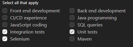
A multiselect component composed from list of checkboxes similar to UkCheckbox. The value of the field is of type Set<T>. The component is backed by DataProvider, but note, paging is not supported, so it is not suitable for large data sets. The wrapping container element is responsive and number of columns can be set. See also UkRadioGroup.
A div based component container with styles from uk-container to a block element to give it a max-width and wrap the main content. The element will be centered and have padding on the sides, that adapts automatically for large screens.
A single select component consisting of input and datalist elements. Typically such component is called as combobox, autosuggest or filter select. The component is populated by bean list from DataProvider. The maximum size of datalist popup can be set, so the component is well suited also larger data sets and DataProvider from callbacks. If more than max size items matches filter, only the first matches upto max size are shown.
UIkit at the moment does not have specific implementation for date picker, thus this is just native html input with date type and basic UIkit styling for the input itself. The value type of the Java implementation is LocalDate.
List of term and description pairs properly constructed with dl, dt and dd html elements. The list is populated by beans from DataProvider. The component supports paging and if you use DataProvider from callbacks, the pages are lazy loaded from the backend. The description can be populated by text String or Component.
A component that wraps a UkButton and dropdown that opens when the button is clicked. The dropdown can be populated by a Component.
A basic div based component container with CSS flexbox rules. For a responsive grid like layout see UkGrid.
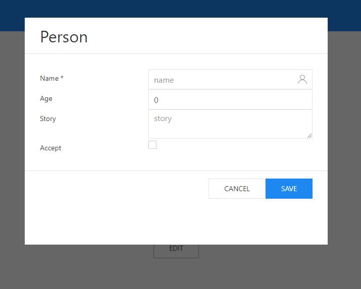
A responsive layout component based on form html element. The class contains UkFormItem subcomponent to wrap proper label element with the wrapped field meeting typical A11y criteria. UkFormItem has also required status indicator inherited from the wrapped field.
UkForm form = new UkForm();
form.setHorizontal(true);

UkTextField nameField = new UkTextField();
UkInline inline = new UkInline(UkIcons.USER, nameField);
inline.setIconFlip(true);
nameField.setPlaceholder("name");
UkTextField ageField = new UkTextField();
ageField.setPlaceholder("age");
UkCheckbox acceptField = new UkCheckbox();
UkTextArea storyField = new UkTextArea();
storyField.setPlaceholder("story");

form.add("Name", inline); // Shorthand to add field to form wrapped with given String as a label
form.add("Age", ageField);
form.add("Story", storyField);
form.add("Accept", acceptField);
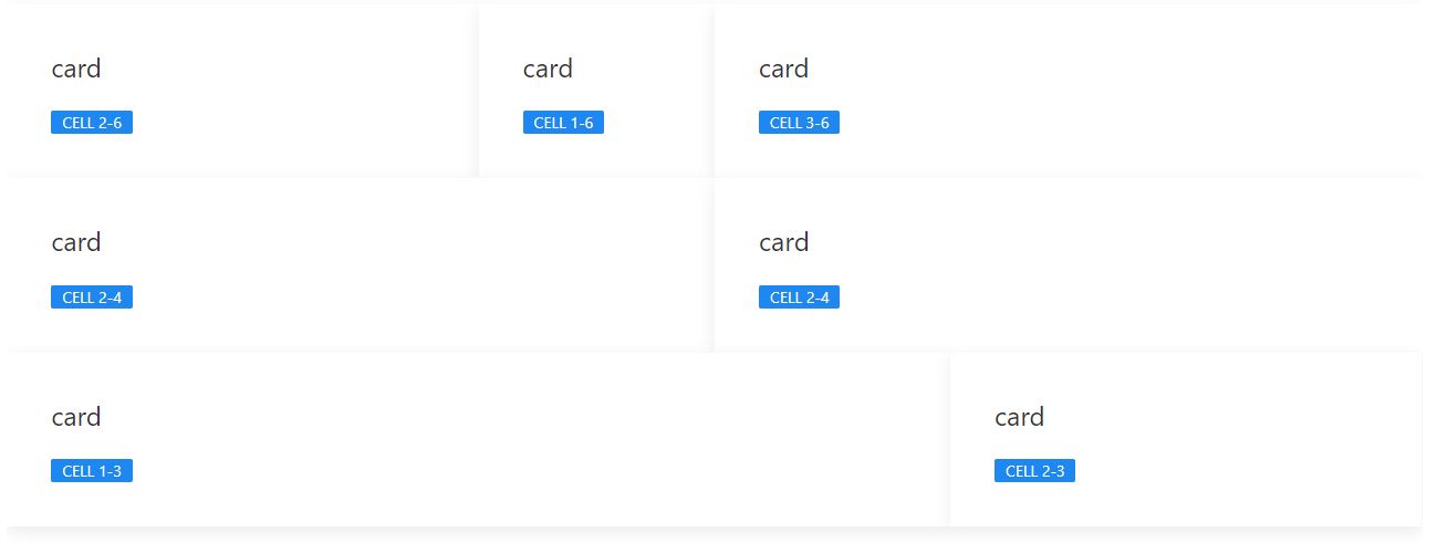
A div based responsive grid layout component container with CSS flexbox rules provided by UIkit. Has fluent Java API in similar fashion as UkTable. Note, do not mix this with CSS grid. For basic flex layout see UkFlex. Supports 1-6 columns and different number of columns per row.
UkGrid grid = new UkGrid();
grid
    .withRow(6)
    .withCell(2, new UkCard("card", new UkLabel("Cell 2-6")))
    .withCell(1, new UkCard("card", new UkLabel("Cell 1-6")))
    .withCell(3, new UkCard("card", new UkLabel("Cell 3-6")))
    .withRow(4)
    .withCell(2, new UkCard("card", new UkLabel("Cell 2-4")))
    .withCell(2, new UkCard("card", new UkLabel("Cell 2-4")))
    .withRow(3)
    .withCell(2, new UkCard("card", new UkLabel("Cell 1-3")))
    .withCell(1, new UkCard("card", new UkLabel("Cell 2-3")))
    .build();
grid.setGapModifier(GapModifier.COLLAPSE);
A span containing icon from UkIcons collection. The size can be defined.
UkIcon icon = UkIcons.CHECK.create();
icon.setTooltip("This is an icon");
add(icon);
A span with a Label style. Not to be mixed with proper html label. Use UkFormItem of UkForm to wrap proper label with a field component.
UIkit itself does not have component for login. This is a component made by composing a login form using other components, such as UkForm, UkTextField, UkPassword and UkButton.
A modal popup dialog overlay component.
UkModal dialog = new UkModal();
dialog.setWidth(FixedWidth.XLARGE);
dialog.setHeight(FixedHeight.LARGE);
UkForm form = new UkForm();

dialog.add(form);
dialog.addModalHiddenListener(event -> {
    UkNotification.show("Thanks!");
});
A helper component for wrapping an icon from UkIcons to the UkTextField, UkPassword, UkNumberfield or UkDateField.
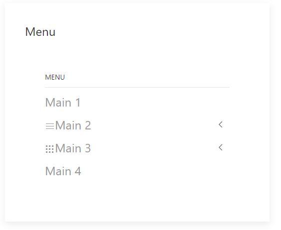
Tree like menu with vertical orientation.
Implementation of menu bar of the UIkit.
A regular html input of number type. Value of the field is Double. The min and max range can be set as well as step amount.
UkButton button = new UkButton("Click me");
button.addClickListener(event -> {
UkNotification notification = new UkNotification();
notification
    .withPosition(Position.BOTTOM_CENTER)
    .withStatus(Status.SUCCESS)
    .view("Notification message " + range.getValue());
});
An overlay component container that is normally hidden, but can be slid to view either from the left or right.
A div element based component container which has set box-sizing to border-box. Optionally you can enable scrolling using panel.setScrollable(true).
A regular html input of password type. Value of the field is String.
A progress bar component using styles from UIkit.
A single select component composed from list of radio buttons similar. The value of the field is of type T. The component is backed by DataProvider, but note, paging is not supported, so it is not suitable for large data sets. The wrapping container element is responsive and number of columns can be set. See also UkCheckboxGroup.

A regular html input of range or so called slider type. Value of the field is Double. The min and max range can be set as well as step amount.
UkRange range = new UkRange(1, 10, 0.1);
range.setTooltip("Range slider");
range.setValue(5d);
range.addValueChangeListener(event -> {
    UkNotification.show("Value: " + event.getValue());
});
range.setWidth(FieldWidth.MEDIUM);
range.setSize(FieldSize.SMALL);
Sections are used to separate the content of a page into differently styled blocks. You can use UkContainer component to modify the width of the content inside sections and add horizontal padding. Note that the padding of a nested container will be reset.
A single select field component based on natvie html select element.
Variant of html table based component, which can be constructed using fluent API. You can populate table's cells with String or Component. The component supports also row span and column span. There is also UkBeanTable component that has different kind of Java API purposed for table as a data list / grid. The both are using the same UIkit styles for html table. UkTable has responsive styles enabled, which means that when screen / browser is narrow, the data is collapsed to one column.
UkTable table = new UkTable();
table
    .withRow()
    .withCell(1, 2, new UkCard("chart", createChart("black")))
    .withCell(new UkCard("card", new UkLabel("Cell 1,2")))
    .withCell(new UkCard("card", new UkLabel("Cell 2,2")))
    .withRow()
    .withCell(2, 1, loremIpsum)
    .withRow()
    .withCell("cell 1,3")
    .withCell("cell 2,3").withCell("cell 3,3")
    .build();
table.setDivider(true);
table.setMiddle(true);

UIkit has css and JavaScript combo component for Slideshows. This is Java API for it. The slides can contain image or video as baseline and additional component on top of media positioned in various ways. The media is loaded when slide is shown, i.e. lazy loading. Also there are event listener for slide change.
A simple spinner component to show indeterminate progress / waiting status.
This is a tabsheet type of a layout component. Tabs can be either on the top or bottom side of the content. There is event to listen for tab view / exit. See also UkAccordion.
UkTabSwitcher tabSwitcher = new UkTabSwitcher();
tabSwitcher.setOverflow(OverflowMode.AUTO);
UkCard card1 = new UkCard("Card 1", new Paragraph(loremIpsum));
card1.setVariant(CardVariant.DEFAULT);
UkCard card2 = new UkCard("Card 2", new Paragraph(loremIpsum));
card2.setVariant(CardVariant.SECONDARY);
UkCard card3 = new UkCard("Card 3", new Paragraph(loremIpsum));
card3.setVariant(CardVariant.PRIMARY);
tabSwitcher.addItem("Tab 1", card1);
tabSwitcher.addItem("Tab 2", card2);
tabSwitcher.addItem("Tab 3", card3);

Optionally resizeable text field based on native html textarea element. Value of the field is String.
A regular input of textual type. Value of the field is String.
A single component (or text) containing component. Has DEFAULT,PRIMARY, MUTED and SECONDARY variants for background color accent.
- /src/main/scss/custom.scss - Example of how to customize UIkit. Use
mvn -Puikitto compile the theme. - /src/uikit - SASS source code of the UIkit
- This is not a best practice example, just proof of concept how to build Java API for another frontend stack
- You can't use all Vaadin normal components fully, in order to keep the UI compatible with UIkit, I would assume z-planes go differently with modals, notifications etc.
- This is work in progress, I will probably re-package this as re-usable add-on library later
-
Run using
mvn jetty:runand open http://localhost:8080 in the browser. -
If you want to run the application with custom UIkit theme, run
mvn jetty:run -Puikit, which will include additional SASS compilation step. -
If you want to run your app locally in the production mode, run
mvn jetty:run -Pproduction. (In production mode ~700 kilobytes of static resources are loaded when app starts)


 React
React
 Typescript
 Django
 Laravel
 Facebook
 Microsoft
 Google
 Alibaba
 D3
D3
 Tencent