Coder Social home page Coder Social logo

t0gre / react-datepicker Goto Github PK

View Code? Open in Web Editor NEW
329.0 9.0 53.0 5.48 MB

An easily internationalizable, accessible, mobile-friendly datepicker library for the web, build with styled-components.

Home Page: https://react-datepicker.netlify.com/

License: MIT License

JavaScript 65.88% TypeScript 34.10% HTML 0.02%
react styled-components styled-system datepicker grid rtl i18n react-hooks typescript

react-datepicker's Introduction

@datepicker-react/styled

Gzip size Coverage Status Build Status Netlify Status

NPM

An easily internationalizable, accessible, mobile-friendly datepicker library for the web, build with styled-components.

N.B. this project is looking for a new maintainer. I do not have time to maintain it unfortunately. If anyone would like to take it over please file and issue saying you'd like to take it

over and I will transfer it to you.

example

How to build your own datepicker?

Simple. Use React hooks (@datepicker-react/hooks).

Live Playground

For examples of the datepicker in action, go to https://datepicker-react.netlify.com/.

OR

To run that demo on your own computer:

Getting Started

Install

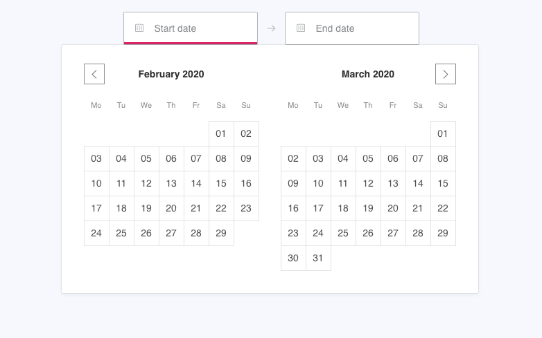
yarn add @datepicker-react/styled styled-components

Include component

import {DateRangeInput, DateSingleInput, Datepicker} from '@datepicker-react/styled'

DateRangeInput

The DateRangeInput is a fully controlled component that allows users to select a date range. You can control the selected dates using the startDate, endDate, and onDatesChange props as shown below. Similarly, you can control which input is focused as well as calendar visibility (the calendar is only visible if focusedInput is defined) with the focusedInput and onFocusChange props as shown below.

Here is the minimum REQUIRED setup you need to get the DateRangeInput working:

IE11 is not supported

import React, {useReducer} from 'react'
import {DateRangeInput} from '@datepicker-react/styled'

const initialState = {
  startDate: null,
  endDate: null,
  focusedInput: null,
}

function reducer(state, action) {
  switch (action.type) {
    case 'focusChange':
      return {...state, focusedInput: action.payload}
    case 'dateChange':
      return action.payload
    default:
      throw new Error()
  }
}

function App() {
  const [state, dispatch] = useReducer(reducer, initialState)

  return (
    <DateRangeInput
      onDatesChange={data => dispatch({type: 'dateChange', payload: data})}
      onFocusChange={focusedInput => dispatch({type: 'focusChange', payload: focusedInput})}
      startDate={state.startDate} // Date or null
      endDate={state.endDate} // Date or null
      focusedInput={state.focusedInput} // START_DATE, END_DATE or null
    />
  )
}

The following is a list of other OPTIONAL props you may provide to the DateRangeInput to customize appearance and behavior to your heart's desire.

displayFormat?: string | FormatFunction // Default: 'MM/DD/YYYY'
phrases?: DateRangeInputPhrases
showStartDateCalendarIcon?: boolean // Default: true
showEndDateCalendarIcon?: boolean // Default: true
onClose?(): void
vertical?: boolean // Default: false
showResetDates?: boolean // Default: true
showSelectedDates?: boolean // Default: true
showClose?: boolean // Default: true
rtl?: boolean // Default: false
placement?: 'top' | 'bottom' // Default: bottom
unavailableDates?: Date[] // Default: []
minBookingDate?: Date
maxBookingDate?: Date
numberOfMonths?: number // Default: 2
minBookingDays?: number // Default: 1
exactMinBookingDays?: boolean // Default: false
firstDayOfWeek?: FirstDayOfWeek // Default: 1
initialVisibleMonth?: Date
isDateBlocked?(date: Date): boolean
dayLabelFormat?(date: Date): string
weekdayLabelFormat?(date: Date): string
monthLabelFormat?(date: Date): string
onDayRender?(date: Date): React.ReactNode
startDateInputId?: string
endDateInputId?: string

Datepicker

The Datepicker is a fully controlled component that allows users to select a date range. You can control the selected dates using the startDate, endDate, and onDatesChange props as shown below. Similarly, you can control which input is focused with the focusedInput prop.

Here is the minimum REQUIRED setup you need to get the Datepicker working:

IE11 is not supported

import React, {useState} from 'react'
import {Datepicker, START_DATE} from '@datepicker-react/styled'

function App() {
  const [state, setState] = useState({
    startDate: null,
    endDate: null,
    focusedInput: START_DATE,
  })

  function handleDatesChange(data: OnDatesChangeProps) {
    if (!data.focusedInput) {
      setState({...data, focusedInput: START_DATE})
    } else {
      setState(data)
    }
  }

  return (
    <Datepicker
      onDatesChange={handleDatesChange}
      startDate={state.startDate} // Date or null
      endDate={state.endDate} // Date or null
      focusedInput={state.focusedInput} // START_DATE, END_DATE or null
    />
  )
}

The following is a list of other OPTIONAL props you may provide to the Datepicker to customize appearance and behavior to your heart's desire.

phrases?: DatepickerPhrases
displayFormat?: string | FormatFunction // Default: 'MM/DD/YYYY'
onClose?(): void
showResetDates?: boolean // Default: true
showSelectedDates?: boolean // Default: true
showClose?: boolean // Default: true
vertical?: boolean // Default: false
rtl?: boolean // Default: false
unavailableDates?: Date[] // Default: []
minBookingDate?: Date
maxBookingDate?: Date
numberOfMonths?: number // Default: 2
minBookingDays?: number // Default: 1
exactMinBookingDays?: boolean // Default: false
firstDayOfWeek?: FirstDayOfWeek // Default: 0
initialVisibleMonth?: Date
isDateBlocked?(date: Date): boolean
dayLabelFormat?(date: Date): string
weekdayLabelFormat?(date: Date): string
monthLabelFormat?(date: Date): string
onDayRender?(date: Date): React.ReactNode

DateSingleInput

The DateSingleInput is a fully controlled component that allows users to select a date. You can control the selected date using the date and onDateChange props as shown below. Similarly, you can control calendar visibility (the calendar is only visible if showDatepicker is true) with the showDatepicker and onFocusChange props as shown below.

Here is the minimum REQUIRED setup you need to get the DateSingleInput working:

IE11 is not supported

import React, {useReducer} from 'react'
import {DateSingleInput} from '@datepicker-react/styled'

const initialState = {
  date: null,
  showDatepicker: false,
}

function reducer(state, action) {
  switch (action.type) {
    case 'focusChange':
      return {...state, showDatepicker: action.payload}
    case 'dateChange':
      return action.payload
    default:
      throw new Error()
  }
}

function App() {
  const [state, dispatch] = useReducer(reducer, initialState)

  return (
    <DateSingleInput
      onDateChange={data => dispatch({type: 'dateChange', payload: data})}
      onFocusChange={focusedInput => dispatch({type: 'focusChange', payload: focusedInput})}
      date={state.date} // Date or null
      showDatepicker={state.showDatepicker} // Boolean
    />
  )
}

The following is a list of other OPTIONAL props you may provide to the DateSingleInput to customize appearance and behavior to your heart's desire.

minBookingDate?: Date
maxBookingDate?: Date
numberOfMonths?: number
firstDayOfWeek?: FirstDayOfWeek
displayFormat?: string | FormatFunction
phrases?: DateSingleInputPhrases
showCalendarIcon?: boolean
vertical?: boolean
showResetDate?: boolean
showClose?: boolean
rtl?: boolean
placement?: 'top' | 'bottom'
initialVisibleMonth?: Date
unavailableDates?: Date[] // Default: []
isDateBlocked?(date: Date): boolean
onClose?(): void
dayLabelFormat?(date: Date): string
weekdayLabelFormat?(date: Date): string
monthLabelFormat?(date: Date): string
onDayRender?(date: Date): React.ReactNode
inputId?: string

Theming

@datepicker-react/styled supports theming with Styled components ThemeProvider and Styled System theme-based style.

<ThemeProvider
  theme={{
    breakpoints: ['32em', '48em', '64em'],
    reactDatepicker: {
      daySize: [36, 40],
      fontFamily: 'system-ui, -apple-system',
      colors: {
        accessibility: '#D80249',
        selectedDay: '#f7518b',
        selectedDayHover: '#F75D95',
        primaryColor: '#d8366f',
      },
    },
  }}
>
  ...
</ThemeProvider>

Who's using

LifeOnScreen

Articles

License

Licensed under the MIT License, Copyright © 2019-present Miha Sedej.

See LICENSE for more information.


Buy me a coffee

react-datepicker's People

Contributors

dependabot[bot] avatar devinrhode2 avatar guilhermepatriarca avatar ilyamkin avatar jonatthu avatar jonespen avatar marekstracar avatar meesvandongen avatar monapasan avatar omonk avatar pmeller-siili avatar renovate-bot avatar t0gre avatar tobiasf avatar tresko avatar vutran avatar

Stargazers

 avatar  avatar  avatar  avatar  avatar  avatar  avatar  avatar  avatar  avatar  avatar  avatar  avatar  avatar  avatar  avatar  avatar  avatar  avatar  avatar  avatar  avatar  avatar  avatar  avatar  avatar  avatar  avatar  avatar  avatar  avatar  avatar  avatar  avatar  avatar  avatar  avatar  avatar  avatar  avatar  avatar  avatar  avatar  avatar  avatar  avatar  avatar  avatar  avatar  avatar  avatar  avatar  avatar  avatar  avatar  avatar  avatar  avatar  avatar  avatar  avatar  avatar  avatar  avatar  avatar  avatar  avatar  avatar  avatar  avatar  avatar  avatar  avatar  avatar  avatar  avatar  avatar  avatar  avatar  avatar  avatar  avatar  avatar  avatar  avatar  avatar  avatar  avatar  avatar  avatar  avatar  avatar  avatar  avatar  avatar  avatar  avatar  avatar  avatar  avatar

Watchers

 avatar  avatar  avatar  avatar  avatar  avatar  avatar  avatar  avatar

react-datepicker's Issues

Select specific active(s) month

We cannot select the active month on the hook. I want to be able to go to the month that corresponds to StartDate or EndDate.

Issues with responsive display

@datepicker-react/styled version 2.3.1

More of a question rather than a bug.

How do you get the datepicker to behave responsively. At the moment when vertical is set to false, the two calendars display horizontally and expand beyond the screen on mobile. Is there a setting to make this responsive?

Source code (including props configuration)
<DateRangeInput
onDatesChange={data => {
dispatch({ type: "dateChange", payload: data });
register({ name: "Start Date", type: "custom" });
register({ name: "End Date", type: "custom" });
setValue("Start Date", data.startDate);
setValue("End Date", data.endDate);
}}
onFocusChange={focusedInput =>
dispatch({ type: "focusChange", payload: focusedInput })
}
startDate={state.startDate} // Date or null
endDate={state.endDate} // Date or null
focusedInput={state.focusedInput} // START_DATE, END_DATE or null
/>

If you have custom methods that you are passing into a `@datepicker-react` component / hooks, please include the source for those as well.

Note datepicker being used with react-hook-form. Should not effect display

**Screenshots/Gifs**


https://recordit.co/u6Xu9ahRUJ

**Smartphone (please complete the following information):**

Testing in browser, and on iphone 7 all browsers

**Is the issue reproducible in Storybook?**
Yes https://react-datepicker.netlify.com/?path=/story/daterangeinput--simple-demo

**Additional context**

Nope.

I love your work. This has been the best experience I have had with a react datepicker component. Thanks!

Prevent to hide datepicker

How I prevent to hide datepicker when i clicked day. I want to do apply button that can been close the datepicker.

ie11 doesn't have ms prefixes (and missing IE11 full support)

According to this article, repeat is not provided by IE11, and when rendering the grid, the alignment is off.

https://stackoverflow.com/questions/45786788/css-grid-layout-not-working-in-ie11-even-with-prefixes

The following is observed in IE11:

  1. the component doesn't show elements side by side
  2. the first day of the month is always sunday
  3. input elements are stacked

@datepicker-react/hooks or @datepicker-react/styled version
e.g. @datepicker-react/[email protected]

Describe the bug
A clear and concise description of what the bug is.

Source code (including props configuration)
Steps to reproduce the behavior:

<DateRangeInput
  onDatesChange={data => dispatch({type: 'dateChange', payload: data})}
  onFocusChange={focusedInput => dispatch({type: 'focusChange', payload: focusedInput})}
  startDate={state.startDate} // Date or null
  endDate={state.endDate} // Date or null
  focusedInput={state.focusedInput} // START_DATE, END_DATE or null
/>

If you have custom methods that you are passing into a @datepicker-react component / hooks, please include the source for those as well.

Screenshots/Gifs
If applicable, add screenshots or gifs to help explain your problem.

Desktop (please complete the following information):

  • OS: [e.g. iOS]
  • Browser [e.g. chrome, safari]
  • Version [e.g. 22]

Smartphone (please complete the following information):

  • Device: [e.g. iPhone6]
  • OS: [e.g. iOS8.1]
  • Browser [e.g. stock browser, safari]
  • Version [e.g. 22]

Is the issue reproducible in Storybook?
Please link to the relevant storybook example

Additional context
Add any other context about the problem here.

Is there any way to specify month days?

Using all the options available i managed to change the data-picker to resemble a Persian calendar but the only issue i am facing is days of month is for Gregorian Calendar , what i need now is an extensibility point to change days of month. is there any option to do this?

datepicker

Centering datepicker?

Current State
before

Desired State
after

What would an appropriate way to achieve this? I tried looking into Theme Props but couldn't find the props I need to make the adjustment.

Is there a way to make the calender open upwards

@datepicker-react/hooks or @datepicker-react/styled version
e.g. @datepicker-react/[email protected]

Describe the bug
A clear and concise description of what the bug is.

Source code (including props configuration)
Steps to reproduce the behavior:

<DateRangeInput
  onDatesChange={data => dispatch({type: 'dateChange', payload: data})}
  onFocusChange={focusedInput => dispatch({type: 'focusChange', payload: focusedInput})}
  startDate={state.startDate} // Date or null
  endDate={state.endDate} // Date or null
  focusedInput={state.focusedInput} // START_DATE, END_DATE or null
/>

If you have custom methods that you are passing into a @datepicker-react component / hooks, please include the source for those as well.

Screenshots/Gifs
If applicable, add screenshots or gifs to help explain your problem.

Desktop (please complete the following information):

  • OS: [e.g. iOS]
  • Browser [e.g. chrome, safari]
  • Version [e.g. 22]

Smartphone (please complete the following information):

  • Device: [e.g. iPhone6]
  • OS: [e.g. iOS8.1]
  • Browser [e.g. stock browser, safari]
  • Version [e.g. 22]

Is the issue reproducible in Storybook?
Please link to the relevant storybook example

Additional context
Add any other context about the problem here.

Change year

I change year programmatically or with a method of useDatepicker?

No event triggered when typing non-date-related input

If I type "incorrect" values in the input fields nothing happens, no event is triggered. E.g. if I type 12122020 (instead of 12/12/2020).

I would expect to have the onDatesChange triggered so I can display an alert to the user.

This is my implementation:

import React, {useReducer} from 'react';
import {DateRangeInput} from '@datepicker-react/styled'
import moment from 'moment';

const ORIGIN_OF_TIME = 1410868800000;

const initialState = {
  startDate: moment().subtract(1, 'days').toDate(),
  endDate: moment().toDate(),
  focusedInput: null,
};

const reducer = (state, action) => {
  switch (action.type) {
    case 'focusChange':
      return {...state, focusedInput: action.payload};
    case 'dateChange':
      return action.payload;
    default:
      throw new Error();
  }
};

const App = () => {

  const [state, dispatch] = useReducer(reducer, initialState);

  return (
        <DateRangeInput
          onDatesChange={data => dispatch({type: 'dateChange', payload: data})}
          onFocusChange={focusedInput => dispatch({type: 'focusChange', payload: focusedInput})}
          startDate={state.startDate}
          endDate={state.endDate}
          minBookingDate={moment.unix(ORIGIN_OF_TIME).toDate()}
          maxBookingDate={moment().toDate()}
          focusedInput={state.focusedInput}
          minBookingDays={1}
        />
  );
};

Let me know :)

Is it possible to specify end date first?

@datepicker-react/hooks@latest

Describe the bug
Is it possible to specify the end date first, and then the start date? I tried passing END_DATE: FocusedInput, but it doesn't work if start date isn't specified. Are there any workarounds to solve this problem?

[feature request] sync date typed into input with calendar

Awesome library. It would be cool if users could type in the input and have that sync with the calendar. In my use case, users are selecting a license expiration date that is likely years in the future so clicking through the months would add up to a lot of clicks.

Having trouble to load a page after installing 1.7.1

@datepicker-react/[email protected]

I updated datepicker from 1.6.0 to 1.7.1 and now I see this
image

I'm not sure if it's possible to reproduce this issue with raw CRA application, mine was ejected about a year ago and maybe not all of the dependencies are resolved. There's no errors during compilation, only on page load (any page, to be exact. doesn't matter if datepicker presented on the page or not).
Styled components version is now 4.4.1

Am I missing some dependencies to be updated to ?

Any clue on what is going on is highly appreciated in this cause.
Same applies to version 2.0.2

Time picker feature

Love the library!

We have started transitioning all our implementations of date pickers to use this library. However, we have a few places where we also need to be able to change the time of day, together with choosing a specific date. See screenshot for our current implementation with our old custom date-picker:

datepicker

Is this something you could consider implementing? Or is it out of scope for this library?

Setting initialVisibleMonth

@datepicker-react/hooks or @datepicker-react/styled version
@datepicker-react/[email protected]

Describe the bug
Unsure what values need to be passed to initialVisibleMonth so the initial month is not current month?

Source code (including props configuration)
Steps to reproduce the behavior:

 const createDate = (days, months, years) => {
    var date = new Date();
    date.setDate(date.getDate() + days);
    date.setMonth(date.getMonth() + months);
    date.setFullYear(date.getFullYear() + years);
    return date;
  };

<DateSingleInput
        onFocusChange={focusedInput => setShowDatepicker(focusedInput)}
        showDatepicker={showDatepicker}
        onDateChange={val => (val && val.date ? setDateField(val.date) : null)}
        date={dateField}
        displayFormat={"dd/MM/yyyy"}
        // initialVisibleMonth={[
        //   {
        //     year: 1991,
        //     month: 11,
        //     date: "Wed Nov 27 1991 11:51:41 GMT+0000 (Greenwich Mean Time)"
        //   }
        // ]}
        // initialVisibleMonth={() => [
        //   {
        //     year: 1991,
        //     month: 11,
        //      date: "Wed Nov 27 1991 11:51:41 GMT+0000 (Greenwich Mean Time)"
        //   }
        // ]}
        // initialVisibleMonth={{
        //   year: 1991,
        //   month: 11,
        //   date: "Wed Nov 27 1991 11:51:41 GMT+0000 (Greenwich Mean Time)"
        // }}
        // initialVisibleMonth={11}
        // initialVisibleMonth={(1991, 11, "1991-03-11")}
        // initialVisibleMonth={[1991, 11, "1991-03-11"]}
        // initialVisibleMonth={[11]}
        // initialVisibleMonth={[1991]}
        // initialVisibleMonth={() => 11}
        // initialVisibleMonth={() => (1991, 11, "1991-03-11")}
        // initialVisibleMonth={() => [1991, 11, "1991-03-11"]}
        // initialVisibleMonth={() => [11]}
        // initialVisibleMonth={() => [1991]}
        // initialVisibleMonth={() => moment().add(10, "months")}
        // initialVisibleMonth={() => moment().add(10, "months")._d}
        // initialVisibleMonth={moment().add(10, "months")}
        // initialVisibleMonth={moment().add(10, "months")._d}
        // initialVisibleMonth={
        //   "Sun Feb 07 2021 11:51:41 GMT+0000 (Greenwich Mean Time)"
        // }
        // initialVisibleMonth={() =>
        //   "Sun Feb 07 2021 11:51:41 GMT+0000 (Greenwich Mean Time)"
        // }
        // initialVisibleMonth={createDate(1, 1, 1)}
        // initialVisibleMonth={[createDate(1, 1, 1)]}
      />

If you have custom methods that you are passing into a @datepicker-react component / hooks, please include the source for those as well.

Desktop (please complete the following information):

  • OS: iOS
  • Browser: chrome
  • Version: 79

Additional context
From the above Source code you can see all the different type of values I've added to initialVisibleMonth but when I open the calendar, it's still this month. What is the specific value I would need to pass to get next month for example?

CodeSandBox
https://codesandbox.io/s/cool-datepicker-datepicker-reactstyled-b0hr3

Block multiple dates

@datepicker-react/[email protected]

Wondering if there is a way to pass multiple dates to isDateBlocked? I see in your styled example you have blocked a single date.

I have an array of dates I need to block off, wondering if you have a solution for this? I could not find anything while digging around in the code.

const { isDateBlocked } = useDatepicker({ isDateBlocked: arrayOfDatesToGoHere });

Thanks for you work on this project!

zIndex problem with react Material-ui

@datepicker-react/hooks or @datepicker-react/styled version
e.g. @datepicker-react/[email protected]

Describe the bug
zIndex problem with react Material-ui

image

Source code (including props configuration)
Steps to reproduce the behavior:

<>
      <ThemeProvider
        theme={{
          breakpoints: ["32em", "48em", "64em"],
          reactDatepicker: {
            dateRangeZIndex: 9999999,
            daySize: [36, 40],
            fontFamily: "system-ui, -apple-system",
            colors: {
              accessibility: "#D80249",
              selectedDay: "#f7518b",
              selectedDayHover: "#F75D95",
              primaryColor: "#d8366f"
            }
          }
        }}
      >
        <DateRangeInput
          onDatesChange={data =>
            dispatch({ type: "dateChange", payload: data })
          }
          onFocusChange={focusedInput =>
            dispatch({ type: "focusChange", payload: focusedInput })
          }
          startDate={state.startDate} // Date or null
          endDate={state.endDate} // Date or null
          focusedInput={state.focusedInput} // START_DATE, END_DATE or null
        />
      </ThemeProvider>
      <Button type="submit" color="primary" variant="contained">
        Submit
      </Button>
    </>

If you have custom methods that you are passing into a @datepicker-react component / hooks, please include the source for those as well.

Screenshots/Gifs
If applicable, add screenshots or gifs to help explain your problem.

Code Example to reproduce problem:
https://codesandbox.io/s/theming-datepicker-reactstyled-3vi2i

IE11 not supported

@datepicker-react/hooks or @datepicker-react/styled version
e.g. @datepicker-react/[email protected]

Describe the bug
Syntax errpr
Source code (including props configuration)
Steps to reproduce the behavior:


function h(e) {
  if (arguments.length < 1)
    throw new TypeError('1 argument required, but only ' + arguments.length + ' present')
  var t = Object.prototype.toString.call(e)
  return e instanceof Date || ('object' == typeof e && '[object Date]' === t)
    ? new Date(e.getTime())
    : 'number' == typeof e || '[object Number]' === t
    ? new Date(e)
    : (('string' != typeof e && '[object String]' !== t) ||
        'undefined' == typeof console ||
        (console.warn(
          "Starting with v2.0.0-beta.1 date-fns doesn't accept strings as arguments. Please use `parseISO` to parse strings. See: https://git.io/fjule",
        ),
        console.warn(new Error().stack)),
      new Date(NaN))
}

If you have custom methods that you are passing into a @datepicker-react component / hooks, please include the source for those as well.

Screenshots/Gifs
If applicable, add screenshots or gifs to help explain your problem.

Desktop (please complete the following information):

  • OS: [e.g. iOS]
  • Browser [e.g. chrome, safari]
  • Version [e.g. 22]

Smartphone (please complete the following information):

  • Device: [e.g. iPhone6]
  • OS: [e.g. iOS8.1]
  • Browser [e.g. stock browser, safari]
  • Version [e.g. 22]

Is the issue reproducible in Storybook?
Please link to the relevant storybook example

Additional context
Add any other context about the problem here.

React native

Is there anyway to make this work with react native by making a custom component and just using hooks?

Input losing focus when I used arrows in datepicker

@datepicker-react/[email protected]

Describe the bug
When I have an input in the same page with a datepicker, I use arrows for navigate in the datepicker, after that ...I hit a key in the input, input lose focus and datepicker has focus back (at last focused day).

I created a repo with this bug. It is happen with CRA (create react app). I used base example plus default html input.

Source code (including props configuration)
https://github.com/martinadamec/datepicker-hooks-lose-input-focus-bug

Screen record
https://github.com/martinadamec/datepicker-hooks-lose-input-focus-bug/blob/master/screen-record.mov

Desktop (please complete the following information):

  • OS: Mac
  • Browser: Chrome (83), Firefox (77)

Any idea what is wrong? Thank you Martin.

Syntax Error IE10/11

@datepicker-react/hooks or @datepicker-react/styled version
@datepicker-react/styled@^2.2.0

Describe the bug
Attempting to import { DateSingleInput } from "@datepicker-react/styled";

Getting the following error message in the console on Internet Explorer 10 & 11

SCRIPT1002: Syntax error
File: npm.datepicker-react.8bc67c13d06c5b6ac925.3d59cc2fac81304a59be.chunk.js, Line: 423, Column: 9

Which links to the following line of code

420 |        (console.warn(
421 |           "Starting with v2.0.0-beta.1 date-fns doesn't accept strings as arguments. Please  
422 |  use `parseISO` to parse strings. See: https://git.io/fjule",
423 |          ),

With the following error stack

ChunkLoadError: Loading chunk npm.datepicker-react failed.
(missing: http://localhost:9090/app/npm.datepicker-react.8bc67c13d06c5b6ac925.3d59cc2fac81304a59be.chunk.js)
   at Anonymous function (http://localhost:9090/app/npm.react-loadable.8bc67c13d06c5b6ac925.130dd8d8b84555ceb45a.chunk.js:53:5)
   at run (http://localhost:9090/app/npm.core-js.8bc67c13d06c5b6ac925.aef2e6ba9e7f76ac2bfc.chunk.js:6372:13)
   at Anonymous function (http://localhost:9090/app/npm.core-js.8bc67c13d06c5b6ac925.aef2e6ba9e7f76ac2bfc.chunk.js:6389:30)
   at flush (http://localhost:9090/app/npm.core-js.8bc67c13d06c5b6ac925.aef2e6ba9e7f76ac2bfc.chunk.js:4098:9)

Source code (including props configuration)
Steps to reproduce the behavior:

import { DateSingleInput } from "@datepicker-react/styled";

Using the following webpack config

const path = require('path');
const webpack = require('webpack');
const HtmlWebpackPlugin = require('html-webpack-plugin');
const CleanWebpackPlugin = require('clean-webpack-plugin');
const MiniCssExtractPlugin = require("mini-css-extract-plugin");
const OptimizeCssAssetsPlugin = require("optimize-css-assets-webpack-plugin");
const TerserPlugin = require('terser-webpack-plugin');
const modernizr = require("modernizr");
const CopyWebpackPlugin = require('copy-webpack-plugin');
const CompressionPlugin = require('compression-webpack-plugin');
const dotenv = require('dotenv');
const fs = require('fs'); // to check if the file exists

module.exports = (env) => {
      const currentPath = path.join(__dirname);
      const basePath = currentPath + '/.env';
      const envPath = basePath + '.' + env.ENVIRONMENT;
      const finalPath = fs.existsSync(envPath) ? envPath : basePath;
      const fileEnv = dotenv.config({ path: finalPath }).parsed;
      const ASSET_PATH = process.env.ASSET_PATH;
      const envKeys = Object.keys(fileEnv).reduce((prev, next) => {
         prev[`process.env.${next}`] = JSON.stringify(fileEnv[next]);
         return prev;
       }, {});

      return {
         context: path.resolve(__dirname, 'src/main/client'),
         entry: './index',
         devtool: 'cheap-module-source-map',
         optimization: {
            minimizer: [
               new TerserPlugin({
                  cache: true,
                  parallel: true,
                  terserOptions: {
                     mangle: true,
                     compress: true,
                     ecma: 6
                  },
               }),
               new OptimizeCssAssetsPlugin({
               }),
            ],
            runtimeChunk: 'single',
            splitChunks: {
               chunks: 'all',
               maxInitialRequests: Infinity,
               minSize: 0,
               cacheGroups: {
                  vendor: {
                  test: /[\\/]node_modules[\\/]/,
                  name(module) {
                     const packageName = module.context.match(/[\\/]node_modules[\\/](.*?)([\\/]|$)/)[1];
                     return `npm.${packageName.replace('@', '')}`;
                  },
                  },
               }
            }
         },
         plugins: [
            new CompressionPlugin({
               test: /\.js$|\.css$|\.html$|\.(png|svg|jpg|gif)$/,
               cache: true,
               filename: '[path].gz[query]',
               algorithm: 'gzip',
               threshold: 10240
            }),
            new CleanWebpackPlugin([
               './target/webapp'
            ]),
            new HtmlWebpackPlugin({
               template: './index.html',
               filename: '../index.html',
               xhtml: true
            }),
            new MiniCssExtractPlugin({
               filename: "[name].[hash].css",
            }),
            new CopyWebpackPlugin([
               { from: '../webapp/**/*', to: '../' },
               { from: 'fragments', to: '../fragments' },
            ]),
            new webpack.DefinePlugin( envKeys ),
            new webpack.HashedModuleIdsPlugin() // so that file hashes don't change unexpectedly
         ],
         output: {
            publicPath: ASSET_PATH,
            filename: '[name].[hash].js',
            chunkFilename: '[name].[hash].[chunkhash].chunk.js',
            path: path.resolve(__dirname, 'target/webapp/app/')
         },
         node: {
            fs: 'empty',
            net: 'empty',
            tls: 'empty',
            'utf-8-validate' : 'empty'
          },
         module: {
           
            rules: [
               {
                  loader: "webpack-modernizr-loader",
                  test: /\.modernizrrc\.js$/
               },
               {
                  test: /\.html$/,
                  exclude: /node_modules/,
                  use: { loader: 'html-loader' }
               },
               {
                  test: /\.s?css$/,
                  use: [
                     MiniCssExtractPlugin.loader,
                     { loader: 'css-loader', options: { importLoaders: 1 } },
                     { loader: 'postcss-loader' },
                     { loader: 'sass-loader' }
                  ]
               },
               {
                  test: /\.(png|svg|jpg|gif)$/,
                  use: [
                     'file-loader'
                  ]
               },
               {
                  test: /\.(woff|woff2|eot|ttf|otf)$/,
                  use: [
                     {
                        loader: 'file-loader',
                        options: {
                           name: '[name].[ext]',
                           outputPath: './assets/fonts/'
                        }
                     }
                  ]
               },
               {
                  test: /\.(js|jsx)$/,
                  exclude: [/node_modules\/(?!(swiper|dom7)\/).*/, /\.test\.js(x)?$/],
                  loader: "babel-loader",
                  options: { 
                     presets: ["@babel/env","@babel/preset-react"], 
                     plugins: ["@babel/plugin-syntax-dynamic-import"]
                  }
               }
            ],
         },
         resolve: {
            alias: {
            modernizr$: path.resolve(__dirname, "./.modernizrrc.js"),
            "propertypal-shared-components": path.resolve('./node_modules/propertypal-shared-components'),
            "react": path.resolve('./node_modules/react'),
            "node-fetch": path.resolve('./node_modules/node-fetch'),
            "styled-components": path.resolve('./node_modules/styled-components')
            }
            
         },
         stats: {
            children: false,
            warningsFilter: warn => warn.indexOf('Conflicting order between:') > -1 // if true will ignore
         },
      }

}

Desktop (please complete the following information):

  • OS: iOS
  • Browser: Internet Explorer
  • Version: 10/11

Additional context
Have a suspicion that it is linked to my webpack config but not sure how to go back fixing this particular error as it does seem to be linked via date-fns in some form?

How to localize?

First of all you have build an amazing datepicker. It works fast, very well and looks excellent. I have however not been able to understand how to localize the months and days.

By checking the storybook implementation I have seen, that you are using a function to get the labels. Is this function provided by the library or do I have to provide the labels in another way? In which format would I have to provide the labels?

I understand that it might be something coming from the hooks library and probably the functions dayLabelFormat, weekdayLabelFormat and monthLabelFormat. If that assumption is correct could you specify how to use these functions?

If I fully understand the process I could also write a little more documentation and submit a pull request, because this might be the hardest implementation aspect of this excellent component.

How to change location/internationalization? (miss documentation)

@datepicker-react/hooks or @datepicker-react/styled version
e.g. @datepicker-react/[email protected]

Describe the bug (miss documentation)
I didn't find in the documentation how to change the component language.
As the example in the storyboard shows, there the component is translated from English to Spanish, but I couldn't understand how to do it. Is it a configuration file? Any component props? Which languages can you translate into?

Is the issue reproducible in Storybook?
https://react-datepicker.netlify.com/?path=/story/daterangeinput--localization

Additional context
I would like to change the component language to pt-BR

expose setActiveMonths for configuring separate month instances

this is a feature request, I'd be great to be able to configure two separate monthly instances

say you have to month calendar views (one in August and one in September), right now the behavior is that changing the active month changes both of them (so for example if you go back a month the new view is July and August). But it'd be useful to allow changing them separately as well for selecting longer date ranges (so you can have an active view of July and September).

Request for goToNextYear, goToPreviousYear

Hello, is it possible to add the following two methods?

  • goToNextYear
  • goToPreviousYear

in the useDatepicker hook? It would work just like goToNextMonths / goToPreviousMonths but moving between years.

Thanks

Emotion js version

I really like the approach of this library. Great work!

It would be great to have an emotion js version of the project. I wonder what would be the best way to approach this. I can have a go at working on this if you have suggestions on how best to approach it. The api is very similar to styled components so it would probably be easy to fork it and swap in the emotion functions. Obviously it would be better to try and share the code as much as possible though between the styled components and emotion version.

Help to set custom style

Hi,
is there a way to style the input field just to have only the bottom border?
I don't know styled-system, I'm trying to understand if is possible, but looking to your code seems the inputLabelBorder is for all borders and is not possible to set just one.

Maybe is only my lack of knowledge on styled-system.

Thank you

Change language of react-datepicker

Hello, I've used the Codesandbox example successfully to reproduce the calendar.
I was wondering if it is possible to change the language of the calendar i.e. the monthLabel in particular. Is there an example of this available?

isDateFocused prop really works?

I'm not really sure is this function is working.

I'm calling this function from CalendarDay component using the useDay hook.
isDateFocused(date); allways return false.

Do you know something about it?

How to set default start and end date

<DateRangeInput
onDatesChange={data => dispatch({type: 'dateChange', payload: data})}
onFocusChange={focusedInput => dispatch({type: 'focusChange', payload: focusedInput})}
startDate={state.startDate} // Date or null
endDate={state.endDate} // Date or null
focusedInput={state.focusedInput} // START_DATE, END_DATE or null
/>

In DateRangeInput is there any way to set default startDate and endDate when the UI is rendered first?

And how shall we disable the edit option?

https://prnt.sc/s6v96u

Prop To Enable Selection Of A Single Date Instead Of Two

@datepicker-react/hooks or @datepicker-react/styled version
e.g. @datepicker-react/[email protected]

Describe the bug
Not so much a bug as it would be a great feature.

Source code (including props configuration)
Steps to reproduce the behavior:

<DateRangeInput
  onDatesChange={data => dispatch({type: 'dateChange', payload: data})}
  onFocusChange={focusedInput => dispatch({type: 'focusChange', payload: focusedInput})}
  startDate={state.startDate} // Date or null
  endDate={state.endDate} // Date or null
  focusedInput={state.focusedInput} // START_DATE, END_DATE or null
/>

If you have custom methods that you are passing into a @datepicker-react component / hooks, please include the source for those as well.

Screenshots/Gifs
If applicable, add screenshots or gifs to help explain your problem.

Desktop (please complete the following information):

  • OS: [e.g. iOS]
  • Browser [e.g. chrome, safari]
  • Version [e.g. 22]

Smartphone (please complete the following information):

  • Device: [e.g. iPhone6]
  • OS: [e.g. iOS8.1]
  • Browser [e.g. stock browser, safari]
  • Version [e.g. 22]

Is the issue reproducible in Storybook?
Please link to the relevant storybook example

Additional context
Add any other context about the problem here.

Keep calendar visible all the time

Hello, thanks for the library, it looks pretty nice.

I have a requirement where the calendar is part of a wizard, so I want to keep it open at all times, and make it use all of it's flexbox container, rather than being a popup. Is this currently possible with a property? Or maybe it's hard to implement, due to how the change of focus works?

Sorry that I had to open a ticket to ask a question, but I couldn't find any other forms of communication on the repository :)

Type errors due to lack of types in bundled NPM package

@datepicker-react/hooks or @datepicker-react/styled version
@datepicker-react/[email protected]

Describe the bug
Running typechecking (e.g. tsc --noEmit) with library inluded in a project codebase causes type errors:

node_modules/@datepicker-react/styled/lib/components/DateSingleInput/DateSingleInput.d.ts:4:41 - error TS2307: Cannot find module '@datepicker-react/hooks/src'.

Problem is caused by importing @datepicker-react/hooks/src module that is available in the source code but not available in the bundled NPM package.

how to pop up dialog without input field?

Could you advise on how to create popup calendar component without the input field?
I am thinking to have it popup the calendar, centered on the screen, when you click on a button or some other event occurs.

TypeError: react__WEBPACK_IMPORTED_MODULE_0___default(...) is not a function

What do you think about this implementation? Any suggestions on how to fix this error?
I don't have ideas on how to do it in this case.

`
import React, { useReducer } from 'react';
import { useRouter } from 'next/router';
import { DateRangeInput } from '@datepicker-react/styled';
import {
useFormik,
} from 'formik';

const initialState = {
startDate: null,
endDate: null,
focusedInput: null,
};
const reducer = (state, action) => {
switch (action.type) {
case 'focusChange':
return {
...state,
focusedInput: action.payload,
};
case 'dateChange':
return action.payload;
default:
throw new Error();
}
};
export const Filters = () => {
const [
state,
dispatch,
] = useReducer(reducer, initialState);
const router = useRouter();
const queryString = router.query;
const formik = useFormik({
initialValues: {
breakfast: '',
capacity: '',
pets: '',
type: '',
},
});

Object.assign(formik.initialValues, queryString);

return (
<>


<DateRangeInput
onDatesChange={data => dispatch({
type: 'dateChange',
payload: data,
})}
onFocusChange={focusedInput => dispatch({
type: 'focusChange',
payload: focusedInput,
})}
startDate={state.startDate} // Date or null
endDate={state.endDate} // Date or null
focusedInput={state.focusedInput} // START_DATE, END_DATE or null
/>


Guests
1 2 3 4


Breakfast


Pets


<button
type="submit"
className="btn__blue"
onClick={() => formik.handleSubmit}
>
Submit


</>
);
};
`

[DateRangeInput] Multiple active range dates

Thank you for the great library.

I know we can define a minBookingDate and maxBookingDate but is it possible to define multiple ranges? For example one for the current year and one for the next year. Looking at the documentation I'm not sure we can but perhaps there is a way to do it that I'm not aware of.

Recommend Projects

  • React photo React

    A declarative, efficient, and flexible JavaScript library for building user interfaces.

  • Vue.js photo Vue.js

    🖖 Vue.js is a progressive, incrementally-adoptable JavaScript framework for building UI on the web.

  • Typescript photo Typescript

    TypeScript is a superset of JavaScript that compiles to clean JavaScript output.

  • TensorFlow photo TensorFlow

    An Open Source Machine Learning Framework for Everyone

  • Django photo Django

    The Web framework for perfectionists with deadlines.

  • D3 photo D3

    Bring data to life with SVG, Canvas and HTML. 📊📈🎉

Recommend Topics

  • javascript

    JavaScript (JS) is a lightweight interpreted programming language with first-class functions.

  • web

    Some thing interesting about web. New door for the world.

  • server

    A server is a program made to process requests and deliver data to clients.

  • Machine learning

    Machine learning is a way of modeling and interpreting data that allows a piece of software to respond intelligently.

  • Game

    Some thing interesting about game, make everyone happy.

Recommend Org

  • Facebook photo Facebook

    We are working to build community through open source technology. NB: members must have two-factor auth.

  • Microsoft photo Microsoft

    Open source projects and samples from Microsoft.

  • Google photo Google

    Google ❤️ Open Source for everyone.

  • D3 photo D3

    Data-Driven Documents codes.