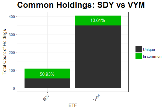
Displays a comparison between two ETF funds by showing similar holdings shared between them.
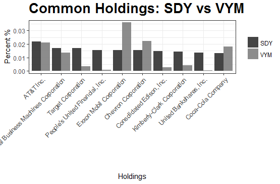
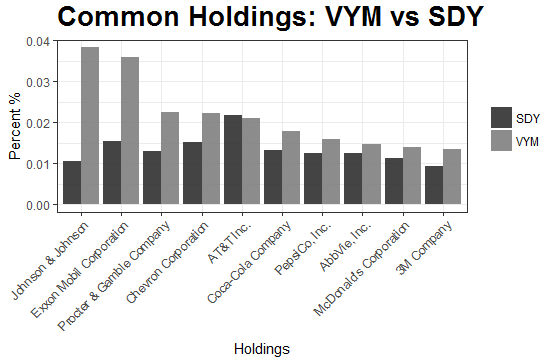
Several graphs are rendered, contrasting the two ETFs. The first graph shows the percentage of shared companies in each ETF, with regard to the other. The second graph shows the top companies, by percent, compared to the same company in the other ETF.
The included charts provide a high-level overview of how similar two ETF funds are. Also works for bonds.
Copyright (c) Kory Becker
Kory Becker http://www.primaryobjects.com/kory-becker

