This project is moved to mui-treasury

A set of components that allows you to build dynamic and responsive layout based on Material-UI
This project based on React Material-UI, so you have to install @material-ui/core @material-ui/styles
// yarn
yarn add mui-layout @material-ui/core @material-ui/styles @material-ui/icons

// npm
npm install mui-layout @material-ui/core @material-ui/styles @material-ui/iconssee demo here Storybook Demo
// this example use icon from material-ui/icons, you can use your own!
import React from 'react';
import { ThemeProvider } from '@material-ui/styles';
import { createMuiTheme } from '@material-ui/core/styles';
import ChevronLeft from '@material-ui/icons/ChevronLeft';
import ChevronRight from '@material-ui/icons/ChevronRight';
import MenuRounded from '@material-ui/icons/MenuRounded';

import {
 Root,
 Header,
 Nav,
 Content,
 Footer,
 presets,
} from 'mui-layout';

const baseTheme = createMuiTheme(); // or use your own theme;
const config = presets.createStandardLayout();

const App = () => (
  <ThemeProvider theme={baseTheme}>
   <Root config={config}>
     <Header
       renderMenuIcon={open => (open ? <ChevronLeft /> : <MenuRounded />)}
     >
       header
     </Header>
     <Nav
       renderIcon={collapsed =>
         collapsed ? <ChevronRight /> : <ChevronLeft />
       }
     >
       nav
     </Nav>
     <Content>
       content
     </Content>
     <Footer>
       footer
     </Footer>
   </Root>
  </ThemeProvider>
)

export default App;-
Collapsible Nav
-
Header Magnet
-
Auto Collapsed
-
Responsive Config
const extendedConfigs2 = {
  ...defaultConfig,

  // navVariant is 'temporary' in mobile and tablet, 'permanent' in desktop and greater
  navVariant: {
    xs: 'temporary',
    md: 'permanent',
  },
Mostly, you will custom Header & Nav. This is an example for Header
import { makeStyles } from '@material-ui/styles';

const useHeaderStyles = makeStyles(({ palette, spacing }) => ({
  header: {
    backgroundColor: palette.secondary.main,
  },
  menuBtn: {
    padding: spacing(2.5),
    borderRadius: 0,
  },
  icon: {
    color: palette.common.white,
  },
  toolbar: {
    padding: spacing(0, 1),
  },
}));

function App() {
  const {
    icon: iconCss,
    toolbar: toolbarCss,
    header: headerCss,
    menuBtn: menuBtnCss,
  } = useHeaderStyles();
  return (
    <Header
      classes={{ root: headerCss }}
      renderMenuIcon={open =>
        open ? (
          <ChevronLeft className={iconCss} />
        ) : (
          <MenuRounded classes={{ root: iconCss }} />
        )
      }
      menuButtonProps={{ className: menuBtnCss }}
      toolbarProps={{ className: toolbarCss }}
    />
  );
}-
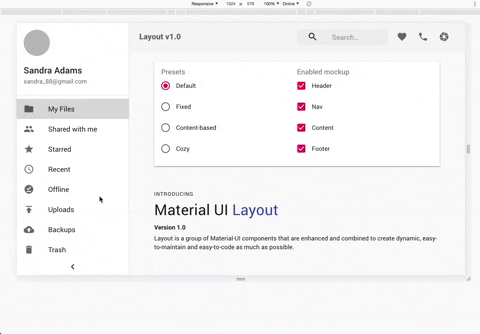
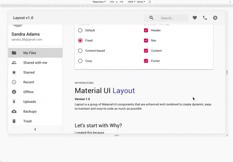
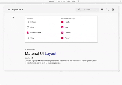
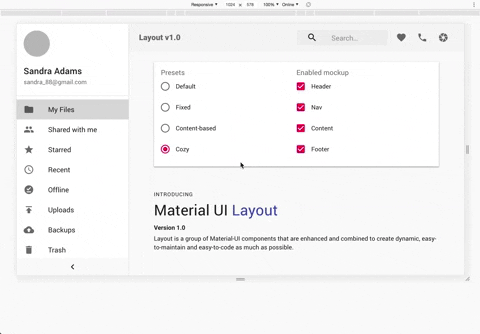
Standard
-
Fixed
-
Content Based
-
Cozy
-
They are basically material-ui components that are combined to make things easier.
AppBar,Toolbar,Drawer -
use
@material-ui/stylesto style components -
use react-hooks
Pull requests are welcome. For major changes, please open an issue first to discuss what you would like to change.
Please make sure to update tests as appropriate.
![dependabot[bot] avatar](https://avatars.githubusercontent.com/in/29110?v=4 "dependabot[bot]")


 React
React
 Typescript
 Django
 Laravel
 Facebook
 Microsoft
 Google
 Alibaba
 D3
D3
 Tencent