Our project aims to develop a visual analytic platform to mine and visualize data to facilitate diverse traders to make decisions, specifically to buy or to sell. In our project, we hope traders can get information from the website, explore how the stock market is moving and make better decisions.
However, getting valuable data and sentimental analysis come as hard tasks for this project. Large amount of human-generate message data is complex to analysis and originally we can only get users’ info, which stock the user is talking and the total amount of ‘like/unlike/reshare’ from the message table. All the data we get at first can not give accurate evaluation of the market mood or the stock trending. In this way, semantic analysis seems necessary together with some other significant attributes.
Thus, we want to help users filter and visualize the tweets data so that they can understand the activities and market consensus of the stocks they are watching. In addition, they should also be able to capture the credibility and real-time data visualization by overview monitoring of the stock market. We need to pull data in sections like trending, investor-relation to give a further and concise analysis and visualization in aspects of the average recommendation, the market trending and the company/trader credibility and so on.
We hope to deal with the following question
-
- How does the whole market change?
-
- What is the top hot sectors or stocks on the StockTwits?
-
- What is the co-relation between the stocks and the changes of their market mood?
-
- What kinds of traders are talking about the stock? What are their attitudes?
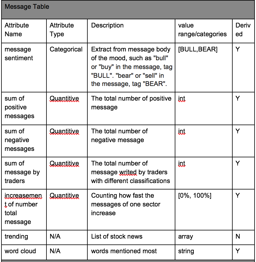
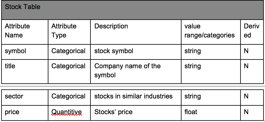
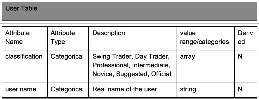
What is your data about? Where does it come from? What attributes are you going to use? What is their meaning? What are their attribute types (data abstraction)? Do you plan to generate derived attributes? If yes, which and why?
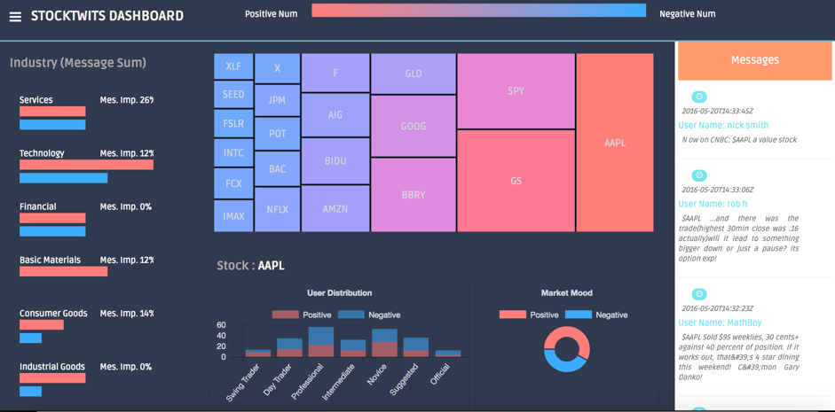
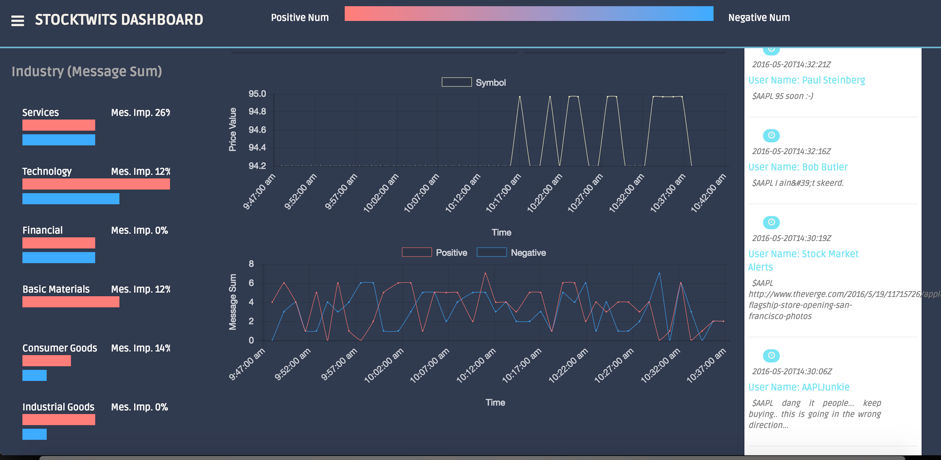
First of all, there is a global color bar on the top for the whole interface. The color hue is linear encoded from red to blue, representing ‘positive’ to ‘negative’. The reason we use color hue blue here rather than green is to make a distinction between mood and price.
- Horizon Bar Chart: The X-axis represents for the total message number, the Y-axis represents for the top 10 sectors. Color is categorical and used to represent the positive and negative attitude. Users can see the improvement percentage after each bar. The value is the total message amount about the sector compared with number of last update. It is a remarkable fact that the length of the bar encodes for the message sum rather than percentage of the sector. To see the detail message number about the stock in this sector, users can click the bar and than find it according to the size of the rectangle in the tree-map.
- Tree-map: Each rectangle represents on stock. Because the stock number is very large, we only select the top 20 stocks. The size of rectangle encodes for the total number of messages. The color hue is categorical and represent for the market mood.
- Vertical Bar Chart: The x-axis of the chart is the seven identifies of the traders. The y-axis shows the value of user number. Color is used to show the mood, red is positive and blue is negative. This chart compares different users’ mood, together the percentage of the mood of the same category identify. In this way the chart presents user information as the weight of message sentiment.
- Donut Chart: the red angle represents for the percentage of positive message of the total, the blue angle represents for the percentage negative message of the total.
- Line Chart: There are two sub line charts distributed vertically in this module. The upper chart shows the price of the selected stock changing overtime. Its y-axis is the value of stock’s price. The lower chart shows the traders’ mood towards the stock. Its y-axis is the number of messages mentioning the stock. Color hue measures the market mood, red for positive and blue for negative. Either of the red/blue line can be extracted by clicking the select button. Both of their X-axises are dynamically change with the real-time. The two line charts share the same x-axis which begin from 9:30 am in order to help users to analyze the co-relationship of between the stock price and market mood. There is a tooltip for each point showing the detail values.
- Message List: The list is the new twits about the selected stock. It is real-time updated.
- Use group bar chart to show positive and negative attitudes. Because sometimes the traders are not satisfied with knowing about the number of the total messages. They also want to know it in detail, if the total messages of one stock is very high while account of the positive messages is low, the traders may pay more attention to the stock.
- Add vertical bar to compare different users’ mood. Sometimes the user may prefer user information as the weight of message sentiment. However, in the former design, there is no data analysis based on the aspect of users. To avoid this limitation, we add the vertical bar to compare different user’s mood.
- Change radial chart to donut chart. Our original design is radial chart which would show the changes of market mood along with time. However, sometimes the changes are too fast and it might confuse the traders. So we change it and make it easy to read, when traders choose one specific stock, they can easily read if it is bull or bear, and can see how many traders hold positive attitudes and how many hold negative.
- Add color hue in line charts; Use database to store the daily historical data. For the line chart module, there was only one message line in the upgrade version. However, it is better for users to analyze the trending of stock’s mood than the trending of stock’ hot. Therefor, we split the total messages into sum of number of positive messages and number of negative messages. Additional we use color hue to represent the mood, red is positive and blue represents negative. We also make an interaction so that the two lines can be choose to show their trending separately. Finally, we polish the interface by thinner the line and shorter the size of points. In addition, we use database to store the daily historical data and empty it for another day at 9:30 am. In the interface, it will show the line trending from 9:30 am to current time. The line is dynamic by pushing new data every 5 seconds. In this way, we guarantee the currency co-relation between the price and the mood as long as the user use our platform during stock opening period.
- Remove the world cloud module. In the final version, we remove the world cloud module for the following reasons. First of all, the words shown in the interface are sometimes ideographic unclear. They don’t explain valuable information for the key function. In this way, we decided to drop this module because of the limitation of research time. However, users can still quickly check what traders are talking about according to the message list module. We have no time for natural language processing and implement filter for the word package. With more research in the future, we may also redesign the arrangement for these high frequency words with invisible grids.
When traders firstly see the website, they can see the top 10 sectors from the horizon bar chart and top 20 stocks from the tree map. In this case, they can find that the financial sector and technology sector are much more popular then other sectors. After click the bar chart, ‘Technology’ in this example, the right tree-map will change to show the top 20 stocks in Technology field. Obviously, AAPL is the hottest stock in this sector. We can also find the market mood towards these sectors. For example, AIG is one of the top 20 stocks but its color is blue, it means even many people are talking about the UNG, they hold negative attitudes. Traders can see the whole market mood as well, which can help them get an impression of the stocks market. From the message list part, users can also see what other traders are talking about the stock they select. We will give AAPL as an example.
● Case: APPL When traders select the technology sector, they can see that AAPL is the most popular stock. Then they may want to know more details about AAPL and figure out if this information can help them make better decisions after analysis. First of all, traders can easily get the quick view of market mood about the AAPL. In this case, the tree-map shows that AAPL is the stock that has the highest support rate. While the donut chart shows that more then 50% users support to buy. However, the market mood can only show the common mood towards the stock. Traders may still need to know which kinds of users hold positive attitude and what kinds hold negative attitude. In this way, the vertical bar chart makes sense. In our case, there is an interesting situation that, most professional users hold ‘negative’ while most novice users hold ‘positive’. So trader may get the conclusion that may be the positive market mood is caused by the large amount of novice users, may be the ‘positive’ cannot be a conclusive factor for their buy decision. Then more information and analysis need to be taken into consideration. The traders will read the line chart together with message list. For example, when the price line is going up slowly, if the positive line is going down rapidly together with the negative line growing fast, it will be a signal for the user to sell his / her stock. Traders will have an anticipation of bear market and hold short positions. But if the positive line is going down rapidly and the negative line is going up slowly, the traders may sell only part of their stocks and keep watching. Traders can also check the message list about AAPL and find what others are talking about AAPL if they want.
● Conclusion Traders can get a quick view of the market and they can also get information about the stocks they are interested about. What’s more, traders can also make some comparisons them
- One of main limitations is the long procession time to load the web page. We cost too much time to load the page in order to guarantee the integrity and currency of the data. For the next step, we need to optimize the processing in the back end.
- In this project, we use free database to store our data, which offers limited storage space. In addition, the stockTwits does not support us to get all of the historical data. In this way we can only save daily historical data. The line chart module can only show the trending in one day. In this way, it is hard for the trader to make an anticipation in long run. However, the platform is suitable for day-traders and mid/high frequency traders. One of our most important future work is to modify the design to satisfy all kinds of users’ need.


