Coder Social home page Coder Social logo

rydmike / flex_color_scheme Goto Github PK

View Code? Open in Web Editor NEW
857.0 11.0 95.0 12.82 MB

A Flutter package to make and use beautiful color scheme based themes.

License: Other

Kotlin 0.01% Swift 0.04% Objective-C 0.01% Dart 99.05% CMake 0.34% C++ 0.40% C 0.03% HTML 0.08% Ruby 0.05%
flutter dart theme colorscheme package flex-package flex-family flutter-package flutter-ui flutter-widget

flex_color_scheme's Introduction

Pub Version codecov License

FlexColorScheme

flutter favorite logo

Use FlexColorScheme to make beautiful Flutter Material Design themes. Apply optional surface blends, and use Material-3 style seeded color schemes. The returned themes are standard ThemeData objects, but very sophisticated ones. They are based on the same idea as Flutter's ThemeData.from(ColorScheme) and ThemeData(colorSchemeSeed) themes, but with many additional features. Choose from numerous pre-made designs or make your own. You can also use optional component sub theming, that are quick and easy to configure.

Dash light Dash dark M3 baseline light M3 baseline dark

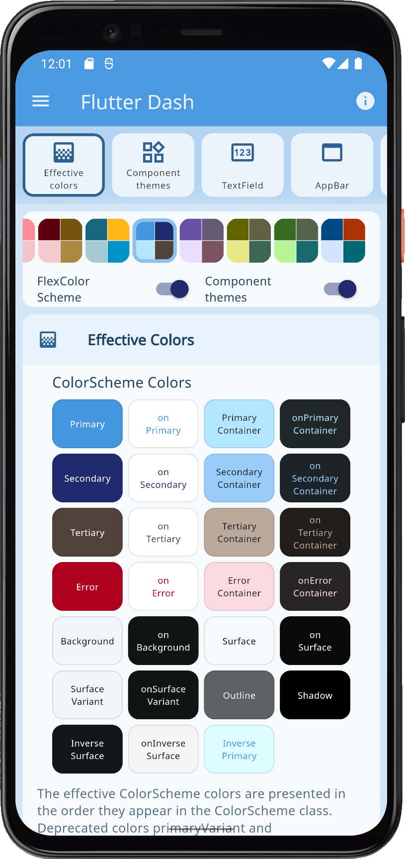
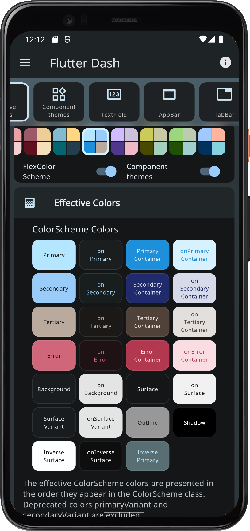
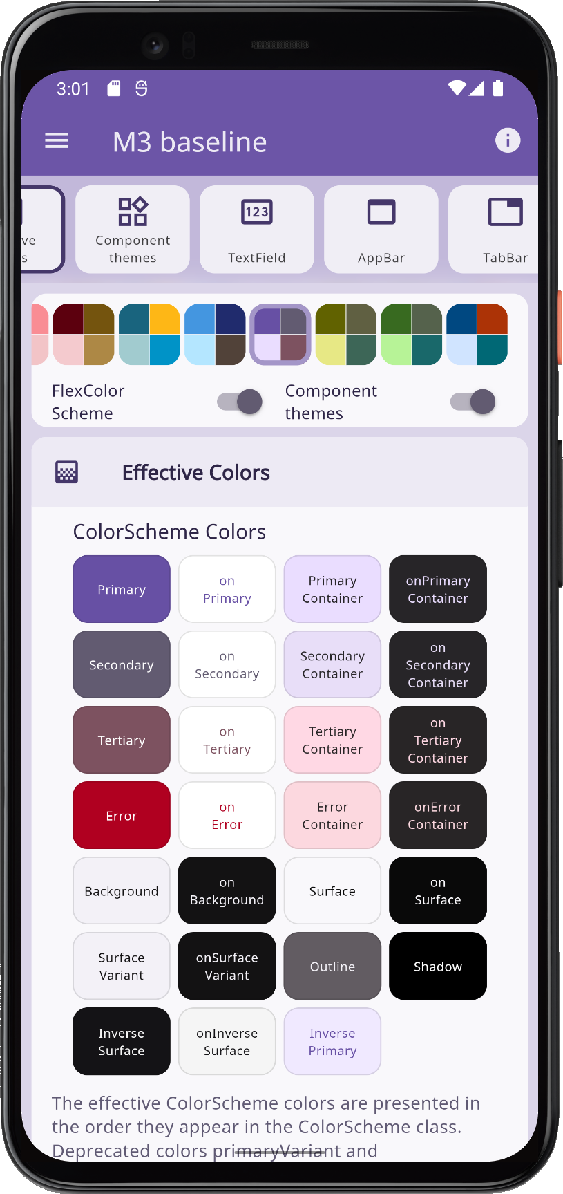
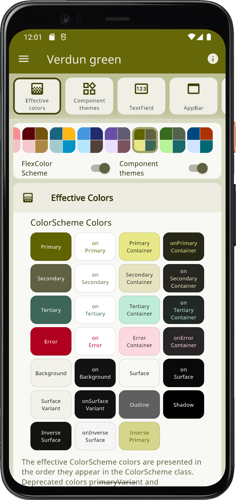
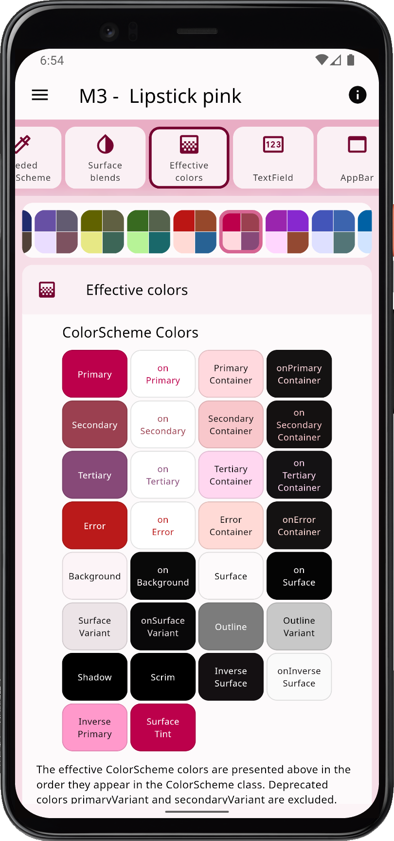
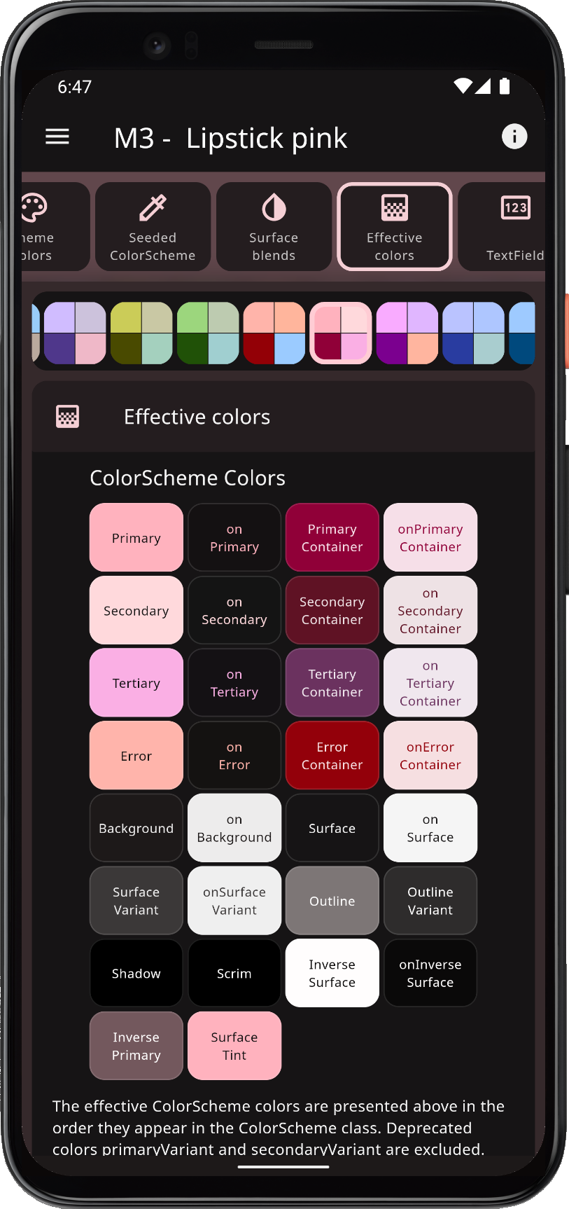
When you theme a Flutter application correctly, all built-in widgets use the colors of the ColorScheme in your theme. At least in theory, and it is almost so if you defined your ThemeData by using the ThemeData.from factory, but it misses a few details. This applies in particular when you use Material-2 design in Flutter, which is the default. When you opt in on using Material-3, the color results and styles are much more consistent by default.

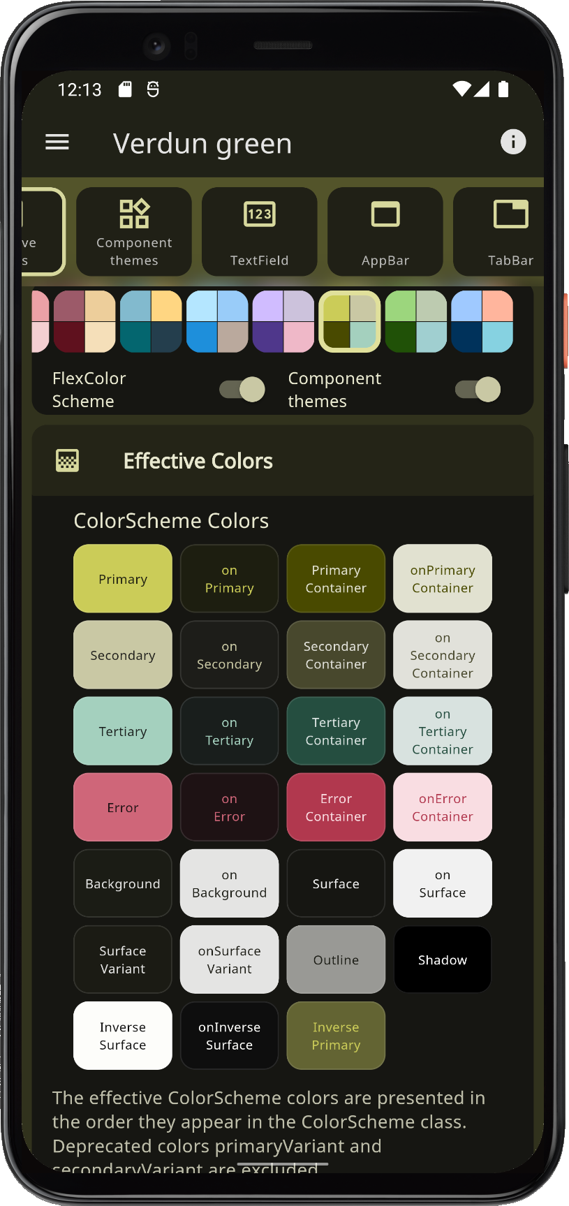
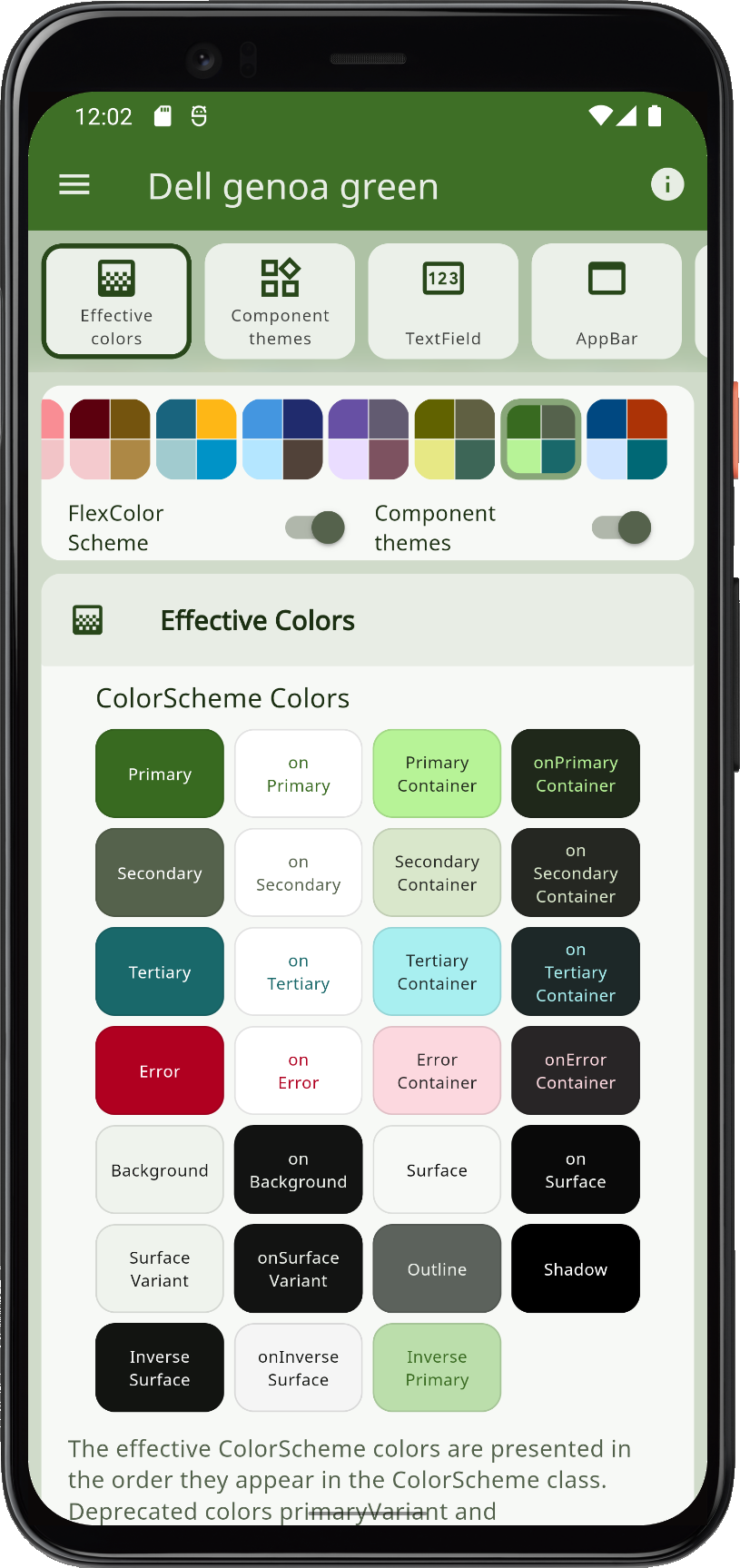
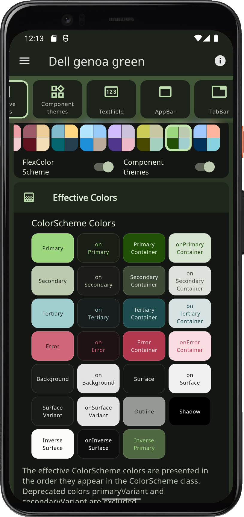
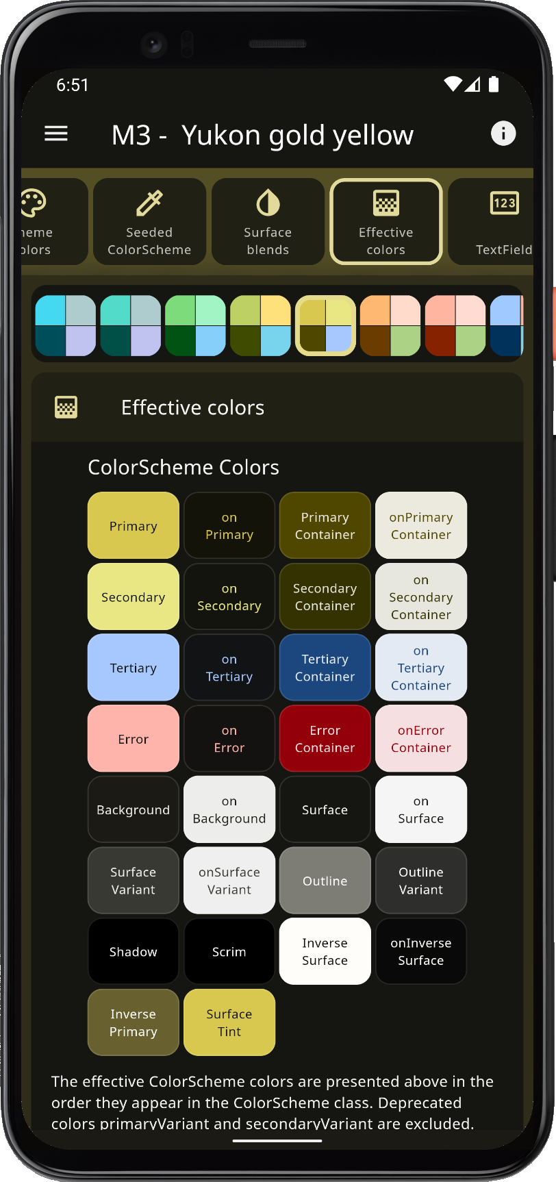
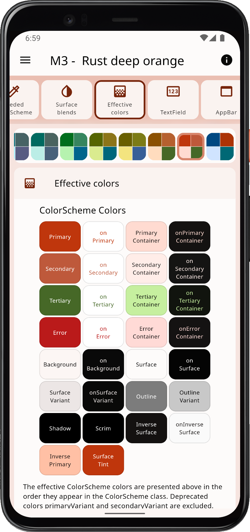
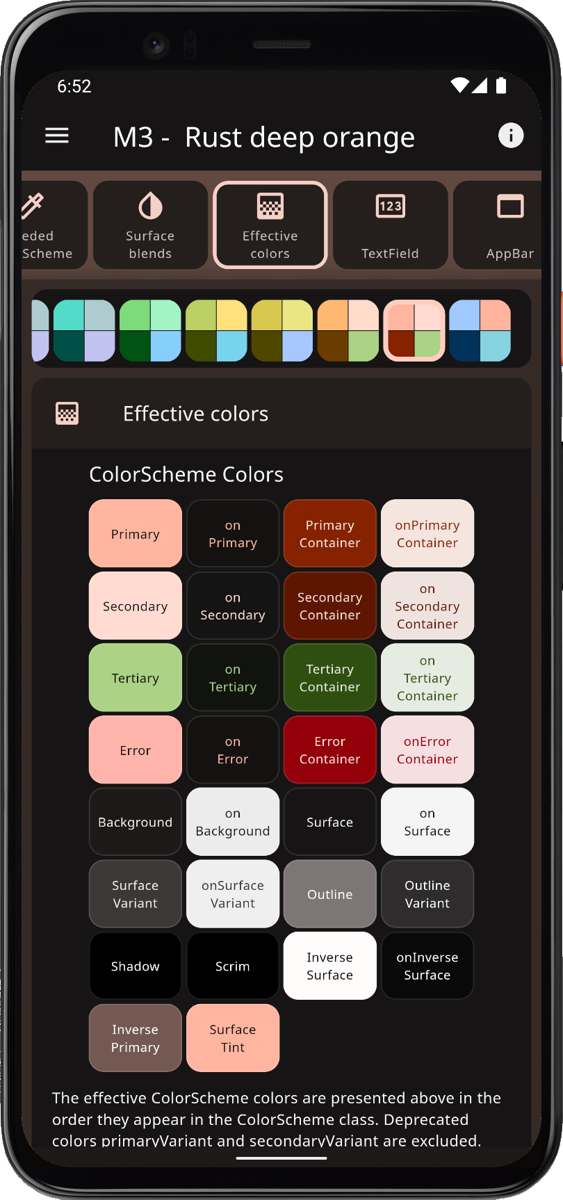
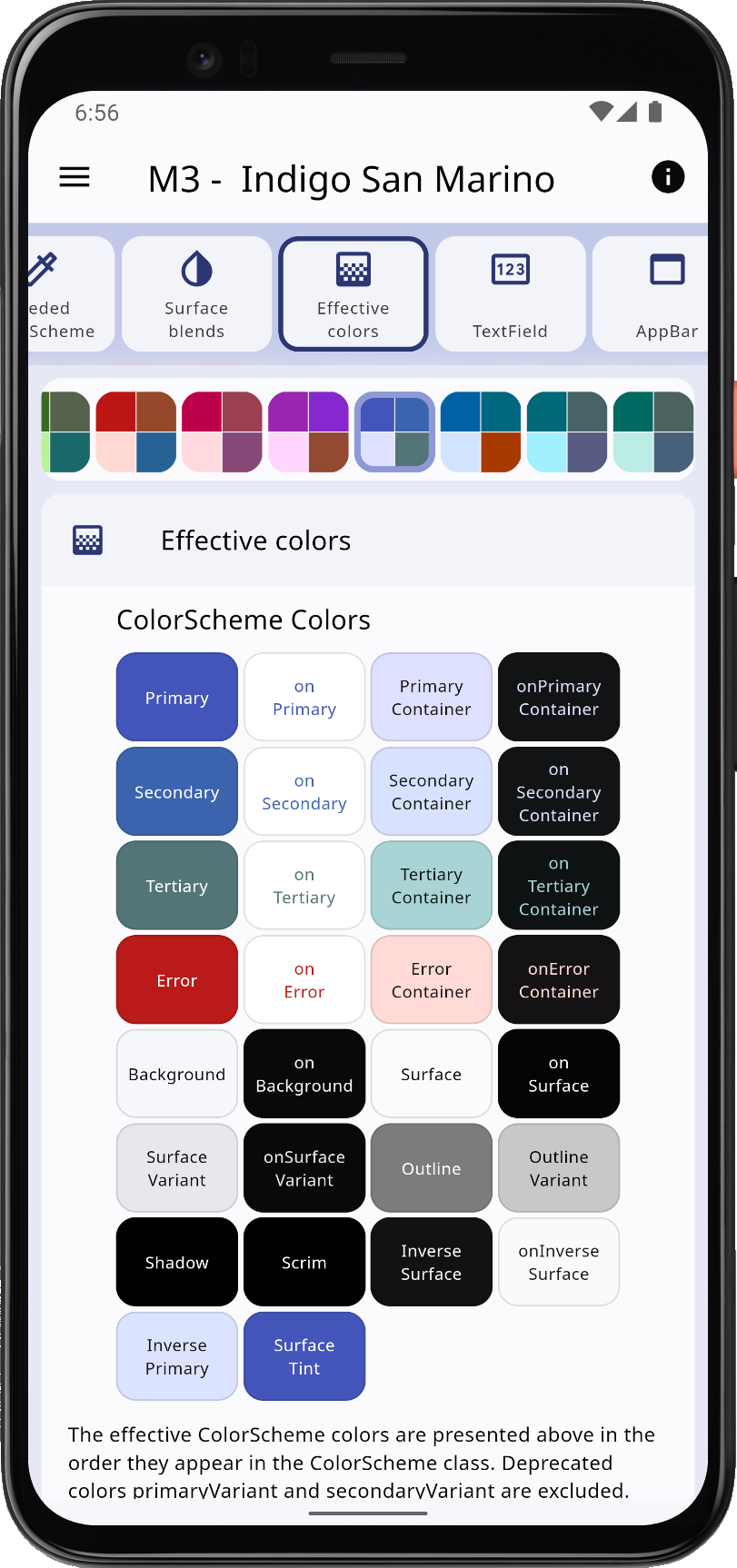
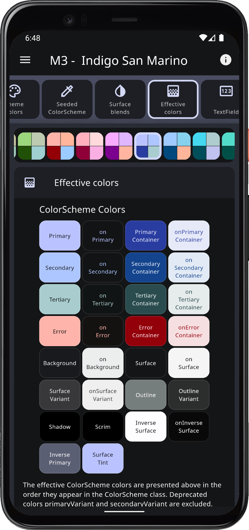
FlexColorScheme ensures that all Flutter SDK UI components get themed completely by its color scheme and custom colors you provide. It applies effective ColorScheme colors to all color properties in ThemeData. This ensures that all the direct colors properties in ThemeData match your ColorScheme. There are no surprising colors in ThemeData legacy colors that do not match your ColorScheme. This applies regardless of if you use Material-2 or Material-3 mode.

You can opt in on using opinionated component sub-themes. By doing so, you can, for example, adjust the border radius on all UI widgets with a single property value. Flutter's Material UI widgets still default to Material-2 design, and thus use 4dp corner radius on most widgets.

Verdun green light Verdun green dark Dell genoa light Dell genoa dark

When you opt in on using the component sub-themes in Material-2 mode, border radius on widgets defaults to the new Material-3 rounded corner design. In it, the radius varies by widget type, as specified by the Material-3 Guide. You can keep this or set the shared global widget radius to a value you prefer. You can also easily set the themed border radius per widget, and override the Material-3 like defaults or the global radius value you defined.

Material 3 Support

You can also opt in on using Material-3. The Material-3 mode component sub-theming is far less opinionated, using mostly Material-3 defaults. It offers many quick settings to customize Material-3 to fit your custom design goals.

In Flutter 3.7 and later, using Material-3 design is ready for production use. Some minor issues still exist, please refer to the FlexColorScheme docs known issues chapter for more information on the status of known theming issues in Flutter.

Yukon gold light Yukon gold dark Rust light Rust dark

FlexColorScheme has many advanced coloring features, like using surface alpha blends. It also fully supports Material 3 based color schemes, including seed generated ColorSchemes. It offers different configuration options that you can use when you generate your ColorScheme from key colors. You can use this to make more saturated seed generated themes and themes with higher contrast. The advanced seeded ColorScheme features are currently not available in Flutter directly. This includes using multiple key colors as seeds, custom minimum chroma levels and customized tone mapping to ColorScheme colors.

In Material-3 mode theming you can disable its surface elevation tint and even bring back elevation shadows where they are removed in M3. You can choose to do this adaptively on only selected platforms, like iOS and macOS, where surface tint elevation may seem foreign, while still keeping the M3 tinted elevation styles when the app is used on Android.

Indigo San Marino light Indigo San Marino dark Lipstick pink light Lipstick pink dark

With FlexColorScheme component themes, you use simple flat property values. No need for verbose Flutter SDK component sub-themes, for example ShapeBorder definitions on multiple widget themes to change their border radius. The component theming provides a large number of easy to configure options via direct properties. In many cases you can avoid complicated and sometimes confusing MaterialState theming properties.

Getting Started

To use FlexColorScheme in your project, add the flex_color_scheme package to pubspec.yaml:

dart pub add flex_color_scheme or flutter pub add flex_color_scheme

Import the package to use it:

import 'package:flex_color_scheme/flex_color_scheme.dart';

You can now start using FlexColorScheme based color schemes and theming in your application. A quick way to do so is to try one of the 52 built-in color schemes. They have enum values that you use to select which one to use as the theme of your application.

The package default example offers a heavily commented code guide on how to use key features in FlexColorScheme. The Examples chapter shows you how to try it. In the Tutorial you can learn more via five additional examples of increasing complexity.

FlexColorScheme Counter App

Let's first setup FlexColorScheme in the default Flutter counter app. Create a new Flutter project, giving you the default counter app. Add the FlexColorScheme import, after that we change one line of code, and add two lines to enable it in the default counter app.

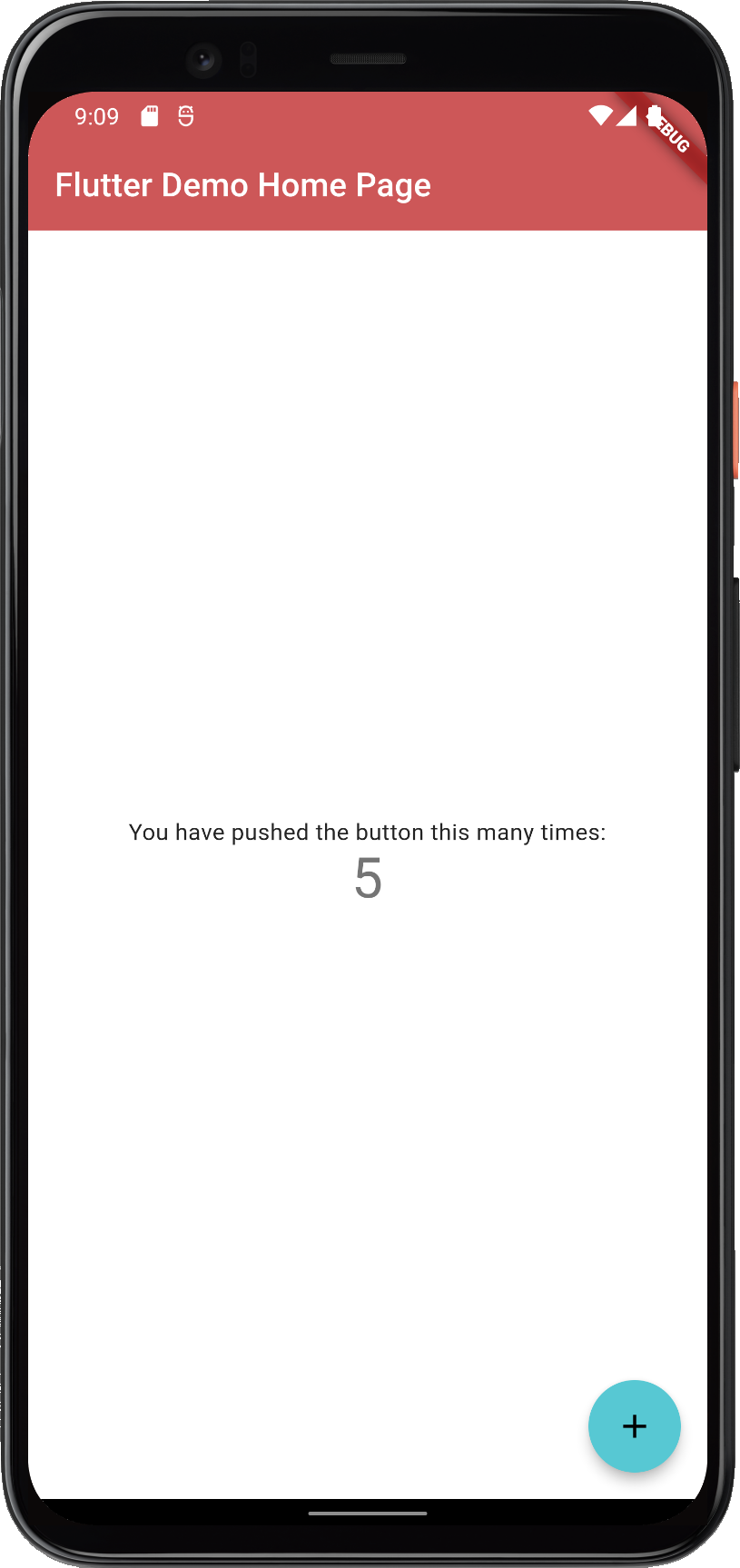
Here we use the Oh Mandy red color scheme, it is represented by enum value FlexScheme.mandyRed. Set the MaterialApp.themeMode to ThemeMode.system so that the device can control if the app uses its light or dark theme mode. You can then toggle the theme mode by changing mode on the used device.

Assign FlexThemeData.light to the app's theme property, which is the application's light theme definition property, and FlexThemeData.dark to darkTheme.

For both FlexThemeData dark and light we set the scheme property to FlexScheme.mandyRed to use the same Oh Mandy red predefined scheme colors in both theme modes. We then get matching light and dark themes based on the built-in scheme's color definitions.

The three line modified MaterialApp, of the Flutter default counter app becomes:

class MyApp extends StatelessWidget {
  const MyApp({Key? key}) : super(key: key);
  @override
  Widget build(BuildContext context) {
    return MaterialApp(
      title: 'Flutter Demo',
      // The Mandy red, light theme.
      theme: FlexThemeData.light(scheme: FlexScheme.mandyRed),
      // The Mandy red, dark theme.
      darkTheme: FlexThemeData.dark(scheme: FlexScheme.mandyRed),
      // Use dark or light theme based on system setting.
      themeMode: ThemeMode.system,
      home: const MyHomePage(title: 'Flutter Demo Home Page'),
    );
  }
}

This gives us a counter application that looks like this:

Counter light Counter dark

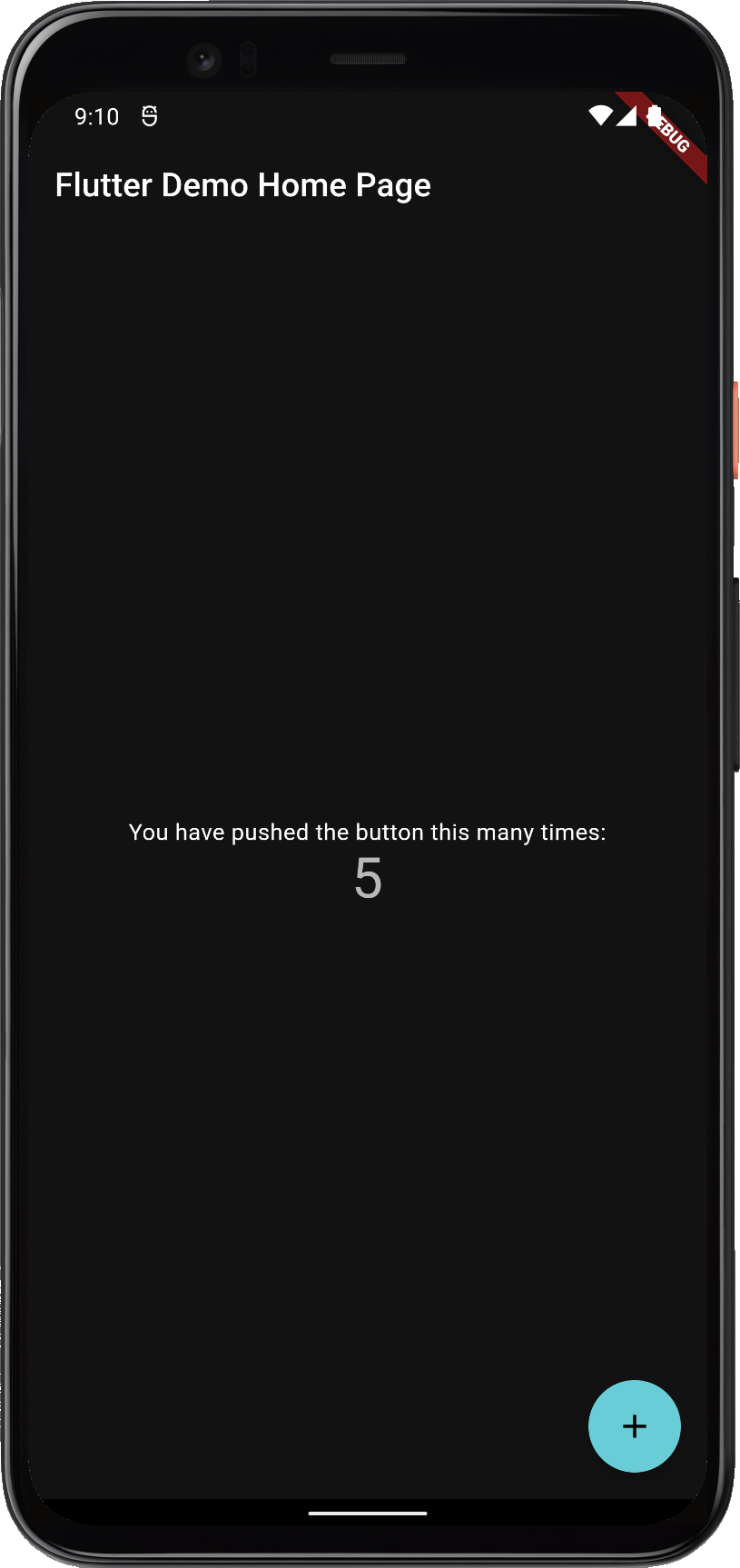
FlexColorScheme in Material-2 mode applied to the standard Flutter counter template

Not as exciting as the images shown above. That is because the basic counter app uses very few features and widgets, so it does not present the results very well.

The included examples contain placeholder user interface to better demonstrate the results. The used UI demonstration code in the examples is not relevant to using FlexColorScheme, it is only there to present the results.

Documentation

For more information and tutorials on how to use FlexColorScheme, please see its documentation site at docs.flexcolorscheme.com. It contains additional getting started info, extensive tutorials, key API walkthrough and even general Flutter theming advice and guidance. The documentation site is powered by docs.page from Invertase. Complete generated package API documentation is also available.

Themes Playground

To make it even easier to configure and setup FlexColorScheme, it comes with a WEB companion app called the Themes Playground.

The Themes Playground is a useful tool to find FlexColorScheme themes and settings you like. You can use it to discover what you can do with FlexColorScheme. The playground persists all its settings. You can reset settings back to their default values, so you can always start over if you get lost in all the configuration possibilities.

The most useful and popular feature of the Playground is that it can generate FlexColorScheme API setup code needed to produce the shown active theme configuration. The themed style of the app itself and the same styled demo apps shown in the included theme simulator, is what you get when you copy the code of the current theme configuration to your app, and use it with the FlexColorScheme package.

Themes Playround Image

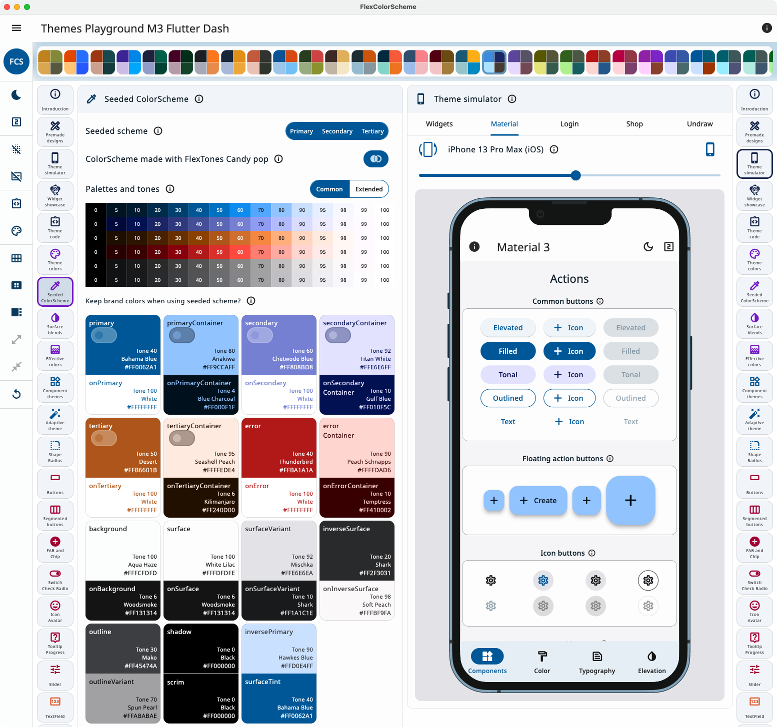
In Themes Playground you can visually configure your theme and copy its setup code.

If you use the code view panel side-by-side, as you change settings, the Playground modifies the code as you change settings. This is a fun way to get familiar with the API.

Themes Playround Image

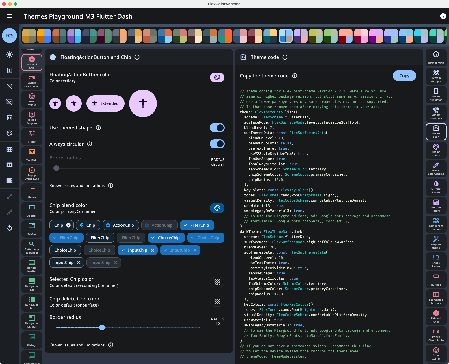
Viewing API configuration and its updates as you change setting in Themes Playground.

The latest Themes Playground build can be used as a web app here. For guidance on how to use the Themes Playground, please read the Themes Playground chapter available in the documentation site.

Beware, fiddling with all the different themes and settings can be quite fun and addictive, happy theming! 💙

Open Source

The Themes Playground application is open source and bundled with the FlexColorScheme package in the example sub-folder. In its GitHub repository you can find it here.

The Playground app is also the last step in the package tutorial series. The tutorial goes through its main used features that are relevant to using FlexColorScheme, and features that differ from the previous examples. It does not go through all the details of the application. You are welcome to study its source code for more insights and inspiration. It is on purposes a bit excessively commented. The tutorial also briefly talks about its background, design choices and limitations.

Older versions of the Themes Playground

If you are using FlexColorScheme version 7.2, you can go here to use Themes Playground V7.2 and generate API setup code for version 7.2. Prefer updating to version 7.3 if you can use Flutter 3.13.

If you are using FlexColorScheme version 7.1, you can go here to use Themes Playground V7.1 and generate API setup code for version 7.1. Prefer updating to version 7.3 if you can use Flutter 3.13.

If you are using FlexColorScheme version 7.0, you can go here to use Themes Playground V7.0 and generate API setup code for version 7.0. Prefer updating to version 7.3 if you can use Flutter 3.13.

If you are using FlexColorScheme version 6, you can go here to use Themes Playground V6 and generate API setup code for version 6. It supports FlexColorScheme version 6.1, you can also use this version of the Playground with FlexColorScheme version 6.0. If you do, you may have to delete some generated API config setup code for properties only available in version 6.1 that are not supported by FlexColorScheme 6.0. You will see those as unsupported API errors when you copy/paste the Themes Playground code to Flutter if you use 6.0 and not 6.1. Delete such rows, or you can of course upgrade the package to 6.1 to get those features, or even better move up to the latest version.

If you are using FlexColorScheme version 5, you can go here to use Themes Playground V5, to generate API setup code for it.

If you are using FlexColorScheme version 4, you should really upgrade, but you can still use Themes Playground V4 here. It does not offer any API code generation, since version 4 did not have that feature.

You can also build Windows, macOS or Linux desktop versions of the Themes Playground, it is highly recommended, as it runs much smoother and nicer than the WEB build. As mentioned above, the Themes Playground app is bundled with the package GitHub repository as Example 5. If you need a Themes Playground companion build for a specific older FlexColorScheme version, you can download a ZIP bundle from the GitHub repo for any past release here.

flex_color_scheme's People

Contributors

dkbast avatar mcssym avatar meandni avatar merrit avatar rydmike avatar sososdk avatar tahatesser avatar

Stargazers

 avatar  avatar  avatar  avatar  avatar  avatar  avatar  avatar  avatar  avatar  avatar  avatar  avatar  avatar  avatar  avatar  avatar  avatar  avatar  avatar  avatar  avatar  avatar  avatar  avatar  avatar  avatar  avatar  avatar  avatar  avatar  avatar  avatar  avatar  avatar  avatar  avatar  avatar  avatar  avatar  avatar  avatar  avatar  avatar  avatar  avatar  avatar  avatar  avatar  avatar  avatar  avatar  avatar  avatar  avatar  avatar  avatar  avatar  avatar  avatar  avatar  avatar  avatar  avatar  avatar  avatar  avatar  avatar  avatar  avatar  avatar  avatar  avatar  avatar  avatar  avatar  avatar  avatar  avatar  avatar  avatar  avatar  avatar  avatar  avatar  avatar  avatar  avatar  avatar  avatar  avatar  avatar  avatar  avatar  avatar  avatar  avatar  avatar  avatar  avatar

Watchers

 avatar  avatar  avatar  avatar  avatar  avatar  avatar  avatar  avatar  avatar  avatar

flex_color_scheme's Issues

[QUESTION] How to pass custom Text Styles to FlexColorScheme?

I can not find a way to pass my custom TextStyle in FlexColorScheme. For example, ThemeData has argument textTheme:

textTheme: const TextTheme(
      bodyText1: TextStyle(
        fontSize: 16.0,
        fontWeight: FontWeight.w700,
      ),
      bodyText2: TextStyle(
        fontSize: 16.0,
      ),
      headline2: TextStyle(
        fontSize: 18.0,
        fontWeight: FontWeight.w700,
      ),
      headline1: TextStyle(
        fontSize: 16.0,
        fontWeight: FontWeight.w700,
      ),
      subtitle2: TextStyle(
        fontSize: 12.0,
        fontWeight: FontWeight.w700,
      ),
      headline6: TextStyle(
        fontSize: 36,
        fontWeight: FontWeight.w700,
      ),
    ),

Could you please let me know how I can add custom text style to Theme?

Thank you.

How to theme switch when using FormBuildSwitch (another package)

Hello, I'm converting over to the color scheme package and everything is working out well except for switches. I use Flutter Form Builder a lot in my app. The switches are not recognizing the color scheme. What is the proper way to use the package with a standard switch (or another package switch)?

Lerping between flex_color_scheme-generated themes causes error

Description

On iOS, switching between light mode and dark mode (CMD + SHIFT + A for iOS Simulator on macOS) with a flex_color_scheme theme for either theme or darkTheme will cause TextStyle.lerp to fail. This doesn't occur when the vanilla ThemeData.light() and ThemeData.dark() default themes are used.

Minimal Reproducible Example:

import 'package:flex_color_scheme/flex_color_scheme.dart';
import 'package:flutter/material.dart';

void main() => runApp(MyApp());

class MyApp extends StatelessWidget {
  @override
  Widget build(BuildContext context) {
    return MaterialApp(
      darkTheme: FlexColorScheme.dark(
        colors: FlexSchemeColor.from(primary: Colors.blue),
      ).toTheme,
      home: MyHomePage(),
    );
  }
}

class MyHomePage extends StatelessWidget {
  Widget build(_) => Scaffold(
        appBar: AppBar(
          title: Text('flex_color_scheme MRE'),
        ),
      );
}

Error text

════════ Exception caught by widgets library ═══════════════════════════════════
The following assertion was thrown building AnimatedTheme(duration: 200ms, dirty, state: _AnimatedThemeState#976ce(ticker active, ThemeDataTween(ThemeData#8c9b4 → ThemeData#47fa6))):
'package:flutter/src/painting/text_style.dart': Failed assertion: line 937 pos 12: 'a == null || b == null || a.inherit == b.inherit': is not true.
2

Either the assertion indicates an error in the framework itself, or we should provide substantially more information in this error message to help you determine and fix the underlying cause.
In either case, please report this assertion by filing a bug on GitHub:
  https://github.com/flutter/flutter/issues/new?template=2_bug.md

The relevant error-causing widget was
MaterialApp
lib/main.dart:9
When the exception was thrown, this was the stack
#2      TextStyle.lerp
package:flutter/…/painting/text_style.dart:937
#3      TextTheme.lerp
package:flutter/…/material/text_theme.dart:690
#4      Typography.lerp
package:flutter/…/material/typography.dart:302
#5      ThemeData.lerp
package:flutter/…/material/theme_data.dart:1530
#6      ThemeDataTween.lerp
package:flutter/…/material/theme.dart:175
...

flutter doctor -v:

[✓] Flutter (Channel stable, 2.0.6, on macOS 11.4 20F71 darwin-x64, locale en-GB)
    • Flutter version 2.0.6 at /Users/jacklusher/dev/flutter
    • Framework revision 1d9032c7e1 (7 weeks ago), 2021-04-29 17:37:58 -0700
    • Engine revision 05e680e202
    • Dart version 2.12.3

[✓] Android toolchain - develop for Android devices (Android SDK version 30.0.3)
    • Android SDK at /Users/jacklusher/Library/Android/sdk
    • Platform android-30, build-tools 30.0.3
    • Java binary at: /Applications/Android Studio.app/Contents/jre/jdk/Contents/Home/bin/java
    • Java version OpenJDK Runtime Environment (build 11.0.8+10-b944.6916264)
    • All Android licenses accepted.

[✓] Xcode - develop for iOS and macOS
    • Xcode at /Applications/Xcode.app/Contents/Developer
    • Xcode 12.5, Build version 12E262
    • CocoaPods version 1.10.1

[✓] Chrome - develop for the web
    • Chrome at /Applications/Google Chrome.app/Contents/MacOS/Google Chrome

[✓] Android Studio (version 4.2)
    • Android Studio at /Applications/Android Studio.app/Contents
    • Flutter plugin can be installed from:
      🔨 https://plugins.jetbrains.com/plugin/9212-flutter
    • Dart plugin can be installed from:
      🔨 https://plugins.jetbrains.com/plugin/6351-dart
    • Java version OpenJDK Runtime Environment (build 11.0.8+10-b944.6916264)

[✓] IntelliJ IDEA Community Edition (version 2021.1)
    • IntelliJ at /Applications/IntelliJ IDEA CE.app
    • Flutter plugin version 55.1.5
    • Dart plugin version 211.7179

[✓] VS Code (version 1.57.1)
    • VS Code at /Applications/Visual Studio Code.app/Contents
    • Flutter extension version 3.23.0

[✓] Connected device (2 available)
    • iPhone 12 Pro Max (mobile) • A1EC90B9-985B-4AF5-A7DC-3961CCBF5D21 • ios            • com.apple.CoreSimulator.SimRuntime.iOS-14-5 (simulator)
    • Chrome (web)               • chrome                               • web-javascript • Google Chrome 91.0.4472.106
    ! Error: Jack's iPhone XS is busy: Waiting for Device. Xcode will continue when Jack's iPhone XS is finished. (code -10)

• No issues found!

feat: add loading screen to web version

It would be very convenient to add a loading screen to the web version, to show the user that it is taking a while to load the page, since it takes a few seconds to download the canvaskit cache

Add the capability to create custom FlexColorScheme themes from a ColorScheme

When using new M3 based colors that may often be created from a seed color using ColorSheme.seed it would be very useful if the FlexColorScheme's color scheme and theme, could be created from a Flutter ColorScheme that in future versions will also includes all the new M3 based colors.

For this purpose a FlexColorScheme(colorScheme) property will be added to all existing constructors.

Documentation improvement

You can opt in on using pre-made opinionated widget sub-themes. By opting in, you can for example adjust the border radius on all widgets with a single property to set the same themed border radius on them. Current Flutter SDK widgets are based on the Material 2 guide and use 4 dp corner radius as default on most corners.

I was exploring your great library and there is no word in documentation or anywhere on how to implement this. In your sample there is a toggle to enable round corners everywhere. What is the API called? I can't find it.

dynamic color support

Ryd Mike,

I am re-doing the dynamic color builder to use flex color scheme instead so that the corePalette from android and accent color from desk equally are used as color scheme seed inputs.

What form does it need to be to contribute back to the this project or Flex Seed Scheme?

Otherwise one would get tone diffs between desktop and android which in my view is a design mess.

Different colors when using Theme.of(context).colorScheme to access the theme colors

I want to use the theme colors as background for some Containers but i couldn't get the right colors, for example in the code below the secondary color specified in the theme is red, but when i try to get it using Theme.of(context).colorScheme.secondary i get grey-ish color instead of red.

I'm using the latest version of the package
This code shows the issue:


import 'package:flutter/material.dart';
import 'package:flex_color_scheme/flex_color_scheme.dart';

void main() async {
  runApp(
    MaterialApp(
      debugShowCheckedModeBanner: false,
      theme: FlexThemeData.light(
        colors: const FlexSchemeColor(
          primary: Color(0xff1145a4),
          primaryContainer: Color(0xff9fb4da),
          secondary: Color(0xffb61d1d),
          secondaryContainer: Color(0xffe1a4a4),
          tertiary: Color(0xff376bca),
          tertiaryContainer: Color(0xffcfdbf2),
          appBarColor: Color(0xffcfdbf2),
          error: Color(0xffb00020),
        ),
        surfaceMode: FlexSurfaceMode.highScaffoldLowSurface,
        blendLevel: 20,
        appBarOpacity: 0.95,
        subThemesData: const FlexSubThemesData(
          blendOnLevel: 20,
          blendOnColors: false,
        ),
        keyColors: const FlexKeyColors(),
        visualDensity: FlexColorScheme.comfortablePlatformDensity,
        useMaterial3: true,
      ),
      darkTheme: FlexThemeData.dark(
        colors: const FlexSchemeColor(
          primary: Color(0xff1145a4),
          primaryContainer: Color(0xff9fb4da),
          secondary: Color(0xffb61d1d),
          secondaryContainer: Color(0xffe1a4a4),
          tertiary: Color(0xff376bca),
          tertiaryContainer: Color(0xffcfdbf2),
          appBarColor: Color(0xffcfdbf2),
          error: Color(0xffb00020),
        ),
        surfaceMode: FlexSurfaceMode.highScaffoldLowSurface,
        blendLevel: 15,
        appBarStyle: FlexAppBarStyle.background,
        appBarOpacity: 0.90,
        subThemesData: const FlexSubThemesData(
          blendOnLevel: 30,
        ),
        keyColors: const FlexKeyColors(),
        visualDensity: FlexColorScheme.comfortablePlatformDensity,
        useMaterial3: true,
      ),
      home: const MyApp(),
    ),
  );
}

class MyApp extends StatelessWidget {
  const MyApp({super.key});

  @override
  Widget build(BuildContext context) {
    return Scaffold(
      body: Container(
        width: double.infinity,
        height: 600.0,
        color: const Color(0xffb61d1d), // I copied the value of secondary here 
        // color: Theme.of(context).colorScheme.secondary, // This color is different from the value of secondary
      ),
    );
  }
}

FloatingActionButtonTheme not set?

Hey rydmike,
I noticed that a FAB created holds a weird color combination in relation to the upper flex_color_scheme (see attached picture)

FlexScheme definition
static FlexScheme usedFlexScheme = FlexScheme.mandyRed;

  static ThemeData lightTheme(BuildContext context) {
    final ThemeData baseTheme = FlexColorScheme.light(
      colors: FlexColor.schemes[usedFlexScheme].light,
      visualDensity: FlexColorScheme.comfortablePlatformDensity,
    ).toTheme;
    return baseTheme.copyWith(
        textTheme: GoogleFonts.firaSansTextTheme(baseTheme.textTheme));
  }

  static ThemeData darkTheme(BuildContext context) {
    final ThemeData baseTheme = FlexColorScheme.dark(
      colors: FlexColor.schemes[usedFlexScheme].dark,
      visualDensity: FlexColorScheme.comfortablePlatformDensity,
    ).toTheme;

    return baseTheme.copyWith(
        textTheme: GoogleFonts.firaSansTextTheme(baseTheme.textTheme));
  }

I also checked by directly setting the FAB (same result)

FAB definition
FloatingActionButton(
                  backgroundColor: Theme.of(context)
                      .floatingActionButtonTheme
                      .backgroundColor,
                  focusColor:
                      Theme.of(context).floatingActionButtonTheme.focusColor,
                  foregroundColor: Theme.of(context)
                      .floatingActionButtonTheme
                      .foregroundColor,
                  hoverColor:
                      Theme.of(context).floatingActionButtonTheme.hoverColor,
                  splashColor:
                      Theme.of(context).floatingActionButtonTheme.splashColor,
                  onPressed: fab?.onPressed,
                  child: fab?.icon,
                );

light mode
dark mode

In your documentation you have the code entry:

FloatingActionButtonThemeData(
  backgroundColor: colorScheme.secondary,
  foregroundColor: colorScheme.onSecondary),

where it not clearly shows, if I should set it myself, or if that is how the FloatingActionButtonTheme is set by the library.
Anyway, I assume that the FloatingActionButtonTheme is null, because ThemeData has no secondary attribute anymore.

question about dynamic color

Hello Mike,

So working through implementing dynamic color using FCS. From what I gather is that I could create a custom dynamic color builder that still uses the dynamic color package to get the corePalette generated from user set color and then have that builder return a light and dark ThemeData via the FlexColorScheme.light or dark toTheme setup.

Or is there a better solution? Does seem like a bad solution as I would only have to do copyWith on FlexSchemeColor with the generated corePalette stuff and then keep brightness and appBarColor the app defaults.

Thoughts?

useSubThemes get the cards borderRadius

First of all I know this has nothing to do with flex_color_scheme, but I image it is a question more people will have when deciding to activate useSubThemes. (Which is a real game changer 😍)

Lets say we create a Container that should have a shape like the Theme's Card. Then one can easily do this with

Container(
        decoration: ShapeDecoration(
            shape: CardTheme.of(context).shape ??
                const RoundedRectangleBorder(
                    borderRadius: BorderRadius.all(Radius.circular(
                        4))) // on null take the default Card borderShape
            ));

With this it is impossible (from my understanding to edit the used ShapeBorder and add a color.
So we instead of ShapeDecoration we have to make use of BoxDecoration.
But BoxDecoration uses a borderRadius which is not exposed by the cardTheme.
So my question would be if you know either a good way to extract the borderRadius of cardTheme, or add a borderColor to the already existing ShapeBorder (not in theme, but individually).

P.S. I am really happy for you that the rest of the community saw the benefit of your packages and the like count now reflects that. 👍

useMaterial3 advice

We can change the do not set useMaterial3 to true advice as when those 6 widgets not yet ported get wrapped via the Material widget class you get this nice thing

md3 demo

I just re worked the sdk md3 demo using FCS 6, good job!

fix: Different design between Windows and Web

Hi Mike,

First of all, thank you for the plugin which allows me to have a unifying design! 😊

Description

I am developing a flutter application on windows with your plugin but I have two different designs between the web and windows version of themesplayground-v5 (5.0.1 Build-01). I checked that I had the same theme settings as well as ColorScheme. I found (for the moment) this bug only on the "Card" type widget, the bug for me is on elevation property. Do you know where it can come from?

Windows vs Web (Screenshot)

Windows Web
windows-img-1 web-img-1
windows-img-2 web-img-2

2-color based scheme modification

As already outlined in #2 some schemes are too strong in difference imo.

I especially talk about the secondary value of

  • "Theme Material high contrast", (lol, I assume it is the standard theme)
  • "Theme Oh Mandy red" (-> if you need blue here, I would argue for one of the "Theme Brand blues" colors)
  • "Amber blue theme" (-> also the blue here seems a little to prominent, a purple value or less prominent blue might be better)

I know this is all according to the individual taste, but I want to highlight the importance of non clashing color themes in the default presets. (Or name them accordingly, so the user knows that the scheme implements clashing colors)

Regarding color theory, I can recommend the adobe color wheel, which also shows information regarding color blindness.

"Unexpected null value" error when we set bottomSheetModalBackgroundColor

When we set bottomSheetModalBackgroundColor: SchemeColor.surface we have an error Unexpected null value. I check the code when the error is thrown
image
in file lib\src\flex_color_scheme.dart it seems if bottomSheetModalBackgroundColor is set then it tries to get the color from bottomSheetBackgroundColor instead of bottomSheetModalBackgroundColor.

I am using the version 6.1.1 and definig a theme data with FlexThemeData.dark .

Differences preview in demoflexfold and flexcolorscheme -> backgroundColor completely white?

Hey rydmike,
I noticed that colors in the main theme with especially light colors get outputted as white.
As an example lets take "backgroundColor", "canvasColor" and the Theme mandyRed.

On the demoflexfold website -> Theme -> select Oh Mandy red theme the fields are slightly different than white (which is awesome), while in the flexscheme demo they are all listed as white.

As I personally like to use the slight white deviations, I wonder if that is an error or intentional and the demoflexfold shows wrong states.

CircleAvatar Widget is ignored by colorscheme

Hi, thank you for this great package.

I'm not quite sure if this is the intended behavior, but I noticed that the default CircleAvatar() Widget's background color has the standard blue color and is ignored by the colorScheme.

From the Circle Avatar Documentation:

If a [backgroundColor] is not specified, the theme's [ThemeData.primaryColorLight] is used with dark foreground colors, and [ThemeData.primaryColorDark] with light foreground colors.

I think it would be great to change the background color of CircleAvatar() to colorScheme.surface or something else for further improvements of the package.

primaryVariant and secondaryVariant deprecated

With the latest flutter update Theme.colorScheme.primaryVariant and Theme.colorScheme.secondaryVariant have been deprecated, how do we access primaryVariant and secondaryVariant declared in FlexSchemeColor.from().

How to set Container colors?

I am trying to set Container colors as lighter shade of black for dark mode and white for dark mode, but primaryContainer property is not working for it.

Create a Material 3 Design Supporting Development Version (branch)

Supporting Material 3 Design Guide Features in FlexColorScheme will require some changes, potentially breaking, at least visually.
The intent is to continue to make theming simpler and more straightforward and to provide opt-in useful ready made sub-theme with useful and straight forward configuration options.

Adding support for the new M3 based colors in ColorScheme will also be done, prebuilt color schemes in FlexColorScheme will also be extended to include the new colors.

To be able to develop and experiment with M3 design, a development version will be created that requires using master channel. It may even be released as a pre-release on pub.dev before M3 reaches stable channel.

Migrate the long readme documentation to a separate doc site

The current readme file is long and difficult to maintain and improve as single readme.md in the repo.

To improve the situation to documentation will be migrated to a separate documentation site, where it can be read more easily, plus maintained and updated without always publishing a new version of the package.

The tool https://docs.page/homepage will be used for the new documentation site.

[Question] How to use custom blending

Hello! I was wondering how one could use a custom blend coloring with the FlexSchemeSurfaceColors.blend factory. I wasn't able to find usages of that constructor.

Thanks!

`FlexSubThemesData` doesn't respect border absence on `InputDecoration.collapsed`

Hiya, love the package and your explanations with Majid Hajian

For an Input with InputDecoration.collapsed, with M2 & M3 there is no border.

But using FlexSubThemesData, it's not possible to have no borders on Inputs

The closest I can get is

const subThemesData = FlexSubThemesData(
  inputDecoratorBorderType: FlexInputBorderType.underline,
  inputDecoratorFocusedBorderWidth: 0,
  inputDecoratorUnfocusedHasBorder: false,
);

Which results in this:
Screenshot 2023-01-14 at 17 01 22

Even when setting

InputDecoration.collapsed(
                      hintText: '',
                      border: InputBorder.none,
                    ),

The Input still has that border

MaterialTapTargetSize - Flutter Web Button margins

Hey @rydmike, thank you so much for this fantastic package.

I have a question regarding MaterialTapTargetSize. How can I apply the different margin to unify web and mobile?
I am struggling to extend the elevatedButtonTheme, which is I think the correct way to address the issue from your docs.

For reference this is what I am trying to achieve: https://stackoverflow.com/questions/67580491/why-dont-the-buttons-in-flutter-web-have-a-margin

Thank you so much1

Suggestion about Themes playground

Sketch of the idea :

flex_color_schema

  • I have checked your theme by playground and I think we can assess the user experience and make more easy if we add the feature that i explained in the sketch above .

  • if you think its a useful idea please contact meso we can collaborate .

Google fonts issue

Hi

First of all thank you for making this great package, I'm really loving it.
Today i discovered this weird issue regarding fonts styling more specifically spacing.
I've enabled the grid so it can be more obvious.

  1. when using the Google fonts inside the Text widget
import 'package:flutter/material.dart';
import 'package:google_fonts/google_fonts.dart';

class TestText extends StatelessWidget {
  const TestText({super.key});

  @override
  Widget build(BuildContext context) {
    return Scaffold(
      body: Center(
        child: Text(
          'Test Text',
          style: GoogleFonts.roboto(
            fontSize: 16,
            fontWeight: FontWeight.w700,
          ),
        ),
      ),
    );
  }
}

The result:
normal


  1. when using Google fonts inside the FlexColorScheme
  • test.dart
import 'package:flutter/material.dart';

class TestText extends StatelessWidget {
  const TestText({super.key});

  @override
  Widget build(BuildContext context) {
    return Scaffold(
      body: Center(
        child: Text(
          'Test Text',
          style: Theme.of(context).textTheme.subtitle2,
        ),
      ),
    );
  }
}
  • theme.dart
import 'package:flex_color_scheme/flex_color_scheme.dart';
import 'package:flutter/material.dart';
import 'package:google_fonts/google_fonts.dart';

FlexColorScheme myFlexColorScheme = FlexColorScheme(
  fontFamily: GoogleFonts.roboto().fontFamily,
  textTheme: const TextTheme(
    subtitle2: TextStyle(fontSize: 16, fontWeight: FontWeight.w700),
  ),
);
  • main.dart
theme: myFlexColorScheme.toTheme,

The result:
weird

Its more obvious when writing in Arabic using NotoKufiArabic font.

  • Normal
    normal_arabic

  • Weird behavior
    weird_arabic

Thank you for your time.

BottomAppBar taps first item where ever i tap

I had spend much of time to find this bug and finally i found the problem is happening when i give the theme with FlexThemeData.

BottomAppBar automaticly taps the first item where ever i tap on the screen.

How to produce:

MaterialApp(
      /* theme: ThemeData.light().copyWith(
        useMaterial3: true,
      ), */
      theme: FlexThemeData.light(
        scheme: FlexScheme.amber,
        useMaterial3: true,
      ),
      home: Scaffold(
        bottomNavigationBar: BottomAppBar(
          child: BottomNavigationBar(
            type: BottomNavigationBarType.fixed,
            items: [
              BottomNavigationBarItem(icon: Icon(Icons.abc), label: '1'),
              BottomNavigationBarItem(icon: Icon(Icons.abc), label: '2'),
              BottomNavigationBarItem(icon: Icon(Icons.abc), label: '3'),
            ],
          ),
        ),
      ),
    ),

Nov-16-2022 01-21-03

Package verison: flex_color_scheme: 6.0.1

[✓] Flutter (Channel stable, 3.3.8, on macOS 13.0.1 22A400 darwin-x64, locale en-TR)
    • Flutter version 3.3.8 on channel stable at /Users/mustafa.dikcinar/fvm/versions/3.3.8
    • Upstream repository https://github.com/flutter/flutter.git
    • Framework revision 52b3dc25f6 (7 days ago), 2022-11-09 12:09:26 +0800
    • Engine revision 857bd6b74c
    • Dart version 2.18.4
    • DevTools version 2.15.0

[✓] Android toolchain - develop for Android devices (Android SDK version 33.0.0)
    • Android SDK at /Users/mustafa.dikcinar/Library/Android/sdk
    • Platform android-33, build-tools 33.0.0
    • Java binary at: /Applications/Android Studio.app/Contents/jre/Contents/Home/bin/java
    • Java version OpenJDK Runtime Environment (build 11.0.12+0-b1504.28-7817840)
    • All Android licenses accepted.

[✓] Xcode - develop for iOS and macOS (Xcode 14.1)
    • Xcode at /Applications/Xcode.app/Contents/Developer
    • Build 14B47b
    • CocoaPods version 1.11.3

[✓] Chrome - develop for the web
    • Chrome at /Applications/Google Chrome.app/Contents/MacOS/Google Chrome

[✓] Android Studio (version 2021.2)
    • Android Studio at /Applications/Android Studio.app/Contents
    • Flutter plugin can be installed from:
      🔨 https://plugins.jetbrains.com/plugin/9212-flutter
    • Dart plugin can be installed from:
      🔨 https://plugins.jetbrains.com/plugin/6351-dart
    • Java version OpenJDK Runtime Environment (build 11.0.12+0-b1504.28-7817840)

[✓] VS Code (version 1.73.1)
    • VS Code at /Applications/Visual Studio Code.app/Contents
    • Flutter extension version 3.52.0

Give examples speaking names

The examples in the examples folder are currently numerated - I would suggest giving them speaking names for easier access to "what we are looking for".

BTW Thanks for creating and maintaining this project :-)!

Add null-safety support

First of all, thanks a lot for this package. It saved me so much time as theming and frontend isn't really my forte.

I have been in the process of migrating my app to dart 2.12.x-pre to get some basic null safety checks going. It would be nice if this package had a null safe version too. See https://dart.dev/null-safety/migration-guide

Null safety is not on my critical path but would likely be at some point when a stable flutter version with null safety is released.

Happy new year 🎉

How to define additional colors

I would like to define additional colors (e.g. successColor) that have different values on Light and Dark theme. Is there a straightforward way to do this with this package?

suggestion: widget button or mixin

At the beginning of your doc.
Have a nice easy quick start to add 36 standard themes and switch between them by user selection.
For Stateful widgets.. it is difficult to see how to do this, examples are based on stateless widgets.
Perhaps have a mixin to help integration.
I do not see how to change the text color(I want to match appbar) and background color(I want grey).

Add support for AppBarTheme.scrolledUnderElevation parameter

In my app, I have a list screen where I'm using a GridView.
However, when scrolling the AppBar receives a shadow effect (only happens with material3).
To remove the shadow, I need to set the parameter scrolledUnderElevation = 0.

AppBar( scrolledUnderElevation: 0, ... )

If can set AppBarTheme.scrolledUnderElevation default to zero or a parameter for FlexSubThemesData.

https://github.com/rydmike/flex_color_scheme/blob/master/lib/src/flex_color_scheme.dart#L5894
appBarTheme: AppBarTheme( scrolledUnderElevation: 0, ...)

Flex theme showing red color by default when passing custom text theme

So the text is picking up red color when I am not passing any color in my custom text theme.
issue

I have not passed any color in my custom text theme so by default it is picking up red color and not the color of that text style

Rx<TextTheme> dosiiTextTheme(BuildContext context) {
    Rx<TextTheme> textTheme = TextTheme(
      displayLarge: const TextStyle(fontSize: 57).apply(
          fontSizeFactor: fontsizeFactor.value,
          fontFamily: googleFontList[fontType.value]),
      displayMedium: const TextStyle(fontSize: 45).apply(
          fontSizeFactor: fontsizeFactor.value,
          fontFamily: googleFontList[fontType.value]),
      displaySmall: const TextStyle(fontSize: 36).apply(
          fontSizeFactor: fontsizeFactor.value,
          fontFamily: googleFontList[fontType.value]),
      headlineLarge: const TextStyle(fontSize: 32).apply(
          fontSizeFactor: fontsizeFactor.value,
          fontFamily: googleFontList[fontType.value]),
      headlineMedium: const TextStyle(fontSize: 28).apply(
          fontSizeFactor: fontsizeFactor.value,
          fontFamily: googleFontList[fontType.value]),
      headlineSmall: const TextStyle(fontSize: 24).apply(
          fontSizeFactor: fontsizeFactor.value,
          fontFamily: googleFontList[fontType.value]),
      titleLarge: const TextStyle(fontSize: 22).apply(
          fontSizeFactor: fontsizeFactor.value,
          fontFamily: googleFontList[fontType.value]),
      titleMedium: const TextStyle(fontSize: 16).apply(
          fontSizeFactor: fontsizeFactor.value,
          fontFamily: googleFontList[fontType.value]),
      titleSmall: const TextStyle(fontSize: 14).apply(
          fontSizeFactor: fontsizeFactor.value,
          fontFamily: googleFontList[fontType.value]),
      bodyLarge: const TextStyle(fontSize: 16).apply(
          fontSizeFactor: fontsizeFactor.value,
          fontFamily: googleFontList[fontType.value],
          color: Theme.of(context).textTheme.bodyLarge?.color),
      bodyMedium: const TextStyle(fontSize: 14).apply(
          fontSizeFactor: fontsizeFactor.value,
          fontFamily: googleFontList[fontType.value]),
      bodySmall: const TextStyle(fontSize: 12).apply(
          fontSizeFactor: fontsizeFactor.value,
          fontFamily: googleFontList[fontType.value]),
      labelLarge: const TextStyle(fontSize: 14).apply(
          fontSizeFactor: fontsizeFactor.value,
          fontFamily: googleFontList[fontType.value]),
      labelMedium: const TextStyle(fontSize: 12).apply(
          fontSizeFactor: fontsizeFactor.value,
          fontFamily: googleFontList[fontType.value]),
      labelSmall: const TextStyle(fontSize: 11).apply(
          fontSizeFactor: fontsizeFactor.value,
          fontFamily: googleFontList[fontType.value]),
    ).obs;

This issue mainly comes when I open my web app on mobile or I am in inspect mode in browser .
But when I pass color in text styles then it overrides the red color . I think it should pickup the default color of the text styles only when no color is passed.

[question?] A series of visible changes when switching FlexScheme

I've been playing with Example3, and noticed when switching to another FlexScheme, the app undergoes through a series of changes with some elements changing colors twice, moreover it happens not simultaneously, but one by one? It should be like that?

Is it possible to make the appearance to change at once?

RichText not following correct colors

I have a RichText widget

  RichText(
    text: TextSpan(
        text: widget.profileStore.milesBetween.toString(),
        style: const TextStyle(
          fontWeight: FontWeight.bold,
          fontSize: 18.0,
          //color: Color(0xff724c0b),
        ),
        children: const [
          TextSpan(
              text: "mi",
              style: TextStyle(
                  color: Colors.grey, fontSize: 12.0))
        ]),
  ),

The color is defaulting to white and not the normal color that occurs inside of Text widgets.
image

Elevated button text is tainted even if blend text is false

darkTheme: FlexThemeData.dark(
scheme: FlexScheme.deepBlue,
surfaceMode: FlexSurfaceMode.highScaffoldLowSurface,
blendLevel: 40,
darkIsTrueBlack: true,
subThemesData: const FlexSubThemesData(
blendTextTheme: false,
),
visualDensity: FlexColorScheme.comfortablePlatformDensity,
useMaterial3: true,
// To use the playground font, add GoogleFonts package and uncomment
// fontFamily: GoogleFonts.notoSans().fontFamily,
),

image

textTheme does not inherit colorScheme when used in copyWith

I created a color scheme but changed the default textTheme, now all fonts do not inherit colorscheme.

I changed the textTheme by doing this

FlexColorScheme.light(
      colors: const FlexSchemeData(
        name: 'Theme',
        description: 'Default theme.',
        light: FlexSchemeColor(
          primary: two62626,
          primaryVariant: Colors.black,
          secondary: two4B57A,
          secondaryVariant: zeroE9F64,
          appBarColor: Colors.white,
          error: fF6A6A,
        ),
        dark: FlexSchemeColor(
          primary: Color(0xFF9E7389),
          primaryVariant: Color(0xFF775C69),
          secondary: Color(0xFF738F81),
          secondaryVariant: Color(0xFF5C7267),
        ),
      ).light,
      surface: Colors.white,
      background: Colors.white,
      onPrimary: Colors.white,
      onSecondary: Colors.white,
      onSurface: two62626,
      onBackground: two62626,
      onError: Colors.white,
      scaffoldBackground: f7F8FA,

      /// Visual density
      visualDensity: FlexColorScheme.comfortablePlatformDensity,

      /// Fonts
      fontFamily: R.fontFamily.avenir_next,
    ).toTheme.copyWith(
          textTheme: _textTheme,
        );

^4.0.0 is not exists

Hi, the readme is updated to ^4.0.0, but the pub repository does not.

When will it be published?

Thanks!

Recommend Projects

  • React photo React

    A declarative, efficient, and flexible JavaScript library for building user interfaces.

  • Vue.js photo Vue.js

    🖖 Vue.js is a progressive, incrementally-adoptable JavaScript framework for building UI on the web.

  • Typescript photo Typescript

    TypeScript is a superset of JavaScript that compiles to clean JavaScript output.

  • TensorFlow photo TensorFlow

    An Open Source Machine Learning Framework for Everyone

  • Django photo Django

    The Web framework for perfectionists with deadlines.

  • D3 photo D3

    Bring data to life with SVG, Canvas and HTML. 📊📈🎉

Recommend Topics

  • javascript

    JavaScript (JS) is a lightweight interpreted programming language with first-class functions.

  • web

    Some thing interesting about web. New door for the world.

  • server

    A server is a program made to process requests and deliver data to clients.

  • Machine learning

    Machine learning is a way of modeling and interpreting data that allows a piece of software to respond intelligently.

  • Game

    Some thing interesting about game, make everyone happy.

Recommend Org

  • Facebook photo Facebook

    We are working to build community through open source technology. NB: members must have two-factor auth.

  • Microsoft photo Microsoft

    Open source projects and samples from Microsoft.

  • Google photo Google

    Google ❤️ Open Source for everyone.

  • D3 photo D3

    Data-Driven Documents codes.