

react-native-really-awesome-button is a performant, extendable, production ready React Native component that renders an animated set of 3D UI buttons.
 |
 |
 |
|---|
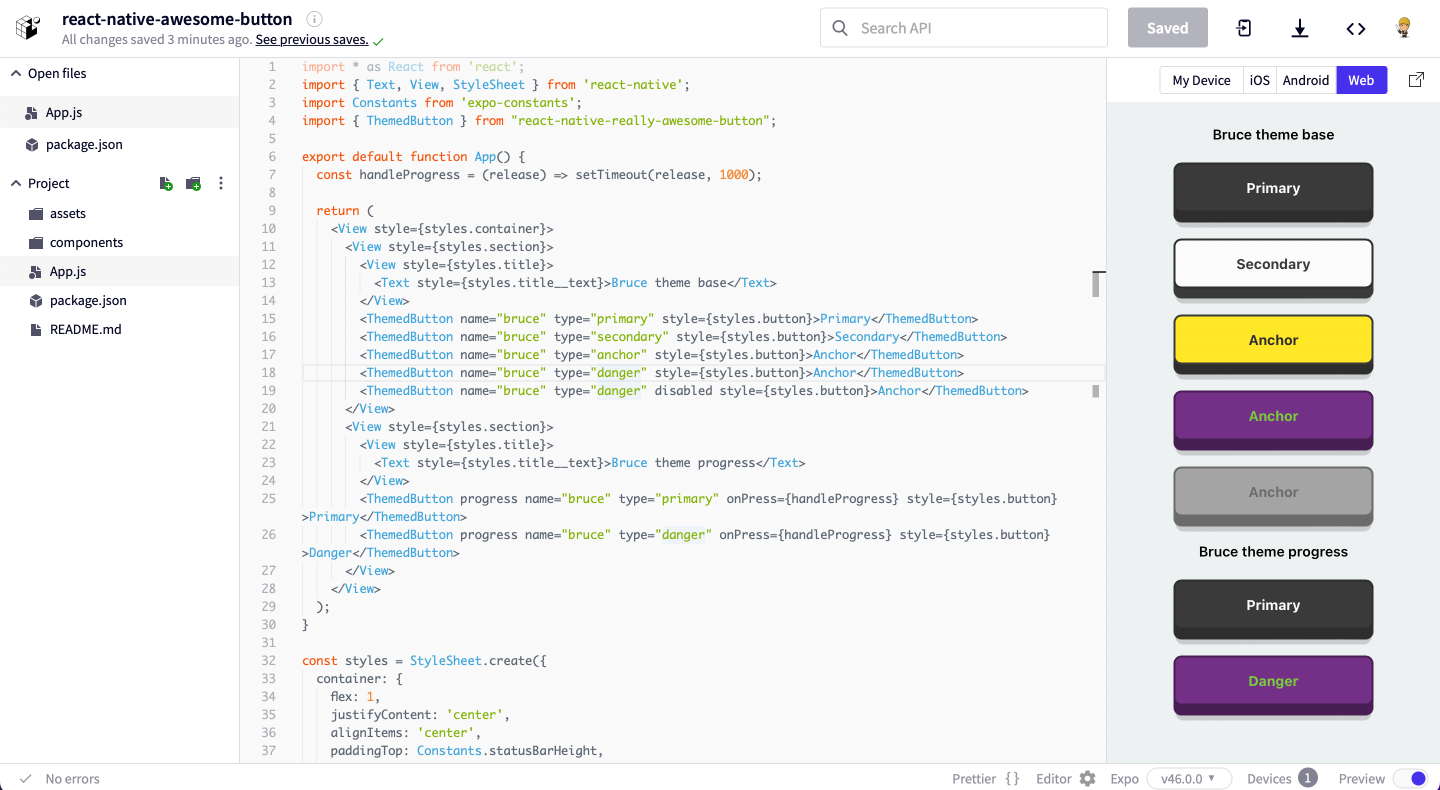
Access the snack at expo.dev.
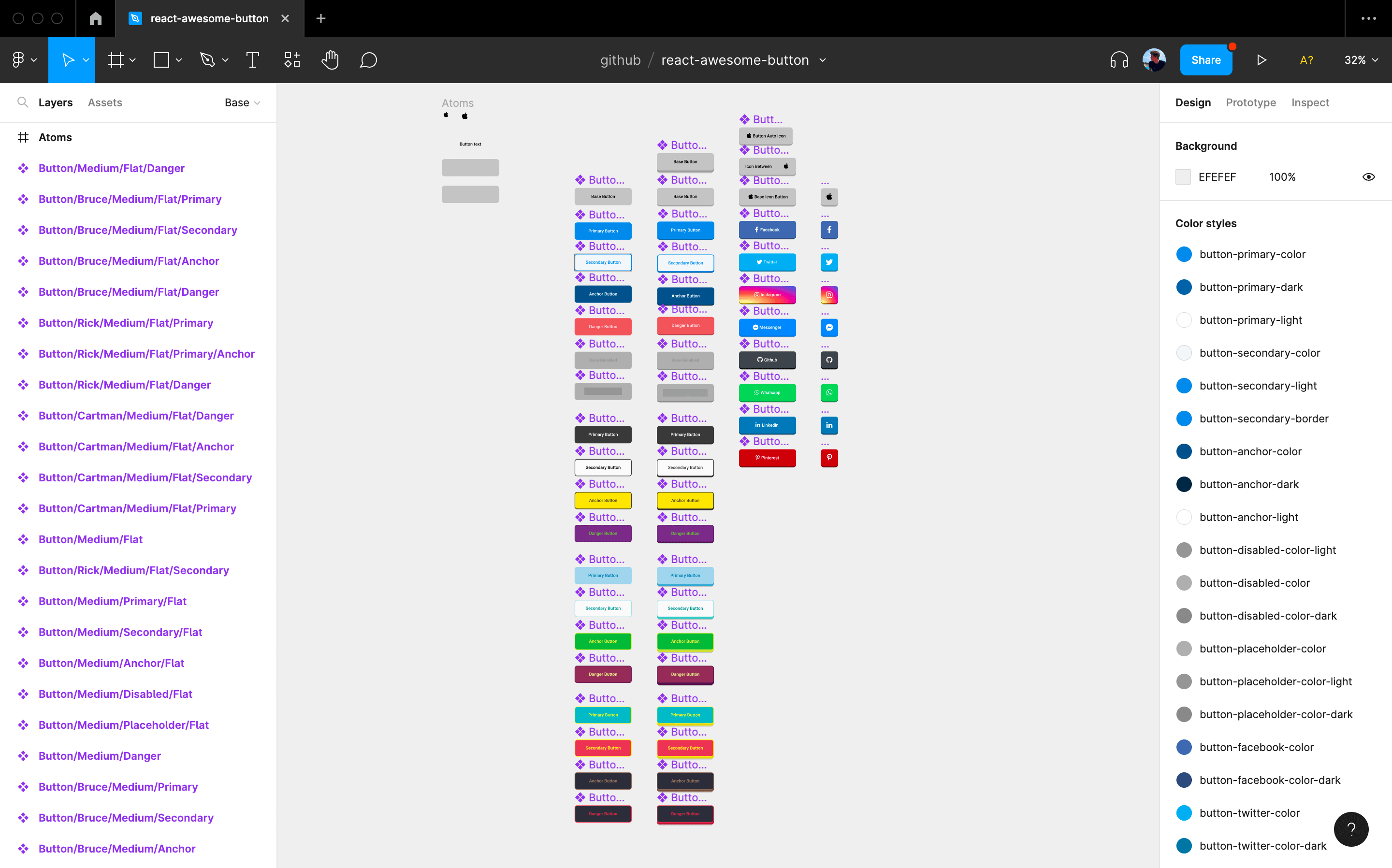
Import it directly into your Figma project.
npm install --save react-native-really-awesome-button
import AwesomeButton from "react-native-really-awesome-button";

function Button() {
  return <AwesomeButton>Text</AwesomeButton>;
}import AwesomeButton from "react-native-really-awesome-button";
function Button() {
return (
<AwesomeButton
progress
onPress={async (next) => {
/** await for something; then: **/
next();
}}
>
Text
</AwesomeButton>
);
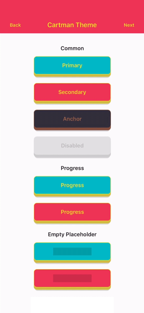
} import { ThemedButton } from 'react-native-really-awesome-button';
function ButtonWithTheme() {
return (
<>
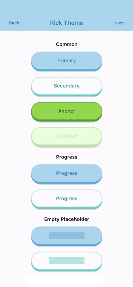
<ThemedButton name="rick" type="primary">Rick's Primary Button</ThemedButton>
<ThemedButton name="rick" type="secondary">Rick's Secondary Button</ThemedButton>
</>
);
}import AwesomeButton from "react-native-really-awesome-button";
function ButtonWithCustomChildren() {
return (
<AwesomeButton>
<Image source="require('send-icon.png)" />
<Text>Send it</Text>
</AwesomeButton>
);
}Useful for handling icons or any other inlined content which animates together with the button text.
  import { ThemedButton } from 'react-native-really-awesome-button';
  import { FontAwesome } from "@expo/icons";

  function ButtonWithIcon() {
    return (
      <ThemedButton
        name="bruce"
        type="primary"
        before={<FontAwesome name="twitter" />}>
        Rick's Primary Button
      </ThemedButton>
    );
}You can use the extra prop to render a component inside the button content body; this should be useful to render an image or gradient background
import { StyleSheet } from "react-native";
import AwesomeButton from "react-native-really-awesome-button";
import LinearGradient from "react-native-linear-gradient";

function ButtonWithExtraContent() {
  return (
    <AwesomeButton
      extra={
        <LinearGradient
          colors={["#4C63D2", "#BC3081", "#F47133", "#FED576"]}
          style={{ ...StyleSheet.absoluteFillObject }}
        />
      }
    >
      <Text>Instagram</Text>
    </AwesomeButton>
  );
}Added a set of controlling events on v2, giving control of every animation stage like onPressedIn and onPressedOut which are triggered on the Animated callback.
import { StyleSheet } from "react-native";
import AwesomeButton from "react-native-really-awesome-button";
import LinearGradient from "react-native-linear-gradient";

function ButtonWithExtraEvents() {
  return (
    <>
      <AwesomeButton
        onPressIn={handlePressIn}
        onPressedIn={handlePressedIn}
        onPressOut={handlePressOut}
        onPressedOut={handlePressedOut}
      >
        Label
      </AwesomeButton>
      <AwesomeButton
        progress
        onProgressStart={handleOnProgressStart}
        onProgressEnd={handleOnProgressEnd}
        onPress={handleOnPress}
      >
        Label
      </AwesomeButton>
    </>
  );
}| Attributes | Type | Default | Description |
|---|---|---|---|
| activityColor | String |
#FFFFFF |
Button activity indicator color |
| activeOpacity | Number |
1 |
Button active state opacity |
| animatedPlaceholder | Boolean |
true |
When set to false removes the placeholder animation loop |
| backgroundActive | String |
#C0C0C0 |
Button active state background-color |
| backgroundColor | String |
#C0C0C0 |
Button content background-color |
| backgroundDarker | String |
#9F9F9F |
Button bottom-front-face background-color |
| backgroundShadow | String |
#C0C0C0 |
Button bottom shadow background-color |
| backgroundPlaceholder | String |
#C0C0C0 |
Button placeholder background-color |
| backgroundProgress | String |
#C0C0C0 |
Button progress bar background-color |
| borderColor | String |
null |
Button border-color |
| borderRadius | Number |
4 |
Button border-radius |
| borderWidth | Number |
0 |
Button border-width |
| dangerouslySetPressableProps | PressableProps |
null |
Exposes the PressableProps of the Pressable wrapper; it can overwrite all props except onPressIn and onPressOut |
| debouncedPressTime | Number |
0 |
Configure onPress function debounce time |
| disabled | Boolean |
true |
Button disabled state: cancels animation and onPress func |
| height | Number |
50 |
Button height |
| width | Number |
null |
Setting width to null mirrors an auto behaviour |
| paddingHorizontal | Number |
12 |
Sets the button horizontal padding |
| paddingTop | Number |
0 |
Sets the button padding top |
| paddingBottom | Number |
0 |
Sets the button padding bottom |
| stretch | Boolean |
false |
When set to true together with width set to null the button fills it's parent component width |
| raiseLevel | Number |
4 |
Button 3D raise level |
| before | ReactNode |
null |
Renders a custom component before the button content Text |
| after | ReactNode |
null |
Renders a custom component after the button content Text |
| extra | ReactNode |
null |
Renders a custom component inside the button content body |
| springRelease | Boolean |
true |
Button uses elastic spring on the release animation |
| progress | Boolean |
false |
When set to true enables progress animation |
| progressLoadingTime | Number |
3000 |
Number in ms for the maximum progress bar animation time |
| textColor | String |
#FFFFFF |
Button default label text color |
| textLineHeight | Number |
20 |
Button default label text line height |
| textSize | Number |
16 |
Button default label text font size |
| textFontFamily | String |
null |
Button default label text font family |
| style | Style |
null |
Button container custom styles |
| onPress | Function |
null |
Button onPress function. It receives a next argument when the progress prop is set to true |
| onPressIn | Function |
null |
Triggered with the onPressIn native event |
| onPressedIn | Function |
null |
Triggered once the press animation has finished |
| onPressOut | Function |
null |
Triggered with the onPressOut native event |
| onPressedOut | Function |
null |
Triggered once the release animation has finished |
| onProgressStart | Function |
null |
Triggered before the progress animation has started |
| onProgressEnd | Function |
null |
Triggered after the progress animation has finished |
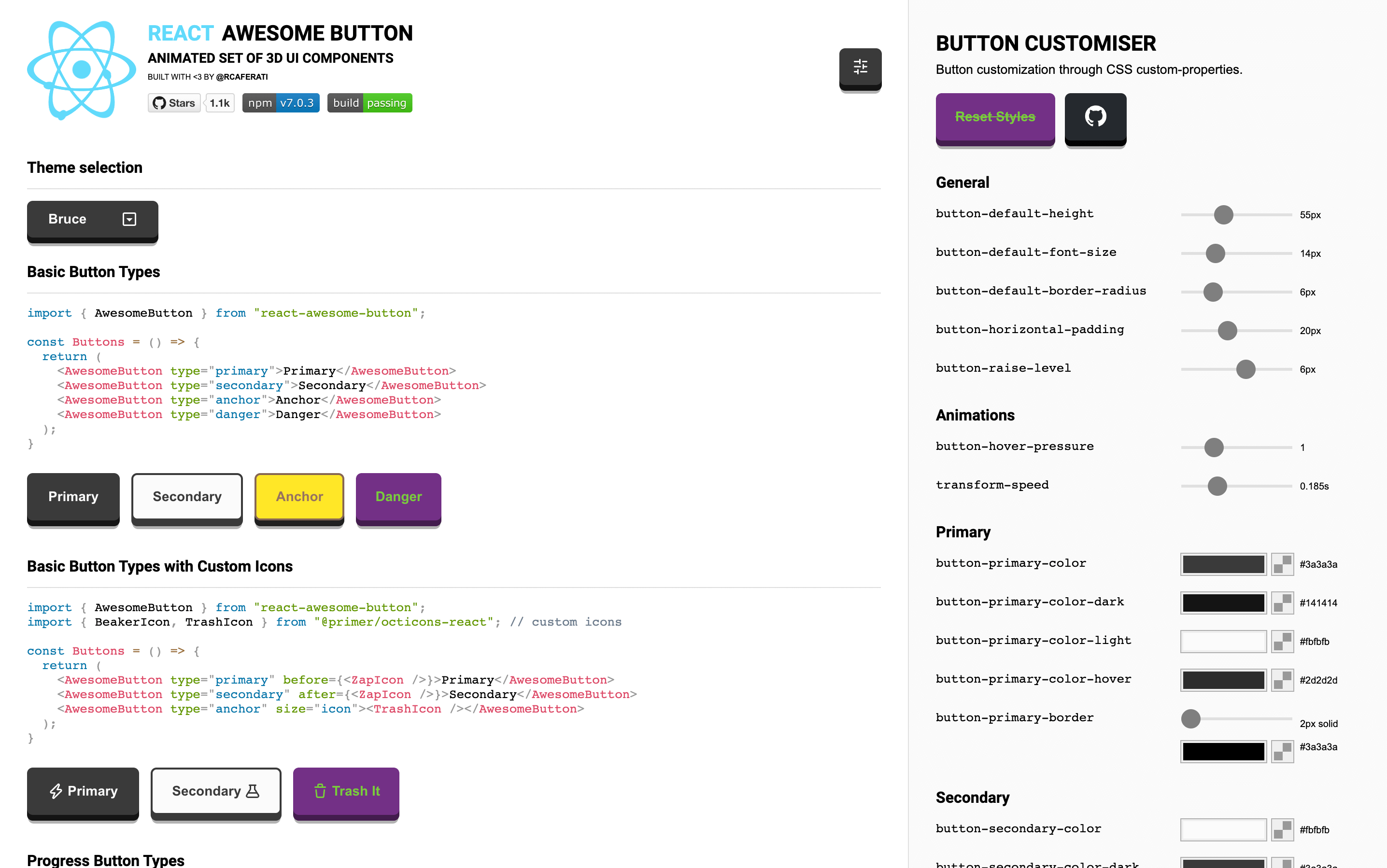
Checkout the web version of the Awesome Button UI Component at rcaferati/react-awesome-button
- Checkout my Portfolio Website
- Connect with me on
LinkedIn@rcaferati
MIT. Copyright (c) 2022 Rafael Caferati.


 React
React
 Typescript
 Django
 Laravel
 Facebook
 Microsoft
 Google
 Alibaba
 D3
D3
 Tencent