raisissoftware / store-framework Goto Github PK
View Code? Open in Web Editor NEWHome Page: https://lab.github.com/vtex-trainings/store-framework
Home Page: https://lab.github.com/vtex-trainings/store-framework


An e-commerce's homepage is always the client's first contact with the brand. Therefore, it's common for retailers to want to establish direct communication with their users at this strategic point in time during navigation.
Several components in Store Framework serve this scenario, such as the Info Card, which we looked at previously, and the Rich Text.
As we have seen during step three, the Rich Text is responsible for transforming texts into HTML elements, having the big advantage of reading Markdown. This give the component the flexibility to accept various text structures, allowing retailers to build their communication in more direct and clear way.
Just as with its functionality, the Rich Text configuration is also simple.
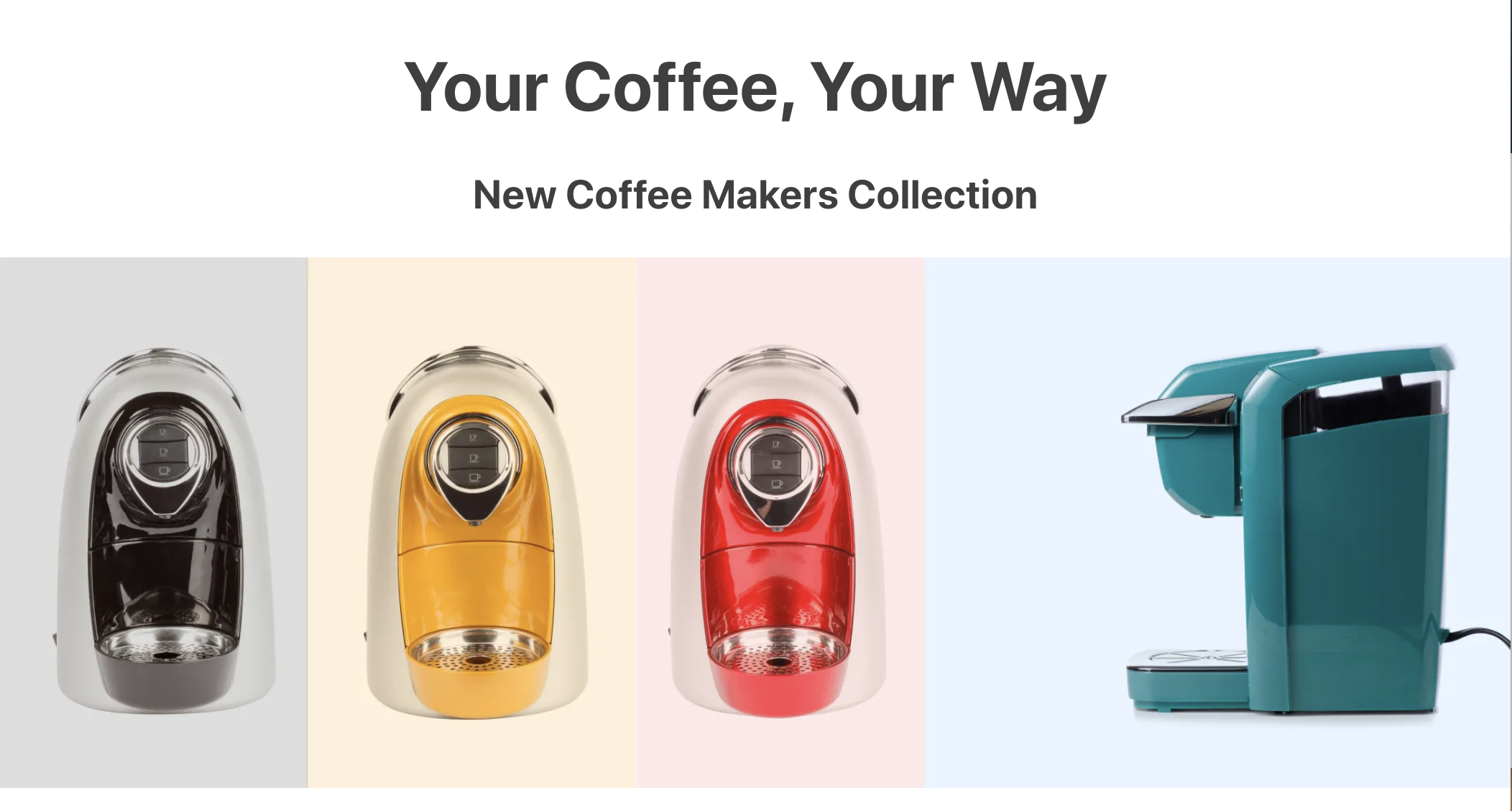
The same way that "Hello, world!" was created, we can create a block implementation example using written text in markdown format. For example:
"rich-text": {
  "props": {
    "text": "# Your Coffee, Your Way \n ### New Coffee Makers Collection",
    "textPosition": "CENTER",
    "textAlignment": "CENTER"
  }
},
As previously stated, using Markdown allows for more component flexibility. However, it may also lead to your alteration in your rendering, according to the device used by the user.
For example: the above sentence ( # Your Coffee, Your Way \n ### New Coffee Makers Collection ) can be use a markdown that's suitable for desktop, but not necessarily for mobile as well (whose screen size is smaller).
To resolve this scenario and make the behavior more adaptable to other devices, we should use the Responsive Layout.
First, we must declare the blocks in the store.home template:
"responsive-layout.desktop#desktop", "responsive-layout.mobile#mobile"
Them, we must declare these blocks as follows:
...

"responsive-layout.desktop#desktop": {
  "children": ["rich-text#desktop"]
},

"responsive-layout.mobile#mobile": {
  "children": ["rich-text#mobile"]
},

"rich-text#desktop": {
  "props": {
    "text": "# Your Coffee, Your Way \n ### New Coffee Makers Collection",
    "textPosition": "CENTER",
    "textAlignment": "CENTER"
  }
},

"rich-text#mobile": {
  "props": {
    "text": "# Your Coffee, Your Way \n ### New Coffee Makers Collection",
    "textPosition": "CENTER",
    "textAlignment": "CENTER"
  }
}
As we interpret the code above, we can notice two Rich Text configurations, built based on responsive-layout.desktop#desktop and responsive-layout.mobile#mobile.
During this activity, we will play around a little with the Rich Text markdown and learn how to use it with the Image component. All the while using Responsive Layout, of course!
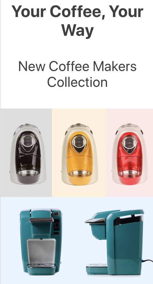
home.jsonc and declare the responsive-layout block in the store.home template;rich-text#mobile, alter the markdown of the first sentence to h3 and of the second to h4;image#desktop as a child of responsive-layout.desktop#desktop. Repeat the process with image#mobile and responsive-layout.mobile#mobile;"image#desktop": {
"props": {
"src": "https://appliancetheme.vteximg.com.br/arquivos/Responsive-Image-Desktop.jpg?q=1",
"link": {
"url": "/small-appliances/coffee-makers"
} ,
"alt": "Coffee Makers Collection"
}
},
"image#mobile": {
"props": {
"src": "https://appliancetheme.vteximg.com.br/arquivos/Responsive-Image-Mobile.jpg?q=1",
"link": {
"url": "/small-appliances/coffee-makers"
} ,
"alt": "Coffee Makers Collection"
}
},100%.ℹ️ Remember to access the Responsive Layout documentation if you have any question during your activity.
If you're still unsure as to how to send your answers, click here.
A store needs a good home page to engage users, increasing session time and therefore conversion chances. To achieve this, several elements need to be used, such as promotional banners, shelves with highlights, about us material, etc.
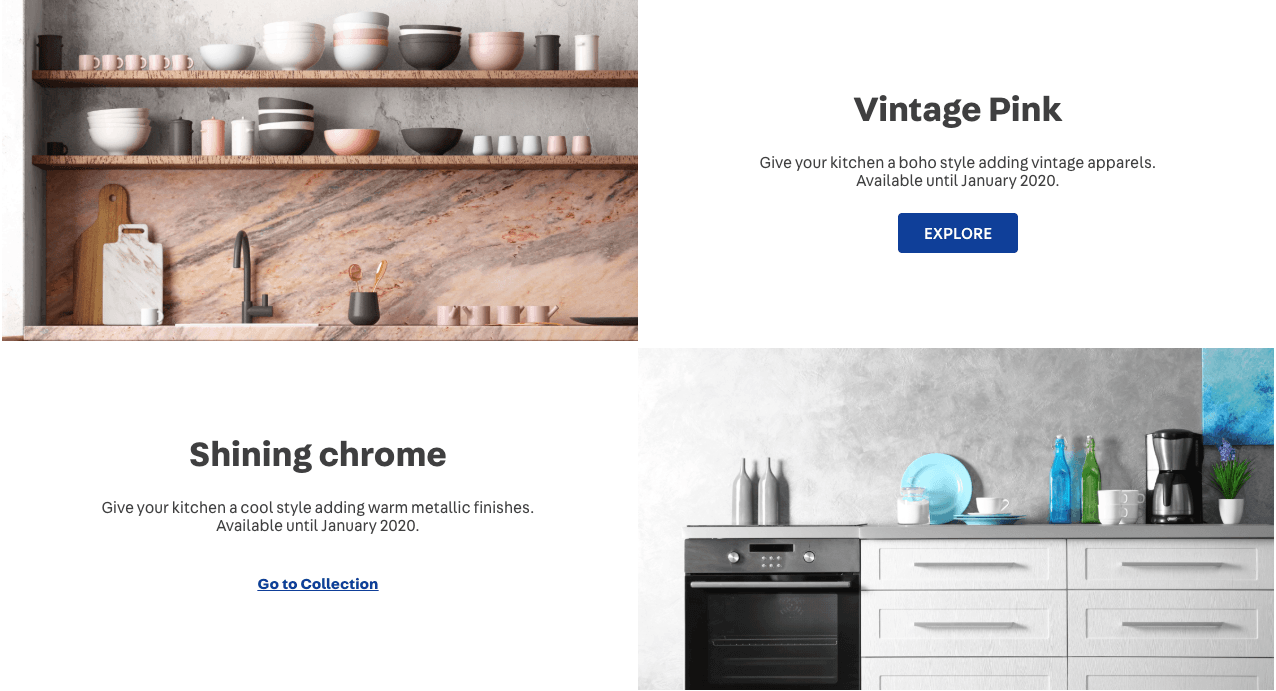
We have created the next block on the home page using a call to action. In Store Framework, we have a block designed for this purpose, called Info Card.
Using the Info Card, you can create images which have links and buttons (top or side of the block) that direct the user's flow (Call to action).
Looking at the documentation, we can see that:
isFullModeStyle defines whether the Call to Action (CTA) is set above the banner;textPosition defines the position of the text;textAlignment defines the text's alignment;imageUrl defines which image will be used as banner;headline determines which text will be used as headline;callToActionMode allows to choose the CTA mode as either a link or a button;callToActionText defines the CTA text;callToActionUrl determines the URL to which it redirects;We therefore have the following props:
  {
    "store.home": {
      "blocks": [
        "rich-text",
        "info-card"
      ]
    },
    "rich-text": {
      "props": {
        "text": "*Hello, World!*",
        "textPosition": "RIGHT"
      }
    },
    "info-card": {
      "props": {
      "isFullModeStyle": false,
      "textPosition": "right",
      "imageUrl": "https://appliancetheme.vteximg.com.br/arquivos/cozinha-rosa-min.png",
      "headline": "Vintage Pink",
      "subhead": "Give your kitchen a boho style adding vintage apparels.<br>Available until January 2020.",
      "callToActionMode": "button",
      "callToActionText": "Explore",
      "callToActionUrl": "/sale/d",
      "textAlignment": "center"
      }
    }
}You may have asked yourself:
"What if I wanted to have two different Info Cards?"
It's possible through block instancing.
All block have pre-established names, but you can create block instances and define different ways in which the block types appear. After each block has been defined, simply place an '#' with an arbitrary name that makes, for example:
  {
    "store.home": {
      "blocks": [
        "rich-text",
        "info-card#button-right"
      ]
    },
    ...
    "info-card#button-right": {
      "props": {
        "isFullModeStyle": false,
        "textPosition": "right",
        "imageUrl": "https://appliancetheme.vteximg.com.br/arquivos/cozinha-rosa-min.png",
        "headline": "Vintage Pink",
        "subhead": "Give your kitchen a boho style adding vintage apparels.<br>Available until January 2020.",
        "callToActionMode": "button",
        "callToActionText": "Explore",
        "callToActionUrl": "/sale/d",
        "textAlignment": "center"
      }
    }
  }
WARNING: Throughout the course, you will notice several
..., which you should not copy as it represents the progress achieved during previous steps.
In the home.jsonc file, based on the code above, create the info-card#button-left right under the infocard: info-card#button-right. This new infocard must implement the following:
Shining chromeGo to Collectionhttps://appliancetheme.vteximg.com.br/arquivos/cozinha-cinza-min.pngGive your kitchen a cool style adding warm metallic finishes.<br>Available until January 2020.textPosition).The expected result will look similar to this:
ℹ️ Remember to access the Info Card documentation if you have any questions regarding the activity.
If you're still unsure as to how to send your answers, click here.

It's important to establish that is not an expository course. Its objective is to teach participants about the VTEX IO Store Framework based on practical applications/activities. Therefore, in order to advance, you'll need to invest some time and dedication into it.
At the beginning of the course, you'll receive a repository containing a minimum amount of code our wish is that, upon completing all the tasks laid before you, you would have transformed that code into a fully functional store.
The course is divided into chapters. As each chapter begins, you'll receive initial instructions, just as you've already received for this and previous chapters. You should read through all of the presented content and perform the minor task set out at the end of the chapter.
For your answers to be sent, follow these steps:
git clone
https://github.com/raisissoftware/store-frameworkOpen on the notification that appears in the lower right corner
store-framework;raisissoftware/store-framework and then on Install.
After reading the entire content and performing the wanted task, you should send your answer according to the steps below:
Source Control, in the VSCode side menu;
+ in the CHANGES section;

✓ (Commit);

+ Create new branch...;


Once you complete this flow, our bot will let you know whether your answers were correct or not. If yes, the reply will look like this:

Thereafter, you'll receive another reply highlighting the next steps:

If you're familiar with git, this entire flow is equivalent to creating a branch with a predefined name, committing changes and then executing a push.
Throughout the course, you may run into difficulty and not manage to correctly complete the activity on your first try. When this happens, you'll receive a feedback message that will let you know where you failed:

You can submit as many answers and you want by simply retrying the entire process explained in the previous section.

You may see your course progress at any time by going back to the main page. There, you'll see every step, what you've already completed, along with a button that takes you back to where you last stopped:

Anytime you open the VSCode terminal, you can run a vtex link to monitor the evolution of your project in https://{workspace}--{account}.myvtex.com. Make sure that the solution is visually comparable to what was presented and that no link errors occurred.
Do not create issues and PRs during the course flow, since this can interfere with its functioning.

For your Mac setup video, click here
Before getting your hands dirty and learning more about VTEX IO's Store Framework, you'll need to set up a few basic configurations, such as:
Have a look at the step-by-step below for each of these configurations:
Install Git on your computer by clicking on the link below and selecting your operating system (Windows, MAC or Linux):
Toolbelt is a VTEX command line tool. It allows you to perform any activity on the platform, such as creating a new development workspace, logging into a VTEX account, developing new apps, or managing already existing ones, etc.
Since it's Toolbelt that establishes the communication between the developer and the platform, you'll need it in order to perform all the activities put forward during the Store Framework course.
npm i -g vtex in your terminal if you're using Windows or yarn global add vtex if you're using MAC;Your can run vtex-v (Windows) or vtex (MAC) to confirm whether the Toolbelt installation was as expected.
Once successfully installed, your next step is to log into a VTEX account.
Run vtex login VTEXaccount in your terminal, replacing VTEXaccount with the name of the account in which you want to work. For example, vtex login appliancetheme.
After logging in, run vtex whoami to confirm the account and workspace in which you find currently are.
Workspaces are nothing other than what the namesake suggests. On VTEX IO, accounts have three main workspace types, namely master, production and development.
The next step is to create a development workspace, which will allow you to play with the configurations throughout the course without altering the store's final public version.
vtex use workspace-name, replacing workspace-name with the desired name. For example, vtex use devworkspace.After creating the workspace, you'll be able to access it at this link: https://{workspace}--{account}.myvtex.com, replacing {workspace} and {conta} with the name of the previously created workspace and account. For example, https://devworkspace--appliancetheme.myvtex.com
After setting up the basic configurations, you're ready to start the course!
Taking a quick look at your online store, you'll notice that components have similar styles, even without applying any customization.
All of them, including the recently configured Info Card, share pre-established values for font, background color, main color, button format, etc.
This is due to the style.json, the file responsible for declaring generic customization values for every Store Framework store.

To create a unique identity for your store's components, you can overwrite these values using CSS customizations.
Analyzing the recipe employed to customize stores using CSS, we can notice that several steps will be needed in order to apply your own style, such as:
CSS folder, naming it vtex.{AppName}.css.{CSSHandle} {
{PropriedadeDeCSS}: {ValorDesejado};
{PropriedadeDeCSS}: {ValorDesejado};
}:global(vtex-{componentName})..{CSSHandle}--{blockClass} {
{PropriedadeDeCSS}: {ValorDesejado};
{PropriedadeDeCSS}: {ValorDesejado};
}To uncover a component's CSS Handles, such as the Info Card, simply access your documentation's Customization section.
According to the description of CSS Handles and to the store customization recipe using CSS, we can implement a customized Info Card example, editing its title and call-to-action button configurations by adding the following code to the vtex.store-components.css file, found in /styles/css:
.infoCardHeadline {
    font-family: serif;
    font-size: 2.25rem;
    font-weight: normal;
    color: gray;
    border: 2px solid black;
    padding: 24px;
}

.infoCardCallActionContainer :global(.vtex-button) {
    color: white;
    background-color: gray;
    border: transparent;
}

.infoCardCallActionContainer :global(.vtex-button):hover {
    color: gray;
    background-color: blue;
    border: transparent;
}
You can check the effect of these changes by running the vtex link command.

Next, we'll add a specific style to the vintage info card. To begin, add the blockClassprop to info-card#button-right, as shown below:
"info-card#button-right": {
  "props": {
    "isFullModeStyle": false,
    "textPosition": "right",
    "imageUrl": "https://appliancetheme.vteximg.com.br/arquivos/cozinha-rosa-min.png",
    "headline": "Vintage Pink",
    "subhead": "Give your kitchen a boho style adding vintage apparels.<br>Available until January 2020.",
    "callToActionMode": "button",
    "callToActionText": "Explore",
    "callToActionUrl": "/sale/d",
    "textAlignment": "center",
    "blockClass": "vintage"     //  <------------
  }
}
Thereafter, declare a background-color for this specific info card in your CSS file:
.infoCardContainer--vintage {
  background-color: #EDCFD1
}
Check out the result by linking your app.

vtex.store-components.css file, copy the above-mentioned code and use it in your theme's CSS file, according to the recipe on store customizations using CSS;max-width) of 1260px for all info cards, a margin of 0 auto and a padding of 0.black;bold;white.vintage blockClass, apply a new block class called metal to the info card info-card#button-left and apply the #e1e1e1 background color to it.
If you're still unsure as to how to send your answers, click here to go through that step again.
The Flex Layout is a layout structuring paradigm created in Store Framework to allow the construction of complex layouts. This paradigm uses the concepts of lines and columns to define the desired block structure and positioning on a certain page.
There are two basic building blocks for each Flex Layout:
flex-layout.rowflex-layout.colIf you are already familiar with the Flexbox used in CSS, the Flex Layout should be easy to understand, since Flexbox is already used "under the hood" by flex-layout.row and flex-layout.col.
With the help of Flex Layout, you can create customized layouts, using the Flexbox structure of lines and columns.
Analyzing the block's documentation, we see that you can use any block array as Flex Layout's children. In addition, you should always use flex-layout.row and flex-layout.col, and NEVER flex-layout alone.
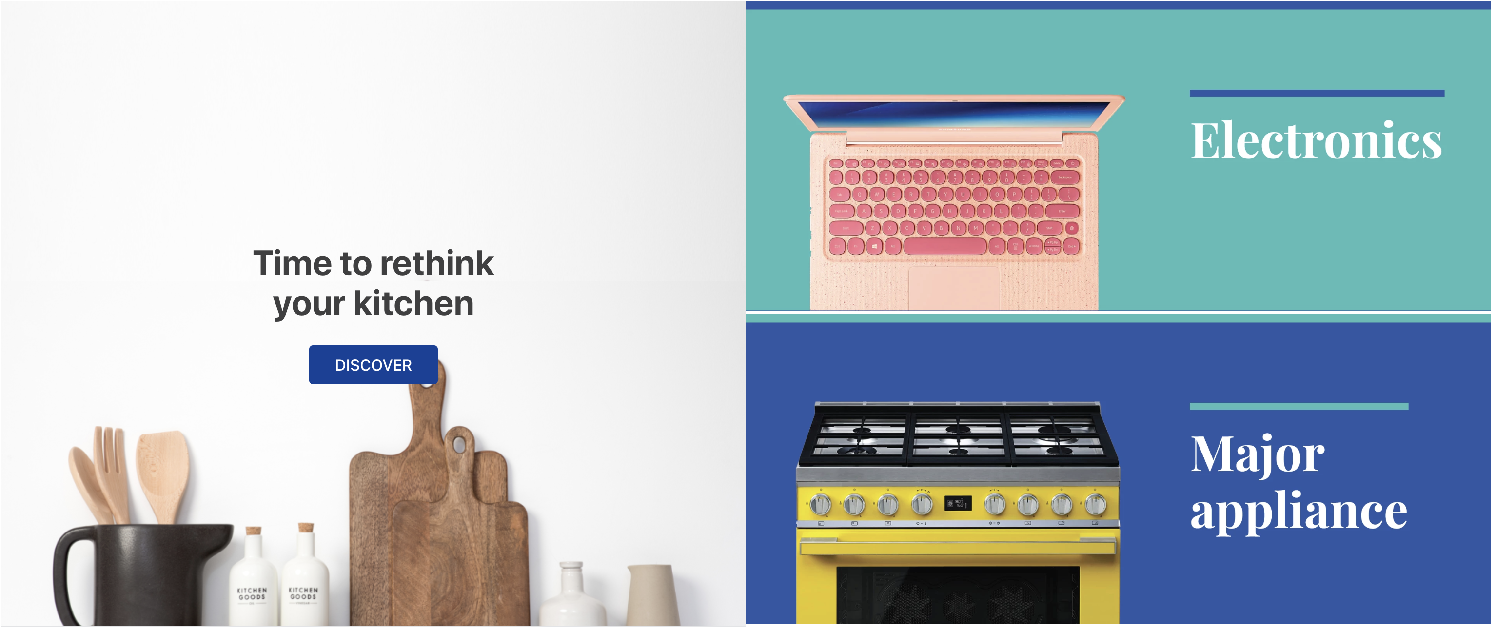
Below, we have an example of a flex layout comprised of a flex-layout.row with two children: an info-card and a rich-text:
  "flex-layout.row":{
    "children": [
      "info-card#rethink",
      "rich-text#delete"
    ]
  },

 "info-card#rethink": {
    "props": {
      "imageUrl": "https://appliancetheme.vteximg.com.br/arquivos/utensilios-cozinha-min.png",
      "isFullModeStyle": true,
      "headline": "Time to rethink your kitchen",
      "callToActionText": "Discover",
      "textPosition": "center"
    }
  },

  "rich-text#deletar": {
    "props": {
      "text": "I'll be deleted soon"
    }
}flex-layout.row in the store.home's template blocks and then declare the blocks mentioned above in your home.jsonc file.flex-layout.row children, substituting the rich-text block with a flex-layout.col column.rich-text block from your theme.flex-layout.col block in your home.jsonc file with two image components as children: image#electronics and image#major-appliance, in this order.image blocks with the following props:...
"image#electronics": {
"props": {
"src": "https://appliancetheme.vteximg.com.br/assets/vtex.file-manager-graphql/images/electronics_banner___25d69b49f8224b369375e68513b4d593.png",
"maxWidth": "100%"
}
},
"image#major-appliance": {
"props": {
"src": "https://appliancetheme.vteximg.com.br/assets/vtex.file-manager-graphql/images/major_appliance_banner___bb10093866a127345ddfbcca3efa5022.png",
"maxWidth": "100%"
}
}The result should be similar to this:
ℹ️ Remember to access the Flex Layout documentation in case you have any questions during the activity.
If you're still unsure as to how to send your answers, click here.
Before getting down to business there are some important, frequently occurring concepts you need to familiarize yourself with.
Store Framework is a commerce low-code tool used for building unique and custom storefronts.
The building flow starts with a custom theme, which can be worked on in different workspaces, without impacting the production environment.
A theme is essentially an arrangement of blocks and their position. In a theme, you can define every customization, position and style for every block that theme encompasses. You can also declare new pages in a theme, pages that in the future may represent about us or promotional landing pages (such as mother's day, black Friday, cyber Monday pages). The theme's end result consists of the content it's comprised of, in addition to the storefront.
Blocks are the minimal abstraction in Store Framework. They declare small pieces that make up a store's layout. Although they may look simple at first, blocks are imbued with a high customization power, allowing us to achieve complex designs. There are a total of four block customization levels:

Secure work environments that show a very close copy of what is running in production, allowing themes to be developed further without affecting the store.
Once the store's homepage is done, we can start working on a new store template: the product page. Product pages are probably the templates with the most blocks, which makes them extremely flexible and customizable.
Let's build a minimal product page, with only the bare essentials:
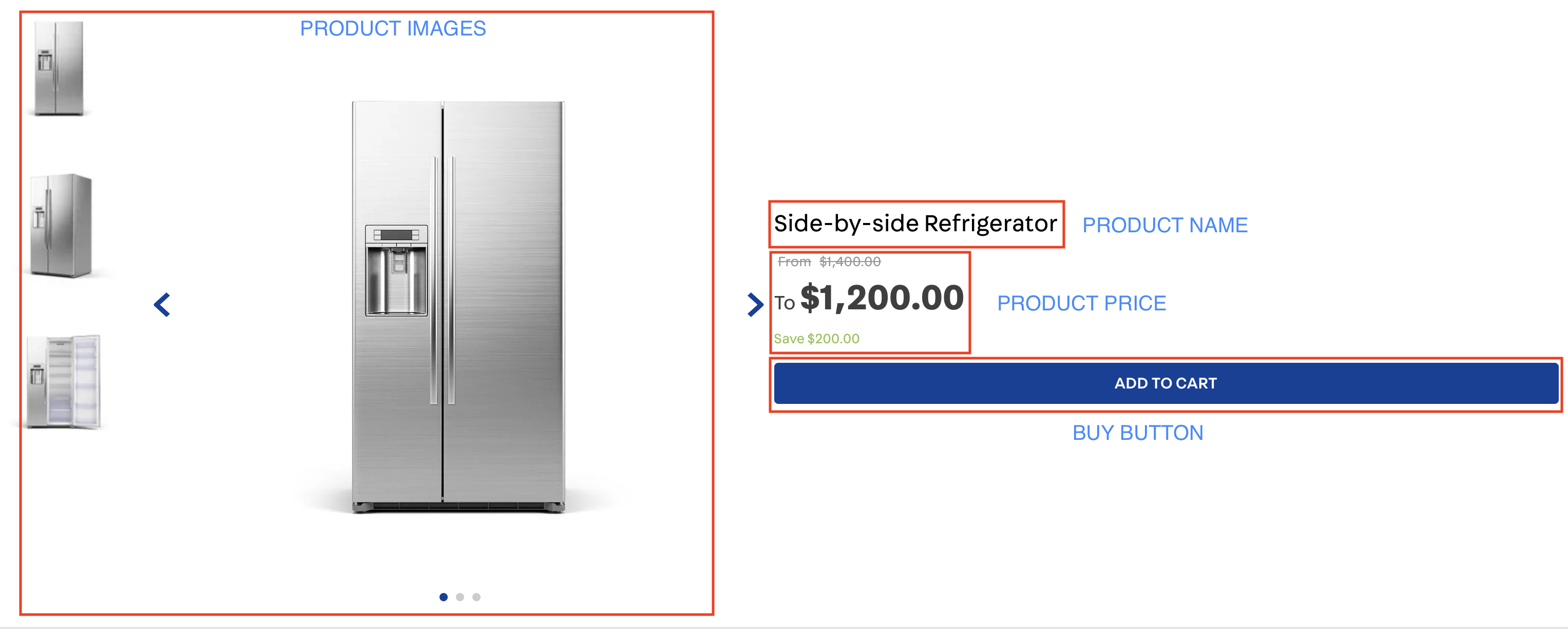
Most product blocks, unlike content blocks, are inserted into a certain context, making them a little bit "plug-n-play": placing product-images on the product page will automatically lead to images being rendered on that page, the same being valid for price and name.
This doesn't mean that these blocks are less customizable, quite the opposite actually, as we'll soon see.
Build a product page using the following blocks in product.jsonc and declare it in the store/blocks folder: product-images, product-price, product-name and buy-button. We expect the structure to contain the following:
store.product;{
"store.product": {
"children": [
"flex-layout.row#main"
]
}
}"flex-layout.row#main": {
"props": {
"marginTop": 6
},
"children": [
"flex-layout.col#left",
"flex-layout.col#right"
]
}product-images;"flex-layout.col#left": {
"children": [
"product-images"
]
}product-name, product-price and buy-button;In addition, we want:
verticalAlign and preventVerticalStretch props in the Flex Layout Column documentation)product-price to show the total savings and list price (showSavings and showListPrice)ℹ️ Remember to access the product-images, product-price, product-name e buy-button documentation in case you have any questions during your activity.
If you're still unsure as to how to send your answers, click here.
The next block that we'll use is the Shelf, on which we display a product collection. This session will show you how to render and configure this shelf on your store's homepage.
After a closer look at the Shelf documentation, we see that it's possible to configure which product collection we want to have displayed using either category, specificationFilters or collection props, according to the products added in the catalog.
Other props help to configure how the items are displayed. It's important to remember that the shelf component always requests that product-summary type blocks be part of its composition. Check out the product-summary block's documentation for more info on how it functions.
Below, we have a Shelf implementation example:
{
  "store.home": {
    "blocks": [
      ...
      "shelf"
    ]
  },
  ...
  "shelf": {
    "blocks": ["product-summary.shelf"],
    "props": {
      "category": 1,
      "orderBy": "OrderByTopSaleDESC",
      "paginationDotsVisibility": "desktopOnly",
      "productList": {
        "maxItems": 10,
        "itemsPerPage": 5,
        "minItemsPerPage": 1,
        "scroll": "BY_PAGE",
        "arrows": true,
        "titleText": "Top sellers"
      }
    }
  },
  "product-summary.shelf": {
    "children": [
      "product-summary-image",
      "product-summary-add-to-list-button",
      "product-summary-name",
      "product-rating-inline",
      "product-summary-space",
      "product-summary-price",
      "product-identifier.summary",
      "product-summary-buy-button"
    ]
  }
}home.jsonc, declare a shelf component is the store.home template;shelf.jsonc file;shelf.jsonc, define the shelf block with all the props given in the example above;84Note: It's important to remember that the product-summary.shelf block is already declared in default.jsonc. Therefore, it wasn't necessary to declare it during this activity.
ℹ️ Remember to access the Shelf's documentation if you have any questions during this activity.
The end result should be similar to the one below:
In case you're using your own VTEX account, make sure that the category 1 is functional and active in your environment.
If you're still unsure as to how to send your answers, click here.
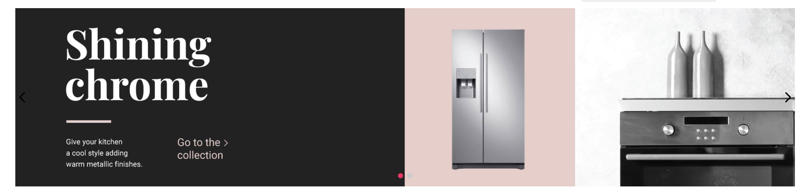
The Slider Layout, just as the Flex Layout, is a flexible way of creating a new block based on other blocks, using children. It allows slider from other blocks to be created, such as info-card and even flex-layout, for example.
Let's use the Slider Layout to transform a couple of info-cards into a slide.
Looking at the documentation, we notice that we can use any block array as children, just as with Flex Layout.
Below, you have an implementation example of a slider-layout with two info-card:
  "slider-layout#home": {
    "children": ["info-card#1", "info-card#2"],
    "props": {
      "autoplay": {
        "timeout": 5000,
        "stopOnHover": false
      }
    }
  },

  "info-card#1": {
    "props": {
      "imageUrl": "https://images.unsplash.com/photo-1524185962737-ea7c028a12cd?ixlib=rb-1.2.1&auto=format&fit=crop&w=1350&q=80",
      "isFullModeStyle": true,
      "headline": "Black Friday",
      "callToActionText": "Subscribe",
      "textPosition": "center"
    }
  },

  "info-card#2": {
    "props": {
      "imageUrl": "https://images.unsplash.com/photo-1524185962737-ea7c028a12cd?ixlib=rb-1.2.1&auto=format&fit=crop&w=1350&q=80",
      "isFullModeStyle": true,
      "headline": "Black Friday",
      "callToActionText": "Subscribe",
      "textPosition": "center"
    }
  }
In this activity, we will create a brand slider for our site:
In home.jsonc, declare the slider-layout#home block to the store.home template.
Create a file called slider-layout.jsonc in the /store/blocks folder;
In this file, based on the above-mentioned code, replace the declared info-card as slider-layout#home's children and add 6 image image components as children. As format, use image#brand1, image#brand2 (...) image#brand6 to declare the components;
Declare a specific src prop for each defined image#brand. Use the URLs below for each:
https://appliancetheme.vteximg.com.br/arquivos/flatflat-brand-logo-square1.pnghttps://appliancetheme.vteximg.com.br/arquivos/flatflat-brand-logo-square2.pnghttps://appliancetheme.vteximg.com.br/arquivos/flatflat-brand-logo-square3.pnghttps://appliancetheme.vteximg.com.br/arquivos/flatflat-brand-logo-square4.pnghttps://appliancetheme.vteximg.com.br/arquivos/flatflat-brand-logo-square5.pnghttps://appliancetheme.vteximg.com.br/arquivos/flatflat-brand-logo-square6.pngLastly, you have to use the autoplay property in the slider-layout#home block. Make the slider occur automatically every 7 seconds and also make it stop when the user hovers over the slide.
ℹ️ Remember to go through the Slider Layout and Image documentation if you have any questions during the activity.
If you're still unsure as to how to send your answers, click here.
We begin our journey with the classic "Hello, World!". In order to create something similar, we need to understand the Store Framework blocks and use one that allows us to create texts. This block is aptly called Rich Text.

The Rich Text is only one of the dozens of blocks available in Store Framework. It's a block that seems simple, but that allows a series of customizations meant to create texts. To start, any text written in Rich Text supports Markdown, making text styling much easier.
Looking at the block's documentation, we can find a technical specification. One of the sessions present is that of the Blocks API, in which we can see the list of all Rich Text properties (props). These properties are the main customization points of a block, which give a block its distinct visual and behavior, depending on how its been configured.
We'll start by customizing the home page. In your theme's /store/blocks folder, you'll find a file called home.jsonc. This file determines how the blocks you intend to use are organized. The language used in the layout composition is simple and based on JSON.
In home.jsonc, you'll notice a block which is default in all themes, namely store.home. This block determines which child blocks will be displayed on the home page.
{
  "store.home": {
    "blocks": []
  }
  ...
}
Let's use Rich Text in its body:
{
  "store.home": {
    "blocks": [
      "rich-text"
    ]
  }
  ...
}
Thus, store.home now knows that it needs to render a Rich Text. However, we're haven't yet specified which visual this Rich Text should adopt. For that, we'll need to define the block.
Defining a block must always be performed apart from any other block, at thee source level of the JSON file.
{
  "store.home": {
    "blocks": [
      "rich-text" <----- Here the block is used within another
    ]
  },
  "rich-text": { <----- Here it's at source level
  }
}
In the block's definition, you can set its behavior and visual. Customization points have to be used to achieve this, so we'll start off using the Rich Text props:
{
  "store.home": {
    "blocks": [
      "rich-text"
    ]
  },
  "rich-text": {
    "props": {

    }
  }
}
Read through the Rich Text documentation one more time and let's define the props we'll use to customize the block.
We want to achieve a simple "Hello, World!", and looking at the props we notice one called: text (Text written in markdown language to be displayed). This is the prop that determines which text will be displayed.
Including this prop, we now have the following:
{
  "store.home": {
    "blocks": [
      "rich-text"
    ]
  },
  "rich-text": {
    "props": {
      "text": "Hello, World!"
    }
  }
}
Reading through the Markdown documentation, we learn that in order for a text to appear in italic, we just need to place that text between *:
{
  "store.home": {
    "blocks": [
      "rich-text"
    ]
  },
  "rich-text": {
    "props": {
      "text": "*Hello, World!*"
    }
  }
}
To center align the text, we can add the textPosition prop and give it the CENTER value:
{
  "store.home": {
    "blocks": [
      "rich-text"
    ]
  },
  "rich-text": {
    "props": {
      "text": "*Hello, World!*",
      "textPosition": "CENTER"
    }
  }
}Define a Rich Text on your home page and create a bold "Hello, World!" that's right aligned.

ℹ️ Remember to access the Rich Text documentation if you have any questions during the activity.
If you're still unsure as to how to send your answers, click here.
During the last step we learned how to create a simple product page with a minimum amount of products, but we know that the result is far from an ideal product page, so we'll add other elements that frequently appear on product pages from various stores.

Our documentation contains more than 30 product-related blocks. At the beginning of the course we looked at the Shelf and its related blocks, in addition to the 4 blocks we looked at during our last session. We'll explore 4 more in this step:
It's important that by the end of the course you take some time to fully explore our components, in addition to the customization possibilities that accompany each component.
Develop the product page by adding the 4 blocks listed above toproduct.jsonc as follows:
breadcrumb right before the product's main line;"store.product": {
"children": [
"breadcrumb",
"flex-layout.row#main"
]
}product-identifier.product right under the product-name;sku-selector and product-quantity as children;{
...
"children": [
"product-price",
"flex-layout.row#qty-sku"
]
},
"flex-layout.row#qty-sku": {
"children": [
"sku-selector",
"product-quantity"
]
},
...
}shipping-simulator right under the line containing the SKU Selector and Product Quantityℹ️ Remember to access the Breadcrumb, Product Identifier, Product Quantity and SKU Selector documentation if you have any questions during the activity.
If you're still unsure as to how to send your answers, click here.
 React
React
A declarative, efficient, and flexible JavaScript library for building user interfaces.
🖖 Vue.js is a progressive, incrementally-adoptable JavaScript framework for building UI on the web.
 Typescript
TypeScript is a superset of JavaScript that compiles to clean JavaScript output.
An Open Source Machine Learning Framework for Everyone
 Django
The Web framework for perfectionists with deadlines.
 Laravel
A PHP framework for web artisans
Bring data to life with SVG, Canvas and HTML. 📊📈🎉
JavaScript (JS) is a lightweight interpreted programming language with first-class functions.
Some thing interesting about web. New door for the world.
A server is a program made to process requests and deliver data to clients.
Machine learning is a way of modeling and interpreting data that allows a piece of software to respond intelligently.
Some thing interesting about visualization, use data art
Some thing interesting about game, make everyone happy.
 Facebook
We are working to build community through open source technology. NB: members must have two-factor auth.
 Microsoft
Open source projects and samples from Microsoft.
 Google
Google ❤️ Open Source for everyone.
 Alibaba
Alibaba Open Source for everyone
 D3
D3
Data-Driven Documents codes.
 Tencent
China tencent open source team.