Coder Social home page Coder Social logo

petecorreia / react-circular-input Goto Github PK

View Code? Open in Web Editor NEW
171.0 3.0 12.0 4.31 MB

React components for easily composing a circular range input

Home Page: https://react-circular-input.now.sh

License: MIT License

TypeScript 98.16% CSS 1.84%
react gauge circular radial knob hooks

react-circular-input's Introduction

react-circular-input

React components for easily composing a circular range input

Latest Release Downloads Version MIT License

npm i react-circular-input

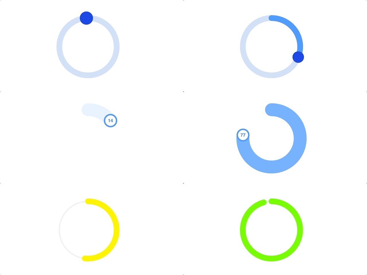
Animated example image (GIF)

Example

import {
	CircularInput,
	CircularTrack,
	CircularProgress,
	CircularThumb
} from 'react-circular-input'

export default () => {
	const [value, setValue] = useState(0.25)

	return (
		<CircularInput value={value} onChange={setValue}>
			<CircularTrack />
			<CircularProgress />
			<CircularThumb />
		</CircularInput>
	)
}

There's a lot more you can do with the library. From a simple gauge to a fully custom and animated circular input range.

Play around with examples at CodeSandbox:

Edit react-circular-input

A declarative and composable approach means we have a lot of flexibility, check out the documentation for how to go further!

Documentation

Full documentation at react-circular-input.now.sh.

Enjoy! ๐ŸŽ‰


Contributing | Code of Conduct | MIT License

react-circular-input's People

Contributors

dependabot-preview[bot] avatar dependabot[bot] avatar dimagimburg avatar mikesurowiec avatar ossamaweb avatar petecorreia avatar petecorreia-appital avatar

Stargazers

 avatar  avatar  avatar  avatar  avatar  avatar  avatar  avatar  avatar  avatar  avatar  avatar  avatar  avatar  avatar  avatar  avatar  avatar  avatar  avatar  avatar  avatar  avatar  avatar  avatar  avatar  avatar  avatar  avatar  avatar  avatar  avatar  avatar  avatar  avatar  avatar  avatar  avatar  avatar  avatar  avatar  avatar  avatar  avatar  avatar  avatar  avatar  avatar  avatar  avatar  avatar  avatar  avatar  avatar  avatar  avatar  avatar  avatar  avatar  avatar  avatar  avatar  avatar  avatar  avatar  avatar  avatar  avatar  avatar  avatar  avatar  avatar  avatar  avatar  avatar  avatar  avatar  avatar  avatar  avatar  avatar  avatar  avatar  avatar  avatar  avatar  avatar  avatar  avatar  avatar  avatar  avatar  avatar  avatar  avatar  avatar  avatar  avatar  avatar  avatar

Watchers

 avatar  avatar  avatar

react-circular-input's Issues

Help needed with running development environment

Hey, I want to add a feature to react circular input.

Can you please guide me how do I run the local development environment easily so I can reflect the changes I do in the code some rendered example? thanks.

(this is the first time I contribute to a project with such structure)

Warning: Support for defaultProps will be removed from function components in a future major release. Use JavaScript default parameters instead.

I'm getting the defaultProps warning for CircularTrack and CircularProgress.

Warning: CircularTrack: Support for defaultProps will be removed from function components in a future major release. Use JavaScript default parameters instead.

Warning: CircularProgress: Support for defaultProps will be removed from function components in a future major release. Use JavaScript default parameters instead.

I've attempted to modify the code like the below, but no luck. Does anyone have any ideas on how to resolve this?

import { CircularTrack } from 'react-circular-input';

const ModifiedCircularTrack = ({
  stroke='#fff',
  fill='#fff',
  strokeWidth='1',
  strokeLinecap='round',
  ...props
}) => {
  return (
    <CircularTrack
      stroke={stroke}
      fill={fill}
      strokeWidth={strokeWidth}
      {...props}
    />
  );
};

export default ModifiedCircularTrack;

Questions about cutomization

First, this library is awesome!

Two questions:

  1. How can I prevent dragging past min and max? The overflow makes it really hard to set 100% or 0%. I was thinking about using the hooks to test if the new value is moving past a certain coordinate?

  2. How can I rotate the input so that it starts somewhere other than the top? What if I want the input to start and stop at different points? Say start at 190deg and end at 170deg?

Type SpringValue<number> is not assignable to type 'number' . Update react-spring library and its corresponding implementation in examples

Hi ,
I was trying to implement the animated example using react-spring from CodeSandbox https://codesandbox.io/s/ypwq61rnxz?hidenavigation=1&file=/src/index.tsx . But it gave me error when i tried to pass props.value to the <CircularInput value={props.value}. The error is Type SpringValue<number> is not assignable to type 'number'

But as soon as i downgraded react-spring to v8.0.27 (this is what is used in your example) . It started working

Please update the react-spring library and its corresponding implementation in examples so that developers don't get confused

Here is the code for reference

<Spring to={{ value }} config={config.slow}>
        {props => (
          <CircularInput value={props.value} radius={75} onChange={setValue}>
            <CircularProgress
              strokeWidth={45}
              stroke={`rgba(61, 153, 255, ${props.value})`}
            />
            <CircularThumb
              fill="white"
              stroke="rgb(61, 153, 255)"
              strokeWidth="5"
            />
            <CustomComponent />
          </CircularInput>
        )}
</Spring>

controlled component?

How does one go about creating a controlled component, e.g. one where the value can be changed externally?

As a simple example, here's the sample code from README with an additional button:

import {
  CircularInput,
  CircularTrack,
  CircularProgress,
  CircularThumb
} from 'react-circular-input'

export default () => {
  const [value, setValue] = useState(0.25)
  
  return (
    <>
      <button 
        type="button" 
        onClick={() => { setValue(v => v + 12 }}
      >
        add 12
      </button>

      <CircularInput value={value} onChange={setValue}>
        <CircularTrack />
        <CircularProgress />
        <CircularThumb />
      </CircularInput>
    </>
  )
}

The component flickers when the value changes but does not update. It looks like we can only set the value initially and from then on there's no way to update it?

Custom Progess Component

Hi,

Thanks for this awesome library!

Problem: I want to have an initial progress component that is read-only and styled with a lighter color. It is used as a reference to the previous value submitted.

Is it possible to have an additional <CircularProgress /> within CircularInput that takes a different value?

Recommend Projects

  • React photo React

    A declarative, efficient, and flexible JavaScript library for building user interfaces.

  • Vue.js photo Vue.js

    ๐Ÿ–– Vue.js is a progressive, incrementally-adoptable JavaScript framework for building UI on the web.

  • Typescript photo Typescript

    TypeScript is a superset of JavaScript that compiles to clean JavaScript output.

  • TensorFlow photo TensorFlow

    An Open Source Machine Learning Framework for Everyone

  • Django photo Django

    The Web framework for perfectionists with deadlines.

  • D3 photo D3

    Bring data to life with SVG, Canvas and HTML. ๐Ÿ“Š๐Ÿ“ˆ๐ŸŽ‰

Recommend Topics

  • javascript

    JavaScript (JS) is a lightweight interpreted programming language with first-class functions.

  • web

    Some thing interesting about web. New door for the world.

  • server

    A server is a program made to process requests and deliver data to clients.

  • Machine learning

    Machine learning is a way of modeling and interpreting data that allows a piece of software to respond intelligently.

  • Game

    Some thing interesting about game, make everyone happy.

Recommend Org

  • Facebook photo Facebook

    We are working to build community through open source technology. NB: members must have two-factor auth.

  • Microsoft photo Microsoft

    Open source projects and samples from Microsoft.

  • Google photo Google

    Google โค๏ธ Open Source for everyone.

  • D3 photo D3

    Data-Driven Documents codes.