novus / nvd3 Goto Github PK
View Code? Open in Web Editor NEWA reusable charting library written in d3.js
Home Page: http://nvd3.org/
License: Other
A reusable charting library written in d3.js
Home Page: http://nvd3.org/
License: Other
I get problems with long legend text. I don't see the same problem in the livecode view on NVD3 org.
Tried to look at the legend.js file
 if (align) {
        var seriesWidths = [];
        series.each(function(d,i) {
              seriesWidths.push(d3.select(this).select('text').node().getComputedTextLength() + 28); // 28 is ~ the width of the circle plus some padding
            });

        nv.log('Series Widths: ', JSON.stringify(seriesWidths));

        var seriesPerRow = 0;
        var legendWidth = 0;
        var columnWidths = [];

        while ( legendWidth < availableWidth && seriesPerRow < seriesWidths.length) {
          columnWidths[seriesPerRow] = seriesWidths[seriesPerRow];
          legendWidth += seriesWidths[seriesPerRow++];
        }
}
I cannot figure what's wrong. Got stock css file and json objects are copied from NVD3.org.
Hey there,
I was just wondering if there is a way to align multiple y-axis to have 0 at the same coordinate. e.g. changing the linePlusBarChart example to contain negative values yields the following:
Is there a way to keep both yAxis 0 value at the same vertical position?
I am using scatterChart() to plot a data set that increases in size on a daily basis and have found that the plot's transition performance is growing slower and slower as the number of data points increases from the hundreds into the thousands. I'm wondering if this performance degradation has been experienced by other users and, if so, if there are any optimizations that can be made to improve this performance. I'm running these plots in the latest version of Chrome.
The Cumulative Line Graph Example displays the message "No Data Available".
It looks like d3 cannot find cumulativeLineData.json in http://nvd3.org/ghpages/cumulativeLine.js.
When I show timeseries data using a lineChart, and all the points in the line have the same y value (i.e. a flat line is displayed) - when hovering over the points the wrong point is highlighted:
It seems that the path.nv-path-XXX elements inside g.nv-point-paths aren't the size they should be from some reason.
Here is an example, reproducible in the live code editor:
Chart Code
  nv.addGraph(function() {
    var chart = nv.models.lineChart()
        .x(function(d) { return d[0] })
        .y(function(d) { return d[1] })
        .color(d3.scale.category10().range());

    chart.xAxis.tickFormat(function(d) {
      return d3.time.format('%x')(new Date(d))
    });

    chart.yAxis.tickFormat(d3.format(',d'));

    d3.select('#chart svg')
      .datum(data)
      .transition().duration(500)
      .call(chart);

    return chart;
  });
Data
  [
    {
      "key": "Series 1",
      "values": [
        [ 1025409600000 , 1],
        [ 1025409610000 , 1],
        [ 1025409620000 , 1],
        [ 1025409630000 , 1],
        [ 1025409640000 , 1],
        [ 1025409650000 , 1],
      ]
    }
  ]
Markup
  <style>

  #chart svg {
    height: 400px;
  }

  </style>


  <div id="chart">
    <svg></svg>
  </div>
Try hovering over the line to highlight the points on it.
I have tested this on both latest chrome and latest Firefox.
If I change any of the points from 1 to any other numeric value, the problem goes away.
I'd be happy to provide more info (or help in any other way).
Thanks for an awesome library!
It would be great if a Swimlane/Timeline style chart could be added to nvd3.
The following d3 examples are a pretty great:
So I have just run into this issue, as have others before me: (http://stackoverflow.com/questions/13619436/large-black-circles-overlay-scatterchart).
If you don't reference the nv.d3.css file, then the graphs look completely broken (which isn't surprising) but there is no explanation anywhere that I can find that you need to include the css file in your html. And it's even hidden in the src folder rather than at the top level.
So some thoughts:
I am happy to make both of these changes, but just wanted to check I am not missing something obvious before I do?
When clicking the toggles for a line chart (and possibly others) you get the exception Uncaught TypeError: Cannot read property '1' of undefined
Here's is an example of the bug: http://jsfiddle.net/aRmjm/
Building a multiBarChart with d3v3.js works, but clicking on a button returns an error.
Using d3v2.js makes thing works.
I thought that I could set scale of the axis by doing the following:
  var chart;
  var xScale = d3.scale.ordinal()
                  .domain(_.map(seriesDef[0].values, function(d) {
                    return d.x;
                  }))
                  // .rangeBands([0, seriesDef[0].values.length - 1]);


  nv.addGraph(function() {
    chart = nv.models.lineChart();

    chart.x(function(d, i) { return String(d.x); })
         .y(function(d) { return d.y; });

    chart.xAxis.scale(xScale);

    chart.yAxis
      .tickFormat(d3.format(',.2f'));

    d3.select(that.chartElement.find('svg')[0])
        .datum(seriesDef)
      .transition().duration(500)
        .call(chart);

    nv.utils.windowResize(chart.update);

    return chart;
  });
Here's what seriesDef looks like:
{
  "area": false,
  "key": "Total Amount By Term",
  "values":
    [
      {
        "x": "199520",
        "y": 1119707
      },
      {
        "x": "199510",
        "y": 1253042
      },
      {
        "x": "199610",
        "y":  868849
      },
      {
        "x": "199540",
        "y": 50
      },
      {
        "x": "199430",
        "y":  6803
      },
      {
        "x": "199810",
        "y":  1850
      },
      {
        "x": "200820",
        "y":  30
      }
    ]
}
The xAxis still ends up looking like an interval
Any suggestions?
https://github.com/novus/nvd3/blob/master/src/models/sparklinePlus.js
in function: nv.models.sparklinePlus
line 37: var currentValue = sparkline.y()(data[data.length-1], data.length-1);
unsafe access to userInput variable 'data'
check of data-existance verify only at line 46:
if (!data || !data.length) {...
exception as result.
please consider to change order of this two operations.
thank you.
I show a line chart via Twitter Bootstrap Modal.
The placement calculation gets somehow confused. Even window.events.ClientX and ClientY return strange values.
<div id="metro-details-modal" class="modal hide fade" tabindex="-1"
role="dialog" aria-labelledby="Details" aria-hidden="true">
</div> container.delegate('.element .metro-details .balance', 'click', function() {
var id = $(this).parent().parent().parent().parent().parent().attr('data-id');
$('#metro-details-modal').empty();
var url = buildUrl('/api/users/stats/billing/' + id);
d3.json(url, function(jsondata) {
//to set color
var data = [{
key : jsondata[0].key,
values : jsondata[0].values,
color : '#DD4814'
}]
nv.addGraph(function() {
var margin = {top: 20, right: 20, bottom: 30, left: 50},
width = 750 - margin.left - margin.right,
height = 350 - margin.top - margin.bottom;
var chart = nv.models.lineChart();
chart.xAxis
.tickFormat(function(d) { return d3.time.format('%d.%m')(new Date(d)) });
chart.yAxis
.axisLabel('Kontostand (€)')
.tickFormat(d3.format('.02f'));
var svg = d3.select('#metro-details-modal')
.append("svg:svg")
.attr("width", width)
.attr("height", height)
svg.datum(data)
.transition().duration(500)
.call(chart);
$('#metro-details-modal').modal('show');
nv.utils.windowResize(chart.update);
return chart;
});
});
});We need the ability to get/set a "state" object for all charts. The state should be a dummy object (i.e. do not include any functions) so that it can be serialized easily using JSON or a URL hash.
The "set" method should be robust enough to handle scenarios where the series data might have changed. For example, if we hide the "A" series, retrieve the state, and then set it back again on a chart that doesn't have just "B" and "C" series, it should simply smoothly ignore this inconsistency.
These are the states that need to be implemented (from the top of my head... might be more):
The tree's state is not required at the moment.
Also, we should have the ability to subscribe to change events. I guess d3.dispatch would be fine.
How to disable legend "onClick" toggle behavior for NVD3 charts?
An image is better than explain, see the espace in top of graph
I am trying to use nvd3's lineChart model and I notice that the y axis label is getting rendered off the screen. The following code (this is pretty much the code from the sample page):
var chart = nv.models.lineChart();

chart.xAxis
    .axisLabel('Time (ms)')
    .tickFormat(d3.format(',r'));

chart.yAxis
    .axisLabel('Voltage (v)')
    .tickFormat(d3.format('.02f'));

d3.select('#chart svg')
    .datum(data())
  .transition().duration(500)
    .call(chart);
Generates a text element with the following values:
<text class="nv-axislabel"
      text-anchor="middle"
      transform="rotate(-90)"
      y="-63"
      x="-160">
Voltage (v)
</text>
I simply made the following change to src/models/axis.js:
diff --git a/src/models/axis.js b/src/models/axis.js
index 123cfbb..80db73e 100644
--- a/src/models/axis.js
+++ b/src/models/axis.js
@@ -210,7 +210,7 @@ nv.models.axis = function() {
           axisLabel.enter().append('text').attr('class', 'nv-axislabel')
               .attr('text-anchor', rotateYLabel ? 'middle' : 'end')
               .attr('transform', rotateYLabel ? 'rotate(-90)' : '')
-              .attr('y', rotateYLabel ? (-Math.max(margin.left,width) + 12) : -10); //TO
+              .attr('y', rotateYLabel ? (-Math.max(margin.left,width) + 25) : -10); //TO
           axisLabel
               .attr('x', rotateYLabel ? (-scale.range()[0] / 2) : -axis.tickPadding());
           if (showMaxMin) {
Which generates the following svg:
<text class="nv-axislabel"
      text-anchor="middle"
      transform="rotate(-90)"
      y="-50"
      x="-160">
Voltage (v)
</text>
I don't really know if this is the correct solution or if it breaks other graphs. I am not super familiar with d3.js or nvd3.js. Let me know if you need more information. Thanks!
The statement "with an explanation, apology, and commitment to its permanent status as an open-source project" from Novus partners seems to be missing from nvd3.org. Where has it gone?
The toggles on the pie chart appear to be broken for the latest nvd3 on github. I have no idea when it broke, but everything works with http://nvd3.org/nv.d3.js. When I change to https://raw.github.com/novus/nvd3/master/nv.d3.js, I get an error "Uncaught TypeError: Object # has no method 'map' " on line 8132 of nv.d3.js. Same problem with the minified javascript.
As far as I can find, nothing else is affected.
You can repro this with the scatter / bubble chart in the live code section of nvd3.org
Change the Data(JSON) generator to:
for (j = 0; j < points; j++) {
data[i].values.push({
x: 100000.0 * random()
, y: 100000.0 * random()
, size: Math.random()
//, shape: shapes[j % 6]
});
}
Note how both axes have truncation issues in Chrome.
If this is an easy enough fix for someone just getting started with the codebase -- give me a hint on where this should live in the code I'm happy to investigate and provide a pull request.
I would like to blow up the font-size for the LineChart x and y axes.
What is the correct method?
Do I need to adjust both the axis.tickPadding() and the font-size using CSS? Or is there a way to have the chart canvas adjust itself depending on the outer elements' size? It would be nice to have some sort of theme presets, for example "Presentation mode" which scaled up all fonts and made other valuable adjustments.
Thanks.
For graphs with dates on X-axis, in a short date range, the dates may repeat for multiple ticks. I believe reduceXTicks on multiBarChart model resolves this, but it's not implemented in multiChart or lineChart models and most others.
It was discussed here: http://stackoverflow.com/questions/14799511/how-can-i-keep-tick-marks-from-repeating-when-i-have-a-small-number-of-dates-on but I was wondering if there's a simpler solution of porting this function to other models?
Having 40+ series leads to several problems in the chart. I'm giving the series legends some extra space.
Open http://nvd3.org/ghpages/line.html with IE 9. The height of the page will grow extremely (look at the scrollbar).
Any ideas? Would love to fix this.
Normal use case is:
var svg = d3.select("svg");
// setup
var chart = ...;
svg.datum(data)
  .call(chart)
Here tooltips of course work fine.
Instead I have multiple charts on the svg 'canvas' and I draw each graph into a separate <g> element:
var g = d3.select("g");
// setup
var chart = ...;
g.datum(data)
  .call(chart)
Here tooltips either fail to show up or in the case of lineChart throw an error in d3 as they attempt to determine the viewBox settings (line 3975 in the current source). Is there a way to make tooltips work in my case? (and the reason for submitting this as a bug report is to allow this feature in the mainstream source).
Load a chart that has bar data but no line data. The x axis ticks disappear.
Hi,
I'm using the StackedAreaChart Example code and want to update my data from another webservice.
My update function looks like this
function updateData(url) {
    d3.json(url, function(jsondata) {
        d3.select('#trendItemArea svg')
          .datum(jsondata)
          .transition().duration(500)
          .call(weeklyAreaChart);
    });
}The options buttons to select expanded, stacked, stream and items select/deselect buttons don't work after this update.
Sometimes the new data is missing one item which was available, which causes nvd3 to draw the "no data available" label, even it draws the rest correctly.
thanks,
Muki
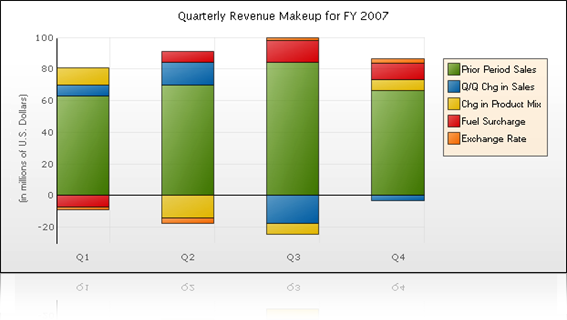
To reproduce:
function stream_index(d, i) {
  return {x: i, y: -Math.max(0, d)};
}Stacked Bar chart should handle any combination of negative and positive values.
The following image illustrates how the bars should be stacked when mixing negative and positive values:
http://www.infragistics.com/uploadedImages/Content/Products/ASPNET/Whats_new/PositiveNegativeStackChartWeb.png
Using the line chart, if two lines exactly match (presumably for at least two vertices), tooltips for the whole chart break.
The error is in d3.geom.voronoi; you get an invalid polygon, probably because it can't do anything with two duplicate points.
I've spent multiple days trying to get the examples in both the live console and the examples directory working just to draw a simple bar chart. I'm curious where I should be looking for working copies? It really isn't clear what data format should be used for each chart. I suggest changing the live charts to use the example data format which is accepted by the chart instead of using functions to generate the data. This would really help folks learn and pickup your charting library.
I noticed in the example directory the data format for the test data is passed into a map function and remapped - is this something d3 would normally handle and you are just doing it for the sake of the example or do I need that in my code also?
Anyways - here is the specific error with the one example I am trying.
On load, the bars are not drawn, just the line. When deselecting the line, multiple errors appears in the javascript console:
Error: Problem parsing d="MNaN,-14886.89952325868LNaN,-15647.099487464346LNaN,-14172.899545385642LNaN,-12961.199573494292LNaN,-14571.899531896603LNaN,-12341.699593160929LNaN,-11816.699619341965LNaN,-14061.599537994782LNaN,-14038.499547523323LNaN,-15955.79947755232LNaN,-16816.799457896686LNaN,-19038.59937866465LNaN,-17606.39943190845LNaN,-17793.29941845821LNaN,-17558.099432733008LNaN,-19301.099370448246LNaN,-20747.99932993517LNaN,-25240.109180397463LNaN,-25418.39917976133LNaN,-27459.599109578445LNaN,-28870.79906856349LNaN,-32018.698963779156LNaN,-39679.49872196405LNaN,-38056.19877081632LNaN,-41386.798666609415LNaN,-28215.599085562644LNaN,-26044.199156851577LNaN,-29924.999030881794LNaN,-36319.49882732094LNaN,-39427.498726776685LNaN,-34952.3988703471LNaN,-33169.498927218745LNaN,-35391.29885558126LNaN,-23658.599231721997LNaN,-22383.89927109702LNaN,-19250.699373254316LNaN,-17713.49941982878LNaN,-18717.29939034215LNaN,-18545.099392496544LNaN,-21865.19928982724LNaN,-26214.2991463611LNaN,-28310.099083741083LNaN,-29700.299034088064LNaN,-34101.898898739506LNaN,-35114.09886012542LNaN,-38713.49875198607LNaN,-39374.998723055585LNaN,-41771.09865396959LNaN,-44043.718572935504LNaN,-40123.22870705696LNaN,-42760.19861328711LNaN,-49139.998417114344LNaN,-54618.89823308766LNaN,-53734.79826984894LNaN,-52611.298296609835LNaN,-53812.49826777681LNaN,-50840.998352538394LNaN,-59377.498090379406LNaN,-62995.797962863755LNaN,-65131.49790658317LNaN,-67527.59781712512LNaN,-71047.19771680307LNaN,-73964.09761043606LNaN,-72976.57265487275LNaN,-73317.29763041264LNaN,-72834.29765966273LNaN,-70280.6977268628LNaN,-81790.7973718023LNaN,-80604.29739578656LNaN,-79867.19743322143LNaN,-84793.79726100151LNaN,-80051.99742697336LNaN,-84839.99725880208LNaN,-95650.79692764768LNaN,-113702.39633448425LNaN,-125695.49596632441LNaN,-122425.7960546144" localhost:1
Error: Problem parsing d="MNaN,-14886.9LNaN,-15647.1LNaN,-14172.9LNaN,-12961.199999999999LNaN,-14571.9LNaN,-12341.7LNaN,-11816.7LNaN,-14061.599999999999LNaN,-14038.499999999998LNaN,-15955.800000000001LNaN,-16816.8LNaN,-19038.6LNaN,-17606.4LNaN,-17793.3LNaN,-17558.1LNaN,-19301.1LNaN,-20748LNaN,-25240.11LNaN,-25418.4LNaN,-27459.6LNaN,-28870.8LNaN,-32018.7LNaN,-39679.5LNaN,-38056.2LNaN,-41386.8LNaN,-28215.600000000002LNaN,-26044.2LNaN,-29925LNaN,-36319.5LNaN,-39427.5LNaN,-34952.4LNaN,-33169.5LNaN,-35391.3LNaN,-23658.6LNaN,-22383.9LNaN,-19250.7LNaN,-17713.5LNaN,-18717.3LNaN,-18545.100000000002LNaN,-21865.2LNaN,-26214.3LNaN,-28310.100000000002LNaN,-29700.300000000003LNaN,-34101.899999999994LNaN,-35114.1LNaN,-38713.5LNaN,-39375LNaN,-41771.1LNaN,-44043.72LNaN,-40123.229999999996LNaN,-42760.200000000004LNaN,-49140LNaN,-54618.899999999994LNaN,-53734.799999999996LNaN,-52611.3LNaN,-53812.5LNaN,-50841LNaN,-59377.5LNaN,-62995.8LNaN,-65131.5LNaN,-67527.6LNaN,-71047.2LNaN,-73964.09999999999LNaN,-72976.575LNaN,-73317.3LNaN,-72834.3LNaN,-70280.7LNaN,-81790.8LNaN,-80604.3LNaN,-79867.2LNaN,-84793.79999999999LNaN,-80052LNaN,-84840LNaN,-95650.8LNaN,-113702.40000000001LNaN,-125695.49999999999LNaN,-122425.8"
Hi,
I have multiple graphs each of a different type: lines, bars, areas... The X values are not the same on every graph, but their width is. I only with to display the min and max axis and I use the appropriate showMaxMin function.
This works like a charm, but the max axis text are not aligned from one chart to another.
I have done a sample of the problem: Full screen result and Issue sample code.
This sample is using my fork (because it has the last version of my pull-request).
Now when I try to select or deselect any series it throws a strange exception. This exception does not happen on the most recent version of your code @bobmonteverde . I was not able to identify the cause, can you help me perfect my last pull-request?
Take a look on the same sample using nvd3 master: Full screen result and Issue sample code
Bar charts, in specific cases, does not set Y Axis scale properly causing the bars with largest values render off chart area.
Example data set that causes problem is: (500000, 3000000, 250000)
The example I use is very straightforward:
       nv.addGraph(function() {
            var chart = nv.models.discreteBarChart()
                .x(function(d) { return d.label; })
                .y(function(d) { return d.value; })
                .tooltips(false)
                .showValues(true);

            chart.yAxis.tickFormat(numberFormatter);    // my custom Y Axis formatter

            d3.select(that.$node.get(0))
                .datum(historicalBarChart)    // data set including just the values given above
              .transition().duration(500)
                .call(chart);

            nv.utils.windowResize(chart.update);

            return chart;
          });
If I create a svg in a hidden div (e.g. for tabs), then the svg isn't rendered correctly. A click on a button or area causes the chart to be rendered correctly.
Small example is here. Click on Open AreaChart. (Sorry for the messy code)
Uncaught TypeError: Cannot call method 'scale' of undefined nv.d3.js:538
Which goes away when I roll back to the previous commit.
For reference: db9778e
I am trying to customize tooltip content for a scatterplot by using chart.tooltipContent . From the source code, I am able to access x, y and key. However, when I try to access other variables from my data, the tooltip shows up blank.
Here is a sample data set. My question is how can I pass the variable site to chart.tooltipContent?
[{
   key: "Manchuria",
   values: [
      {yield: 27.00, variety: "Manchuria", year: 1931, site: "University Farm"},
      {yield: 48.87, variety: "Manchuria", year: 1931, site: "Waseca"},
      {yield: 27.43, variety: "Manchuria", year: 1931, site: "Morris"}
}]Currently, your CSS uses "svg {}" to define styling for the graphs. Although this works, it potentially causes conflicts with other svg elements that may be on the page.
Can you please add a class to your svg elements when they're created, and use that in the CSS stylesheet?
Thank you.
Currently we can set the color by series, but also need the ability to set the color by group.
in this commit
8a846ef
Do you plan to introduce them back?
Is there a way to place a click event on a data point in a line chart model? I've tried through d3, and even though selectAll finds all the circles in the chart, the on click event doesn't fire when clicking on those circle, however, it does fire when you click on the circle in the legend (which is not what I want).
Hello.
function nv.mode.discreteBar() || nv.model.discreteBarChart()
when you set custom forceY([10, 100]) property there is invalid bar-height (actually in domain 0...100)
https://github.com/novus/nvd3/blob/master/src/models/discreteBar.js
line 211
Math.max(Math.abs(y(getY(d,i)) - y(0)) || 1)
please consider change this line to something like
Math.max(Math.abs(y(getY(d,i)) - y(yDomain()[0])) || 1)
Thanks.
Hi,
I removed most inline CSS and added a nv-color- i class to the legend, the tool tips and the lines / bars / areas. My changes work, but are quite messy.
Are you going to release any similar feature to remove CSS from JS files ?
I am working on a jsbin-like project making an in browser code-editor for putting together svg charts.
Bringing in nvd3 seemed like a no brainer and is so far working great.
One issue though comes from this bit of code
As you can see the actual rendering is done outside of the event loop on which the charting plugin is triggered. This makes sense in the general case but for me it means that I cannot effectively intercept errors and display them to the user.
Can you provide a hook for setting a method to wrap this?
Not really an issue, but lacking a forum, irc, email, faq, or wiki got to ask here - how on earth do you get rid of the grid lines behind the charts?
I can't even find where in the code they're coming from.
Sorry, I don't know if there is another place to make this questions.
I have two series of data that are related (searches and clicks). The two series have similar appearance in the chart but the magnitude of the first is much greater than the latter so I would like to scale up the latter.
I'm currently doing it multiplying the values of the second series by 10 but I would like to show the real value in the tooltip.
Is it possible?
Tooltips for pie charts in Opera behave strangely (I used Opera 12). They appear and disappear when moving the mouse. Or appear when you click on a pie slice.
I do not know the reason for that, but it would be nice to fix it.
Thanks.
A declarative, efficient, and flexible JavaScript library for building user interfaces.
🖖 Vue.js is a progressive, incrementally-adoptable JavaScript framework for building UI on the web.
TypeScript is a superset of JavaScript that compiles to clean JavaScript output.
An Open Source Machine Learning Framework for Everyone
The Web framework for perfectionists with deadlines.
A PHP framework for web artisans
Bring data to life with SVG, Canvas and HTML. 📊📈🎉
JavaScript (JS) is a lightweight interpreted programming language with first-class functions.
Some thing interesting about web. New door for the world.
A server is a program made to process requests and deliver data to clients.
Machine learning is a way of modeling and interpreting data that allows a piece of software to respond intelligently.
Some thing interesting about visualization, use data art
Some thing interesting about game, make everyone happy.
We are working to build community through open source technology. NB: members must have two-factor auth.
Open source projects and samples from Microsoft.
Google ❤️ Open Source for everyone.
Alibaba Open Source for everyone
Data-Driven Documents codes.
China tencent open source team.


