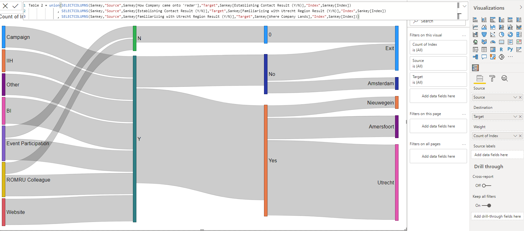
Sankey is a type of flow diagram in which the width of the series is in proportion to the quantity of the flow. Use it to find major contributions to an overall flow.
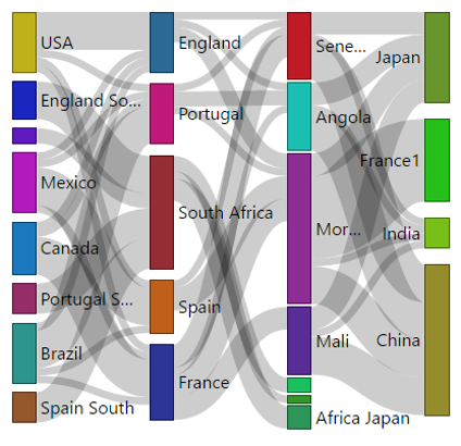
With Sankey, you can clearly find the sources, destinations and steps in between and how the stuff flow across them all in one quick glance. You can also interact with it either by clicking the link or the flow itself and leverage the cross highlighting/filtering feature of Power BI to get even more interesting insights in related data. Fittingly they are used widely in the energy industry. But it finds interesting use cases across all industries. It energies everyone to visualize information that has a start and an end or dynamic relationship with many intermediaries, for example how the user landed and navigated in a web site, or a material in a manufacturing unit, control or money transfers in business processes in a completely different perspective and bring interesting insights to the forefront.
See also Sankey at Microsoft Office store
Check out documentation to find out more about visual's properties and features

![dependabot[bot] avatar](https://avatars.githubusercontent.com/in/29110?v=4 "dependabot[bot]")