Coder Social home page Coder Social logo

metonym / svelte-typeahead Goto Github PK

View Code? Open in Web Editor NEW
217.0 2.0 16.0 523 KB

Accessible, fuzzy search typeahead component

Home Page: https://metonym.github.io/svelte-typeahead

License: MIT License

JavaScript 8.65% Svelte 91.35%
typeahead fuzzy highlight search filter wai-aria accessibility typescript-definitions

svelte-typeahead's Introduction

svelte-typeahead

NPM

Accessible, fuzzy search typeahead component.

This component uses the lightweight fuzzy library for client-side, fuzzy search and follows WAI-ARIA guidelines.

Try it in the Svelte REPL.


Installation

# Yarn
yarn add -D svelte-typeahead

# npm
npm i -D svelte-typeahead

# pnpm
pnpm i -D svelte-typeahead

Usage

Basic

Pass an array of objects to the data prop. Use the extract prop to specify the value to search on.

<script>
  import Typeahead from "svelte-typeahead";

  const data = [
    { state: "California" },
    { state: "North Carolina" },
    { state: "North Dakota" },
    { state: "South Carolina" },
    { state: "South Dakota" },
    { state: "Michigan" },
    { state: "Tennessee" },
    { state: "Nevada" },
    { state: "New Hampshire" },
    { state: "New Jersey" },
  ];

  const extract = (item) => item.state;
</script>

<Typeahead {data} {extract} />

Custom label

$$restProps are forwarded to svelte-search.

Use the label prop to specify a custom label.

<Typeahead label="U.S. States" {data} {extract} />

Hidden label

Set hideLabel to true to visually hide the label.

It's recommended that you set the label – even if hidden – for accessibility.

<Typeahead label="U.S. States" hideLabel {data} {extract} />

Custom-styled results

This component uses the fuzzy library to highlight matching characters with the mark element.

Use the default slot to render custom results.

<Typeahead {data} {extract} let:result let:index>
  <strong>{@html result.string}</strong>
  {index}
</Typeahead>

No results

Use the "no-results" slot to render a message if the search value does not yield results.

<Typeahead value="abcd" {data} {extract} let:value>
  <svelte:fragment slot="no-results">
    No results found for "{value}"
  </svelte:fragment>
</Typeahead>

Limit the number of results

Use the limit prop to specify the maximum number of results to display. The default is Infinity.

<Typeahead limit={2} {data} {extract} />

Disabled items

Disable items using the disable filter. Disabled items are not selectable or navigable by keyboard.

In the following example, items with a state value containing "Carolina" are disabled.

<Typeahead
  {data}
  value="ca"
  extract={(item) => item.state}
  disable={(item) => /Carolina/.test(item.state)}
/>

Focus after select

Set focusAfterSelect to true to re-focus the search input after selecting a result.

<Typeahead focusAfterSelect {data} {extract} />

Show dropdown on focus

By default, the dropdown will be shown if the value has results.

Set showDropdownOnFocus to true to only show the dropdown when the search input is focused.

<Typeahead value="ca" showDropdownOnFocus {data} {extract} />

Show all results on focus

By default, no results are shown if an empty input (i.e., value="") is focused.

Set showAllResultsOnFocus to true for all results to be shown when an empty input is focused.

<Typeahead showAllResultsOnFocus {data} {extract} />

Styling

Note: this component is minimally styled by design. You can target the component using the [data-svelte-typeahead] selector.

:global([data-svelte-typeahead]) {
  margin: 1rem;
}

API

Props

Name Type Default value Description
value string "" Input search value.
data TItem[] [] Items to search.
extract (TItem) => any (item) => item Target the value if TItem is an object.
disable (TItem) => boolean (item) => false Disabled items are shown in results but are not selectable.
filter (TItem) => boolean (item) => false Filtered out items will not be displayed in the results.
autoselect boolean true Whether to automatically select the first result.
inputAfterSelect "update" | "clear" | "keep" "update" Set to "clear" to clear the value after selecting a result. Set to "keep" to keep the search field unchanged after a selection.
results FuzzyResult[] [] Raw fuzzy results from the fuzzy module
focusAfterSelect boolean false Set to true to re-focus the input after selecting a result.
showDropdownOnFocus boolean false Set to true to only show results when the input is focused.
showAllResultsOnFocus boolean false Set to true for all results to be shown when an empty input is focused.
limit number Infinity Specify the maximum number of results to display.
...$$restProps (forwarded to svelte-search) N/A All other props are forwarded to the input element.

Dispatched events

  • on:select: dispatched when selecting a result
  • on:clear: dispatched when clearing the input field
<script>
  import Typeahead from "svelte-typeahead";

  let e = [];
</script>

<Typeahead
  {data}
  {extract}
  on:select={({ detail }) => (e = [...e, { event: "select", detail }])}
  on:clear={() => (e = [...e, { event: "clear" }])}
/>

<pre>{JSON.stringify(e, null, 2)}</pre>

Forwarded events

The following events are forwarded to the svelte-search component.

  • on:type
  • on:input
  • on:change
  • on:focus
  • on:clear
  • on:blur
  • on:keydown

TypeScript

Svelte version 3.31 or greater is required to use this component with TypeScript.

TypeScript definitions are located in the types folder.

Changelog

Changelog

License

MIT

svelte-typeahead's People

Contributors

amerlander avatar dependabot[bot] avatar elimisteve avatar greenheart avatar metonym avatar skovvart avatar

Stargazers

 avatar  avatar  avatar  avatar  avatar  avatar  avatar  avatar  avatar  avatar  avatar  avatar  avatar  avatar  avatar  avatar  avatar  avatar  avatar  avatar  avatar  avatar  avatar  avatar  avatar  avatar  avatar  avatar  avatar  avatar  avatar  avatar  avatar  avatar  avatar  avatar  avatar  avatar  avatar  avatar  avatar  avatar  avatar  avatar  avatar  avatar  avatar  avatar  avatar  avatar  avatar  avatar  avatar  avatar  avatar  avatar  avatar  avatar  avatar  avatar  avatar  avatar  avatar  avatar  avatar  avatar  avatar  avatar  avatar  avatar  avatar  avatar  avatar  avatar  avatar  avatar  avatar  avatar  avatar  avatar  avatar  avatar  avatar  avatar  avatar  avatar  avatar  avatar  avatar  avatar  avatar  avatar  avatar  avatar  avatar  avatar  avatar  avatar  avatar  avatar

Watchers

 avatar  avatar

svelte-typeahead's Issues

Allow setting initial / default value

The plugin works great when creating objects.
Where I'm struggling is with Edit / Update scenarios.

It would be great to be able to supply an initial value.
Assigning this via value requires maintaining a value var which will get cumbersome esp. of there are multiple typeaheads on one screen.

Wdyt?

Should we communicate no results?

I think we should somehow communicate to the user that we have not found any results for their search.

Now the list disappears and neither happens nor is any message displayed.

What do you think?

Custom search icon

It would be nice to:

  • have a default search icon so the component better resembles a search input
  • customize the icon

... and also have a custom icon for the "Clear" functionality instead of using the native browser default

Z-index fix?

I currently have multiples of this component instanced and... just look at this:

image

the ones below are also instances of svelte-type-ahead, the results of the focused instance are rendered under the instances below them, any work around for this?

[Doc] How to use in sveltekit

Hi,
I had difficulty to get it to work with the Sveltekit, after some research found a solution.
if it's acceptable please include it in the docs, so other people can use it.

<script>
  import data from "./states.js";
  import { onMount } from 'svelte';

  let Typeahead;

  onMount(async () => {
    const module = await import("svelte-typeahead");
    Typeahead = module.default || module;
  });
	
  let events = [];
</script>

{#if Typeahead}
<svelte:component this={Typeahead} 
  label="U.S. States"
  placeholder={`Search U.S. states (e.g. "California")`}
  {data}
  extract={(item) => item.state}
  disable={(item) => /Carolina/.test(item.state)}
  on:select={({ detail }) => events = [...events, detail]}
  on:clear={() => events = [...events, "clear"]}
/>
{/if}
<pre>{JSON.stringify(events, null, 2)}</pre>

<style>:global(input) { margin: 0; }</style>

Documentation audit

  • simplify SvelteKit config example
  • separate filter example
  • id in data is not required

[QUESTION] Show first entries on input click

Thank you for creating typeahead! It's really cool!

I would like to show the first entries when clicking the input, (like a select would do). It can be useful to avoid typing when the list is initially small.
I tought it was showDropdownOnFocus but it doesn't show up when input is empty :O

Focus after select not focusing

When I do focusAfterSelect='true' the search results stay open after an selection, but the input doesn't get focus. I have to select it with the mouse to change the text in it.
The console error says TypeError: searchRef.focus is not a function.

I wasnt able to get the input focused, but the error message can be removed by changing

    if (focusAfterSelect) searchRef.focus();

    hideDropdown = true;

to

        if (!focusAfterSelect)   hideDropdown = true;

[Q] How to pre-select a value without the dropdown showing?

Hi all,

is it possible to pre-select a value on mount without the dropdown showing?

I'm binding a value variable to the component which I set to an item from the data array on mount. The value shows up in the search box (good!), but unfortunately the dropdown is open as well, showing exactly one result (not so good!):

image

Is there any way to prevent this from happening?

// rough code:
let value = 'UNITED STATES';
...
<Typeahead autoselect data={countries} {extract} bind:value />

How to set initial value?

If I want to pass in a key and have that be the selected one from my data as an initial value, then upon edit I just erase it, is it possible with this component?

Same IDs

The outer div, the form and the input are all sharing the same id. Is this by intention?


I was also wondering about the double writing of on:focus and on:clear:


But I feel like this is by intention and I just didn't get the concept behind it, so maybe this issue can just be closed.

[Feature request] Pass an Array into extract

I think about having a title and a subtilte, which should both be searched but have different formatting.

of course I can do const extract = (item) => ' <h3>' + item.title+ '</h3><p>'+item.subtitle+'</p>':

But searching for h3 would find (and crash) the html:

image

So I thought about passing an array into extract and geting an array in result.string back:

const extract = (item) => [ item.title, item.subtitle ];
 <Typeahead {data} {extract}>
        <div>
           <h3> {result.string[0]}</h3>
           <h3> {result.string[1]}</h3>
        </div>
    </Typeahead>

What do you think about that Idea?
To not break things it would be nice to have the ability to pass in an array or a string.

I think this would also need some changes in fuzzy.js, but I dind't looked much into it and thought I'll ask you first.

Search results don't have on:keydown, on:keyup, or on:keypress events and it triggers an A11y warning

I get the warning
svelte-typeahead/src/Typeahead.svelte:233:8 A11y: visible, non-interactive elements with an on:click event must be accompanied by an on:keydown, on:keyup, or on:keypress event. wherever I use svelte-typeahead with svelte version 3.52.0

Workaround: Suppress the warning using <!-- svelte-ignore a11y-click-events-have-key-events --> for each of the result list item.

   {#if showResults}
      {#each results as result, index}
      <!-- svelte-ignore a11y-click-events-have-key-events -->
        <li
          role="option"
          id="{id}-result-{index}"
          class:selected={selectedIndex === index}
          class:disabled={result.disabled}
...

If that workaround is good enough to be a solution for now, I can send a pull request.

styling overrides require more specific CSS selectors

For the results you just need:

:global([data-svelte-typeahead] li) {
  background: blue;
}

But for the form elements (input and label) you need:

:global([data-svelte-typeahead] [data-svelte-search] input) {
  background: blue;
}

TypeError: selectionTarget.value.substring is not a function

<Typeahead
  data={list} // object array
  {extract} // obejct.id
  on:select={({ detail }) => {
    console.log(detail);

    // gotoIndex(detail.selectedIndex); // a function for manipulating my custom store
  }}
/>

when I select a result I'm getting the error (title)

Is this importing svelte-search two times?

I'm using this amazing component in a "@sveltejs/kit": "1.0.0-next.142".

Analyzing with source-map-explorer I found that svelte-typeahead is ~7KB but there is svelte-search too ~4KB.

Screenshot 2021-08-09 at 21 08 55

image

Is this correct?

Or am I importing svelte-search two times?

Scoped styling?

I have multiple instances on my route, a main one, and a wrapped version, the wrapped version has a different look, but the styles of the main version is being overwritten by the wrapped version, I'm using this for targeting:

/// main version
<style lang="postcss">
  :global([data-svelte-search] label) {
    @apply hidden;
  }
  :global([data-svelte-search] input) {
    @apply rounded-none rounded-r-lg bg-none;
  }
  :global([data-svelte-search] form) {
    @apply rounded-none rounded-r-lg;
  }
  :global([data-svelte-typeahead]) {
    @apply bg-none rounded-none rounded-r-lg;
  }
  select {
    @apply rounded-none rounded-l-lg w-fit pr-8;
  }
</style>

/// scoped version
<style lang="postcss">
  :global([data-svelte-search] label) {
    @apply hidden;
  }
  :global([data-svelte-search] input) {
    @apply bg-gray-50 border border-gray-300 text-gray-900 text-sm rounded-lg focus:ring-blue-500 focus:border-blue-500 block w-full p-2 dark:bg-gray-700 dark:border-gray-600 dark:placeholder-gray-400 dark:text-white dark:focus:ring-blue-500 dark:focus:border-blue-500;
  }
  :global([data-svelte-search] form) {
    @apply rounded-lg;
  }
  :global([data-svelte-typeahead]) {
    @apply bg-none rounded;
  }
</style>

Allow setting a threshold score for result to be considered a match

I'd like to be able to set a threshold on what is considered a match. This is what I do right now:

<Typeahead
	hideLabel
	label="Search works"
	placeholder="Try me..."
	{data}
	{extract}
	let:result
	let:value
>
	{#if result.score >= 20}
		<div>
			<strong>{getTitle(result.original)}</strong>
		</div>
	{/if}
</Typeahead>

This kinda works, but I still see empty boxes where the results below threshold are:
image

Allowing for something like this to be set so only very close matches are shown would be nice.

Custom search function with async support

As title says, a prop like searchFunc that can return an array of strings, or an array of objects with {title: string, value: string, highlights?: {start: number, stop: number}[]}, or that but as a promise. (Removes the need to supply data)

This also requires a getLabel function for two way binding.

Willing to implement it myself.

Change or hide "Label"

Currently "Label" seems to be hard coded and fixed as it is not exposed as a prop on the svelte-typeahead, only on the svelte-search component.

Can't figure out how to hide it or change it.

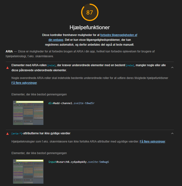
Wrong aria-labelledby reference

Lighthouse is currently complaining about invalid aria attributes, which I believe is due an invalid aria-labelledby reference.

I am unsure of whether it even makes sense to have the aria-labelledby when it is hidden, but this seems to be separate to this issue.

The following Svelte

<Typeahead 
   data={availableChannels} 
   {extract} 
   inputAfterSelect="clear"
   limit={20}
   on:select={c => addUserChannel(c.detail.original)}
   hideLabel={true} 
   id="add-channel" 
   placeholder="Tilføj kanal" 
/>

returns this output

<div data-svelte-typeahead="" role="combobox" aria-haspopup="listbox" aria-owns="add-channel-listbox" aria-expanded="false" id="add-channel" class="svelte-t0wd5r">
   <form data-svelte-search="" role="search" aria-labelledby="search0.ddsho5m56h8">
      <label 
         id="search0.ddsho5m56h8-label" 
         for="search0.ddsho5m56h8" 
         class="svelte-5m0wg6 hide-label">Label</label> 
      <input
         name="search" 
         type="search" 
         placeholder="Tilføj kanal" 
         autocomplete="off" 
         spellcheck="false" 
         aria-autocomplete="list" 
         aria-controls="add-channel-listbox" 
         aria-labelledby="add-channel-label" 
         aria-activedescendant="" 
         id="search0.ddsho5m56h8" 
         class="svelte-5m0wg6">
   </form> 
</div>

with these errors
image

image

At first I believe propagating the Typeahead id-prop to Search would do it, but that would lead to duplicate ids between the containing div and the input element.

on:change is not triggered with option showAllResultsOnFocus

The component works as expected when used like this:

              <Typeahead
                label="Country"
                hideLabel
                limit={10}
                placeholder="Search Country"
                extract={(item) => item.NAME_0}
                data={regions0}
                bind:value={countrySelected}
                on:change={() => {
                console.log('expect an output')}
              >

With this I get the output expect an output

However, if I add the showAllResultsOnFocus like this:

              <Typeahead
                label="Country"
                hideLabel
                limit={10}
                placeholder="Search Country"
                extract={(item) => item.NAME_0}
                data={regions0}
                bind:value={countrySelected}
                on:change={() => {
                console.log('expect an output')}
               showAllResultsOnFocus
              >

I just get the expected output every other time.

Avoid dropdown when value is already selected

When the component gets focus and there is already a value selected, the drop down should not fire. When you just entered the page, the first click does not fire the dropdown (which is good) but after that any focus it gets will fire automatically the dropdown.

Here is a REPL where I am testing:
REPL

Ben

Recommend Projects

  • React photo React

    A declarative, efficient, and flexible JavaScript library for building user interfaces.

  • Vue.js photo Vue.js

    🖖 Vue.js is a progressive, incrementally-adoptable JavaScript framework for building UI on the web.

  • Typescript photo Typescript

    TypeScript is a superset of JavaScript that compiles to clean JavaScript output.

  • TensorFlow photo TensorFlow

    An Open Source Machine Learning Framework for Everyone

  • Django photo Django

    The Web framework for perfectionists with deadlines.

  • D3 photo D3

    Bring data to life with SVG, Canvas and HTML. 📊📈🎉

Recommend Topics

  • javascript

    JavaScript (JS) is a lightweight interpreted programming language with first-class functions.

  • web

    Some thing interesting about web. New door for the world.

  • server

    A server is a program made to process requests and deliver data to clients.

  • Machine learning

    Machine learning is a way of modeling and interpreting data that allows a piece of software to respond intelligently.

  • Game

    Some thing interesting about game, make everyone happy.

Recommend Org

  • Facebook photo Facebook

    We are working to build community through open source technology. NB: members must have two-factor auth.

  • Microsoft photo Microsoft

    Open source projects and samples from Microsoft.

  • Google photo Google

    Google ❤️ Open Source for everyone.

  • D3 photo D3

    Data-Driven Documents codes.