Coder Social home page Coder Social logo

material-components / material-components-web-catalog Goto Github PK

View Code? Open in Web Editor NEW
117.0 25.0 42.0 24.97 MB

Catalog of Material Components for the web (MDC Web)

Home Page: https://material-components.github.io/material-components-web-catalog/

License: Apache License 2.0

HTML 0.76% JavaScript 92.56% SCSS 6.69%

material-components-web-catalog's Introduction

Material Components for the Web Catalog

This is the catalog of components for Material Components for the web (MDC Web).

About

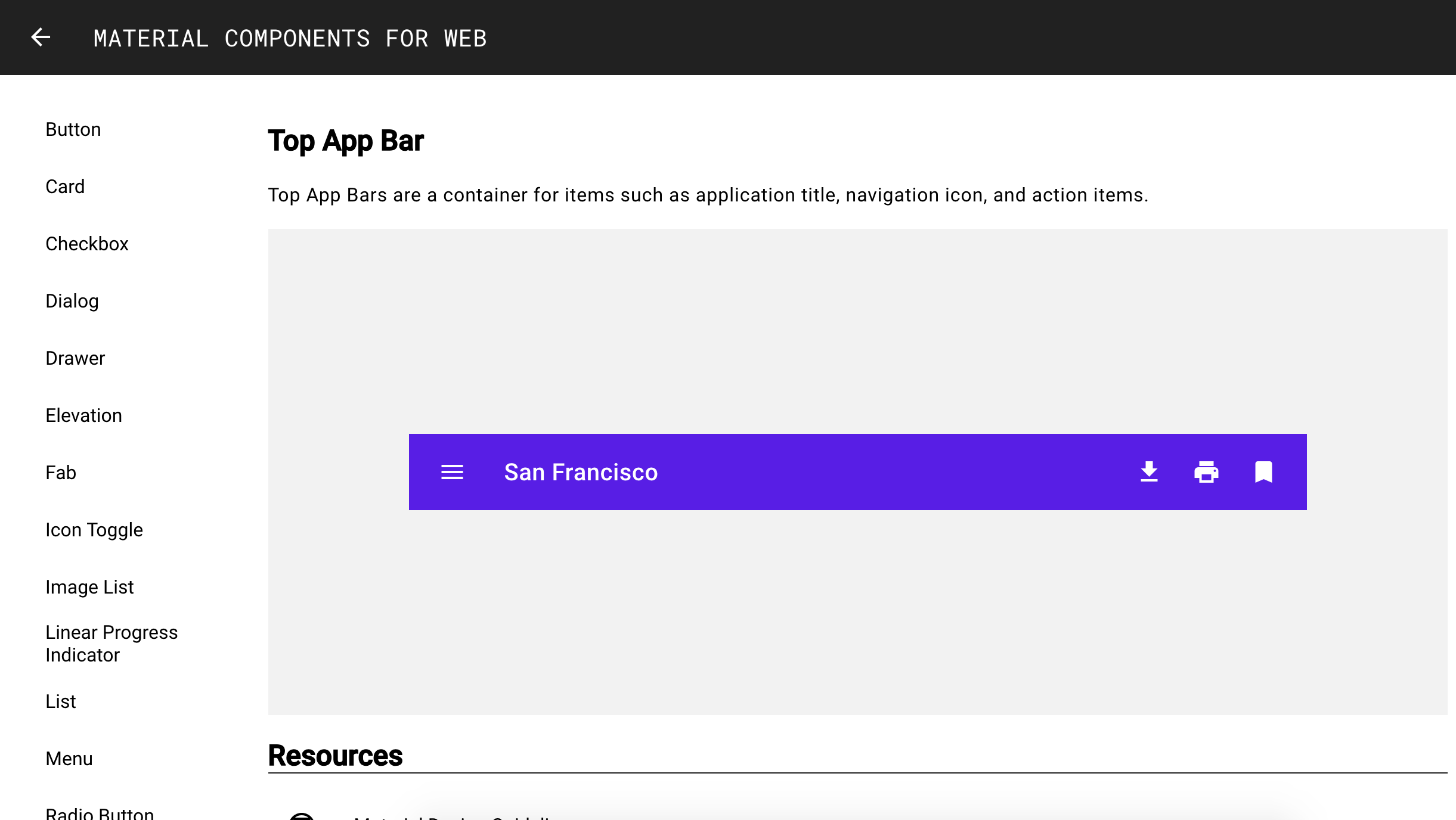
Material Components for the web (MDC Web) help developers execute Material Design. Developed by a core team of engineers and UX designers at Google, these components enable a reliable development workflow to build beautiful and functional web projects.

Adding a new component

Follow these steps to add a new component to the MDC Web demo catalog.

  1. Add a new file to the src directory for the JSX (e.g. FooCatalog.js). It should follow this template:
import React, { Component } from 'react';
import ComponentCatalogPanel from './ComponentCatalogPanel.js';
import {MDCFoo} from '@material/foo/index';

import './styles/FooCatalog.scss';

const FooCatalog = () => {
  return (
    <ComponentCatalogPanel
      hero={<FooHero />}
      title='Foo'
      description='A short description about the Foo component.'
      designLink='https://material.io/guidelines/components/foo.html'
      docsLink='https://material.io/components/web/catalog/foo/'
      sourceLink='https://github.com/material-components/material-components-web/tree/master/packages/mdc-foo'
      demos={<FooDemos />}
    />
  );
}

class FooHero extends Component {
  // Class methods for JS
  render() {
    return (
      // JSX for the Foo component's hero header
    );
  }
}

class FooDemos extends Component {
  // Class methods for JS
  render() {
    return (
      // JSX for the Foo component demos
    );
  }
}

export default FooCatalog;

NOTE: If your components only require a render method, you can write functional components rather than classes, e.g. function Foo() { ... }. In this case, props are passed in as an argument instead of accessed via this.

  1. Add a new file to the src/styles directory for styling the demo page (e.g. FooCatalog.scss):
@import "@material/foo/mdc-foo";

// Custom styles here
  1. Add a SVG image associated with the component (e.g. foo_180px.svg) to the src/images directory.

  2. Import the SVG and render a new list item inside the render() element in ComponentImageList.js:

import fooImg from './images/foo_180px.svg';

...

class ComponentImageList extends Component {
  ...
  render() {
    return (
      ...
      {this.renderListItem('Foo', fooImg, 'foo')}
    );
  }
}
  1. Add a new entry in the links in the render() method in ComponentSidebar.js:
const links = [
  ...,
  {
    content: 'Foo',
    url: '/foo',
  }
];
  1. Add a <Route> in ComponentPage.js:
import FooCatalog from './FooCatalog';

class ComponentPage extends Component {
  ...
  renderComponentRoutes() {
    ...
    <Route path='/component/foo' component={FooCatalog} />
  }
}

Development

To start a local server of the catalog, run

npm start

Then point your browser to http://localhost:3000/.

Local Testing

To run a build that can be locally tested using any HTTP server:

  1. npm run build
  2. Rename the build folder to material-components-web-catalog
  3. Serve the top-level repository directory (e.g. with live-server)
  4. Browse to http://localhost:/material-components-web-catalog/

Deployment

To deploy the catalog to GitHub pages, run

npm run deploy

You should see it live on https://material-components.github.io/material-components-web-catalog/.

material-components-web-catalog's People

Contributors

abhiomkar avatar acdvorak avatar asyncliz avatar bonniezhou avatar dependabot[bot] avatar kfranqueiro avatar lynnmercier avatar material-admin avatar patrickrodee avatar rlfriedman avatar wesleyabbey avatar williamernest avatar

Stargazers

 avatar  avatar  avatar  avatar  avatar  avatar  avatar  avatar  avatar  avatar  avatar  avatar  avatar  avatar  avatar  avatar  avatar  avatar  avatar  avatar  avatar  avatar  avatar  avatar  avatar  avatar  avatar  avatar  avatar  avatar  avatar  avatar  avatar  avatar  avatar  avatar  avatar  avatar  avatar  avatar  avatar  avatar  avatar  avatar  avatar  avatar  avatar  avatar  avatar  avatar  avatar  avatar  avatar  avatar  avatar  avatar  avatar  avatar  avatar  avatar  avatar  avatar  avatar  avatar  avatar  avatar  avatar  avatar  avatar  avatar  avatar  avatar  avatar  avatar  avatar  avatar  avatar  avatar  avatar  avatar  avatar  avatar  avatar  avatar  avatar  avatar  avatar  avatar  avatar  avatar  avatar  avatar  avatar  avatar  avatar  avatar  avatar  avatar  avatar  avatar

Watchers

 avatar  avatar  avatar  avatar  avatar  avatar  avatar  avatar  avatar  avatar  avatar  avatar  avatar  avatar  avatar  avatar  avatar  avatar  avatar  avatar  avatar  avatar  avatar  avatar  avatar

material-components-web-catalog's Issues

Create landing page

Basically just the Top App Bar. We will add links to individual component pages later.

Somewhat confusingly...The Top App Bar is not the MDC Web version of the Top App Bar (because it is not written yet). It will be a custom one specific to our catalog...Once the MDC Web version of Top App Bar is written, we will update this catalog to use that Top App Bar.

Create button component page

  • Import @material/button
  • Link to guidelines
  • Link to documentation
  • Link to source code
  • Demo sections showing types of buttons
  • Home grown navigation side panel (will replace with MDC Drawer once it is ready)
  • Update landing page to have link to Button

Update HeaderBar with new design

  • Update HeaderBar colour to black
  • Make HeaderBar icon a back arrow on component pages (make icon a param?)
  • Update HeaderBar typography
  • Update HeaderBar title to "MATERIAL COMPONENTS FOR WEB"

App should scroll to top of page upon navigation

With the update to use hash routing, currently the page maintains its current scroll position when you navigate, which is confusing since it can mean landing smack in the middle of a component's page when navigating from the index.

Can we do something to set document.documentElement.scrollTop = 0 whenever the route changes?

Live is a bit dull

Its not meant to work yet right ?

Page only has header and nothing else. Nice big service worker cache though

Shape demo causes error when navigating away

Steps:

  1. Navigate to Shape demo
  2. Navigate away by any means (arrow, sidebar, back button)

8 errors are reported, seemingly one for each of the ripples constructed in the shape catalog component:

image

Recommend Projects

  • React photo React

    A declarative, efficient, and flexible JavaScript library for building user interfaces.

  • Vue.js photo Vue.js

    ๐Ÿ–– Vue.js is a progressive, incrementally-adoptable JavaScript framework for building UI on the web.

  • Typescript photo Typescript

    TypeScript is a superset of JavaScript that compiles to clean JavaScript output.

  • TensorFlow photo TensorFlow

    An Open Source Machine Learning Framework for Everyone

  • Django photo Django

    The Web framework for perfectionists with deadlines.

  • D3 photo D3

    Bring data to life with SVG, Canvas and HTML. ๐Ÿ“Š๐Ÿ“ˆ๐ŸŽ‰

Recommend Topics

  • javascript

    JavaScript (JS) is a lightweight interpreted programming language with first-class functions.

  • web

    Some thing interesting about web. New door for the world.

  • server

    A server is a program made to process requests and deliver data to clients.

  • Machine learning

    Machine learning is a way of modeling and interpreting data that allows a piece of software to respond intelligently.

  • Game

    Some thing interesting about game, make everyone happy.

Recommend Org

  • Facebook photo Facebook

    We are working to build community through open source technology. NB: members must have two-factor auth.

  • Microsoft photo Microsoft

    Open source projects and samples from Microsoft.

  • Google photo Google

    Google โค๏ธ Open Source for everyone.

  • D3 photo D3

    Data-Driven Documents codes.