

Multiple dates picker based on Angular Material.
Compatible with Angular / CDK / Material >= 9.x.x. See Versioning.
-
Install dependency:
npm install --save ngx-multiple-dates
-
Include
NgxMultipleDatesModuleto your module:import { NgModule } from '@angular/core'; import { BrowserModule } from '@angular/platform-browser'; import { BrowserAnimationsModule } from '@angular/platform-browser/animations'; // Any of the supported date adapter should be imported. For more details - see // https://material.angular.io/components/datepicker/overview#choosing-a-date-implementation-and-date-format-settings import { MatNativeDateModule } from '@angular/material/core'; // import { MatDateFnsModule } from '@angular/material-date-fns-adapter'; // import { MatLuxonDateModule } from '@angular/material-luxon-adapter'; // import { MatMomentDateModule } from '@angular/material-moment-adapter'; import { MatDatepickerModule } from '@angular/material/datepicker'; import { MatIconModule } from '@angular/material/icon'; import { NgxMultipleDatesModule } from 'ngx-multiple-dates'; // module import @NgModule({ imports: [ BrowserModule, BrowserAnimationsModule, MatNativeDateModule, // any of the supported date adapter should be imported MatDatepickerModule, MatIconModule, NgxMultipleDatesModule // import to Angular // ... ], // ... }) export class AppModule { }
-
Styles:
-
Add one of the prebuilt themes to
angular.jsonor your styles file:@import 'ngx-multiple-dates/prebuilt-themes/indigo-pink.css';
-
Or you can use custom SCSS theme
- Angular < 12.x.x:
@import '~@angular/material/theming';
@import '~ngx-multiple-dates/theming'; // import library theme

@include mat-core();
// Palette
$primary: mat-palette($mat-indigo);
$accent:  mat-palette($mat-pink);

$theme: mat-light-theme($primary, $accent); // theme
@include angular-material-theme($theme); // apply Angular Material styles
@include ngx-multiple-dates-theme($theme); // apply Angular Multiple Dates styles

// ...
- Angular >= 12.x.x:
@use '@angular/material' as mat;
@import '~ngx-multiple-dates/theming'; // import library theme

@include mat.core;
// Palette
$primary: mat.define-palette(mat.$indigo-palette);
$accent:  mat.define-palette(mat.$pink-palette);

$theme: mat.define-light-theme($primary, $accent); // theme
@include mat.all-component-themes($theme); // apply Angular Material styles
@include ngx-multiple-dates-theme($theme); // apply Angular Multiple Dates styles

// ...
- Starting Angular Multiple Dates = 14.x.x SASS
@userule supported:@use '@angular/material' as mat; @use 'ngx-multiple-dates' as ngxMultipleDates; // use library theme @include mat.core; // Palette $primary: mat.define-palette(mat.$indigo-palette); $accent: mat.define-palette(mat.$pink-palette); $theme: mat.define-light-theme($primary, $accent); // theme @include mat.all-component-themes($theme); // apply Angular Material styles @include ngxMultipleDates.multiple-dates-theme($theme); // apply Angular Multiple Dates styles // ...
- Angular Multiple Dates >= 15.x.x:
@use '@angular/material' as mat;
@use 'ngx-multiple-dates' as ngxMultipleDates; // use library theme

@include mat.core;
// Palette
$primary: mat.define-palette(mat.$indigo-palette);
$accent:  mat.define-palette(mat.$pink-palette);

$theme: mat.define-light-theme((
  color: (
    primary: $primary,
    accent: $accent
  )
)); // theme
@include mat.all-component-themes($theme); // apply Angular Material styles
@include ngxMultipleDates.multiple-dates-theme($theme); // apply Angular Multiple Dates styles

// ...
- Angular < 12.x.x:
-
deeppurple-amber.cssindigo-pink.csspink-bluegrey.csspurple-green.css
Library tested for Angular / CDK / Material versions >= 9.x.x.
Use Angular Multiple Dates 1.x.x for Angular Components <= 11.x.x
Later versions are consistant with major Angular Components version. E.g.:
Use v13.x.x with Angular Components 13.x.x.
Use v12.x.x with Angular Components 12.x.x.
- Angular
- Angular CDK
- Angular Material
- RxJs
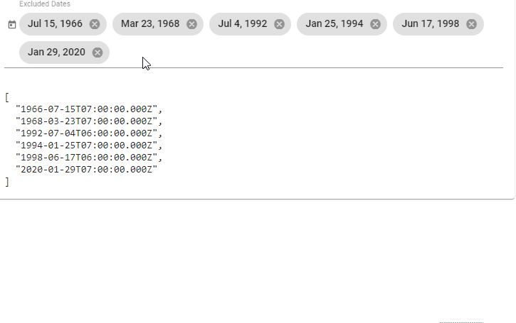
<mat-form-field>
  <ngx-multiple-dates [matDatepicker]="picker" placeholder="Excluded Dates" name="excludedDates"
                      [(ngModel)]="model">
  </ngx-multiple-dates>
  <mat-datepicker-toggle matPrefix [for]="picker"></mat-datepicker-toggle>
  <mat-datepicker #picker></mat-datepicker>
</mat-form-field><mat-form-field class="full-width">
<ngx-multiple-dates [matDatepicker]="picker" placeholder="Excluded Dates"
name="excludedDates" [(ngModel)]="excludedDates">
</ngx-multiple-dates>
</mat-form-field>
<mat-calendar #picker></mat-calendar>For more examples please visit the Demo page. Its source code is located here.
Selector: ngx-multiple-dates
Exported as: ngxMultipleDates
Properties
| Name | Description |
|---|---|
| Input | |
@Input()value: D | null |
The value of the ngx-multiple-dates control. |
@Input()matDatepicker: MatDatepicker<D> | MatCalendar<D> |
The datepicker (or calendar - for inline view) that this ngx-multiple-dates element is associated with. |
@Input()color: ThemePalette |
Theme color palette for the component. |
@Input()placeholder: string |
Placeholder to be shown if no value has been selected. |
@Input()required: boolean |
Whether the component is required. |
@Input()disabled: boolean |
Whether the component is disabled. |
@Input()matDatepickerFilter: (date: D) => boolean |
Function that can be used to filter out dates within the datepicker. |
@Input()max: D | null |
The maximum valid date. |
@Input()min: D | null |
The minimum valid date. |
@Input()classes: Array<DateClass<D>> |
Custom date classes. |
@Input()id: string |
Unique id of the element. |
@Input()errorStateMatcher: ErrorStateMatcher |
An object used to control when error messages are shown. |
@Input()format: string |
The date/time components to include, using predefined options or a custom format string. See DatePipe Usage notes for more information. |
| Output | |
@Output()dateChange: EventEmitter<MatDatepickerInputEvent<D>> |
Emits when a change event is fired on this ngx-multiple-dates element. |
@Output()remove: EventEmitter<DateRemoveEvent<D>> |
Emits on a date removal. |
| Properties | |
resetModel: Date |
Model used to reset datepicker selected value, so unselect just selected date will be possible. |
closeOnSelected: boolean |
Whether datepicker should be closed on date selected, or opened to select more dates. |
empty: boolean |
Whether the select has a value. |
shouldLabelFloat: boolean |
Whether the MatFormField label should try to float. |
focused: boolean |
Whether ngx-multiple-dates element has focus. |
errorState: boolean |
Whether the control is in an error state. |
stateChanges: Observable<void> |
Stream that emits whenever the state of the control changes such that the parent MatFormField needs to run change detection. |
ngControl: NgControl |
Form control to manage component. |
controlType: 'ngx-multiple-dates' |
A name for this control that can be used by mat-form-field. |
Methods
-
focus
Focuses thengx-multiple-dateselement. -
blur
Used to leave focus from thengx-multiple-dateselement. -
setDescribedByIds
Sets the list of element IDs that currently describe this control.
| Parameters | |
|---|---|
ids: string[] |
Ids to set. |
-
onContainerClick
Handles a click on the control's container. -
validate
Performs synchronous validation for the control.
| Parameters | |
|---|---|
control: AbstractControl |
The control to validate against. |
| Returns | |
ValidationErrors | null |
A map of validation errors if validation fails, otherwise null. |
dateClass
Function used to add CSS classes to selected dates.
| Parameters | |
|---|---|
date: D |
Date to check if classes should be applied. |
| Returns | |
MatCalendarCellCssClasses |
CSS classes to apply. |
dateChanged
Fires when a change event is fired on the datepicker<input />.
| Parameters | |
|---|---|
event: MatDatepickerInputEvent<D> |
Change event. |
remove
Removes selected chip from the list.
| Parameters | |
|---|---|
date: D |
Value to remove. |
Run npm run build to build the project. The build artifacts will be stored in the dist/ directory. Use the --prod flag for a production build.
Run npm start for a dev server. Navigate to http://localhost:4200/. The app will automatically reload if you change any of the source files.
![dependabot[bot] avatar](https://avatars.githubusercontent.com/in/29110?v=4 "dependabot[bot]")


 React
React
 Typescript
 Django
 Laravel
 Facebook
 Microsoft
 Google
 Alibaba
 D3
D3
 Tencent