- Easy to use
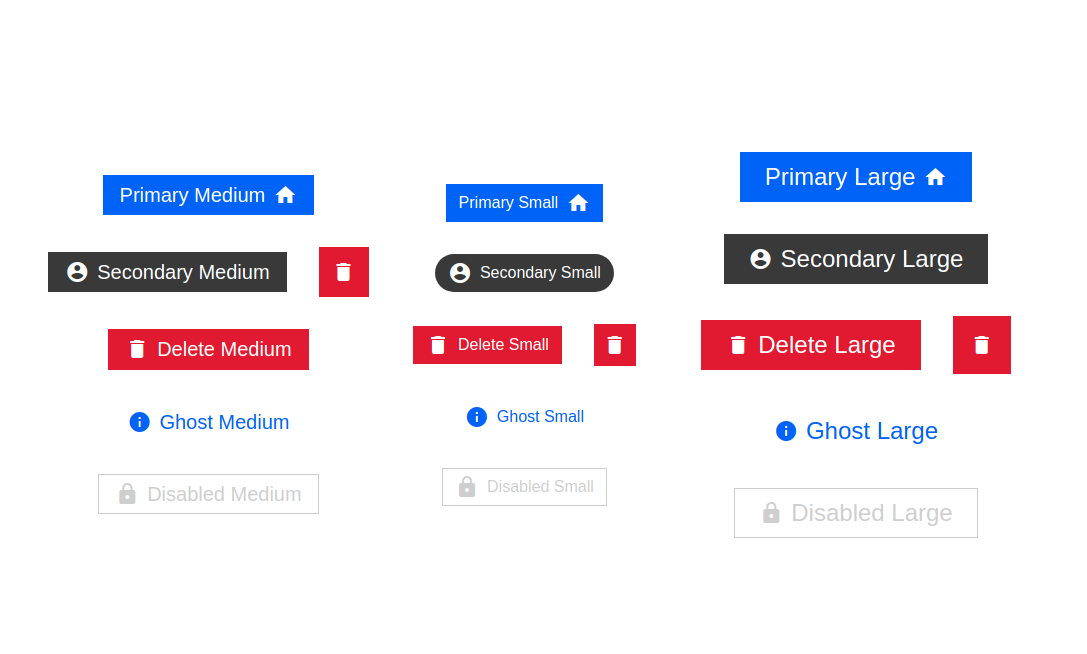
- Different States
- Primary
- Secondary
- Danger
- Ghost
- Disabled
- Material Icon Buttons supported
- Icon only button
- Icon with text
- Left and Right aligned buttons
- Override styles with your own
npm install atombuttons --saveFor using the icon feature, you must include Material Design Icons.
<link rel="stylesheet" href="https://fonts.googleapis.com/icon?family=Material+Icons" />
import AtomButton from "atombuttons";| Name | Type | Default | Description |
|---|---|---|---|
| size | enum["sm", "md", "lg"] |
"md" |
Defines the size of button |
| state | enum["primary","secondary","ghost","danger"] |
"primary" |
The color scheme of button. Defaults to primary |
| disabled | boolean |
false |
if true, disables the button |
| icon | Material Icon Name | null | Icons can be picked up from here -> https://fonts.google.com/icons |
| iconAlignment | enum["left", "right"] |
"left" |
Aligns the chosen icon to left or right |
| children | HTML element | null | if specified, it's wrapped in a tag |
| rounded | boolean |
false |
Makes the buttons rounded |
| roundEdge | boolean |
false |
Makes the buttons slightly round edged |
| tooltip | string |
null | It adds a tooltip around the button |
| overrideStyles | css object |
{} |
applies the object to style{{}} property |
Licensed under the MIT License.


 React
React
 Typescript
 Django
 Laravel
 Facebook
 Microsoft
 Google
 Alibaba
 D3
D3
 Tencent