App Theme Engine
App Theme Engine is a library that makes it easy for developers to implement a theme system in their apps.
This is a fork of afollestad's App-Theme-Engine, since he took down the repo. This way I and everyone else who used the library can still use it.
When To NOT Use This Library
If your app has two themes, a light theme and a dark theme, do not use this library to configure them. Only use this library if you intend to give the user the ability to change the color of UI elements in your app.
Table of Contents
- Gradle Dependency
- How It Works
- Installation
- Configuration
- Color Tags
- Other Tags
- Customizers
- Material Dialogs Integration
- Preference UI
Gradle Dependency

Repository
Add this in your root build.gradle file (not your module build.gradle file):
allprojects {
	repositories {
		...
		maven { url "https://jitpack.io" }
	}
}
Dependency
Add this to your module's build.gradle file (make sure the version matches the JitPack badge above):
dependencies {
	...
	compile('com.github.garretyoder:app-theme-engine:1.5@aar') {
        transitive = true
    }
}
How It Works
ATE installs a LayoutInflaterFactory into your app. This factory acts as an interceptor during
layout inflation, and replaces stock Android views with custom views that are able to theme themselves.
ATE also includes a tag engine which allows you to customize the theming of views at a detailed and dynamic level.
Installation
ATEActivity
The first option is to have all of your Activities extend ATEActivity. This will do all the heavy
lifting for you.
public class MyActivity extends ATEActivity {

    @Override
    public void onCreate(Bundle savedInstanceState) {
        super.onCreate(savedInstanceState);
        setContentView(R.layout.my_layout);
    }

    // This method is optional, you can change Config keys between
    // different Activities. This will become useful later.
    @Nullable
    @Override
    public String getATEKey() {
        return null;
    }
}
Custom Activities
If you don't want to use ATEActivity, you can plug ATE into your already existing
Activities with a bit of extra code.
public class MyActivity extends AppCompatActivity {

    private long updateTime = -1;

    // Again, this method will become useful later
    @Nullable
    public String getATEKey() {
        return null;
    }

    @Override
    protected void onCreate(Bundle savedInstanceState) {
        // Applies initial theming, required before super.onCreate()
        ATE.preApply(this, getATEKey());
        super.onCreate(savedInstanceState);
        // Sets the startup time to check for value changes later
        updateTime = System.currentTimeMillis();
    }

    @Override
    protected void onStart() {
        super.onStart();
        // Performs post-inflation theming
        ATE.postApply(this, getATEKey());
    }

    @Override
    protected void onResume() {
        super.onResume();
        // Checks if values have changed since the Activity was previously paused.
        // Causes Activity recreation if necessary.
        ATE.invalidateActivity(this, updateTime, getATEKey());
    }

    @Override
    protected void onPause() {
        super.onPause();
        // Cleans up resources if the Activity is finishing
        if (isFinishing())
            ATE.cleanup();
    }

    @Override
    public boolean onCreateOptionsMenu(Menu menu) {
        // Themes the overflow icon in the toolbar, along with
        // the collapse icon for widgets such as SearchViews.
        ATE.themeOverflow(this, getATEKey());
        return super.onCreateOptionsMenu(menu);
    }
}
Configuration
Without any configuration setup by you, default theme values will be used throughout your app.
Default theme values would mean attributes used by AppCompat, such as colorPrimary and colorAccent.
The major benefit of using ATE is the fact that you can dynamically change theme colors in your
apps, rather than relying on static themes in styles.xml for everything.
The config Method
The ATE.config(Context, String) method allows you to setup configuration. ALl of the methods
chained below are optional, comments explain what they do:
// Context and optional Config key as parameters to config()
ATE.config(this, null)
    // 0 to disable, sets a default theme for all Activities which use this config key
    .activityTheme(R.style.my_theme)
    // true by default, colors support action bars and toolbars
    .coloredActionBar(true)
    // defaults to colorPrimary attribute value
    .primaryColor(color)
    // when true, primaryColorDark is auto generated from primaryColor
    .autoGeneratePrimaryDark(true)
    // defaults to colorPrimaryDark attribute value
    .primaryColorDark(color)
    // defaults to colorAccent attribute value
    .accentColor(color)
    // by default, is equal to primaryColorDark's value
    .statusBarColor(color)
    // true by default, setting to false disables coloring even if statusBarColor is set
    .coloredStatusBar(true)
    // dark status bar icons on Marshmallow (API 23)+, auto uses light status bar mode when primaryColor is light
    .lightStatusBarMode(Config.LIGHT_STATUS_BAR_AUTO)
    // sets a color for all toolbars, defaults to primaryColor() value.
    // this also gets correctly applied to CollapsingToolbarLayouts.
    .toolbarColor(color)
    // when on, makes the toolbar navigation icon, title, and menu icons black
    lightToolbarMode(Config.LIGHT_TOOLBAR_AUTO)
    // by default, is equal to primaryColor unless coloredNavigationBar is false
    .navigationBarColor(color)
    // false by default, setting to false disables coloring even if navigationBarColor is set
    .coloredNavigationBar(false)
    // defaults to ?android:textColorPrimary attribute value
    .textColorPrimary(color)
    // defaults to ?android:textColorPrimaryInverse attribute value
    .textColorPrimaryInverse(color)
    // defaults to ?android:textColorSecondary attribute value
    .textColorSecondary(color)
    // defaults to ?android:textColorSecondaryInverse attribute value
    .textColorSecondaryInverse(color)
    // true by default, setting to false disables the automatic use of the next 4 modifiers.
    .navigationViewThemed(true)
    // Color of selected NavigationView item icon. Defaults to your accent color.
    .navigationViewSelectedIcon(color)
    // Color of selected NavigationView item text. Defaults to your accent color.
    .navigationViewSelectedText(color)
    // Color of non-selected NavigationView item icon. Defaults to Material Design guideline color.
    .navigationViewNormalIcon(color)
    // Color of non-selected NavigationView item text. Defaults to Material Design guideline color.
    .navigationViewNormalText(color)
    // Background of selected NavigationView item. Defaults to Material Design guideline color.
    .navigationViewSelectedBg(color)
    // Sets the text size in sp for bodies, can use textSizePxForMode or textSizeResForMode too.
    .textSizeSpForMode(16, Config.TEXTSIZE_BODY)
    // application target as parameter, accepts different parameter types/counts
    .apply(this);
Methods which are used to set color have a literal variation, resource variation, and attribute variation.
For an example, you could use navigationBarColor(int) to set the nav bar color to a literal color, you
could use navigationBarColorRes(int) to set a color from a color resource (e.g. R.color.primary_color),
or you could use navigationBarColorAttr(int) to set a color from a theme attribute (e.g. R.attr.colorPrimary).
It's possible there are configuration methods I forgot to include in the code block above. So feel free to experiment.
Configuration Keys
The second parameter in the ATE.config(Context, String) is an optional configuration key. You can pass
different keys to setup different configurations.
For an example, you could do this:
ATE.config(this, "light_theme")
    .primaryColor(R.color.primaryLightTheme)
    .commit();

ATE.config(this, "dark_theme")
    .primaryColor(R.color.primaryDarkTheme)
    .commit();
From an Activity, you could use these configuration keys:
public class MyActivity extends ATEActivity {

    @Nullable
    @Override
    public String getATEKey() {
        SharedPreferences prefs = PreferenceManager.getDefaultSharedPreferences(this);
        boolean useDark = prefs.getBoolean("dark_theme", false);
        return useDark ? "dark_theme" : "light_theme";
    }
}
You could dynamically change the primary theme color in this Activity by changing the value
of dark_theme in your SharedPreferences. This is how dynamic theming starts.
Default Configuration
Preferably, you'd want to setup your default configuration in your default styles.xml theme for your
Activities. However, there are probably some theme values you'd want to set defaults for directly from
code. It can be done like this:
// The default configuration (no config key) has NOT been set before
if (!ATE.config(this, null).isConfigured()) {
    // Setup default options for the default (null) key
}
There is a variation of isConfigured() that takes an integer as a parameter. This can be
used to make configuration upgrades. An example of where this would be useful is if you had to change
something which required current users to have new defaults when they update your app. Increasing
the number passed to isConfigured() will return false if that number hadn't been passed and setup before.
Value Retrieval
Using the Config class, you can retrieve your set theme values from code.
int primaryColor = Config.primaryColor(this, null);The second parameter is an optional configuration key as discussed above.
Marking as Changed
There are some situations in which you'll want Activities to recreate themselves even though
a value within Config had not been changed.
A good example of this is the Sample app for this library. When you switch between the light or dark theme, it saves a value to the app's preferences, but nothing in ATE's configuration is changed. Activities are forced to recreate themselves so that they use a different ATE key during creation.
You can mark configuration as changed to do this:
Config.markChanged(this, null);You can also mark multiple configuration keys as changed:
Config.markChanged(this, "light_theme", "dark_theme");Color Tags
ATE tags can be set to your views to customize theme colors at a per-view level.
You can have multiple tags set to a single view, separated by commas.
<TextView
    android:layout_width="match_parent"
    android_layout_height="wrap_content"
    android:tag="text_color|primary_color" />
The structure of an ATE tag is like this:
category|colorColor Options
Categories will be discussed below, but you should first know what colors can be used along side them.
primary_colorprimary_color_darkaccent_colorprimary_textprimary_text_inversesecondary_textsecondary_text_inverseparent_dependent- checks the background colors of the view's parent, and uses a light or dark color in order to be visible.primary_color_dependent- uses a light or dark color based on the lightness of the primary theme color in order to be visible.accent_color_dependent- uses a light or dark color based on the lightness of the accent theme color in order to be visible.window_bg_dependent- uses a light or dark color based on the lightness of the window background color in order to be visible.
Background Color
The category for background colors is background. This can be used on all views.
background|primary_colorMore color options can be seen in Colors Options.
Text Color
The category for text colors is text_color. It can be used on any instance of TextView, including Button's.
text_color|primary_colorMore color options can be seen in Colors Options.
Text Hint Color
The category for text hint colors is text_color_hint. It can be used on any instance of TextView, including Button's.
text_color_hint|primary_colorMore color options can be seen in Colors Options.
Text Link Color
The category for text link colors is text_color_link. It can be used on any instance of TextView, including Button's.
text_color_link|primary_colorMore color options can be seen in Colors Options.
Text Shadow Color
The category for text shadow colors is text_color_shadow. It can be used on any instance of TextView, including Button's.
text_color_shadow|primary_colorMore color options can be seen in Colors Options.
Tint Color
The category for tinting is tint. It can be used on widget views, such as: CheckBox, RadioButton, ProgressBar,
SeekBar, EditText, ImageView, Switch, SwitchCompat, Spinner. Tinting affects the color of view elements, such
as the underline of an EditText and its cursor. It can also change the color of icons in an ImageView.
tint|primary_colorMore color options can be seen in Colors Options.
Background Tint Color
The category for background tinting is tint_background, it can be used on all views. Basically, it changes
the background color of a view without changing the background entirely.
tint_background|primary_colorSelector Tint Color
The category for selector tinting is tint_selector or tint_selector_lighter. tint_selector_lighter
will make the view lighter when pressed, versus being darker when pressed. This tag can be used on any
view, preferably views that respond to touch. An example of how this could be used is to change the color of a
pressable button.
``xml tint_selector|primary_color
// or
tint_selector_lighter|primary_color
More color options can be seen in [Colors Options](https://github.com/garretyoder/app-theme-engine#colors-options).

#### TabLayouts

The categories for `TabLayout` theming are `tab_text` and `tab_indicator`. `tab_text` changes the color of
tab titles, `tab_indicator` changes the color of the active tab underline (along with tab icons).

```xml
tab_text|primary_color

// or

tab_indicator|primary_color
More color options can be seen in Colors Options.
Edge Glow Color
The category for edge glow tinting is edge_glow. It can be used on ScrollView, ListView, NestedScrollView,
RecyclerView, and ViewPager (along with subclasses of them). It changes the color of the overscroll animation
(e.g. what happens if you scroll to the end and attempt to keep scrolling).
edge_scroll|primary_colorMore color options can be seen in Colors Options.
Other Tags
Tags which are not related to color are listed here. See an intro of what tags are in Color Tags.
Fonts
The category for font tags is font. It can be used on TextView or any subclass of it, including Button.
The value after the pipe for this category is the name of a font file in your project's assets folder. ATE
handles caching your fonts automatically: if you use the same font in multiple places, it only gets allocated once.
font|RobotoSlab_Bold.ttfText Size
The category for text size is text_size. It can be used on TextView or any subclass of it, including Button.
text_size|bodyThe options that can go after the pipe are:
caption- defaults to 12spbody- defaults to 14spsubheading- defaults to 16sptitle- defaults to 20spheadline- defaults to 24spdisplay1- defaults to 34spdisplay2- defaults to 45spdisplay3- defaults 56spdisplay4- defaults to 112sp
The defaults above are taken from the Material Design guidelines. These
values can all be changed using an option in ATE.config(Context, String).
Ignore
If you set a view's tag to ate_ignore, ATE will skip theming it (even with defaults).
Customizers
Customizers are interfaces your Activities can implement to specify theme values without saving them in your Configuration.
public class MyActivity extends AppCompatActivity implements
        ATEActivityThemeCustomizer,
        ATEToolbarCustomizer,
        ATEStatusBarCustomizer,
        ATETaskDescriptionCustomizer,
        ATENavigationBarCustomizer,
        ATECollapsingTbCustomizer {

    @StyleRes
    @Override
    public int getActivityTheme() {
        // Self explanatory. Can be used to override activityTheme() config value if set.
        return R.style.my_activity_theme;
    }

    @Config.LightToolbarMode
    @Override
    public int getLightToolbarMode(@Nullable Toolbar forToolbar) {
        // When on, toolbar icons and text are made black when the toolbar background is light
        return Config.LIGHT_TOOLBAR_AUTO;
    }

    @ColorInt
    @Override
    public int getToolbarColor(@Nullable Toolbar forToolbar) {
        // Normally toolbars are the primary theme color
        return Color.BLACK;
    }

    @ColorInt
    @Override
    public int getStatusBarColor() {
        // Normally the status bar is a darker version of the primary theme color
        return Color.RED;
    }

    @Config.LightStatusBarMode
    @Override
    public int getLightStatusBarMode() {
        // When on, status bar icons and text are made black when the primary theme color is light (API 23+)
        return Config.LIGHT_STATUS_BAR_AUTO;
    }

    @ColorInt
    @Override
    public int getTaskDescriptionColor() {
        // Task description is the color of your Activity's entry in Android's recents screen.
        // Alpha component of returned color is always stripped.
        return Color.GREEN;
    }

    @Nullable
    @Override
    public Bitmap getTaskDescriptionIcon() {
        // Returning null falls back to the default (app's launcher icon)
        return null;
    }

    @ColorInt
    @Override
    public int getNavigationBarColor() {
        // Navigation bar is usually either black, or equal to the primary theme color
        return Color.BLUE;
    }

    @ColorInt
    @Override
    public int getExpandedTintColor() {
        return Color.GRAY;
    }

    @ColorInt
    @Override
    public int getCollapsedTintColor() {
        return Color.DARKGRAY;
    }
}
Material Dialogs Integration
Since Material Dialogs is one of my libraries, I decided it would be a good idea to have some sort of integration with ATE.
Luckily, nothing has to be done by you for it to work. Dialogs created with Material Dialogs will automatically be themed using your ATE configurations.
You obviously need to have Material Dialogs added as a dependency in your app, in order for it to work.
Preference UI
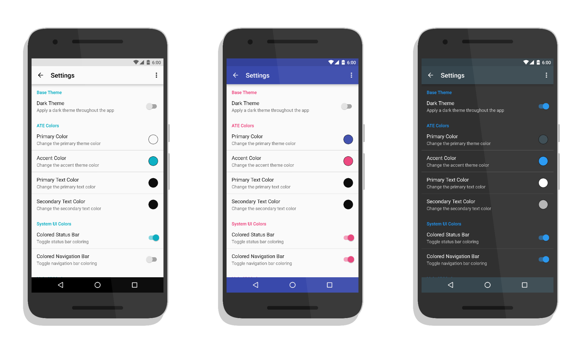
Important note: you need to have Material Dialogs added as a dependency to your apps in order for these classes to work. Material Dialogs is a provided dependency in ATE, meaning it will not use it if depending apps don't.
As seen in the sample project, ATE includes a set of pre-made Preference classes that handle theming their own UI in your settings screen. They also use Material Dialogs, and enable Material Dialogs integration automatically when used. The preference classes include:
ATEDialogPreferenceATEListPreferenceATECheckBoxPreferenceATEEditTextPreferenceATEMultiSelectPreferenceATEColorPreference– doesn't actually display a dialog, just displays a color indicator on the right. Setting display color and displaying a dialog is done from the settings screen.ATEPreferenceCategory– used for section headers, see the sample project for an example.
In your settings screen, the title will be themed to the primary text color, the summary will be themed to the secondary text color. The actual dialogs are themed using the logic in Material Dialogs Integration.
You can specify config keys through your XML. For an example, you can use a theme attribute set from your Activity theme, which specifies a string (see the sample project):
<com.afollestad.appthemeengine.prefs.ATEColorPreference
        android:key="primary_color"
        android:persistent="false"
        android:summary="@string/primary_color_summary"
        android:title="@string/primary_color"
        app:ateKey_pref_color="?ate_key" />
app:ateKey_pref_ is suffixed with the preference type. Android Studio will auto complete the name for you for other preference types.


 React
React
 Typescript
 Django
 Laravel
 Facebook
 Microsoft
 Google
 Alibaba
 D3
D3
 Tencent