Coder Social home page Coder Social logo

koolamusic / chakra-ui-autocomplete Goto Github PK

View Code? Open in Web Editor NEW
330.0 4.0 39.0 4.55 MB

An utility autocomplete UI library to use with Chakra UI

Home Page: https://koolamusic.github.io/chakra-ui-autocomplete/

HTML 5.95% TypeScript 92.23% CSS 1.82%
chakra-ui react downshift autocomplete autocompletetextfield hacktoberfest hacktoberfest2021 hacktoberfest-accepted

chakra-ui-autocomplete's Introduction

Chakra-UI AutoComplete

All Contributors

Financial Contributors on Open Collective All Contributors

An Accessible Autocomplete Utility for Chakra UI that composes Downshift ComboBox

NPM JavaScript Style Guide

demo-image

Install

*Warning This Package is still WIP at the Moment and there might be some missing features

npm install --save chakra-ui-autocomplete

Usage

  • Usage Example with TSX/Typescript
import React from 'react'
import { CUIAutoComplete } from 'chakra-ui-autocomplete'


export interface Item {
  label: string;
  value: string;
}
const countries = [
  { value: "ghana", label: "Ghana" },
  { value: "nigeria", label: "Nigeria" },
  { value: "kenya", label: "Kenya" },
  { value: "southAfrica", label: "South Africa" },
  { value: "unitedStates", label: "United States" },
  { value: "canada", label: "Canada" },
  { value: "germany", label: "Germany" }
];

export default function App() {
  const [pickerItems, setPickerItems] = React.useState(countries);
  const [selectedItems, setSelectedItems] = React.useState<Item[]>([]);

  const handleCreateItem = (item: Item) => {
    setPickerItems((curr) => [...curr, item]);
    setSelectedItems((curr) => [...curr, item]);
  };

  const handleSelectedItemsChange = (selectedItems?: Item[]) => {
    if (selectedItems) {
      setSelectedItems(selectedItems);
    }
  };

  return (
        <CUIAutoComplete
          label="Choose preferred work locations"
          placeholder="Type a Country"
          onCreateItem={handleCreateItem}
          items={pickerItems}
          selectedItems={selectedItems}
          onSelectedItemsChange={(changes) =>
            handleSelectedItemsChange(changes.selectedItems)
          }
        />
  );
}

  • Usage Example with JSX/Javascript
import React from 'react'
import { CUIAutoComplete } from 'chakra-ui-autocomplete'

const countries = [
  { value: "ghana", label: "Ghana" },
  { value: "nigeria", label: "Nigeria" },
  { value: "kenya", label: "Kenya" },
  { value: "southAfrica", label: "South Africa" },
  { value: "unitedStates", label: "United States" },
  { value: "canada", label: "Canada" },
  { value: "germany", label: "Germany" }
];

export default function App() {
  const [pickerItems, setPickerItems] = React.useState(countries);
  const [selectedItems, setSelectedItems] = React.useState([]);

  const handleCreateItem = (item) => {
    setPickerItems((curr) => [...curr, item]);
    setSelectedItems((curr) => [...curr, item]);
  };

  const handleSelectedItemsChange = (selectedItems) => {
    if (selectedItems) {
      setSelectedItems(selectedItems);
    }
  };

  return (
        <CUIAutoComplete
          label="Choose preferred work locations"
          placeholder="Type a Country"
          onCreateItem={handleCreateItem}
          items={pickerItems}
          selectedItems={selectedItems}
          onSelectedItemsChange={{(changes) => {
            handleSelectedItemsChange(changes.selectedItems)
          }}}
        />
  );
}

View on CodeSandbox 109296467-3cdbe100-7828-11eb-9491-1bd069bf90a4

Usage Example with Custom Item Renderer

custom-render-image

import React from 'react'
import { Text, Flex, Avatar } from '@chakra-ui/react'
import { CUIAutoComplete } from 'chakra-ui-autocomplete'


const countries = [
  { value: "ghana", label: "Ghana" },
  { value: "nigeria", label: "Nigeria" },
  { value: "kenya", label: "Kenya" },
  { value: "southAfrica", label: "South Africa" },
  { value: "unitedStates", label: "United States" },
  { value: "canada", label: "Canada" },
  { value: "germany", label: "Germany" }
];

export default function App() {
  const [pickerItems, setPickerItems] = React.useState(countries);
  const [selectedItems, setSelectedItems] = React.useState([]);

  const handleCreateItem = (item) => {
    setPickerItems((curr) => [...curr, item]);
    setSelectedItems((curr) => [...curr, item]);
  };

  const handleSelectedItemsChange = (selectedItems) => {
    if (selectedItems) {
      setSelectedItems(selectedItems);
    }
  };

  const customRender = (selected) => {
    return (
      <Flex flexDir="row" alignItems="center">
        <Avatar mr={2} size="sm" name={selected.label} />
        <Text>{selected.label}</Text>
      </Flex>
    )
  }

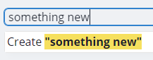
  const customCreateItemRender = (value) => {
    return (
      <Text>
        <Box as='span'>Create</Box>{' '}
        <Box as='span' bg='red.300' fontWeight='bold'>
          "{value}"
        </Box>
      </Text>
    )
  }


  return (
          <CUIAutoComplete
            tagStyleProps={{
              rounded: 'full'
            }}
            label="Choose preferred work locations"
            placeholder="Type a Country"
            onCreateItem={handleCreateItem}
            items={pickerItems}
            itemRenderer={customRender}
            createItemRenderer={customCreateItemRender}
            selectedItems={selectedItems}
            onSelectedItemsChange={(changes) =>
              handleSelectedItemsChange(changes.selectedItems)
            }
          />
  );
}

Props

Property Type Required Decscription
items Array Yes An array of the items to be selected within the input field
placeholder string The placeholder for the input field
label string Yes Input Form Label to describe the activity or process
highlightItemBg string For accessibility, you can define a custom color for the highlight color when user is typing also accept props like yellow.300 based on chakra theme provider
onCreateItem Function Yes Function to handle creating new Item
optionFilterFunc Function You can define a custom Function to handle filter logic
itemRenderer Function Custom Function that can either return a JSX Element or String, in order to control how the list items within the Dropdown is rendered
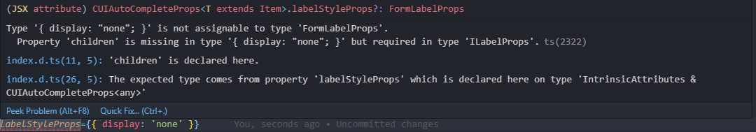
labelStyleProps Object Custom style props based on chakra-ui for labels, Example `{{ bg: 'gray.100', pt: '4'}}
inputStyleProps Object Custom style props based on chakra-ui for input field, Example`{{ bg: 'gray.100', pt: '4'}}
toggleButtonStyleProps Object Custom style props based on chakra-ui for toggle button, Example `{{ bg: 'gray.100', pt: '4'}}
tagStyleProps Object Custom style props based on chakra-ui for multi option tags, Example`{{ bg: 'gray.100', pt: '4'}}
listStyleProps Object Custom style props based on chakra-ui for dropdown list, Example `{{ bg: 'gray.100', pt: '4'}}
listItemStyleProps Object Custom style props based on chakra-ui for single list item in dropdown, Example`{{ bg: 'gray.100', pt: '4'}}
selectedIconProps Object Custom style props based on chakra-ui for the green tick icon in dropdown list, Example `{{ bg: 'gray.100', pt: '4'}}
icon Object CheckCircleIcon @chakra-ui/icons Icon to be displayed instead of CheckCircleIcon
hideToggleButton boolean Hide the toggle button
disableCreateItem boolean Disable the "create new" list Item. Default is false
createItemRenderer Function Custom Function that can either return a JSX Element or String, in order to control how the create new item within the Dropdown is rendered. The input value is passed as the first function parameter, Example: (value) => `Create ${value}`
renderCustomInput Function Custom function to render input from outside chakra-ui-autocomplete. Receives input props for the input element and toggleButtonProps for the toggle button. Can use this to render chakra-ui's <InputGroup>. Example: (inputProps) => (<InputGroup><InputLeftElement pointerEvents="none" children={<PhoneIcon color="gray.300" />} /><Input {...inputProps} /></InputGroup>)

Todo

  • Add Combobox Support for Single Select Downshift Combobox
  • Multi Select Support
  • Feature to Create when not in list
  • Add prop for Items Renderer to enable rendering of React Element
  • Ability to define chakra-ui components that will render in place of Tags, MenuList, TextInput, Form Label will check render props or headless UI patterns.

Contributors

Code Contributors


Arafat Zahan

๐Ÿ’ป

Joรฃo Viana

๐Ÿ’ป

Hamed Sedighi

๐Ÿ’ป

Akash Singh

๐Ÿ’ป

Anthony Master

๐Ÿ“– โš ๏ธ ๐Ÿ’ป

Vidur Murali

๐Ÿ’ป

Marco Nalon

โš ๏ธ ๐Ÿ’ป ๐Ÿ“–

U.M Andrew

๐Ÿ“– โš ๏ธ ๐Ÿ’ป

sr.cristofher

๐Ÿ“–

This project exists thanks to all the people who contribute. [Contribute].

Financial Contributors

Become a financial contributor and help us sustain our community. [Contribute]

Individuals

Organizations

Support this project with your organization. Your logo will show up here with a link to your website. [Contribute]

License

MIT ยฉ koolamusic

chakra-ui-autocomplete's People

Contributors

akash4393 avatar allcontributors[bot] avatar amaster507 avatar crisjumbo avatar dependabot[bot] avatar herol3oy avatar it-nalon avatar joaoviana avatar koolamusic avatar kuasha420 avatar maximking1 avatar vyder avatar

Stargazers

 avatar  avatar  avatar  avatar  avatar  avatar  avatar  avatar  avatar  avatar  avatar  avatar  avatar  avatar  avatar  avatar  avatar  avatar  avatar  avatar  avatar  avatar  avatar  avatar  avatar  avatar  avatar  avatar  avatar  avatar  avatar  avatar  avatar  avatar  avatar  avatar  avatar  avatar  avatar  avatar  avatar  avatar  avatar  avatar  avatar  avatar  avatar  avatar  avatar  avatar  avatar  avatar  avatar  avatar  avatar  avatar  avatar  avatar  avatar  avatar  avatar  avatar  avatar  avatar  avatar  avatar  avatar  avatar  avatar  avatar  avatar  avatar  avatar  avatar  avatar  avatar  avatar  avatar  avatar  avatar  avatar  avatar  avatar  avatar  avatar  avatar  avatar  avatar  avatar  avatar  avatar  avatar  avatar  avatar  avatar  avatar  avatar  avatar  avatar  avatar

Watchers

 avatar  avatar  avatar  avatar

chakra-ui-autocomplete's Issues

Dropdown causes navbar size to change

Wrap the example codesandbox autocomplete inside a nav. Like this.

<ChakraProvider>
  <Flex as="nav" align="center" bg="blue.100" wrap="wrap">
    <Box px={8} py={4}>
      <CUIAutoComplete
        label="Choose preferred work locations"
        placeholder="Type a Country"
        onCreateItem={handleCreateItem}
        items={pickerItems}
        tagStyleProps={{
          rounded: "full",
          pt: 1,
          pb: 2,
          px: 2,
          fontSize: "1rem"
        }}
        selectedItems={selectedItems}
        onSelectedItemsChange={(changes) =>
          handleSelectedItemsChange(changes.selectedItems)
        }
      />
    </Box>
  </Flex>
</ChakraProvider>

Forked CodeSandbox

Now when the toggle button is clicked the dropdown causes navbar size to change. I would like the dropdown to go past the navbar. React Select seems to do this fine. Chakra's own Select component works fine as well.

Is there a way to get the desired behavior similar to React Select or Chakra's Select ?

Add element duplicated, not delete it

Hi!

Thanks for this awesome lib.
We would like to have this option to add an item duplicated to the list, there should not be an icon, because now the default behaviour is that the item will be deleted automatically from the selected list.

Thanks for your cooperation!
Happy hacktoberfest!

Add All contributors

Add an allcontributorsrc to thank contributors to this project in the readme.

Ability to select an item from a method (programmatically)

Is there any way to select an item without actually using the autocomplete box? The items selected go into a built in custom component, but I'd either like to use my own - or alternatively be able to use the autocomplete box programmatically.

Am I missing something or is this not possible?

Missing Dependency react-highlight-words

./node_modules/chakra-ui-autocomplete/dist/chakra-ui-autocomplete.cjs.development.js
Module not found: Can't resolve 'react-highlight-words' in '[my-project-path]\node_modules\chakra-ui-autocomplete\dist'

I believe this needs to be added as a dependency. Just working through to get this working, and this was one error that occurred.

TagCloseButton

Hi! Thank you for the great utility! How can I change the style of the closing button for the tags?

Docs and Demo Page

The Current Examples Page is a rough patch koolamusic.github.io/chakra-ui-autocomplete/
Should Design a Docs page with the component Examples as well as sample code

The idea

  • People should be able to see what the component looks like
  • People should be able to know how to use the components

Customize item creation

Hello, everyone reading this :)

I have a feature request for the component, it would be useful for me to have these options:

  • Disallow creating items
  • Changing the text on the box previous to creation for internationalization.

I can code this into a PR, but first I'd like to know if these features are aligned with the vision of the maintainers and how they imagine this being implemented.

Can't input accented characters

First of all, thanks for this great library!

I am having a small problem typing accented characters like ร , รช, รฃ, etc. inside the box. It is splitting the accentuation from the letter. Like ~a instead of รฃ. I bet there is a quick way to fix that, but I am not finding any answers for it online.

Any idea?

BUG package.json

Hi folks, I'm triying to use this lib with Vitejs + react + typescript but I receive an error when I import the module

"The package may have incorrect main/module/exports specified in its package.json"

For me the problem was that in package.json the "module" property refer to a nonexistent file "index.modern.js", after change it to "index.js" it started to work.

{
"name": "chakra-ui-autocomplete",
"version": "1.4.1",
"description": "An accessible autocomplete utility library built for chakra UI",
"author": "Andrew Miracle [email protected]",
"license": "MIT",
"main": "dist/index.js",
"typings": "dist/index.d.ts",
"module": "dist/index.modern.js",
"source": "src/index.tsx",
"engines": {
"node": ">=10"
},
"scripts": {
"start": "tsdx watch",
"build": "rimraf dist && tsdx build",
"test": "tsdx test",
"test:tsc": "tsc --pretty --noEmit",
"prepare": "run-s build",
"test:build": "run-s build",
"test:lint": "eslint ./src --ext ts --ext tsx --fix",
"test:unit": "cross-env CI=1 react-scripts test --env=jsdom",
"test:watch": "react-scripts test --env=jsdom",
"predeploy": "cd example && npm install && npm run build",
"deploy": "gh-pages -d example/build"
},
"peerDependencies": {
"@chakra-ui/react": ">= 1.0.0",
"framer-motion": ">= 2.9.4",
"react": ">= 16.8.1"
},
"devDependencies": {
"@chakra-ui/react": "^1.0.1",
"@emotion/react": "^11.1.1",
"@emotion/styled": "^11.0.0",
"@testing-library/jest-dom": "^4.2.4",
"@testing-library/react": "^9.5.0",
"@testing-library/user-event": "^7.2.1",
"@types/jest": "^25.1.4",
"@types/match-sorter": "^4.0.0",
"@types/node": "^12.12.38",
"@types/react": "^16.9.27",
"@types/react-dom": "^16.9.7",
"@types/react-highlight-words": "^0.16.1",
"@types/react-test-renderer": "^16.9.3",
"@typescript-eslint/eslint-plugin": "^2.26.0",
"@typescript-eslint/parser": "^2.26.0",
"cross-env": "^7.0.2",
"eslint": "^6.8.0",
"eslint-config-prettier": "^6.7.0",
"eslint-config-standard": "^14.1.0",
"eslint-plugin-import": "^2.18.2",
"eslint-plugin-node": "^11.0.0",
"eslint-plugin-prettier": "^3.1.1",
"eslint-plugin-react": "^7.17.0",
"framer-motion": "^2.9.4",
"gh-pages": "^2.2.0",
"npm-run-all": "^4.1.5",
"prettier": "^2.0.4",
"react": "^16.13.1",
"react-dom": "^16.13.1",
"react-scripts": "^4.0.3",
"react-test-renderer": "^17.0.1",
"rimraf": "^3.0.2",
"tsdx": "^0.14.1",
"tslib": "^2.0.3",
"typescript": "^3.7.5"
},
"files": [
"dist"
],
"publishConfig": {
"access": "public"
},
"keywords": [
"Chakra UI",
"downshift",
"autocomplete",
"combobox",
"react",
"chakra-ui",
"multiselect-chakra-ui"
],
"repository": {
"type": "git",
"url": "git+https://github.com/koolamusic/chakra-ui-autocomplete.git"
},
"dependencies": {
"@chakra-ui/icons": "^1.0.3",
"downshift": "^6.0.6",
"match-sorter": "^4.2.1",
"react-highlight-words": "^0.16.0",
"react-use": "^15.3.4"
}
}

Tab index

Pressing tab from the input should lead to the option list.

Upgrade to chakra ui v1.0

I would like to integrate chakra-ui-autocomplete into my app, but I'm using chakra v1.0. Can we upgrade to chakra v1.0?

Cannot hide Label

I have a scenario, where I don't want to show the label. I tried removing the label attribute, but it throws a warning as it is a required prop. So I instead tried to use labelStyleProps to set the display to none, and that did not work as expected.

labelStyeProps={{ display: 'none' }}

Bug when repeatedly adding & removing tags

Great package but I stumbled across some bugs

How to reproduce:

  1. Go to the sandbox link in the documentation
    https://codesandbox.io/s/chakra-ui-autocomplete-example1-8uxbs?file=/src/App.js:119-177

  2. Add like lets say at least 4 tags from the dropdown menu.

  3. For the last added tag, now delete this one and add it again and repeat.

  4. You will soon get an unclickable state on the list element where it won't add the tag no matter how much you click.

Also please make it so that when you delete tags, the dropdown also doesn't disappear.

It works perfect on your page: https://koolamusic.github.io/chakra-ui-autocomplete/

There's no bugs on that page, but on the package I installed and the demo I get these bugs.

Backspace button actual deleting the selected options.

When the user selects an option, and then deletes what he typed, if he continues to press the backspace key, the selected items begin to be deselected. I think a good new feature would be to cancel this behavior, and when the user continue to type backspace nothing really happens. Like if the only way to deselect a option is by pressing the "X" button on the created option tag.

renderCustomInput doesn't work

renderCustomInput doesn't work

STR:

add to component
renderCustomInput={(inputProps) => <input {...inputProps} />}

Result: nothing not happend

Making the item list scrollable

First of all, this is an awesome addon.
Is there a way to make the Item List scrollable? When there are too many options, it begins to be cumbersome and would be a lot better if there was a way to limit how many items are shown in the list, with an option to choose the amount of items and when it becomes scrollable.
If there's any easy way to add this functionality, I think it would be useful!

Module not found: Error: Can't resolve 'react-highlight-words'

> node --version
v15.5.1
> npm --version
7.3.0
> yarn --version
1.22.10

Attempted install with both yarn add chakra-ui-autocomplete and npm install --save chakra-ui-autocomplete. Install appears to complete successfully.

I am currently running a Storybook, implementing the basic Javascript example defined in the readme. Upon running Storybook, I get the following error:

ERROR in ./node_modules/chakra-ui-autocomplete/dist/chakra-ui-autocomplete.cjs.development.js
Module not found: Error: Can't resolve 'react-highlight-words' in '/Users/adam/dev/chakra/node_modules/chakra-ui-autocomplete/dist'
 @ ./node_modules/chakra-ui-autocomplete/dist/chakra-ui-autocomplete.cjs.development.js 10:34-66
 @ ./node_modules/chakra-ui-autocomplete/dist/index.js
 @ ./src/stories/AutocompleteForm.js
<snip>
 @ ./src sync ^\.(?:(?:^|\/|(?:(?:(?!(?:^|\/)\.).)*?)\/)(?!\.)(?=.)[^/]*?\.stories\.(js|jsx|ts|tsx))$
 @ ./.storybook/generated-stories-entry.js
 @ multi ./node_modules/@pmmmwh/react-refresh-webpack-plugin/client/ReactRefreshEntry.js ./node_modules/@storybook/core/dist/server/common/polyfills.js ./node_modules/@storybook/core/dist/server/preview/globals.js ./.storybook/storybook-init-framework-entry.js ./node_modules/@storybook/addon-docs/dist/frameworks/common/config.js-generated-other-entry.js ./node_modules/@storybook/addon-docs/dist/frameworks/react/config.js-generated-other-entry.js ./node_modules/@storybook/addon-links/dist/preset/addDecorator.js-generated-other-entry.js ./node_modules/@storybook/addon-actions/dist/preset/addDecorator.js-generated-other-entry.js ./node_modules/@storybook/addon-actions/dist/preset/addArgs.js-generated-other-entry.js ./node_modules/@storybook/addon-backgrounds/dist/preset/addDecorator.js-generated-other-entry.js ./node_modules/@storybook/addon-backgrounds/dist/preset/addParameter.js-generated-other-entry.js ./.storybook/preview.js-generated-config-entry.js ./.storybook/generated-stories-entry.js ./node_modules/webpack-hot-middleware/client.js?reload=true&quiet=false&noInfo=undefined ./node_modules/react-scripts/node_modules/react-dev-utils/webpackHotDevClient.js

Pressing enter should select the highlighted item

Right now, as you type the closest match is highlighted, however, if you press enter nothing happens. You'd have to navigate with arrow keys and press enter or press the option with a mouse. This is a bit bothersome on the UX side. The closest match / highlighted option, should be automatically added when enter is pressed.

Dependency error

Any idea how to solve this error? I'm trying to use this component. Thanks.

npm WARN idealTree Removing dependencies.typescript in favor of devDependencies.typescript
npm ERR! code ERESOLVE
npm ERR! ERESOLVE unable to resolve dependency tree
npm ERR! 
npm ERR! Found: [email protected]
npm ERR! node_modules/react
npm ERR!   react@"^17.0.2" from the root project
npm ERR!   peer react@">=16.8.6" from @chakra-ui/[email protected]
npm ERR!   node_modules/@chakra-ui/icons
npm ERR!     @chakra-ui/icons@"^1.0.15" from the root project
npm ERR!     @chakra-ui/icons@"^1.0.3" from [email protected]
npm ERR!     node_modules/chakra-ui-autocomplete
npm ERR!       chakra-ui-autocomplete@"^1.4.4" from the root project
npm ERR!   75 more (@chakra-ui/system, @emotion/react, @emotion/styled, ...)
npm ERR! 
npm ERR! Could not resolve dependency:
npm ERR! peer react@"^0.14.0 || ^15.0.0 || ^16.0.0-0" from [email protected]
npm ERR! node_modules/chakra-ui-autocomplete/node_modules/react-highlight-words
npm ERR!   react-highlight-words@"^0.16.0" from [email protected]
npm ERR!   node_modules/chakra-ui-autocomplete
npm ERR!     chakra-ui-autocomplete@"^1.4.4" from the root project
npm ERR! 
npm ERR! Fix the upstream dependency conflict, or retry
npm ERR! this command with --force, or --legacy-peer-deps
npm ERR! to accept an incorrect (and potentially broken) dependency resolution.
npm ERR! 
npm ERR! See /root/.npm/eresolve-report.txt for a full report.
npm ERR! A complete log of this run can be found in:
npm ERR!     /root/.npm/_logs/2021-10-21T16_50_28_343Z-debug.log

add maxSelectedItemsQuantity and maxDisplayItemsQuantity properties

I think a good new feature for this lib would be to add a maxSelectedItemsQuantity and a maxDisplayItemsQuantity, or something like that.

These two properties would control, as their name suggests, the maximum quantity of options that the user can select (maxSelectedItemsQuantity), and the maximum quantity of options displayed on the screen (for long list of options - maxDisplayItemsQuantity).

That's my list issue. Thanks for this awesome lib again!

Disable Create New

For my one of my use cases, I do not want users to be able to create new options. Of course, by leaving out the onCreateItem prop, the newly created item does nothing, but it still shows to Create the new item. I don't want that at all for this use case

image

Better Examples Page with Docs

The Current Examples Page is a rough patch koolamusic.github.io/chakra-ui-autocomplete/
Should Design a Docs page with the component Examples as well as sample code

Compilation issue

Using version 1.2.0 with @chakra-ui/react version 1.0.1, getting this compilation error:

wait  - compiling...
error - ./node_modules/chakra-ui-autocomplete/dist/chakra-ui-autocomplete.cjs.development.js:15:0
Module not found: Can't resolve '@chakra-ui/core'
null

I think this library needs to be updated for the latest Chakra release or I need to add @chakra-ui/core as a dep?

optionFilterFunc is required in Props but not show in examples

Hello there! First off all I want to congratulate you for this awesome lib! I have some observations on the autocomplete component so it can be better. I'm not used to opening many issues, so sorry for maybe not good practices.

First it's the optionFilterFunc property. In the documentation it's required, but in the examples it isn't used at all. I think it shouldn't be displayed as "required" in the docs.

Missing Dependency react-use

/node_modules/chakra-ui-autocomplete/dist/chakra-ui-autocomplete.cjs.development.js
Module not found: Can't resolve 'react-use/lib/useDeepCompareEffect' in '[my-project-path]\node_modules\chakra-ui-autocomplete\dist'

Duplicating values on unselecting when initial value is given

Hi,

I found an unexpected behavior when some initial state is given to the component. I created this Code Sandbox where you can notice the bug:

  1. Open the code sandbox
  2. Try to unselect "United States" through the dropdown list multiple times
  3. Randomly add/unselect other countries

You will notice that the tag list has many duplicated entries. I also tried using uncontrolled mode (not passing selectedItems prop) and using initialSelectedItems or defaultSelectedItems and neither worked.

Thank you.

Does not work with chakra-ui/core 1.0.0-rc.8

I received a compile error when trying to use this.

Module not found. Can't resolve '@chakra-ui/core/dist/Box' in '[my-project-path]\node_modules\chakra-ui-autocomplete\dist'

I was really excited to start using this. Guess I will build out what we need in the meantime.

Don't allow to user create new item on list.

Today, when the user types something that isn't on the items list, it appears the option to the user create the inputed item.

On my use case I need to, when the user types something that isn't on the item list, to display kind of a error message (something like to change the border color to red, or style the input as I want). I think this could be a good feature to have on this great lib.

1 row between two items

If I use more than 1 items, between them alway has a downshift <ul -> so it is terible look
image

How to hide that row, then show when dropdown click?

ERESOLVE unable to resolve dependency tree

when Im trying to install I get following error:

 npm i chakra-ui-autocomplete -S                                                                                                                                                    โ”€โ•ฏ
npm ERR! code ERESOLVE
npm ERR! ERESOLVE unable to resolve dependency tree
npm ERR! 
npm ERR! Found: [email protected]
npm ERR! node_modules/react
npm ERR!   react@"^17.0.1" from the root project
npm ERR!   peer react@">= 16.8.1" from [email protected]
npm ERR!   node_modules/chakra-ui-autocomplete
npm ERR!     chakra-ui-autocomplete@"*" from the root project
npm ERR!   1 more (downshift)
npm ERR! 
npm ERR! Could not resolve dependency:
npm ERR! peer react@"^0.14.0 || ^15.0.0 || ^16.0.0-0" from [email protected]
npm ERR! node_modules/chakra-ui-autocomplete/node_modules/react-highlight-words
npm ERR!   react-highlight-words@"^0.16.0" from [email protected]
npm ERR!   node_modules/chakra-ui-autocomplete
npm ERR!     chakra-ui-autocomplete@"*" from the root project
npm ERR! 

Im using following:
npm --version โ”€โ•ฏ
7.5.2

node -v โ”€โ•ฏ
v14.15.4

"react": "^17.0.1"

Keep options expanded if input loses focus

Howdy!

I'm creating an application that has the following screen: An input, which uses CUIAutoComplete and then a keyboard component, which shows to the user a keyboard and I can now control the value of the input from it and I wanted to keep the suggestions open when the user is clicking on that keyboard. Is there a way to do it, make it always expanded or a way to control the expanded state?

Thanks!

Recommend Projects

  • React photo React

    A declarative, efficient, and flexible JavaScript library for building user interfaces.

  • Vue.js photo Vue.js

    ๐Ÿ–– Vue.js is a progressive, incrementally-adoptable JavaScript framework for building UI on the web.

  • Typescript photo Typescript

    TypeScript is a superset of JavaScript that compiles to clean JavaScript output.

  • TensorFlow photo TensorFlow

    An Open Source Machine Learning Framework for Everyone

  • Django photo Django

    The Web framework for perfectionists with deadlines.

  • D3 photo D3

    Bring data to life with SVG, Canvas and HTML. ๐Ÿ“Š๐Ÿ“ˆ๐ŸŽ‰

Recommend Topics

  • javascript

    JavaScript (JS) is a lightweight interpreted programming language with first-class functions.

  • web

    Some thing interesting about web. New door for the world.

  • server

    A server is a program made to process requests and deliver data to clients.

  • Machine learning

    Machine learning is a way of modeling and interpreting data that allows a piece of software to respond intelligently.

  • Game

    Some thing interesting about game, make everyone happy.

Recommend Org

  • Facebook photo Facebook

    We are working to build community through open source technology. NB: members must have two-factor auth.

  • Microsoft photo Microsoft

    Open source projects and samples from Microsoft.

  • Google photo Google

    Google โค๏ธ Open Source for everyone.

  • D3 photo D3

    Data-Driven Documents codes.