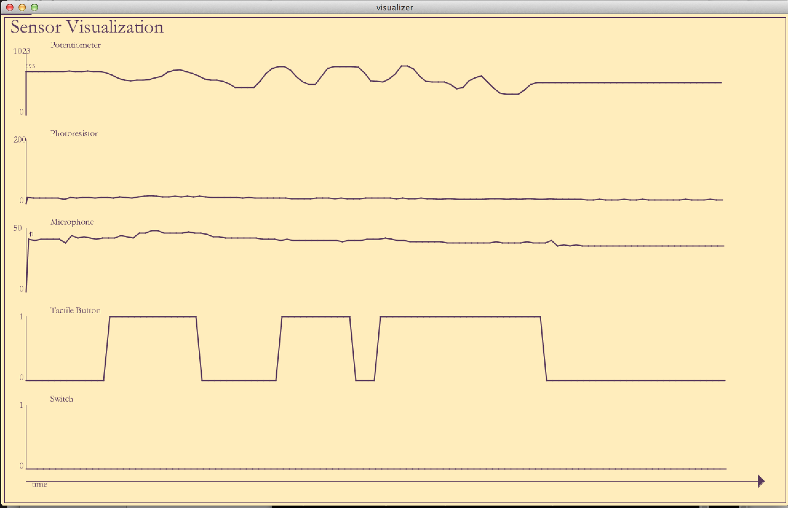
The sensor visualization is inspired by the famous Napoleon's March by Charles Minard and in general, Edward Tufte's style of small multiples. This is quite a good technique to visualize multiple variables that are dependent on one (in this case, its time). Tufte promotes a minimalist design without using too much color.
The purpose of this small multiples based visualization is to differentiate between sensors while making it easy to compare by aligning them on the same axis. This lets us visualize the sensor values without any twisted/braided lines in the line chart.
Apart from visualizing the data, there is an added logic to pop the sensor values on the chart when there is a significant change from previous value. This acts as an additional visual guideline.
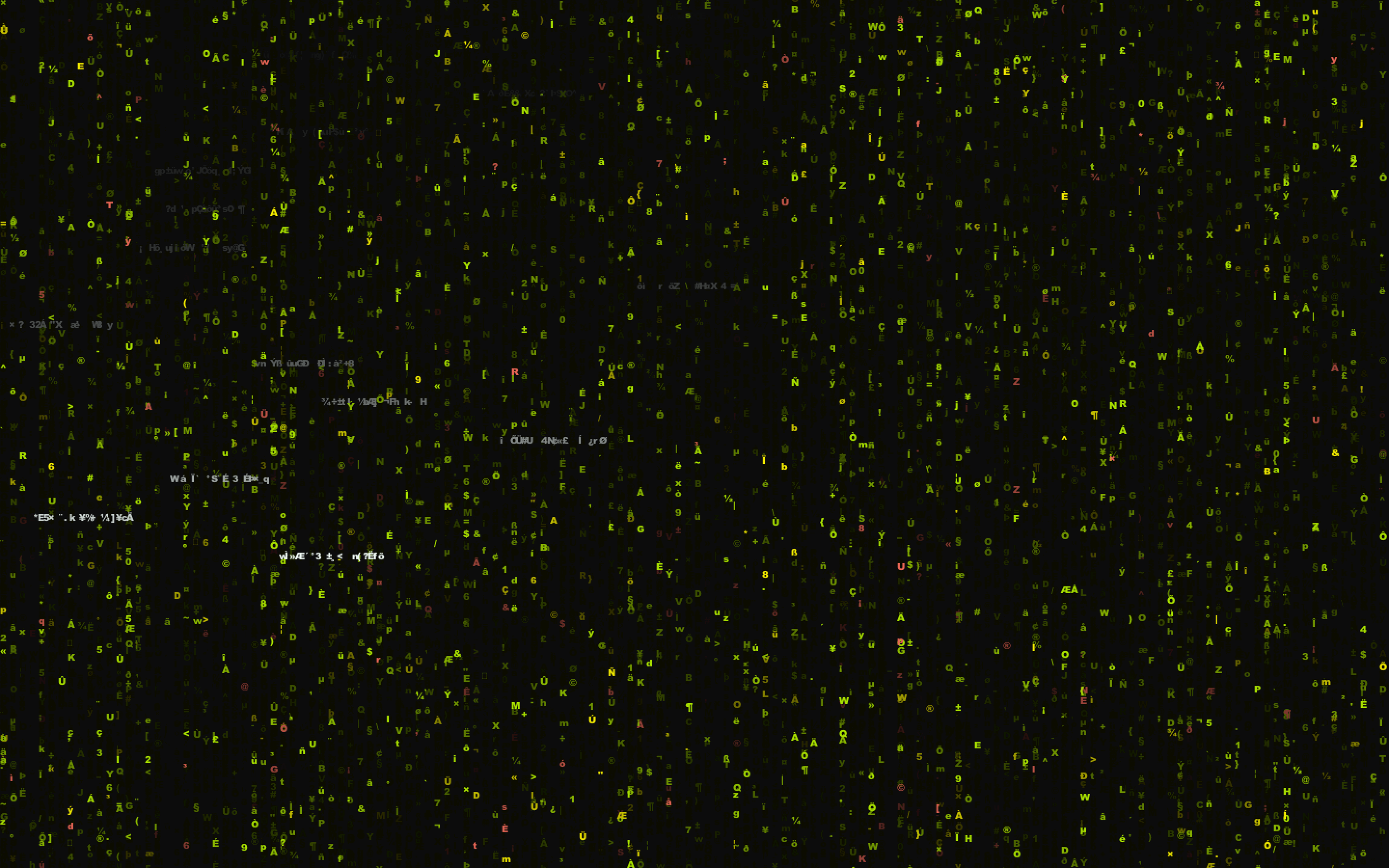
The abstract visualization of the sensor values is rather crazy. I decided to use the iconic Matrix visual effect to somehow show the change in sensor values. The original Matrix effect shows the activity in the virtual environment using a falling green code. In Matrix 1, Cypher (a character) says that the programming of the Matrix is so complex that it's impossible to view it normally. I wanted to kinda regenerate this complexity, so I decided to use random characters and play with the column colors based on the sensor values.
The outcome of a brief thought about the visual variables led to this visual encoding. The algorithms behind this visualization is:
-
Predefine number of sensors and colors for each sensor (stick to shades close to green to maintain loyalty to the Matrix).
-
Based on the sensor value pick number of columns on the screen that are to be active (i.e., have a trailing character).
-
For each active column, create a random character and pop it onto the screen.
The rest is Processing magic! The fading animation is made possible by drawing a transparent rectangle on screen for every frame.
Reading the visualization is quite simple. When a sensor value increases, the number of active columns assigned to the sensor increase. This shows more characters of the sensor color on the screen. For Digital values (0 or 1), I pick random columns on the screen and pop a white ghost. The location of this white ghost is based on the sensor.
The protocol is quite simple. A CSV-style string is written at every Loop() instance. If there are 3 sensors then the Arduino code reads all sensor values and writes a single line of the form:
type1, channel1, value1, type2, channel2, value2...
Here,
- type stands for whether its Digital or Analog (D or A).
- channels are predefined. Potentiometer talks at channel value 0, Photoresistor talks at channel 1, and so on (see the code for this mapping). The channel is used to differentiate each sensor.
- value stands for the sensor value.
In Processing, I just read the line and split it into triplets (type, channel, value). Each sensor value is translated into a visual encoding based on its type.
Note: The code is well documented to further explain the logic.

