Coder Social home page Coder Social logo

kadirgombel / react-chat-elements Goto Github PK

View Code? Open in Web Editor NEW

This project forked from detaysoft/react-chat-elements

1.0 1.0 0.0 1.23 MB

Reactjs chat elements chat UI, react chat components

License: MIT License

CSS 17.17% JavaScript 77.00% Java 1.14% Objective-C 3.37% Starlark 1.32%

react-chat-elements's Introduction

npm Github pre-)release

react-chat-elements

Reactjs chat elements

Install

npm install react-chat-elements --save

For React Native

Step 1: Install react-chat-elements

npm install react-chat-elements --save

If you have already installed react-native-vector-icons as a dependency for your project you can skip this step. Otherwise run the following command:

Step 2: Install react-native-vector-icons

npm i --save react-native-vector-icons

Link:

react-native link react-native-vector-icons

If you have any issues installing react-native-vector-icons, check out their installation guide here.

Imports

// RCE CSS
import 'react-chat-elements/dist/main.css';
// MessageBox component
import { MessageBox } from 'react-chat-elements';

React Native

// MessageBox component
import { MessageBox } from 'react-chat-elements/native';

Components

  1. ChatItem
  2. MessageBox
  3. SystemMessage
  4. MessageList
  5. ChatList
  6. Input
  7. Button
  8. Popup
  9. SideBar
  10. Navbar
  11. Dropdown
  12. Avatar
  13. LocationMessage
  14. SpotifyMessage

ChatItem Component

chatitem-photo

import { ChatItem } from 'react-chat-elements'

<ChatItem
    avatar={'https://facebook.github.io/react/img/logo.svg'}
    alt={'Reactjs'}
    title={'Facebook'}
    subtitle={'What are you doing?'}
    date={new Date()}
    unread={0} />

ChatItem props

prop default type description
avatar none string ChatItem avatar photo url
avatarFlexible false boolean flexible ChatItem avatar photo
alt none string ChatItem avatar photo alt text
title none string ChatItem title
subtitle none string ChatItem subtitle
date none date ChatItem date
dateString none string ChatItem represents dateString or timeagojs(now, date)
unread 0 int ChatItem unread count
onClick none function ChatItem on click
onContextMenu none function ChatItem on context menu
statusColor none color ChatItem status color
statusColorType badge string ChatItem status color type (encircle, badge)
statusText none color ChatItem status text
lazyLoadingImage none image path lazy loading image

MessageBox Component

file photo text location
file-message photo-message   text-message location-message
import { MessageBox } from 'react-chat-elements'

<MessageBox
    position={'left'}
    type={'photo'}
    text={'react.svg'}
    data={{
        uri: 'https://facebook.github.io/react/img/logo.svg',
        status: {
            click: false,
            loading: 0,
        }
    }}/>

MessageBox props

prop default type description
id i (index) string  message box id
position  left string  message box position
type  text string  
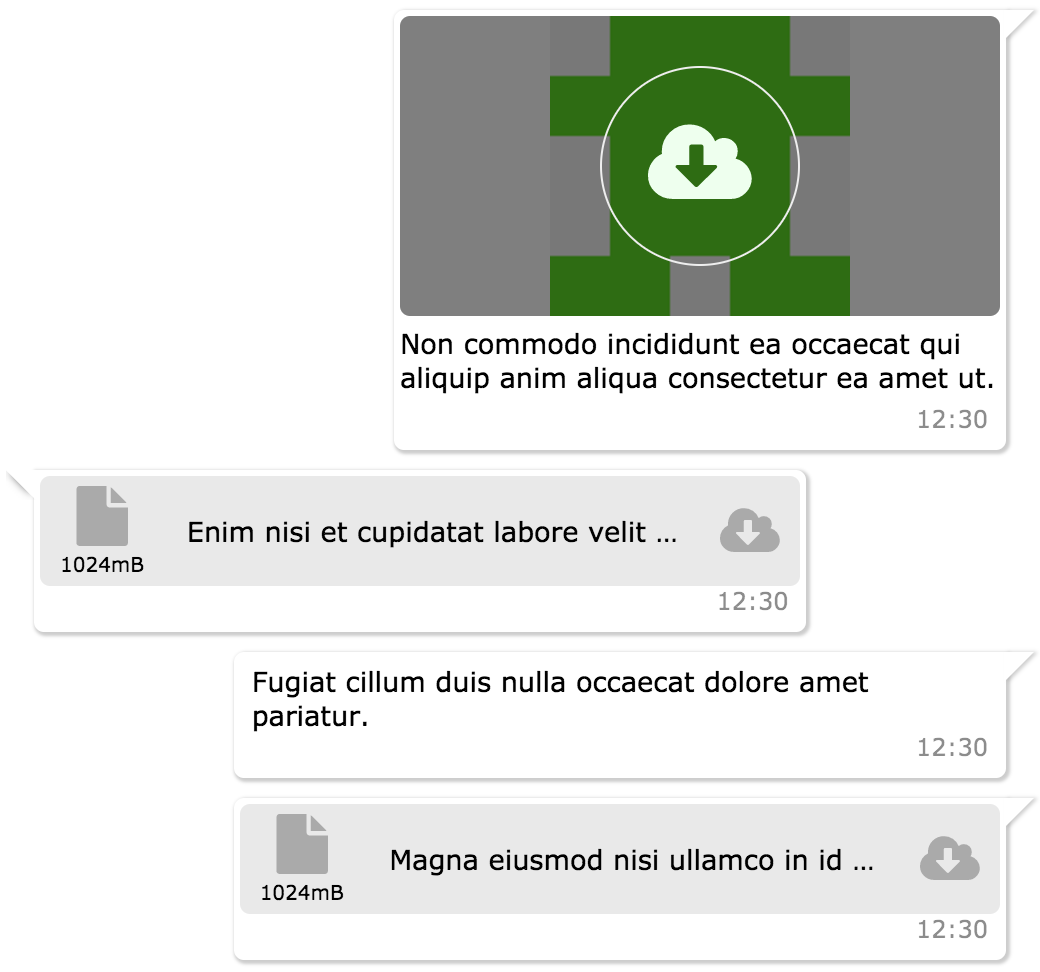
message type (text, photo, file, location, spotify)
text none string  message text
title none string  message title
titleColor none string(color)  message title color
data  {} object message data
date new Date() Date message date
dateString none string message represents dateString or timeagojs(now, date)
onClick none function message on click (message(object) is returned)
onOpen none function message on open (file or photo) (message(object) is returned)
onDownload none function message on download (file or photo) (message(object) is returned)
onLoad none function message on load photo
onPhotoError none function message on error photo
onTitleClick none function message title on click event
onForwardClick none function message forward on click event
onReplyClick none function message reply on click event
onReplyMessageClick none function reply message on click event
onContextMenu none function message contextmenu click event
forwarded none boolean message forward icon
replyButton none boolean message reply icon
status none string message status info (waiting, sent, received, read)
notch true boolean message box notch
avatar none url message box avatar url
renderAddCmp none function (component) adding custom components to message box
copiableDate false boolean message box date text copiable
focus false boolean used in message focus feature in MessageList component, makes style of the component focused
onMessageFocused none function makes focus value false after the message becomes focus
reply none object reply data

Reply Message Component

import { MessageBox } from 'react-chat-elements'

<MessageBox
    reply={{
        photoURL: 'https://facebook.github.io/react/img/logo.svg',
        title: 'elit magna',
        titleColor: '#8717ae',
        message: 'Aliqua amet incididunt id nostrud',
    }}
    onReplyMessageClick={() => console.log('reply clicked!')}
    position={'left'}
    type={'text'}
    text={'Tempor duis do voluptate enim duis velit veniam aute ullamco dolore duis irure.'}/>

reply-message

SystemMessage Component

import { SystemMessage } from 'react-chat-elements'

<SystemMessage
    text={'End of conversation'}/>

SystemMessage props

prop default type description
text none string  message text

MessageList Component

messagelist-photo

import { MessageList } from 'react-chat-elements'

<MessageList
    className='message-list'
    lockable={true}
    toBottomHeight={'100%'}
    dataSource={[
        {
            position: 'right',
            type: 'text',
            text: 'Lorem ipsum dolor sit amet, consectetur adipisicing elit',
            date: new Date(),
        },
        .
        .
        .
    ]} />

MessageList props

prop default type description
className none string optional message list className
dataSource [] array message list array
lockable false boolean It locks to scroll position when the dataSource has been changed
toBottomHeight 300 int or string(only '100%') If the toBottomHeight property's value higher than bottom value of the scrollbar when the data source has been changed Scrollbar goes to bottom at the end of the page. If the toBottomHeight property's value has been set '100%', scrollbar goes to bottom at the end of the page when the data source has been changed.
onClick none function message list item on click (message(object) is returned)
onOpen none function message list item on open (file or photo) (message(object) is returned)
onDownload none function message list item on download (file or photo) (message(object) is returned)
onScroll none function message list onScroll event
onForwardClick none function message list item onForwardClick event
onReplyClick none function message list item onReplyClick event
onReplyMessageClick none function message list item onReplyMessageClick event
downButton true boolean message list scroll to bottom button
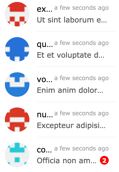
downButtonBadge none boolean message list downButton badge content
onDownButtonClick none function message list onDownButtonClick
onContextMenu none function message list item onContextMenu event, gets 3 parameters: message item, index of item, event
onPhotoError none function message list item on error photo

ChatList Component

chatlist-photo

import { ChatList } from 'react-chat-elements'

<ChatList
    className='chat-list'
    dataSource={[
        {
            avatar: 'https://facebook.github.io/react/img/logo.svg',
            alt: 'Reactjs',
            title: 'Facebook',
            subtitle: 'What are you doing?',
            date: new Date(),
            unread: 0,
        },
        .
        .
        .
    ]} />

ChatList props

prop default type description
className none string optional chat list className
dataSource [] array chat list array
onClick none function chat list item on click (chat(object) is returned)
onContextMenu none function chat list item on context menu (chat(object) is returned)
onAvatarError none function chat list item on error avatar img
lazyLoadingImage none image path lazy loading image

Input Component

import { Input } from 'react-chat-elements'

<Input
    placeholder="Type here..."
    multiline={true}
    rightButtons={
        <Button
            color='white'
            backgroundColor='black'
            text='Send'/>
    }/>

// Clear text, e.g.:
// For pure components, use inputRef instead of this.inputRef

inputRef = React.createRef();
// ...
<Input
    ref={el => (this.inputRef = el)}
    placeholder="Type here..."/>
// ...
this.inputRef.clear();

Input props

prop default type description
className none string optional input className
placeholder none string input placeholder text
defaultValue none string input default value
onChange none function input onChange function
multiline false bool input is textarea
autoHeight true bool input auto height
minHeight 25 int input min height
maxHeight 200 int input max height
inputStyle none object inputStyle object
leftButtons none object(component) left buttons component
rightButtons none object(component) right buttons component
ref none function input or textarea ref
maxlength none int input or textarea maxlength
onMaxLengthExceed none function called when max length exceed
autofocus false bool input autofocus

Button Component

import { Button } from 'react-chat-elements'

<Button
    text={'click me!'} />

Button props

prop default type description
type none string button type (outlined, transparent)
disabled none string button is disabled?
text none string button text
buttonRef none function button ref
title none string button title

Popup Component

import { Popup } from 'react-chat-elements'

<Popup
    show={this.state.show}
    header='Lorem ipsum dolor sit amet.'
    headerButtons={[{
        type: 'transparent',
        color:'black',
        text: 'close',
        onClick: () => {
            this.setState({show: false})
        }
    }]}
    text='Lorem ipsum dolor sit amet, consectetur adipisicing elit. Voluptatem animi veniam voluptas eius!'
    footerButtons={[{
        color:'white',
        backgroundColor:'#ff5e3e',
        text:"Vazgeç",
    },{
        color:'white',
        backgroundColor:'lightgreen',
        text:"Tamam",
    }]}/>

Popup props

prop default type description
show false bool popup visible
header none string popup title (header) message
headerButtons none array popup title (header) buttons
text none string popup content (center) message
color #333 string (color) popup content message color
footerButtons none array popup footer buttons
renderHeader none function (component) render header function
renderContent none function (component) render content function
renderFooter none function (component) render footer function

SideBar Component

import { SideBar } from 'react-chat-elements'

<SideBar
    top={
        <div>'TOP' area</div>
    }
    center={
        <div>'CENTER' area</div>
    }
    bottom={
        <div>'BOTTOM' area</div>
    }/>

SideBar props

prop default type description
type light string sidebar style type (eg: light, dark)
top none component sidebar top component
center none component sidebar center component
bottom none component sidebar bottom component

Navbar Component

import { Navbar } from 'react-chat-elements'

<Navbar
    left={
        <div>'LEFT' area</div>
    }
    center={
        <div>'CENTER' area</div>
    }
    right={
        <div>'RIGHT' area</div>
    }/>

Navbar props

prop default type description
type light string navbar style type (eg: light, dark)
left none component navbar left component
center none component navbar center component
right none component navbar right component

Dropdown Component

import { Dropdown } from 'react-chat-elements'

<Dropdown
    buttonProps={{
        text: 'Dropdown',
    }}
    items={[
        {
            icon: {
                component: icon,
                float: 'left',
                color: 'red',
                size: 22,
            },
            text: 'lorem'
        },
        {
            icon: {
                component: icon,
                float: 'left',
                color: 'purple',
                size: 22,
            },
            text: 'ipsum'
        },
        {
            text: 'dolor'
        },
    ]}/>

Dropdown props

prop default type description
animationType none string fade or default
animationPosition nortwest string animation start position (nortwest, norteast, southwest, southeast)
items none array dropdown items array
onSelect none function item on select
buttonProps none object button properties

Avatar Component

import { Avatar } from 'react-chat-elements'

<Avatar
    src={'https://facebook.github.io/react/img/logo.svg'}
    alt={'logo'}
    size="large"
    type="circle flexible"/>

Avatar props

prop default type description
src none image image src
alt none string image alt description
size default string image size. default (25px), xsmall(30px), small(35px), medium(40px), large(45px), xlarge (55px)
type default string types: default, circle, rounded(border radius 5px), flexible
letterItem none object avatar to be a letter
sideElement none component avatar side element
onError none component avatar img onerror
lazyLoadingImage none image path lazy loading image

LocationMessage Component

import { LocationMessage } from 'react-chat-elements'

<LocationMessage
    data={{
        latitude: '37.773972',
        longitude: '-122.431297',
        // staticURL: '<optional>',
        // mapURL: '<optional>'
    }}/>

LocationMessage props

prop default type description
src none image image src
apiKey none string google staticmap api key
zoom 14 int google staticmap zoom level
markerColor red string google staticmap marker color
data {} object  message data
target _blank string image a tag target prop
onOpen none function image on open

SpotifyMessage Component

spotify

import { SpotifyMessage } from 'react-chat-elements'

<SpotifyMessage
    theme='white'
    view='coverart'
    uri={'spotify:user:spotify:playlist:3rgsDhGHZxZ9sB9DQWQfuf'}/>

SpotifyMessage props

prop default type description
uri none uri spotify uri
theme black string spotify theme color (black or white)
view list string spotify view type (list or coverart)
data {} object  message data
width 300 int spotify embed width
height 380 int spotify embed height

react-chat-elements's People

Contributors

abdurrahmanekr avatar edam avatar goregut avatar hacivat avatar kubraturan avatar lehasvv2009 avatar michaeldever avatar mlelyakan avatar oxinosg avatar rorz avatar

Stargazers

 avatar

Watchers

 avatar

Recommend Projects

  • React photo React

    A declarative, efficient, and flexible JavaScript library for building user interfaces.

  • Vue.js photo Vue.js

    🖖 Vue.js is a progressive, incrementally-adoptable JavaScript framework for building UI on the web.

  • Typescript photo Typescript

    TypeScript is a superset of JavaScript that compiles to clean JavaScript output.

  • TensorFlow photo TensorFlow

    An Open Source Machine Learning Framework for Everyone

  • Django photo Django

    The Web framework for perfectionists with deadlines.

  • D3 photo D3

    Bring data to life with SVG, Canvas and HTML. 📊📈🎉

Recommend Topics

  • javascript

    JavaScript (JS) is a lightweight interpreted programming language with first-class functions.

  • web

    Some thing interesting about web. New door for the world.

  • server

    A server is a program made to process requests and deliver data to clients.

  • Machine learning

    Machine learning is a way of modeling and interpreting data that allows a piece of software to respond intelligently.

  • Game

    Some thing interesting about game, make everyone happy.

Recommend Org

  • Facebook photo Facebook

    We are working to build community through open source technology. NB: members must have two-factor auth.

  • Microsoft photo Microsoft

    Open source projects and samples from Microsoft.

  • Google photo Google

    Google ❤️ Open Source for everyone.

  • D3 photo D3

    Data-Driven Documents codes.