juaresba / store-block Goto Github PK
View Code? Open in Web Editor NEWHome Page: https://lab.github.com/vtex-trainings/vtex-store-block-course
Home Page: https://lab.github.com/vtex-trainings/vtex-store-block-course
![dependabot[bot] avatar](https://avatars.githubusercontent.com/in/29110?v=4 "dependabot[bot]")


Now we have an h1 element rendered, it's possible to used it to display information that depend on the component's properties (props). For that, some concepts will be shown, given that they are essential for the app development.
Hook
Hooks are APIs that allow using React features inside functional components. Without the hooks, a functional React component is only able to render UI elements. They, hereby, allow, among other things, state storage between different renders and execute side effets to the component's life cycle. Note: They do not work inside classes.
e.g:
const [count, setCount] = useState(0)props interface
Defines the props Typescript typing that the component will receive, allowing IDE's intellisense about the created component.
interface CountdownProps {
  exampleProp: string
}
Block's schema
In VTEX IO, we offer a content management tool called Site Editor. With it, through VTEX Admin, it's possible to change images, texts and behaviours of blocks without having to change the Store's code.
In order for your block to accept user customizations, you need to export a schema in the React component responsible for the block using JSON schema. This will, automatically, generate a form in Site Editor linked to the block that you're developing. Here's a schema example:
// react/Countdown.tsx
Countdown.schema = {
    title: 'editor.countdown.title',
    description: 'editor.countdown.description',
    type: 'object',
    properties: {},
}
The schema is also responsible for defining the labels that will be displayed to the user when editing the block content on the form.
In the interface defined in Countdown.tsx, add a prop called targetDate, its type is string. We are, hence, defining a component prop that will be used to initialize the countdown.
The prop definition itself is made through its declaration in the CountdownProps interface in the Countdown.tsx file, shown previously. Thus, add a line that define the targetDate prop of type string:
// react/Countdown.tsx
interface CountdownProps {
+   targetDate: string
}
Now, we need to use it on the component, substituting the text used used previously, Countdown Test, for another, using Site Editor.
Keep in mind that targetDate will be used to define the countdown ending date. However, for now, it will work as a dummy field.
First, change the component in order for it to use the targetDate prop. To do that, you need to use its variable inside the h1 of the React component.
// react/Countdown.tsx
const Countdown: StorefrontFunctionComponent<CountdownProps> = ({ targetDate }) => {
  return (
    <div>
      <h1>{ targetDate }</h1>
    </div>
  )
}
Furthermore, to be able to edit this property through Site Editor, it's necessary to add that same prop to the schema. This is done by adding the targetDate key to the properties object of the schema:
// react/Countdown.tsx
Countdown.schema = {
title: 'editor.countdown.title',
description: 'editor.countdown.description',
type: 'object',
properties: {
+ targetDate: {
+ title: 'Final date',
+ description: 'Final date used in the countdown',
+ type: 'string',
+ default: null,
+ },
},
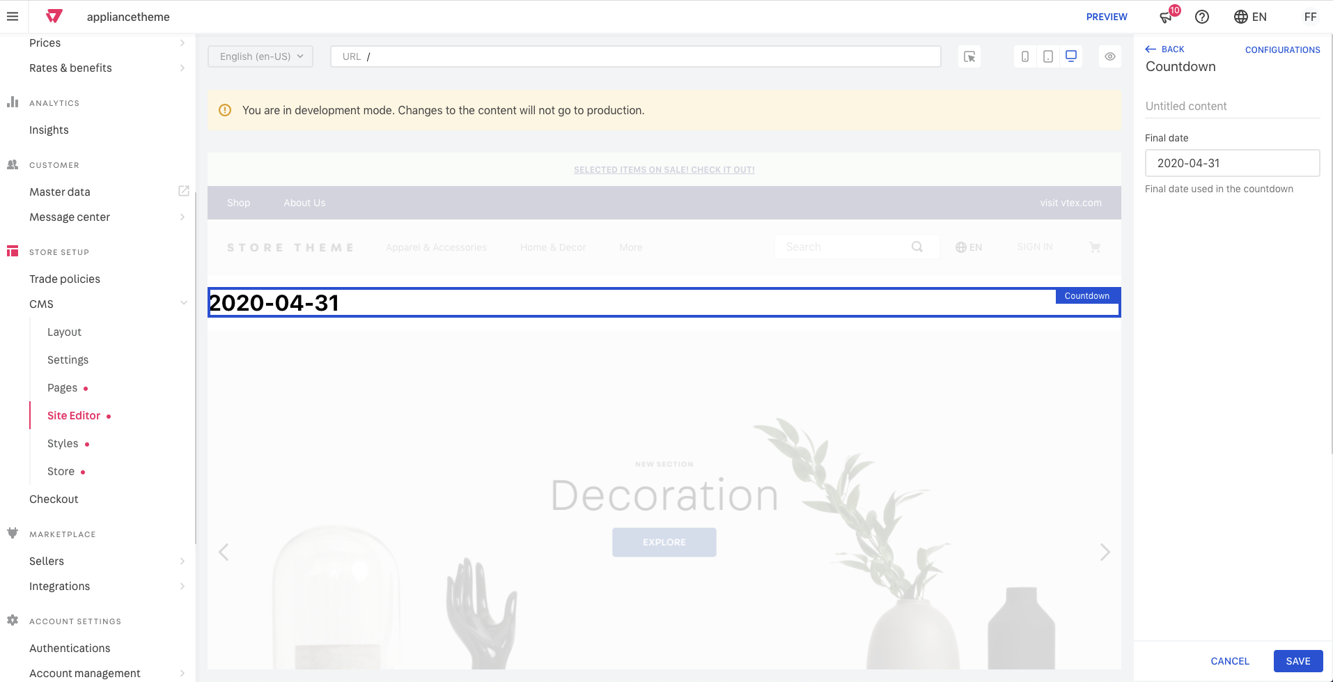
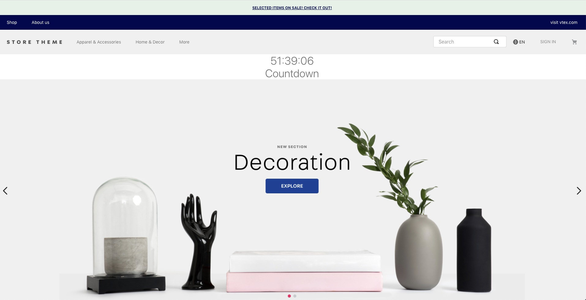
}All set! Now you can change the text content through Site Editor. Go ahead to the Site Editor and click on Countdown on the side menu, this will open an edit menu, like the shown bellow:
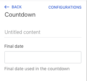
Now, in the field below the title, type the date in the format AAAA-MM-DD and see the change, that will then show the text you've typed!
Now that we have implemented the countdown, how about adding a little customization? In this step, you will learn basic concepts about CSS handles and Tachyons to customize the style of your app.
CSS handles are used to customize your store's components through CSS classes in the theme code. All settings are defined through the app vtex.css-handles, responsible for declaring all the customization points of your block.
By defining the names of your handles and adding them to their respective HTML elements, it is possible to give the theme's user customization points that allow them to create flexible layouts.
Tachyons is a framework for functional CSS. Unlike other known frameworks, like Bootstrap, it does not have "pre-built" UI components. In fact, its purpose is, precisely, separate the CSS rules into small, reusable parts. This type of strategy is commonly known as Subatomic Design System and, if you are interested, you can find a reference in this link. This strategy makes frameworks like Tachyons very flexible, scalable and fast.
A lot of the Tachyons' definitions can be changed, so that your store will have a more customized style. To do this, just define a JSON file in the styles / configs folder; this information can be found in more detail at: Build a store using VTEX IO - Customizing styles.
Import the useCssHandles hook. To do so, return to Countdown.tsx and do the import:
// react/Countdown.tsx
import { useCssHandles } from "vtex.css-handles"
Besides, define in a Array all necessary handles (in this case, only 'countdown' will be used):
// react/Countdown.tsx
const CSS_HANDLES = ["countdown"]
Use the useCssHandles in the component Countdown to define the countdown handle:
// react/Countdown.tsx
const Countdown: StorefrontFunctionComponent<CountdownProps> = ({ targetDate = DEFAULT_TARGET_DATE }) => {
  const [timeRemaining, setTime] = useState<TimeSplit>({
    hours: '00',
    minutes: '00',
    seconds: '00'
  })

+ const handles = useCssHandles(CSS_HANDLES)

  tick(targetDate, setTime)

  return (
    <div>
      <h1>
        { `${timeRemaining.hours}:${timeRemaining.minutes}:${timeRemaining.seconds}` }
      </h1>
    </div>
  )
}
At last, it is needed to use the handle in the component to see the customization. For this, use the prop className with the classes to be used and the Tachyons classes, for global styles.
// react/Countdown.tsx
import React from 'react'
...
const Countdown: StorefrontFunctionComponent<CountdownProps> = ({ targetDate = DEFAULT_TARGET_DATE }) => {
const [timeRemaining, setTime] = useState<TimeSplit>({
hours: '00',
minutes: '00',
seconds: '00'
})
const handles = useCssHandles(CSS_HANDLES)
tick(targetDate, setTime)
return (
+ <div className={`${handles.countdown} t-heading-2 fw3 w-100 c-muted-1 db tc`}>
{`${timeRemaining.hours}:${timeRemaining.minutes}:${timeRemaining.seconds}`}
</div>
)
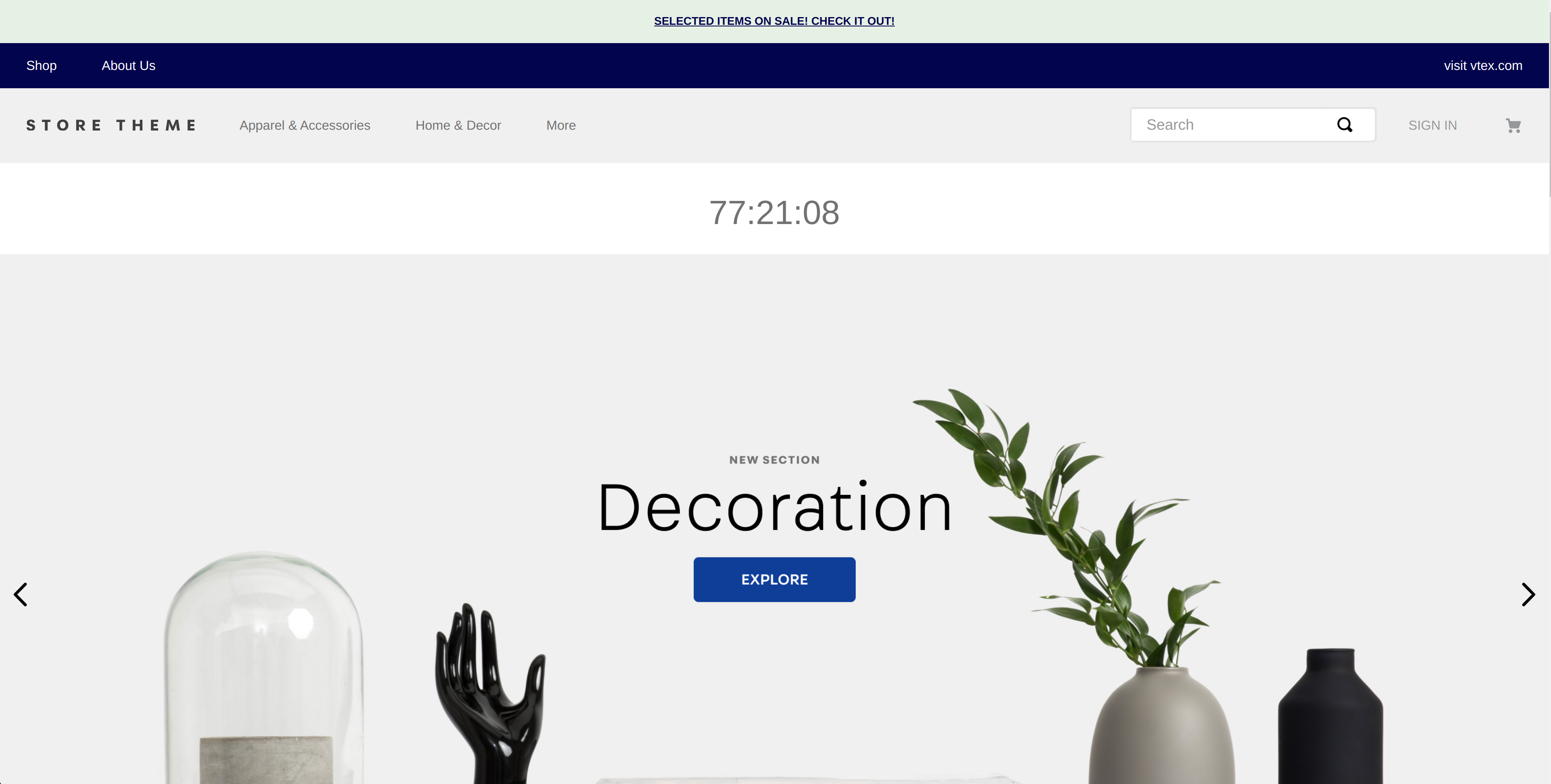
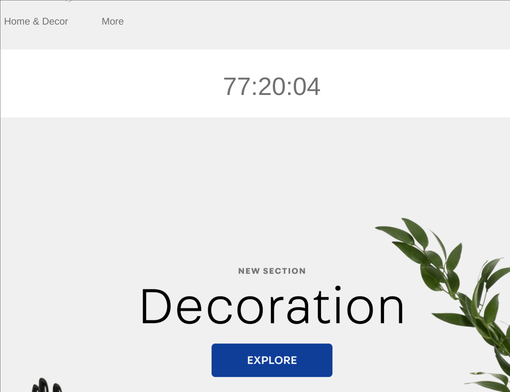
}Let's see the result?
Before we start, it's necessary to remind some important concepts of the logical for a better understanding of the logical workflow when developing an app.
It defines the name of the VTEX account that is developing the app. This account is responsible for its maintenance and distribution (the app can be installed in other accounts or only in its own)
The
vtexvendor is used for native apps
It identifies the name of the application. It should not contain any special characters (except from -) or uppercase characters.
It identifies the current app version. We use the Semantic Versioning 2.0.0 specification for versioning. The format is well defined, divided in patch, minor and major releases.
You can find bellow a summary of the specification:
For example: If an API is at version 2.3.2 and it adds a new non breaking change feature, it can then be updated to version 2.4.0.
At the moment the deployment is made, there is a worker called housekeeper which is responsible for updating automatically the new version for every account. It will, therefore, update all new minor and patch releases because of its backwards compatibility. It will not, however, automatically update major versions since it might come with dependency changes.
An app might depend on other applications. This field lists all of the necessary dependencies for the correct app functioning.
In the example of the manifest.json structure below, it's possible to see characteristics pointed out above. In particular, the app version is 0.0.1 and these numbers correspond respectively to its major, minor and patch.
{
  "vendor": "vtex",
  "name": "countdown",
  "version": "0.0.1",
  "title": "Countdown",
  "description": "Countdown component",
  "defaultLocale": "pt-BR",
  "builders": {
    "messages": "1.x",
    "store": "0.x",
    "react": "3.x"
  },
  "mustUpdateAt": "2019-04-02",
  "scripts": {
    "postreleasy": "vtex publish --verbose"
  },
  "dependencies": {
    "vtex.styleguide": "9.x",
    "vtex.css-handles": "0.x"
  },
  "$schema": "https://raw.githubusercontent.com/vtex/node-vtex-a pi/master/gen/manifest.schema"
}With the customized block in the store, we need to learn to internationalize the content presented.
It is important to remember that blocks must always follow good localization practices, and must not show hardcoded strings, but ones that are sensitive to the language that the store operates.
Don't worry, you won't need to add translations of all texts for the various languages in which the Store Framework is used. Therefore, in this stage, will be presented concepts about the internationalization of apps and how to do it.
The concept of messages makes it easy to add new languages to the theme. The Messages centralize all translation services on the platform. Given a text to be translated, Messages will first check the user-defined context, then check the translations of the apps and, finally, go through the automatic translation system.
In the directory structure, you can see that there is a folder called messages, which has three main files: pt.json, en.json andes.json, each responsible for the translations: Portuguese, English and Spanish, respectively. In addition, in order to provide better automatic translations, the context.json file is used, which is responsible for avoiding ambiguities.
To use such definitions, the translation files mentioned above are JSON, whose keys are messages and values are translations.
The
context.jsonfile is necessary and must contain all messages, besides offering automatic translations in exceptional cases.
You must have learned how to use our builder messages, and it will be through it that internationalized strings will be added to the components.
To do so, in the directory /messages, add now a message for the title of the component:
messages/pt.json
{
  ...,
+	"countdown.title": "Contagem Regressiva"
}
messages/en.json
{
  ...,
+	"countdown.title": "Countdown"
}
messages/es.json
{
  ...,
+	"countdown.title": "Cuenta Regresiva"
}
messages/context.json
{
  ...,
+	"countdown.title": "Countdown"
}
After that, to render the title the component FormattedMessage of the lib react-intl must be used.
The lib react-intl supports many ways of configuration and internationalization, it is worth checking it out.
Add the lib using yarn add react-intl in the react directory
In your component's code, Countdown.tsx, import the FormattedMessage
//react/Countdown.tsx
import { FormattedMessage } from 'react-intl'
Add a new prop to the interface CountdownProps:
interface CountdownProps {
+ title: string
  targetDate: string
}
Add a const that will be your title:
//react/Countdown.tsx
const titleText = title || <FormattedMessage id="countdown.title" />
Now, join the title to the countdown to render. To do so, define a container outside. Besides, the text for the title will be passes using the prop title:
//react/Countdown.tsx
const Countdown: StorefrontFunctionComponent<CountdownProps> = ({
  title,
  targetDate,
}) => {
  const [timeRemaining, setTime] = useState<TimeSplit>({
    hours: '00',
    minutes: '00',
    seconds: '00',
  })

  const titleText = title || <FormattedMessage id="countdown.title" />
  const handles = useCssHandles(CSS_HANDLES)

  tick(targetDate, setTime)

  return (
    <div className={`${handles.container} t-heading-2 fw3 w-100 c-muted-1`}>
      <div className={`${handles.title} db tc`}>{titleText}</div>
      <div className={`${handles.countdown} db tc`}>
        {`${timeRemaining.hours}:${timeRemaining.minutes}:${timeRemaining.seconds}`}
      </div>
    </div>
  )
}
Note that three new handles are used: container, countdown and title. Therefore, remember to declare them in the const CSS_HANDLES, seen in the previous step:
const CSS_HANDLES = ["container", "countdown", "title"]At last, it is needed to add the title prop in the schema:
//react/Countdown.tsx
Countdown.schema = {
title: 'editor.countdown.title',
description: 'editor.countdown.description',
type: 'object',
properties: {
+ title: {
+ title: 'I am a title',
+ type: 'string',
+ default: null,
+ },
targetDate: {
title: 'Final date',
description: 'Final date used in the countdown',
type: 'string',
default: null,
},
},
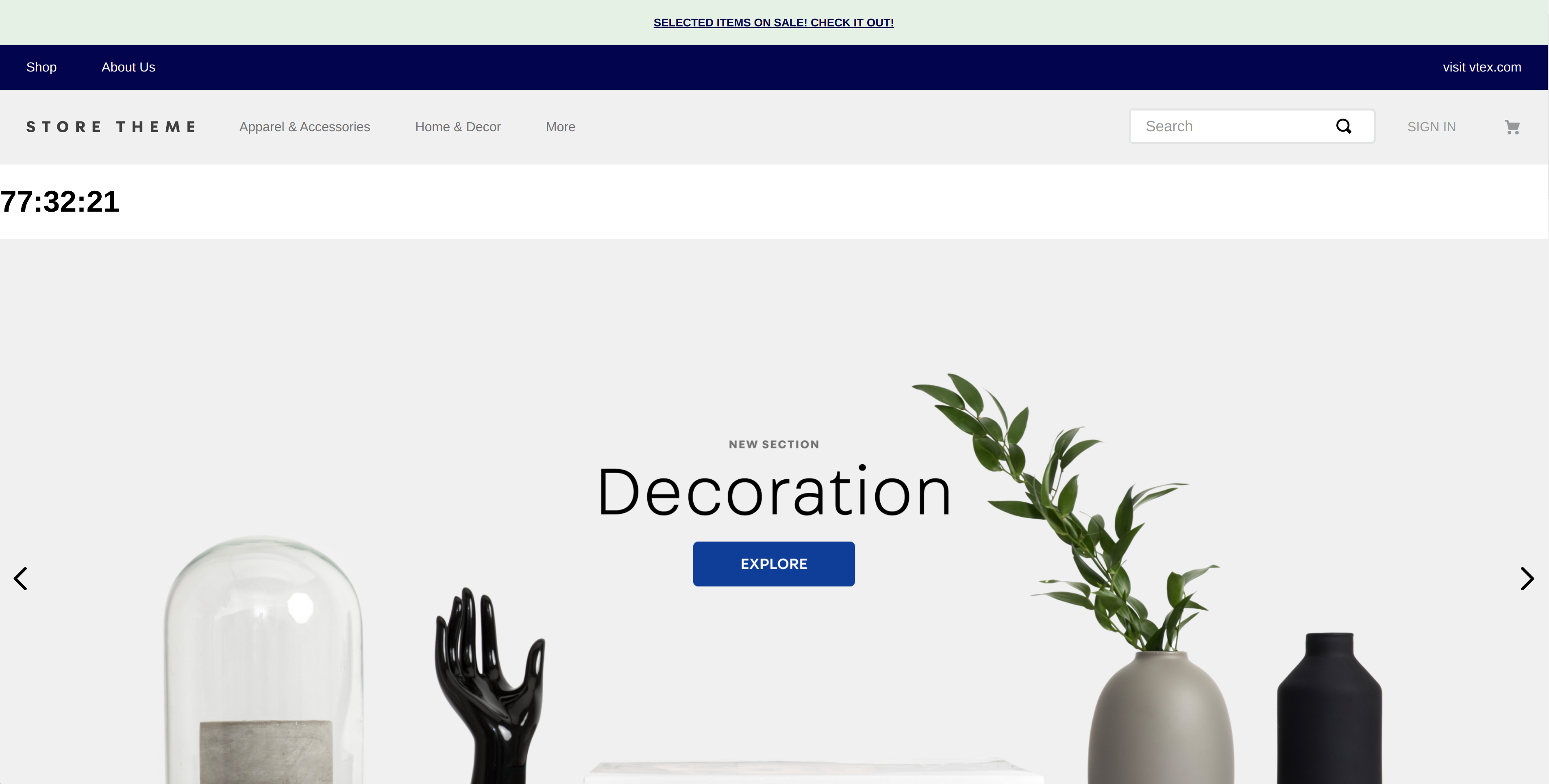
}Done! Now, to try out your store in another languages, you just need to add the query string /?cultureInfo=pt-br or /?cultureInfo=es-ar on the URL, for example. By using the first URL, the expected result is this one:

In this step, the app has two main elements: the title and the countdown. However, in order to obtain greater positioning and customization flexibility, it is interesting that they are separated into two distinct blocks. For this, it is necessary to briefly introduce the concept of interfaces, and then a new Title component will be developed. An example of customization in terms of positioning, which will be covered in this step, is:
What if I wanted the title to be under or beside the counter?
An interface works like a contract, with well-defined restrictions on how the blocks will work together. It then defines a mapping that creates a Store Framework block, from a React component. It is important to highlight that the use of interfaces, in order to separate an app in several interfaces, makes the customization power much greater.
When defining an app in the interface, the component property is responsible for defining the React component that will be used. It is important to note that the name of component must be the same as the file name of the component inside the react/ folder.
interfaces.json examples:
{
  "countdown": {
    "component": "Countdown"
  }
}In this activity, the title will be separated and added to the store below the countdown.
Countdown componentRemove the imports, the title from the interface and change the CSS handles const, CSS_HANDLES:
//react/Countdown.tsx
import React, { useState } from 'react'
import { TimeSplit } from './typings/global'
import { tick } from './utils/time'
import { useCssHandles } from 'vtex.css-handles'
-import { FormattedMessage } from 'react-intl'

interface CountdownProps {
  targetDate: string,
-  title: string
}

const DEFAULT_TARGET_DATE = (new Date('2020-03-02')).toISOString()
-const CSS_HANDLES = ['container', 'countdown', 'title']
+const CSS_HANDLES = ['countdown']
Now, in the component itself, remove the title as a prop given and also the title text constant, which changes what is being rendered:
//react/Countdown.tsx
const Countdown: StorefrontFunctionComponent<CountdownProps> = ({
- title,
  targetDate = DEFAULT_TARGET_DATE,
}) => {
  const [
    timeRemaining,
    setTime
  ] = useState<TimeSplit>({
    hours: '00',
    minutes: '00',
    seconds: '00'
  })

- const titleText = title || <FormattedMessage id="countdown.title" />
  const handles = useCssHandles(CSS_HANDLES)

  tick(targetDate, setTime)

  return (
-   <div className={`${handles.container} t-heading-2 fw3 w-100 pt7 pb6 c-muted-1 db tc`}>
-     <div className={`${handles.title} db tc`}>
-       { titleText }
-     </div>
      <div className={`${handles.countdown} db tc`}>
        {`${timeRemaining.hours}:${timeRemaining.minutes}:${timeRemaining.seconds}`}
      </div>
-   </div>
  )
}
At last, remove the title from the schema:
//react/Countdown.tsx
Countdown.schema = {
  title: 'editor.countdown.title',
  description: 'editor.countdown.description',
  type: 'object',
  properties: {
-   title: {
-     title: 'I am a title',
-     type: 'string',
-     default: null,
-   },
    targetDate: {
      title: 'Final date',
      description: 'Final date used in the countdown',
      type: 'string',
      default: null,
    },
  },
}Create a new file in the /react directory, named Title.tsx, it will be the new title component. In it, some imports are needed. The basic structure of the code is very similar to the Countdown component's.
Add the imports needed and the CSS handles constant:
//react/Title.tsx
import React from "react"
import { FormattedMessage } from "react-intl"
import { useCssHandles } from "vtex.css-handles"

const CSS_HANDLES = ["title"] as const
Change the component's function:
//react/Title.tsx
const Title: StorefrontFunctionComponent<TitleProps> = ({ title }) => {
  const handles = useCssHandles(CSS_HANDLES)
  const titleText = title || <FormattedMessage id="countdown.title" />

  return (
    <div
      className={`${handles.title} t-heading-2 fw3 w-100 c-muted-1 db tc`}
    >
      {titleText}
    </div>
  )
}
Add the interface, the schema and the export:
//react/Title.tsx
interface TitleProps {
  title: string
}

Title.schema = {
  title: "editor.countdown-title.title",
  description: "editor.countdown-title.description",
  type: "object",
  properties: {
    title: {
      title: "I am a title",
      type: "string",
      default: null,
    },
  },
}

export default Titleinterfaces.json fileBy now, there are two components in the app: the title and the countdown. However, it is necessary to change the interfaces.json file, which is in store folder. It is needed to declare each one separately. At first, our interface only contained the Countdown. It is needed to add the other component:
{
  "countdown": {
    "component": "Countdown"
  },
+   "countdown.title": {
+     "component": "Title"
+   }
}It is also needed to add to the Messages the translations whose keys are the strings of the schema that we included in the Title.tsx file above. As seen in the Messages step, go to the /messages folder and add the necessary translations to each file (pt.json, es.json and en.json). Below is an example for the case of the en.json file:
 {
   "countdown.title": "Countdown",
   "editor.countdown.title": "Countdown",
   "editor.countdown.description": "Countdown component",
+  "editor.countdown-title.title": "Countdown title",
+  "editor.countdown-title.description": "Title component",
}Finally, to see the changes, go back to the theme to change it to include the new block. To do so, simply add the title to home! Same as the countdown, it is necessary to add countdown.title as a block in the theme of your store, in the store-theme file home.jsonc.
//home.jsonc
 {
   "store.home": {
     "blocks": [
       "countdown",
+      "countdown.title",
       ...
     ]
   },
   ...
 }
Done! Now let's see how the result should look like:
To develop a store front block, like the ones provided natively in Store Framework, we use the UI development library React.js.
React's basic development unit is a component, in which should be implemented all-in-one the logical operation, visual interface and data retrieval of an UI element. Following the most recent recommendation, we will focus our usage in the Hook API, not using class definition for component building.
In VTEX IO, we adopt Typescript as default language for frontend programming. Despite the complexity of learning new syntaxes, the effort is quickly rewarded! Using Typescript, the bug anticipation is enhanced, because of its static typing. Besides that, with the right IDEs, it's possible to increase the development speed with a smarter code completion of the code objects.
In this course, we'll use Typescript exclusively. If you're not familiar with the language, it will be a great chance to give it a try!
Since you're already familiar to Store Framework, you know that we use blocks, like shelf and sku-selector, to create a VTEX IO store. In this step you're going to create a block that is going to be used in your store's home page theme.
It's important for you to have out test bot installed in this course repository so as for us to see your progress, even though it does not contains any tests or evaluation on each step. So as to install it, follow the steps below:
Open our test bot installation page and click on Configure;
Select the Only selected repositories option, then click on Select repositories and type in store-block;
Click on juaresba/store-block and then on Install.

In the local template cloned, open up the Countdown.tsx file:
//react/Countdown.tsx
import React from 'react'

interface CountdownProps {}

const Countdown: StorefrontFunctionComponent<CountdownProps> = ({}) => {
  return <div></div>
}

Countdown.schema = {
  title: 'editor.countdown.title',
  description: 'editor.countdown.description',
  type: 'object',
  properties: {},
}

export default Countdown
Add an h1 tag inside the component and link it in your terminal, using the command vtex link.
const Countdown: StorefrontFunctionComponent<CountdownProps> = ({}) => {
-   return <div></div>
+   return (
+     <div>
+       <h1>Countdown Test</h1>
+     </div>
+   )
}IMPORTANT: In order to the component that you've just linked to be seen in a functional store, you need to declare the block that the app defines in a theme. For that, hereby, we need to first have a theme to add the app to. In this course, we'll use the Store Theme. To clone the repository just run a:
git clone https://github.com/vtex-apps/store-theme.git
To avoid conflicts, go to your terminal and unlink any theme or apps you have linked. To do that, head just run the following command:
vtex unlink --all
With the repository cloned, go to its folder (cd store-theme) and link the theme on your workspace:
vtex link
IMPORTANT: At this point, you need to have two terminals opened and running
vtex link. The first one contains the link of the custom block that you're creating and the second one refers to thestore-theme, the theme you're using to insert your custom block on.
Now, with both links active (theme and custom block), in order to use the app on the theme, we have to add it to the theme's dependencies, which, is in the manifest.json. Therefore, head to the theme's manifest in the store-theme folder and add vtex.countdown as a dependency. Its version is defined in its manifest (0.0.1). The manifest will then have one extra line like it is defined below:
{
    ...
    "dependencies": {
        ...
+        "vtex.countdown": "0.x",
        ...
    },
    ...
}
Lastly, we need to add the block to the store. Inside the file store-theme/store/blocks/home/home.jsonc, declare countdown block:
{
    "store.home": {
        "blocks": [
            "countdown",
            ...
        ]
        ...
    }
    ...
}
The expected result is to find a h1 in the top of the store, you can see it below:

Now we covered the component's basics, it's time to implement the countdown effectively. For that, we need to use a React hook called useState.
useState hookIt is called within the functional component to update and consume the component state. The state represents the component's current state.
The
useStatereturns a pair: the current state value and a function to update it.
Seeing the example provided the previous step we can understand these concepts:
const [count, setCount] = useState(0)In the above code piece, you might observe three things:
count variables, it's possible to get the current state;setCount is a function used for updating it;0 is its initial state;const [timeRemaining, setTime] = useState<TimeSplit>({
hours: '00',
minutes: '00',
seconds: '00'
})We need to import a few functions and types to continue:
//react/Countdown.tsx
import React, { useState } from 'react'
import { TimeSplit } from './typings/global'
import { tick } from './utils/time'Add the state update hook (useState):
//react/Countdown.tsx
const Countdown: StorefrontFunctionComponent<CountdownProps> = ({ targetDate }) => {
+ const [timeRemaining, setTime] = useState<TimeSplit>({
+ hours: '00',
+ minutes: '00',
+ seconds: '00'
+ })
return (
<div>
{ targetDate }
</div>
)
}Add a default constant targetDate for the edge case where the prop is not defined:
//react/Countdown.tsx
const DEFAULT_TARGET_DATE = (new Date('2020-06-25')).toISOString()Use the tick function and the DEFAULT_TARGET_DATE constant to make the countdown work:
//react/Countdown.tsx
const Countdown: StorefrontFunctionComponent<CountdownProps> = ({ targetDate = DEFAULT_TARGET_DATE }) => {
const [timeRemaining, setTime] = useState<TimeSplit>({
  hours: '00',
  minutes: '00',
  seconds: '00'
})
+ tick(targetDate, setTime)
return (
<div>
{ targetDate }
</div>
)
}Change the h1 so that it shows the countdown that we've created. For that, we need to use the timeRemaining current state:
//react/Countdown.tsx
const Countdown: StorefrontFunctionComponent<CountdownProps> = ({ targetDate = DEFAULT_TARGET_DATE }) => {
  const [timeRemaining, setTime] = useState<TimeSplit>({
    hours: '00',
    minutes: '00',
    seconds: '00'
  })

  tick(targetDate, setTime)

  return (
    <div>
-     <h1>{ targetDate }</h1>
+     <h1>{ `${timeRemaining.hours}:${timeRemaining.minutes}:${timeRemaining.seconds}` }</h1>
    </div>
  )
}
The countdown string formatting is in a
HH:MM:SSformat, made through anhours,minutesandsecondssplitting.
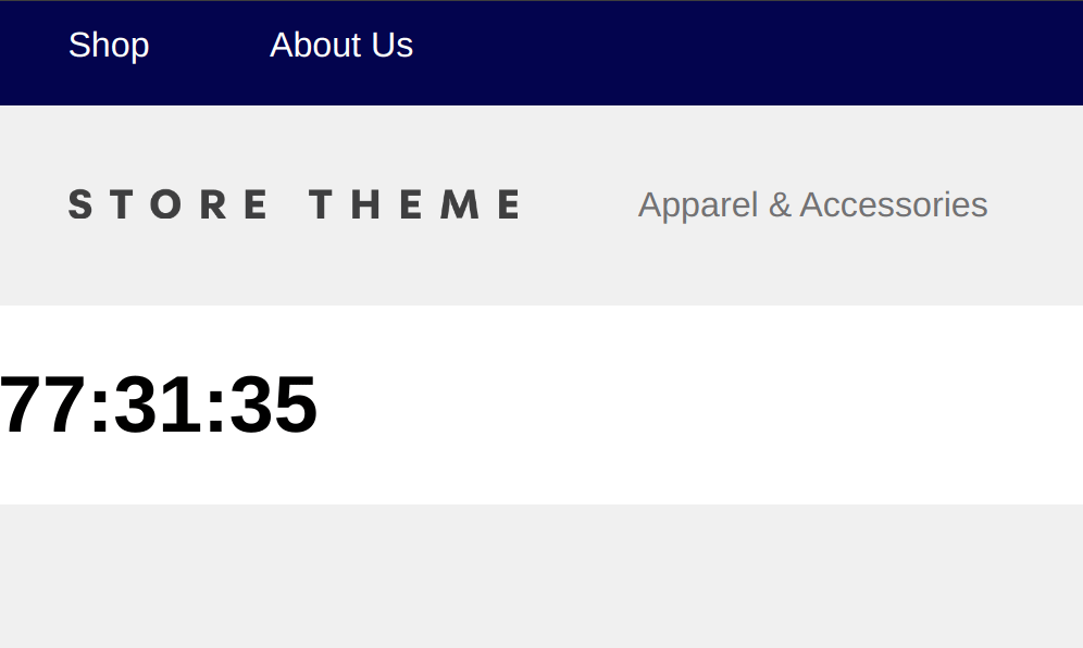
Therefore, with these changes, we'll see a real time update of the countdown! The result in the homepage is this:
 React
React
A declarative, efficient, and flexible JavaScript library for building user interfaces.
🖖 Vue.js is a progressive, incrementally-adoptable JavaScript framework for building UI on the web.
 Typescript
TypeScript is a superset of JavaScript that compiles to clean JavaScript output.
An Open Source Machine Learning Framework for Everyone
 Django
The Web framework for perfectionists with deadlines.
 Laravel
A PHP framework for web artisans
Bring data to life with SVG, Canvas and HTML. 📊📈🎉
JavaScript (JS) is a lightweight interpreted programming language with first-class functions.
Some thing interesting about web. New door for the world.
A server is a program made to process requests and deliver data to clients.
Machine learning is a way of modeling and interpreting data that allows a piece of software to respond intelligently.
Some thing interesting about visualization, use data art
Some thing interesting about game, make everyone happy.
 Facebook
We are working to build community through open source technology. NB: members must have two-factor auth.
 Microsoft
Open source projects and samples from Microsoft.
 Google
Google ❤️ Open Source for everyone.
 Alibaba
Alibaba Open Source for everyone
 D3
D3
Data-Driven Documents codes.
 Tencent
China tencent open source team.