Coder Social home page Coder Social logo

barlow's Introduction

Barlow Screenshot

Barlow

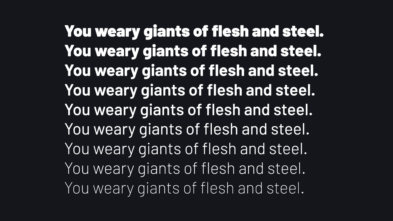
Barlow is a slightly rounded, low-contrast, grotesk type family designed by Jeremy Tribby. Drawing from the visual style of the California public, Barlow shares qualities with the state's car plates, highway signs, busses, and trains.

The family includes 54 styles in three widths and nine weights, as well as italics, suitable for large and small digital and print use. Customizable weights and widths are available via the included variable font (GX) file.

Barlow is named after internet pioneer, EFF co-founder, songwriter, and activist John Perry Barlow, in tribute to his lasting impact on the information superhighway. Please consider making a donation to the Electronic Frontier Foundation in his memory.

Download

Download the project and find the OpenType font files in the fonts/otf directory. A good way to play with it as a web font (fonts/woff) is on the Cyreal.org font testing site

Variable font support

Variable font support is currently experimental, both in the Barlow typeface and in the general ecosystem of tooling and rendering; please open an issue if you find a bug (other than a lack of rounding)!

Building the variable Font

Building the GX file requires Glyphs. First, move the contents of the tools folder in this repo to your local Glyphs Scripts folder (Scripts->Open Script Folder) and refresh your Glyphs scripts (Option + Scripts->Reload Scripts). Save a copy of Barlow.glyphs as Barlow-GX.glyphs. Run the Brace Layer Decompose script, and then the Brace Layer VF Designspace Fix script. The font is now ready for GX export from Glyphs.

Contributors

Jeremy Tribby, principal design

Nguyễn Hồng Nhung, Vietnamese

Acknowledgements

Thank you Lukas Schneider (@lukas____s) of Revolver Type for donating the LS Cadencer spacing tool. Thank you Dave Crossland (@davelab6) and Thomas Phinney (@tphinney) of Crafting Type for the guidance and early feedback. Thank you Hugh D'Andrade (@hughillustration) for holding me to a high standard from the start.

And thank you, Barlow, most of all, for a legacy that will carry our future into a brighter place.

License

This Font Software is licensed under the SIL Open Font License, Version 1.1. This license is available in the bundled OFL.txt file, and is also available with a FAQ at: http://scripts.sil.org/OFL

barlow's People

Contributors

crystaltype avatar jpt avatar m4rc1e avatar

Stargazers

 avatar  avatar  avatar  avatar  avatar  avatar  avatar  avatar  avatar  avatar  avatar  avatar  avatar  avatar  avatar  avatar  avatar  avatar  avatar  avatar  avatar  avatar  avatar  avatar  avatar  avatar  avatar  avatar  avatar  avatar  avatar  avatar  avatar  avatar  avatar  avatar  avatar  avatar  avatar  avatar  avatar  avatar  avatar  avatar  avatar  avatar  avatar  avatar  avatar  avatar  avatar  avatar  avatar  avatar  avatar  avatar  avatar  avatar  avatar  avatar  avatar  avatar  avatar  avatar  avatar  avatar  avatar  avatar  avatar  avatar  avatar  avatar  avatar  avatar  avatar  avatar  avatar  avatar  avatar  avatar  avatar  avatar  avatar  avatar  avatar  avatar  avatar  avatar  avatar  avatar  avatar  avatar  avatar  avatar  avatar  avatar  avatar  avatar  avatar  avatar

Watchers

 avatar  avatar  avatar  avatar  avatar  avatar  avatar  avatar  avatar  avatar  avatar  avatar  avatar  avatar  avatar  avatar  avatar  avatar

barlow's Issues

Please fix the kerning with polish "ł" character

Hello,

This font is great. Clear and professional. And beauty. But, I have found an one big problem with kerning polish "ł" character with some other letters. I have send you an screenshots. It seems, that there is only need to increase a space after and before polish "ł", when this letter appears in pair with most of next characters.

Also, after polish "ą" there is little too big space. But it is not a big problem.

Can you fix this "ł" error? I will be a very thankful! :)

Screen with errors:
barlow-kerning

barlow-kerning2

Ø in bold has low readability

The ø/Ø-character does not have a full line through it in the bolder versions. This creates low readability, as it is hard to see that it is a Ø and not a O. It's not a "Ø" unless there is a whole line through the "O"!

Suggested solution: Sacrificy some of the boldness of the line in order to have a full line.

Enable round edges in OTVar by removing all components and overlaps then rounding the font

Similar to #9, it also (incidentally) fixes the rendering error in webkit with overlapping shapes in the variable TTF file

I imagine I will write a Glyphs script to do this using its own rounding function, because I would like to maintain a separate source file with a "lossless" (i.e. non-rounded, still has components) version of Barlow. This will be a separate source file step for variable font compilation only I suppose

Cyrillic Support

I absolutely love this font and I've been searching for a free good looking DIN/Highway Gothic alternative for years, but what about Cyrillic support? Any plans for that?

GX file interpolates bizarrely

Looking into this... contacted Georg/Ranier in case it is a bracket layer thing. Maybe be due to decomposition of components too... not sure. /V/F/l/i are correct here but all have same weight / width (using font-variation-settings: 'wght' and 'wdth'). Also width goes in reverse order, may be the culprit.. Lots of possibilities.

screen shot 2017-07-10 at 12 34 00 am

Windows (Office), too much weight difference between Bold and Regular

First of all thank you for this wonderful font and all its many weights and variants.

I've been using it recently in some Office documents, but due to how windows selects fonts when using "Bold" text in Powerpoint or Word, the results are a bit too heavy. I know that it is also a question of personal aesthetics but please see the example below:

image

The first line is using Barlow (weight 400) and the last part is using Word's Bold option. It seems to be selecting the Barlow Bold font (weight 700)

For comparison's sake, the second line is using Barlow Medium (weight 500) and when using Word's Bold option, Word interpolates a weight that seems to have quite lighter contrast.

In the third line I have manually selected alternative fonts to arrive at a more pleasing result (for me): Barlow with Barlow SemiBold (weight 600) instead of using Word's Bold option.

I'm not sure what an elegant solution would be. As an example, I edited the metadata of Barlow Semi Condensed and changed its family to Barlow Semi Condensed Standard thus preventing Word from automatically selecting Barlow Semi Condensed Bold. You can see the difference below. In the first line I use the official Barlow Semi Condensed and the second line uses the one with the modified metadata:

image

As you can see the interpolated option in the second line looks better (again IMHO)

Problem with kerning for "ą"

Hello. I like your work very much. I noticed one issue with kerning after "a ogonek" (U+0105) while in the middle of the word. You can find this issue both in source font and webfont.
aogonek

add tabular figures

I've had a couple requests for this, seems like a common enough feature to support

Should SmallCaps be a separate file? Open question

This will add.... 54 more styles, but is this something anyone would want, a Barlow SC, Barlow Condensed SC, Barlow SemiCondensed SC? Does an SC really need to exist can can TT or OTF features be used? I know in CSS it's font-feature-stettings: 'smcp', and the woff built from TTF supports it, which for me is "fine for web." I think font-variant: small-caps is for TTF specifically?
So if it exists in spec of files, does anyone actually have a use case for SC font files? Some print application I am not considering?

Italic OTF font files missing in download archive on tribby.com/fonts/barlow/

I noticed that when downloading the font at tribby.com/fonts/barlow/, the archive https://tribby.com/fonts/barlow/download/barlow-1.408.zip doesn’t contain many italic font files in the OTF version under fonts/otf/. As far as I can tell, the italic variants aren’t new, and it looks they should have been included in that file.

In case that’s right, it would be nice if the archive file could be updated to include the italic versions 🙂.

Problem with italic "p"

Hi,

There is a small problem with italic "p". Not only in Barlow Condensed - SemiBold Italic, but in other faces too. Just look please:

barlow-kerning4

Ps.
It is "barlow-1.104" version and "ttf" files. In "otf" files this problem seems to not exist.

Bring language support to 100% for partially covered languages

I'd like to request just a few languages which have over 90% character support and are just missing a few characters according to Unicode CLDR :)

Language (code) Coverage %Coverage Missing Characters
Romanian (ro) 101/102 99 \u2010 (‐)
Estonian (et) 104/105 99 \u014f (ŏ)
French (fr) 111/113 98 \u2010 (‐), \u01d4 (ǔ)
Indonesian (id) 73/74 98 \u2010 (‐)
Serbian (Latin) (sr-Latn) 83/84 98 \u2010 (‐)
Dutch (nl) 107/110 97 \u2010 (‐), \u2032 (′), \u2033 (″)
Polish (pl) 123/126 97 \u2010 (‐), \u2032 (′), \u2033 (″)
Latvian (lv) 106/109 97 \u2010 (‐), \u2032 (′), \u2033 (″)
Swedish (sv) 106/109 97 \u2010 (‐), \u2032 (′), \u2033 (″)
Afrikaans (af) 105/108 97 \u2010 (‐), \u2032 (′), \u2033 (″)
Icelandic (is) 100/103 97 \u2010 (‐), \u2032 (′), \u2033 (″)
German (de) 121/126 96 \u2010 (‐), \u0115 (ĕ), \u012d (ĭ), \u014f (ŏ), \u016d (ŭ)
Czech (cs) 125/130 96 \u2010 (‐), \u0115 (ĕ), \u012d (ĭ), \u014f (ŏ), \u016d (ŭ)
Danish (da) 106/110 96 \u2010 (‐), \u2032 (′), \u2033 (″), \u01ff (ǿ)
Filipino (fil) 94/97 96 \u2010 (‐), \u2032 (′), \u2033 (″)
Croatian (hr) 86/89 96 \u2010 (‐), \u2032 (′), \u2033 (″)
Lithuanian (lt) 102/106 96 \u2010 (‐), \u0129 (ĩ), \u0169 (ũ), \u1ebd (ẽ)
Slovak (sk) 126/131 96 \u2010 (‐), \u0115 (ĕ), \u012d (ĭ), \u014f (ŏ), \u016d (ŭ)
Slovenian (sl) 108/112 96 \u0115 (ĕ), \u012d (ĭ), \u014f (ŏ), \u016d (ŭ)
Malay (ms) 80/83 96 \u2010 (‐), \u2032 (′), \u2033 (″)
Albanian (sq) 84/87 96 \u2010 (‐), \u2032 (′), \u2033 (″)
Finnish (fi) 154/162 95 \u2010 (‐), \u021f (ȟ), \u015d (ŝ), \u0292 (ʒ), \u01e5 (ǥ), \u01e7 (ǧ), \u01e9 (ǩ), \u01ef (ǯ)
English (en) 114/121 94 \u2010 (‐), \u0115 (ĕ), \u012d (ĭ), \u2032 (′), \u2033 (″), \u014f (ŏ), \u016d (ŭ)
English (United Kingdom) (en-GB) 114/121 94 \u2010 (‐), \u0115 (ĕ), \u012d (ĭ), \u2032 (′), \u2033 (″), \u014f (ŏ), \u016d (ŭ)
Spanish (es) 123/130 94 \u2010 (‐), \u0115 (ĕ), \u012d (ĭ), \u2032 (′), \u2033 (″), \u014f (ŏ), \u016d (ŭ)
Spanish (Latin America) (es-419) 123/130 94 \u2010 (‐), \u0115 (ĕ), \u012d (ĭ), \u2032 (′), \u2033 (″), \u014f (ŏ), \u016d (ŭ)
Portuguese (pt) 117/124 94 \u2010 (‐), \u0115 (ĕ), \u012d (ĭ), \u2032 (′), \u2033 (″), \u014f (ŏ), \u016d (ŭ)
Turkish (tr) 123/130 94 \u2010 (‐), \u0115 (ĕ), \u012d (ĭ), \u2032 (′), \u2033 (″), \u014f (ŏ), \u016d (ŭ)
Hungarian (hu) 126/133 94 \u0115 (ĕ), \u012d (ĭ), \u014f (ŏ), \u2052 (⁒), \u016d (ŭ), \u27e8 (⟨), \u27e9 (⟩)
Portuguese (Portugal) (pt-PT) 117/124 94 \u2010 (‐), \u0115 (ĕ), \u012d (ĭ), \u2032 (′), \u2033 (″), \u014f (ŏ), \u016d (ŭ)
Azerbaijani (az) 92/97 94 \u2010 (‐), \u2032 (′), \u2033 (″), \u0259 (ə), \u018f (Ə)
Uzbek (uz) 82/87 94 \u2010 (‐), \u2032 (′), \u2033 (″), \u02bb (ʻ), \u02bc (ʼ)
Catalan (ca) 121/129 93 \u2010 (‐), \u0115 (ĕ), \u012d (ĭ), \u2032 (′), \u2033 (″), \u0140 (ŀ), \u014f (ŏ), \u016d (ŭ)

LICENSE

Please add a LICENSE file stating the terms of the project :)

Weird "c" letter in Semibold, Bold and Black weights

Hey there, I just found out this issue zooming on Illustrator. Look at the weird angle in bottom left circle of the letter. I left the medium weight on the right as a reference (it doesn't show up from lighter weights up to Medium).

schermata 2017-12-19 alle 10 35 10

problem displaying these letters "ffi" together

Hi, i am using the font on my website via google fonts, and i noticed that there is a problem displaying these letters "ffi" together, letters are hidden, words like efficient, affirmative will show with spaces in the middle, i tried firefox but ! same issue, any ideas please ?!
ScreenShot080

Rendering issue on Ubuntu & Windows with Self-Hosted Fonts

I tried self-hosting font files and ran into rendering issues on Windows and Ubuntu that I don't see when using Google Fonts. It looks fine on Mac in both cases.

On Ubuntu and Windows the baseline of the characters is inconsistent, leading to lines with some characters higher than others. Note that this is using the files from a git pull of tag 1.422.

An image showing the problem and the css used to load the font are attached.

image

barlow.css.txt

German Umlauts – ä,ü,ö

Hello,

a very nice font!!!! We like it very much. We have the problem, if the font is printed on an HP-Printer, the umlauts are not printed regular. Is this a know problem? What can we do? With other printers it is not problem!??

Best regards
Andreas

Interpunct (middot) not positioning properly

Hi!
First of all, thanks for your work on this awesome font.
I am loading Barlow Regular from Google Fonts on a website. When using the interpunct (middot) character, which is a needed character in Catalan language, it is positioned incorrectly. This is how the word "col·laboradors" is rendered, notice the middot on top of the first l:
Captura de Pantalla 2019-03-18 a les 16 53 37
I am sure I am using the correct middot character (U+00B7). This is definitely not the expected behaviour, but I am not sure if this is a font problem, a Google Fonts problem, or a problem on my end. Could you please investigate this issue and let me know if there is anything I can do on my side to fix this?
Thanks in advance!
Jordi

0 and O look too alike

The 0 number and capitalized O characters have too subtle differences and heavily rely on context to be distinguishable and properly interpreted. If I have to propose a solution, it would be to make the capitalized O slightly wider and/or rounded.

image image

Create italics

Real ones! This is a ways off. But I removed the existing faux obliques from the Glyphs file and elsewhere for now; even if the released italics end up being mostly or entirely faux obliques (looked pretty good with "Transformations;Slant:7;SlantCorrection:0;Origin:4;"), the standard workflow seems to be having them in a separate file.

It would be nice to have a slnt axis, however. Along with #10, I'm thinking a variable font needs to be an entirely separate compilation step that may involve combining compatible masters from separate Glyphs files into one.

Barlow lower case 'c' issue

There seems to be an issue with the lower case 'c' on certain weights when used with the Adobe Suite.

See the screenshots below for the 'c' used in Illustrator and Sketch with Barlow Semibold.
The 'c' in Illustrator appears to have an extra point along the bottom curve.

Adobe Illustrator cc 22.0.1
screenshot 2018-04-09 14 40 13

Sketch 49.3
screenshot 2018-04-09 14 41 18

Legibility problem in heavy weights of lowercase "i"s and other details

We use Barlow for our admin interface at my company, and we've been having problems with the legibility of the lowercase i at 14px, semi-bold weight -- it's blurry enough to look like a lowercase l (L). (Note: this is not a problem on retina displays, or other high-pixel-density screens.)

In investigating this problem, I was surprised to find that Google font's specimen page for Barlow does not have the same problem. At the same size and weight, the i's details are crisp and distinct, as are certain features of other glyphs, like the top of lowercase "f"s.

After running through all the CSS styles on the text in an attempt to figure out what Google fonts might be doing, I finally tried grabbing the font file that their specimen page uses directly... and I found that I was able to get the crisp version myself. You can see a comparison of the two on this CodePen. And, in case you don't have a screen that produces the same differences, here's a screenshot:

Screen Shot 2019-04-15 at 9 54 55 AM

I downloaded the official version of Barlow from this repo and double-checked against the .woff2 versions of the files, just to make sure, and I got the same blurry rendering displayed shown above in the lower example.

For the moment, I've plucked these mysterious versions from the Google fonts specimen page and am using them, which solves my problem, but I'd love to solve the mystery. I'm not a typeface expert, so I don't know if there's a possibility there was some kind of regression involving hinting (?) or something else at some stage in Barlow's development and that Google Fonts has an older version of the file for their specimen page.

Here's an example of how the new version of the files I grabbed changed our admin interface:

BEFORE:

Screen Shot 2019-04-12 at 2 56 28 PM

AFTER:

Screen Shot 2019-04-12 at 2 56 07 PM

I was hoping someone here might be able to shed some light on the problem. I thought it might be significant for Barlow's use, too, since this has a fairly major effect on Barlow's appearance on many screens at fairly normal size and weight. Thank you!

Character width – ď – 0x010F

There is very big space between character „ď“ and other characters. It should be less – glyph width 423 for example, in my case. Final width is on you ;-)

See attachments. Please, repair it for a better glyph width.

doura

Add smallcaps -- possible with VF?

Not sure how to define arbitrary axes in Glyphs but would be cool if the smallcaps could be part of the GX file (or whatever ends up winning on the web)

Improve Ø and ø (oslash) angles

I did a fairly poor job of drawing these Glyphs

screen shot 2017-11-18 at 7 24 40 pm

screen shot 2017-11-18 at 7 24 20 pm

Would probably be an improvement for the Bold thru Black weights if it looked more like the currency symbol with only one slash e.g.

screen shot 2017-11-18 at 7 27 18 pm

Need to figure out if it's possible to have contextual alternates in variable fonts, so if the weight axis is > 700 (or whatever), it switches out

markup U00B7 in MS Word on Windows PCs

Hi all,

on Windows PCs we recognized a strange behaviour with barlow. When you turn on MS-Words "show markup" function, in Barlow a space shows a "." glyph instead of a floating point. This makes it really hard to differ spaces from full stops.

I think it is U00B7.

cheers
Sebastian

Alternative lower case g

Typography Noob here. But Barlow is perfect. While I reckon the g does lend a personality to the typeface, had to recently switch it out on a project because the client found the g to be an of all amongst all the other letter forms.

Is there a way to tweak the font and add in an extended tail to the g such that it is elongated without looking out of place?

Restructure repository to match GF checklist

We have a spec here

Copyright string should be:
Copyright 2017 The Barlow Project Authors (https://github.com/jpt/barlow)

This should also be the first line of the OTF.txt doc

The repo structure should look like the following examples:
Nunito, Montserrat

Font Metadata:

  • Manufacturer and ManufacturerUrl can be the same as Designer and DesignerUrl.
  • I'm happy with the default vertical metrics. However, we should lock these down so if we add glyphs in the future, the linespacing won't need to change.

screen shot 2017-02-27 at 11 45 55

In order to do this, we need to enable Use_Typo_Metrics
screen shot 2017-02-27 at 11 47 20

We also need to assign all the vertical metric values to each master. To match the same visual linespace and ensure future compatibility, the following values are needed:

typoAscender: 1000
typoDescender: -200
typoLineGap: 0
winAscent: 958 (family ymax bbox)
winDescent: 211 (family ymin bbox)
hheaAscander: 1000
hheaDescnder: -200

Hope this helps, cheers,
Marc

Superscript zero U2070 is missing

It seems like the glyph for unicode Superscript Zero, U2070, is missing. At least on the Semi Condensed fonts. All the other unicode superscript numbers are present. Was the zero skipped on purpose or was that an oversight?

The missing superscript zero is causing me some headaches so unless there's a good reason not to add it I'd love to see it get added.

Thanks for your hard work!

Wrong caron on ľ (U+013E) and Ľ (U+013D)

The ľ glyph (U+013E) and also upper case Ľ (U+013D) uses a wrong caron symbol. You already have the correct caron that should be used in the ď glyph (U+010F).

Also thank you for good work and great font.

Problem with kerning for "LT"

Hi, first of all congratulations for this super font.

I noticed that there is a problem with kerning with uppercase "LT" letter combination, there seems to be too much white space between these two letters.

You can try in example with words like "ALTAIR", "VOLTAGE", and so on, this minor issue is leaving a blank space in the middle of the word that is slightly distracting. It is more prominent with light font weights, but even in heavier ones it is noticeable, and all three variations (regular, condensed and semi) seem to be affected.

Would you consider fixing this?

Thank you.

Polish "ogonki" positions - proposition of improvements

This is only a proposition - I think, that Barlow font with the polish characters will be presented more better, if the polish "ogonki" gonna be equaled with a dot on letter "i" in one horizontaly position. The images below show also the size of "i" and "ż" ogonki dot, which is not correct (in my opinion) position (red arrows). The proposed correct position is showed by green arrows.

What do you think about it?

barlow-dots-ogonki_01

barlow-dots-ogonki_02

barlow-dots-ogonki_03

Ps.
The font I choosed for images is "Barlow Regular", with 1.104 version.

Support Vietnamese

Language (code) Coverage %Coverage Missing Characters
Vietnamese (vi) 104/157 66 \u2010 (‐), \u0129 (ĩ), \u2032 (′), \u2033 (″), \u0169 (ũ), \u01a0 (Ơ), \u01a1 (ơ), \u1ea1 (ạ), \u1ea3 (ả), \u1ea5 (ấ), \u1ea7 (ầ), \u1ea9 (ẩ), \u1eab (ẫ), \u1ead (ậ), \u1eaf (ắ), \u01af (Ư), \u01b0 (ư), \u1eb1 (ằ), \u1eb3 (ẳ), \u1eb5 (ẵ), \u1eb7 (ặ), \u1eb9 (ẹ), \u1ebb (ẻ), \u1ebd (ẽ), \u1ebf (ế), \u1ec1 (ề), \u1ec3 (ể), \u1ec5 (ễ), \u1ec7 (ệ), \u1ec9 (ỉ), \u1ecb (ị), \u1ecd (ọ), \u1ecf (ỏ), \u1ed1 (ố), \u1ed3 (ồ), \u1ed5 (ổ), \u1ed7 (ỗ), \u1ed9 (ộ), \u1edb (ớ), \u1edd (ờ), \u1edf (ở), \u1ee1 (ỡ), \u1ee3 (ợ), \u1ee5 (ụ), \u1ee7 (ủ), \u1ee9 (ứ), \u1eeb (ừ), \u1eed (ử), \u1eef (ữ), \u1ef1 (ự), \u1ef5 (ỵ), \u1ef7 (ỷ), \u1ef9 (ỹ)

Redraw some angles

Right now I have a lot of brace layers at semicondensed (and everywhere) that I won't need if I just open up the corners of some of the drawings. Should help GX too, which is ready except for #10

Anyway, drawings should be like

this (new)

screen shot 2018-01-20 at 12 59 43 am

instead of this (old)

screen shot 2018-01-20 at 1 02 31 am

Recommend Projects

  • React photo React

    A declarative, efficient, and flexible JavaScript library for building user interfaces.

  • Vue.js photo Vue.js

    🖖 Vue.js is a progressive, incrementally-adoptable JavaScript framework for building UI on the web.

  • Typescript photo Typescript

    TypeScript is a superset of JavaScript that compiles to clean JavaScript output.

  • TensorFlow photo TensorFlow

    An Open Source Machine Learning Framework for Everyone

  • Django photo Django

    The Web framework for perfectionists with deadlines.

  • D3 photo D3

    Bring data to life with SVG, Canvas and HTML. 📊📈🎉

Recommend Topics

  • javascript

    JavaScript (JS) is a lightweight interpreted programming language with first-class functions.

  • web

    Some thing interesting about web. New door for the world.

  • server

    A server is a program made to process requests and deliver data to clients.

  • Machine learning

    Machine learning is a way of modeling and interpreting data that allows a piece of software to respond intelligently.

  • Game

    Some thing interesting about game, make everyone happy.

Recommend Org

  • Facebook photo Facebook

    We are working to build community through open source technology. NB: members must have two-factor auth.

  • Microsoft photo Microsoft

    Open source projects and samples from Microsoft.

  • Google photo Google

    Google ❤️ Open Source for everyone.

  • D3 photo D3

    Data-Driven Documents codes.