


Remember when the web was this quirky place full of "Under Construction" clipart, guestbooks, and web rings? The time when animated GIFs were used for everything - background images, cursors, nothing was off-limits. The time before we learned that BonziBuddy was actually malware.
Sometimes I miss the 90s web. This is a small gesture to help share some of that nostalgia.
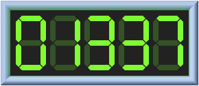
Relive your youth with this straight-outta-geocities hit counter. If you have a page on the Information SuperHighway, slap this bad boy on it and impress all your friends.
- 💾 Retro 90s aesthetic
- ⚙️ Highly customizable
- 🔲 Includes optional skeumorphic border, and soft glow.
- 🔨 Generated on-the-fly with SVG and Canvas. No images, totally scalable.
- ⚡️ Tiny! <3kb gzip.
Easily the best React counter you'll find anywhere on Altavista.
Yes! It's a real thing.
» Try the demo! 🎉
No. This is just a presentational component, you need your own tracking system.
I recommend micro-analytics. Super easy to set up and use.
Compatible with React 15.3 or higher.
Works on all major browsers, including Edge. Haven't tested on IE.
$ yarn install react-retro-hit-counter
# or
$ npm i -s react-retro-hit-counterimport RetroHitCounter from 'react-retro-hit-counter';
const YourComponent = () => (
<RetroHitCounter
hits={1337}
/* The following are all default values: */
withBorder={true}
withGlow={false}
minLength={4}
size={40}
padding={4}
digitSpacing={3}
segmentThickness={4}
segmentSpacing={0.5}
segmentActiveColor="#76FF03"
segmentInactiveColor="#315324"
backgroundColor="#222222"
borderThickness={7}
glowStrength={0.5}
/>
);| Type: | Default Value |
|---|---|
number |
undefined |
The number of hits to display!
Protip: You can cheat, I won't tell!
hits={actualNumber * 100}
| Type: | Default Value |
|---|---|
number |
4 |
Single-digit hit counters are sad. Start-pad the number with 0s.

| Type: | Default Value |
|---|---|
number |
40 |
The height, in pixels, of each digit. Not including padding.

| Type: | Default Value |
|---|---|
number |
4 |
The padding, in pixels, around the hit counter.

| Type: | Default Value |
|---|---|
number |
3 |
The amount of space, in pixels, between each digit.

| Type: | Default Value |
|---|---|
number |
4 |
The width of each segment, in pixels.

You can make really abstract numbers with this prop! I've decided that this is a feature, not a bug.
| Type: | Default Value |
|---|---|
number |
0.5 |
Spacing between the segments, in pixels.

| Type: | Default Value |
|---|---|
string |
#76FF03 |
Each digit is comprised of 7 segments, and this prop controls the color of the active ones (AKA the number itself).

| Type: | Default Value |
|---|---|
string |
#315324 |
Controls the color of the inactive segments. Pass "transparent" to not show the inactive ones.

| Type: | Default Value |
|---|---|
string |
#222222 |
Set a custom background color for your hit counter. Accepts any valid CSS value (pass "transparent" for no background).

| Type: | Default Value |
|---|---|
boolean |
true |
No 90s hit counter would be complete without a skeumorphic chrome border!

Protip: You can use the border on your own if you like, it's a named export.
import {RetroBorder} from 'react-retro-hit-counter'. You'll need to provide an explicit width/height, though (the border is made in Canvas, and I didn't want the cost of reading width/height from the DOM).You can find its props here
| Type: | Default Value |
|---|---|
number |
7 |
Width, in pixels, of the border. Only used if withBorder is set to true.

| Type: | Default Value |
|---|---|
boolean |
false |
If desired, a soft glow can be emitted from the hit counter. This works especially well with the border.
The color of the glow is based on segmentActiveColor.

| Type: | Default Value |
|---|---|
number |
2 |
The size of the glow. This parameter controls both the negative margin, in pixels, as well as the blur amount (also in pixels). Only used if withGlow is set to true.

| Type: | Default Value |
|---|---|
number |
0.4 |
The opacity of the glow. Only used if withGlow is set to true.

Wanna help bring that 90s aesthetic back to the web?
There are a few things I'd like to do, and could use a hand with:
-
#1 - The segments are all the same shape. This can be harmful to legibility; ideally, you want the outer pieces to be trapezoids. See an example.
-
#2 - a11y: unclear if the best approach is to use aria tags, or just add actual zero-opacity text like "Hit counter. Number: n" that screen-readers can recite.
-
#3 - Tests! I have very few tests, none on the component itself. This should change.
-
#4 - Build process could use some work, specifically making it easier to work on the demo.
-
Additional flourishes. Transitions right now are just a simple CSS transition, and they're the only animation. Possibly this is good enough and anything else would just be fluff... but I'm curious if we can do anything else to make it more interesting?
To set up locally, simply clone and run yarn or npm i. Then, run yarn storybook to get an interactive sandbox. Add stories as needed to test the contribution.
There's also a demo app, which offers far greater parameter control. You can cd into /demo, run yarn to install the demo dependencies, and then yarn start to run the demo. From the parent directory, whenever you yarn build, it updates the demo dependency.


 React
React
 Typescript
 Django
 Laravel
 Facebook
 Microsoft
 Google
 Alibaba
 D3
D3
 Tencent