
This website project is to profile a business offering mindfulness classes for children. The site features a consistent presentation of key information related to mindfulness for children as well as video and audio so that activities can be experienced. Call to action buttons are visible consistently, with the aim of ensuring people can easily sign up to classes when they are ready. An important point to note is that whilst most B2C sites experience impulse buying, user research indicates that when purchasing services for children's mental and spiritual health, many people wish to establish trust and check reputation before making a purchase for their children. This is addressed with a look that feels professional, informative whilst still being calm and soothing. The primary goal of the site is to encourage users to subscribe / book classes.
- Increase customer subscriber numbers
- Develop business reputation - establish expertise and trust
- Understand benefits of mindfulness
- Be certain I can trust this business
- When what's happening and when
- Ask a question
- Sign up
- User 1: Customer who made a decision
- As a user, I want to sign up so that I am on the waiting list
- User 2: Parent of child, potential customer
- As a user, I want to find out the benefits of mindulness for children so that I can make a decision
- As a user, I want to feel confident that mindfulness is safe and also works so that I can make a decision
- As a user, I want to find out about the teacher, so I am convinced they are an expert I can trust
- As a user, I want to find out when classes happen so that I can make a decision
- As a user, I want to find out where classes happen so that I can plan my journey easily
- As a user, I want to find out how much classes cost so that I can decide if I can afford it
- As a user, I want to find out how to pay so that I can decide whether to pay in advance or on the day
- I want to ask a question by email about mindfulness for kids so that I can decide whether this is for me
- User 3: Loyal customer, happy to share or refer business
- As a user, I want to share information with my family and friends so that they can bring their children along too
- User 4: Child, potential attendee of mindfulness classes
- I want to know if the classes are fun and exciting so that I can make a decision
Planning was completed using a spreadsheet, based in Google Drive. This can be accessed here
View in this repository
View on Google Drive
Each page features an identical navbar. The bar is fully responsive, collapsing on medium screens and below. It includes a call to action button which is always visible. The call to action button links to an id property on the Classes page. This has the affect of displaying the contact form which is the primary goal whilst still giving the user a peek at the key information about classes which is also a key business aim.
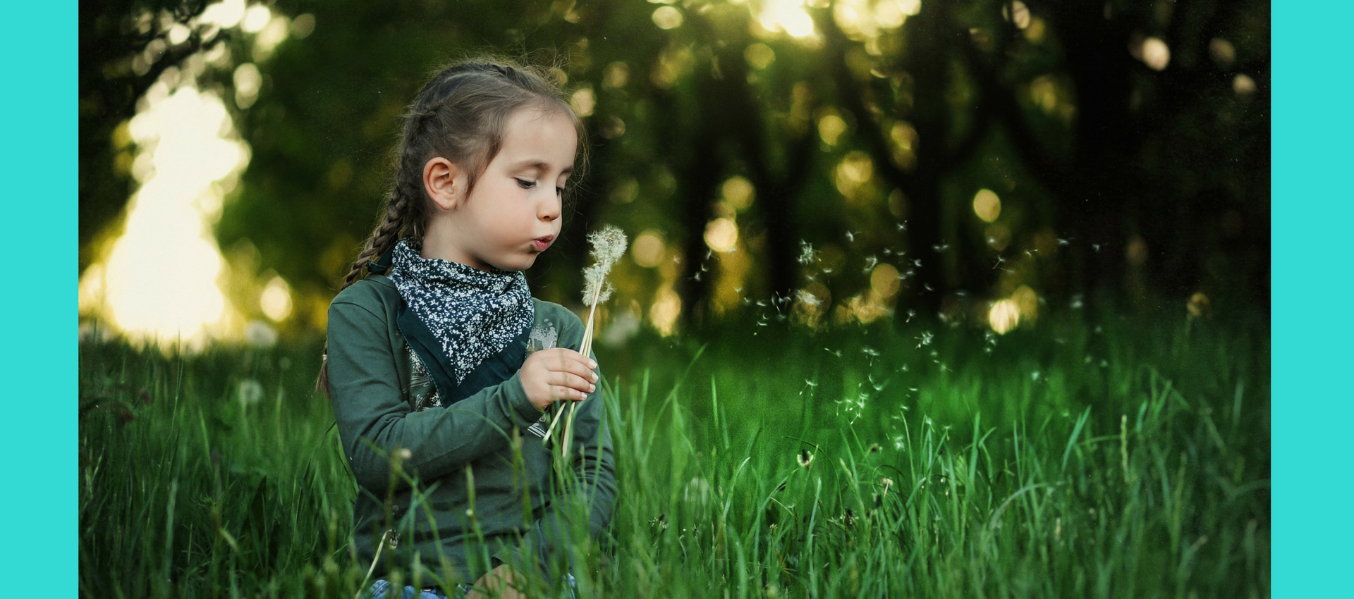
Each active page is underlined in the navbar to create a reassuring navigation experience for the user. Each page has an identical footer which includes the opportunity to sign up for a newsletter, and social media buttons which link to the Facebook and Twitter (these would be linked to business social media profiles if the site was to be deployed.) Hero images are used throughout the site to grab attention and promote a positive emotional response, and also to communicate the nature of the service offered (mindfulness classes for children.)
A calm colour scheme is used throughout the site. A colour scheme was generated from the landing page hero image and then tints and tones were selected for the final colour scheme. Fonts were selected with a professional feel rather than childlike fonts, which were considered.
The Home Page features a hero image beneath heading text and a call to action button. Content peeking is used to indicate there is more to read. Key information to address user stories is then presented in a way which draws the reader down the page. Each section of compelling copy is accompanied by a button, to allow the reader to read more. Copy is presented bellow, to the right or the left of the appropriate image on larger screens to create interest and also establish and reinforce the visual concept of the rule of thirds which is established in the header area, and is used throughout the site.
On small screen sizes, the compelling copy appears over the background images in a translucent box, still allowing the user to read it whilst introducing the ideally of the calming activities which the business offers. The 'Benefits of Mindfulness' compelling copy section is reduced to two sections of content on medium screens and then to one on small screens. This is to reduce visual clutter and minimise the amount of scrolling required on small screens. As each section of this copy has equal semantic value, reducing the quantity displayed does not detract from the user experience.
The page has a header and footer which are identical to the rest of the website, with a line beneath the active page in the header to provide reassurance and aid navigation.
The compelling copy on this page follows the rule of thirds established on the Home Page. Hero Images are used to elicit a positive emotional response. The page is completed with a video to explain more and encourage the user to reduce bounce rate. The video would also be more accessible to children who might have less reading ability than adults but are still have a significant user story. Children spend a significant amount of time watching video online, and so video was used to engage this user. A plain background was introduced behind the video to reduce visual clutter and encourage the user to focus on the video.
The page has a header and footer which are identical to the rest of the website, with a line beneath the active page in the header to provide reassurance and aid navigation.
The by now familiar rule of thirds is used again to develop familiarity and consistency. Once the compelling copy has been read, the download research link is introduced. This opens in a new tab so that the user does not leave then main site and is not forced to use the back button to return to the main page. The detailed research will further establish trust and reassurance for User 2, but to include this level of detail on the site itself would be offputting and go go against the simplicity introduced on the Home Page and reflected throughout the site.
The page has a header and footer which are identical to the rest of the website, with a line beneath the active page in the header to provide reassurance and aid navigation.
The page showcases a video to allow User 4 to experience mindfulness. Minimal text is used on this page as the page is primarily for children, who read less and are very familiar with watching video. A plain background was introduced behind the video to reduce visual clutter and encourage the user (a child) to focus on the video without becoming distraced.
The page has a header and footer which are identical to the rest of the website, with a line beneath the active page in the header to provide reassurance and aid navigation.
The page starts with a hero image to elicit a positive emotional response. Information about classes is broken in to three sections to make it easier to digest. Times of classes are displayed as a list for the same reason. Icons are used to break up the text and make the layout more visually accessible. The rule of thirds is used once more to present the information on larger screens.
The contact form is displayed without a photo background to reduce distractions and encourage the user to stay put and complete the form. The form includes a name, email address and message field along with a submit button. The text of the submit button displays the message 'Start Calming.' This reinforces the requirements of the user stories - they want to know mindfulness works and does indeed establish calm.
This page includes an id property to direct visitors to the form whilst still using content peeking to display some information about classes above the form when they visit this page.
The page has a header and footer which are identical to the rest of the website, with a line beneath the active page in the header to provide reassurance and aid navigation.
The page starts with a hero image to elicit a positive emotional response. This image shows the coach with a baby to establish trust and their suitability as a person to work with children.
The rule of thirds, established on the home page, is used once again to provide visual familiarity and consistency on larger screens. Qualifications are displayed as a list along with icons to communicate visually with the user. A quote is included to remind the user that the coach is a real person, and someone who can be trusted.
- HTML and CSS programming languages
- Bootstrap
- Font Awesome
- Flex as implemented through Bootstrap 4
- Cloud9 IDE for development of this site. GIT was used to push files to Github
- jQuery was loaded by Bootstrap in order to implement the collapsable navbar
- Popper.js was loaded by Bootstrap in order to implement the collapsable navbar
- Git
- To validate html https://validator.w3.org/
- To validate css https://jigsaw.w3.org/css-validator/
- To convert hex codes to rgba: https://www.rapidtables.com/convert/color/hex-to-rgb.html
- To create colour pallette from image: http://www.palettefx.com/
- To find tints and tones of a specific colour: https://coolors.co/
- To pick colours from image when building colour scheme: https://imagecolorpicker.com/
- To invert colours of images and add transparency: https://www.online-image-editor.com/
- To create custom favicon https://www.favicon-generator.org/
- Photography - This would ideally all be from the same shoot, with a wider range of photos and more different images eg on the benefits and the facts pages. Images would also be more precise eg. to signify trust and reassurance. Images would be larger (some images have become stretched eg payingattention.jpg).
- Use javascript to ensure images are not loaded at all on mobile view
- Audit site for accessibility to screen readers and implement improvements
- Add button in footer to navigate straight to top of website
- Improve form to create a full booking form - dates of classes required, number of places, safeguarding waiver etc.
- Add further content detailing exactly what happens in a session
- Add a video library of testimonials and short clips of sessions
- Add button to aid navigation from footer to top of index.html
- Add EU Cookie Warning and add Google Analytics pixel code to track visitors
- Improve the experience for User 3 by adding social share buttons so that compelling copy can be shared easily with friends.
- Add free mindfulness activities content either as video or as downloadable pdfs. This would further establish the expertise and reputation of the business owner and also suggest generosity - a key component of an attitude of mindfulness.
The following testing protocols were followed for each page on desktop, mobile, tablet and smart TV devices.
- Navigation Bar
- Verify that each link is correctly hyperlinked to the appropriate page. During testing, the brand text was found to be incorrectly linked.
- Verify that the menu item visited is signified as the active page.
- Hover over and off the button in the menu to ensure hover behaviour is as expected.
- Change the width of the browser to ensure the navbar collapses when expected.
- Click on the navbar toggler icon to ensure the navbar menu opens as expected.
- Verify that the text on the collapsed menu is clearly readbable and does not interfere with page content.
- Hover over the brand text and verify the hover behaviour is as expected.
- Hover over each link and verify that the hover behaviour is as expected.
- Page content
- Resize the width of the browser and verify that the content resizes for different screen sizes as expected.
- Verify that any content that should be hidden on smaller screen sizes is hidden on those screens.
- Verify there is no overflow.
- Verify any video is responsive and plays when clicked.
- Verify any links to downloads or external sites open in a new tab.
- Verify that images cover the screen without interferring with text. During testing it was found that the hero image needed to be wider on extra large screens, so a separate image was loaded via a media query. The hero image was set to 95% viewport height for extra lareg screens.
- Footer
- Enter a correct email address in the text field and click the submit button.
- Enter an incorrect email address in the text field and verify this is validated when the submit button is clicked.
- Hover over the social media buttons and verify that they behave as expected. During testing, it was found that these buttons were not linked to social media profiles.
- During testing it was noticed that forms can be sent with no content, so the required property was added.
- Header
- Verify that the header is identical on every page.
-
Main content
-
Footer
- Verify that the footer is identical on every page.
- Misc
- Verify that the favicon has loaded.
This site is hosted on GitHub pages, and deployed from the master branch using the following method:
- Navigate to repository
- Click on the settings cog
- Scroll down to Github Pages section
- Select Source dropdown
- Select Master Branch
- Copy link provided
The deployed site will update automatically upon new commits to the this branch. In order for the site to deploy correctly on GitHub pages, the home page must be named index.html.
To run locally, you should clone the repository directly into the IDE of your choice as follows.
-
From this repository this repository click the green Clone or Download button.
-
OR Copy the following:
git clone https://github.com/jonburdon/calm-little-stars.git -
Paste the copied link into the terminal of your IDE. 👍
-
To cut ties with this GitHub repository, type
git remote rm origininto the terminal.
Use this Video Tutorial on how to clone a Github Repository or see GitHub help pages for more support.
- https://css-tricks.com/snippets/css/transparent-background-images/
- https://stackoverflow.com/questions/42586729/bootstrap-4-change-hamburger-toggler-color
To Inspect which fonts are used where on various websites: Chrome Extension ‘What Font’
Images from Google Images - These are not used with permission. This is a student project, for educational purposes only.
- https://static.thenounproject.com/png/754157-200.png
- http://www.athleta.net/wp-content/uploads/2016/01/Get-Outdoors_EJ-Drevno-Your-Mindful-Child.jpg
- http://www.athleta.net/wp-content/uploads/2016/01/Unplugging-_EJ-Drevno-Your-Mindful-Child-768x512.jpg
- http://www.athleta.net/wp-content/uploads/2016/01/Notice-the-Small-Things-1_EJ-Drevno-768x512.jpg
- https://cms-tc.pbskids.org/parents/expert-tips-and-advice/tips-for-helping-your-child-focus-and-concentrate-hero.jpg?mtime=20181008032811
- https://img1.wsimg.com/isteam/ip/beff053d-5e00-41d8-b149-a7dc4d96d52b/6ffbc48c-0f9b-48a8-bf2a-7614280c07f1.jpg/:/rs=w:1280
- https://eileenburns.co.uk/wp-content/uploads/2018/02/mindfulness-for-children.png
- https://i0.wp.com/www.michaelswerdloff.com/wp-content/uploads/2014/07/MEDITATION-FOR-KIDS.jpg?fit=1536%2C1024&ssl=1
- https://cms-tc.pbskids.org/parents/expert-tips-and-advice/pressing-pause-how-mindfulness-helps-kids-hero.jpg?mtime=20181008031829
- Icons made by Freepik from www.flaticon.com is licensed by CC 3.0 BY
- https://childmind.org/article/the-art-and-science-of-mindfulness/
- https://parentswithconfidence.com/mindfulness-with-kids/
- https://mindfulnessinschools.org/wp-content/uploads/2013/02/MiSP-Research-Summary-2012.pdf
This project is for educational purposes only and copyright permission has not been obtained for each image.

