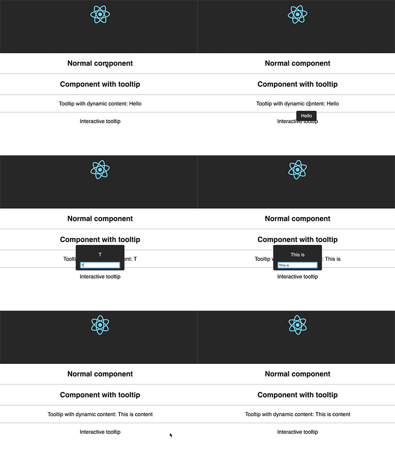
Tooltip for React,
Powered by tippy.js Popper.js
yarn add react-tippy
First, you need import css
import 'react-tippy/dist/tippy.css'There are 2 ways for you to use react Tippy
import {
  Tooltip,
} from 'react-tippy';


<Tooltip
  // options
  title="Welcome to React"
  position="bottom"
  trigger="click"
>
  <p>
    Click here to show popup
  </p>
</Tooltip>withTooltip(Component, options)
import {
  withTooltip,
} from 'react-tippy';


const Header = () => (
  <h2>Header here</h2>
);

const HeaderWithTootip = withTooltip(Header, {
  title: 'Welcome to React with tooltip',
});| Settingsettings | Defaultremove | Optionssettings_input_component | Rolebuild |
|---|---|---|---|
| position | 'top' | 'top' 'bottom' 'left' 'right' | Specifies which direction to position the tooltip on the element. |
| trigger | 'mouseenter focus' | 'mouseenter' 'focus' 'click' 'manual' | Specifies which type of events will trigger a tooltip to show. Separate each by a space. mouseenter is for hovering and touch on mobile, and focus is for keyboard navigation. Use manual if you want to show/hide the tooltip manually/programmatically (see below). |
| interactive | false | true false | Makes a tooltip interactive, i.e. will not close when the user hovers over or clicks on the tooltip. This lets you create a popover (similar to Bootstrap) when used in conjunction with a click trigger. |
| delay | 0 | Any integer >= 0 (milliseconds) | Specifies how long it takes after a trigger event is fired for a tooltip to show. |
| hideDelay | 0 | Any integer >= 0 (milliseconds) | Specifies how long it takes after a leave event is fired for a tooltip to hide. Not applicable when clicking on the document to hide tooltips. |
| animation | 'shift' | 'shift' 'perspective' 'fade' 'scale' 'none' | Specifies the type of transition animation a tooltip has. |
| arrow | false | true false | Adds an arrow pointing to the tooltipped element. Setting this to true disables animateFill. |
| animateFill | true | true false | Adds a material design-esque filling animation. This is disabled if you have arrow set to true. |
| duration | 400 | Any integer >= 0 (milliseconds) | Specifies how long the transition animation takes to complete when showing a tooltip. |
| hideDuration | duration | Any integer >= 0 (milliseconds) | Specifies how long the transition animation takes to complete when hiding a tooltip. |
| theme | 'dark' | 'dark' 'light' | The CSS styling theme. You can add your own easily. See Creating themes. |
| offset | 0 | Any number (pixels) | Offsets the tooltip on its opposite axis. For position top and bottom, it acts as offsetX. For position left and right, it acts as offsetY. |
| hideOnClick | true | true false | Specifies whether to hide a tooltip upon clicking its element after hovering over. |
| multiple | false | true false | Specifies whether to allow multiple tooltips open on the page (click trigger only). |
| followCursor | false | true false | Specifies whether to follow the user's mouse cursor (mouse devices only). |
| inertia | false | true false | Modifies the transition-timing-function with a cubic bezier to create a "slingshot" intertial effect. |
| popperOptions | {} | Object | Allows more control over tooltip positioning and behavior. See right below. |
| id | null | It is template id | Just only use when you want to add HTML to a tooltip. |
| content | null | react element | Tooltip content. If you don't define content, the title will be used |
You need to pass option id and content
import {
  withTooltip,
} from 'react-tippy';


<Tooltip
  id="my-template-id"
  content={(
    <div>
      <strong>
        Troi oi
      </strong>
    </div>
  )}
>
  // ...
</Tooltip>MIT. Also check Popper.js' license.

