Coder Social home page Coder Social logo

esri / calcite-ui-icons Goto Github PK

View Code? Open in Web Editor NEW
60.0 19.0 18.0 19.41 MB

A collection of UI icons built by Esri for applications.

Home Page: https://developers.arcgis.com/calcite-design-system/icons/?library=Calcite%20UI

License: Other

JavaScript 99.96% Shell 0.04%

calcite-ui-icons's Introduction

calcite-ui-icons

A collection of UI SVG icons created by Esri for mapping applications. https://esri.github.io/calcite-ui-icons/

Installation

npm install @esri/calcite-ui-icons --save

Description

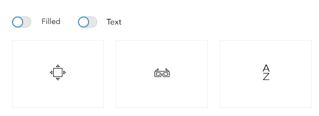
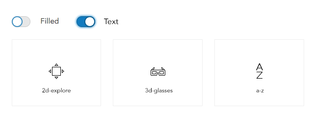
Icons use an outlined style. Some icons include an additional filled version.

Every concept has 3 sizes:

  • 16x16
  • 24x24
  • 32x32

Why 3 Sizes?

More info on what happens when you scale vector based icons here

Outline icons are the standard

Outline icons have the default name. For example, trash-16.svg will render the default outline icon.

Some icons have alternative states for toggling or greater flexibility. For those icons, appending -f (information-16-f.svg) will render the filled version.

Web Component

For web apps, the easiest way to use calcite-ui-icons is with calcite-components. The calcite-icon component will handle fetching and rendering any icon from this set with the following api:

<calcite-icon icon="arrowLeft" scale="m"></calcite-icon>

Sprite packages

Furthermore, sprites are available in 3 packages and live outside the icons/ directory:

  • sprite-16.svg
  • sprite-24.svg
  • sprite-32.svg

Alternative filled versions of the outlined icons have -f appended to their name, and are included in the sprites above.

Icons in the sprite have an id of the individual SVG file name.

JavaScript Exports

The icons are also made available as named ES6 exports. This way you can import just the icons you need into your app:

import { arrowLeft16 } from "@esri/calcite-ui-icons";

console.log(arrowLeft16); // => "M16 6v3H5.035l5 5H6.5L0 7.5 6.5 1h3.536l-5 5z"

The icon names will be lower camel case. If the icon name starts with a number (ex. 2d-explore, 3d-glasses) prefix the name with i. This is due to the fact that JavaScript variables cannot begin with a number. If the icon is a filled alternate, it will have F at the end of the variable name.

If your build system does not perform tree shaking and dead code removal, there is a chance that importing the icons using this syntax will make your bundle extremely large. If that is the case, you can also import icons directly:

import { lock16F } from "@esri/calcite-ui-icons/js/lock16F.js";

Some icons use multiple paths and opacity in their construction, for these the data structure will be as follows:

import { imageLayer16 } from "@esri/calcite-ui-icons/js/imageLayer16.js";

console.log(imageLayer16) // => [{ path: "M16 6v3H5.035l5 5H6.5L0 7.5 6.5 1h3.536l-5 5z", opacity: .4 }, ...]

Note: It is not recommended to import the entire library of icons. This will have negative performance implications. Use the technique above to select only the icons your users actually need to download.

TypeScript

Types are also available for projects leveraging TypeScript. CalciteIconPath describes all exported icons (both single and multipath) while CalciteMultiPathEntry describes an individual path from a multipath icon.

JSON Format

All icons are also provided as part of a JSON file. If you installed via npm, you can import the full icon data set using the following:

var calciteIcons = require('@esri/calcite-ui-icons/docs/icons.json');

This will give you an object containing all the icons in the library at all sizes:

{
  version: '{current version number}',
  icons: {
    blog: {
      alias: ['social'],
      category: 'Social-Media',
      16:['M15.541...'],
      24:['M23.756...'],
      32:['M31.618...']
    },
    "image-layer": {
      alias:[ "raster", ...],
      category:"GIS",
      multiPath: true,
      16:[{ path: "M16...", opacity: .4 }, ...],
      24:[{ path: "M127...", opacity: .4 }, ...],
      32:[{ path: "M112...", opacity: .4 }, ...]
    },
    ...
  }
}

Note: path data omitted for brevity.

Most icons will have simple strings as path data, but some will be more complex as they need to store not only path, but opacity as well for multiple shapes. Icons of this structure will be anotated with the multiPath flag.

Individual icons structure

All the individual SVG icons have a common file structure.

This is what the close-16.svg looks like:

<svg xmlns="http://www.w3.org/2000/svg" viewBox="0 0 16 16">
  <path d="M0 10V7h10.965l-5-5H9.5L16 8.5 9.5 15H5.964l5-5H0z"/>
</svg>

None of the icons have stroke attributes. The fill attribute can be defined with css:

svg {
  fill: gray;
}

All the other styling properties applicable to the whole svg element are applicable.

svg:hover {
  fill: blue;
}

Build PNG icons for mobile and desktop

For convenient use in iOS & desktop application projects, you can convert all icons to PNG.

First, run npm install:

npm install

Then:

  • To create Xcode image sets (for use with iOS, macOS, iPadOS) with a default size:

    npm run convert-all-ios
  • To create Xcode image sets with a specified size (e.g. 44x44):

    npm run convert-all-ios:size 44
  • To create versions for use on desktop in one size:

    npm run convert-all-desktop:size 64
  • To create versions for use on desktop in sizes ranging from 16 to 64, run:

    npm run convert-all-desktop-multi

Licensing

COPYRIGHT © 2020 Esri

All rights reserved under the copyright laws of the United States and applicable international laws, treaties, and conventions.

This material is licensed for use under the Esri Master License Agreement (MLA), and is bound by the terms of that agreement. You may redistribute and use this code without modification, provided you adhere to the terms of the MLA and include this copyright notice.

See use restrictions at http://www.esri.com/legal/pdfs/mla_e204_e300/english

For additional information, contact: Environmental Systems Research Institute, Inc. Attn: Contracts and Legal Services Department 380 New York Street Redlands, California, USA 92373 USA

email: [email protected]

Contributing

Please read the contribute document.

calcite-ui-icons's People

Contributors

allieorth avatar aphilobos avatar arowles avatar benelan avatar esreli avatar fy1900 avatar gavinr avatar gpbmike avatar grecordova avatar jcfranco avatar jorgegutierrez2019 avatar kellybrownlee avatar macandcheese avatar ncastle1 avatar nicklu10 avatar paulcpederson avatar sfrizzell avatar skyeseitz avatar

Stargazers

 avatar  avatar  avatar  avatar  avatar  avatar  avatar  avatar  avatar  avatar  avatar  avatar  avatar  avatar  avatar  avatar  avatar  avatar  avatar  avatar  avatar  avatar  avatar  avatar  avatar  avatar  avatar  avatar  avatar  avatar  avatar  avatar  avatar  avatar  avatar  avatar  avatar  avatar  avatar  avatar  avatar  avatar  avatar  avatar  avatar  avatar  avatar  avatar  avatar  avatar  avatar  avatar  avatar  avatar  avatar  avatar  avatar  avatar  avatar  avatar

Watchers

 avatar  avatar  avatar  avatar  avatar  avatar  avatar  avatar  avatar  avatar  avatar  avatar  avatar  avatar  avatar  avatar  avatar  avatar  avatar

calcite-ui-icons's Issues

Request : Date icon

We currently have a calendar icon. While this can represent things like a date picker interface, it would also be good to have slightly smaller and simpler icon for "date".

In a lot of cases, we are asking the user to "pick a date" as opposed to "open a calendar". Sometimes, we also need a way to indicate that something "is a date" or "is of type date", e.g. when showing a list of attributes from a data table.

So a "date" icon might like look like the one on the right:
Screen Shot 2019-08-21 at 8 09 37 AM

Here's an example of where the date icon would be used:
image

In this case, the user is setting the formatting for this date attribute.

Here's what it looks like with the calendar icon:
image

Please ignore the # icons. That'll be a different issue. :)

Tablet, Desktop, Rotate

To pair with the mobile icon, it would be great to additionally have:

  • Tablet
  • Desktop
  • Rotate

Example from another icon set:

screenshot 2018-08-24 18 25 43

Thanks!

update magnifying-glass to remove the handle detail

@johnmgriffith @julio8a

Hey guys,

It would be nice to get that chunky handle removed off of magnifying-glass.

Currently on esri.com global nav we are using the icon font style that is simplified.

There's a few other designers that think that detail is unnecessary, can we make it happen?

comparison

Update Tags and Release Number on Reference Page

The current version of the calcite-ui-icons reference page doesn't have all the correct related tags for the icons, related to 1.1.3

• Reference page should display "1.1.3" instead of "1.1.2"

• Each icon should be be searchable by its category, (e.g. when searching "arrows", all the icons with the category "arrows" are filtered).

• All icons should have the most up to date tags from the latest application.js file:
application.js.zip

"mixed state" Eye

We previously had three states for the icon:
"visible" | "mixed" | "hidden"

something like this.

image

Can we bring back the mixed state?
One use case for this is this:

Layer is set to visible but because of the current scale of the map, its symbols are hidden.

A layer may be configured to only show at specific map scales because its symbology only works correctly at those scales.

@KatelynSeitz @johnmgriffith @sfrizzell @driskull

Collections - 24px icon alignment

image

Would it be optically problematic to have the upper right part of collection-24.svg at the same place as it is in collection-24-f.svg?
image

Additional Satellite icons needed

Its going to be easier on our developers if we have several versions of this versus trying to manipulate it through CSS.

The current icon would still be used, but ones with only two signal bars, one signal bar, and no signal bars are needed. See example below.

screen shot 2018-09-10 at 1 06 50 pm

caret-16 seems too large for most contexts

The caret icon seems too large. Would it be possible to resize it similarly to the chevron-16 icon?

Here is a screenshot of our in progress UI with annotations. Please disregard the weird placeholder images.
image

Icon Requests: Projects and Plans

Hey Icon guys,

We’re building ArcGIS Urban and have two icon requests:

  1. A bulldozer - to represent urban planning projects
  2. A zoning/parcel icon - to represents plans

Currently we are using:
screenshot 2019-01-23 at 10 49 00

How do we go about getting something like these made available in the Calcite UI icon set?
Thanks

Clicking "X" goes up to top

Clicking the "X" to close a dialogue box causes the page to scroll back to the top. It'd be best if it could just stay where it was.

Undo, redo, reset

Add undo and redo arrows.
We currently have the reset icon.

image

Not sure if this overlaps too much with what "undo" and "redo" concepts would look like.

Request for a Grab Icon (hand) that matches to the CSS cursor: grab

We've a requirement in our project to use Grab icon while performing Pan action in UI. I could locate 'Move' icon and 2dExplore but that is not what we want to use while panning.

Request is to have an icon should be similar to the one that can be seen in CSS cursor: grab;

grab

Request : "what's new" or "new thing"

We could use a "what's new" or "updates" icon.
In the new map viewer, we will have an interface that informs users what our upcoming capabilities are.

Something like this
image

@paulcpederson @KatelynSeitz

Taken from YouTube Studio beta.

Vertical 'ellipsis'/'handle'

In the previous icon set there were two 'handle' icons:

  • handle-horizontal
  • handle-vertical

screenshot 2018-08-27 10 14 57

In the new set, it appears these handles have been changed in favor of the ellipsis icon. Would it be possible to have a vertical ellipsis icon as well?

Calculator Icon

Hey there.
We are currently using a calculator icon in places.
Would it make sense to add this concept to the library?

image

image

Add watcher for rebuilding icons.json when files are added/change

Currently, after changing or adding icons, the build step must be run by hand. Would be good to run a file watcher to automatically rebuild the json file when updates happen, so that in-progress work can be previewed quickly.

Could be run in parallel with the server for a one-stop script for development.

Icon Request - Clipboard Check

There's currently a copy-to-clipboard icon available, but it would help to also have a "copied-to-clipboard" or "clipboard-check" icon to show the success state of having copied something.

A couple examples of copy components that would be improved with this icon:
https://calcite-react.netlify.com/copy-to-clipboard
screen shot 2019-01-04 at 11 15 49 am
screen shot 2019-01-04 at 11 15 56 am

https://developers.arcgis.com/dashboard
screen shot 2019-01-04 at 11 16 21 am
screen shot 2019-01-04 at 11 16 27 am

Thinking along these lines:
screen shot 2019-01-04 at 11 28 29 am

Let me know if there's a better place to make icon requests or if this is already planned...

Icons as a font

Hi

Could the calcite icons be made available as a TrueType font? This would be very usefully for rendering the fonts in an app and taking advantage of the font rendering environment.

Request : Datatype icons

[edited]
We would like icons for a few of the datatypes:

  • Date (already happening #75)
  • String
    • some are using the description icon for this
  • The abc icon is English specific. Is that OK?
  • Number
    • I tried using the # symbol for this, and that seemed to make sense, but yeah...
  • Integer
    • Some are using the SUM symbol for this but that seems weird.
    • According to wikipedia the symbol for integer is the Zahlen.
  • Boolean
    • We don't really have this type in our system (that I know of), but enhancements will allow for a datatype that is semantically a boolean.

I understand that these icons may already exist in a different style, so if we can leverage any prior concept approvals, cool!

@johnmgriffith @KatelynSeitz @paulcpederson

Add text underneath icons in reference page.

I think this could be a toggle function to display or hide text underneath the icons. Like in issue #14, the toggle could be located next to the "Filled" toggle on the header.

From this:
image

to this:
image

Average symbol

Do you already have an SVG for this concept:
xAvg

It is currently used to indicate the average in a histogram. In this case 👇 , we are looking at it in the vertical smart mapping histogram slider, but it may also show up in a horizontal histogram...dunno if that matters.
Screen Shot 2019-03-14 at 3 49 33 PM

@johnmgriffith @KatelynSeitz @mitc7862

How to use compass icons?

With the new addition of compass-needle, it's becoming a little more vague how and when we should use the different compass icons.

List is as follows:
• compass
• compass-needle
• compass-north
• compass-north-circle

image
image

My suggestion is that these icons: image are better for when indicating current location or direction facing.
The north image and needle image icons are better for indicating orientation of the map. But the real question is when and how to use these? Feel free to share your thoughts.

Quick note about rotating:
Some of these assets are better for rotating than others. compass and compass-needle align perfectly in the center of the artboard, so they can be easily rotated. But the compass-north… icons are slightly off center so that the point of the compass can land perfectly on a sharp pixel.

General: Sizing alignment with rectangular icons.

Hai.

So, sometimes icons that are generally rectangular are the full width or height of their containers and sometimes they've got some padding. While I understand how this can result from the requirements of some of the shapes, it can sometimes look weird in interfaces.

image
Showing a few 24 icons.

Any thoughts?

Compass icon.

Currently, we have compass, compass-north, and compass-north-circle.

Previously we had this guy:
image
A sort of 2-point compass rose.

This icon is being used in a widget and acts as an interface element that rotates as a map is being rotated.

image

It would be good to add this to the library as it is distinct from "tracking" or "device orientation" which the current compass icons seem closer to...?

@driskull

Circle Filled - it's ok to fill the circle.

Hey there. Seems like it's all right to fill the circle in this icon.
image

The hashes do follow the single-line approach, but seems like we can probably vary from that a little here.

Drag and drop icon

We could us an icon specifically for drag interactions.

Something like the double vertical handle here
image

Update alignment: centered

In the discussions for centering vs. pixel perfect, the short term solutions will be to tackle the most used icons for now. arrow(s), chevron(s) & spinner.

  1. Should bump up the right arrow 1px as it would still be aligned to the pixel grid in that position.
  2. Alter the chevron glyphs so they are vertically centered. The top and bottom edge may need to be altered to align to the grid
  3. Center the spinner inside its artboard.

More information and discussion on the repo issue:
#60

Icon request: destructive icon

For Calcite, we're working on a messaging pattern, which involves icons.

Messaging:

  • Information: circle with i (blue)
  • Success: checkmark (green)
  • Warning: a triangle with ! (yellow or orange (still needs work))
  • Destructive: stop sign with ! (red)

We have icons for Information, success, and warning.
However, we don't have the stop sign with !, based on our concept for messaging.

Request: We need a destructive icon (stop sign with !)

Relocate "filled" toggle to header

In the reference page, the "filled" toggle would be more useful up on the top header, so while browsing users can toggle between outlined and filled without having to scroll to the top.

So like this:

image

For 3.0 release

  • Remove the concept of fill and outline (documentation page too)
  • reference pages show all icons including a fill. Multi-path icons displayed in a new tab
  • Update readme to reflect changes

Please update or add anything I missed.

Enhancement : Speech bubble design update

The family of speech bubble icons seems a bit out of place next to the other icons.

In general, the icons nicely utilize straight lines and rectangular silhouettes. Would we be able to update the speech icons to match that look.

I am also thinking about new map viewer and that we'll have a "give feedback" button from the left menu bar, so having an icon that aligns visually would be cool.

Popup "designer" or "styler"

We currently have the "configure popup" icon.
image

This is a good one and has a technical feel befitting the current and legacy ways of exposing this to the user.

Our future map authoring app will have an experience that is more like "popup design", "popup style", or "popup layout".

Would we be able to make a similar icon to "configure" that is less technical and more about "styling" or "designing" a popup?

Thanks!

cc @johnmgriffith @KatelynSeitz

Make path data available as JSON for all icons

Allowing developers access to the raw path data of the SVGs could help people wire up their own tooling (gulp, grunt, webPack, etc). This could be as simple as a build process that ran before releases and generated a JSON file with the icons inside and added it to the dist folder. Something like:

{
  "version": "1.0.0",
  "icons": {
    "arrow": {
      "tags": [
        "next",
        "previous",
        "up",
        "down"
      ],
      "outline": {
        "16": [
          "M3 6.982h9.452L9.948 4.48l.707-.707L14.384 7.5l-3.729 3.729-.707-.707 2.54-2.54H3z"
        ],
        "24": [
          "M15.597 5.613l5.886 5.887-5.886 5.887-.707-.707L19.57 12H4v-1h15.57l-4.68-4.68z"
        ]
      },
      "fill": {
        "16": [
          "M3 6.982h9.452L9.948 4.48l.707-.707L14.384 7.5l-3.729 3.729-.707-.707 2.54-2.54H3z"
        ],
        "24": [
          "M15.597 5.613l5.886 5.887-5.886 5.887-.707-.707L19.57 12H4v-1h15.57l-4.68-4.68z"
        ]
      }
    }
  }
}

Path-level detail might be overkill. There is potential to just use the full SVG code as well:

{
  "version": "1.0.0",
  "icons": {
    "arrow": {
      "tags": [
        "next",
        "previous",
        "up",
        "down"
      ],
      "outline": {
        "16": "<svg xmlns='http://www.w3.org/2000/svg' id='arrow-outline-16' viewBox='0 0 16 16'><path d='M3 6.982h9.452L9.948 4.48l.707-.707L14.384 7.5l-3.729 3.729-.707-.707 2.54-2.54H3z'/></svg>",
        "24": "<svg xmlns='http://www.w3.org/2000/svg' id='arrow-outline-24' viewBox='0 0 24 24'><path d='M15.597 5.613l5.886 5.887-5.886 5.887-.707-.707L19.57 12H4v-1h15.57l-4.68-4.68z'/></svg>"
      },
      "fill": {
        "16": "<svg xmlns='http://www.w3.org/2000/svg' id='arrow-fill-16' viewBox='0 0 16 16'><path d='M3 6.982h9.452L9.948 4.48l.707-.707L14.384 7.5l-3.729 3.729-.707-.707 2.54-2.54H3z'/></svg>",
        "24": "<svg xmlns='http://www.w3.org/2000/svg' id='arrow-fill-24' viewBox='0 0 24 24'><path d='M15.597 5.613l5.886 5.887-5.886 5.887-.707-.707L19.57 12H4v-1h15.57l-4.68-4.68z'/></svg>"
      }
    },
    ...
  }
}

Symbol icon shapes have inconsistent paths

Some of the paths on the 32px filled shape icons are either off pixel or are inconsistent.

square-32-f and plus-square-32-f path is off pixel on top and left side.

check-square-f is inconsistent with the other square icons.

caret-square-…-f icons are inconsistent with the square-f icon.

Remove sprites/sprite generation

All of the sprite files are over 150kb now, making them too large to load in a performant way in the browser. I think we should remove the sprites so we're not encouraging poor performance practices.

Drop the Compass-north-circle icon

We have two compass icons, one called "compass-north-circle", and another called "compass-circle".
We had both because the circles were slightly different sizes, but I think altogether it's unnecessary to have both, so we are considering consolidating them into just "compass-circle". That way we have only one, centered asset.

So from this:
image

to this:
image

Would this cause any issues?

Recommend Projects

  • React photo React

    A declarative, efficient, and flexible JavaScript library for building user interfaces.

  • Vue.js photo Vue.js

    🖖 Vue.js is a progressive, incrementally-adoptable JavaScript framework for building UI on the web.

  • Typescript photo Typescript

    TypeScript is a superset of JavaScript that compiles to clean JavaScript output.

  • TensorFlow photo TensorFlow

    An Open Source Machine Learning Framework for Everyone

  • Django photo Django

    The Web framework for perfectionists with deadlines.

  • D3 photo D3

    Bring data to life with SVG, Canvas and HTML. 📊📈🎉

Recommend Topics

  • javascript

    JavaScript (JS) is a lightweight interpreted programming language with first-class functions.

  • web

    Some thing interesting about web. New door for the world.

  • server

    A server is a program made to process requests and deliver data to clients.

  • Machine learning

    Machine learning is a way of modeling and interpreting data that allows a piece of software to respond intelligently.

  • Game

    Some thing interesting about game, make everyone happy.

Recommend Org

  • Facebook photo Facebook

    We are working to build community through open source technology. NB: members must have two-factor auth.

  • Microsoft photo Microsoft

    Open source projects and samples from Microsoft.

  • Google photo Google

    Google ❤️ Open Source for everyone.

  • D3 photo D3

    Data-Driven Documents codes.