Coder Social home page Coder Social logo

efemkay / obsidian-modular-css-layout Goto Github PK

View Code? Open in Web Editor NEW
891.0 16.0 75.0 87.55 MB

CSS Layout hack for Obsidian.md

Home Page: https://efemkay.github.io/obsidian-modular-css-layout/

License: GNU General Public License v3.0

CSS 100.00%
css markdown

obsidian-modular-css-layout's Introduction

Modular CSS Layout for Obsidian

This is a repository for modular CSS layout hack for use with Obsidian.md. It's meant to complement/assist Community Theme, focusing solely on providing alternative layout to standard width and standard top-bottom block view.

I mainly do casual test on select popular themes like ITS, Primary, Shimmering Focus, Prism, and Minimal. Need your help to let me know if there's anything not working right. Do log in MCL GH Issue if you find anything not working properly.

Table of Content

Installation / Download and Enable

This is actually just a CSS code snippets collection. So it isn't an installation per se, but rather download and enable in Obsidian. The best way is to use Mara Li's Snippet Downloader plugin as I have plans to update this snippets from time to time

Wide Views

CSS snippet: MCL Wide Views.css

This section only briefly explains Wide Views snippet. Please go through the documentation site Wide Views - Modular CSS Layout for more details.

This snippet provides you the following features:

  • Full width page or blocks (dataview, table and backlinks) per page/note basis by specifying custom cssClass at the frontmatter (YAML)
    • wide-page
    • wide-dataview
    • wide-table
    • wide-callout
    • wide-backlinks
    • vault-wide toggle for each of the above
  • Narrow width page per page/note basis for vault with RLL disabled by specifying custom cssClass at the frontmatter (YAML)
    • narrow-page
  • Adjustable RLL (custom css class toggle) applicable to entire vault
    • Disabled by default. Enable it via Style Settings plugin

Tip

Thanks to Obsidian updated Electron base to V21, I have managed to avoid using Contextual Typography plugin to support wide blocks with the release of v0.9.6

Example

---
cssClass: wide-page
---

<the rest of your note>

Multi Column

CSS snippet: MCL Multi Column.css

This section only briefly explains Multi Column snippet. Please go through the documentation site Multi Column - Modular CSS Layout for more details.

This snippet provides you the following features:

  • Multi Column layout using Callout i.e. > [!multi-column]
  • List Column/Grid/Card layout using (Unordered) list by either (a) using tag, (b) using Markdown Attributes plugin, or (c) specifying in the frontmatter (YAML)
  • Float (Aside) Callout using callout metadata e.g. > [!info|right-medium]

Multi Column Callout

Multi Column Callout layout take advantage of Obsidian Callout - leveraging it as parent ‘div’ to house the sub callout (including Dataview results block). You can nest as many sub-callouts within it. The sub-callout will expand if [!multi-column] callout has extra space or overflow to next row if it doesn’t.

Example of Multi Column Callout

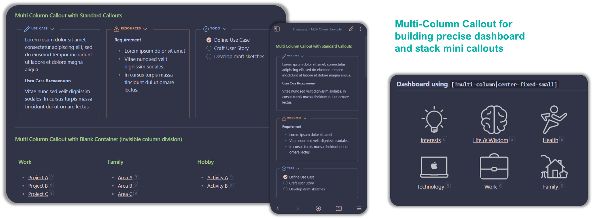
Example below is for the three callouts side-by-side in the picture above

> [!multi-column]
>
>> [!note]+ Use Case
>> Lorem ipsum dolor sit amet, consectetur adipiscing elit, sed do eiusmod tempor incididunt ut labore et dolore magna aliqua.
>> ##### User Case Background
>> Vitae nunc sed velit dignissim sodales. In cursus turpis massa tincidunt dui ut ornare lectus.
>
>> [!warning]+ Resources
>> #### Requirement
>> - Lorem ipsum dolor sit amet
>> - Vitae nunc sed velit dignissim sodales.
>> - In cursus turpis massa tincidunt dui ut ornare lectus.
>
>> [!todo]+
>> - [x] Define Use Case
>> - [ ] Craft User Story
>> - [ ] Develop draft sketches

note that when you insert callout within callout, the line separating the callouts should only use single angle bracket (">")

List Column/Grid/Card

This layout take advantage of markdown unordered list (i.e. - list item) to create multi column (and multi row for List Grid/Card) layout by matching with an identifier i.e. either #mcl tag, Markdown Attributes plugin syntax, or cssclass: key at frontmatter.

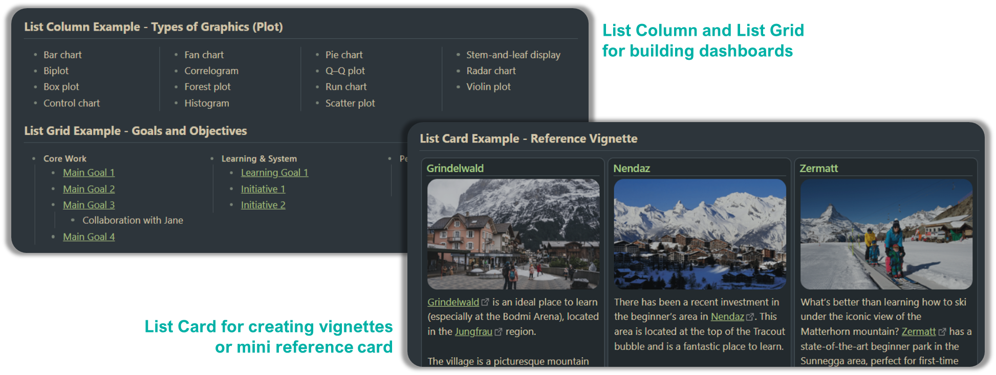
Here are quick reference on the syntax for List Column/Grid/Card

Type Using Tag MD Attr plugin Frontmatter
LCol #mcl/list-column two-column-list-block
three-column-list-block
four-column-list-block
multi-column-list-block
two-column-list
three-column-list
four-column-list
multi-column-list
LGrd #mcl/list-grid
#mcl/list-grid-wide
- two-column-grid-list
three-column-grid-list
LCrd #mcl/list-card
#mcl/list-card-wide
- -

Note: LCol = List Column // LGrd = List Grid // LCrd = List Card

Example of List Grid

Example below is for the "Goals and Objectives" in the picture above

## List Grid Example - Goals and Objectives

- #### Core Work #mcl/list-grid
    - [[00 Home|Main Goal 1]]
    - [[00 Home|Main Goal 2]]
    - [[00 Home|Main Goal 3]]
        - Collaboration with Jane
    - [[00 Home|Main Goal 4]]
- #### Learning & System
    - [[00 Home|Learning Goal 1]]
    - [[00 Home|Initiative 1]]
    - [[00 Home|Initiative 2]]
- #### Personal
    - [[00 Home|Personal Goal 1]]
    - [[00 Home|Personal Goal 2]]

Float Callout

Float Callout will allow you to position side note or info box either to the left or right of the main note with other content wrapping around it. It uses callout-metadata to specify which side to float to and the size of the callout

You can apply to any callout as the identifier is done on the callout-metadata i.e. after the | in [!<callout-type>|<callout-metadata>]. Table below gives some understanding of the syntax structure.

Apply in LP? Which Side? Preset FC Size Example
<empty>
float
left
right
small
medium
large
[!info|float-right-medium]
[!blank|right-small]

Gallery Cards

CSS snippet: MCL Gallery Cards.css

This section only briefly explains Gallery Cards snippet. Please go through the documentation site Gallery Cards - Modular CSS Layout for more details.

This snippet provides you the following features:

  • Image gallery using callout by specifying the callout-metadata gallery e.g. > [!NOTE|gallery]
  • Image gallery using YAML/frontmatter .cssClass: image-gallery
  • Float Image using image alt-text
  • Image and Mermaid Diagram Controls
    • Dimension control for images in bullet list
    • Image Zoom
    • Mermaid Scale and Zoom

Float Image

Float Image is similar to Float Callout but apply directly to the images (doesn’t require you to wrap it in a callout). Currently it uses image caption to identify how you want to float it, but in the future I intend to make it work with anchor tag # as well.

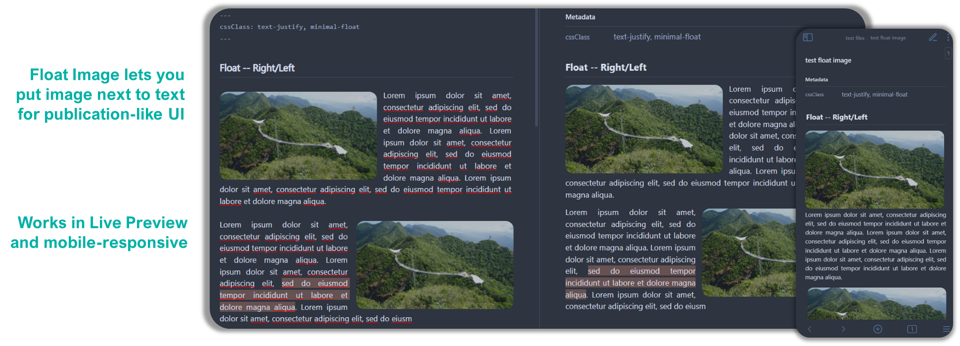
You can apply to any image as the identifier is done on the alt-text i.e. after the | in [[path/to/image.jpg|alt-text]] or the text inside [] in [alt-text](path/to/image.jpg). Table below gives some understanding of the syntax structure.

Apply in LP? Which Side? Preset FC Size Example
<empty>
float
left
right
small
medium
large
[[image.jpg|float-right-medium]]
[right-small](image.jpg)

Support Me

I do this on my free time for personal joy. However, a cup of coffee or two would motivate me further! If you like what I do, and want to contribute back, you can support me via Ko-fi

Buy Me a Coffee at ko-fi.com

obsidian-modular-css-layout's People

Contributors

doctordalek1963 avatar efemkay avatar laozipizhaikal avatar

Stargazers

 avatar  avatar  avatar  avatar  avatar  avatar  avatar  avatar  avatar  avatar  avatar  avatar  avatar  avatar  avatar  avatar  avatar  avatar  avatar  avatar  avatar  avatar  avatar  avatar  avatar  avatar  avatar  avatar  avatar  avatar  avatar  avatar  avatar  avatar  avatar  avatar  avatar  avatar  avatar  avatar  avatar  avatar  avatar  avatar  avatar  avatar  avatar  avatar  avatar  avatar  avatar  avatar  avatar  avatar  avatar  avatar  avatar  avatar  avatar  avatar  avatar  avatar  avatar  avatar  avatar  avatar  avatar  avatar  avatar  avatar  avatar  avatar  avatar  avatar  avatar  avatar  avatar  avatar  avatar  avatar  avatar  avatar  avatar  avatar  avatar  avatar  avatar  avatar  avatar  avatar  avatar  avatar  avatar  avatar  avatar  avatar  avatar  avatar  avatar  avatar

Watchers

 avatar  avatar  avatar  avatar  avatar  avatar  avatar  avatar  avatar  avatar  avatar  avatar  avatar  avatar  avatar  avatar

obsidian-modular-css-layout's Issues

Improve Export to PDF

Hey, just discovered your interesting multi-column snippet and I'm looking forward to using it more as it's something that I've been wanting for a while now. Tried Obsidian's Export to PDF feature with the snippet and I've found some issues:

Drop shadows on blank-container columns

First, there are some drop shadows underneath what seems to be the border of each column even though I'm using blank-container:

Screen Shot 2022-05-29 at 5 11 31 PM

Not sure if this was intentional. It might be intentional for non-blank-container stuff (e.g., with standard callouts) and other things I'm not considering, but it doesn't seem to fit with blank-container stuff.

Multi-column lists not working

Another problem I've found is that the <two|three|multi>-column-list, etc. aren't rendered in the exported PDF: instead of dividing the list in columns, it's the regular long top-bottom list. I'm using the frontmatter to enable this instead of using the Markdown Attributes plugin, and I've experienced frontmatter-enabled snippets to export properly in the past, so it seems that these css classes haven't been coded to support PDF-export yet.

No gap between standard callouts

image

As seen in the image, there's very little to no gap between the visible callouts, which can seem off. That said, I think adding the gap between these callouts might also increase the gap for blank-container callouts as well, which can also seem off or that users may prefer less gaps between the latter and more on the former—if that makes sense.

Conclusion

These are the issues I've found so far, there may or may not be more of them since I've only done a few testing; I'm sure you would do a better job at testing since you know the features more. I also haven't tried out your wide views and gallery cards snippets so I can't say much about them in terms of PDF-exports, but there might be issues there as well that you could consider dealing with.

Thanks so much for what you do, apologies if this was long and complain-y 😅 Keep up the good work!

Floating callouts doesn`t work properly on Minimal Theme

I switched on last version of css snippet called "MCL Multi Column.css". I also specified text-justify css class in the YAML metadata.

Firstly I tried to add blank-container callout in another callout and this way works properly:

image

Secondly I put same blank container callout in usual text, and it`s not "floating" paragraphs:

image
image

I noticed only one difference between these cases, second has div wrapper on obsidian level:

image

And this is first works:

image

I have suspicion to Minimal Theme, because on default theme it works nice. But disabling Minimal`s styles for .el-div doesn`t help.

My setup:
Obsidian v0.14.6

Live Preview float doesn't work in Minimal theme: width and margins not respected

Absolutely love this snippet, thanks so much for publishing it. I'm using it extensively for multiple columns and really hoping I can use it for infobox style callouts in Live Preview with Minimal.

Currently in Live Preview, with Minimal theme, float-right-small (or any size) doesn't quite work because 1: the width isn't respected (callout is full width) and 2: the callout sits on the far right of the view pane, out of line with the rest of the content:

Screenshot 2022-11-19 at 10 00 28 AM

The problem of right alignment only gets worse as the window gets wider.

Note: this is in a clean vault with only Minimal and Contextual Typography installed, on MacOS.

Here is the source for the above:
Screenshot 2022-11-19 at 10 15 33 AM

As exepected, things generally work with the default theme:
Screenshot 2022-11-19 at 10 04 40 AM

Also, if you use wide-page, everything works quite nicely with Minimal Theme in Live Preview, including respecting the size:

Screenshot 2022-11-19 at 10 10 39 AM

Apply a two column in dataview group by

I have a dataview query which returns a list of files grouped by tags. I want to apply a two-column-list-block or a three-column-list-block based on the group by tags such that each #TAG is a list with the files as its sublist. The query is on a note below a a H2 Header. Looks like this not possible. However I see that the dashboard++ script does this correctly.

Example:

Testing a List of Tags

LIST rows.file.link
FROM #TAGNAME
SORT file.ctime ASC
FLATTEN file.etags AS tags GROUP BY tags

Weird Callout on mobile (iOS)

Hi!

Thanks for the lovely CSS for building multi-column things in Obsidian. I genuinely like the approach and usage.

I stumbled across some weird behavior of the multi-column callouts on mobile. I only tried the IOS app, not the android one. Sometimes the callouts do not work (I tested it with the Default theme and the Minimal theme) but sometimes they do (on the Sanctum theme - my favorite, hurray!).

In the sanctum theme, however, something weird happens with callouts within the multi-column callouts. See this screenshot:
IMG_5722
The margins in the callouts seem off. My knowledge of css is very limited. Do you recon there is some way to fix it?

Kind regards and keep up the good work!

wide-dataview makes normal text wide as well in live-preview

Hi,

I found your wide-dataview to be exactly what I need, however I notice that it makes everything wide in live preview mode. Reading mode looks just fine, but live preview mode is where I spend the majority of my time.

Any ideas on how to fix this? I am currently using the everforest theme.

Live Preview:

Obsidian_2022-05-18_22-23-40

Reading:

Obsidian_2022-05-18_22-24-00

Showcase-Request

Hi efemkay,

I would really appreceate to see in your Showcases how the md-file looks like for the design which can be seen in "multi-column-showcase.png" in your screenshot folder.
Thx

FR: A way to make working with tables easier

I'm frequently using your snippets. Thanks for these.

I wonder if there is an easier way to work with tables apart from having to use the callouts?

Such as:

> [!multi-column]
>> [!blank-container]
>> | Item    | Desc                 |
>> | ------- | -------------------- |
>> | An Item | An item desccription |
>
>> [!blank-container]
>> | Item    | Desc                 |
>> | ------- | -------------------- |
>> | An Item | An item desccription |
>
>> [!blank-container]
>> | Item    | Desc                 |
>> | ------- | -------------------- |
>> | An Item | An item desccription |

It would not even be monospaced such as the snippet I pasted in, but that is not really the biggest issue

It comes to when you would like to edit the table using plugins such as Advanced Tables or Markdown Table Editor

It, basically, means that you have to remove the >> from the entire table and then place back once done

Thanks

Allow for wide [!multi-column] layout using an option

So I've been using MCC for some time now and I think this tiny feature would be immensely useful, since horizontal space is essential. What I was thinking was adding a modifier to the [!multi-column] callout with a modifier like |note-width that would make the MCC stretch horizontally to the same width as the note. I'm not sure if the readable length setting should be taken into consideration here but that's up to you.
Thanks for this awesome snippet! :D

No configuration available in Style Settings plugin for multi column CSS snippet

Style Settings Plugin Version: 0.4.10 (latest)
Obsidian Version: 0.14.6 (latest official)

The readme file states that

(can be change using Sytle Settings plugin).

I tried:

  • copying only the Multi Column CSS snippet into snippet folder of existing vault
  • copying all three CSS snippets into the snippet folder of a completely new vault
    In both cases, no configuration options showed up in Style Settings Plugin.

About the style of float

I like the float function , I often used it make note like the wiki effect

In v0.94, I accidentally discovered that float can be on the far right when "Readable line length is on"
This effect is great because it saves space,but this effect does not seem to have a good setting to control

Please see my screenshot, after I add "table format" at End, float can be on the far right, and delete "table format" is normal floaton the right
动画

I hope: Is it possible to add a setting like "float-far_right-small" to achieve such control? this is my little idea

expecting your reply~

Unable to Use Width-Control

Hi, I am not able to see or use the width-control setting. The code below did not have any differences after applying the width control. Please advise.

[!multi-column]

[!todo|wide-2]+ Overdue

not done
due before today
sort by due

[!todo|wide-4]+ Due Today

not done
due today
sort by due

[!todo|wide-2]+ Due Tomorrow

not done
due tomorrow
sort by due

Narrowing dataview blocks

Unsure if this is already possible and/or I am doing something wrong. I am trying to set up multiple columns with dataviews creating a list in each. However, the width of the dataview blocks make it so only two columns will display at most. And that's with both sidebars hidden. Any less space and it collapses into a single column. This seems to be a result of dataviews having a fixed width. Is there a way to override that for the page, so that their width is more responsive? I am using the Minimal theme.

Figures not at the middle

I'm using Obsidian 1.0.3

CSS version Version 0.6.3 (updated 2022-11-18)

setting by style settings

The figures are not in the middle after customising the line width

Hope any one has a solution

image

Bug: margins wrong when using blank line as divider instead of "blank" admonition

When using a blank line inside a "multi-column" admonition to split a new column, then there is virtually no margin between the columns.

Using

```ad-multi-column
Test 1 
Test 2
Test 3

Test 4
Test 5
```

looks like this.
image

While using "blank" as divider, columns look like this (which is what it should look like)

```ad-blank
Test 1 
Test 2
Test 3
```
```ad-blank
Test 4
Test 5
```

image

Both ways should look identical / consistent and behave like the second example (ad-blank) to fully use the page width.

Left-fixed visualized differently between preview and actual reading mode

Given

> [!multi-column|left-fixed]
> 
> > [!blank-container]+
> > 
> > ```button
> > name New Meeting
> > type note(undefined, split) template
> > action Meeting
> > ```
> 
> > [!blank-container]+
> > 
> > ```button
> > name New Mail
> > type note(undefined, split) template
> > action Mail
> > ```
> 
> 

it is displayed correctly within the preview:

yet seems to have malformed visualization in reading mode:

Updated from a version around 0.6. Was working fine back then.

BUG: After opening "wide", it will overlap with Banner

Your CSS snippets are very useful to me, I have achieved the idea of ​​building Homepage to a certain extent, thank you very much

But in the process of using, I found some problems, which are recorded as follows:

  1. Floating CSS seems to have no effect, some issues have been raised (I also use the mini theme)

  2. After using wide cssclass(page,dataview, table), in reading mode, the content will overlap with Banner (I use Banner plugin)

Can you see what the problem is?
@efemkay
Looking forward to the fix, this CSS snippet is really useful, thanks again~

image

Multi column list grid is broken with last update

The following snippet taken from documentation no longer works:

- #### Core Work #mcl/list-grid 
    - [[00 Home|Main Goal 1]]
    - [[00 Home|Main Goal 1]]
    - [[00 Home|Main Goal 1]]
        - Collaboration with Jane
    - [[00 Home|Main Goal 1]]
- #### Learning & System
    - [[00 Home|Learning Goal 1]]
    - [[00 Home|Initiative 1]]
    - [[00 Home|Initiative 2]]
- #### Personal
    - [[00 Home|Personal Goal 1]]
    - [[00 Home|Personal Goal 2]]

Current version

image

Previous version

image

Help with { .multi-column-list-block }

Hi! I use your modular CSS layout constantly. Wondering if you could assist with a configuration item. I do have the Markdown Attributes plugin installed and activated. When I add "two-column-list" as a CSS class in the frontmatter, all lists are two column, as expected. When I try to only have the "Active Projects" callout be two column, I can't get the changes to work. Am I misunderstanding how this is supposed to work, or maybe my syntax isn't correct? Thanks so much!

> [!multi-column]
>> [!INFO] Active Projects
>>```dataview 
>>LIST
>>FROM "300 Projects"
>>WHERE status="active"
>>SORT file.name ASC
>>```
{ .multi-column-list-block }
> 
>> [!CHECK] My tasks for today
>>```todoist
>>{
>>"name": "",
>>"filter": "(today | overdue)",
>>"sorting": ["date"]
>>}
>>```

Properties Panel break with update to 0.9.5 + above

Hey,
since I recently updated to the newest snippets files I noticed that the properties panel breaks with the minimal theme.
When I went back to 0.9.4 it still worked again, I also resisted my Style Settings before so that it could get from that.

PropertiesBreak_2023-10-12_08-34-48.mp4

FR: Multi column limit the max number of columns in the settings

It would be quite nice if there was a setting for the max number of columns in the [!multi-column]. The min width for callouts is quite nice, but the problem is that the layout can completely change depending on the current note width. Another possibility would be to allow to set the number of columns right next to [multi-column] with a modifier with pipe symbol.
Thanks again for the awesome plugin.

Using # headings as titles for the columns is not evenly distr

As the title says, when I use a callout as the type of the column, it works properly but if I use # Heading instead they're not evenly distributed among the page width:
image

> [!multi-column]
>
>> # Work
>> sadas
>
>> # Personal
>> your notes or lists here. using markdown formattingasdasdasdasd
>
>># Charity
>> your notes or lists here. using markdown formattingsadasdasd
>
>> # Test
>> dsadas
>> asdsad
> [!multi-column]
> 
>> [!note]+ Work
>> - your notes or lists here. using markdown formatting
>
>> [!warning]+ Personal
>> your notes or lists here. using markdown formatting
>
>> [!summary]+ Charity
>> your notes or lists here. using markdown formatting

Not working in Obsidian v0.14.5

I dropped the three CSS files into the [vault].obsidian\snippet folder, enabled the CSS snippets in Settings/CSS snippets, and ensured that Readable Line Length was off. I also add the 'Contextual Typography' plug-in. I copied the md example you had in your README.MD and it still displays three in a stack.

[!three-column]

[!note]+ Work
your notes or lists here. using markdown formatting

[!warning]+ Personal
your notes or lists here. using markdown formatting

[!summary]+ Charity
your notes or lists here. using markdown formatting

Multi-column in multi-column?

Just tried the snippet today and it's truly a godsend for customization! But as I playing around with how I could go about laying out my dashboard, it seems that I can't stack multi-columns.

A demonstrative callout

Just throw this in a new Obsidian note.

%%> [!multi-line}%% %%this ruins the layout%%
>> [!blank-container]
>>> [!multi-column]
>>>> [!manifest]- ### Manifest
>>>> test
>>>
>>>> [!tasklist]- ### Backlog
>>>> test
>>
>>> [!projects] ### Projects
>>> test

The Issue

I wanted to have this kind of layout:
image

And have this table to the left:
image

But when adding a multi-column callout inside another, it does this instead, and happens regardless of line width:
image

columns bullets misaligned post obsidian v1.1.9

obsidian v1.1.9, bullets for columns misaligned (initial note: due to how obsidian treat css columns and the new custom bullets. it's okay if using normal css li::marker bullet).

  • to figure out this is bug on obsidian side
    image

How to apply this globally?

I would like to know how to apply wide views across all the notes without specifying cssClass in every single one. Thanks!

Gallery Card broken on Obsidian Mobile

After version 0.9.4 the Gallery Cards snippet started to behave strangely on Obsidian Mobile. The snippet simply stopped working.

Obsidian Desktop (Expected behavior)

test1

Obsidian Mobile (Android)

Screenshot_20230825-183653_Obsidian_1

Multi-column broken with Minimal Theme

This is a multi-column by 3x3

Default Theme (Expected)

Default Theme

Minimal Theme (Bug?)

Minimal Theme

Not only does the layout change, the image is also "cropped" on the right.

All the themes I have tested act like the "Default Theme", it only happens with the Minimal Theme.

File Explorer Highlighting

when I toggle on the multi-callout snippet, when I hover over the file explorer on the left, it doesn't highlight the whole bar, it just highlights based on the title size.

mcl-multi-column.issue.mov

Remove blockquotes from dataview query columns

Greater than ">" is reserved for blockquotes, so whenever i create a callout with [!blank-container] to nest dataview queries, the result will be a blockquote in preview mode.

Of course i don't need blockquotes in preview mode, i just want to group dv queries and secondly i use a custom css to render blockquotes, so your callout isn't placed anymore at the center of my note and this gets even messier if i place 2 dataview callouts one next another

I didn't try yet, but your css should be able to render callouts without blockquotes in preview mode

Multi-Column not working in new Vault

My initial issue is that multi-column callouts dont seem to work as intended in my productive vault.
All testing was done with Live Preview (reading mode is kind of obsolete now).
I used the latest multi-column CSS snippet with Obsidian 0.14.6 (latest official version).

This callout block:

> [!multi-column]
> 
>> [!note]+ Work
>> your notes or lists here. using markdown formatting
>
>> [!warning]+ Personal
>> your notes or lists here. using markdown formatting
>
>> [!blank-container]
>> your notes or lists here. using markdown formatting

will produce this result:
image
It creates two instead of the intended three columns and the blank-container callout is not blank.

HOWEVER, for troubleshooting, I set up a new, fresh vault from scratch.
I copied all three CSS snippets to the snippets folder and enabled them.

In the new test vault, the multi column flat out does not work at all.

This callout

> [!multi-column]
> 
>> [!note]+ Work
>> your notes or lists here. using markdown formatting
>
>> [!warning]+ Personal
>> your notes or lists here. using markdown formatting
>
>> [!summary]+ Charity
>> your notes or lists here. using markdown formatting

produces this result
image

Enhancement: wide-dataview fragment, increased width

hello, Wide-dataview is a very practical function. On pages with limited width, displaying DataView as much as possible is his meaning, great

I updated the latest css snippet and found that the width increase of the dataview is still limited, as the gif recorded below
GIF 2022-5-6 11-49-37

But I found that using the old version of the css fragment, with the edit setting: edit>Display>Readable line length: off, yes, off, can stretch the width of the dataview table even the widest

as recorded gif
GIF 2022-5-6 11-54-52

After all, there are not a few users of Readable line length: on. I don't know the mechanism very well, but the display effect of this maximum width DataView is what I have always wanted to have, and I believe this will greatly improve productivity

so I hope:

Is it possible to turn on the wide-dataview fragment when Readable line length: on, and the dataview width can still be the widest?

Looking forward to your reply
@efemkay
good luck

Centered text on interior callouts

After release 0.9.0, text is centered inside callouts nested within a multi-column callout.

Theme is minimal.

Code is:

> [!multi-column]
>
>> [!info]
>> Information!!
>
>
>> [!warning]
>> ## Why?
>> - This spacing is strange
>> - This list looks funny.

image

Weird images on Minimal Theme with "MCL Gallery Cards" snippet

First, I will say that I love your snippets! They bring my Obsidian notes to life!

But... recently "MCL Gallery Cards" has issues when I use it with the Minimal Theme.

Issues like:

Big images in live preview

Minimal Theme
Obsidian 20230526231059

Default Theme (Expected)
Obsidian 20230526231111

Right-Left bugs

Minimal Theme (Live preview)
Obsidian 20230526231130

Minimal Theme (Reading view)
Obsidian 20230526231140

Default Theme (Expected)
Obsidian 20230526231150

Turn on the CSS snippet, will affect the table width of the minimal theme

Problem Description:
When I use the minimal theme of v7.0.7 and set cssclass: table-wide in yaml, if 「MCL Gallery Cards.css」and 「 MCL Multi Column.css」 is turned on at the same time, table-wide will not work

According to my test, any opening of these two snippets will cause this problem. Only when they are closed at the same time can this problem be solved.

I recorded the corresponding animation, please check

动画

I like minimal and your CSS snippets very much. They are widely used in my OB system. Please be sure to solve this problem. If you have any questions, please feel free to contact me

expecting your reply

FR: blank line should always count as column divider

A blank line in a "multi-column" admonition should always split the contens into a new column.
This already works with "normal" paragraphs (not list) but there the margins seem to be wrong.

This will produce a two column list:

```ad-multi-column
Test 1 
Test 2
Test 3

Test 4
Test 5
```

image

While this will not:

```ad-multi-column
- Test 1 
- Test 2
- Test 3

- Test 4
- Test 5
```

image

Please make blank lines behave consistently and always act as seperator between columns.

Bug: Fold / Unfold toggle gets hidden

Hey, thank you for developing the MCL snippets.
Especially the gallery view is super crucial for me, so it's amazing that you made them!

Unfortunately since the newest update to MCL gallery the toggles to fold unfold get hidden behind something. And can't be used.
Untitled

When toggling the gallery snippet off, they appear again.
Happy to provide any further information that is needed.

Best regards :)

If i don't use the wide-page caaclass zhe default view is also wide.

widepage
First of all, this CSS is awesome I like it. But I find there is a narrow mode in the setting, but the narrow mode isn't the default view. I have to choose one type in CSS class to let narrow view work, could you add a new CSS class as narrow-page or some other. I want to use it instead of "Readable in length" mode. Thank you.

`wide-page` very not-wide in Obsidian 1.4.5

Downloading latest version of MCL (zip says 0.9.5, source calls out 0.9.4) I added a wide-page to the cssclasses in Obsidian 1.4.5 and see the following not-so-wide-pade in edit mode:

Screenshot 2023-08-31 at 3 28 37 PM

The page is full width in view mode.

I have several snippets copied over from Minimal (I use the AnuPpuccin theme). I removed them all, keeping only MCL, but got the same result.

wide-dataview works with no other CSS:

Screenshot 2023-08-31 at 4 01 26 PM

But collapses (in edit mode) when I add the Minimal CSS styles that provide for the cards* classes:

Screenshot 2023-08-31 at 4 02 11 PM

Works fine in view mode.

Screenshot 2023-08-31 at 4 03 02 PM

Bug: {.three-column-list-block} artefacts on lists

There are some strange artefacts occurring when utilising the {.[two|three]-column-list-block} functionality

Graphic showing what is looks like
58411

Example that can be used to reproduce

- **A section**
	- An item which is but an item
	- An item which is but an item
	- An item which is but an item
	- An item which is but an item
	- An item which is but an item
	- An item which is but an item
- **A section**
	- An item which is but an item
	- An item which is but an item
	- An item which is but an item
- **A section**
	- An item which is but an item
	- An item which is but an item
	- An item which is but an item
	- An item which is but an item
	- An item which is but an item
	- An item which is but an item
	- An item which is but an item
	- An item which is but an item
	- An item which is but an item
	- An item which is but an item
	- An item which is but an item
	- An item which is but an item
- **A section**
	- An item which is but an item
	- An item which is but an item
	- An item which is but an item
- **A section**
	- An item which is but an item
	- An item which is but an item
	- An item which is but an item
	- An item which is but an item
	- An item which is but an item
	- An item which is but an item
	- An item which is but an item
	- An item which is but an item
	- An item which is but an item
	- An item which is but an item
	- An item which is but an item
	- An item which is but an item
- **A section**
	- An item which is but an item
	- An item which is but an item
	- An item which is but an item
{.three-column-list-block}

Furthermore, you utilise this twice on the same page it seems to just not work at all

Does with default theme as well

Thanks

Recommend Projects

  • React photo React

    A declarative, efficient, and flexible JavaScript library for building user interfaces.

  • Vue.js photo Vue.js

    🖖 Vue.js is a progressive, incrementally-adoptable JavaScript framework for building UI on the web.

  • Typescript photo Typescript

    TypeScript is a superset of JavaScript that compiles to clean JavaScript output.

  • TensorFlow photo TensorFlow

    An Open Source Machine Learning Framework for Everyone

  • Django photo Django

    The Web framework for perfectionists with deadlines.

  • D3 photo D3

    Bring data to life with SVG, Canvas and HTML. 📊📈🎉

Recommend Topics

  • javascript

    JavaScript (JS) is a lightweight interpreted programming language with first-class functions.

  • web

    Some thing interesting about web. New door for the world.

  • server

    A server is a program made to process requests and deliver data to clients.

  • Machine learning

    Machine learning is a way of modeling and interpreting data that allows a piece of software to respond intelligently.

  • Game

    Some thing interesting about game, make everyone happy.

Recommend Org

  • Facebook photo Facebook

    We are working to build community through open source technology. NB: members must have two-factor auth.

  • Microsoft photo Microsoft

    Open source projects and samples from Microsoft.

  • Google photo Google

    Google ❤️ Open Source for everyone.

  • D3 photo D3

    Data-Driven Documents codes.