Coder Social home page Coder Social logo

ctxhou / react-tabtab Goto Github PK

View Code? Open in Web Editor NEW
397.0 11.0 54.0 1.99 MB

💃 Make your react tab dance🕺

Home Page: https://ctxhou.github.io/react-tabtab/

License: MIT License

JavaScript 100.00%
react-tab tab react-component react-tabtab react drag drop-tab

react-tabtab's Introduction


version travis appveyor david codecov download gzip size

A mobile support, draggable, editable and api based Tab for ReactJS.
Support react >= v16.3

Note: Since v2, we don't support v15 and old styled-components version (<4.0.0) v15 document

demo gif

Features

  • Mobile supported — Touch support. Easy to use on mobile device
  • Draggable tab — Support drag and drop tab
  • Add & Delete — Tab can be added and deleted
  • Async content — Lazy load panel content
  • Customizable style — Based on styled-components, super easy to customize tab style
  • API based — All actions are controllable
  • ARIA accessible

Table of Contents

Installation

Install it with npm or yarn

Install styled-components. Because we put the styled-components to the peerDependencies, it suggests by styled-components official blog

$ npm install react-tabtab --save
$ npm install styled-components@^4.0.0 --save

Then, import the module by module bundler like webpack, browserify

// es6
import {Tabs, DragTabList, DragTab, PanelList, Panel, ExtraButton} from 'react-tabtab';

// not using es6
var Tabtab = require('react-tabtab');
var Tabs = Tabtab.Tabs;
var DragTabList = Tabtab.DragTabList;
var DragTab = Tabtab.DragTab;
var PanelList = Tabtab.PanelList;
var Panel = Tabtab.Panel;
var ExtraButton = Tabtab.ExtraButton;

UMD build is also available. If you do this, you'll need to include the dependencies:

For example:

<script src="https://unpkg.com/[email protected]/umd/react.production.min.js"></script>
<script src="https://unpkg.com/[email protected]/umd/react-dom.production.min.js"></script>
<script src="https://unpkg.com/[email protected]/prop-types.min.js"></script>
<script src="https://unpkg.com/[email protected]/index.js"></script>
<script src="https://unpkg.com/styled-components/dist/styled-components.min.js" type="text/javascript"></script>
<script src="https://unpkg.com/react-sortable-hoc/dist/umd/react-sortable-hoc.js"></script>
<script src="https://unpkg.com/react-poppop/dist/react-poppop.min.js"></script>
<script src="https://unpkg.com/react-tabtab/dist/react-tabtab.min.js"></script>

You can reference standalone.html example.

Usage

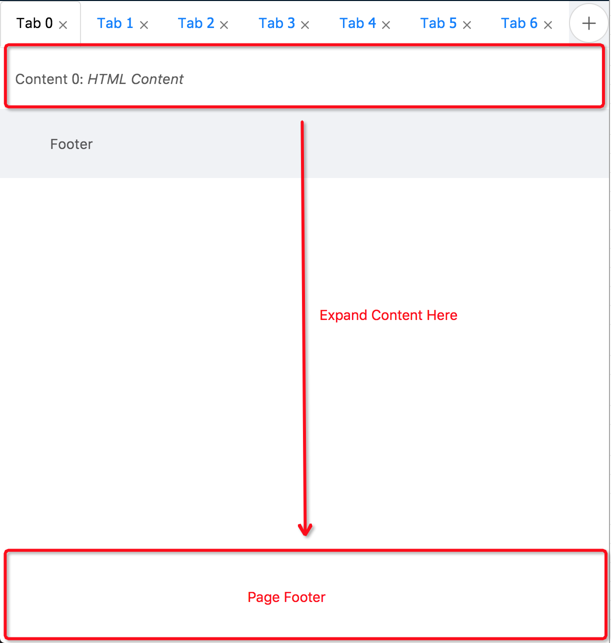
React-tabtab is a tab component with highly customization. You can create a tab in simply setting. You also can create a tab system full with draggable, async loading, close and create button. All the actions are api based. It means there is no state in the component. Developers have full control.

Minimal setup

import React, {Component} from 'react';
import ReactDOM from 'react-dom';
import {Tabs, TabList, Tab, PanelList, Panel} from 'react-tabtab';

class Basic extends Component {
  render() {
    return (
      <Tabs>
        <TabList>
          <Tab>Tab1</Tab>
          <Tab>Tab2</Tab>
        </TabList>
        <PanelList>
          <Panel>Content1</Panel>
          <Panel>Content2</Panel>
        </PanelList>
      </Tabs>
    )
  }
}

ReactDOM.render(<Basic/>, document.getElementById('root'));

It's simple to use. Zero configuration!

Draggable tab

import React, {Component} from 'react';
import {Tabs, DragTabList, DragTab, PanelList, Panel} from 'react-tabtab';
import {simpleSwitch} from 'react-tabtab/lib/helpers/move';

export default class Drag extends Component {
  constructor(props) {
    super(props);
    this.handleTabChange = this.handleTabChange.bind(this);
    this.handleTabSequenceChange = this.handleTabSequenceChange.bind(this);
    this.state = {
      activeIndex: 0,
    }
  }

  handleTabChange(index) {
    this.setState({activeIndex: index});
  }

  handleTabSequenceChange({oldIndex, newIndex}) {
    const {tabs} = this.state;
    const updateTabs = simpleSwitch(tabs, oldIndex, newIndex);
    this.setState({tabs: updateTabs, activeIndex: newIndex});
  }

  render() {
    const {activeIndex} = this.state;
    return (
      <Tabs activeIndex={activeIndex}
            onTabChange={this.handleTabChange}
            onTabSequenceChange={this.handleTabSequenceChange}>
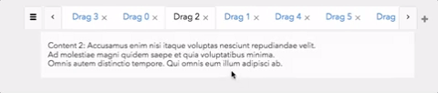
        <DragTabList>
          <DragTab>DragTab1</DragTab>
          <DragTab>DragTab2</DragTab>
        </DragTabList>
        <PanelList>
          <Panel>Content1</Panel>
          <Panel>Content2</Panel>
        </PanelList>
      </Tabs>
    )
  }
}
ReactDOM.render(<Basic/>, document.getElementById('root'));

Based on above example, the different to implement normal tab or drag tab is using different wrapper and child.

And all the actions are controllable. You can customize your switch action. But if you don't want to write customized switch logic, you can directly use import {simpleSwitch} from 'react-tabtab/lib/helpers/move' this built-in function.

normal tab

<Tabs>
  <TabList>
    <Tab>Tab1</Tab>
  </TabList>
  <PanelList>
    <Panel>Content1</Panel>
  </PanelList>
</Tabs>

drag tab

<Tabs>
  <DragTabList>
    <DragTab>DragTab1</DragTab>
  </DragTabList>
  <PanelList>
    <Panel>Content1</Panel>
  </PanelList>
</Tabs>

Async Panel

In some case, if the data is large or we want to save the bandwidth, lazy loading the content is possible solution. You can use AsyncPanel to laze load panel content. Moreover, you can mix lazy load panel with normal panel!

import React, {Component} from 'react';
import ReactDOM from 'react-dom';
import {Tabs, TabList, Tab, PanelList, AsyncPanel, Panel} from 'react-tabtab';

function loadContentFunc(callback) {
  setTimeout(() => {
    callback(null, [
      {product: 'json'},
      {product: 'joseph'}
    ]);
  }, 100);
}

// You also can provide promise as return function:
// function loadContentFunc() {
//   return fetch('/products')
//     .then(resp => resp.json())
//     .then(data => data);
// }

class AsyncTab extends Component {
  render() {
    return (
      <Tabs>
        <TabList>
          <Tab>Tab1</Tab>
          <Tab>Tab2</Tab>
        </TabList>
        <PanelList>
          <Panel>Content1</Panel>
          <AsyncPanel loadContent={loadContentFunc}
                      render={data => (<div>{JSON.stringify(data)}</div>)}
                      renderLoading={() => (<div>Loading...</div>)}
                      cache={true}
          />
        </PanelList>
      </Tabs>
    )
  }
}

ReactDOM.render(<AsyncTab/>, document.getElementById('root'));

To implement lazy loading, use AsyncPanel to wrap your panel content. Remember to provide loadContent, render, renderLoading these 3 props.

In loadContent props, both callback and promise type are supported.

If you use callback, remember to call callback when finish async loading.

If you use promise, need to return promise action.

When data is loading, the panel content will show renderLoading component.

After finishing loading data, the panel content will show render component and react-tabtab will pass the loadContent result as first parameter. So you can customize the component of panel content.

Live example: Link

Another Example

Except drag and drop tab, react-tabtab also support other usable application, like:

  • Add and close button: Example
  • Modal view at mobile support: Example
  • Auto detect number of tab and make it scrollable
  • All the action is controllable:Example

All of these features are api based, so you can customize each action on demand.

More code examples are avalable here.

Components / Api

<Tabs />

<Tabs/> is the main component of react-tabtab. Most of the api is passed from it.

props type default
defaultIndex int null set the initial active key
activeIndex int null control current activeIndex.
You need to pass new activeIndex value if you want to show different tab.
defaultIndex int null set the initial active key
showModalButton boolean
number
4
  • true: always show button
  • false: always hide button
  • [number]: when number of tab >= [number], show button
showArrowButton auto
boolean
auto
  • auto: detect tab width, if they exceed container, show button
  • true: always show button
  • false: always hide button
  • ExtraButton React Node null customize extra button content, example: `+` button
    onTabChange () => tabIndex null return tabIndex is clicked
    You can use this api with activeIndex. When user click tab, update activeIndex.
    onTabSequenceChange () => {oldIndex, newIndex} null return changed oldIndex and newIndex value
    With this api, you can do switch tab very easily. Note:This api is only called by <DragTab/>
    onTabEdit () => {type: [delete], index} null When user click close button , this api will return the clicked close button index.
    customStyle
    {
      TabList: React.Element,
      Tab: React.Element,
      Panel: React.Element,
      ActionButton: React.Element
    }
    Bootstrap theme customized tab style component

    <TabList />

    Use to wrap <Tab/>.

    <Tab />

    Normal Tab. Show the children component on tab.

    props type default
    closable boolean false whether to show close button

    Example

    <Tab>
      <i className="fa fa-map-pin"></i>
      map tab
    </Tab>

    <DragTabList />

    Use to wrap <DragTab/>.

    <DragTab/ >

    A draggable tab. Api is the same with <Tab/>

    <PanelList/ >

    Use to wrap <Panel/>

    <Panel />

    Tab content.

    <AsyncPanel />

    Lazy loading panel content.

    props type default
    loadContent * (cb) => cb(error, data) or
    (cb) => Promise
    null when loadContent finish, call the callback or you can return promise
    render * (data) => Component null when finish loading data, render this component
    renderLoading * () => Component null when it is loading data, render this component
    cache boolean true should cache the data

    Customize style

    react-tabtab is based on styled-components. Therefore, it's super easy to customize the tab style.

    Just extend the default component style and pass it to customStyle props.

    Use current style

    You can check the current style at src/themes folder.

    For example, if you want to use material-design, import the style and pass to customStyle props.

    Example:

    import {Component} from 'react';
    import {Tabs, TabList, Tab, PanelList, Panel} from 'react-tabtab';
    import * as customStyle from 'react-tabtab/lib/themes/material-design';
    
    class Customized extends Component {
      render() {
        return (
          <Tabs customStyle={customStyle}>
            <TabList>
              <Tab>Tab1</Tab>
              <Tab>Tab2</Tab>
            </TabList>
            <PanelList>
              <Panel>Content1</Panel>
              <Panel>Content2</Panel>
            </PanelList>
          </Tabs>
        )
      }
    }

    And now your tab is material design style!

    Make your own style

    If current theme doesn't meet your demand, follow this three steps and create a new one.

    First step: import current style

    import styled from 'styled-components';
    import { styled as styledTabTab } from 'react-tabtab';
    
    let {TabListStyle, ActionButtonStyle, TabStyle, PanelStyle} = styledTabTab;

    Second: extend style and export it

    import styled from 'styled-components';
    import { styled as styledTabTab } from 'react-tabtab';
    
    let {TabListStyle, ActionButtonStyle, TabStyle, PanelStyle} = styledTabTab;
    
    TabListStyle = styled(TabListStyle)`
      // write css
    `;
    
    TabStyle = styled(TabStyle)`
      // write css
    `;
    
    ActionButtonStyle = styled(ActionButtonStyle)`
      // write css
    `;
    
    PanelStyle = styled(PanelStyle)`
      // write css
    `;
    
    // need to follow this object naming
    module.exports = {
      TabList: TabListStyle,
      ActionButton: ActionButtonStyle,
      Tab: TabStyle,
      Panel: PanelStyle
    }

    Last: import your style and use it!

    When you finish the new react-tabtab style, feel free to add it to theme/ folder and send PR!

    Development

    $ yarn
    $ npm start

    License

    MIT @ctxhou

    react-tabtab's People

    Contributors

    ctxhou avatar dependabot[bot] avatar fdidron avatar greenkeeperio-bot avatar iainfreestone avatar pedrobernardina avatar

    Stargazers

     avatar  avatar  avatar  avatar  avatar  avatar  avatar  avatar  avatar  avatar  avatar  avatar  avatar  avatar  avatar  avatar  avatar  avatar  avatar  avatar  avatar  avatar  avatar  avatar  avatar  avatar  avatar  avatar  avatar  avatar  avatar  avatar  avatar  avatar  avatar  avatar  avatar  avatar  avatar  avatar  avatar  avatar  avatar  avatar  avatar  avatar  avatar  avatar  avatar  avatar  avatar  avatar  avatar  avatar  avatar  avatar  avatar  avatar  avatar  avatar  avatar  avatar  avatar  avatar  avatar  avatar  avatar  avatar  avatar  avatar  avatar  avatar  avatar  avatar  avatar  avatar  avatar  avatar  avatar  avatar  avatar  avatar  avatar  avatar  avatar  avatar  avatar  avatar  avatar  avatar  avatar  avatar  avatar  avatar  avatar  avatar  avatar  avatar  avatar  avatar

    Watchers

     avatar  avatar  avatar  avatar  avatar  avatar  avatar  avatar  avatar  avatar  avatar

    react-tabtab's Issues

    Make your own style

    Hey guys,

    I want to create an own style. Unfortunately it does not work.
    Would be great, if you can share an example...

    Thanks in advance

    Closing a modal with no tabs in TabList results in an error

    When I attempt to close the Modal and there are no tabs open, because the user closes all tabs they have from the Modal, I get a TypeError: tab is undefined and the relevant stack being:

    getTabNode
    scrollToIndex
    toggleModal
    

    I know that this isn't a typical case because generally we disallow tabs to be closable if there is just one, but in my case I need to allow all tabs to be closable from any point in this component's use.

    Otherwise, great component, saved my skin. 👍

    custom styled is not function

    I followed the guidelines in order to make my own style, However, I am getting the following error: TypeError: (0 , _reactTabtab2.default) is not a function
    import {styled} from 'react-tabtab';
    let {TabListStyle, ActionButtonStyle, TabStyle, PanelStyle} = styled;

    TabListStyle = styled(TabListStyle)// write css;

    In order to fix the issue. I have to write like the following:
    import styled from 'styled-components';
    import {styled as themeStyled} from 'react-tabtab';
    let {TabListStyle, ActionButtonStyle, TabStyle, PanelStyle} = themeStyled;

    TabListStyle = styled(TabListStyle)// write css;

    "react": "^16.8.6", "react-dom": "^16.8.6", "styled-components": "^4.0.0" "react-tabtab": "^2.0.0",

    Arrow button if not using font awesome

    I am not using font awesome and I cannot see the left and right arrows. How to use custom arrow icons. For other modifications, I cannot even add css as it having dynamic classNames.

    custom style not propagated

    Hello all,

    I've been playing few hours with this library, very easy to instantiate tabs and panels however, I am having an issue with the customStyle that somehow I am not able to define.

    The style has been defined in a separate file called tabConfiguration.js (I copied the css section from the material theme and then tried to change it to see changes on the UI).

    import {styled} from 'react-tabtab';
    let {TabListStyle, ActionButtonStyle, TabStyle, PanelStyle} = styled;
    
    TabListStyle = TabListStyle.extend`
        background-color: #009988;
    `;
    
    TabStyle = TabStyle.extend`
        background-color: #009988;
        transition: color .28s ease;
    ${props => props.active && !props.vertical ?
        ` border-bottom: 2px solid #f6b2b5;` : null}
            &:hover {
                background-color: transparent;
            }
    `;
    
    ActionButtonStyle = ActionButtonStyle.extend`
        background-color: #009988;
        border-radius: 0;
        &:hover {
            background-color: #eee;
        }
    `;
    
    PanelStyle = PanelStyle.extend`
        background-color: #009988;
        border-left: 1px solid rgba(0,0,0,0.12);
        border-right: 1px solid rgba(0,0,0,0.12);
        border-bottom: 1px solid rgba(0,0,0,0.12);
        padding: 30px 30px;
        transition: box-shadow .25s, -webkit-box-shadow .25s;
        border-radius: 2px;
    `;
    
    // need to follow this object naming
    export default {
        TabList: TabListStyle,
        ActionButton: ActionButtonStyle,
        Tab: TabStyle,
        Panel: PanelStyle
    }
    

    This file is then imported in the main file of my project

    import {Tabs, TabList, Tab, PanelList, Panel} from 'react-tabtab';
    import * as customStyle from './configuration/tabConfiguration';
    

    and this is where I use the react-tabtab component

    <div className="containerForTabs">
                        <Tabs customStyle={customStyle}>
                            <TabList>
                                <Tab>Adult Brain</Tab>
                                <Tab>Half Ito</Tab>
                            </TabList>
                            <PanelList>
                                <Panel>
                                <FlexLayout.Layout
                                    model={this.state.model}
                                    factory={this.factory.bind(this)}/>
                                </Panel>
                                <Panel>
                                    Officiis commodi facilis optio eum aliquam.<br />
                                    Tempore libero sit est architecto voluptate. Harum dolor modi
                                    deleniti animi qui similique facilis. Sit delectus voluptatem
                                    praesentium recusandae neque quo quod.
                                </Panel>
                            </PanelList>
                        </Tabs>
                    </div>
    

    Thanks in advance for any help.

    How to set the height and width of PanelList ?

    Since we're using Draggable Tab to display dynamic content , we expect all tabs to have a fixed height and width (80vh, 100vw for example)

    However setting style seperately for every Panel content is not working.

    picture

    Any help will be appreciated.

    Feature - add classname prop to various components

    Working with styles and styled components does not work for everybody (and to be honnest I think that's one of the worst tools for react that was ever created, but nevermind). If you just added the ability to pass a classname to various components it would make it easier to extend for various users like I do

    Error when loading themes

    Hi, I'm using react-tabtab with Electron, and when loading themes, webpack reports erros:

    ERROR in ./node_modules/[email protected]@react-tabtab/src/DragTab.js
    Module parse failed: Unexpected token (6:51)
    You may need an appropriate loader to handle this file type.
    | import Tab from './Tab';
    | 
    | const DragTabElement = SortableElement(({children, ...props}) => {
    |   return (
    |     <Tab index={props.tabIndex} {...props}>
     @ ./node_modules/[email protected]@react-tabtab/src/index.js 6:0-32
     @ ./node_modules/[email protected]@react-tabtab/src/themes/material-design/index.js
     @ ./app/pages/tabs/containers/themes.js
     @ ./app/pages/tabs/containers/index.js
     @ ./app/pages/tabs/index.js
     @ ./app/routes.js
     @ ./app/pages/root/containers/index.js
     @ ./app/index.js
     @ multi (webpack)-dev-server/client?http://localhost:1212 webpack/hot/dev-server react-hot-loader/patch webpack-dev-server/client?http://localhost:1212/ webpack/hot/only-dev-server ./app/index.js


    devDependencies of package.json:

    "devDependencies": {
        "babel-core": "^6.26.0",
        "babel-eslint": "^8.2.1",
        "babel-jest": "^22.1.0",
        "babel-loader": "^7.1.2",
        "babel-plugin-add-module-exports": "^0.2.1",
        "babel-plugin-dev-expression": "^0.2.1",
        "babel-plugin-flow-runtime": "^0.15.0",
        "babel-plugin-transform-class-properties": "^6.24.1",
        "babel-plugin-transform-es2015-classes": "^6.24.1",
        "babel-preset-env": "^1.6.1",
        "babel-preset-react": "^6.24.1",
        "babel-preset-react-hmre": "^1.1.1",
        "babel-preset-react-optimize": "^1.0.1",
        "babel-preset-stage-0": "^6.24.1",
        "babel-register": "^6.26.0",
        "chalk": "^2.3.0",
        "concurrently": "^3.5.1",
        "cross-env": "^5.1.3",
        "cross-spawn": "^6.0.4",
        "css-loader": "^0.28.9",
        "detect-port": "^1.2.2",
        "electron": "^1.7.11",
        "electron-builder": "^19.55.3",
        "electron-devtools-installer": "^2.2.3",
        "electron-rebuild": "^1.7.3",
        "enzyme": "^3.3.0",
        "enzyme-adapter-react-16": "^1.1.1",
        "enzyme-to-json": "^3.3.1",
        "eslint": "^4.16.0",
        "eslint-config-airbnb": "^16.1.0",
        "eslint-formatter-pretty": "^1.3.0",
        "eslint-import-resolver-webpack": "^0.8.4",
        "eslint-plugin-compat": "^2.2.0",
        "eslint-plugin-flowtype": "^2.42.0",
        "eslint-plugin-import": "^2.8.0",
        "eslint-plugin-jest": "^21.7.0",
        "eslint-plugin-jsx-a11y": "6.0.3",
        "eslint-plugin-promise": "^3.6.0",
        "eslint-plugin-react": "^7.6.1",
        "express": "^4.16.2",
        "extract-text-webpack-plugin": "^3.0.2",
        "fbjs-scripts": "^0.8.1",
        "file-loader": "^1.1.6",
        "flow-bin": "^0.64.0",
        "flow-runtime": "^0.16.0",
        "flow-typed": "^2.3.0",
        "identity-obj-proxy": "^3.0.0",
        "jest": "^22.1.4",
        "minimist": "^1.2.0",
        "node-sass": "^4.7.2",
        "npm-logical-tree": "^1.2.1",
        "react-test-renderer": "^16.2.0",
        "redux-logger": "^3.0.6",
        "rimraf": "^2.6.2",
        "sass-loader": "^6.0.6",
        "sinon": "^4.2.2",
        "spectron": "^3.8.0",
        "style-loader": "^0.20.1",
        "stylefmt": "^6.0.0",
        "stylelint": "^8.4.0",
        "stylelint-config-standard": "^18.0.0",
        "uglifyjs-webpack-plugin": "1.1.8",
        "url-loader": "^0.6.2",
        "webpack": "^3.10.0",
        "webpack-bundle-analyzer": "^2.9.2",
        "webpack-dev-server": "^2.11.1",
        "webpack-merge": "^4.1.1"
      }
    

    Could any show me why this occurs and how to solve it? Very much appreciated.

    Default tabs show buttons between them

    When I starting implemented the "react-tabtab" component worked well and on the beginning don't appear it to me this, but on the progress of the project somehow this starting to showing.

    image

    How can I remove them?

    if the last tab has been removed because of props update, it throws an error: TypeError: Cannot read property '__INTERNAL_NODE' of undefined

    When the last tab gets removed, because of property updates (i create tabs by iterating over an array and then i remove an entry from the array), i get this error:

    TypeError: Cannot read property '__INTERNAL_NODE' of undefined
        at TabListComponent.getTabNode (/node_modules/react-tabtab/lib/TabList.js:166:15)
        at TabListComponent.scrollToIndex (/node_modules/react-tabtab/lib/TabList.js:212:28)
        at TabListComponent.componentDidUpdate (/node_modules/react-tabtab/lib/TabList.js:147:14)
    

    New install: ActionButton.extend is not a function.

    Hi there,
    Into my project I tossed some code just to see it in action which was basically a duplicate of the add and close. Upon running I received the following error.

    85 | var ActionButtonStyle = _styledComponents2.default.div(_templateObject4, buttonWidth);
     86 | 
     87 | var makeScrollButton = function makeScrollButton(ActionButton) {
    > 88 |   return ActionButton.extend(_templateObject5, function (props) {
     89 |     return props.left ? props.showModalButton ? 'left: ' + (buttonWidth + 2) + 'px' : 'left: 0' : 'right: 0';
     90 |   });
     91 | };


    and

    TabList.js:88 Uncaught TypeError: ActionButton.extend is not a function
        at makeScrollButton (TabList.js:88)
        at TabListComponent.render (TabList.js:353)
        at finishClassComponent (react-dom.development.js:13538)
        at updateClassComponent (react-dom.development.js:13501)
        at beginWork (react-dom.development.js:14090)
        at performUnitOfWork (react-dom.development.js:16416)
        at workLoop (react-dom.development.js:16454)
        at HTMLUnknownElement.callCallback (react-dom.development.js:145) ....
    

    The issue was resolved by reverting back from styled-components 4.0.2 to 3.4.10.
    Just FYI.

    Add disabled prop to ExtraButton

    Should be able to pass disabled to ExtraButton when user isn't allowed to make new tabs. Although I guess you can just use a custom button.

    Uncaught TypeError: Cannot read property 'EventPluginHub' of undefined

    Hey.

    I've just tried the examples of basic tabs view and draggable ones, and got the following error, with no real ability to change it as the stack is inside the package:

    Uncaught TypeError: Cannot read property 'EventPluginHub' of undefined

    Uncaught TypeError: Cannot read property 'EventPluginHub' of undefined
    at injectTapEventPlugin
    at Object.
    at webpack_require
    at Object._typeof
    at webpack_require
    at Object.defineProperty.value
    at webpack_require
    at Object.defineProperty.value
    at webpack_require
    at Object._typeof

    Issues were solved when I've commented out the tabs components.

    Performance issues, with unnecessary updates

    Thank you for this awesome package! It's really great, and works as expected and without any hassle. My only concern is a lot of unnecessary updates, originating from react-tabtab components. I use the why-did-you-update package, to monitor updates that could be avoided, since props and/or state are the same.

    skaermbillede 2017-12-07 kl 13 05 49

    Any ideas on how to avoid this?

    React router

    Hi,

    I would like to know if there is the possibility to use your library with react router?

    I have app which I want to have only the active page content as every page performs ASP .NET server side processing

    Thanks

    Sometimes remove(close) button is not working

    Hello,

    I have tested remove(close) buttons on your demo site, https://ctxhou.github.io/react-tabtab/#add-close.

    When I intentionally clicked remove buttons in tabs again and again, sometimes nothing happened.

    That's it. Is there a possibility to fix it ?

    Drag Tabs between multiple strips

    I have a chat client, where a user has several columns of tabs.

    I wish the user to be able to drag a tab between columns.

    1. Would react-tabtab support this?
      If not,
    2. Would it be a very complex change to support it?

    (I'm happy to sponsor such a new capability, if necessary)

    Issue with styled-components

    I just installed and it crashes with the following message.

    "./node_modules/react-tabtab/lib/TabList.js
    Module not found: Can't resolve 'styled-components' in 'node_modules\react-tabtab\lib' "

    arrow button icon is not getting displayed

    I have used the tabs as per the documentation. But the arrow button icon is not getting displayed. I have imported bootstrap style in my component. do i need to install any extra dependency for arrow button.

    DragTab can't trigger close

    Version: ^1.81 (npm)
    If change dragTab to Tab then close event is fine.

    And official mix all feature example has same issue (Windows 7 / Chrome 66.0.3359 )

    custom style not working

    If i add custom style as follows

    import * as customStyle from 'react-tabtab/lib/themes/bootstrap';

    This works fine.

    However, if i create my own style following instructions and put into themes/index.js. Import as follows

    import * as customStyle from '../themes';

    Then it does not work. Not work meaning the styles are not picked up from my index.js, there are no errors either.

    My index.js is exact copy of https://github.com/ctxhou/react-tabtab/tree/master/src/themes/bootstrap

    How to make tab content stateful ?

    Suppose we have a couple of components that are stateful, now we mount them to tab content.

    I know I can change the state of one component, when the tab that contains it is activated. But after switching to another tab and back, the component is re-mounted and the modified state of it is gone.

    Maybe it is too much for react-tabtab, but is there a way to maintain the states of all tab content ?

    onDrop API

    I recently use react-tabtab, its good for use.But in my situation, I just setData in drop event trigger not every hover.

    TabList: Initiate scroll on componentDidMount when defaultIndex is set

    Hi,

    Thanks for the really great plugin.

    One slight issue I'm having is that when I mount the Tabs component with the prop defaultIndex set to the index of a Tab hidden by the container, it doesn't scroll to make it visible.

    I tried to add the following code this.scrolltoIndex(this.props.activeIndex) in the componentDidMount method of the TabList component., it seems to be scrolling a little, but not enough to show the active tab, I'm suspecting an issue with the container width calcuation.

    set tab in state bug

    if set the tab in state and push the new tab then re-set state, the new tab cant work (cant click).

    Recommend Projects

    • React photo React

      A declarative, efficient, and flexible JavaScript library for building user interfaces.

    • Vue.js photo Vue.js

      🖖 Vue.js is a progressive, incrementally-adoptable JavaScript framework for building UI on the web.

    • Typescript photo Typescript

      TypeScript is a superset of JavaScript that compiles to clean JavaScript output.

    • TensorFlow photo TensorFlow

      An Open Source Machine Learning Framework for Everyone

    • Django photo Django

      The Web framework for perfectionists with deadlines.

    • D3 photo D3

      Bring data to life with SVG, Canvas and HTML. 📊📈🎉

    Recommend Topics

    • javascript

      JavaScript (JS) is a lightweight interpreted programming language with first-class functions.

    • web

      Some thing interesting about web. New door for the world.

    • server

      A server is a program made to process requests and deliver data to clients.

    • Machine learning

      Machine learning is a way of modeling and interpreting data that allows a piece of software to respond intelligently.

    • Game

      Some thing interesting about game, make everyone happy.

    Recommend Org

    • Facebook photo Facebook

      We are working to build community through open source technology. NB: members must have two-factor auth.

    • Microsoft photo Microsoft

      Open source projects and samples from Microsoft.

    • Google photo Google

      Google ❤️ Open Source for everyone.

    • D3 photo D3

      Data-Driven Documents codes.