Coder Social home page Coder Social logo

matplotlib-label-lines's Introduction

matplotlib-label-lines

Build status Supported Python Versions PyPI codecov

Easily label line(s) using matplotlib.

The code is heavily based on http://stackoverflow.com/questions/16992038/inline-labels-in-matplotlib (original code from NauticalMile).

Install

Just do:

pip install matplotlib-label-lines

You can try it online on binder Binder, get some inspiration from the example or from the following script:

import numpy as np
from matplotlib import pyplot as plt
from scipy.stats import chi2, loglaplace

from labellines import labelLine, labelLines

X = np.linspace(0, 1, 500)
A = [1, 2, 5, 10, 20]
funcs = [np.arctan, np.sin, loglaplace(4).pdf, chi2(5).pdf]

fig, axes = plt.subplots(ncols=2, nrows=3, constrained_layout=True, figsize=(8, 8))

axes = axes.flatten()

ax = axes[0]
for a in A:
    ax.plot(X, np.arctan(a * X), label=str(a))

labelLines(ax.get_lines(), zorder=2.5)

ax = axes[1]
for a in A:
    ax.plot(X, np.sin(a * X), label=str(a))

labelLines(ax.get_lines(), align=False, fontsize=14)

ax = axes[2]
for a in A:
    ax.plot(X, loglaplace(4).pdf(a * X), label=str(a))

xvals = [0.8, 0.55, 0.22, 0.104, 0.045]
labelLines(ax.get_lines(), align=False, xvals=xvals, color="k")

ax = axes[3]
for a in A:
    ax.plot(X, chi2(5).pdf(a * X), label=str(a))

lines = ax.get_lines()
l1 = lines[-1]
labelLine(
    l1,
    0.6,
    label=r"$Re=${}".format(l1.get_label()),
    ha="left",
    va="bottom",
    align=False,
    backgroundcolor="none",
)
labelLines(lines[:-1], yoffsets=0.01, align=False, backgroundcolor="none")

# labelLines also supports log-scaled x-axes
ax = axes[4]
for a in A:
    ax.semilogx(X, np.arctan(5 * a * X), label=str(a))

labelLines(ax.get_lines(), zorder=2.5)

ax = axes[5]
for a in A:
    ax.semilogx(X, chi2(5).pdf(a * X), label=str(a))

labelLines(ax.get_lines(), xvals=(0.1, 1), zorder=2.5)

fig.show()

Example

Citing

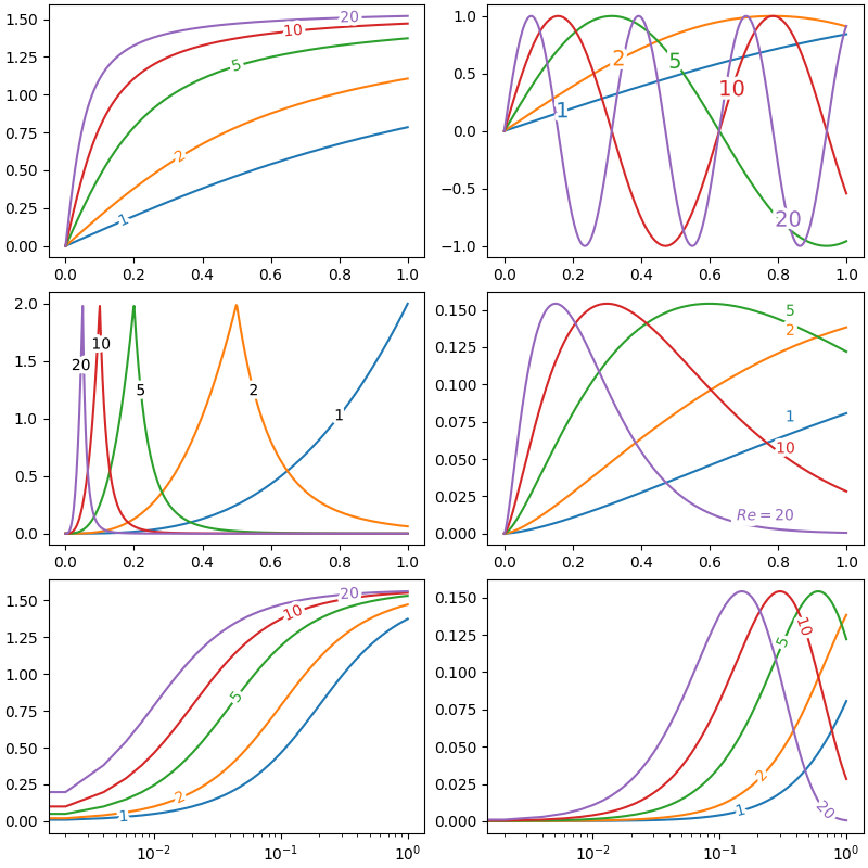
If you're using this package for research purposes, consider citing the Zenodo entry (https://zenodo.org/record/7428071).

matplotlib-label-lines's People

Contributors

andreamoro-git avatar cphyc avatar cvanelteren avatar genietim avatar hplegion avatar jhykes avatar maxghenis avatar nategeorge avatar nicholaswogan avatar pre-commit-ci[bot] avatar soxofaan avatar sportsracer48 avatar

Stargazers

 avatar  avatar  avatar  avatar  avatar  avatar  avatar  avatar  avatar  avatar  avatar  avatar  avatar  avatar  avatar  avatar  avatar  avatar  avatar  avatar  avatar  avatar  avatar  avatar  avatar  avatar  avatar  avatar  avatar  avatar  avatar  avatar  avatar  avatar  avatar  avatar  avatar  avatar  avatar  avatar  avatar  avatar  avatar  avatar  avatar  avatar  avatar  avatar  avatar  avatar  avatar  avatar  avatar  avatar  avatar  avatar  avatar  avatar  avatar  avatar  avatar  avatar  avatar  avatar  avatar  avatar  avatar  avatar  avatar  avatar  avatar  avatar  avatar  avatar  avatar  avatar  avatar  avatar  avatar  avatar  avatar  avatar  avatar  avatar  avatar  avatar  avatar  avatar  avatar  avatar  avatar  avatar  avatar  avatar  avatar  avatar  avatar  avatar  avatar  avatar

Watchers

 avatar  avatar  avatar  avatar  avatar  avatar  avatar

matplotlib-label-lines's Issues

Fix answers tests

The answer tests have diverged again making the test suite failing.

Text on path effect

Following a discussion on Twitter (https://twitter.com/matplotlib/status/1480027041315667971) it would be great to implement a “text-on-path” effect.

This would notably be made possible by reusing the following snippet https://stackoverflow.com/questions/19353576/curved-text-rendering-in-matplotlib (after asking for the OP permission), which implements a CurvedText artist as a replacement for the Text artist.

This would perfectly fit in after #74 is merged in (thanks @HPLegion!!).

State

Using the StackOverflow snippet above and the tokenizer below (see the diff.txt), I was able to achieve the following
image

What needs to be done:

  1. Support the features of matplotlib-label-lines (notably outlining)
  2. Wire-in properly with the package, for example using a switch follow_path=True|False in the labelLine[s] functions.
  3. Come up with a clever solution for math (see below)?

Further thoughts on math text

One of the difficulties in handling this would be math texts. Indeed, the “natural” approach to adding text on a line is by splitting it character-wise and adding each character in sequence on the line. Unfortunately, this doesn't work for math text,s as how a character will be displayed depends on the current context:

$a^2$          % will display: a², so the ^should be ignored and the 2 be a superscript
$\mathrm{abc}$ % will display abc in roman (not italic) so should we expand it to \mathrm{a}\mathrm{b}\mathrm{c} ?!
$\dfrac{1}{2}$ % will display 1/2 (in a fraction), so it should not be expanded at all and just put on the line as is.

Note that one easy workaround would simply be to consider a math string as a single character and do not do any expansion whatsoever. The text could then be placed token by token, where each token would either be a character or a math expression ($…$). Here is an example of a tokenizer (to be tested thoroughly):

import re
from typing import List
def tokenize_string(text: str) -> List[str]:
    # Make sure the string has only valid math (i.e. there is an even number of `$`)
    valid_math = len(re.findall(r"(?<!\\)\$", text)) % 2 == 0

    if not valid_math:
        return [c for c in text]

    math_mode = False
    tokens = []
    i = 0
    prev_c = None
    for i, c in enumerate(text):
        if c == "$" and prev_c != "\\":
            if math_mode:
                tokens.append("$" + current_token + "$")
                math_mode = False
            else:
                math_mode = True
                current_token = ""
        elif math_mode:
            current_token += c
        else:
            tokens.append(c)
        prev_c = c
    return tokens

Labels in the middle of each line

Dear cphyc,

Thank you for the amazing work! I am using the labelling functions but I am wondering if there is a way to keep all the labels to the middle of the lines. It doesn't matter if they might overlap.

This is a screenshot of a plot where I would like the labels to be in the middle.
image

Really hope that this is an easy fix that I am missing! Thanks again!

Error When Plotting Lines with DateTimes for x values

matplotlib 3.0.3
matplotlib-label-lines 0.3.6

I am trying to put labels on the lines in the plot where the x axis is datetimes:
individualImage

And I get this error:

    137     set_matplotlib_axes()
    138     figure.autofmt_xdate()
--> 139     labelLines(plt.gca().get_lines(), align=False)
    140 
    141 

/usr/local/lib/python3.5/dist-packages/labellines/core.py in labelLines(lines, align, xvals, **kwargs)
    127 
    128     for line, x, label in zip(labLines, xvals, labels):
--> 129         labelLine(line, x, label, align, **kwargs)

/usr/local/lib/python3.5/dist-packages/labellines/core.py in labelLine(line, x, label, align, **kwargs)
     29     # Find first segment of xdata containing x
     30     for i, (xa, xb) in enumerate(zip(xdata[:-1], xdata[1:])):
---> 31         if min(xa, xb) <= x <= max(xa, xb):
     32             break
     33     else:

TypeError: unorderable types: int() <= datetime.datetime()
  In call to configurable 'train' (<function train at 0x7f8e91b7e400>)

font properties

Thanks for sharing!

I have a question about how to change the font for the label; I tried

font_path = fm.findfont(fm.FontProperties(family='Times New Roman'))
font_prop = fm.FontProperties(fname=font_path, size=18)

labelLines(axs["D"].get_lines(), align=True, fontsize=18,fontproperties=font_prop)

It seems can't work...

Unable to reproduce last notebook example

Problem

The last example in the example notebook is not reproducing what is shown in the repository. The labels on the dashed lines are incorrect. There is a mismatch between the lines and the label shown on the lines when specifying the lines parameter in labelLines.

Image produced when I run the example:
wrong

It appears this problem is a result of using the labels from the all_labels variable from the ax.get_legend_handles_labels() call on line 130. The for loop at line 199 in core.py assumes that all_labels and all_lines have the same ordering, which may not always be true if the lines parameter is specified.

It looks like the example notebook hasn't been updated in 3 years, so I presume some change to core.py in the meantime has resulted in this issue.

Tentative solution

I was able to fix this by ignoring the all_labels variable and reading the label directly from the line object when iterating through all_lines. This can be done by changing line 200 to the following: label = line.get_label().

However, perhaps there is a reason this is not already the default. I did not test this with every line object in matplotlib, so there could be some objects in matplotlib that do not support the get_label method.

Thanks

Despite this issue, this is a nice package.
I appreciate the work put into it, and I plan on using it :)

Integrate with seaborn

I'd really like this to work with the seaborn library. I haven't looked into how seaborn is managing labels, but here is an example of how to label something with a seaborn plot:

import pandas as pd
import seaborn as sns
from labellines import labelLines

gb = pd.read_csv('https://pastebin.com/raw/cJnxzxkY', parse_dates=['InvoiceDate'], infer_datetime_format=True)
ax = sns.lineplot(data=gb, x='InvoiceDate', y='Total', hue='BillingCountry', legend=False)
# labelLines(plt.gcf().gca().get_lines()[:3])  # doesn't work, and only first 3 lines have data -- last 3 are empty
for (i, line), label in zip(enumerate(ax.get_lines()[:3]), ['Canada', 'USA', 'France']):
    labelLine(line, x=gb['InvoiceDate'][i * 20 + 50], label=label)

Request: allow plotting a labelLine outside the data range

To use the first example as a starting point, say I want to put all the labels for the lines to the right of the lines at x=1.05. Right now if I try to do the below, I get the error: ValueError: x label location is outside data range!

But I think it would be useful functionality to be able to place a label at an arbitrary x value for the closest data edge's y value.

An alternative way to get this behavior would be to allow passing in an xoffset for the labels.

import numpy as np
from matplotlib import pyplot as plt
from scipy.stats import chi2, loglaplace
from labellines import labelLine

X = np.linspace(0, 1, 500)
A = [1, 2, 5, 10, 20]
funcs = [np.arctan, np.sin, loglaplace(4).pdf, chi2(5).pdf]

fig, ax = plt.subplots()

for a in A:
    ax.plot(X, np.arctan(a * X), label=str(a))
for i in range(len(A)):
    labelLine(ax.get_lines()[i], 1.05, zorder=2.5)

image

Labels appear with the wrong angle

Description of issue

When the limits of an axis (x or y) change, the angle at which the label are inserted is not updated, resulting in the label looking misaligned.

This can be circumvented by setting the limits before adding the labels, but this is confusing.

Steps to reproduce

import numpy as np
from matplotlib import pyplot as plt

from labellines import labelLines
X = np.linspace(0, 1, 500)

plt.figure(figsize=(10, 3))
ax = plt.subplot(121)
ax.plot(X, np.arctan(X), label=r"$\mathrm{atan}(x)$")
labelLines(ax.get_lines(), zorder=2.5)
ax.set_title("Right angle")

ax = plt.subplot(122)
ax.plot(X, np.arctan(X), label=r"$\mathrm{atan}(x)$")
labelLines(ax.get_lines(), zorder=2.5)
ax.set_title("Wrong angle")
ax.set_ylim(top=2)

image

Feature request: manually supply labels to labelLines

I would like to add custom labels to the labelLines method. This is already supported via labelLine, however, adding the same functionality to labelLines would save some boilerplate code.

Feature description

  • add labels as arg to labelLines
  • use labels if supplied for allLabels instead of the labels from ax.get_legend_handles_labels()
  • labels should either be a list of length lines/all_lines or a string
  • test solution + test cases

Suggested solution

I think the implementation should not be too difficult, but I am a first time user of this module so I dont know if I am missing something. I am replacing allLabels with the custom labels and check if everything seems to line up. I see that there are already check for the label content so I did not touch any code not in core.py.

# in \labellines\core.py
# ln 84 ff

def labelLines(
    lines=None,
    labels=None,
    # ...
    **kwargs,
):
    """Label all lines with their respective legends.
    Parameters
    ----------
    lines : list of matplotlib lines, optional.
       Lines to label. If empty, label all lines that have a label.
    labels : list of strings, optional.
        Labels for each line. Must match lines.
    # ...
    """
    # ...

    # !! new code after ln 131 ff

    # if lines has been supplied and contains Line2D objects use those for all_lines, 
    # disregard any other Line2D objects in ax
    if lines is not None:
        assert np.all([isinstance(l, Line2D) for l in lines]), \
            f"Objects in lines must be matplotlib.line.Line2D objects.\n" \
            f"\t Object type at lines[0]: {type(lines[0])} "
        all_lines = lines
    else:  # old code here that iterates over the handles from the figure
        all_lines = []
        for h in handles:
            if isinstance(h, ErrorbarContainer):
                line = h.lines[0]
            else:
                line = h

            # If the user provided a list of lines to label, only label those
            if (lines is not None) and (line not in lines):
                continue
            all_lines.append(line)

    # !! new code after ln 141 ff

    if labels is not None:
        assert len(labels) == len(all_lines) or isinstance(labels, str), \
            f"Number of labels must be equal to one or the number of lines to label.\n" \
            f"\t len(labels): {len(labels)}, len(lines to label): {len(all_lines)}"

        assert lines is not None, f"If labels is supplied manually lines must also be supplied manually."
        allLabels = labels
        # TODO: unsure: if lines is not supplied but labels is supplied raise exception
        #  to make sure that each line gets the right label

    # Check that the lines passed to the function have all a label
    # other code is unchanged
    # ...

Additional context

Issues with suggested solution

  1. TODO above is partially addressed below (ln 141)
  2. supplying lines and labels together is required with this change. This should not be needed but makes sure that the user labels the each label is assigned to the correct line.

Notes

To be even more fancy a string formatter should be able to be passed as labels together with values /or with reference to the data in Line2D to automatically format the labels on the lines, but I have not gotten around to this yet. This could also build on the mpl methods for string formatting.

Can this work with areas?

I'm trying to label areas, like here: https://github.com/JulienPalard/python-versions/blob/8aa82b48375f4771476fc821b0e8495d958173bb/python-versions.py#L161

It does not appear to work, I tried:

    to_plot.plot.area(stacked=True, figsize=(10, 10 * 2 / 3))
    labelLines(plt.gca().get_lines())
    plt.savefig("python-versions-pct.png")

And I'm getting:

Traceback (most recent call last):
  File "/home/mdk/clones/JulienPalard/python-versions/python-versions.py", line 170, in <module>
    plot_pct()
  File "/home/mdk/clones/JulienPalard/python-versions/python-versions.py", line 163, in plot_pct
    labelLines(plt.gca().get_lines())
  File "/home/mdk/.local/lib/python3.9/site-packages/labellines/core.py", line 222, in labelLines
    xdata = ensure_float(line.get_xdata())
AttributeError: 'PolyCollection' object has no attribute 'get_xdata'

Making the text transparent

Is there a way to increase the transparency of the on-line text label. Currently, it is fully opaque.

P.S congrats on the awesome package!

Unstable test

The test test_xylogspace yields unstable results, see the example below.
For a reason to be found, the result either look like 1 or 2 below.
This causes the test to fail on main.

Result 1

result

Result 2

baseline

Difference

result-failed-diff

Labels crammed into small region for semilogx plots

For semilogx plots, the labels are constrained to be in the last interval ($[10^{n-1}, 10^n]$, where $10^n$ is the maximum value plotted on the axis). I have copied an example below where the effect is obvious, but the semilogx examples in the readme also show the behavior.

image

Line isn't labelled

Thanks for the great package!

I'm drawing a multiline plot, and one of the lines doesn't get labelled.
I don't have an MWE yet, but here's a screenshot:
labels

Any pointers for what I can do to narrow down the problem?

labelLines function ignores lines argument

According to the description, the first parameter of labelLines() should hold the lines to label.
However, that does not work. Internally, the lines argument is only used to obtain the axis object.

Issue with axhline

labelLine fails with axhline with x label location is outside data range! That is because the x value in get_xdata is 0-1 but the text plots in data coords so that either a value of 0-1 needs to be used for x. I hacked a fix:

    if len(xdata) == 2:
        i = 0
        xa = min(xdata)
        xb = max(xdata)
    else:
        for i, (xa, xb) in enumerate(zip(xdata[:-1], xdata[1:])):
            if min(xa, xb) <= x <= max(xa, xb):
                break
        else:
            raise Exception('x label location is outside data range!')

On slope alignments

Hello, thanks for your repo, which made my life easier and my graph prettier :)

I encountered two problems with alignment with respect to line slope :

  • It does not work for vertical lines. The failing line is here, so maybe we should add a test case when x does not change ?
  • text orientation is very noisy with noisy line, especially with high x-resolution, you could end up with inperceptible noise, but very noisy slope when not filtered, this is the case for my own experiences. Would it be a good idea to figure out x span of the label, and then compute slope with a slope based on the x-span boundaries ? Some borderline would probably be to test however

I encountered another problem that is related to the first point where we compute y based on x : when line is not valid for every x value (with vertical line for example, bust also more simply with lines with shorter lines than the longest). You check that x is within line range (here), but it conflict with the way you create x values implicitely as linspace from the whole ax range here
I don't mind doing this simple x repartition, otherwise it would be very complicated to deal with all kinds of line supports, but maybe we can find the nearest x instead of erroring when not in range ?

Poor labels placement

Hi, thank you for this great tool. It notably increases plots readability. However for bigger data series (16 lines) labels placement is not optimal, is it possible to tune it to get better locations?

from matplotlib import pyplot as plt
from matplotlib import style
from numpy import genfromtxt
import glob, os
import re
from labellines import labelLine, labelLines
import argparse

parser = argparse.ArgumentParser()
parser.add_argument('xvals', metavar='xvals', type=int, nargs='?',
                    help='Number of x values.')
args = parser.parse_args()

CHANNELS = 16
DATA_SAMPLES = int(args.xvals)
print('Plot for X='+str(DATA_SAMPLES))

file = 'results.txt'
data = genfromtxt(file,delimiter=',')
# Sort by channel
data = data[data[:,4].argsort()]
for i in range(0, CHANNELS):
    low = i*DATA_SAMPLES
    high = (i+1)*DATA_SAMPLES
    D = data[low:high,:]
    # Sort by Y
    D = D[D[:,2].argsort()]
    # Sort by X
    D = D[D[:,3].argsort()]
    X = D[0:DATA_SAMPLES,3]
    Y = D[0:DATA_SAMPLES,2]
    # Total bits tested
    B = D[0:DATA_SAMPLES,0]
    for i in range(0,len(Y)):
        # Zero bits transmitted - link not established
        if B[i] == 0:
            Y[i] = 1.0
        # Zero BER - set some value below x axis for better
        # plot readability
        if Y[i] == 0:
            Y[i] = 1e-12
    label = str(int(data[low,4]))
    plt.semilogy(X, Y, '-', label=label, linewidth=0.8)

plt.legend(loc='best')
plt.ylim(1e-12, 1e0)
labelLines(plt.gca().get_lines())
plt.title('PRBS RX BER')
plt.ylabel('BER')
plt.xlabel('X')
plt.grid(True)
plt.savefig('results.svg')

Zrzut ekranu z 2020-02-28 17-11-24
results.txt

Doesn't work with Matplotlib 2.1.0+ due to get_axes() removal

Unfortunately, the code is now broken, because previously deprecated get_axes method was removed in Matplotlib 2.1.0.

python2 ./trend1.py
Traceback (most recent call last):
  File "./trend1.py", line 20, in <module>
    labelLines(plt.gca().get_lines(),zorder=2.5)
  File "/usr/lib/python2.7/site-packages/labellines/core.py", line 78, in labelLines
    ax = lines[0].get_axes()
AttributeError: 'Line2D' object has no attribute 'get_axes'

Labels not overlapping in radians polar plot

Hello,

First, nice work.
However here what I have :

image

There is the snip to reproduce :

import csv
import numpy as np
import matplotlib.pyplot as plt

bar_colors = ['#333333', '#444444', '#555555', '#666666', '#777777', '#888888', '#999999', '#AA0000']
num_obs = len(bar_colors)

wind_direction = (2*3.14)*(np.random.random_sample(num_obs))
wind_speed = 5 * np.random.random_sample(num_obs)
number = [1,2,3,4,5,6,7,8]
wind = zip(wind_direction, wind_speed, bar_colors, number)

fig = plt.figure(figsize=(3, 3))  
ax = plt.subplot(111, polar=True)  


for w in wind:
    ax.plot((0, w[0]), (0, w[1]), c = w[2], label = str(w[3]))
    
labelLines(ax.get_lines())

fig.show()

Thanks a lot !

How can i add labels to the circles with radius size?

t = np.linspace(0,2*np.pi)
A = [10,25]
fig = plt.figure(figsize=[5,5])
for r in [5,10,15,20,25]:
    plt.plot(r*np.cos(t),r*np.sin(t),lw=1, color='k',label=str(A))
    labelLines(plt.gca().get_lines(), zorder=3.5)
plt.draw()

download (29)

Labels are not aligned in some cases

image

How to reproduce

import matplotlib.pyplot as plt
from labellines import *


x = [0, 1e-9, 5e-7]

y = [0, 3e21, 1e21]

plt.plot(x, y, label="label")

labelLines(plt.gca().get_lines(), zorder=2.5, xvals=[3e-7])
plt.show()

Support for pandas DataFrame with DatetimeIndex

Hi, thanks for this great matplotlib "plugin"

I couldn't get it to work yet on pandas based plots with a DatetimeIndex:
screen shot 2018-10-24 at 11 43 01

Any ideas, and is there any interest in supporting this?
I already had a quick look, but couldn't find a quick fix yet as date handling is quite messy territory

Outline sometimes have holes that show the line underneath

When using the the package to label lines with minus signs, I noticed that the minus signs typically had some artifacts to them. The seemed to be wider on a small segment of their length. (See an example below.)

After digging a bit into it I realized that it occurred due to the outline_width not being optimal for the text I had on my lines, and I saw that this was discussed and implemented in #32 and #34, from what I understand its using this matplotlib effect.

I guess it is not really a bug, but since I couldn't find it being mentioned in the example in the README or in the example, I thought it would be good to include somewhere so users are aware that it can happen, and that tweaking the outline_width parameter should be sufficient.

A minimal example showing the effect:

import numpy as np
from matplotlib import pyplot as plt

from labellines import labelLines

X = np.linspace(0, 1, 500)
A = [1, 2, 5, 10, 20]

fig, axes = plt.subplots(ncols=2, nrows=1, constrained_layout=True, figsize=(8, 3))

axes = axes.flatten()

# Changing the outline width gives very different results
outline_width = 10

ax = axes[0]
for a in A:
    ax.plot(X, np.arctan(a * X), label=f"$-{a}$")

labelLines(
    ax.get_lines(),
    zorder=2.5,
    outline_width=outline_width,
    outline_color="black",
    backgroundcolor="red",
)

ax = axes[1]
for a in A:
    ax.plot(X, np.arctan(a * X), label=f"$-{a}$")

labelLines(ax.get_lines(), zorder=2.5, outline_width=outline_width)

plt.show()

lines

xvals changing?

Hi! I was wondering what was the input for xvals? I would like the labels to at the end of each plot.

There are 4 lines being plotted: 3 subjects and the average. My code gets the last value for each subject's line and saves it to x_val_label. I have a print of x_val_label before it goes into labeLines and a print afterwards. I'm not sure why the values are changing?

    plt.figure()
    x_val_label = [] #for labeLines, the position of the label name will be at last point of the line
    for pm in pickled_mice:
        x_values = np.arange(1,len(pickled_dict_mouse_data[pm])+1)
        x_val_label.append(len(pickled_dict_mouse_data[pm])+1) 
        plt.plot(x_values,pickled_dict_mouse_data[pm].iloc[0::,1],color,alpha =0.3,label =pm) #ITI is 1 here
    x_valuesO = np.arange(1,len(overview_df_mouse_data['ITI_avg'])+1)
    x_namesO = overview_df_mouse_data['ITI_avg'].index.tolist()
    plt.plot(x_valuesO,overview_df_mouse_data.iloc[0::,0],color) #ITI_avg is 0 here
    plt.title(pickleGroup + " n" + str(len(pickled_mice)) + ", " + "Additional ITI above 2")
    x_valuesFINAL = x_valuesO
    x_namesFINAL = x_namesO 
    print(x_val_label)
    labelLines(plt.gca().get_lines(), align=False, zorder = 2.5, xvals=x_val_label) 
    print(x_val_label)

[18, 14, 14]
[15.4, 11.8, 11.8]

labelLines_xvals

Throws error for reversed or unsorted lines

if (x < xdata[0]) or (x > xdata[-1]):

When I try to label a line on a certain x position e.g. labelline(line[1], 0.2, label="test") a outside of data range error is thrown.
This is because my data runs from 1.0 to -1.0. This is easily solved by flipping the data in my case.
However this method assumes all data has the highest number on the end and lowest number at the beginning of the array which is not always the case.
This would be solved by using np.amin(), np.amax()

Crash in automatic placement heuristic

While playing around with #54 I ran into the following crash (I fixed the seed for repropducibility)

import numpy as np
import matplotlib.pyplot as plt
from labellines import labelLines

bar_colors = ['#333333', '#444444', '#555555', '#666666', '#777777', '#888888', '#999999', '#AA0000']
num_obs = len(bar_colors)

np.random.seed(0)
wind_direction = (2*3.14)*(np.random.random_sample(num_obs))
wind_speed = 5 * np.random.random_sample(num_obs)
number = [1,2,3,4,5,6,7,8]
wind = zip(wind_direction, wind_speed, bar_colors, number)

fig = plt.figure(figsize=(3, 3))
ax = plt.subplot(111, polar=True)


for w in wind:
    ax.plot((0, w[0]), (0, w[1]), c = w[2], label = str(w[3]))

labelLines(ax.get_lines())

plt.show()

results in

Traceback (most recent call last):
  File "example.py", line 42, in <module>
    labelLines(ax.get_lines())
  File "/home/hpahl/Repos/matplotlib-label-lines/labellines/core.py", line 178, in labelLines
    order[order < 0] = np.arange(imax + 1, len(order))
ValueError: NumPy boolean array indexing assignment cannot assign 0 input values to the 1 output values where the mask is true

Dependency issues?

When I attempt to import this module

from labellines import labelLines

I get the following error

File "/home/scott/.local/lib/python3.8/site-packages/labellines/core.py", line 8, in <module>
    from more_itertools import always_iterable
ModuleNotFoundError: No module named 'more_itertools'

So I attempt to install more_itertools with pip, but it is already installed on my system.

Does this exist for anyone else in the latest release?

Labels not working

anyways,

import matplotlib.pyplot as plt
import numpy as np

from labellines import labelLine, labelLines

xAxis = "x"
yAxis = "y"
title = {"x": "x_axis_title", "y": "y_axis_title"}

plt.title("%s-%s Diagram" % (yAxis, xAxis))
plt.xlabel(title[xAxis])
plt.ylabel(title[yAxis])
plt.grid()

import random

line = []
list_x = [1,2,3,4,5,6,7]

for t in range(len(list_x)):
    x = [x+random.randint(0,10) for x in range(10)]
    y = [y-random.randint(0,10) for y in range(10)]
##    x = [x+t for x in range(10)]
##    y = [y+t for y in range(10)]
    line.extend(plt.plot(x, y, 'g', lw=0.5, label = 'a'))
labelLines(line, zorder=2.5)
plt.show()

This doesn't work with the traceback

Traceback (most recent call last):
  File "D:\Users\*****\Desktop\test.py", line 132, in <module>
    labelLines(line, zorder=2.5)
  File "C:\Users\*****\AppData\Local\Programs\Python\Python39\lib\site-packages\labellines\core.py", line 242, in labelLines
    labelLine(
  File "C:\Users\*****\AppData\Local\Programs\Python\Python39\lib\site-packages\labellines\core.py", line 87, in labelLine
    raise Exception("x label location is outside data range!")
Exception: x label location is outside data range!

If I put it inside a while loop and keep trying the code, it eventually works so not sure why it's raising that error. I'm kinda sure I did nothing wrong.

The commented part in the code works but changing it to the uncommented part makes it raise the error.
image
This is the expected result if you need it

Pip installation fails

Hi! Thanks for making this function into a pip package!
When I try to install it (Python 2.7, in OsX) with pip I get the following error:

File "/private/var/folders/sp/7r30s3n961985xnzjdkm1p2m0000gn/T/pip-build-QJzWRo/matplotlib-label-lines/setup.py", line 5, in <module> with open('Readme.md') as f: IOError: [Errno 2] No such file or directory: 'Readme.md'

transparent label background ?

Is there a way to avoid having white rectangle like this ?

image

MWE:

import matplotlib.pyplot as plt
from labellines import labelLine, labelLines

plt.plot([1, 2, 3], label="label")
labelLines(plt.gca().get_lines(), zorder=2.5)
plt.minorticks_on()
plt.grid(which='minor', alpha=0.3)
plt.grid(which='major', alpha=0.7)
plt.show()

Label for a multiple y values for one x value curve

Hi,

I try to display label on lines whose have several values of y for one x value. But, I can't manage to have the label on the value of y that I want, even I try every possible values of xvals..

I hope that you can help me,
Thanks,

Pierre

Removing the underlying path/line instead of having a white rectangle

Hi all,

Thank you for that nice package I've been using for a while now.

I still think that this feature should be included in matplotlib. I've raised an issue there. See: matplotlib/matplotlib#19406

I think that improving this package even further would be to replace the use of a white rectangle by actually removing the underlying lines. Exactly the way it's done for matplotlib.pyplot.clabel(inline=True).

What do you guys think ? I think that's a feature many users (me included) would like to see implemented in matplotlib.

I'd be very happy to participate in any global effort towards this goal 😄

Stopped working for axes containing errorbars

I don't remember if I had a recent update, but a function where I'm labeling errorbars suddenly stopped working without any change on my part, whereas it works fine when if change the errorbar into a simple plot.
I have matplotlib-label-lines 0.4.3, matplotlib 3.5.1, numpy 1.22.1.

It gives the following error:

File "/home/x/Documents/Paper/images/plot_functions.py", line 470, in polarization
    labelLines(ax.get_lines())
  File "/home/x/Documents/Paper/.virtualenv/lib/python3.10/site-packages/labellines/core.py", line 276, in labelLines
    labelLine(
  File "/home/x/Documents/Paper/.virtualenv/lib/python3.10/site-packages/labellines/core.py", line 58, in labelLine
    mask = np.isfinite(ydata)
TypeError: ufunc 'isfinite' not supported for the input types, and the inputs could not be safely coerced to any supported types according to the casting rule ''safe''

It also gives the same error if there is any errorbar on the axes even if that's not the one I'm trying to label.
I tracked down that the dtype of ax.get_lines().get_ydata() is an object instead of being a float for errorbars, and it worked again when modified core.py to I convert the object into a float:

ydata = line.get_ydata()
ydata = np.array(ydata, dtype=float)
mask = np.isfinite(ydata)

Import error

image

Can't seem to quite figure out why I'm being thrown this error.

Running Python 3.8.13

auto y_offset

Hello,

thank you for this awesome project! I just wanted to ask if there is any easy way you could think of to auto adjust the yoffset if there is already a label at the same position?

Regards
Felix

Adding option to offset y location

Sometimes I don't want the label to cover the line. I have added an option to offset the location of labels by a given amount. I wrote a patch and submitted it as a git pull request.

ValueError if lines contain single elements

So this is probably a niche case but when this code is presented with a 'line' comprised of a singular point _update_anchors() throws a value error as it can't surround itself with valid line segment points. In this case it'd probably make more sense to set xa, xb ya & yb to the position of the point itself. The rest of the code still works fine with this change and the label appears normally.

I changed the code to the following, the index is unnecessary but I kept it for readability.

        # Find the first line segment surrounding x
        for i, (xa, xb) in enumerate(zip(xdata[:-1], xdata[1:])):
            if min(xa, xb) <= x <= max(xa, xb):
                ya, yb = ydata[i], ydata[i + 1]
                break
        else:
            i = 0
            ya, yb = ydata[i], ydata[i]
            xa, xb = xdata[i], xdata[i]
            # raise ValueError("x label location is outside data range!")

The code still throws a warning about the anchor position but it still completes fine, there might be a more intelligent way to handle this though.

Recommend Projects

  • React photo React

    A declarative, efficient, and flexible JavaScript library for building user interfaces.

  • Vue.js photo Vue.js

    🖖 Vue.js is a progressive, incrementally-adoptable JavaScript framework for building UI on the web.

  • Typescript photo Typescript

    TypeScript is a superset of JavaScript that compiles to clean JavaScript output.

  • TensorFlow photo TensorFlow

    An Open Source Machine Learning Framework for Everyone

  • Django photo Django

    The Web framework for perfectionists with deadlines.

  • D3 photo D3

    Bring data to life with SVG, Canvas and HTML. 📊📈🎉

Recommend Topics

  • javascript

    JavaScript (JS) is a lightweight interpreted programming language with first-class functions.

  • web

    Some thing interesting about web. New door for the world.

  • server

    A server is a program made to process requests and deliver data to clients.

  • Machine learning

    Machine learning is a way of modeling and interpreting data that allows a piece of software to respond intelligently.

  • Game

    Some thing interesting about game, make everyone happy.

Recommend Org

  • Facebook photo Facebook

    We are working to build community through open source technology. NB: members must have two-factor auth.

  • Microsoft photo Microsoft

    Open source projects and samples from Microsoft.

  • Google photo Google

    Google ❤️ Open Source for everyone.

  • D3 photo D3

    Data-Driven Documents codes.