
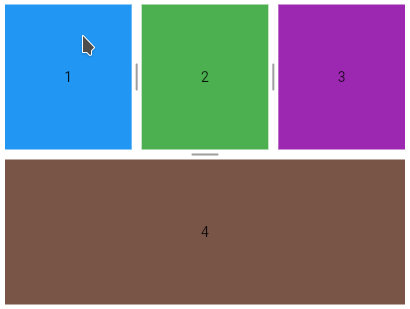
A widget to provides horizontal or vertical multiple split view for Flutter.
- Horizontal or vertical
- Configurable weight or size for each child
- Automatic calculation of weights when:
- Child added without defined weight
- Weight redistribution when a child is removed
- Listener to detect children size changes
- Horizontal
- Vertical
- Horizontal and vertical
- Size
- Divider
- Support this project
MultiSplitView(children: [child1, child2, child3]);
MultiSplitView(axis: Axis.vertical, children: [child1, child2]);
    MultiSplitView(axis: Axis.vertical, children: [
      MultiSplitView(children: [child1, child2, child3]),
      child4
    ]);
    // setting 10% of weight for the first child
    MultiSplitView multiSplitView = MultiSplitView(
children: [child1, child2, child3], initialAreas: [Area(weight: 0.1)]); MultiSplitViewController _controller =
MultiSplitViewController(areas: [Area(weight: 0.1)]);or
  MultiSplitViewController _controller2 =
      MultiSplitViewController(areas: Area.weights([0.1]));
and
    // setting 10% of weight for the first child
    MultiSplitView multiSplitView = MultiSplitView(
        children: [child1, child2, child3], controller: _controller);
_controller.areas = [Area(size: 150)]; MultiSplitViewController _controller =
MultiSplitViewController(areas: [Area(minimalWeight: .25), Area(minimalWeight: .25)]); MultiSplitViewController _controller =
MultiSplitViewController(areas: [Area(minimalSize: 150)]); MultiSplitView(children: [child1, child2, child3], resizable: false); MultiSplitView(
children: [child1, child2, child3, child4],
onWeightChange: () =>
DemoFlu.printOnConsole(context, 'Weight has changed')); MultiSplitView multiSplitView =
MultiSplitView(children: [child1, child2, child3]);
MultiSplitViewTheme theme = MultiSplitViewTheme(
child: multiSplitView,
data: MultiSplitViewThemeData(dividerThickness: 30));
    MultiSplitView multiSplitView = MultiSplitView(
        children: [child1, child2, child3],
        dividerBuilder:
            (axis, index, resizable, dragging, highlighted, themeData) {
          return Container(
            color: dragging ? Colors.grey[300] : Colors.grey[100],
            child: Icon(
              Icons.drag_indicator,
              color: highlighted ? Colors.grey[600] : Colors.grey[400],
            ),
          );
        });

    MultiSplitViewTheme theme = MultiSplitViewTheme(
        child: multiSplitView,
        data: MultiSplitViewThemeData(dividerThickness: 24));
Allows customizing the divider through the DividerPainter class.
The DividerPainters factory class offers default painters.
The DividerPainters.background allows setting the background color. The default color is NULL.
    MultiSplitView multiSplitView = MultiSplitView(children: [child1, child2]);

    MultiSplitViewTheme theme = MultiSplitViewTheme(
        child: multiSplitView,
        data: MultiSplitViewThemeData(
            dividerPainter: DividerPainters.background(color: Colors.black)));
    MultiSplitView multiSplitView = MultiSplitView(children: [child1, child2]);

    MultiSplitViewTheme theme = MultiSplitViewTheme(
        child: multiSplitView,
        data: MultiSplitViewThemeData(
            dividerPainter: DividerPainters.background(
                color: Colors.grey[200], highlightedColor: Colors.grey[800])));
    MultiSplitView multiSplitView = MultiSplitView(children: [child1, child2]);

    MultiSplitViewTheme theme = MultiSplitViewTheme(
        child: multiSplitView,
        data: MultiSplitViewThemeData(
            dividerPainter: DividerPainters.dashed(
                color: Colors.deepOrange, highlightedColor: Colors.black)));
    MultiSplitViewTheme theme = MultiSplitViewTheme(
        child: multiSplitView,
        data: MultiSplitViewThemeData(
            dividerPainter: DividerPainters.dashed(
                gap: 30, size: 20, thickness: 3, highlightedThickness: 6)));
    MultiSplitView multiSplitView = MultiSplitView(children: [child1, child2]);

    MultiSplitViewTheme theme = MultiSplitViewTheme(
        child: multiSplitView,
        data: MultiSplitViewThemeData(
            dividerPainter: DividerPainters.grooved1(
                color: Colors.indigo[100]!,
                highlightedColor: Colors.indigo[900]!)));
    MultiSplitViewTheme theme = MultiSplitViewTheme(
        child: multiSplitView,
        data: MultiSplitViewThemeData(
            dividerPainter: DividerPainters.grooved1(
                size: 5,
                highlightedSize: 30,
                thickness: 3,
                highlightedThickness: 6)));
    MultiSplitView multiSplitView = MultiSplitView(children: [child1, child2]);

    MultiSplitViewTheme theme = MultiSplitViewTheme(
        child: multiSplitView,
        data: MultiSplitViewThemeData(
            dividerPainter: DividerPainters.grooved2(
                color: Colors.grey[400]!, highlightedColor: Colors.red)));
    MultiSplitViewTheme theme = MultiSplitViewTheme(
        child: multiSplitView,
        data: MultiSplitViewThemeData(
            dividerPainter: DividerPainters.grooved2(
                gap: 15,
                thickness: 4,
                count: 3,
                highlightedCount: 9,
                strokeCap: StrokeCap.square)));
It is possible to extend the DividerPainter class to create a painter from scratch.
class MyDividerPainter extends DividerPainter {
  @override
  Map<int, Tween> buildTween() {
    Map<int, Tween> map = super.buildTween();
    // create your tween here, example:
    map[100] = Tween<double>(begin: 1, end: 5);
    return map;
  }

  @override
  void paint(
      {required Axis dividerAxis,
      required bool resizable,
      required bool highlighted,
      required Canvas canvas,
      required Size dividerSize,
      required Map<int, dynamic> animatedValues}) {
    super.paint(
        dividerAxis: dividerAxis,
        resizable: resizable,
        highlighted: highlighted,
        canvas: canvas,
        dividerSize: dividerSize,
        animatedValues: animatedValues);
    double myAnimatedValue = animatedValues[100];
    // ...
  }
}
MultiSplitView multiSplitView = MultiSplitView(children: [child1, child2]);
MultiSplitViewTheme theme = MultiSplitViewTheme(
child: multiSplitView,
data: MultiSplitViewThemeData(dividerPainter: MyDividerPainter()));bc1qhqy84y45gya58gtfkvrvass38k4mcyqnav803h
0x9eB815FD4c88A53322304143A9Aa8733D3369985


 React
React
 Typescript
 Django
 Laravel
 Facebook
 Microsoft
 Google
 Alibaba
 D3
D3
 Tencent