iron-container is not strictly part of iron-grid but is important in laying out content. It allows you to center your page content. iron-container's default is set to ~90% of the window width. It helps you center and contain your page content. We use the container to contain our body content.
The following custom proporties are available for styling:
| Custom property | Description | Default |
|---|---|---|
--iron-container-width |
Width of the Container | 90% |
--iron-grid-element-style |
Permit to override grid style element | null |
iron-grid helps you layout polymer elements in an ordered, easy fashion. We are using a standard 12 column fluid responsive grid system.
iron-grid is now designed to be used in each element you want to be responsive, not only the complete page. So if you want differents behaviors following screen size for each element, you can.
Now each compoment can manage its own responsiveness.
Please note that all the examples pictured below have the class 'example' on them. The class is included in the component. This class gives each grid column a 1px white border so that you can see the seperation.
Our standard grid has 12 columns. No matter the size of the browser, each of these columns will always have an equal width.

To get a feel of how the grid is used in HTML. Take a look at this code below which will produce a similar result as the one above.
<iron-grid>
    <div class="s1">1</div>
    <div class="s1">2</div>
    <div class="s1">3</div>
    <div class="s1">4</div>
    <div class="s1">5</div>
    <div class="s1">6</div>
    <div class="s1">7</div>
    <div class="s1">8</div>
    <div class="s1">9</div>
    <div class="s1">10</div>
    <div class="s1">11</div>
    <div class="s1">12</div>
</iron-grid>To offset, simply add offset-s2 to the class where s signifies the screen class-prefix (s = small, m = medium, l = large) and the number after is the number of columns you want to offset by.
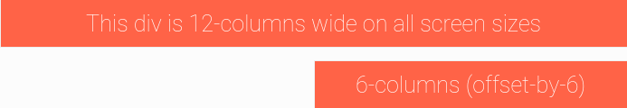
<iron-grid>
    <div class="s12">
        <span>This div is 12-columns wide on all screen sizes</span>
    </div>
    <div class="s6 offset-s6">
        <span>6-columns (offset-by-6)</span>
    </div>
</iron-grid>You can change normal elements order appearance following screen. To order, simply add order-s1 to the class where s signifies the screen class-prefix (s = small, m = medium, l = large) and the number is the appearance order (from 1 to 12). Default element order is 6, so in this case the element appear before standard element.

<iron-grid>
    <div class="s1">1</div>
    <div class="s1">2</div>
    <div class="s1">3</div>
    <div class="s1">4</div>
    <div class="s1">5</div>
    <div class="s1">6</div>
    <div class="s1">7</div>
    <div class="s1">8</div>
    <div class="s1">9</div>
    <div class="s1">10</div>
    <div class="s1">11</div>
    <div class="s1 order-s1">12</div>
</iron-grid>You can create hidden elements by using s0.
<iron-grid>
    <div class="s0 m12">
        <span>This div is hidden on small screen sizes and 12-columns wide on medium and large screen sizes.</span>
    </div>
</iron-grid>Above we showed you how to layout elements using our grid system. Now we'll show you how to design your layouts so that they look great on all screen sizes.
| Mobile Devices <= 500px | Mobile Devices <= 600px | Tablet Devices <= 700px | Desktop Devices <= 850px | Desktop Devices > 850px | |
|---|---|---|---|---|---|
| Class Prefix | .xs | .s | .m | .l | .xl |
| Number of Columns | 12 | 12 | 12 | 12 | 12 |
In the previous examples, we only defined the size for small screens using s12. This is fine if we want a fixed layout since the rules propogate upwards. By just saying s12, we are essentially saying s12 m12 l12. But by explicitly defining the size we can make our website more responsive.
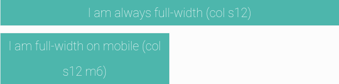
<iron-grid>
    <div class="s12">
        <span>I am always full-width (s12)</span>
    </div>
    <div class="s12 m6">
        <span>I am full-width on mobile (s12 m6)</span>
    </div>
</iron-grid>For each usage of iron-grid you can change the default screen sizes of screen format management (xs, s, m, l, xl) Each iron-grid instance will have its owns screen sizes.
<iron-grid xs-max-width="400" s-max-width="600" m-max-width="900" l-max-width="1150">
    <div class="s12">
        <span>I am always full-width (s12)</span>
    </div>
    <div class="s12 m6">
        <span>I am full-width on mobile (s12 m6)</span>
    </div>
</iron-grid>
Note that xl is not set because it is the size above 'l' max width.
Thanks to that each compoment can manage its own responsiveness and that's really cool.
You can log an iron-grid during you development adding log on iron-grid tag.
<iron-grid log >
    <div class="s12">
        <span>I am always full-width (s12)</span>
    </div>
    <div class="s12 m6">
        <span>I am full-width on mobile (s12 m6)</span>
    </div>
</iron-grid>
Open your dev console and you will see during zomm/dezoom :
width : 375 screenFormat = s
Apply logging on iron-grid one at a time. If not you will be disturb because each iron-grid can manage its screen formats


 React
React
 Typescript
 Django
 Laravel
 Facebook
 Microsoft
 Google
 Alibaba
 D3
D3
 Tencent