cesarbr / corona-mission Goto Github PK
View Code? Open in Web Editor NEWDesafio COVID-19
License: Apache License 2.0
Desafio COVID-19
License: Apache License 2.0


Describe the bug
"NaN dias sem missão" message is shown in contacts with whom no mission was done
To Reproduce
Steps to reproduce the behavior:
Expected behavior
"Realize a sua primeira missão" message shown
Screenshots

Smartphone (please complete the following information):
Describe the bug
After input wrong email/password for login, or click in button Google Login and immediately press back button on smartphone keyboard.
To Reproduce
Steps to reproduce the behavior:
Expected behavior
Loading modal disappear.
Screenshots


Smartphone (please complete the following information):
Additional context
Describe the bug
[BUG] password reset code validation screen is not built as planned (incomplete flow)
To Reproduce
Steps to reproduce the behavior:
Actual behavior
5. There isn't an input to enter the verification code, and the submit button SAVE was replace by the Resend Code option
Expected behavior
5. There is an input to enter the verification code, a button to save/verify code, and a link text to resend the verification code.
Screenshots

Desktop (please complete the following information):
Smartphone (please complete the following information):
Additional context
the text that explains the sending of the verification code is incomplete, it should be: "Verifique seu e-mail - enviamos um e-mail com um código de confirmação com 6 dígitos. Insira o código acima para prosseguir com a redefinição da senha."
the save/recover button should open a new screen to type the new password (new password and repeat password)
Is your feature request related to a problem? Please describe.
No, it's a new feature
Describe the solution you'd like
When creating a new contact, the same default placeholder picture is assigned to all contacts. I would like to be able to replace this placeholder picture with a new picture of my choosing.
Describe alternatives you've considered
I believe that the best option would be to insert this on the edit contact information page.
It would be also helpful to be able to search the device for pictures, take one on the spot with the mobile camera and also crop the image to better fit the profile.
Additional context
The design files can be found here: https://xd.adobe.com/view/9be0bbe8-f524-435d-6702-efcf55fe51d7-edd1/screen/a74ec8f0-159d-4477-9b8a-e7e8ff68209e/iPhone-X-XS-11-Pro-9


Describe the bug
[UI] Change "querentena" to "quarentena" on tutorial screen
To Reproduce
Steps to reproduce the behavior:
Actual behavior
The text "querentena" is wrong
Expected behavior
The correct text should be "quarentena"
Screenshots

Desktop (please complete the following information):
Smartphone (please complete the following information):
Additional context
Describe the bug
[Missions] After completing the missions, on homescreeen it remains displaying that user never completed a missio
To Reproduce
Steps to reproduce the behavior:
Actual behavior
You didn't do any mission today! (Vocẽ não fez nenhuma missão hoje!)
Expected behavior
You did 2 missions today! (Voce fez 2 missões hoje!)
Screenshots
If applicable, add screenshots to help explain your problem.

Desktop (please complete the following information):
Smartphone (please complete the following information):
Additional context
Add any other context about the problem here.
Is your feature request related to a problem? Please describe.
Currently, the user cannot logout
Describe the solution you'd like
Onde logged in, the user should be able to logout of the application
Describe alternatives you've considered
The logout button is available in the app menu
Additional context
No.
Is your feature request related to a problem? Please describe.
A clear and concise description of what the problem is. Ex. I'm always frustrated when [...]
Describe the solution you'd like
A clear and concise description of what you want to happen.
Describe alternatives you've considered
A clear and concise description of any alternative solutions or features you've considered.
Additional context
Add any other context or screenshots about the feature request here.
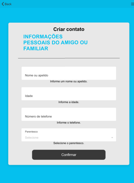
Describe the bug
[BUG] The AGE field has no validate on REGISTER screen, and some on EDIT screen.
To Reproduce (First Scenario)
Steps to reproduce the behavior:
Actual behavior
2. Contact is registered with negative age
3. Contact can't be registered with a negative age
Expected behavior
2. Contact can't be registered with a negative age
3. Contact can't be registered with a negative age
Screenshots

Desktop (please complete the following information):
Smartphone (please complete the following information):
To Reproduce (Second Scenario)
Steps to reproduce the behavior:
Actual behavior
2. Contact is registered with 999 age
3. Contact can't be registered, the limit is 130 age
Expected behavior
2. Contact can't be registered, the limit is 130 age
3. Contact can't be registered, the limit is 130 age
Screenshots

Desktop (please complete the following information):
Smartphone (please complete the following information):
Additional context
N/A
Describe the bug
A clear and concise description of what the bug is.
To Reproduce
Steps to reproduce the behavior:
1.Check the register contact screen
Actual behavior
Top area is bad used, the logo is consuming the top area:

Expected behavior
Grandpa lgo could be on top:

Screenshots
If applicable, add screenshots to help explain your problem.
Desktop (please complete the following information):
Smartphone (please complete the following information):
Additional context
This enhancement could be propagated to the others screens, and the logo will be always on screen.


Describe the bug
[Login] In this new version, after open the application for the first time, there's no login option
To Reproduce
Steps to reproduce the behavior:
Expected behavior
Login screen is displayed before user can try the application.
Actual behavior
Application open the home screen, with the option to register a new grandpa contact, without the login option (Something is missing)
Screenshots
First time opening the app:

Second time opening the app:

Desktop (please complete the following information):
Smartphone (please complete the following information):
Additional context
Add any other context about the problem here.
Describe the bug
When opening the application if the user chooses to log in with "Email" it is not possible to go back and choose "Gmail" authentication
To Reproduce
Steps to reproduce the behavior:
Expected behavior
User able to return to the first screen and choose another form of authentication
Smartphone (please complete the following information):
Describe the bug
[BUG] there is no vertical scrolling on home screen (list of contacts) | same on register and edit screen
To Reproduce
Steps to reproduce the behavior:
Actual behavior
3. It's not possible to Check all contacts, there's no vertical scrolling
Expected behavior
4. It's possible to Check all contacts, there's vertical scrolling
Screenshots

Desktop (please complete the following information):
Smartphone (please complete the following information):
Additional context
Same issue on other screens:


Is your feature request related to a problem? Please describe.
The current code needs refactoring and better structure.
Describe the solution you'd like
Code refactoring.
Describe alternatives you've considered
No.
Additional context
No.
Describe the bug
User can't scroll the contact list. It is not possible to see more than 4 people (depending on screen size more or less contacts can be seen).
To Reproduce
Steps to reproduce the behavior:
Expected behavior
Contacts list scrolled down and user can see all his contacts
Smartphone (please complete the following information):
Describe the bug
[UX] whatsapp call text is truncated
To Reproduce
Steps to reproduce the behavior:
Actual behavior
4. whatsapp call text is truncated
Expected behavior
4. whatsapp call text is NOT truncated
Screenshots

Desktop (please complete the following information):
Smartphone (please complete the following information):
Additional context
Same issue on all devices, also on iPad

Describe the bug
[BUG] there is no vertical scrolling on home screen (list of contacts)
To Reproduce
Steps to reproduce the behavior:
Actual behavior
4. It shows NaN days without mission: "NaN dias sem missão"
5. It shows You dis 0 missions today: "Você fez 0 missões hoje!"
Expected behavior
4. It shows You dis 0 missions today: "Você fez 0 missões hoje!"
5. It shows You dis 0 missions today: "Você fez 0 missões hoje!"
Screenshots


Desktop (please complete the following information):
Smartphone (please complete the following information):
Additional context
N/A
Is your feature request related to a problem? Please describe.
A clear and concise description of what the problem is. Ex. I'm always frustrated when [...]
Describe the solution you'd like
A clear and concise description of what you want to happen.
Describe alternatives you've considered
A clear and concise description of any alternative solutions or features you've considered.
Additional context
Add any other context or screenshots about the feature request here.
Describe the bug
Blank page when authenticating with Gmail
To Reproduce
Steps to reproduce the behavior:
Expected behavior
In the webpage, a notification whether the Gmail authentication was successful or not, then user automatically redirected to the application and logged in (if happy path)
Smartphone (please complete the following information):
Describe the bug
[Performance] The password recovery screen is taking too long to set up
To Reproduce
Steps to reproduce the behavior:
Actual behavior
4. Recover screen take too long to load in comparison with the other screens, a white screen is displayed before the password recovery
Expected behavior
4. Recover screen loads as the same as the other screen (a loading modal is show)
Screenshots
N/A
Desktop (please complete the following information):
Smartphone (please complete the following information):
Additional context
there is no loading modal in this flow
Describe the bug
[Register] In this new version, it's not possible to register a new grandpa contact after open the application for the first time
To Reproduce
Steps to reproduce the behavior:
Actual behavior
Nothing happens, the user stays stuck in the register screen, and it's not registered.
Expected behavior
New Grandpa contact is registered
Screenshots
Opening the app for the first time: i'ts not possible to register a new contact:

Desktop (please complete the following information):
Smartphone (please complete the following information):
Additional context
Closing the app, and opening it for the second time, it's now possible to register the new grandpa contact
Is your feature request related to a problem? Please describe.
No
Describe the solution you'd like
The user should be able to login/create account via Facebook
Describe alternatives you've considered
This authentication feature shall be developed on Firebase
Additional context
Not applicable.
It's not good when we have to do login every time after we close the app.
Save in the locally a token or a ID that makes possible to make login in the firebase again, so we can keep context.
We can save the uid, and infos we use in the screen locally, and do not make login again, and use all locally untill the user make logout, but we lose firebase analisys, remember we won't save passwords, only datas we really use in application.
Additional context
Add any other context or screenshots about the feature request here.
Describe the bug
[UX] title and description texts should be smaller and lower case, and missing text in the edit form
To Reproduce
Steps to reproduce the behavior:
Actual behavior
2. title and description texts should be smaller and lower case, and missing text in the edit form
Expected behavior
2. title and description texts are smaller and lower case, and the same text is available in the edit form
Screenshots


Desktop (please complete the following information):
Smartphone (please complete the following information):
Additional context
Same kind of items should be present in the edit screen, but it's missing
Describe the bug
[UX] Input fields should be aligned with the buttons and other elements from screen
To Reproduce
Steps to reproduce the behavior:
Actual behavior
2. component alignment is not the same
Expected behavior
2. the alignment of the input fields and buttons components must be the same
Screenshots


Desktop (please complete the following information):
Smartphone (please complete the following information):
Additional context
Same components have different sizes, but they shouldn't.
Describe the bug
[BUG] improve the contrast of missions performed on the home screen (contact list), also fix the text to single/plural.
To Reproduce
Steps to reproduce the behavior:
Actual behavior
5. There's no contrast in label of mission completed: "Você fez 1 missões hoje" / "Você fez 5 missões hoje". Text blue with background blue.
Expected behavior
5. There's a good contrast in label of mission completed: "Você fez 1 missão hoje" / "Você fez 5 missões hoje". Text blue with background gray.
Screenshots

Desktop (please complete the following information):
Smartphone (please complete the following information):
Additional context
To fix the contrast, I suggest to change the blue background to a gray background.
Describe the bug
A clear and concise description of what the bug is.
To Reproduce
Steps to reproduce the behavior:
Actual behavior
Profile image is alligned to left, and Change Photo to center.

Expected behavior
Profile image and Change Photo are both alligned to center.
Screenshots
If applicable, add screenshots to help explain your problem.
Desktop (please complete the following information):
Smartphone (please complete the following information):
Additional context
Add any other context about the problem here.
New Design

Better Design with more space, no scroll

Is your feature request related to a problem? Please describe.
Once a password is defined, the user shall be able to recover the password.
Describe the solution you'd like
Implement password recovery/redefinition using email confirmation
Describe alternatives you've considered
None.
Additional context
The design files are available at https://xd.adobe.com/view/9be0bbe8-f524-435d-6702-efcf55fe51d7-edd1/grid


Describe the bug
[UX] 7On screens where there is no hamburger menu or the back button on top, it's possible scroll the screen vertically
To Reproduce
Steps to reproduce the behavior:
Actual behavior
1/2. It's possible to scroll vertically
Expected behavior
1/2. It's NOT possible to scroll vertically
Screenshots


Desktop (please complete the following information):
Smartphone (please complete the following information):
Additional context
N/A
Examples:
Describe the bug
Status bar stay hidden on my phone. Galaxy S10.
To Reproduce
Steps to reproduce the behavior:
Expected behavior
A status bar visible
Screenshots

Desktop (please complete the following information):
Smartphone (please complete the following information):
Additional context
This behavior appears in others screens. Like home.
Is your feature request related to a problem? Please describe.
Currently, the app does not have a constants file for texts in order to easily change texts.
Describe the solution you'd like
Create a file with all texts. This is a first step into internationalisation.
Describe alternatives you've considered
No.
Additional context
No.
Is your feature request related to a problem? Please describe.
No.
Describe the solution you'd like
The app must keep track of the user's actions, tracking completed challenges and remembering the user on the home page to do challenges.
Describe alternatives you've considered
No.
Additional context
The design files are available at: https://xd.adobe.com/view/9be0bbe8-f524-435d-6702-efcf55fe51d7-edd1/grid


Migrate all Firebase services to official Gmail account of CESAR ([email protected])
Describe the bug
[Home] Without contacts registered, there are two options to add contacts.
To Reproduce
Steps to reproduce the behavior:
Actual behavior
There are two options to add a new contact

Expected behavior
There is only one options to add a new contact
Screenshots
Note: Originaly:
Desktop (please complete the following information):
Smartphone (please complete the following information):
Additional context
Add any other context about the problem here.
Describe the bug
[UX] Tutorial needs to fit better in different devices, the edges are not well aligned letting the text and next go beyond the screen
To Reproduce
Steps to reproduce the behavior:
Actual behavior
2. Some itens like the text, X close button, and the navigator on bottoem are not completely visible on screen
Expected behavior
2. All the interface is visible on screen
Screenshots


Desktop (please complete the following information):
Smartphone (please complete the following information):
Additional context
On devices like iPad, the behavior is the opposite:

Describe the bug
[UX] there is no margin between the profile and mission icons, and the text to your right
To Reproduce
Steps to reproduce the behavior:
Actual behavior
2/3. there is no margin between the profile and mission icons, and the text to your right
Expected behavior
2/3. there is a margin between the profile and mission icons, and the text to your right
Screenshots


Desktop (please complete the following information):
Smartphone (please complete the following information):
Additional context
N/A
Describe the bug
[UX] Some emojis are NOT displayed on text missions
To Reproduce
Steps to reproduce the behavior:
Actual behavior
4. Some emojis are NOT displayed on text missions
Expected behavior
4. All emojis are displayed on text missions
Screenshots


Desktop (please complete the following information):
Smartphone (please complete the following information):
Additional context
N/A
Is your feature request related to a problem? Please describe.
No.
Describe the solution you'd like
In order to promote better and more consistent interaction with the app, it's necessary to generate app notifications calling the user to complete challenges.
Describe alternatives you've considered
These notifications should be sent one or more times a day with helpful tips, news and call for actions.
Also, there should be a place in which the user should be able to enable/disable notifications and/or change the frequency of notifications.
Additional context
We do not have design mockups yet.
Describe the bug
[UX] on most mobile devices, the edit and remove buttons are not aligned
To Reproduce
Steps to reproduce the behavior:
Actual behavior
2/3. on most mobile devices, the edit and remove buttons are not aligned
Expected behavior
2/3. the edit and remove buttons should be aligned
Screenshots


Desktop (please complete the following information):
Smartphone (please complete the following information):
Additional context
No problem on iPad, but only on it.

Is your feature request related to a problem? Please describe.
Currently, the user is not able to call to the contact
Describe the solution you'd like
When the user clicks the phone icon, on the contact page, the user should be able to call the contact phone via whatsapp or mobile connection.
Describe alternatives you've considered
None.
Additional context
Display a message when the call is ended.

Describe the bug
[UX] error messages should not readjust items on the screen
To Reproduce
Steps to reproduce the behavior:
Actual behavior
3. Error messages are readjust the items on the screen
Expected behavior
3. Error messages should NOT are readjust the items on the screen
Screenshots


Desktop (please complete the following information):
Smartphone (please complete the following information):
Additional context
I suggest to find new ways to present the error, such as a field whose border is changed to red, or even reserving an area for the text that will be displayed on the screen.
Describe the bug
[UX] Fix text to lower case: Costura and Crochê
To Reproduce
Steps to reproduce the behavior:
Actual behavior
4. "...Costura, Crochê..."
Expected behavior
4. "...costura, crochê..." (lower case)
Screenshots

Desktop (please complete the following information):
Smartphone (please complete the following information):
Additional context
N/A
Describe the bug
[BUG] The contact edit screen does not provide feedback after trying to save a contact without changes
To Reproduce
Steps to reproduce the behavior:
Actual behavior
4. There's NO feedback, after clicking the button nothing happens. There's a feedback on button, but no feedback on screen.
Expected behavior
4. Button should be disable or application should provide the saving feedback
Screenshots

Desktop (please complete the following information):
Smartphone (please complete the following information):
Additional context
N/A
Describe the bug
[UX] add a margin to the button that adds a new profile and the explanatory text below
To Reproduce
Steps to reproduce the behavior:
Actual behavior
5. There is NO margin between the add button and the explanatory text below
Expected behavior
5. There is a margin between the add button and the explanatory text below
Screenshots

Desktop (please complete the following information):
Smartphone (please complete the following information):
Additional context
Text should be update to: "Adicione um perfil", because the term contact was changed to profile "perfil" in others screeens
Is your feature request related to a problem? Please describe.
The application has no flow about how to repeat a same mission again.
Describe the solution you'd like
The same missions could be completed in a more gaming way, like complete 5 five time, you got brass medal, after complete 10 more times, a silver medal, and after 15 more times a gold medal. this way the user can complete a same mission 30 times to really finish it.
Describe alternatives you've considered
After complete the full medals system, it could be add a rank, like novice, or professional. Anything that could add a reward feeling to this mission system.
Additional context
N/A
Describe the bug
[BUG] The PHONE NUMBER field has no validate on REGISTER and EDIT screen
To Reproduce (First Scenario)
Steps to reproduce the behavior:
Actual behavior
2/3. Wrong phone number is registered or edited with success
Expected behavior
2/3. Wrong phone number can't be registered or edited, it fails
Screenshots

Desktop (please complete the following information):
Smartphone (please complete the following information):
Additional context
N/A
A declarative, efficient, and flexible JavaScript library for building user interfaces.
🖖 Vue.js is a progressive, incrementally-adoptable JavaScript framework for building UI on the web.
TypeScript is a superset of JavaScript that compiles to clean JavaScript output.
An Open Source Machine Learning Framework for Everyone
The Web framework for perfectionists with deadlines.
A PHP framework for web artisans
Bring data to life with SVG, Canvas and HTML. 📊📈🎉
JavaScript (JS) is a lightweight interpreted programming language with first-class functions.
Some thing interesting about web. New door for the world.
A server is a program made to process requests and deliver data to clients.
Machine learning is a way of modeling and interpreting data that allows a piece of software to respond intelligently.
Some thing interesting about visualization, use data art
Some thing interesting about game, make everyone happy.
We are working to build community through open source technology. NB: members must have two-factor auth.
Open source projects and samples from Microsoft.
Google ❤️ Open Source for everyone.
Alibaba Open Source for everyone
Data-Driven Documents codes.
China tencent open source team.