#Vincent


###A Python to Vega translator
The folks at Trifacta are making it easy to build visualizations on top of D3 with Vega. Vincent makes it easy to build Vega with Python.
The data capabilities of Python. The visualization capabilities of JavaScript.
Vincent takes Python data structures and translates them into Vega visualization grammar. It allows for quick iteration of visualization designs via getters and setters on grammar elements, and outputs the final visualization to JSON.
Perhaps most importantly, Vincent groks Pandas DataFrames and Series in an intuitive way.
This Readme represents the new Vincent syntax, which is gunning for an official release by the beginning of August (there are still a few features missing). If you prefer the old-style Vincent syntax, release 0.1.7 is available. Additionally, until the release of 0.2, old Vincent features can be found in import vincent.legacy
Yes, map features will return. Soon.
Let's start with some lists of data, and then show some different ways to visualize them with Vincent.
import pandas as pd

farm_1 = {'apples': 10, 'berries': 32, 'squash': 21, 'melons': 13, 'corn': 18}
farm_2 = {'apples': 15, 'berries': 43, 'squash': 17, 'melons': 10, 'corn': 22}
farm_3 = {'apples': 6, 'berries': 24, 'squash': 22, 'melons': 16, 'corn': 30}
farm_4 = {'apples': 12, 'berries': 30, 'squash': 15, 'melons': 9, 'corn': 15}

data = [farm_1, farm_2, farm_3, farm_4]
index = ['Farm 1', 'Farm 2', 'Farm 3', 'Farm 4']

df = pd.DataFrame(data, index=index)
We'll start with a simple bar chart looking at apple production:
import vincent
bar = vincent.Bar(df['apples'])
bar.axis_titles(x='Farms', y='Apples')
bar.to_json('vega.json')
Now let's stack some bars:
stack = vincent.StackedBar(df)
stack.axis_titles(x='Farms', y='Fruit')
stack.legend(title='Fruit Production')
Nice! What if we want to look at farms on the y-axis, and fruit on the x? Just do a quick data swap:
flipped = df.T
stack.data[0] = vincent.Data.from_pandas(df.T)
stack.axis_titles(x='Fruit', y='Farms')
Let's look at some stocks data:
import pandas.io.data as web
all_data = {}
for ticker in ['AAPL', 'GOOG', 'IBM', 'YHOO', 'MSFT']:
    all_data[ticker] = web.get_data_yahoo(ticker, '1/1/2010', '1/1/2013')
price = pd.DataFrame({tic: data['Adj Close']
                      for tic, data in all_data.iteritems()})

lines = vincent.Line(price)
lines.axis_titles(x='Date', y='Price')
lines.legend(title='Tech Stocks')
We can also visualize this as a stacked area:
stacked = vincent.StackedArea(price)
stacked.axis_titles(x='Date', y='Price')
stacked.legend(title='Tech Stocks')
You could also create a scatterplot with a couple of stocks (thought I would not recommend it):
scatter = vincent.Scatter(price[['AAPL', 'GOOG']])
scatter.axis_titles(x='Date', y='Price')
scatter.legend(title='Apple vs. Google')
To see how the charts are being built with Vincent -> Vega grammar, see charts.py.
Building the bar chart from scratch will provide a quick example of building with Vincent:
import pandas as pd
from vincent import (Visualization, Scale, DataRef, Data, PropertySet,
                     Axis, ValueRef, MarkRef, MarkProperties, Mark)

df = pd.DataFrame({'Data 1': [15, 29, 63, 28, 45, 73, 15, 62],
                   'Data 2': [42, 27, 52, 18, 61, 19, 62, 33]})

#Top level Visualization
vis = Visualization(width=500, height=300)
vis.padding = {'top': 10, 'left': 50, 'bottom': 50, 'right': 100}

#Data. We're going to key Data 2 on Data 1
vis.data.append(Data.from_pandas(df, columns=['Data 2'], key_on='Data 1', name='table'))

#Scales
vis.scales.append(Scale(name='x', type='ordinal', range='width',
                        domain=DataRef(data='table', field="data.idx")))
vis.scales.append(Scale(name='y', range='height', nice=True,
                        domain=DataRef(data='table', field="data.val")))

#Axes
vis.axes.extend([Axis(type='x', scale='x'), Axis(type='y', scale='y')])

#Marks
enter_props = PropertySet(x=ValueRef(scale='x', field="data.idx"),
                                     y=ValueRef(scale='y', field="data.val"),
                                     width=ValueRef(scale='x', band=True, offset=-1),
                                     y2=ValueRef(scale='y', value=0))
update_props = PropertySet(fill=ValueRef(value='steelblue'))
mark = Mark(type='rect', from_=MarkRef(data='table'),
            properties=MarkProperties(enter=enter_props,
            update=update_props))

vis.marks.append(mark)
vis.axis_titles(x='Data 1', y='Data 2')
vis.to_json('vega.json')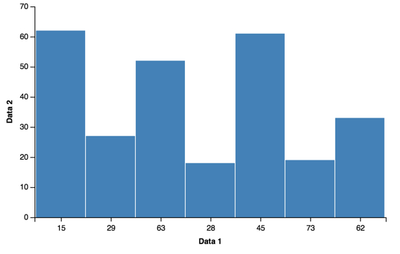
Because the Vega elements are represented by Python classes, it can be difficult to get a good idea of what the Vega grammar looks like:
In [5]: vis.marks[0]
<vincent.marks.Mark at 0x110d630d0>
However, at almost any point in the Vincent stack, you can call the grammar() method to output the Vega grammar as Python data structures:
>>>vis.marks[0].grammar()
{u'from': {u'data': u'table'},
 u'properties': {u'enter': {u'width': {u'band': True,
    u'offset': -1,
    u'scale': u'x'},
   u'x': {u'field': u'data.idx', u'scale': u'x'},
   u'y': {u'field': u'data.val', u'scale': u'y'},
   u'y2': {u'scale': u'y', u'value': 0}},
  u'update': {u'fill': {u'value': u'steelblue'}}},
 u'type': u'rect'}
>>>vis.marks[0].properties.enter.x.grammar()
{u'field': u'data.idx', u'scale': u'x'}
or you can simply output it to a string of JSON:
>>>print(vis.marks[0].to_json())
{
  "type": "rect",
  "from": {
    "data": "table"
  },
  "properties": {
    "update": {
      "fill": {
        "value": "steelblue"
      }
    },
    "enter": {
      "y": {
        "field": "data.val",
        "scale": "y"
      },
      "width": {
        "band": true,
        "scale": "x",
        "offset": -1
      },
      "y2": {
        "scale": "y",
        "value": 0
      },
      "x": {
        "field": "data.idx",
        "scale": "x"
      }
    }
  }
}
Vincent is built around classes and attributes that map 1:1 to Vega grammar, for easy getting, setting, and deleting of grammar elements:
>>>vis.marks[0].properties.enter.grammar()
{u'width': {u'band': True, u'offset': -1, u'scale': u'x'},
 u'x': {u'field': u'data.idx', u'scale': u'x'},
 u'y': {u'field': u'data.val', u'scale': u'y'},
 u'y2': {u'scale': u'y', u'value': 0}}
 >>> del vis.marks[0].properties.enter.width
 >>> vis.marks[0].properties.enter.y2.scale = 'y2'
 >>> vis.marks[0].properties.enter.grammar()
{u'x': {u'field': u'data.idx', u'scale': u'x'},
 u'y': {u'field': u'data.val', u'scale': u'y'},
u'y2': {u'scale': u'y2', u'value': 0}}pandas


