Coder Social home page Coder Social logo

aws / aws-northstar Goto Github PK

View Code? Open in Web Editor NEW
204.0 13.0 36.0 30.21 MB

NorthStar is an open source design system with reusable React components for rapidly prototyping intuitive, meaningful and accessible user experience. It simplifies your work and ensures consistent, predictable user experience at scale for your customers. With NorthStar, you can focus on innovation and do more with less.

Home Page: https://aws.github.io/aws-northstar

License: Apache License 2.0

JavaScript 1.03% TypeScript 95.96% Shell 0.23% HTML 0.16% MDX 2.62%
aws-northstar ui design-system

aws-northstar's Introduction

NorthStar - Prototyping Design System

CodeBuild Status Github Action Workflow - CI NorthStar UI NPM latest version Coverage Status GitHub Release Date NPM Download NPM type definitions Github license GitHub pull-requests GitHub issues

NorthStar is an open source design system with reusable React components for rapidly prototyping intuitive, meaningful and accessible user experience. It simplifies your work and ensures consistent, predictable user experience at scale for your customers. With NorthStar, you can focus on innovation and do more with less.

Check out our documentation website for more details.

Cloudscape Design System and NorthStar v2

On July 19, 2022, AWS released Cloudscape Design System as open source. Cloudscape is a solution for building intuitive user experiences. It offers guidelines to create web applications, along with the design resources and front-end components to streamline implementation.

NorthStar v2 (@aws-northstar/ui) improves upon the previous version by leveraging Cloudscape Design System and with updates to the existing components with new features that make the development experience even better.

NorthStar Legacy

NorthStar legacy (aws-northstar), released in October 2020, was built using Material UI v4 as its base and provided approximately 50 components for building prototyping user experience. This version entered maintenance on April 1, 2023.

During the maintenance phase, NorthStar legacy will only receive critical bug fixes and security patches. New features will be exclusively developed for NorthStar v2. On April 1, 2024, support will end for NorthStar legacy.

Refer to the Migration tabs in the documentation website for more information on how to migrate NorthStar legacy to v2.

Development

Contribution guide are available at the Contributing Guidelines.

Folder Structure

This monorepo hosts source code for both NorthStar legacy and NorthStar v2.

Path
packages/legacy Source code for NorthStar legacy
packages/ui Source code for NorthStar v2
packages/examples/legacy Source code for NorthStar legacy demo app
packages/examples/ui Source code for NorthStar v2 demo app

Prerequisites

Commands

In the project directory, you can run:

yarn storybook

Runs storybook to navigate all the components on NorthStarv v2.

Open http://localhost:6006 to view it in the browser. The page will reload if you make edits.

It is recommended to use storybook as development environment.

yarn lint:fix

Fix lint problems automatically

yarn check:all

Check all the tests passed, code built, storybook built, documentation built

License

This project is licensed under the Apache-2.0 License.

Changelog

Check out the Changelog

aws-northstar's People

Contributors

abrenaut avatar agdimech avatar ajoohongkim avatar amazon-auto avatar aws-prototyping-bot avatar cesarkohl avatar cogwirrel avatar dependabot[bot] avatar howyi avatar jessieweiyi avatar martenpayne avatar mirgj avatar mmarkelov avatar mteichtahl avatar richardneililagan avatar rjenkin avatar semantic-release-bot avatar sureshkumarkv avatar

Stargazers

 avatar  avatar  avatar  avatar  avatar  avatar  avatar  avatar  avatar  avatar  avatar  avatar  avatar  avatar  avatar  avatar  avatar  avatar  avatar  avatar  avatar  avatar  avatar  avatar  avatar  avatar  avatar  avatar  avatar  avatar  avatar  avatar  avatar  avatar  avatar  avatar  avatar  avatar  avatar  avatar  avatar  avatar  avatar  avatar  avatar  avatar  avatar  avatar  avatar  avatar  avatar  avatar  avatar  avatar  avatar  avatar  avatar  avatar  avatar  avatar  avatar  avatar  avatar  avatar  avatar  avatar  avatar  avatar  avatar  avatar  avatar  avatar  avatar  avatar  avatar  avatar  avatar  avatar  avatar  avatar  avatar  avatar  avatar  avatar  avatar  avatar  avatar  avatar  avatar  avatar  avatar  avatar  avatar  avatar  avatar  avatar  avatar  avatar  avatar  avatar

Watchers

 avatar  avatar  avatar  avatar  avatar  avatar  avatar  avatar  avatar  avatar  avatar  avatar  avatar

aws-northstar's Issues

BreadcrumbGroup capitalises urls

Describe the bug
When no items are given to the BreadcrumbGroup component it creates links for you based on the current route. The links it creates are capitalised versions of the actual routes, eg if you visit /the/current/route, you get breadcrumbs with links to /The and /The/Current. This works if routing is not case sensitive, but if you want to use url parameters with IDs where the case matters, this can be a problem!

To Reproduce
Can be seen in the storybook: https://storybook.northstar.aws-prototyping.cloud/?path=/story/breadcrumbgroup--breadcrumbs-with-no-items

Expected behavior
Casing of breadcrumb urls should be preserved, but text should still be capitalised.

Example package.json has outdated package

I tried following the instructions on the Getting Started page:

Download the example:

mkdir northstar && cd northstar
curl https://northstar.aws-prototyping.cloud/examples/create-react-app.tar.gz | tar -xz && cd create-react-app
Install it and run:

npm install
npm start

But at the npm install step it failed with the following error:
CleanShot 2021-11-15 at 18 28 42@2x

I'm not familiar enough with how the package is being used by NorthStar so I can't say what the solution is, but I assume one of the following two lines needs to change?

"plotly.js": "^2.6.2",

Move to CSS grid for layout

Is your feature request related to a problem? Please describe.

negative calculations in styles

Is your feature request related to a specific component? Please add.

AppLayout

Describe the solution you'd like
A clear and concise description of what you want to happen.

The app body contains the following style seen below. Since the body element is offset relatively in the document, a main of 100% would cause space below the fold so instead it's calculated. If i decide to change header height now I have to edit these other calculated styles as well. Changing the layout to use CSS grid would fix this and allow the inner main container to reset the bounding box so you won't have to calculate heights

.makeStyles-main-3 {
    height: calc(100vh - 65px);
    display: flex;
}

Describe alternatives you've considered
A clear and concise description of any alternative solutions or features you've considered.

Move to CSS Grid for layout.

Additional context
N/A

Table component pagination numbers are incorrect when no filter matches are found

Describe the bug
Table component shows incorrect page number (e.g. 1-0 of 11) when no filtered results are found.

Versions
Latest version as the error exists in Northstar demo website - 1.3.18, but all previous versions have the same issue as well

To Reproduce
Steps to reproduce the behavior:

  1. Go to https://northstar.aws-prototyping.cloud/#/Components/Table
  2. Scroll down to Multi Select Table
  3. Enter abc in the Filter/Search input
  4. See pagination numbers show 1-0 of 11

Code
Reproducible in Northstar docs website

Expected behavior
Pagination should show 0-0 of 0 when no matches are found

Screenshots
image

Desktop (please complete the following information):

  • OS: OSX 12.4
  • Browser: Chrome
  • Version: 104.0.512

Smartphone (please complete the following information):

  • Device: [e.g. iPhone6]
  • OS: [e.g. iOS8.1]
  • Browser [e.g. stock browser, safari]
  • Version [e.g. 22]

Additional context
Add any other context about the problem here.

Expandable section in FormRenderer renders all form fields in-line

Describe the bug
When rendering an EXPANDABLE_SECTION field with the FormRenderer component, all fields are thrown into one big in-lined flex container. This results in an ugly form in my view, not in line with the expected behaviour of other fields.

To Reproduce

Schema to use
{
    "fields": [
    {
        "component": "EXPANDABLE_SECTION",
        "title": "Additional attributes",
        "description": "This is an expandable section",
        "name": "selfServiceAttributes",
        "variant": "container",
        "expanded": true,
        "fields": [
            {
                "component": "text-field",
                "name": "remoteName",
                "label": "Remote name",
                "validate": [
                    {
                        "type": "required",
                        "message": "Required"
                    },
                    {
                        "type": "min-length",
                        "threshold": 2,
                        "message": "Min length is 2"
                    }
                ]
            },
            {
                "component": "switch",
                "name": "isHazmatNode",
                "label": "Is true?",
                "initialValue": true
            },
            {
                "component": "switch",
                "name": "isEFPEnabled",
                "label": "Is false?",
                "initialValue": true
            },
            {
                "component": "switch",
                "name": "isEnabled",
                "label": "Is enabled?",
                "initialValue": true
            },
            {
                "component": "select",
                "name": "selecttt",
                "label": "Select",
                "placeholder": "Choose an option",
                "options": [
                    {
                        "label": "Option 1",
                        "value": "option_1"
                    },
                    {
                        "label": "Option 12",
                        "value": "option_12"
                    }
                ],
                "isRequired": true,
                "validate": [
                    {
                        "type": "required"
                    }
                ]
            }
        ]
    }
]

}

Steps to reproduce the behavior:

  1. Create a FormRenderer component
  2. Pass down the schema as described above (any schema that contains an EXPANDABLE_SECTION field will work)
  3. See behaviour in action

Expected behavior
All fields are rendered on their own line

Screenshots
Current behaviour
Screen Shot 2020-11-29 at 10 41 39 AM

Expected behaviour
Screen Shot 2020-11-29 at 10 49 55 AM

Desktop (please complete the following information):

  • OS: macOS
  • Browser: any
  • Version: 1.0.21

Additional context
It can be fixed by manually overriding the .MuiAccordionDetails-root class, e.g.

.MuiAccordionDetails-root {
  flex-direction: column !important;
}

... but this feels hacky and I am not sure if this behaviour is intended (as it doesn't match the behaviour of other fields).

Installation fails for react version 18.2.0

Describe the bug
The installation fails for react version 18.2.0

Versions
Which version of aws-northstar npm package is installed?
version 1.3.18

Screenshots
If applicable, add screenshots to help explain your problem.
Screen Shot 2022-09-22 at 12 02 52 PM

Desktop (please complete the following information):

  • OS: MacOs
  • Browser [e.g. chrome, safari] Chrome
  • Version [e.g. 22]

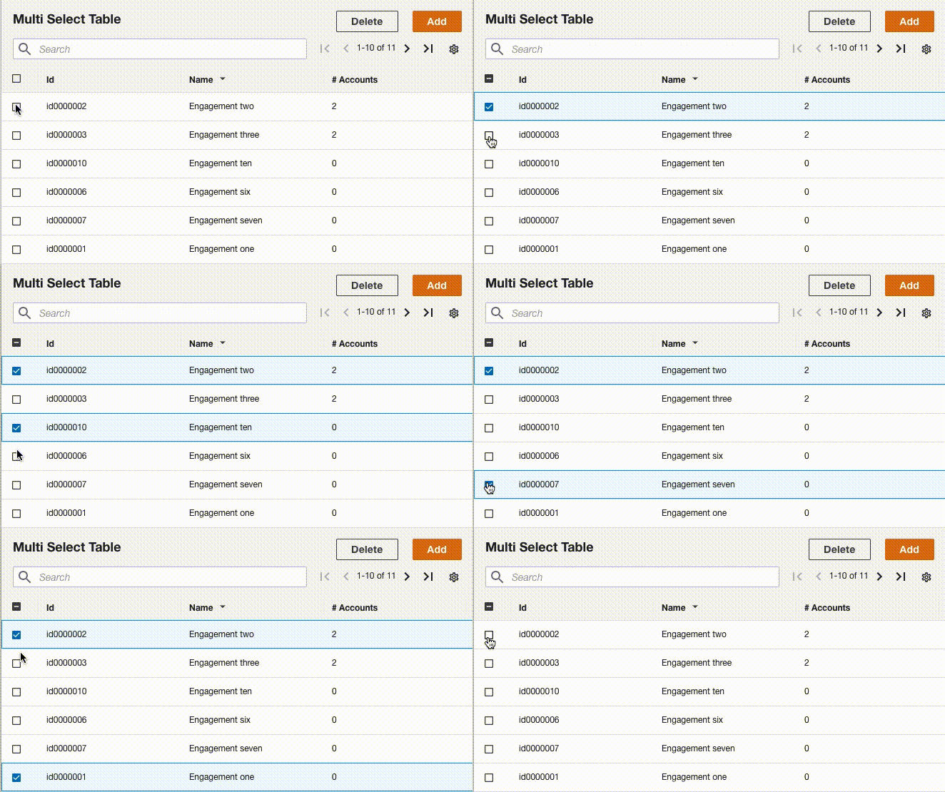
Multi Select Table sample does not work correctly

Describe the bug
Multi Select Table sample does not work correctly. When clicking multiple checkbox, the previously selected row becomes unselected.

To Reproduce
Steps to reproduce the behavior:

  1. Create a new react app with create-react-app
  2. Edit App.js and implement the Multi Select Table sample
  3. Open the app and select the first row
  4. Select the second row
  5. Select the third row, then the second row becomes unselected

Expected behavior
The previously selected rows will remain selected.

Screenshots
sample

Desktop (please complete the following information):

  • OS: macOS
  • Browser: Chrome
  • Version: 87.0.4280.141 (Official Build) (x86_64)

Additional context
It looks like an issue in react-table, as reported here: TanStack/table#2651

I expect upgrading react-table to newer than 7.6.0 will fix the problem. Could you consider upgrading the dependency?

"react-table": "7.0.0-rc.16",

Add data-testid to all components that don't have one

Is your feature request related to a problem? Please describe.
It is difficult to identify northstar components that have no "data-testid" for ui automation testing using tools like Cypress.

Is your feature request related to a specific component? Please add.

Describe the solution you'd like
Add data-testid to all components.

Describe alternatives you've considered

Additional context

Side navigation in AppLayout on mobile / small screen view does not behave as expected

Describe the bug
When using AppLayout on a small screen (<= 688px width) or on a mobile device:

  • the side navigation displays in open state, covering all of the content on the screen (it should display in closed state by default)
  • clicking on a link in the side nav updates navigates successfully, however the side nav remains open on top of the page content (it should automatically close)

Versions
Latest version (@aws-northstar/ui v1.1.6)

To Reproduce
Steps to reproduce the behavior:

  1. Open code sandbox here: https://codesandbox.io/s/strange-ritchie-8j5ssq?file=/src/App.tsx&resolutionWidth=320&resolutionHeight=675 (ensure you are in mobile view)
  2. Observe that you are on the home route
  3. Click on a link in the side nav (e.g. page 2)
  4. Navigation is successful, however side nav is still open
  5. Click close icon on side nav and observe that you are now on page 2
  6. Refresh page
  7. Observe that the page loads with the side nav open on top of the page you should be seeing

Code

Example of AWS Northstar AppLayout: https://codesandbox.io/s/strange-ritchie-8j5ssq?file=/src/App.tsx&resolutionWidth=320&resolutionHeight=675

Compare this to example of Cloudscape Layout which behaves as expected:
https://codesandbox.io/s/red-dream-cgvc8y?file=/src/App.js

Expected behavior

  • Click on links in side nav should close side nav
  • Opening a page in mobile view or small screen should have side nav closed when page loads

Desktop (please complete the following information):

  • OS: MacOS Ventura 13.4
  • Browser: Chrome
  • Version: latest

Smartphone (please complete the following information):

  • Device: iPhone 11
  • OS: iOS 16
  • Browser: Safari
  • Version: latest

Additional context
Similar issue was raised previously here:
#918

One was resolved (thank you!) however, this particular problem still persists. Any help or direction would be appreciated, thanks!

Table documentation page shows ReferenceError: regeneratorRuntime is not defined

Describe the bug
A clear and concise description of what the bug is.

To Reproduce
Steps to reproduce the behavior:

  1. Go to https://northstar.aws-prototyping.cloud/#/Components/Table
  2. Scroll down
  3. See error

Expected behavior
Preview of table component and options

Screenshots
If applicable, add screenshots to help explain your problem.

Desktop (please complete the following information):

  • OS: [e.g. iOS] Mac
  • Browser [e.g. chrome, safari] chrome
  • Version [e.g. 22]

Smartphone (please complete the following information):

  • Device: [e.g. iPhone6]
  • OS: [e.g. iOS8.1]
  • Browser [e.g. stock browser, safari]
  • Version [e.g. 22]

Additional context
Add any other context about the problem here.

Multiselect add option twice if initial value is provided

Describe the bug

Multiselect initial value has a wrong behaviour. In case you provide an initial value/values to the Multiselect component it will add the same element twice in the TokenGroup unless the initial value it's removed and added a second time (see gif below)

To Reproduce
Steps to reproduce the behavior:

  1. Provide initial values to the MultiSelect component (see story below)
  2. Click on the select box and select again one of the items provided as initial value
  3. The same item will be added twice in the TokenGroup
  4. if you try to remove from the select, it will remove only the second one
  5. If you remove any of the duplicate from the TokenGroup and select the same one once again then you won't have this problem anymore

To reproduce it this story can be added to the storybook file:

export const WithValue = () => (
    <FormField label="Form field label" controlId="formFieldId2">
        <Multiselect
            options={awsServices}
            controlId="formFieldId2"
            ariaDescribedby="This is a description"
            onChange={action('onChange')}
            checkboxes={true}
            value={[
                {
                    value: 'EC2',
                    label: 'EC2 - Amazon Elastic Compute Cloud',
                }
            ]}
        />
    </FormField>
);

Expected behavior
Initial values provided to the Multiselect component should behave the same way as the one selected afterwards. eg. if the item is already selected should be removed from the TokenGroup regardless if it's one item provided in the initial value or an item selected from the Multiselect

Screenshots

multiselect-bug

Desktop (please complete the following information):

  • OS: MacOS
  • Browser Chrome
  • Version 87.0.4280.67

Additional context
Add any other context about the problem here.

Need proper ESM package output

Is your feature request related to a problem? Please describe.

Kind of. It's a catalyst from this issue: When using the AppLayout component with create-react-app, jest fails with an error Cannot use import statement outside a module complaining about a UMD/CJS module AppLayout requiring an ESM module from react-use-localstorage. I see you're having to handle this module specially in the AppLayout test due to the react-use-localstorage package not implementing main/module correctly in the package.json (might want to drop this package or have them fix this issue). Then I noticed NorthStar doesn't have an esm module output at all which should be available to support advanced use cases.

Is your feature request related to a specific component? Please add.

Affects all components.

Describe the solution you'd like

Modern builds should include both es5 and esm output so that an application build can use the correct module format for the application. It would solve the problem above as well as enable advanced treeshaking plugins for webpack or advanced minification with closure compiler.

Describe alternatives you've considered

This pattern is common for modern package formats.

Additional context
-na-

Mix single select with group by

Describe the bug
I would like to combine single select with group by for my table to show, everything went well just one problem, there will be select buttons near each group, which is not expected, since if they click on the button near each group, it will select all the items in the group, which will lead to the logic of my app broke, since you can only choose one item at a time.

So the problem will be how should I remove the select option near each group so my user wouldn't click them ?

See below picture for clarification
Screen Shot 2022-07-17 at 1 26 36 PM

Versions
"aws-northstar": "^1.3.12",

Code

Link to sample codesandbox

AppLayout in mobile view does not display side navigation as expected

Describe the bug
When using the AppLayout component and viewing on a mobile device or small screen size, there are a number of issues.

  • The side navigation is displayed when first landing on the page (it should be hidden on a small screen)
  • The side navigation is hidden behind the top header bar - this causes the close icon hidden and header text in the side navigation to be hidden
  • Clicking on a link the side navigation keeps the side navigation open - clicking on a link does not take the user to the screen they expect to see

Versions
Which version of aws-northstar npm package is installed?
@aws-northstar/ui 1.1.2

To Reproduce
Please check code sandbox here:
https://codesandbox.io/s/strange-ritchie-8j5ssq?file=/src/App.tsx&resolutionWidth=320&resolutionHeight=675

Expected behavior

  • Side navigation hidden by default on mobile view
  • Side navigation shifted down slightly so that it is not hidden behind the top header
  • Side navigation links automatically close the side navigation when clicked (only on mobile/small screen)

Screenshots
image

Desktop (please complete the following information):

  • OS: Mac OS - Ventura 13.4
  • Browser: Chrome
  • Version 114.0.5735.133

Smartphone (please complete the following information):

  • Device: iPhone 11
  • OS: iOS 16.5
  • Browser: Safari

Table action buttons should right aligned

Describe the bug
When adding a custom header with action buttons to a Table, the buttons are left aligned. according to the cloudscape style guide, these buttons should be right aligned.

Versions
@aws-northstar/ui@npm:1.1.2

To Reproduce

Code

<Table
      columnDefinitions={columnDefinitions}
      header={
        <Header
          variant="h2"
          info={<Link variant="info">Info</Link>}
          actions={<SpaceBetween direction="horizontal" size="xs">
            <Button disabled={editButtonDisabled}>Secondary button</Button>
            <Button variant="primary">
              Create new tenant
            </Button>
          </SpaceBetween>}
        >
          Tenants
        </Header>}

Expected behavior
Action buttons right aligned

Screenshots

image

Desktop (please complete the following information):
all

Smartphone (please complete the following information):
all

Additional context
nil

seleted row color is immutable in table component

Describe the bug
color of selected row is pink in table component which i want to change to blue .no props in table component to change color .

Versions
1.3.12

To Reproduce
Steps to reproduce the behavior:

  1. Go to '...'
  2. Click on '....'
  3. Scroll down to '....'
  4. See error

Code

If it's possible, please provide the code which reproduces the issue.
You can use this CodeSandbox Template to create a demo sandbox.

Expected behavior
A clear and concise description of what you expected to happen.

Screenshots
If applicable, add screenshots to help explain your problem.

Desktop (please complete the following information):

  • OS: [e.g. iOS]
  • Browser [e.g. chrome, safari]
  • Version [e.g. 22]

Smartphone (please complete the following information):

  • Device: [e.g. iPhone6]
  • OS: [e.g. iOS8.1]
  • Browser [e.g. stock browser, safari]
  • Version [e.g. 22]

Additional context
Add any other context about the problem here.

Northstar vs. Cloudscape

Hey,

I've been loving* using Northstar for a couple of my personal projects but noticed that AWS has recently released Cloudscape which seems to be in a similar vein.

I just wanted to checkin to see if Cloudscape replaces Northstar or if Northstar will continue to be updated?

Thanks,

Marrick

* I'm pretty obsessive about design so haven't a library that basically doesn't support styling has been an amazing way to force me to actually focus on functionality ๐Ÿ˜Ž

New component - Popover

Is your feature request related to a problem? Please describe.
No

Is your feature request related to a specific component? Please add.
No

Describe the solution you'd like
A popover component is often used to show contextual help or more information.

Describe alternatives you've considered
Popper, and its React version

Additional context
Add any other context or screenshots about the feature request here.

Confusing hover outline for disabled input elements

I'm not sure if it's a bug, but I'm just confused about outline style for hovered disabled inputs - Input, DatePicker components. It just seem that i can change the value of input. Should it change outline color?
Screen Shot 2021-05-19 at 9 59 47 AM

For example there is no any ui changes for disabled hovered inputs in Material UI library

Missing styles dependency in HelpPanel

Describe the bug
HelpPanel component has its style definition in it, but it is not set as a dependency in React useMemo. This leads to style corruption when the component is re-rendered.

const styles = useStyles();
const header = useMemo(() => {
return (
<Box className={styles.header}>
<Heading variant="h2">{headerLabel}</Heading>
</Box>
);
}, [headerLabel]);

}, [children, learnMoreFooter]);

To Reproduce
Steps to reproduce the behavior:

  1. Implement a sample of AppLayout in the documentation
  2. Open the App, the HelpPanel shows properly
  3. Click on close button of a notification to invoke re-rendering
  4. You will see the style corrupts in HelpPanel

Sample at CodeSandbox: https://codesandbox.io/s/aws-northstar-missing-styles-dependency-4up5g?file=/src/App.js

Expected behavior
styles variable should be included in React useMemo dependencies so that the style remains even when the component is updated.

Screenshots

before clicking notification close button after clicking notification close button
Screen Shot 2021-01-26 at 14 30 51 Screen Shot 2021-01-26 at 14 30 38

Desktop (please complete the following information):

  • OS: macOS
  • Browser: Chrome
  • Version: 87.0.4280.141 (Official Build) (x86_64)

Smartphone (please complete the following information):
n/a

Additional context
n/a

<Link> inside a form schema

Hi there,

I tried to insert a link to a form schema using the code below but it comes out with this which is not what I expected. I went thru your documentation but nothing is related to this.
image

import FormRenderer, { componentTypes, validatorTypes } from 'aws-northstar/components/FormRenderer';
import Link from "aws-northstar/components/Link";
...
let schema = {
    fields: [
        ...
        {
            component: componentTypes.SELECT,
            name: 'icon',
            label: `Icon (Please refer ${<Link href="https://feathericons.com/">here</Link>} for the looks of the icons)`,
            options: [
                ...
            ],
            isRequired: true,
            validate: [
                {
                    type: validatorTypes.REQUIRED,
                },
            ],
        },
        ...
    ]
};
...

Is there any existing way to achieve this?
Thanks!!

Change active tab

Describe the bug
A clear and concise description of what the bug is.

The issue I have in my app code is that I have 2 callbacks subscribed to an API and when they are called I want to change the Tab that is visible to the user.

Default = Tab 1
Call 1 = Tab 2
Call 2 = Tab 1

However when I am updating the state for the ActiveId on the callback it is not updating the Tabs component to display the correct view.

Versions
Which version of aws-northstar npm package is installed? ^1.3.12

Code

If it's possible, please provide the code which reproduces the issue.

const handleTabChanged = (event) => {
  props.onChange(event);
};
const tabs = [
    {
        label: 'Tab 1',
        id: '1',
        content: 'Tab 1'
    },
    {
        label: 'Tab 2',
        id: '2',
        content: "Tab 2"
    },
    {
        label: 'Tab 3',
        id: '3',
        content: "Tab 3"
    },
];
  return (
    <Tabs tabs={tabs} variant="container" activeId={props.handleTabChanged} onChange={handleTabChanged}  />
  );
};
export default TabLayout;

And I have the Parent app passing down the handler function to the Tab component to update the state:

const App = () => {
  const [activeTabId, setActiveTabId] = useState([]);
  const handleTabChanged = (activeId) => {
    setActiveTabId(activeId);
  };
  const onConnected = useCallback((c) => {
     setActiveTabId("2");
    } catch (e) {
      error("couldn't set data", e);
    }
  }, []);
  useConnected(onConnected);
  const onDestroy = useCallback(() => {
    try {      
      setActiveTabId("1");
    } catch (e) {
      error("couldn't empty data", e);
    }
  }, []);
  useDestroy(onDestroy);
  return (
      <Tabs onChange={handleTabChanged} activeId={activeTabId} />
  );
}
export default App;

Expected behavior
Tabs active tab is changed to the ActiveId that in State when the State is updated outside of the Users input. Eg We are able to change the active tab based on the ActiveId stored in State.

Similar to "Button with loading prop" functionality by where you can update the State for Loading and the button reacts.

Desktop (please complete the following information):

  • Device: Macbook

  • OS: iOS 12.0.1

  • Browser Chrome

  • Version 98.0.4758.102

  • Device: HP Elitebook

  • OS: Windows 10 - Version 10.0.19044 Build 19044

  • Browser Firefox

  • Version 91.6.0esr (64-bit)

Additional context
Add any other context about the problem here.

'SideNavigation' cannot be used as a JSX component.

Hi there,

I have this following error just by importing it and it doesn't seem any other code on top of this is causing this error. Can I get some help for this?

Thanks,
Cheston

'SideNavigation' cannot be used as a JSX component.
  Its instance type 'Component<Pick<SideNavigationProps, "header" | "items" | "defaultExpandedAll"> & ({} | { wrappedComponentRef?: Ref<any> | undefined; }), any, any>' is not a valid JSX element.
    The types returned by 'render()' are incompatible between these types.
      Type 'React.ReactNode' is not assignable to type 'import("/home/user/website/node_modules/@types/react-router/node_modules/@types/react/index").ReactNode'.
        Type '{}' is not assignable to type 'ReactNode'.  TS2786

    75 |     }
    76 | 
  > 77 |     const navigation = <SideNavigation header={{ href: '/', text: 'asdfasdf'}}/>;
       |                         ^
    78 |     // const navigation = <SideNavigation header={{ href: '/', text: 'asdfasdf'}} items={navigationItems}/>;
    79 | 
    80 |     return (

Here are my package.json dependencies

  "dependencies": {
    "@aws-amplify/ui-react": "^2.15.1",
    "@mui/styles": "^5.4.1",
    "aws-amplify": "^4.3.19",
    "aws-northstar": "^1.3.12",
    "react": "^17.0.2",
    "react-dom": "^17.0.2",
    "react-feather": "^2.0.9",
    "react-router-dom": "^5.2.0",
    "react-scripts": "3.4.4",
    "which": "2.0.2"
  },
  "devDependencies": {
    "@types/react": "^17.0.2",
    "@types/react-dom": "^17.0.2",
    "@types/react-router-dom": "^5.3.3",
    "typescript": "^4.6.2"
  },

Radio Buttons Not Concentric on Safari

Describe the bug
When a radio button is selected on Safari, the inner dot is misaligned by a few pixels.

The video below shows that it animates correctly but jumps down on the last frame.

To Reproduce
Steps to reproduce the behavior:

  1. Go to 'https://northstar.aws-prototyping.cloud/#/Components/RadioGroup'

Expected behavior
It to be pixel-perfect (it's fine on Chrome)

Screenshots
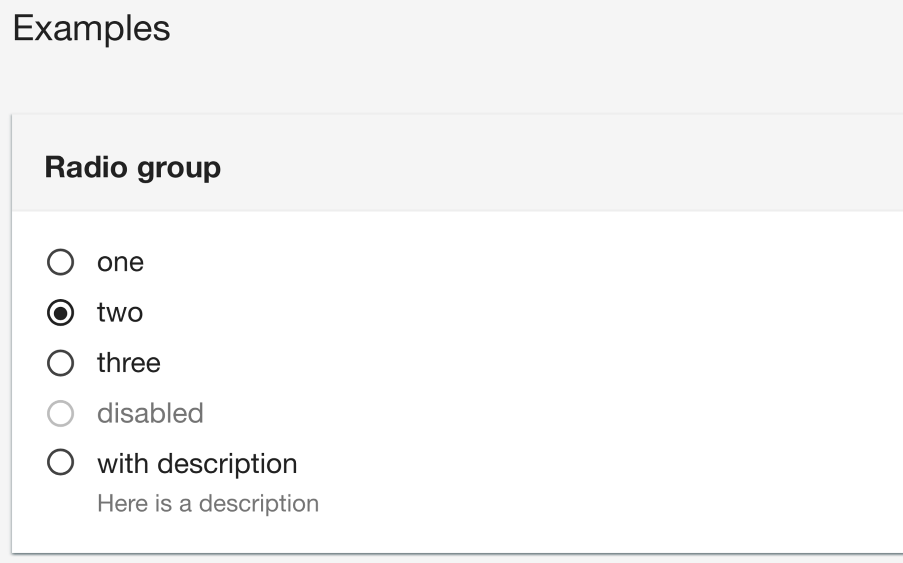
Screen Shot 2021-01-20 at 8 07 45 PM

radio-buttons-recording.mp4

Desktop:

  • OS: MacOS Big Sur
  • Browser: Safari
  • Version: 14.0.1

[FormRenderer][DatePicker] - The value is reset to undefined when initial value is provided and users change the initial value

Describe the bug

A user reported a weird issue related to the Date Picker used in the Form Renderer. The Date Picker is expecting or outputting a Date object as value. If initial value is NOT provided, everything works fine and user can set the value or change the value using the Date Picker. If initialValue is provided and users do not touch the input, it is also ok. However, if users touch the input, the underlying value becomes undefined.

The issue can be reproduced in this CodeSandbox:
https://codesandbox.io/s/eager-meadow-qli49?file=/src/DateComponent.tsx

FormRenderer does not display a validation errors if the fields are in a subform

Describe the bug
FormRenderer does not display a validation error if the fields are in a subform.
(Validation is being performed.)

To Reproduce
Steps to reproduce the behavior:

  1. Show wizard made by FormRenderer.
  2. Click Next button of wizard without filling requred fields.
  3. Stay the page due to validation error. But validation errors are not displayed.
  4. Fill required fields and click Next button.
  5. Next page of wizard is displayed.

Expected behavior
Validation results in the subforms in the wizard should be displayed.

Desktop (please complete the following information):

  • OS: Windows 10
  • Browser: Chrome 86.0.4240.111
  • Version: 1.0.12

Additional context
Code to reproduce:

import React from 'react';
import FormRenderer, { componentTypes, validatorTypes } from 'aws-northstar/components/FormRenderer';
import Container from 'aws-northstar/layouts/Container';
import Box from 'aws-northstar/layouts/Box';

const ReviewTemplate = (data: any) => {
    return <Box>{JSON.stringify(data)}</Box>;
};

const wizardSchema = {
    fields: [
        {
            component: componentTypes.WIZARD,
            name: 'wizard',
            submitButtonText: 'Custom Submit Label',
            fields: [
                {
                    name: 'step-1',
                    title: 'title-1',
                    description: 'description-1',
                    fields: [
                        {
                            component: componentTypes.SUB_FORM,
                            title: 'subform-title',
                            description: 'subform-description',
                            name: 'InputData',
                            fields: [
                                {
                                    component: componentTypes.TEXT_FIELD,
                                    name: 'Name',
                                    label: 'Name',
                                    isRequired: true,
                                    isReadOnly: false,
                                    validate: [
                                        {
                                            type: validatorTypes.REQUIRED,
                                        },
                                    ],
                                },
                            ],
                        },
                    ],
                },
                {
                    name: 'step-2',
                    title: 'review',
                    description: 'review',
                    fields: [
                        {
                            component: componentTypes.REVIEW,
                            name: 'review',
                            Template: ReviewTemplate,
                        },
                    ],
                },
            ],
        },
    ],
    header: 'header',
    description: 'description',
};

const initialValues = {
};

function MyWizard() {
    return (
        <FormRenderer schema={wizardSchema} initialValues={initialValues} onSubmit={console.log} onCancel={console.log} />
    );
}
export default MyWizard;

Custom Table Header does not append the the item account

Describe the bug
When using a custom header in a Table, the item counter is presented below the custom header with no way to append it.

image

Versions
@aws-northstar/ui@npm:1.1.2

To Reproduce
Steps to reproduce the behavior:

  1. Go to '...'
  2. Click on '....'
  3. Scroll down to '....'
  4. See error

Code

<Table
      columnDefinitions={columnDefinitions}
      header={
        <Header
          variant="h2"
          info={<Link variant="info">Info</Link>}
          actions={<SpaceBetween direction="horizontal" size="xs">
            <Button disabled={editButtonDisabled}>Secondary button</Button>
            <Button variant="primary">
              Create new tenant
            </Button>
          </SpaceBetween>}
        >
          Tenants
        </Header>}

Expected behavior

The item counter should be appended to the custom header

Screenshots
If applicable, add screenshots to help explain your problem.

Desktop (please complete the following information):
all

Smartphone (please complete the following information):
all

Additional context
Nil

File Upload Feature

Is your feature request related to a problem? Please describe.
Need a component that handles file upload. It can be a simple button component with listener, but it will be good to be part of FormField Input component

Is your feature request related to a specific component? Please add.
Input

Describe the solution you'd like
Input component will have type="file" that renders a hidden html component and wrap it in a good UI looks aligned with northstar theme

Describe alternatives you've considered
Embedding a hidden element like described above, manually

Additional context
Add any other context or screenshots about the feature request here.

Wizard allows mandatory fields to be skipped

Describe the bug
In the Wizard form renderer component, it is possible for the user to skip mandatory fields in a step. The user is able to submit the form with invalid data (i.e. valid form submission but missing mandatory fields).

Versions
Latest

To Reproduce
Steps to reproduce the behavior:

  1. Go to https://aws.github.io/aws-northstar/?path=/story/components-formrenderer-wizard--default
  2. Enter a value for "Config 1"
  3. Click Next to go to Step 2
  4. Enter a value for "Config 2"
  5. Click Next to go to Step 3
  6. Click Next to go to Step 4
  7. Click on Step 2 in the wizard navigation menu to go back to Step 2
  8. Remove text in the "Config 2" textbox
  9. Click on Step 1 in the wizard navigation menu
  10. Click on Step 4
  11. Click submit
  12. The form submits successfully - { "config1": "some value" }

Expected behavior
All fields should be validated before submission.

i.e. The form should not allow the user to submit it unless there is a config2 value, i.e. { "config1": "some value", "config2": "some value" }

Additional context
This is a bit of an edge case, but technically this bug makes it possible for a user to submit an invalid form.

Add the ability to invoke function on Wizard navigation buttons

Is your feature request related to a problem? Please describe.
We're implementing a wizard based form that requires the ability to invoke an arbitrary function when the Next or Previous buttons are clicked.

Is your feature request related to a specific component? Please add.
Yes, the FormRenderer component

Describe the solution you'd like
Add onNext and onPrevious props that accept function handlers and invoke them when the Next or Previous buttons are clicked

Describe alternatives you've considered
N/A

Additional context
Add any other context or screenshots about the feature request here.

Conditional fields within a FormRenderer wizard do not display validation errors correctly

Describe the bug
FormRenderer does not display a validation error for fields that are "conditional" when inside a Wizard form.
(Validation is being performed)

Versions
Which version of aws-northstar npm package is installed?
@aws-northstar/ui 1.1.1

To Reproduce
Steps to reproduce the behavior:

  1. Create a wizard using FormRenderer
  2. Trigger a conditional component - e.g. display a conditional text field that only displays when a switch is turned on
  3. Press Next on the wizard without filling any fields
  4. The wizard does not go to the next step - validation is performed but validation errors for conditional components are not shown
  5. Fill in required fields and click Next
  6. Next page in the wizard is displayed

Code

Sandbox link to reproduce error:
https://codesandbox.io/s/sharp-bogdan-578mzc

Expected behavior
Validation errors should be shown for all conditional fields.

Screenshots
If applicable, add screenshots to help explain your problem.

Desktop (please complete the following information):

  • OS: Mac OS - Ventura 13.4
  • Browser: Chrome
  • Version 114.0.5735.133

Additional context
Validation errors are shown correctly for fields that are not conditional.
Validation errors are also shown correctly for conditional fields that are NOT within a wizard.

This looks like a similar issue to:
#34

Code to reproduce:

import NorthStarThemeProvider from "@aws-northstar/ui/components/NorthStarThemeProvider";
import {
  componentTypes,
  FormRenderer,
  validatorTypes
} from "@aws-northstar/ui";

const schema = {
  header: "Header",
  description: "Description",
  fields: [
    {
      name: "wizard",
      component: componentTypes.WIZARD,
      fields: [
        {
          name: "step-1",
          title: "Step 1",
          fields: [
            {
              name: "switch-enabled",
              component: componentTypes.SWITCH,
              label: "Show conditional input"
            },
            {
              name: "conditional-text-field",
              component: componentTypes.TEXT_FIELD,
              label: "Conditional text field",
              description: "(Validates but does not show error)",
              isRequired: true,
              validate: [
                {
                  type: validatorTypes.REQUIRED
                }
              ],
              condition: {
                when: "switch-enabled",
                is: true
              }
            },
            {
              name: "standard-text-field",
              component: componentTypes.TEXT_FIELD,
              label: "Standard text field",
              description: "(Validates properly)",
              isRequired: true,
              validate: [
                {
                  type: validatorTypes.REQUIRED
                }
              ]
            }
          ]
        },
        {
          name: "step-2",
          title: "Review",
          fields: [
            {
              name: "review",
              component: componentTypes.REVIEW,
              Template: (data: any) => {
                return <>{JSON.stringify(data)}</>;
              }
            }
          ]
        }
      ]
    }
  ]
};

export default function App() {
  return (
    <NorthStarThemeProvider>
      <FormRenderer
        onCancel={console.log}
        onSubmit={console.log}
        schema={schema}
      />
    </NorthStarThemeProvider>
  );
}

A programmatic way to open the AppLayout HelpPanel drawer

Is your feature request related to a problem? Please describe.
A clear and concise description of what the problem is. Ex. I'm always frustrated when [...]

Currently, the users have to open the HelpPanel by themselves. Usually, HelpPanel includes detailed information about the main content. It is better to have a programmatic way to open the HelpPanel when users click a link.

Is your feature request related to a specific component? Please add.

AppLayout and HelpPanel

Describe the solution you'd like
A clear and concise description of what you want to happen.

A helper method that users can import and trigger to open the HelpPanel drawer

Describe alternatives you've considered
A clear and concise description of any alternative solutions or features you've considered.

Additional context
Add any other context or screenshots about the feature request here.

Samples for Cognito auth

Is your feature request related to a specific component? Please add.
Cognito Auth

Describe the solution you'd like
The Cognito auth looks very useful. We are using Cognito extensively and having to implement the React components ourselves. Are there any samples or sample code that shows how to use the Northstar Cognito auth components? Would love to leverage this instead of building our own.

thanks!

Figma template

Would it be possible to release a Figma template containing all of these components?

Wizard allows mandatory fields to be skipped

Describe the bug
In the Wizard form renderer component, it is possible for the user to skip mandatory fields in a step. The user is able to submit the form with invalid data (i.e. valid form submission but missing mandatory fields).

Versions
Latest

To Reproduce
Steps to reproduce the behavior:

  1. Go to https://aws.github.io/aws-northstar/?path=/story/components-formrenderer-wizard--default
  2. Enter a value for "Config 1"
  3. Click Next to go to Step 2
  4. Enter a value for "Config 2"
  5. Click Next to go to Step 3
  6. Click Next to go to Step 4
  7. Click on Step 2 in the wizard navigation menu to go back to Step 2
  8. Remove text in the "Config 2" textbox
  9. Click on Step 1 in the wizard navigation menu
  10. Click on Step 4
  11. Click submit
  12. The form submits successfully - { "config1": "some value" }

Expected behavior
All fields should be validated before submission.

i.e. The form should not allow the user to submit it unless there is a config2 value, i.e. { "config1": "some value", "config2": "some value" }

Additional context
This is a bit of an edge case, but technically this bug makes it possible for a user to submit an invalid form.

Recommend Projects

  • React photo React

    A declarative, efficient, and flexible JavaScript library for building user interfaces.

  • Vue.js photo Vue.js

    ๐Ÿ–– Vue.js is a progressive, incrementally-adoptable JavaScript framework for building UI on the web.

  • Typescript photo Typescript

    TypeScript is a superset of JavaScript that compiles to clean JavaScript output.

  • TensorFlow photo TensorFlow

    An Open Source Machine Learning Framework for Everyone

  • Django photo Django

    The Web framework for perfectionists with deadlines.

  • D3 photo D3

    Bring data to life with SVG, Canvas and HTML. ๐Ÿ“Š๐Ÿ“ˆ๐ŸŽ‰

Recommend Topics

  • javascript

    JavaScript (JS) is a lightweight interpreted programming language with first-class functions.

  • web

    Some thing interesting about web. New door for the world.

  • server

    A server is a program made to process requests and deliver data to clients.

  • Machine learning

    Machine learning is a way of modeling and interpreting data that allows a piece of software to respond intelligently.

  • Game

    Some thing interesting about game, make everyone happy.

Recommend Org

  • Facebook photo Facebook

    We are working to build community through open source technology. NB: members must have two-factor auth.

  • Microsoft photo Microsoft

    Open source projects and samples from Microsoft.

  • Google photo Google

    Google โค๏ธ Open Source for everyone.

  • D3 photo D3

    Data-Driven Documents codes.